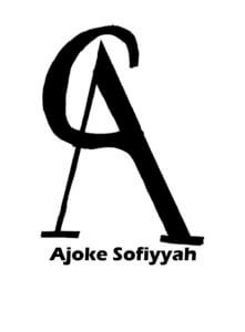
As part of our task today we had to combine our initials to create a transmogrify. We had the choice of two typefaces: Future (A sans serif typeface) and Garamond (a serif typeface) – I experimented with both.
I decided that my initials were better suited to the Futura typeface which created a strong and more angular look, much like my letters K&H. Where as Garamond would’ve created a more rounded, overall, feel which would’ve been better suited to letters like C and G.
I also experimented with different colours, textures and techniques but felt that the block black was better suited to my final piece and ran nicely with the strong, block theme.
Overall i’m happy with my final piece, I think I created something not only abstract but eligible also.
Category: Transmogrify: your initials (Kim’s project)
Transmogrify: your initials
Structured and geometric design

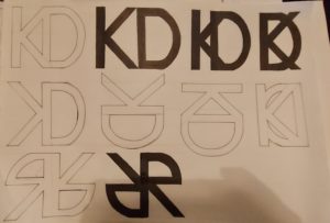
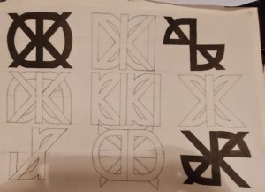
While studying the future font during today’s lesson, i perceived the style and design as very geometric and fluid in its connection. Therefore I experimented with connected and straight lines throughout the design process. with this, the designs that I imagined are very rectangular and geometric in shape when it came down to the final few iterations presented on the right-hand side the of page. With this, I did also experiment with a more ‘Centeria Script’ esque design in one drawn iteration with more wavey and elegant lines but ultimately went with a more structured and geometric design instead. In terms of my final design, I personally prefer either the T connecting the the B’s crossbar design and or the T integrated into the interior of the B’s salute.
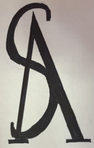
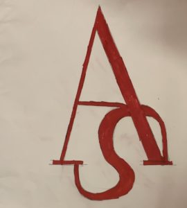
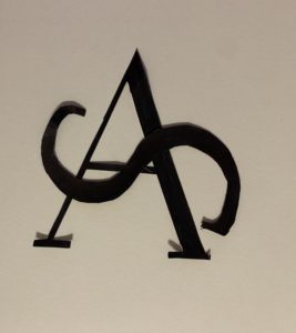
A, S Or A, C – Initials
01/10/2020
I first started with 3 letters for my initials using fonts that I used in my previous monog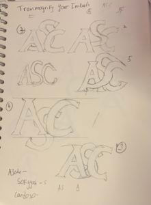 ram serif but later advised by Kim that 2 letters would be better and faster.
Process
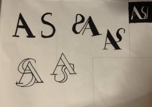
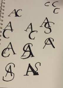
I Used Garamond as I am particularly instead in Serif typeface. I started to sketch and Explore which letter i would use with ‘A’ for my design process I chose ‘S’ cause I liked the swirl around the Letter ‘A’
The Stages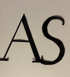
 Final Work
Conclusion
I am quite happy that I took Kim advised as I like the simplicity of the 2 letters. after comparing my work with that of my mates I regret not exploring more with the forms and layout of my letters.
Maybe if I use Futura people would take me seriously
Intro
Todays brief required us to experiment with creating a monogram from our own Initials. I was given the option to base my response on the typefaces Futura or Garamond. I chose Futura because it is a Geometric Sans-Serif. This means that it has more consistency in its weight, suggesting that the monogram will be more uniform in its design. The lack of serifs also make it more practical to connect forms which is ideal for the brief. In addition I feel that Futura is a personal favourite of mine, due to its uniformity in geometric design but slight changes in weight, adding variation and personality, instead of being perfectly boring. To get an idea of how to connect my Initials, I started to source some inspiration of existing sans-serif type monograms.
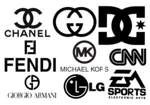
I found that a common way to join the forms are through overlapping them, often creating something not initially legible, thus becoming an odd form for a logo. The monograms also utilise common characteristics found in the typeface. For example the DC logo can utilise the ‘C’ by vertically flipping it to suggest its also a ‘D’. Having this in mind I decided to sketch out some initial ideas in Futura. I printed out my initials in the same size but in ‘Medium’, ‘Bold’ and ‘Condensed medium’ and cut them out. This was to give me a range of weights to experiment with as well as allow me to stencil them for accuracy. I found this was a good way to generate ideas as I could physically manipulate the type, often causing accidents leading to new ideas to try. It also helped me get a fairly close resemblance to the typeface which was helpful for alignment in my sketches. After several sketches I redrew some of my favourites to get a sense of which ones looked legible and suitable when filled in, as sketch outlines give a fall sense of space.
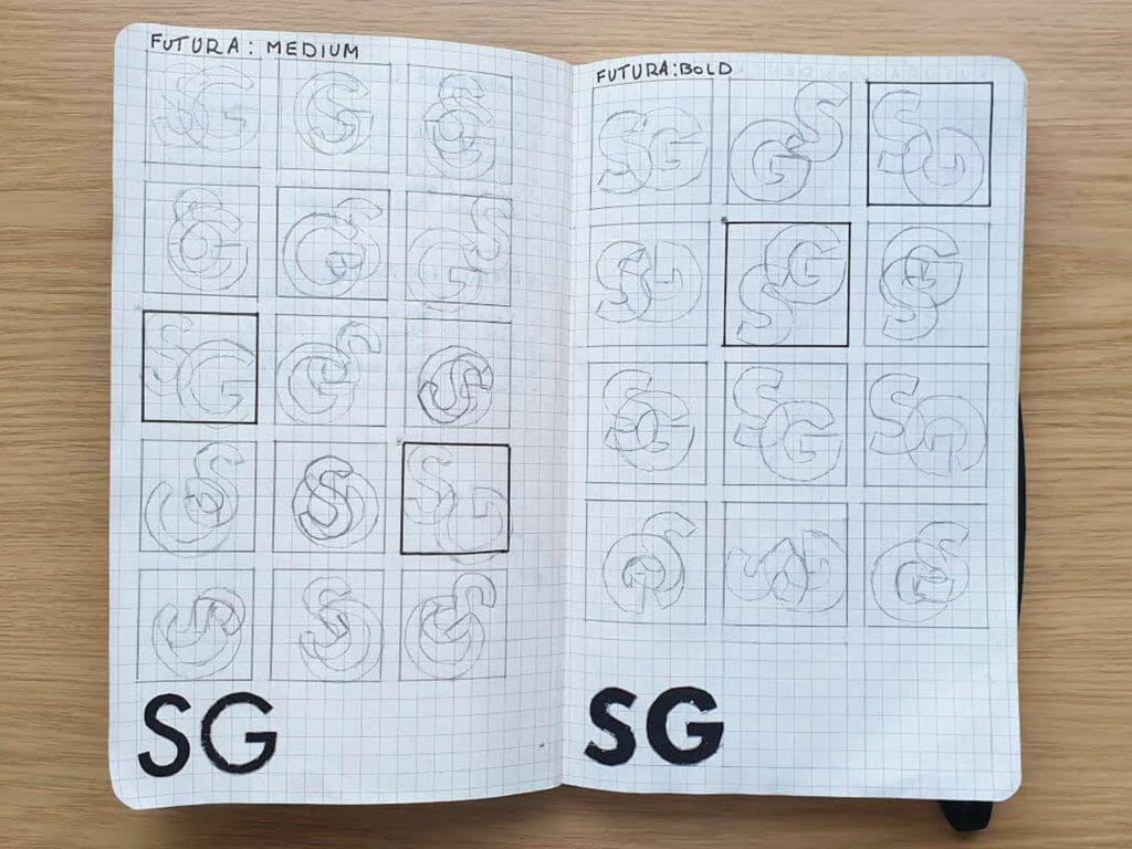
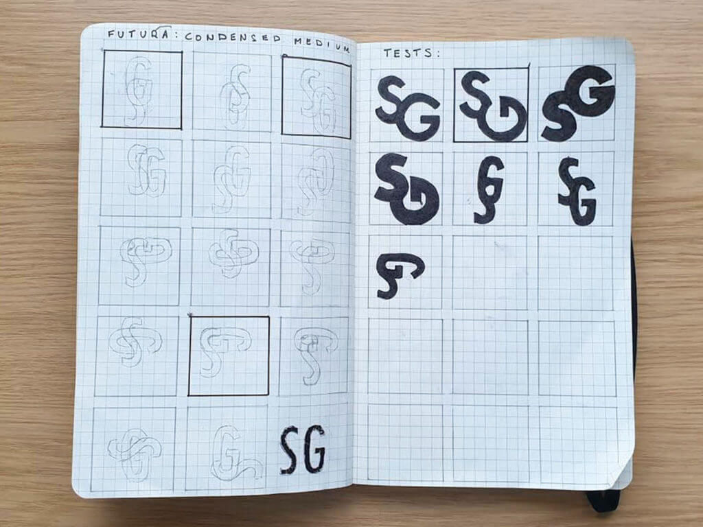
I chose the second Test sketch (see second image above) to develop into a monogram. this was because the ‘S’ and ‘G’ fit together so that they share a satisfying elongated curve. The distance between the two forms also generates a lot of negative space above the ‘G’ in addition to its open style counter, making it look spacious. I also liked how the ‘G’ is rotated at 90 degrees, making it look similar to an arrow. I decided to experiment on Illustrator by recreating the sketch to try and overlap the forms to test if the forms poke through at all. I found that the spine of the ‘S’ wouldn’t align with the ‘G’ so I decided to increase the point size by 2 for the S. This gave it a slight increase in weight to hide the blemish and I think it subtly draws the eye to it more easily, making it recognisable as an ‘S’ and not an odd ornament for the ‘G’. i think started playing around with the idea that the ‘G’ looks like an arrow and made a series of forms. each one included the ‘G’ but at a different angle, as if in order it looks like its rotating. I then experimented with adding the ‘S’ onto the ‘G’ using my sketches as inspiration. I found that I created a bunch of new forms, as if they were trying to morph into my chosen monogram. I tried to place each form side by side but the ornamental style of the ‘S’ didn’t conform to any baseline. I thought that I could use the reoccurring ‘G’ as a point of alignment and started to align them vertically. I treated the forms as if they were real letters and tried to manually kern them. They all interact with one another differently so it was interesting to see how much negative space I could leave between them to make the overall ‘sentence’ seem balanced. The ‘sentence’ looked good in vertical alignment, but required a lot of negative space around it. Because of this I only added ‘Futura’ in the corner and other details in much smaller point size so the form wouldn’t be overcrowded. The final piece can be found below.
overall I’m happy with my outcome and was surprised at how versatile Futura could be considering both my initials are heavily curvaceous. It’s odd to see my initials as the base of a project inspired by a lot of fashion designer logos, but goes to show how a good typeface can make anything look important and ‘put well together’.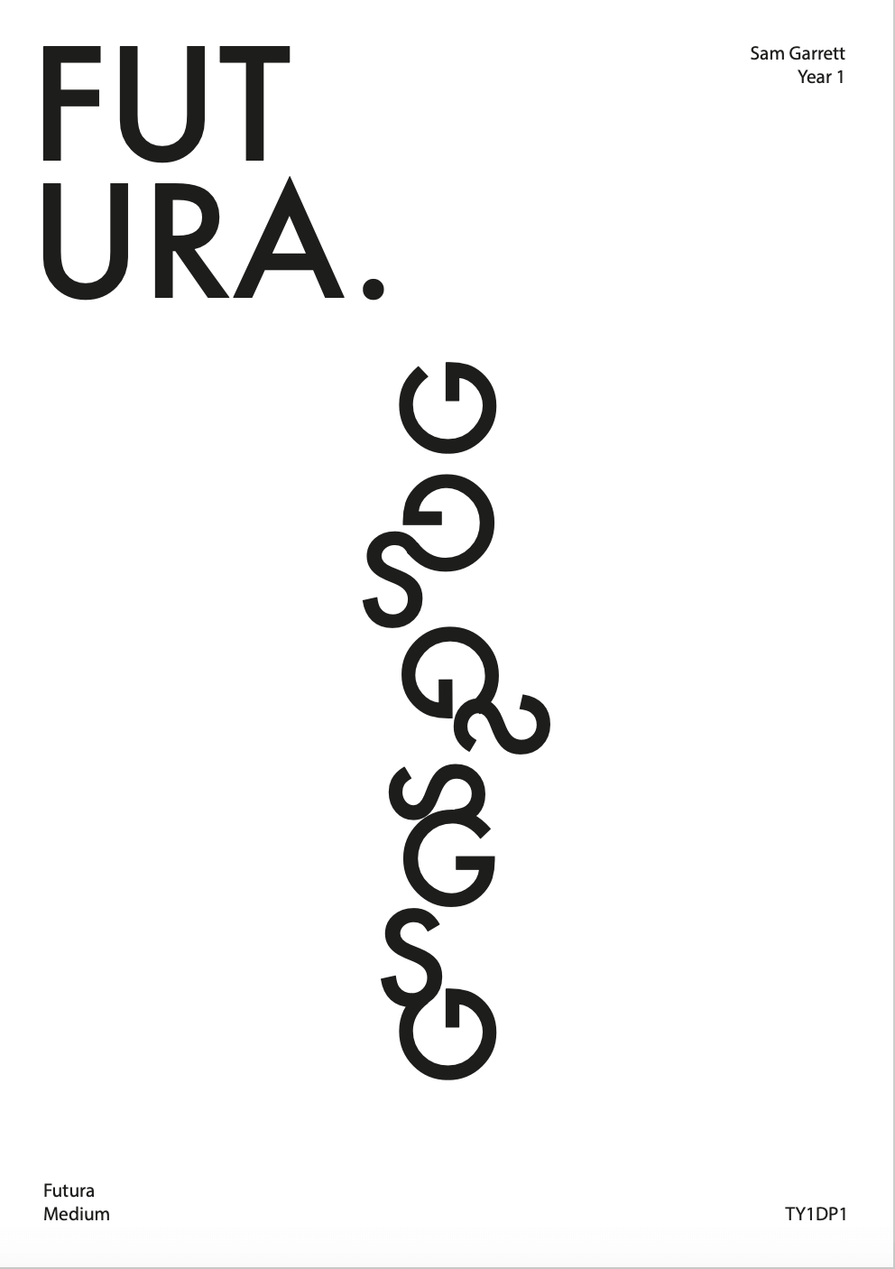
Transmogrify
A learning curve
Our brief for this project was to create a graphic representation of our initials using either Futura or Garamond. To start with I simply brainstormed and sketched out a few ideas in both fonts. I chose to continue my exploration with the Futura font for the rest of the task as I felt that my initials were much clearer this way when attempting to merge them. I was struggling to find combinations and solutions due to my first initial, Y, being so angular and my second initial, C being the exact opposite. To combat this I drew and cut out the letters to experiment with them physically. This helped me massively as I could now visualise what my monogram could look like a lot easier, therefore allowing me to be more creative and push my experimentation further.
For my final design, I chose to combine two of my ideas, as you can see in the image above. Once I had finalised the structure of the design I then had a little extra time to experiment with colour. I chose to do black and purple for my first attempt with colour but found it was a little too dark and so didn’t stand out as much as I would have liked. For my second attempt, I chose light blue and orange. I went with light blue as it is the colour often associated with the city that I am from and seeing as it was my initials I thought this fit quite nicely. I chose orange purely for aesthetic reasons, as it made the monogram stand out just that little bit more.
Transmogrify


Clear in the photo provided, i developed my initial sketches into a final design
However, though i felt happy with my end product, i attempted to change my final slightly in order to balance out the lights from darks. I did this by filling in the letter E. Which gave me the final desired design.
Hannahsmithosis
Brief
To create a monogram, a graphic representation of your name. Develop ideas of ways your first initial could transform into your second initial – a metamorphosis.
Process
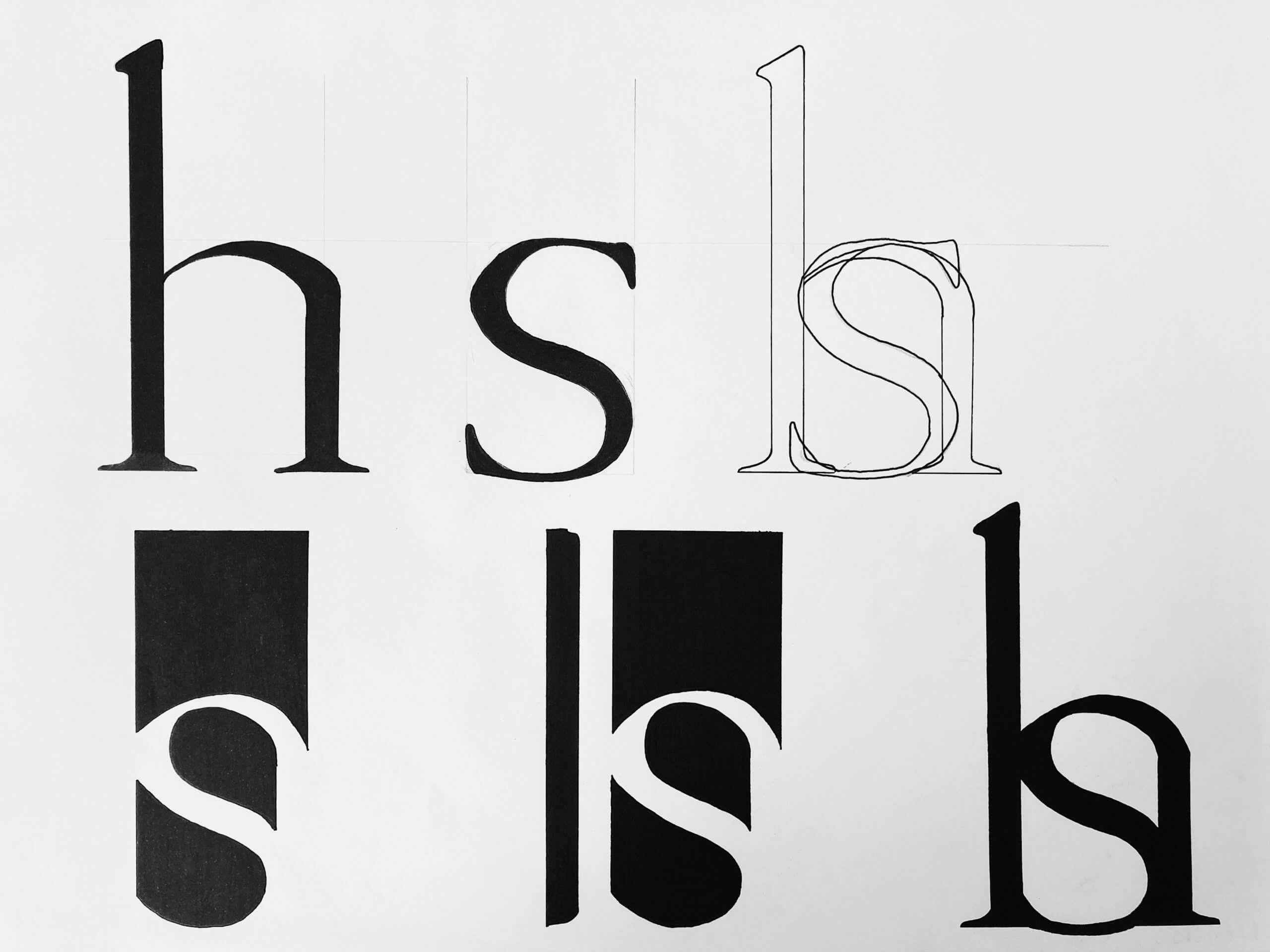
We had the choice between Futura (san serif) and Garamond (serif). Though I began open to both fonts, I was drawn to Garamond because I really like the added detail in the serif and found that the letters created more interesting shapes to play with. My early ideas were playing with the H and S in capitals, however I quickly found it was hard to blend the two together. Therefore I explored the option of using the lower case of each of these letters.
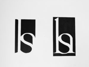
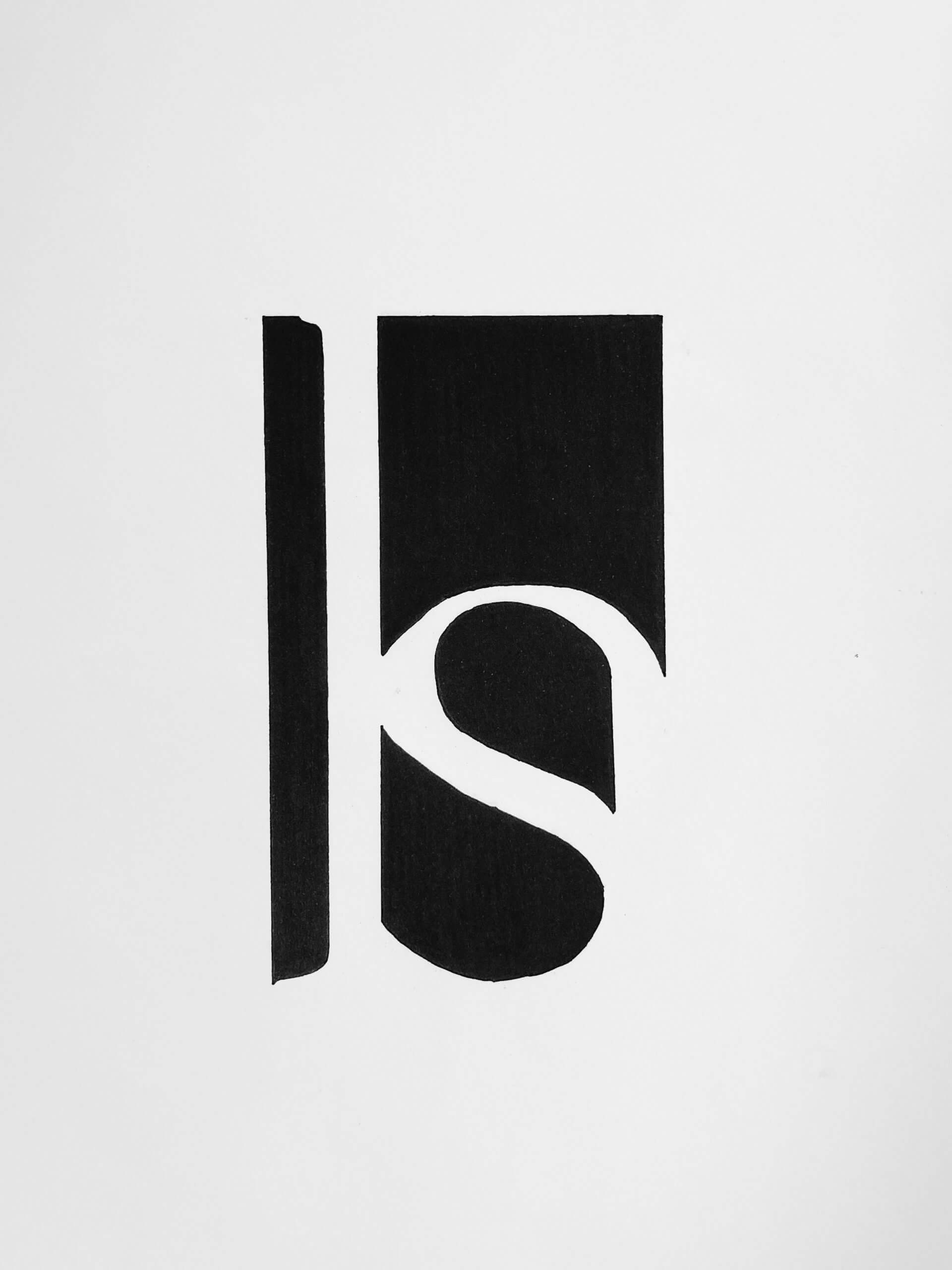
Garamond is quite a round font and so when I put the lower case ‘s’ inside the lower case ‘h’ I found they blended really nicely. I had thought I’d need to scale down the ‘s’ for it to fit the ‘h’ counter but both letters were consistent with the x-height so no alterations in size were needed. Once paired, I thought it would be interesting to play with the negative space as a means of forming the monogram. My idea was to keep it quite simple and minimal but my first draft proved to be too abstract for this brief. The ‘s’ was the only prevalent letter. To rectify this I added a rectangular block to represent the negative space to the left of the stem belonging to the ‘h’, this gave me the opportunity to display the serifs.
Another modification which increased the readability of the ‘h’ was that I decided to follow the shoulder of the ‘h’ rather than the ‘s’. This is why the top of the ‘s’ is thicker than that at the bottom. However I think it works well in this design as it blends the two letters together nicely and is not too noticeable.
As a final exploration I wanted to experiment with adding a matching block to the right side of the monogram, to mirror that of the left. I did this because I wasn’t sure if it looked unfinished having it on just the one side. Adding the second bar however created a black box around my monogram and in some ways made it too obvious. It gave the whole shape away. I really like in my final monogram how you get to look for the finished shape a bit. The eye is taken down the right hand side of the shape through the point and so naturally completes the shape. This I found to be a much better ending than to simply box in the monogram.
Monogram – LMJ
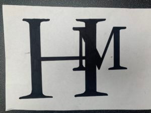
The H in my name deserves the hierarchy
At first I did a couple of sketches to see which type face I preferred and the different ways I could create a monogram.
![]()
![]()
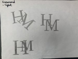
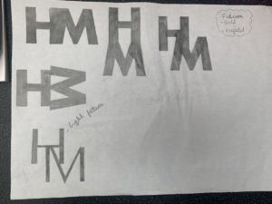
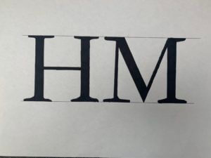
I went with Garamond font as I liked the the flow of the letters more. I decided to take my bottom left sketch further as I liked the idea of having my first name Initial as the more dominant lettering, with my surname in the background. I thought it was ironic as in the name your last name is your family name whereas your first name is you.
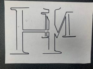
I then draw it out as a line drawing and as a whole. I preferred the full type so took it further.
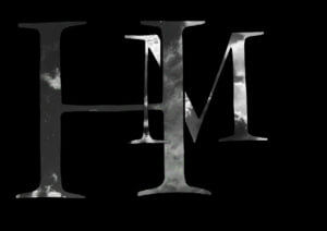
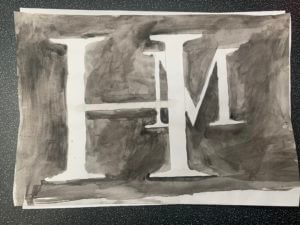
I played around with different media, from digital, collage to watercolour paint.
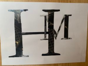
I researched some famous monograms and found that they consisted of 1 to 2 colours max, mainly black and white. which lead me to my final outcome.