
A team of third-year students took on the branding and promotion for this year's degree show.
Author: Hannah Smith
Information Design Summer School 2021
The Department regularly funds students to attend Rob Waller's Information Design Summer School.
Logo Legends Course
Hannah Smith won funding from the Typography Student Fund to attend James Martin's Logo Legends Course.
Liquid Letters – AfterEffects
BRIEF
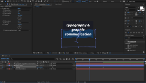
Design 3 different animations for the Typography & Graphic Communication course.
-
- include the text Typography & Graphic Communication
- include a background (colour/image)
- explore different ways to animate the text
DESIGN IDEAS AND DESIGN PROCESS
Classic
- For my Classic design I wanted to demonstrate the process I have learnt throughout this task of applying text effects to my text. My intention for this design was to display those skills as clearly as possible. Therefore, I have chosen just two typefaces on three different layers, with one text effect on layer two and one on layer three. I went for a muted, natural colour pallet to reflect the simplicity of this design and so as not to distract from the applied text effects I applied.
- Each layer makes sense on their own and could be observed in isolation, and the style of the text effect reflects the connotation of the words themselves. The text effect on the word ‘Typography’ is a nod towards kerning, as the space between each letter gently increases. The effect on ‘Graphic Communication’ plays more with more with the graphic element of text effects, bringing one letter in at a time in a jumbled way to eventually reveal the words.

Glitch
- This idea was inspired by my podcast work earlier on in this module. I really enjoyed exploring designs which had an urban, messy edged style which experimented with different ways of layering elements, playing with colour, and embracing imperfections.
- In urban environments there is often a lot of movement and bustle played in and around stationary objects. I continued to explore the impact of adding effects to all layers, one layer, or some layers. In this design all of my layers are animated, but I found having the ‘&’ as my stationary object once it arrives brought a solidarity and grounding to this design, enabling the chaos around it.
- I then wanted to explore how text interacts with the background. I experimented with colour, texture, and image.Here I applied an effect to an image for the background as well as applying effects to the text which sit on top of it using Adobe Bridge.
- This design was really fun to develop the use of bold text and unpredictable movements and it really portrays the style I was aiming for.

Water
- Having made many explorations with the different text effects supplied by Adobe, I wanted to push myself to explore other ways to utilise the tools in After Effects, to bring movement and interest to my text through developing my understanding of the other tools available. This design really challenged me and grew my skills and understanding of After Effects and was the most technically difficult idea I produced. I am really pleased with the outcome and think the effect works well.
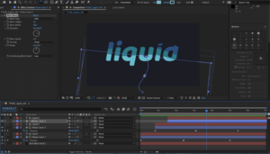
- My favourite idea explores the use of external movements of shapes, to simulate the movement of my text. I watched a few Youtube videos of water effects in AfterEffects and found one that explained the software really well and was easy to follow. This design creates the effect that the text is filling with water, and then it disappears in the same manner. I first followed along with the video using the text ‘liquid’ and then reproduced it again with the text ‘typography and graphic communication’ to meet the brief.
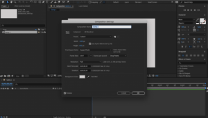
- To create this design I first opened a new project and created a new composition at 1200 x 695, 1080p, 25 frames rate.
- I then went to ‘Layer’ and created a new solid layer and set the colour to dark blue and locked the layer by clicking the lock icon.
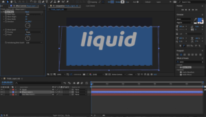
- In the Layer menu again, I created a new text layer and entered my text. Using the select tool I moved it to the centre of the frame and pressed ‘y’ to adjust the anchor tool to the centre also. Adjusting the text to the font and size that I desired was rather simple as it echoed the same process as in other Adobe software.
- Once I was confident the text was in the middle of the frame, I created a shape layer and using the pen tool I drew a rough rectangle shape around the text and filled it in with a lighter blue thank my background. It was important that this blue was markably lighter than my background so that it could be easily visible, but still dark enough that I had room for two further increases in tint for the desired effect.
- With the rough rectangle shape selected, I went to the effects panel at the right of the screen and searched for ‘wave warp’. To apply this to my shape I clicked and dragged it from the results bar onto the shape layer in the timeline. I then adjusted the default settings, such as wave height and wave width, until it had the effect I desired.
- Through pressing ‘p’ on the keyboard, I could click the position stopwatch and create my first keyframe. To get the progression correct, I first set the keyframe for the wave at its highest, then moved to the start of the timeline and set the wave to being under the text, I then set another keyframe. I set a third keyframe in the middle of the timeline, at around the middle of the height of the text.
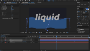
- To enhance the wave effect as we play along the timeline, I adjusted the ‘s path’ of the shape. This meant it could weave up the screen like a snake, adding to the effect of water filling the text. To do this I moved the handles on the path line that was created from moving the shape downward from the last position to the starting point of the water.
- For a smooth transition from one keyframe to the next, I selected all the keyframes at once and hit F9. This activated ‘easy-ease’, creating seamless transition. I further added to the realism of the water effect by rotating the shape slightly with the rotate tool. With the shape selected, I clicked on the rotate tool and could click and drag anywhere on the shape to rotate it around the anchor point.
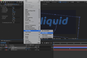
- Once I was happy with the shape, I turned it to ‘Alpha Matte’, this made it a mask over the text layer meaning the waves only appeared within the shapes made by the text. I could then copy and paste the text and shape layers on top of the existing layers (using command+c followed by command+v).
- With my two new layers, I selected the shape layer and adjusted the settings of the shape. I changed the colour to a lighter shade of blue, increased the wave height and increased the wave width. So that my first layer could still be visible, I then moved these two copied layers down along the timeline. I also adjusted the keyframe positions to see how this impacted the effect. It took a bit of experimentation to find the position that worked nicely in unity with the first layer but once I found a position I liked I could repeat this process again to create a third layer with a lighter colour.
- It was important that I didn’t move the text layer each time I copied the layers, otherwise the shape of the letters would be distorted and lose form and clarity. For this project, it was not something I wanted to push the boundaries with.
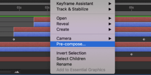
- Having all three shape and text layers in a position I liked, I selected them all (excluding the background layer), right clicked and created a pre-compose layer and gave it the name ‘text’. This brought all the layers into one, though when I double clicked on it I could still access all the layers within it. I copy and pated the third shape layer back into the composition menu and move it to the top.
- This layer is going to become a mask layer to the entire animation. Firstly I was to change the colour of the layer to something really obviously not part of the design. I chose bright green. This was so I was clear that it was a mask layer and not part of the design. Once the colour was changed I could see clearly where it was and I positioned it towards the end of the timeline, roughly where the shape of the text is just filled up.
- This bright green shape layer doesn’t need any further detail adjustments, though if I wanted to do something different I could have done. Because it was in a different place along the timeline (and so out of sync to the previous shape) I didn’t see the need to make any adjustments.
- Making sure the text layer was selected, I made it an ‘inverted alpha matte’, meaning that it will work out the previous animation as it rises up the screen.
- I then selected both layers and pre-composed them again.
- A nice additional detail to the design was the effect of rising bubbles inside the letters. To achieve this I added a new adjustment layer, and in the effects menu I searches for bubbles and click and dragged ‘CC bubbles’ onto my adjustment layer. I was able to change the setting to produce the size and shading that I liked, through pressing ‘t’ for opacity, I reduced the opacity of the bubbles as well.
- Using the ‘bubble amount clock’, I added keyframes along the timeline. Starting with an amount of bubbles, letting then increase in number, and then decrease to zero as the word disappears. This was the most challenging part for me, to get the right number of bubbles at each keyframe. The same as I did to the keyframes on the wave shape layer, I selected all the keyframes on the bubbles and pressed F9, for easy-ease, ensuring a smooth transition between bubble quantities.
- Finally, I duplicated the final text composition layer above the adjustment layer and turned the adjustment layer to ‘alpha matte’. This kept the bubbles within the text shape, like a clipping mask in Illustrator, and had a really nice overall effect.
To view this animation right click and open in a new window:

- Exporting my designs to a GIF was at first a much more fiddly process than I had thought and so I used a few websites to help me understand the process. First from Adobe Effects into Adobe Media Encoder, then export from Adobe Media Encoder as an mp4, import into photoshop, then export as a GIF at an appropriate size. This was a big learning curve for me as it was not something that I had done before but once I got the hang of it it became rather simple.
- Other challenges in this task were getting to grips with a new set of keyboard shortcuts. I also found myself trying to use keyboard shortcuts familiar to me on other pieces of software, however quickly found that almost every key seems to have a different but useful function in AfterEffects, once you know what they are. Becoming familiar with these shortcuts will be both useful, and important if I am to learn to work at a professional standard, which includes working accurately at an efficient speed. Shortcuts also help you to have greater control over your project.
- I also found adjusting keyframes and their default settings tricky to figure out at first as some of the ways of doing this changed with each effect, but I eventually enjoyed the process of combining multiple effects and learning how and where to position the keyframes.
SOFTWARE TUTORIALS
This was my first time using After Effects and so all of the tutorials this week were extremely helpful in building my basic understanding of this software and developing some core skills to begin experimenting with different design ideas and the tools available. I found focusing on text and the available text effects a great place to start and it inspired me to try more advanced design ideas, such as the liquid effect I have presented here. I most appreciated the explanation of keyboard shortcuts as I didn’t find them as intuitive as other Adobe software and so it was really good to have my notes to refer back to to know the most efficient way of achieving each tool/command.
I found Juan Villanueva’s work really inspiring as an example of what is possible in After Effects and text animation. It is great to see real life examples of how the skills can be used and it encouraged me to consider how and where these ideas might be applied. Considering the application of my designs inspired me to think of potential audiences, and that inspired new ideas that pushed me to develop my skills further.
Something I very much want to strengthen is my control of keyframes and effects, this is something i’m sure will come as I spend more time on the software and understand how it works better. It will also take me a little while to figure out the shortcuts and discover all the tools and effects on offer but I was really encouraged by how quickly I picked up what I did this week and I look forward to using After Effects more in the upcoming weeks.
This was a really enjoyable week for me. Having started the week with no clue how to work this software, I am now really excited to continue projects that further develop and strengthen my skills and understanding of Adobe After Effects.
RESOURCES FOR RESEARCH AND INSPIRATION
My inspiration this week started with thinking about and looking at examples of text effects in movies and music videos, as well as GIFs. This, along with the work of Villanueva inspired me to consider the context and use of my designs. I also wanted to explore text effects that I have noticed recently and found appealing, this ultimately led me to my final design of liquid type. The two main videos I used to develop my final idea and learn how to export to GIF properly were https://www.youtube.com/watch?v=Ua8o_hs6Xko and https://www.rocketstock.com/blog/making-animated-gifs-from-after-effects-comps/. As I was searching on YouTube for a liquid effect tutorial I was amazed at the number of diverse and interesting design tutorials that there were and this inspired me to challenge myself to develop my skills further in my own time. Some of these tutorials I watched but felt my skills needed improving before I attempted and I am looking forward to going through some of them in the future, as each showcased a variety of ways in which After Effects can be mastered and help to strengthen my skills. Much of my research this week, however, was about learning a new piece of software and trying to get to grips with its basic functions within the context of the application of text effects. Working my way through the supplied tutorials enabled me to have a rudimentary understanding of what the software could do, and watching a variety of design ideas on YouTube inspired me to push my creativity and skills further.
Print it out
Brief
Design a programme flyer for the Reading Film Theatre. The flyer must be single sided A5, with two columns of text, unsing a maximum of two colours and two typefaces.
Process
- First, I went through the text and removed things that I considered to be unnecessary or repeated information. I also researched missing pieces of information to add things that I felt would be helpful or bring consistency. This was to remove noise on the page and to communicate as clearly as possible.
- I decided to use the branding of the theatre for my colour scheme. As we were only permitted two colours, I took the darker red and grey from the logo and tinted them to 74% each for the lighter numerals.
- Because of my design I didn’t have space to put a short summary of each movie, which upon reflection is a bit more style over substance. However, in our feedback session the large numerals to convey the date were appreciated as a style choice and the lack of summary was not mentioned.
- To display hierarchy I chose to stick with one typeface but to use different font weights, type size, and use of spacing to differentiate key pieces of information.
- For my columns, I separated information by month of screening. This meant I only had to put the date of the month and it also opened up space in the October column to add general theatre information such as address, ticket price etc.
- In my first draft I had lined up each section so that the top of each movie section was level. This meant inconsistent gaps between the showings. After the feedback session, it was suggested that unequal spacing indicates hierarchy. Therefore I adjusted my design to priorities equal spacing between each showing. I had to widen my margins to do this, but I this improved the overall design.
Reflection
This task emphasised how important it is to be aware of the purpose of the finished product you are designing. If the final product is in print, throughout your process you should be printing physical drafts to know how your ideas translate from screen to paper.

The Devil’s in the detail
Brief
1) Choose one of the three suggested fonts. Using the letters ‘c a d b u r y’ draw how you would expect these letterforms to be presented in your chosen typeface.
2) Choose one of the three suggested fonts and complete the partially hidden letterforms.
Process
- Task 1: When recreating this typeface it was really helpful to have a scaled example directly above it. I was able to draw many measured reference lines which helped me to get proportions such as line width and x-height as accurate as I could. Where this helped me with general dimensions such as x-height and tracking, there were some elements of each letter which I did not figure out accurately. For example, I provided the ‘y’ in the first task with a very round and curved descender but this typeface actually has a much more straight descender such as is presented in this blog post. Furthermore, I drew a single story ‘a’ as opposed to a two story ‘a’, which was incorrect for this typeface. Though not perfect, I am quite pleased with the contrast on each of these letters and I think they are rather well proportioned to one another.
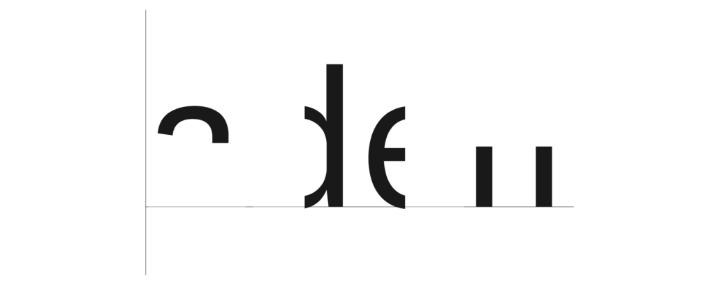
- Task 2: This task I found much simpler. Different sections of each letter were removed and we had to fill in the gaps as accurately as we could. Having observed what many of the letterforms should have looked like after finishing the first task, I had a much better idea of what to recreate here. Similarly to the first task, I drew out reference lines after measuring the scale of these letterforms. Whilst the proportions are quite accurate, I missed some very simple but key details within the letterforms themselves. The crossbar of the ‘e’ is presented slightly too thick. This could have been an error in technique when going over my sketches in fine liner. I also managed to overlook some subtle detail in the letter strokes of the ‘d’ and ‘n’. When compared to the official font, the strokes taper inwards slightly at the ends of the stroke next to where the shoulder joins. Additionally, my letter ‘a’ is too a-symmetrical. This typeface also adds a spur to the ‘a’. I found this to be quite uncharacteristic compared to the rest of the typeface which is why I unknowingly missed this detail.
Reflection
This project taught me to look, look again, then look again harder, especially when something seems rather simple to begin with. There is such a huge variety of typeface available these days, but no two are exactly the same and so it is important to be able to pay attention to the minute detail as it all comes together to create the unique font.
Poster: Icon vs Typography

What are these posters trying to do?
These posters are designed to encourage people to stay at home to help stop the spread of COVID-19. In both of these designs they have chosen bright colours with strong connotations. Red is often associated with danger and yellow is associated with warning, particularly when combined with black. We also see that both are quite simple yet structured. There is a flow to both designs leading you to the same conclusion, but in two very different ways.
The red poster, titled ‘Stay Home’, has chosen a very stark way of conveying this message. Through focusing mostly on icons this very simply structured scene is almost graph like, implying the statistical impact of each person who chooses to endanger society when stepping out the front door. This poster has a very strong message, stay home or the knock on effects could be disastrous. I found this design to be quite shocking but massively impactful and effective. I especially like that they have chosen to include a very small amount of text at the very end; the two words say hardly anything and yet everything and they leave nothing to be questioned.
In contrast, the message to commuters is mostly text. We do have a few small icons to guide the reader but they are not necessarily the focal point in this design. I found this design to have much more attitude than the first. The choice of wording is very interesting, almost humorous in its bluntness, though I do not think this to be the intended effect. Similar to our first design it has a very straightforward message, unless you are an essential worker you should remain at home. However this poster is challenging the reader to confront their own actions in response to this pandemic whilst in the act. The use of a question here is quite provoking. Keeping the same typeface throughout, the reader is not distracted by decoration or overwhelmed by many different elements. I think it is in the simplicity of this design that its seriousness comes through.
Do different approaches produce different results?
I find the implied consequences in the first poster to provoke a stronger response in me than the second. I am not being told what to do or think but I am able to see and understand for myself how my role can affect the society in which I live and I think this greater understanding of context and consequence leaves a greater impression than the second poster which is correcting an action already taken.
References
Stay home. Image created by Barış Cihan Peşmen. Submitted for United Nations Global Call Out To Creatives – help stop the spread of COVID-19. Available at: https://unsplash.com/photos/jTK820WUr2k
Subway message for commuters. New York City, NY, USA. Available at: https://unsplash.com/photos/yCk_WyOdzAk
Happy Feet
The class
Through this class I gained a much better practical understanding of the appropriate use of spacing tools such as tracking, leading and space before, and the guidelines with which spacing within text should be considered. I had not used paragraph rules before and so I was very glad to have discovered this particular tool. I also enjoyed learning how to create a template, in this case replicating a classic Penguin book cover and then using this template as the foundation for experimentation.
The cover
For my cover I chose to focus on the penguin logo. It has become so iconic but is often not designed to be the focus piece of any cover designs. It is almost always positioned in the middle of the bottom third of the cover on a blank background. The movie ‘Happy Feet’ singles out one penguin from the rest as being different and unusual so I wanted to play around with the use of the penguin, it’s colour and it’s position to create the background of the top and bottom thirds whilst echoing the storyline of the movie.

Cateye
Brief
Gather three interesting facts about your partner. Use these three facts to design the ideal gift for them, whilst following the ‘Discover, Define, Develop, Deliver’ method from Design Council.
Process
My first three words were cat, travel, food. I started looking into what I could create based on the cat, there is so much cat paraphernalia out there however that this on its own wasn’t proving to be very interesting. So I experimented with incorporating the travel and food elements more. One of my earlier ideas was an app that you could use in the airport to direct you to allergen friendly foods for those on restricted diets. This is because one of my partners said they were gluten intolerant.
On the hour each hour for three hours we had to add a random word into the mix. The first word I was given was bird. When I think of birds I think of birdsong, vibrant colours and flight. Flight fit perfectly with the theme of travel and so I incorporated a birds wing into my Cateye logo. I went for ‘cateye’ as a play on words from red eye flights. My second word was game. I realised that this app could be both functional and playful. By expanding the cat theme to become a Pokemon-go style collection game, I could integrate the second word pretty well. The idea being that when you find and scan your vegan wrap, you unlock the Cheshire Cat avatar to add yo your family of cats, etc. My third and final random word was milkshake. So I expanded the game idea and included treats to be earned for the cats you have collected.
Reflection
At first I found it really hard to just scratch out a bunch of ideas freely that related to my initial three words. I found I was trying to think of something, rather than just jot down all the ideas that were coming to mind. It was then made much more difficult when throwing in really random words at different points along the process. However, I really enjoyed stretching myself in the idea forming process. This wasn’t a method I had tried before, and though it was a challenge I really appreciated how it encouraged me to push my ideas further and experiment more.

Boris
Brief:
Create two images which convey ‘Politician‘. The first image should convey the word directly. The second image must have one addition to change the feeling or the meaning of the first image. Export into a GIF.
Process:
When I think of a politician the first image I see is a man in a suit behind a podium. It is quickly accompanied by the impression of greed, deception and power. Image is considered everything and so is public perception. This makes many political environments very controlled and staged. I wanted to create something which would pull back the curtain and reveal what people really want to know. We always watch these press conferences and wonder what is not being said, or very much wish they would just say what we are all thinking or know to be true.
My first image is of a political scene as they are often portrayed. My second image has defaced the first with a message we would rather was being shared or admitted.
I was going to create a generic man to represent the ‘politician’, but my classmates suggested a well known figure would make the piece more personable and therefore more impactful, as it relates to this brief. Therefore I chose an image of Boris Johnson at one of the latest COVID news conferences. At first I had thought to deface this image through imposing a monkey over his face, or some other image to suggest foolishness often associated with politicians. However I found this to be too gimmicky and not quite message I was wanting the image to create.
Instead I went for the crude sort of style we often see in text books and on posters. I like how it so effortlessly defaces the controlled and sophisticated front trying to be conveyed by the politicians and brings an element of chaos to the scene. I chose to desaturate the image to further the contrast between their staged presentation and our desire for all the information, however shocking.
To create this loop I first created each image in Illustrator and exported them to Photoshop. In Photoshop I was able to make each layer a 0.5 second clip to play on repeat. From here I could export it as a GIF.
Reflections:
I like how it is as if the message breaking through the mask here is that the podium is saying what Boris isn’t. The simplicity of the design puts the point across clean and clear and I am pleased with how well this has fulfilled the brief. I also learnt how to make a GIF on Photoshop, a function I didn’t know about before.