

What are these posters trying to do?
These posters are designed to encourage people to stay at home to help stop the spread of COVID-19. In both of these designs they have chosen bright colours with strong connotations. Red is often associated with danger and yellow is associated with warning, particularly when combined with black. We also see that both are quite simple yet structured. There is a flow to both designs leading you to the same conclusion, but in two very different ways.
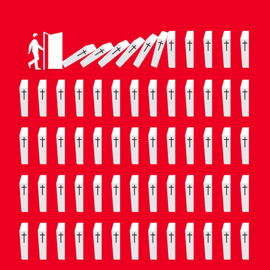
The red poster, titled ‘Stay Home’, has chosen a very stark way of conveying this message. Through focusing mostly on icons this very simply structured scene is almost graph like, implying the statistical impact of each person who chooses to endanger society when stepping out the front door. This poster has a very strong message, stay home or the knock on effects could be disastrous. I found this design to be quite shocking but massively impactful and effective. I especially like that they have chosen to include a very small amount of text at the very end; the two words say hardly anything and yet everything and they leave nothing to be questioned.
In contrast, the message to commuters is mostly text. We do have a few small icons to guide the reader but they are not necessarily the focal point in this design. I found this design to have much more attitude than the first. The choice of wording is very interesting, almost humorous in its bluntness, though I do not think this to be the intended effect. Similar to our first design it has a very straightforward message, unless you are an essential worker you should remain at home. However this poster is challenging the reader to confront their own actions in response to this pandemic whilst in the act. The use of a question here is quite provoking. Keeping the same typeface throughout, the reader is not distracted by decoration or overwhelmed by many different elements. I think it is in the simplicity of this design that its seriousness comes through.
Do different approaches produce different results?
I find the implied consequences in the first poster to provoke a stronger response in me than the second. I am not being told what to do or think but I am able to see and understand for myself how my role can affect the society in which I live and I think this greater understanding of context and consequence leaves a greater impression than the second poster which is correcting an action already taken.
References
Stay home. Image created by Barış Cihan Peşmen. Submitted for United Nations Global Call Out To Creatives – help stop the spread of COVID-19. Available at: https://unsplash.com/photos/jTK820WUr2k
Subway message for commuters. New York City, NY, USA. Available at: https://unsplash.com/photos/yCk_WyOdzAk