
We all know Penguin books, but how much work goes into the design?
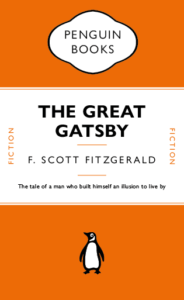
I for one, never realised that the lines between the headers weren’t just added in afterwards, they’re attached to the text itself and change with the text. This honestly surprised me a lot. I also did not know there were hidden characters used every time I write something, e.g. space (a dot placed near the top of the x-height). Just working on this cover made me appreciate just how much actually goes into the formatting of a book cover design.
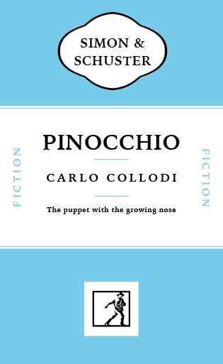
This made me want to try to recreate a children’s book in a similar style without all the flare and illustrations surrounding them typically. A childhood favourite of mine was always Pinocchio. I like the idea that lies are visible straight away, there’s no hiding them they’ll catch up to you. It’s the ideal book to strip back and recreate in this style.