
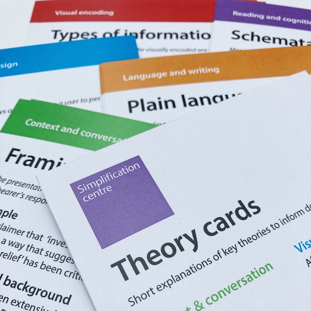
Run by the Simplification Centre & the International Institute for Information Design (IIID)
Last year, thanks to a donation from the Typography Student Fund, I had the opportunity to attend the Information Design summer school, led by Rob Waller. Due to COVID restrictions the school was moved online, enabling me to attend alongside individuals from 17 different nations. We received talks from international designers, worked on design tasks, and worked in teams on live briefs to put directly into practice the theory, history and practices we were learning.
TALKS & TASKS
The course was part time and met online a couple of times a week to listen to talks from guest lecturers and be given small design tasks from lecturers from within IIID. Topics ranged from wayfinding to document design from designers such as Veronika Eggar, Patricia Wright, Karel van Der Warde, and more. Theory from talks was then put directly into practice through a series of tasks that encouraged us to explore different methods of communicating information clearly and effectively. Often starting from a paragraph of unedited text, we were encouraged to find the core message and embrace the power of pen and paper and to sketch our ideas by hand. Some explored typographic solutions, but a majority of us were interested in developing the interaction between type and image. After each task we shared our solutions with the whole class and took time to give feedback on each others work.

GROUP PROJECT
Alongside our talks and tasks, we split into several small groups to tackle live project briefs on an information design challenge in areas of business, medicine, and law. My team of six comprised of lawyers, teachers and medical experts from four different nations, undertook a legal advice project for HMCTS.
BRIEF: Increasing numbers of people are representing themselves in court without a lawyer, and HMCTS is concerned that defendants are under-prepared for court. HMCTS research points to a number of reasons for this which start at the earliest part of the process, when an individual is arrested and charged with an offence. Propose a better way to inform defendants about the advice available to them, and persuade them to take it up.
CONSIDERATIONS: Research suggested that the two main contributors to lack of understanding were a) poor English literacy skills, and b) lack of trust in the police and the legal system. We were also aware of the mental and emotional strain individuals are under in these situations and how this strain can affect the ability to receive and process information accurately and clearly, and to formulate appropriate decisions and actions.
SOLUTION: My team pitched three deliverables and developed one of these ideas digitally. We advised; 1) Three different posters positioned strategically throughout the station to communicate the message in a relevant way at different points in the process. 2) A digital animation playing on screens in lobby and check-in desk, telling the same story as the posters with more detail. 3) A social media campaign so people are informed of their rights before they are in the situation.

- We aimed to use minimal plain language so as to support low literacy levels as well as those under significant mental and emotion strain.
- Acknowledging the role of human emotion in the user journey, we developed our ideas to produce three poster designs to provide multiple access points for different locations, emotional states, and stages of processing whilst in the police station.
- The need for information to be trusting influenced our colour pallet, typeface, and use of spacing and layout to be notably different to other posters and resources within the police station that represent the police and the government. This meant we also opted not to include any government logos, but instead to create our own. A simple survey suggested a handshake to be commonly understood across cultures as a symbol for fairness and equality.
- Choice of language aimed to communicate on a relational level as opposed to being authoritative, empowering individuals who often feel hopeless to activate their power to choose a better situation for themselves.
- Consistency between the three posters is achieved through consistent branding, hierarchy and repetition.

Thank you to the institute and all those involved in running the course last year! I had a great time and would highly encourage others who think they might be interested in information design to consider doing it this year. Thank you also to the Typography Student Fund for supporting me financially.