
Brief
Design a programme flyer for the Reading Film Theatre. The flyer must be single sided A5, with two columns of text, unsing a maximum of two colours and two typefaces.
Process
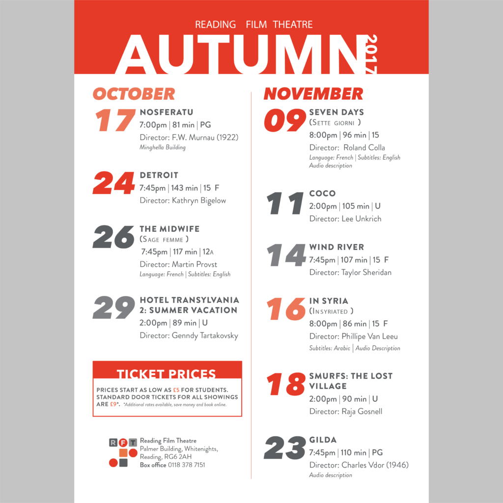
- First, I went through the text and removed things that I considered to be unnecessary or repeated information. I also researched missing pieces of information to add things that I felt would be helpful or bring consistency. This was to remove noise on the page and to communicate as clearly as possible.
- I decided to use the branding of the theatre for my colour scheme. As we were only permitted two colours, I took the darker red and grey from the logo and tinted them to 74% each for the lighter numerals.
- Because of my design I didn’t have space to put a short summary of each movie, which upon reflection is a bit more style over substance. However, in our feedback session the large numerals to convey the date were appreciated as a style choice and the lack of summary was not mentioned.
- To display hierarchy I chose to stick with one typeface but to use different font weights, type size, and use of spacing to differentiate key pieces of information.
- For my columns, I separated information by month of screening. This meant I only had to put the date of the month and it also opened up space in the October column to add general theatre information such as address, ticket price etc.
- In my first draft I had lined up each section so that the top of each movie section was level. This meant inconsistent gaps between the showings. After the feedback session, it was suggested that unequal spacing indicates hierarchy. Therefore I adjusted my design to priorities equal spacing between each showing. I had to widen my margins to do this, but I this improved the overall design.
Reflection
This task emphasised how important it is to be aware of the purpose of the finished product you are designing. If the final product is in print, throughout your process you should be printing physical drafts to know how your ideas translate from screen to paper.
