
BRIEF
Design 3 different animations for the Typography & Graphic Communication course.
-
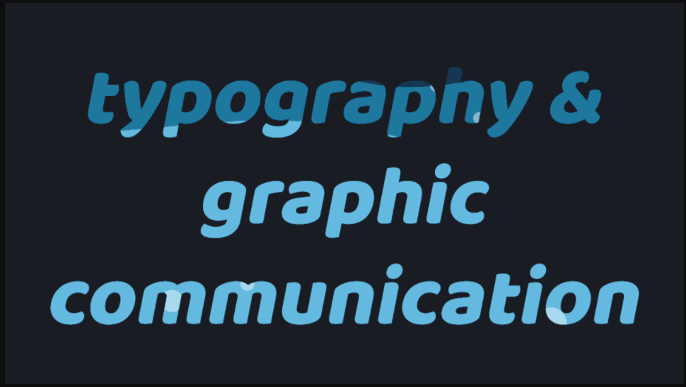
- include the text Typography & Graphic Communication
- include a background (colour/image)
- explore different ways to animate the text
DESIGN IDEAS AND DESIGN PROCESS
Classic
- For my Classic design I wanted to demonstrate the process I have learnt throughout this task of applying text effects to my text. My intention for this design was to display those skills as clearly as possible. Therefore, I have chosen just two typefaces on three different layers, with one text effect on layer two and one on layer three. I went for a muted, natural colour pallet to reflect the simplicity of this design and so as not to distract from the applied text effects I applied.
- Each layer makes sense on their own and could be observed in isolation, and the style of the text effect reflects the connotation of the words themselves. The text effect on the word ‘Typography’ is a nod towards kerning, as the space between each letter gently increases. The effect on ‘Graphic Communication’ plays more with more with the graphic element of text effects, bringing one letter in at a time in a jumbled way to eventually reveal the words.

Glitch
- This idea was inspired by my podcast work earlier on in this module. I really enjoyed exploring designs which had an urban, messy edged style which experimented with different ways of layering elements, playing with colour, and embracing imperfections.
- In urban environments there is often a lot of movement and bustle played in and around stationary objects. I continued to explore the impact of adding effects to all layers, one layer, or some layers. In this design all of my layers are animated, but I found having the ‘&’ as my stationary object once it arrives brought a solidarity and grounding to this design, enabling the chaos around it.
- I then wanted to explore how text interacts with the background. I experimented with colour, texture, and image.Here I applied an effect to an image for the background as well as applying effects to the text which sit on top of it using Adobe Bridge.
- This design was really fun to develop the use of bold text and unpredictable movements and it really portrays the style I was aiming for.

Water
- Having made many explorations with the different text effects supplied by Adobe, I wanted to push myself to explore other ways to utilise the tools in After Effects, to bring movement and interest to my text through developing my understanding of the other tools available. This design really challenged me and grew my skills and understanding of After Effects and was the most technically difficult idea I produced. I am really pleased with the outcome and think the effect works well.
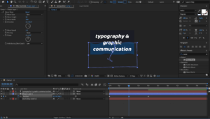
- My favourite idea explores the use of external movements of shapes, to simulate the movement of my text. I watched a few Youtube videos of water effects in AfterEffects and found one that explained the software really well and was easy to follow. This design creates the effect that the text is filling with water, and then it disappears in the same manner. I first followed along with the video using the text ‘liquid’ and then reproduced it again with the text ‘typography and graphic communication’ to meet the brief.
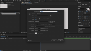
- To create this design I first opened a new project and created a new composition at 1200 x 695, 1080p, 25 frames rate.
- I then went to ‘Layer’ and created a new solid layer and set the colour to dark blue and locked the layer by clicking the lock icon.
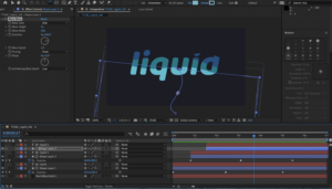
- In the Layer menu again, I created a new text layer and entered my text. Using the select tool I moved it to the centre of the frame and pressed ‘y’ to adjust the anchor tool to the centre also. Adjusting the text to the font and size that I desired was rather simple as it echoed the same process as in other Adobe software.
- Once I was confident the text was in the middle of the frame, I created a shape layer and using the pen tool I drew a rough rectangle shape around the text and filled it in with a lighter blue thank my background. It was important that this blue was markably lighter than my background so that it could be easily visible, but still dark enough that I had room for two further increases in tint for the desired effect.
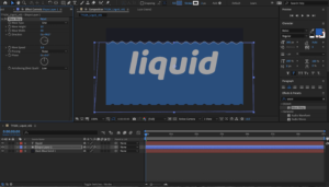
- With the rough rectangle shape selected, I went to the effects panel at the right of the screen and searched for ‘wave warp’. To apply this to my shape I clicked and dragged it from the results bar onto the shape layer in the timeline. I then adjusted the default settings, such as wave height and wave width, until it had the effect I desired.
- Through pressing ‘p’ on the keyboard, I could click the position stopwatch and create my first keyframe. To get the progression correct, I first set the keyframe for the wave at its highest, then moved to the start of the timeline and set the wave to being under the text, I then set another keyframe. I set a third keyframe in the middle of the timeline, at around the middle of the height of the text.
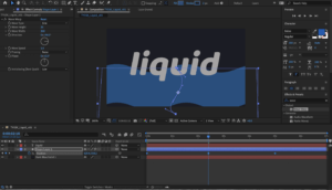
- To enhance the wave effect as we play along the timeline, I adjusted the ‘s path’ of the shape. This meant it could weave up the screen like a snake, adding to the effect of water filling the text. To do this I moved the handles on the path line that was created from moving the shape downward from the last position to the starting point of the water.
- For a smooth transition from one keyframe to the next, I selected all the keyframes at once and hit F9. This activated ‘easy-ease’, creating seamless transition. I further added to the realism of the water effect by rotating the shape slightly with the rotate tool. With the shape selected, I clicked on the rotate tool and could click and drag anywhere on the shape to rotate it around the anchor point.
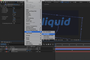
- Once I was happy with the shape, I turned it to ‘Alpha Matte’, this made it a mask over the text layer meaning the waves only appeared within the shapes made by the text. I could then copy and paste the text and shape layers on top of the existing layers (using command+c followed by command+v).
- With my two new layers, I selected the shape layer and adjusted the settings of the shape. I changed the colour to a lighter shade of blue, increased the wave height and increased the wave width. So that my first layer could still be visible, I then moved these two copied layers down along the timeline. I also adjusted the keyframe positions to see how this impacted the effect. It took a bit of experimentation to find the position that worked nicely in unity with the first layer but once I found a position I liked I could repeat this process again to create a third layer with a lighter colour.
- It was important that I didn’t move the text layer each time I copied the layers, otherwise the shape of the letters would be distorted and lose form and clarity. For this project, it was not something I wanted to push the boundaries with.
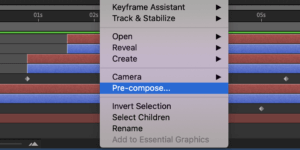
- Having all three shape and text layers in a position I liked, I selected them all (excluding the background layer), right clicked and created a pre-compose layer and gave it the name ‘text’. This brought all the layers into one, though when I double clicked on it I could still access all the layers within it. I copy and pated the third shape layer back into the composition menu and move it to the top.
- This layer is going to become a mask layer to the entire animation. Firstly I was to change the colour of the layer to something really obviously not part of the design. I chose bright green. This was so I was clear that it was a mask layer and not part of the design. Once the colour was changed I could see clearly where it was and I positioned it towards the end of the timeline, roughly where the shape of the text is just filled up.
- This bright green shape layer doesn’t need any further detail adjustments, though if I wanted to do something different I could have done. Because it was in a different place along the timeline (and so out of sync to the previous shape) I didn’t see the need to make any adjustments.
- Making sure the text layer was selected, I made it an ‘inverted alpha matte’, meaning that it will work out the previous animation as it rises up the screen.
- I then selected both layers and pre-composed them again.
- A nice additional detail to the design was the effect of rising bubbles inside the letters. To achieve this I added a new adjustment layer, and in the effects menu I searches for bubbles and click and dragged ‘CC bubbles’ onto my adjustment layer. I was able to change the setting to produce the size and shading that I liked, through pressing ‘t’ for opacity, I reduced the opacity of the bubbles as well.
- Using the ‘bubble amount clock’, I added keyframes along the timeline. Starting with an amount of bubbles, letting then increase in number, and then decrease to zero as the word disappears. This was the most challenging part for me, to get the right number of bubbles at each keyframe. The same as I did to the keyframes on the wave shape layer, I selected all the keyframes on the bubbles and pressed F9, for easy-ease, ensuring a smooth transition between bubble quantities.
- Finally, I duplicated the final text composition layer above the adjustment layer and turned the adjustment layer to ‘alpha matte’. This kept the bubbles within the text shape, like a clipping mask in Illustrator, and had a really nice overall effect.
To view this animation right click and open in a new window:

- Exporting my designs to a GIF was at first a much more fiddly process than I had thought and so I used a few websites to help me understand the process. First from Adobe Effects into Adobe Media Encoder, then export from Adobe Media Encoder as an mp4, import into photoshop, then export as a GIF at an appropriate size. This was a big learning curve for me as it was not something that I had done before but once I got the hang of it it became rather simple.
- Other challenges in this task were getting to grips with a new set of keyboard shortcuts. I also found myself trying to use keyboard shortcuts familiar to me on other pieces of software, however quickly found that almost every key seems to have a different but useful function in AfterEffects, once you know what they are. Becoming familiar with these shortcuts will be both useful, and important if I am to learn to work at a professional standard, which includes working accurately at an efficient speed. Shortcuts also help you to have greater control over your project.
- I also found adjusting keyframes and their default settings tricky to figure out at first as some of the ways of doing this changed with each effect, but I eventually enjoyed the process of combining multiple effects and learning how and where to position the keyframes.
SOFTWARE TUTORIALS
This was my first time using After Effects and so all of the tutorials this week were extremely helpful in building my basic understanding of this software and developing some core skills to begin experimenting with different design ideas and the tools available. I found focusing on text and the available text effects a great place to start and it inspired me to try more advanced design ideas, such as the liquid effect I have presented here. I most appreciated the explanation of keyboard shortcuts as I didn’t find them as intuitive as other Adobe software and so it was really good to have my notes to refer back to to know the most efficient way of achieving each tool/command.
I found Juan Villanueva’s work really inspiring as an example of what is possible in After Effects and text animation. It is great to see real life examples of how the skills can be used and it encouraged me to consider how and where these ideas might be applied. Considering the application of my designs inspired me to think of potential audiences, and that inspired new ideas that pushed me to develop my skills further.
Something I very much want to strengthen is my control of keyframes and effects, this is something i’m sure will come as I spend more time on the software and understand how it works better. It will also take me a little while to figure out the shortcuts and discover all the tools and effects on offer but I was really encouraged by how quickly I picked up what I did this week and I look forward to using After Effects more in the upcoming weeks.
This was a really enjoyable week for me. Having started the week with no clue how to work this software, I am now really excited to continue projects that further develop and strengthen my skills and understanding of Adobe After Effects.
RESOURCES FOR RESEARCH AND INSPIRATION
My inspiration this week started with thinking about and looking at examples of text effects in movies and music videos, as well as GIFs. This, along with the work of Villanueva inspired me to consider the context and use of my designs. I also wanted to explore text effects that I have noticed recently and found appealing, this ultimately led me to my final design of liquid type. The two main videos I used to develop my final idea and learn how to export to GIF properly were https://www.youtube.com/watch?v=Ua8o_hs6Xko and https://www.rocketstock.com/blog/making-animated-gifs-from-after-effects-comps/. As I was searching on YouTube for a liquid effect tutorial I was amazed at the number of diverse and interesting design tutorials that there were and this inspired me to challenge myself to develop my skills further in my own time. Some of these tutorials I watched but felt my skills needed improving before I attempted and I am looking forward to going through some of them in the future, as each showcased a variety of ways in which After Effects can be mastered and help to strengthen my skills. Much of my research this week, however, was about learning a new piece of software and trying to get to grips with its basic functions within the context of the application of text effects. Working my way through the supplied tutorials enabled me to have a rudimentary understanding of what the software could do, and watching a variety of design ideas on YouTube inspired me to push my creativity and skills further.