
Design ideas, process and inspiration
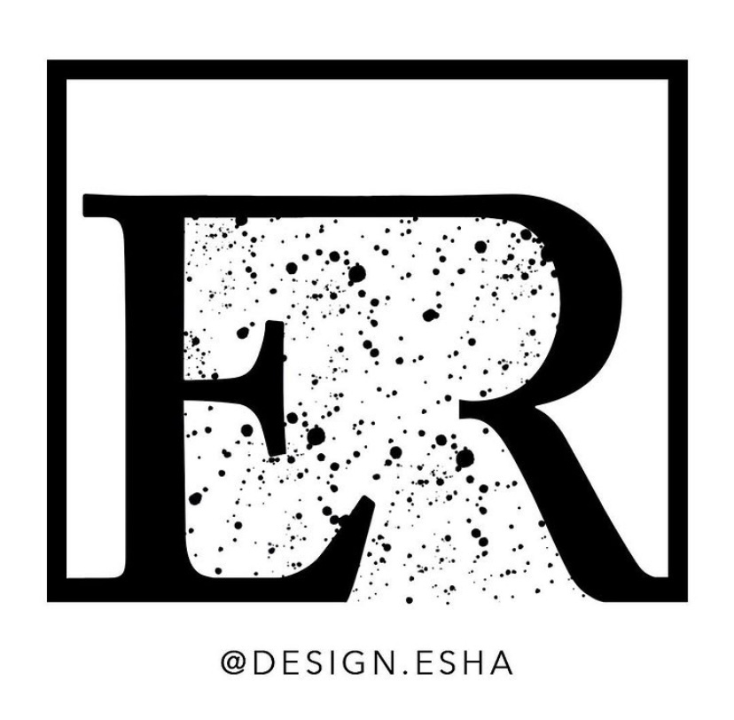
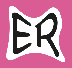
I saw this task as a fantastic opportunity to build my very own logo for my art Instagram page. I have experimented and learned how to the different tools on Illustrator; some which were completely new to me like the scissor tool. The design you see above is actually a continuation from the first experiment I did in this task.
After I had completed the task, I went ahead and explored the composition further and came up with a logo for my own social media design page. I added a square to the continuous line/path which acted like a border/bearer shape for the letters to sit in. I then took the brush tool and experimented with different styles until I found the perfect one which completed the logo design. I finished the logo by stating my social media handle at the bottom using a clear capitalised san-serif.
…
DESIGN 1
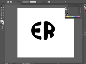
Firstly, I began with creating 2 separate text boxes and typing each letter in each of the text box. I chose to use Minion Pro as my typeface as a serif is the perfect example to do it on due to having well defined descenders and serifs at the end which can easily be cut off. To manipulate and distort the actual letters, we need to make a path around the letterforms. To do this, I expanded both the letters by going onto the object menu which gave me a path around the letterforms.
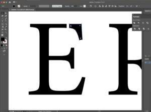
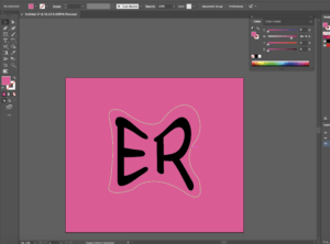
Now that both text boxes were essentially converted to a smart object (due to the paths around them), I was able to use the scissor and line segment tool to draw out the lines where I wanted to break the letter in order for the 2 letters to connect in the end. After I was happy of where I wanted to create these marks, I divided the object using the pathfinder tool – this sliced where I had originally made the marks and to make sure they had separated I edited the object by ungrouping all that was selected. Screenshot 1 shows the top end part of the ‘E’ been cut off. This is where I planned to join the ‘R’ to after extending the line so that there was a reasonable amount of space between both the letterforms. I then did the same thing to the ‘R’ making sure I cut the correct areas out.
I joined both of the objects by using the shape tool and drew a rectangle which connected the two letters together (screenshot 2) By using the cutting method I learned from the tutorial I watched and using the direct selection tool also, I cleaned up the edges where the lines overlapped. The before and after stages of this action is shown in. To finish the edit, I rasterised the 2 elements as a whole which converted it into one single object rather than 2 separate ones.
…
Software tutorials and inspiration
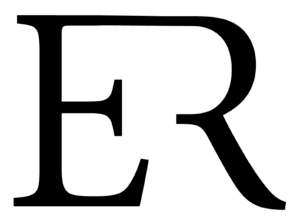
My inspiration for this design is the logo for Louis Vuitton. I like the way they have combined both of the letterforms as a whole. However, I wanted to put my own spin on this, therefore I removed parts which I thought were not essential, but kept the parts which were needed to ensure the letter did in fact look like it was meant to be. To do this, I used 2 video tutorials which helped me. I understood that I needed to outline the text and the video provided in the brief helped me to do so. In terms of cutting parts of the letter out, I found a tutorial on YouTube which helped me remove the parts I did not need. I learned how the scissor tool can be used together with the line segment tool to cut out parts of an object and how the direct selection tool can come in handy to line up the corners of the object and deleting points if necessary.
Helpful tutorial: https://www.youtube.com/watch?v=0LMqhHkI76I&ab_channel=JanisDougherty (cutting shapes in Illustrator)
Helpful tutorial: https://www.youtube.com/watch?v=dz6P94HoZnc&ab_channel=StickerGiant (outlining shapes)
…
DESIGN 2
I started off this design by choosing the typeface. I wanted to make my second design more abstract which is why I picked sans-serif typefaces like Baloo Bhaina and Chalkboard; I chose Chalkboard to be part of my final outcome. The thick strokes of the letter forms is perfect for the effect I was going for as it does not hold back. It stands out and it’s out there and fun. I then drew out the first shape I was going to experiment with – an ellipse. I then created an outline for the text box which essentially converted it into a smart object (with a path)
For the text to warp into the shape, with both elements chosen, I applied the ‘Envelope Distort’ option and I made it with the top option. This gave me the finish I was looking for (screenshot 3) I was not a massive fan of this though, so I went ahead and experimented with a different typeface and shape – this time a rectangle. After adding 2 more points onto the rectangle using the pen tool, I grabbed the direct selection arrow and distorted the rectangle to the shape. Like I previously did, I warped the text using the same technique, however this time remembering to group the rectangle before I did so as I added 2 additional points to the rectangle which had broken the single path. To stylise the warped text, I added a shape around the text as well changing up the colours using different layers to get the final outcome (screenshot 4)
…
Software tutorials and inspiration
Through this design, I have learned a new technique. I was always intrigued to know how people do this and now I finally got around to finding out as well as making my own thanks to this task. It’s quite simple too. Not only do the tools do amazing things but after exploring a couple of the options on the top menu bars allowed me to see that most of the interesting stuff lives up there. I used my previous knowledge on manipulating shapes to change and enhance the background to make the logo the best it can be.
Helpful tutorial and inspiration: https://www.youtube.com/watch?v=zDWcrCzzwxw&ab_channel=DesignTuts (warp text into the custom shape)
…
DESIGN 3
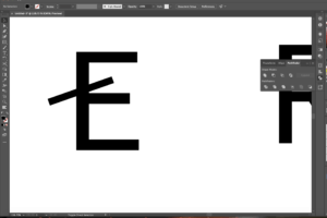
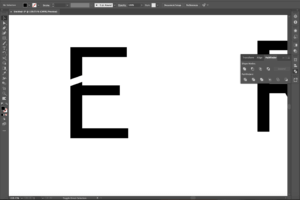
To begin this design, I decided that I was going to use a sans-serif as I hadn’t played around with them as much (like I did in my first design) I realised that creating them as outlines was always the first step to do as it makes a path along the actual letter forms making it easier for us to manipulate the letters. So, after I had done this, I remembered to ungroup the whole letter and began to add lines using the pen tool to see where I would have the cut outs (screenshot 5) After I was happy where I wanted to place these, I used the pathfinder tool and divided the shape so that it make a cut in the letter where I had drawn (screenshot 6)
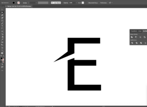
Now, it was time to wing the ends out – I did this by adding a couple more anchor points and using the direct selection tool to expand these where appropriate to create the desired effect (screenshot 7) I then manipulated the ends of the E to make sure the style was consistent throughout as it looked odd without doing so I then did the same to the R, as well as beginning to experiment with colour. I made the cut in the R even more distinctive compared to the E, to use the new technique I had learned. I felt as though by adding more drama to the R would bring the logo together. Lastly, I positioned them so that they created sort of a journey from one letter to the other (starting at the top and slowly changing direction as you move your eye down to the R) I experimented with the line width of the framing of the circle as well as switching up the colours to create an altered ending finish.
…
Software tutorials and inspiration
I found a very useful tutorial to help me with changing up the letter form differently. Although the video showed tools and elements I already was aware of, it showed me how to do things differently. I can now use the pen tool better to by knowing where to add different anchor points which I can then pull out or draw in to curve the edges or extend the corners out. I was inspired by the Nespresso logo, more specifically the ‘N’ in it. It follows the same idea I have dealt with through this design. I think by adding this to the starting letter like the brand has done adds an excellent degree of style, whilst also being legible to users.
Helpful tutorial: https://www.youtube.com/watch?v=-NJojxyLM2c&ab_channel=RifkanCreation (letter logo in Illustrator)
…
Reflection
Throughout this task, I gained a better understanding on how the pathfinder tool works – how I am able to use it to divide sections, overlay, combine as well as group together too. The ‘create outline’ function is extremely useful as it converts the text box into letters which have paths around themsleves. Working with this is easier, as you can take any point on the letter/shape and change it to whatever you feel suits the design and style. Doing this has improved my practice using the pen tool. I am now able to know where to put additional anchor points if I need them and where to remove them to get a softer curve.
An area to improve is to explore the materiality of the letterforms (e.g. adding texture within the letterforms for a greater impact) I think experimenting with different letters of the alphabet can also be useful as by pairing different letters together you can use the shapes of them differently and intertwine them with one another.