
Design ideas and design process:
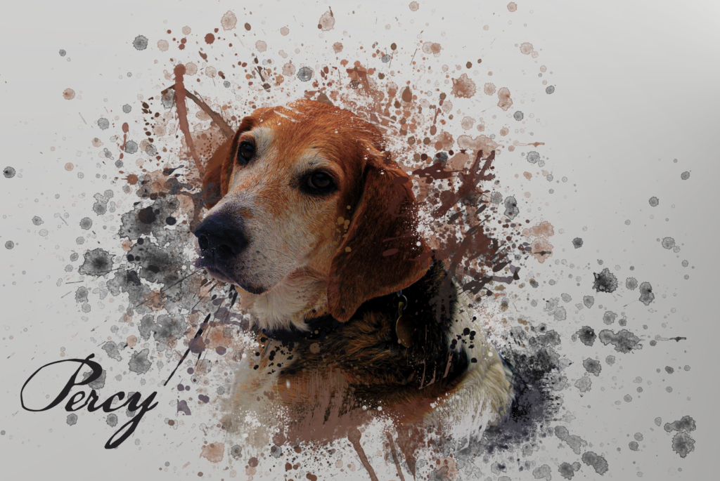
All photoshop designs here included my own photography, the first 2 being of my dogs. In the first one, I isolated him from the background and used a series of brushes to create an ink splatter effect to show off his colours well. Using the eyedropper tool, I could select the same colour as his fur and would create brush strokes behind him. To get rid of any solid outlines I then applied a layer over the top of him, less intense so that all his details could still be seen, yet he is absorbed into all the ink. This made use of his natural colour tones and exaggerated them as much as I could. Alternately for my second design, and other dog, I went for a more cartoony feel, with a pop art aesthetic, steering away from the more complicated aesthetic from the former and favouring bright vibrancy. It feels blockier and more fun, yet I favoured the image resembling more of the original photo, the first design. Therefore, for the final design, I took what worked best in the former two and applied it to my photo of people this time. Using ink splatter to exaggerate the colours of hair, skin and clothes, with a pop art overlay. I feel the transition between realism worked more seamlessly here than in the second design as it blends with colour more effectively due to how intense the presence of the ink is. The focus on the people aids this greatly as the colour and ink flow around the image in a natural way for the audience to follow with their eyes.


 Designs 1-3


The first image shows the underlying layers of ink brushes and the second shows how awkward the image looked awkward when there was no overlaying ink , as to why i added this later on.


The first image shows the early design process when i realised that the pop art effect didn’t work so well on its ownand the second is where I attempted to add no detail to add to a comic tone but decided against it.


The first image shows all the underlying ink layers without the figures with the second showing the figures with just the smoke which inspired me to consume them in it as it flowed well.
Software tutorials
The main assets I used here on Photoshop are the brush and eyedropper tool. This allowed me to colour pick the exact colours of elements of the photos so when painted on top of or behind there is a seamless transition. This also worked for colouring the brush the same colour as the background so there were no harsh lines or clear transitions, it all blends into one. This worked for both the first and final designs to great success. This was especially amplified by increasing the vibrancy of the images so that the colours really popped out and became the main features of the original photos; https://www.youtube.com/watch?v=FipliqS7GYU&list=PLEEgLOr8DxSPMjRanf-E4DaZYLVY9jWhQ&index=7
This is the tutorial I watched by Hass Hasib as the main tutorial in my design, showing how he used brushes in creative ways, something I then wanted to emulate in my own work with my own images. In the second and third design I also made the images look cartoony by altering layer styles, filters and colour to my advantage as well as learning about colour halftone on Photoshop with Blue Lightning TV Photoshops tutorial; https://www.youtube.com/watch?v=IS6k9ax4joI&list=PLEEgLOr8DxSPMjRanf-E4DaZYLVY9jWhQ&index=9&t=21s
These 2 major stylistic choices are not usually presented simultaneously, therefore, that Is more of a reason why I wanted to combine the two, taking what worked and abusing it to extreme effects with very harsh outlines and thick strokes as well as vibrant and loud colour brush effects that amplify and flood the image. These skills I had never dabbled in before and by revisiting both of them in the final design worked as a kind of test to me to see how to apply what I had learnt in the tutorials without external assistance the second time around, to, what I think, was a success.
Resources for research and inspiration
After seeing the first tutorial mentioned above by Hass Hasib, I searched for similar looking final designs using the splash dispersion ink effect such as this one; https://www.youtube.com/watch?v=jxA-E9VtL0s
Although I did not watch the technical elements of this video, I liked how the final image uses colour so violently, in the audience’s face, bringing so much character and excitement. This is a photo where the figure Is moving so it inspired to see if I could bring so much diversity to a stationary image of my dog who has very neutral colours, brown, blacks and whites as opposed to the red and blues present here to see what works well and do the opposite despite the fact to see if I could achieve just as effective results. It became more inspiring when designing the 3rd creative image as here there was much more colour on show I could exploit, make sharper and channel this concept more thoroughly in a playful way as opposed to the more mature and reserved approach I took with the first dog design. For the second design, although not looking very similar, one of my main influences after watching the tutorial was the loading screens for the video game Grand Theft Auto V which present the main characters in a comic pop art version of themselves, still realistic but with more pronunciation on strokes. This Is an approach I took with my second dog, to keep the details but reduce the image to a comic from with bold pronunciation; https://www.youtube.com/watch?v=9_YJnor4XH4
I decided to stray away from the more realistic GTA V aesthetic, applying colour halftone pixels with 6 pixel radius creating marks as if the image is printed on old printers like classic comics and 80s pop art.