Author: TristanBevan

An Overview of my Letter Logo Designs:


Design ideas and design process:

With my early and brief experience with manipulating text in illustrator last submission during term A, and with the quick mini project that happened during DP1 last term exploring letter logos, I was excited to have the chance to return to creating further concepts of logo designs using illustrator. To start off the design process, I began drawing many different sketches in my sketch book to gage a quick understanding of what worked and what didn’t. This was further explored through my exploration of places like Pinterest, Instagram, and other various image searching locations online. My initial experiments during my sketching period helped me to design initial ideas in my notebook in order to render and test my ideas visually. The tutorials I found on how to use the pen tool and pathfinder tool really came in handy when connecting two letters and overlaying one on top of the other as one vector.

Initial drawing and inspirations

As shown in these initial drawings above, elements of my final designs can be found in these sketches. From experiments with geometric type to more calligraphic type, and with unique merging of terminals in the lettering, I found that the logos I rendered onto illustrator gave a good balance between professionalism and creativeness.

The design process of my final designs


The screen shot above shows the journey that took me from the original text – typed out into their individual text boxes – to the use of the object+expand tool to turn the text into vector paths and shaped – where I began to edit them individually – to the final edit merging the vectors to create one connected logo. One technique that I did not know of before, that became very handy in the creation of editing of vectors was the tutorial that I found to split vectors into two shapes in order to edit one area of a vector and merge them back together – this was done by the use of the ‘divide’ tool. As stated, this technique became very useful in the creating and editing of my logos, and even became and integral part of other designs I made following this discovery in other modules.

Software tutorials:

Even though I am relatively new to the use of Adobe programs such as illustrator, apart from photoshop that I dabbled with in the past, I feel like I was able to pick most of the techniques up quickly and without outside sources. I believe this came down to my knowledge in photoshop as they sometimes use similar tools and methods to get the job done – such as the pen tool to create paths. Still being new to the program itself however, I still had to use an array or resources to guide my way through the program when I faced problems that I couldn’t figure out on my own. Examples of this can be seen in my use of the ‘divide’ tool techniques found in the pathfinding area of illustrator. Another area that I was not well versed in where the pathfinding tools in general.

‘devide’ pathfinder tool tutorial https://www.youtube.com/watch?v=4c4bEoT_mwE

From my research I was able to find many different ways in which to do different tasks, for example the overlapping of the letters in design 3 I found could be done in many different ways from the use of the stroke lines of the text and the knife tool to cut away areas, to the way in which letters could be edited by using the typeset tool instead of the expand tool. This knowledge gave me an understanding of the complexity of illustrator as I experiment with different techniques to get similar results.


Skills I improved upon:

A skill that I felt I may have improved upon were the development of my designs through the research and initial drawings I made before starting on illustrator. As I developed through this course, I have come to understand how important planning out rough ideas can be in the development process of my designs as I originally would jump straight into the program. To improve this however, I believe I still need to do more prior development into my designs – such as photoshop tasks – as I still sometimes fall into the trap of experimenting in the program before knowing my idea. Another skill I felt that I improved upon was the  creation of vector and logo designs, and my ability to visualise the logo that I was trying to make on paper, and actually be able to render it onto illustrator. Previously, I would have gotten to a speed bump in the creation process on illustrator – usually down to my lack of  knowledge in the program – and moved onto a more simple design instead of pushes through. To improve further in this, I feel that I should take on more complex design ideas and attempt to develop them into complete rendered designs.

Overall, I believe that I have improved my skills and knowledge in the use of adobe illustrator through my newly acquired knowledge of editing vectors, using tools such as a variation of pathfinder tools and pen tools, and through my design process beginning with drawings and research rather than going straight into the program.

An Overview of my Podcast Cover Designs:

Design ideas and design process:

From my previous experiences with photoshop as a hobby and during school for small projects, I was always inspired to create ethereal images with the backdrop contrast of light in the dark. My inspiration for this preferred style was from the many YouTubers that made tutorials of such styles – such as ‘Benny Productions’ and ‘rafy A’ – whilst also having a great appreciation for 80’s retro futurism from movies such as Blade Runner and Tron. The combination of these two lead me to create ideas 1 and 3 using light adjustment, blending modes and gaussian blur to create the ideal lighting conditions for my podcast covers.

Idea 1 Process – Dual lighting adjustment with a change of colour through a Hue Saturation Layer
Idea 3 Process – Dual lighting adjustment with Curves Adjustment correction
Idea 3 Process – Pen tool path lines with dual stroke lines (one white and one coloured and Gaussian Blurred) creating neon sign


However, as this ethereal neon environment is my favorite and most comfortable style to work in, for my second piece I decided to reach out of my comfort zone and attempt to reach from a bubblier and color saturated 50’s retro inspired style that I never attempted to work with before. My inspiration for attempting a style like this was weirdly enough through a browse of Upsplash – a website gallery full of free usable high-quality photography – where I stumbled across the image that you can see present in my second podcast thumbnail of the man with the circle glasses. From this I began to think of a way of continuing my retro theme without continuing down my comfortable neon path.Eventually I found a tutorial by YouTuber ‘Envato Tuts+’ where she showed how to create the image of a model into that of a retro comic book using many ‘filter tools’ and ‘filter gallery’ effects. I was hooked.

Idea 2 Process – White and Black dual outline
Idea 2 Process – Combination a Sharpening, Blurring, and Filter Gallery filters
Idea 2 Process – Curves Layer Adjustment to brighten the image


Even though the image of the man didn’t come out as shown in the tutorial due to the difference in lighting conditions and photo resolution, I came to appreciate the way it evolved after the placement of the background, the text and overall lighting adjustment.


Software tutorials:

As I have worked with Photoshop before coming to Reading University I was able to use my prior knowledge to guide my way around most problems I faces – an example of this would be the use of the magic wand and mask tools to cut out images from there backgrounds and edit said masks with the black and white brush tool that I learnt in secondary school. However, when I did run into problems regarding the venture that I had never encountered before such as manipulating type in a more exaggerated and curved manner, I made my way to YouTube in order to find an answer to my problem. From this I came across ‘Adobe Photoshops’ own channel where they made a video on how to ‘How to Distort and Warp Text in Photoshop‘ where I learnt that converting a text layer into a smart object, you are able to right click and ‘warp’ the text into your desired configuration by either using the dropdown menu of presets, or by moving the individual point around the image to different locations.

Idea 2 Process – Warping text using Smart Object and Warp Transformation tool


Another tutorial I used in order to get the retro style I was looking for was a tutorial by YouTuber ‘Envato Tuts+’ called ‘How to Make a Retro Comic Book Portrait Effect Action in Photoshop‘ as mentioned in the previous section of this blog post. This video allowed me to create a more retro comic feeling image, however the difference in images from the tutorial image – being very bright with defining lines – to my image – being dark with lines fading into the shadows of the face – made the outcome very different from the tutorial image in a more grudge like fashion. Even so, I came to appreciate the outcome after playing around with the concepts given in the tutorial in addition to my own lighting adjustments, giving the image a more sharpened tone that I was able to works with through the rest of the podcast cover.

‘Envato Tuts+’ tutorial comparison outcome


Design resources and articles:

Additional resources that I used in order to create my podcast thumbnails were DaFont – in order to find the retro bubbly font named ‘Abstract Groovy’, and the broken serif font named ‘Qualy‘ that I wanted to use for my designs – Upsplash – where I got my high quality images by ‘Quinn Buffing‘, ‘Melchior Damu‘ and ‘Dan Freeman‘- and of course the many YouTube tutorial creators such as ‘Benny Productions’ and ‘rafy A’ whom I name dropped above. These resources helped my greatly gathering content to create, and watching content to connect the pieces.

– Original images

Blue and Pink Cinema Listings

With the two designs that I have created, I have decided to base them both on a similar layout however by changing the order of the movie listings through the use of various organisations and type weights, I was able to change the target demographic for each. For example I believe that the ‘Blue Listing’ appeals more to the “retired doctor and her husband, both of whom have a passion for old Hollywood”  as the hierarchy emphasises the directors, time and place of the movies creation and the cast, where the ‘Pink Listing’ is more targeted towards “a father with two children under 10” as the times and age ratings are more prevalent.

Cinema Listing (Pink) 01

Cinema Listing (Blue) 02

‘The New Library’ Penguin Book Design:

For this Penguin Cover project, I made sure to apply what I learnt from the tutorial video in order to make the process of creating my personally designed cover more methodical by using paragraph and character styles in my work. From this, I got very similar layouts from the original penguin design to my own internet inspired design. From this template I was able to add different fonts and text without effecting the layout of the design.

TY1INT Penguin v.01 PDF

TY1INT Penguin Test v.01 PDF

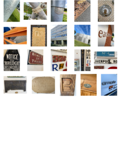
Raised and Indented Lettering

For my ‘Lettering in the Environment’ project, I decided to photograph the themes of raised and indented typography around campus. I chose this theme as walking through campus I realised how common place such techniques are in many areas such as construction, maintenance and even signage. That became apparent to me firstly from the many maintenance and manhole covers that where present an the pavement and the roads, which I believe were raised cast metal in order for the preservation of the type to be present for longer than a print based design. This technique can also be seen in building signs as the text is raised from the buildings wall however, unlike the sturdy maintenance based items, I believe this was designed with the attention of the reader in mind other than rigidity.

Floating Comic (Staircase)

I chose this piece from the box as I thought it would give my work a little more variety from the other works with its comic book styling rather than a more traditional book. With this I decided to use the panels of the comic is a unique way in order for each individual panel to stand out and flow with the rest of the panels in a downward sloping fashion. I did this by allowing the panels at the top of the page to overlap the following panels to give the narrative a downwards sloping feel, sticking with my theme “staircase” (a downward spiral ascending into misery at the bottom). With this theme I also picked the prefect spread in the book as it starts with calm and contentless and slowly terns to despair as the characters a violently killed.

Safety Bubble Gift

Process of Design:

My partner Lewis loves playing football, however he has a condition called Haemophilia which can be described as a bleeding disorder where the blood in the body lacks the necessary amount of clotting factors preform proper clotting. As this could lead to issues during injury, I have designed a safety bubble with built in football boots and medical equipment in order for Lewis to stay as safe as possible when partaking in football. I have also added a magnifying like lens in the front of the bubble in order for Lewis to see easier as he also needs glasses/contact lenses to see. I decided on this feature as it could be dangerous to play with glasses and contact lenses as they could cause injury in wake of a fall. And finally I have added a zip at the rear of the bubble to exit when needed.


Shoes design present

As my partner Hannah had a passion and business in designing custom trainers, I came up with a custom design of my own. Going through some ideas I found that there could be a lot done to the design on a shoe and that the opportunities are great. I was given the three random words ‘fire’, ‘electricity’ and ‘clown’ to work with so I decided to go for a very light expired design with bright colours and a floodlight at the back to represent ‘electricity’. For ‘fire’ I came up with the idea to put a fire hazard symbol for safety on the side of the shoe next to the floodlight as the having such I bright light next to fabric could cause a hazard. And as for ‘clown’, I first tried to incorporate a clown nose onto the back lip of the shoe, however, I did not like the outcome of the product. After that, I decided to try and let colour represent the ‘clown’ and a came up with this final product. Sadly the colour does not represent the clown as much as I would like but the colourfulness in addition to the eeriness did make a connection for me.

The new library:

In the first task, we were given an original Penguin copy of ‘The Great Gatsby’ to recreate to the best of our ability in InDesign. This allowed us to understand and get to grips with the fundamentals of the InDesign design program whilst also getting a good look at a very widespread and professional design. With this new knowledge and design template, I was able to create a design of my own called ‘The New Library’ where I used a QR code to the Wiki page as the title, binary that translates to ‘Safari’ in the side text and the author being named ‘Tim Berners-Lee’ as the man who helped invent the internet. This idea was inspired by the way the internet has changed the face of research and reading as a whole whilst still holding its origins in the cover of a book.


The Dark Side Of Gaming:

Being tasked with the word ‘gaming’, I decided to represent the contrast between the innocent excitement that games can give to the masses, but also the toxic and scary side of gaming from cyberbullying to hacking. In my first piece, the bright lights and excentric colour tones present freedom and excitement to the theme of gaming in addition to the facial expression and body language. In the second piece, the colour tone and body language are very much darkly toned muted colours in addition to the red glows in the eyes all represent the danger underneath the excitement of gaming.