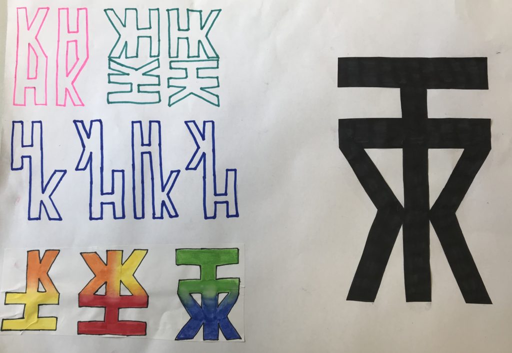
As part of our task today we had to combine our initials to create a transmogrify. We had the choice of two typefaces: Future (A sans serif typeface) and Garamond (a serif typeface) – I experimented with both.
I decided that my initials were better suited to the Futura typeface which created a strong and more angular look, much like my letters K&H. Where as Garamond would’ve created a more rounded, overall, feel which would’ve been better suited to letters like C and G.
I also experimented with different colours, textures and techniques but felt that the block black was better suited to my final piece and ran nicely with the strong, block theme.
Overall i’m happy with my final piece, I think I created something not only abstract but eligible also.