Author: HollySaunders

Covid Colour Signs and posters

COVID-19 – POSTERS AND SIGNS

In todays task we found posters and signs online and in person related to covid 19.

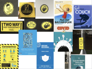
i’ve separated the images into two categories related to the theme of colour, blue and yellow. I’ve realised during the group call a lot of the posters include these colours, i think the creators of these posters and signs choose these colours as they aren’t alarming to the target audience but are still clear and attention grabbing.

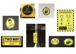
i found all but one of these signs around campus, they all use sans serif type and use the colours black and yellow, the poster also uses a little bit of blue. Most of the signs also use circles with bold black outlines. I’ve also grouped these together as they’re instructions rather than informing the audience. The colours are bold as they’re suppose to catch your attention when you walk past them. They’re also quick, simple and easy to read and understand.

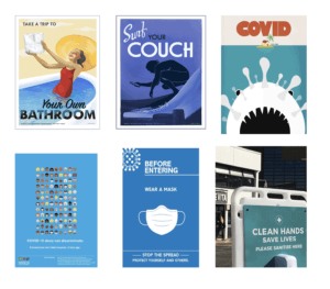
I found these posters online, i grouped them together as they all use different variations of blue. The first three posters are more of decoration, they’re all telling the public to stay at home. The first poster is an image of a woman in the bath holding toilet paper while smiling, this has connotations towards the toilet paper running out in shops, it uses decorative black type. The second poster is an illustration of someone surfing while on their phone, the type is again decorative and is in white and black. The third poster mimics the jaws poster, the covid atom is the shark and the woman is the home, The text is bold and in red making it seem like the situation is a horror. The bottom two posters are used to inform the readers of what covid is and how to prevent it, both posters have a lot of text and would usually be put in places where the reader has a lot of time to read it. They both use white, sans serif typefaces. The last sign is put in this group due its colour, the type is also in white and uses a sans serif typeface, instead of informing the reader it instructs the reader to ‘wash your hands’ the poster uses a similar calm blue, its eye catching and calming with a strong message , it doesn’t scare or intimidate the reader.


The Shining

PENGUIN BOOK COVER

In James’ lesson we followed a tutorial on how to recreate a penguin book cover. I used in design to create both of these covers, in the lesson i learned how to use some of in designs tools as the program is new to me. I learned how to group shapes together and how to manipulate parts of type such as the kerning and the height. In my version of the book cover i choose to represent the movie/ book ‘The Shining’ by Stephen King, i followed the same tutorial and layout we had used in class for the new design. I featured some of the films well known quotes such as ‘Here’s Johnny’ ‘Redrum’ and ‘all work and no play makes jack a dull boy’. I changed the opacity of ‘Redrum’ to 21% so it would be easier to see the title and author of the book, i also gave the penguin an axe as it was an iconic item in the film. I also learned how to change the direction of text as well as make certain objects different colours.

Lettering in the Environment

Lettering in the Environment

lettering in the environment

In Eric’s lesson we explored the campus for interesting pieces of typography. The powerpoint above the stop sign image has all the photos i took in the lesson. I feel as though i could’ve arranged them into better categories.

I enjoyed taking photos of different pieces of type around the campus, this activity also helped me explore the campus further. My favourite image i took is the one above, this is because i like the angle it was shot at and also how the bright red of the sign stands out among the blue background making it the focus point of the whole image.

Transmogrify – HS

Transmogrify – HS

In Kim’s project we experimented with the initials of our names and created a monogram with both of the letters combined, the final outcome is in the featured image and image above.

First i brainstormed ideas, i copied the letters H, S in the different fonts: Futura and Garamond. I drew both of the initials in lowercase and uppercase mixing them together. I used pens, pencils, markers, a ruler, a rubber and layout paper to create these brief designs.

I really liked the bottom right design and the one on top of it. I liked how the main strokes of the H were extended down to match the S, However i chose the one above as i like how the letters blended together better.

Here i drew the process of how the initials merged to make a monogram.

Too improve i would create these designs  online so they would have a more polished finish and also so i could experiment with colour.

Chocolate

The dangers of chocolate

In Sara’s project i was given the noun ‘Chocolate’ The first image, which is shown in the featured image, clearly conveys chocolate. The hearts and smiley faces represent how chocolate makes us feel which is usually happy, The hearts are also linked to valentines day as chocolate is a typical valentines day gift. The above diagram shows ideas linked to chocolate i could use in my images. The below image is almost identical to the first however, the Dairy milk has been replaced with the words Heart disease and the hearts and smiley faces have been replaced with skulls and bones, this represents the danger of chocolate and what health problems it can lead too.

In this project i used paper, Pencils, pens and tracing paper. I liked the outcome of the project and how theres a clear link between the two images, However i think i could. have improved by making the presentation of the images more neat and clean.