Brief
Summary
The Harris Garden is a botanical garden, located on the University of Reading’s Whiteknights campus. It was established in 1972 and has since been enjoyed by students, staff and the public.
The aim of this project was to create a range of deliverables that sit cohesively together within the garden. Our client initially requested a leaflet, map and signage, but after a discussion, we were able to settle on the following deliverables, which we felt would allow us to more successfully achieve both function and aesthetics:
- Brand Identity Design
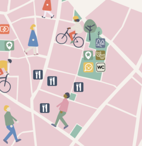
- 10 x Signage
- Garden Map
Team Roles
As we were working as a fairly large team of four students, we decided that we would share responsibility for each deliverable, working collaboratively and ensuring we each were all held accountable throughout the project process.
Schedule
Our client made it clear that this project was flexible, however we felt it would be better for us to decide on an end-date. Having received this project over the summer holidays, we felt early April was a sensible deadline to keep to. Unfortunately, due to several delays, we had to push our deadline back. As a team, we decided to aim to finalise all the deliverables by the start of the following September, but due to lack of communication with our client, our deadline was once again delayed.
Our Vision
With this project we wanted to provide the Harris Garden with an all-new, refreshed signage system to make the gardens more inviting for a broad, but predominantly family orientated, target audience. We wanted our designs to encapsulate both the life of the garden itself and the history of its friends and regular visitors. A key aim for us was to make the garden more accessible and encourage educational learning in an engaging manner. Staying environmentally friendly was important for us to promote sustainability whilst still being durable.
Research & Ideation
Personas
In our client briefing session multiple types of target users began to emerge. The client made it clear that the aim of the project was to attract more young families with children, but he was keen that the signage and map also be accessible for their existing audience. In response to these conversations, we identified four main user types. We developed these into user personas and confirmed in a subsequent meeting with the client that they align with both current and desired garden audiences. The client was satisfied with our personas and so we were able to refer to them throughout the project when making design decisions and considerations.
Materiality
As the location of the signage and maps is to be in a garden that celebrates nature, we discussed with the client environmentally friendly and sustainable options for materials and production. Concerns about vandalism and ongoing garden updates as well as natural weathering meant we had to be mindful of expense as well as the robustness of the materials.
The client wanted materials that would be easy to clean but that stood up to harsh outdoor conditions. In addition, the materials needed to be sturdy and unlikely to break, but easy to remove and replace should the garden layout change or the damage be too extreme. With this in mind we researched existing signage in a range of environments such as gardens and tourist locations as well as those around campus. We researched more traditional approaches to signage as well as unique sustainable responses.
Having Creative Print Services (CPS) located in the same building as the department enabled us to meet members of the team throughout the project in the department and on site in the garden. These conversations around materiality and function guided our design decisions as we considered colour scheme, layout, scale, and typographic treatment.
Design Styles
When considering the direction for the unifying style of the deliverables we drew upon findings from our research that we considered to be successful, and continued to keep in mind the target audience. We knew that the design had to be accessible and attractive to children and young families, whilst also respecting the academic and mature audience. The design style also needed to reflect the natural environment of the garden. As such, we developed ideas with natural colour palettes and organic illustrations. We focused on implementing a consistent layout with clear hierarchy for the signage and considered ways in which we could make clear the link between the map and the signs so that the overall design throughout the garden was cohesive.
Design & Process
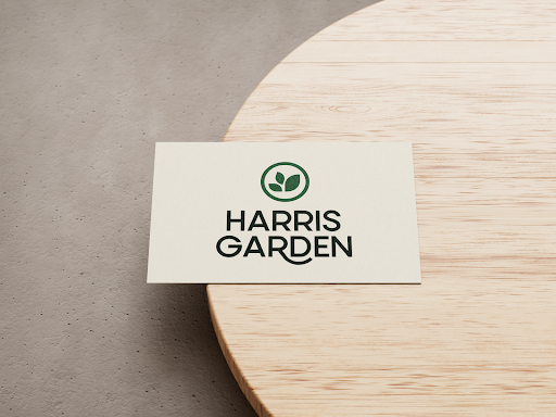
Branding Design
Branding was not a deliverable our client initially requested, however we felt the creation of an identity would allow us to tie the signage and map together resulting in a cohesive set of designs.
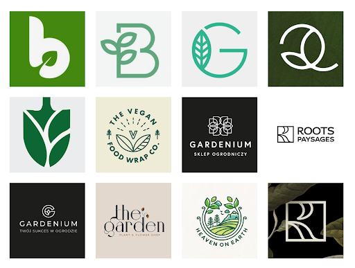
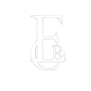
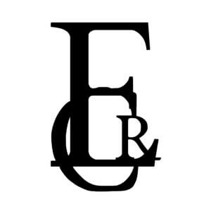
We began by gathering inspiration of existing garden logos which had a focus on icon-like elements. We decided to go down the route of a visual but fairly minimal icon design which we felt could easily be applied to different formats and would scale easily. Using our inspiration as a foundation, we began sketching out some ideas. One of the concepts that immediately stood out to us, was the incorporation of the leaf-like shapes with the initials of the garden. We also were drawn to our sketches of interlocking leaf shapes, and so we started to take these ideas into Adobe Illustrator, exploring typefaces and logo layouts to sit alongside this icon.
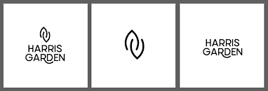
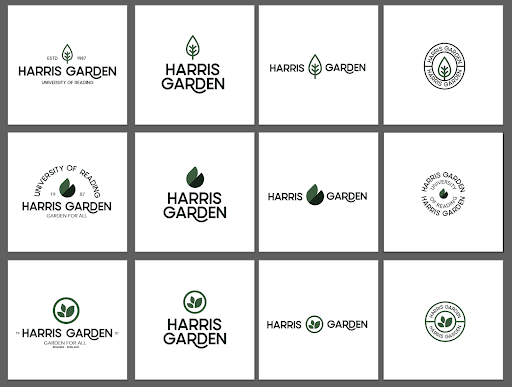
Unfortunately this logo did not stand out to our client, and so we went back to the drawing board, to explore some new ideas, while still keeping to the leaf-shape theme. As a team, we felt the typography from the initial concept was successful, and so we kept this fairly consistent through the next rounds of designs. We were pleased to hear that our client really liked the 3rd brand identity seen in the image below, and so this is the route that we took for the garden’s brand identity.
In terms of colour palette, we wanted to take inspiration from the plants seen within the Harris Garden, while avoiding the ‘expected’ route of an all green scheme. We developed four options, before settling on the bottom left palette. We knew this combination of colours would be taken across onto the map illustration and so we decided to keep the branding palette fairly limited while adding in more variety for the map.
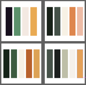
We were really pleased that our client immediately fell in love with our chosen palette, and so we implemented this into our logo variations, testing the different combinations of colour. We found some worked better than others, but overall felt our palette was successful.
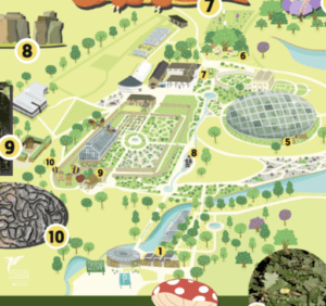
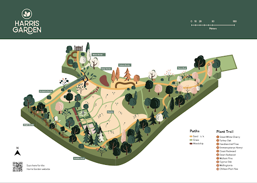
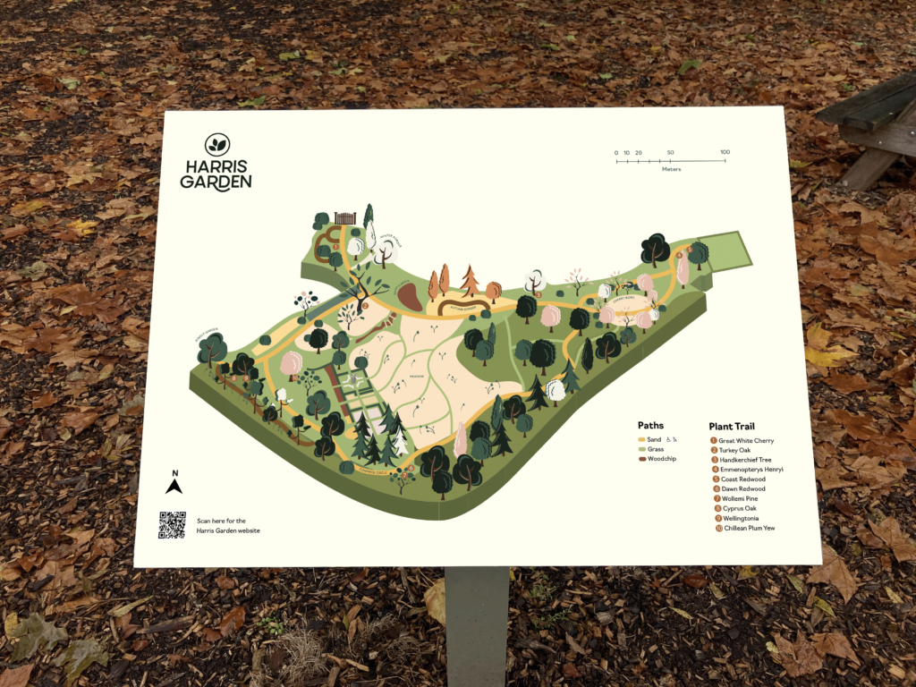
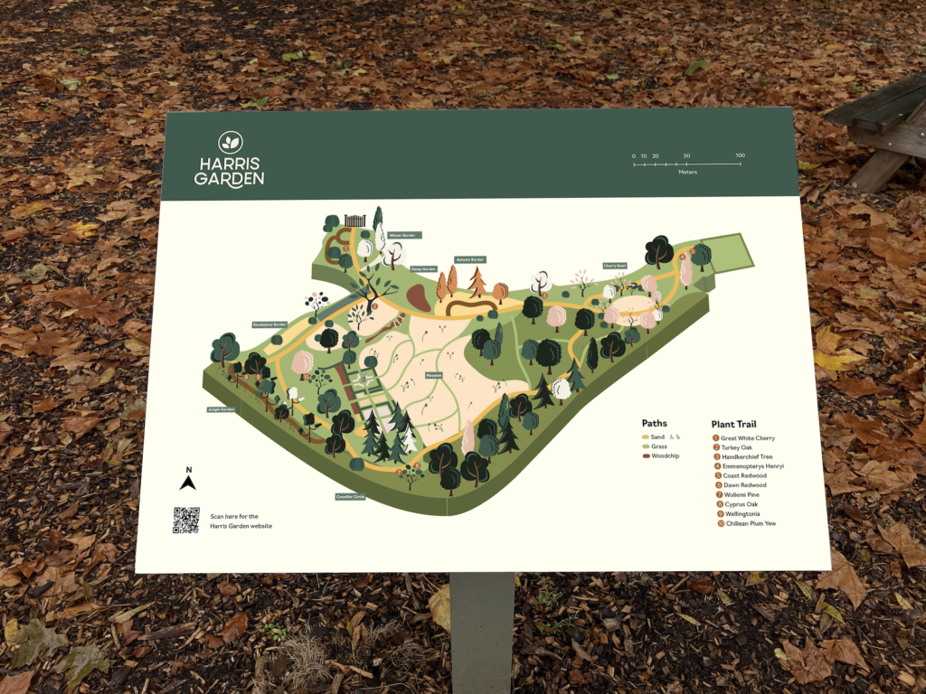
Map Design
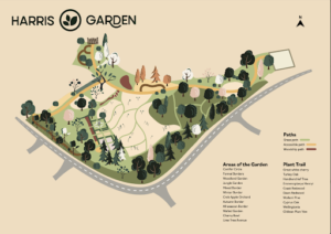
Due to the map being at the forefront of the garden and the first thing visitors would see, we undertook extensive research into appropriate styles of maps designed for use in Garden contexts. We decided on an approach which was colourful and appealing to children and families which had a slightly 3D perspective, enhancing the shape, orientation and location of the garden in relation to the surroundings.
After gathering inspiration for the style of illustration we would use, a colour palette was developed based on the colours selected for the brand identity. We made sure these shades were representative of the four seasons that worked well together as a set. This palette was tweaked and changed slightly as the project went on to create a coherent and appealing appearance with enough contrast to work effectively.
To begin the designing process, we developed the base of the map in illustrator, mapping out the different paths and sections of the garden given to us by the client. Next, we designed a variety of different tree icons that could easily be placed around the map in appropriate places in order to represent denser areas of woodland, or more prominent trees and plants.
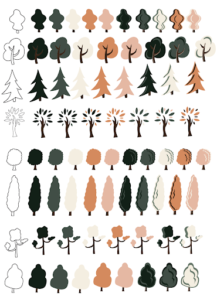
We added the icons and illustrations that represented the plants and trees within the Garden to the base of the map and added additional information such as the entrance gate and a key around the map. We tried many different variations and made many changes along the way to perfect the positioning of tree icons and ensuring the paths were visible for navigation purposes.
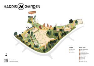
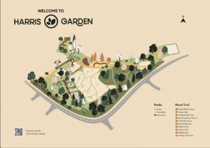
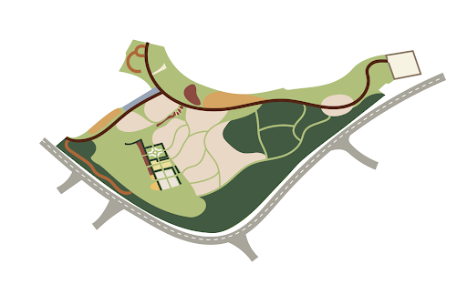
We felt that the pure-white background would look too prominent and out of place in a Garden setting so opted for an off-white colour which would also prevent dirt showing up as easily. The beige background felt much more subtle and suitable for the context we were designing for, and our client also said he felt that some users would find it more difficult to read black text on a bright white background.
We created two different versions of the near finished design which both use a more 3D effect at the edge of the map which we agreed on with the client at the beginning of the project. Differences in these versions include how specific areas of the Harris Garden are labelled, either within the illustrations of the map or around the outside. The road was omitted from the design in the end due to the decision that it was too distracting from the garden and somewhat irrelevant. In addition, the client wanted to detract any attention from the walled garden in the right hand corner as this was a section not maintained by the university, hence why we left the design of this alone.
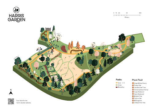
Although we felt we could develop our map design further, this was the stage that we got to when our client unfortunately decided to remove the map from the project’s deliverables. We decided it would be best for us to move our focus to the signage, and further refine them, rather than working on the map any further. If things had gone differently we would have developed the map further, testing different shades of an off-white background to maximise legibility as well as finding the most appropriate solution to include the garden labels around the map.
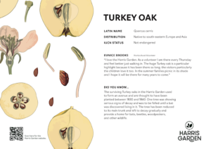
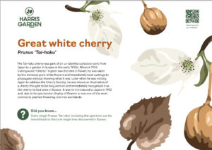
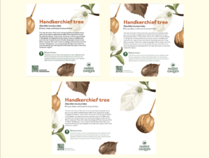
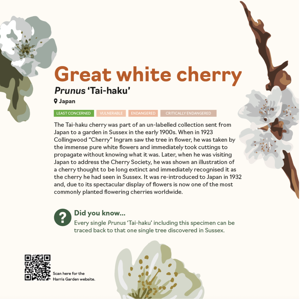
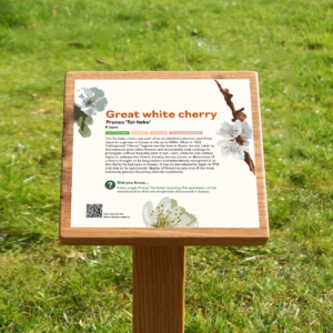
Signage Design
In advance of designing the interpretation panels, we did some visual research and analysis on existing signs used in similar settings and contexts. This research ensured that we were considering the physicality and context of the interpretation panels throughout the entire design process, which has been beneficial for our final outcomes.
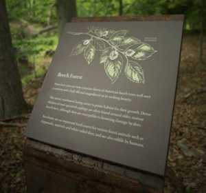
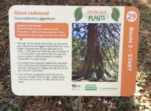
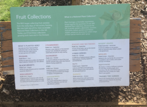
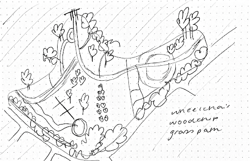
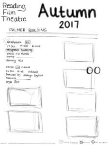
Before taking our ideas to the computer, we sketched out some simple layouts on paper to start thinking about how we could use our format as a canvas and how to present the different kinds of information on the interpretation boards.
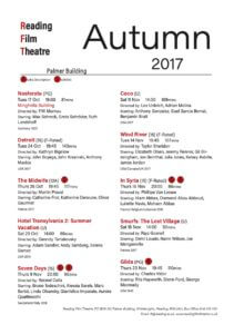
Once we had developed some concepts with mock illustrations and copy, we showed these to our supervisor and client to gather feedback. At this stage, the feedback that we received from our supervisor was that the interpretation boards that we had developed were too ‘book’ like, and weren’t visually appealing enough. Our supervisor also critiqued the illustration style we had chosen, and suggested we might want to experiment with a style that was more appropriate for the target audience, and perhaps something that looked a bit more abstract.
At this point in the project, we focused on how we could transform the signs into something that looked more like information design, or a poster, rather than a page in a book. We categorised the different types of information that was present on the signs and thought about how we could differentiate between the hierarchy of information, and visually represent the content to a reader looking from afar, or only looking for a few seconds. We used colour, type size, icons and shading to achieve this. We also created new versions of the illustrative elements, choosing a style that had less detail than the first, and is more appropriate than the ones we initially presented.
After exploring a more visual approach to the signage, we felt the overall layout had too much white space and did not work successfully. We decided to experiment with alternative sizes to see whether these worked better. We were all drawn to the square format as we felt this worked best for our content and was the most space efficient.
After discussing with our client, we decided to change the background colour to a shade of off white, to make the typography more accessible. This change will be particularly beneficial for people with dyslexia or other needs that make reading more difficult. After a few final copy editing changes, the signs were signed off by our client.
Project Conclusion
Schedule
One of the challenges we faced throughout our project, was sticking to our initial timeline. When designing the signs we had to wait for the content from our client, who struggled to gather the stories from regular visitors. As the client was struggling to collect enough of these stories in the timeframe of our schedule, we offered him multiple extensions and moved our schedule around to accommodate this. So as not to waste time whilst waiting we decided to pause working on the signage until we had real content to work with and started working on the map. The client was happy with this compromise and it enabled the project to keep moving forward despite the delays.
Implementation
Throughout the duration of the project, we faced some barriers that we had to overcome. Tackling these challenges as a team have taught us valuable client facing and time management skills that have not only made us better designers, but better communicators and team members.
Our project deadline of April 2022 was initially extended due to delays in receiving the copy for the interpretation boards from our client, and we struggled to stick to a schedule throughout the project due to delays in client communication. This has taught us that in future, we should set out clearer expectations between ourselves and the client in the initial stages of a project to avoid similar challenges.
Toward the final weeks of our project, we were informed by our client that he needed to use the University branding and that the branding we designed would not be taken forwards in the deliverables. At this point we were advised by our supervisor to let the client handle this directly with the University branding team, as this is something beyond our remit. In addition to this, the client decided to take an alternative approach in regards to the map as it would continue to develop in the coming months. While these changes to the brief were frustrating at the time, we still see the project as a success and are proud to present a full set of deliverables as outlined in our initial brief. Although they might not be implemented in the Harris Garden itself, we are happy with the solutions we arrived at.
Project Summary
Overall, this was a successful and enjoyable project. We set out as a team to create a brand identity, a set of signage and a map that worked cohesively together, and this we achieved. Each member of the team brought different strengths that we were able to identify early in the project. This enabled us to harness each other’s strengths and support one another in areas where we wanted to grow and learn. As challenges arose, such as client communication, scheduling delays, or software issues we were able to create and implement effective solutions that kept us motivated and the client updated.
We attended Real Jobs sessions regularly and benefitted from the feedback, allowing us to push the development of our ideas. Having a logical and clear structure to our process (1:branding, 2 signage, 3: map) made it easy for those providing feedback to follow our process and decisions. Towards the end of the project we acknowledged that more supervisor meetings would have been beneficial, but we were able to make the most of the meetings that we did have, especially as our supervisor was changed half-way through our project.
Lessons on physicality were reinforced as we were reminded of the importance of printing out to-scale drafts of our designs when working on deliverables that will be physical and printed. Each of us developed our communication skills, both with the client and within our design team. Assigning and embracing individual areas of responsibility really helped with this.
Whilst we were disappointed that the client chose to move forward in a different direction, as a team and as individual designers this was still a very beneficial project that taught us many important lessons about the reality of designing for live projects and we are pleased with what we achieved.
By: Emily Collard, Hannah Smith, Megan Hancox, Rio Ware


 I am new to all Adobe apps, so this was a fun experience, trying out the tools available to create each element of my book cover. I am pleased with my final outcome, however there are a few areas that I could improve on. I look forward to gaining a better understanding of InDesign and other Adobe apps in the future.