
Chronic pain is a widespread debilitating condition affecting millions of people worldwide. Pain Research Reading strives to provide a forum for all people interested in and undertaking research on pain, both within and beyond the University of Reading. This logo competition asks for a logo to be designed that represents all aspects of pain research, ‘from bench to bedside’.
Deliverables
- Logo Design (logo suite)
- Colour Palette
- Brand Guidelines
The clients have asked for just one logo that is scalable and can work effectively on all formats, however I wanted to create a full logo suite and put together a brand guideline to ensure the clients can easily apply the logo into the forum. This is because I believe just one logo cannot work perfectly across every possible format or size.
Research & Ideation
To kick start my design process, I did some research to find logos for existing pain forums, charities and groups (figure 01). It became clear that these logos all have a simple icon paired with some typography. The colours are mostly all on the muted side. On top of this, all these logos have icons that are not immediately representative of pain or scientific research, and, I was not impressed by the layout of the typographic elements within these designs.

For some extra inspiration, I explored logo design, not looking at pain specifically (figure 02) to help guide my ideation. I looked at logo layout, to gain a better idea of the ways icons can stack and sit well with type. I also found a few initial ideas of ways I could capture pain as an icon.

The next step in my process was to begin thinking of icon ideas. I created a simple mind map to help my ideation (figure 03). I then started to sketch out some of these ideas (figure 04) before I brought them into Adobe Illustrator.


I then did some typographic experimentation in Illustrator, testing out different typefaces (figure 05) and playing with potential logo layouts (figure 06).

After I was happy with this exploration, I began making vector icons based off my sketches and with a few new ideas as well (figure 07). For these icons I mainly focused on ways to capture pain, looking at nerves, the brain and the spinal cord, as these all play key roles in pain within the body. I also played with the idea of pain radiation, using repeating circular shapes.

After a client meeting, I came to the realisation that my logos were too focused on pain itself rather than the idea of ‘from bench to bedside’. I decided to go back to the drawing board and create some new icons that better captured both the scientific lab element as well as the patient care side of the forum. This was a difficult step in my process as I was proud of some of the logos I had created, however looking back at these initial concepts, I feel they did not meet the mark and I am glad I pushed myself to create a whole new set of concepts.
Development
I began by exploring ways I could incorporate a person into a logo icon. This was tricky as I wanted this person to be both gender and age neutral. I also didn’t want to fall down the trap of capturing a sad person as this forum is aimed to help those with chronic pain. With this being said though, I also didn’t want my person to look too happy! I decided to go down the route of a more abstracted figure. Not only does this suit logo design better, but also removes gender, age and emotion. I tested a few different figure-like shapes (figure 08) and further explore icon logos (figure 09). I paired this figure with different test tubes to add in the scientific element, and I also explored ways to incorporate nerves into this icon. I tested creating icons that used the tail of a nerve that curved in a way that made the appearance of a test tube. These did look too abstract and the concept may have been lost if there was no explanation. Because of this, I preferred the more simple concepts such as the figure curving round the pain radiation circles, and the figure holding the test tube.


I then took the icons that I felt were the most successful and added them to my two favourite type layouts (figures 10 & 11). I felt these icons sat well with the type and created the appearance of a logo, but also captured both the scientific side and the patient side of pain.


At this point, I wanted some more feedback from my clients, and so I put together a second concept presentation for them (figure 12). They both agreed that concepts 2 and 3 (figure 13) were the most successful, and they liked the more minimal type layout with more emphasis on Pain Research.


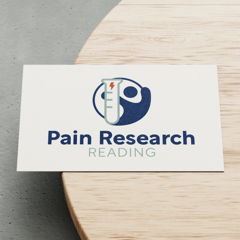
Taking this feedback on board, I developed three new icons (figure 14) combining the elements from these two concepts. I really liked the idea of enclosing the figure within a circle which not only adds the nod to the pain radiation circles, but also creates the impression of wholeness and completion. This works well as the Pain Research Forum aims to make those who suffer with chronic pain feel welcome, but this forum is also very broad, looking into all types of pain.

Finalising the Design
Now I was happy with my main icon and type layout (figure 15), I began creating alternative logos to form a logo suite.

One variation I wanted to make was with a focus on the icon. I wanted to test ways to curve the text around the circular icon, creating a sub-mark logo (figure 16). I also wanted to create a text-only logo variation (figure 17). This would need to be complementary to the main and sub-mark logos, but with fewer elements.


I did consider providing the client with more variations (figure 18), but as they only asked for one, main logo, I thought it would be best not to over complicate the logo suite, and so I decided to stick to just three logo variations.

Colour Exploration
Now that I was pleased with my logo designs, I moved onto colour exploration. I looked back at the existing ‘pain’ logos from the start of this project, and put together seven varying colour palette options (figure 19). I wanted to make these palettes feel inviting, using warmer tones, and also wanted to capture the concept of pain with some reds. Blue is frequently used within healthcare logos and so I tested a few palettes with this colour included as well. Furthermore, I ensured all the palettes had sufficient colour contrast to enable the colours to layer well and make sure my logos were legible.

I took the three palettes that I felt were the most successful, and added them to my logo suite (figure 20). This allowed me to tweak the colours and see what worked best with my logo designs.

From here, I took colours from the three palettes to make a different more successful combination (figure 21). This palette incorporates the blues and reds, but is softened by the cream and the light green. To add some more contrast and a slight tonal element, I also used a deep, deep green.

Once I was happy with these colours, I played with different combinations across my logo suite (figure 22). It was clear that some combinations worked more successfully than others, but as a whole, I felt this palette looked really good. I definitely preferred the logos with the cream background, and for my main colour way, I leant towards the combination of blue, light green and red on this cream (figure 23).


Final Steps
The final part of this project was for me to design and put together a brand guideline for my clients. This would help them successfully implement their new branding across the different formats for the forum. This was not something the competition required, however I believe it is a key deliverable for branding projects. I used Adobe InDesign to put together an A4 document, within which, I outlined the different logo types within my logo suite, and gave examples of how to use them. I also gave the typefaces and colour codes used within my designs. Finally, I saved my logo suite to be entered into the competition. If my logo is chosen, I can then save my designs as each of the file types necessary for branding, such as PDF, EPS and SVG, rather than just PNG and JPEG.

Evaluation
This was a quick, but extremely valuable project. I really enjoyed developing my ideas throughout the process and I am so pleased with my final outcomes. Although my final logo is very different to my first concepts, I feel this initial exploration was a key part of my design journey, as I was able to get ideas out there and then use them as a basis for further exploration. I feel this helped me create a much more successful logo design that more accurately captured the idea of ‘from bench to bedside’. Even if my logo is not selected as the winner of the competition, I believe this project has helped me refine my design process, making me feel more confident with discarding ideas and starting the ideation process again! I also feel much more confident with how to tackle any branding projects to come.
