Author: DanielCox

Flying Car

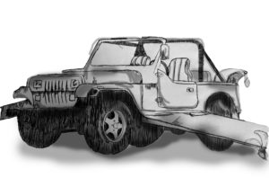
For Kim’s Ideal gift project we were asked to prepare 3 interesting facts about ourselves and then share them in a group. We then had to use someones facts to create an ideal gift for them and use prompt word to further develop our ideas. My partner said they had met Bear Grylls and been skydiving so I thought a a flying jeep would be suitable (jeep is adventurous like Mr Grylls and they must like flying if they have been skydiving so…flying jeep). One of my words was ‘fan’ so I added some rotatory fans to the car.

Modernist Style Cinema Listing

cinema listing

For this project we were tasked with arranging information about 2017 showings at the university cinema onto an A5 sheet with two columns. This was a really fun task and was good for developing my skills on indesign which at the moment are pretty limited. I tried to arrange the information in a way i thought made sense with the title of the films being the most eye catching however during peer assessment someone pointed out the rest of the information sort of merges into one.

For my flyer I wanted to incorporate some styles we have been studying in the history of graphic communications module. Last week Rob was talking about Swiss graphic design so I’ve tried to make my outcome visually similar to the movement. Swiss graphic design, like modernism, uses black and red colours and sanserif fonts.

Recreating Type


For Gerry’s project, our first task was to create the word ‘cadbury’ in the same font as the word hesion above it. I found this particularly challenging. Mimicking a typeface with only the option to view a very selective range of its characters is something I have never done before but I gave it my best shot. Gerry pointed out my U in cadbury should look more like an upside down n with a stem.

For the second task we were given some letters that looked as if each character had been cut in half, It was our job to fill in the rest of the figures. It was interesting to see the different interpretations of the first letter, only the top half of the character stroke was revealed so I incorrectly thought it was a C, others thought it was an S, when it was in fact an A. I added some serifs to my letters just to make them more interesting.


DC

For Kim’s Project we were tasked with creating a logo like symbol that merged our first initial and last initial. I experimented around a lot to create many number of variations however in the end I decided to go with the lower case d inside the upper case C. I then played with the style of the glyph giving it serifs and adding an italic angle to it. I really liked the final outcome even if it does resemble the @ symbol.

Lettering Around Campus

For Erics’s project we studied lettering in the environment. I tried to find lettering around the campus that i thought looked interesting. I liked a lot of the stencil lettering which there was a surprising amount of. After we had taken photographs we were asked to organise/arrange them in a way we thought was suitable. I decided to arrange mine by colour with the greens at the top, followed by the blues, yellows, reds and neutral tones. When looking at how my class mates had arranged theirs I realised mine was by far the least creative however Eric asked an interesting question about whether the colour groups I had split my photographs into had anything else in common. While the green lettering generally invoked safety or a message about the environment it was difficult to find correlations between the other colour groups.

The Matrix

For this project we were asked to create a film, book or even a meme in the form of a classic penguin book cover. For mine I decided to create a penguin book cover for the matrix. I started by getting the green color pallet a lot of people associate with the film. I then distorted the type to make it look like it was dodging the bullets, (a reference to the film) however I’d say this was semi successful as Its quite difficult to tell what my intentions were. Overall though I like the green and really enjoyed this project.

matrix vs 02

Covid 19 In Reading Town

Today for Sue’s and Emma’s Covid 19 project I headed into to town to find any kind of sign or poster that portrayed a warning or instruction about Corona Virus. We then grouped back together to share all of our images and talk about them. We discussed how the general public are growing accustomed to the shear abundance of Covid posters to the point where we have built up a sort of tolerance to them. I personally barley notice these signs anymore and they only really catch my eye when I’m actively looking for them. It was interesting to look at posters that were perhaps not made by professional designers and were a bit more creative and fun. A lot of the signs had a very lighthearted aesthetic to them which is strange considering the disease has killed thousands of people. As a group we evaluated whether we thought these signs might be taken more seriously and further catch the eye if they used scare tactics like on the packaging of cigarettes. The top right image shows a warning poster from decades ago (from the collection) and the image to the left of that is a poster I found around the campus today, it is interesting to see the visual similarities between these to two.

Stairs


I chose the narrative about the man who starts at the top of the Sanatorium but as the days go by he is slowly moved to the bottom floor where he dies. I tried to capture the idea of travelling down through the sanatorium, I did this by cutting descending stairs into my book so like the protagonist in the narrative you too move down through the floors, each page being a step closer to your inevitable doom. On the last page I was going to write ‘death’ however I was concentrating so much on making the word look pretty I actually spelled death incorrectly so i just scribbled over it and drew skeletons, graves and other visuals you correspond with being dead.

Exploration of the word ‘War’


For this task I had to explore the word ‘war’ and create two striking images to show both the positive and negative interpretations of the word. My first image displays a WW2 soldier in his uniform, this could show the pride in fighting for your country. The second image shows a prisoner of war, who has no pride and is stripped from his uniform. The gif lines up both these characters eyes which could suggest they are the same person. This gif explores the effect war has on a man and how the person who’s goes in is not always the same person who comes out. I added a graphic striking pink colour and the text ‘war’ in helvetica font as I think it looks impactful. I’m not sure if the animation with actually play or if I’ve just attached a stationary image.