Creating a monogram
Kim’s project
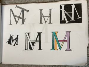
In today’s brief, our task was simple: to create a graphic representation of our initials. I began by sketching out some initial ideas using the Garamond font, as I liked the serifs that this typeface contained. I brainstormed some ways of how I could combine my initials ‘M’ and ‘H’. These two letters have similar forms, so I tested out different ways of intertwining them in an interesting way. I found that drawing the ‘M’ and ‘H’ separately and then photocopying them in different sizes allowed me to quickly experiment by cutting them out and rotating and shifting the letters to find a monogram that worked, before sticking them onto my page as a series of experiments. This was an efficient and effective way to work for me and produced quick results, rather than sketching out the letters each time to come up with a different design.

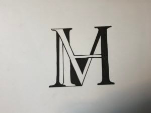
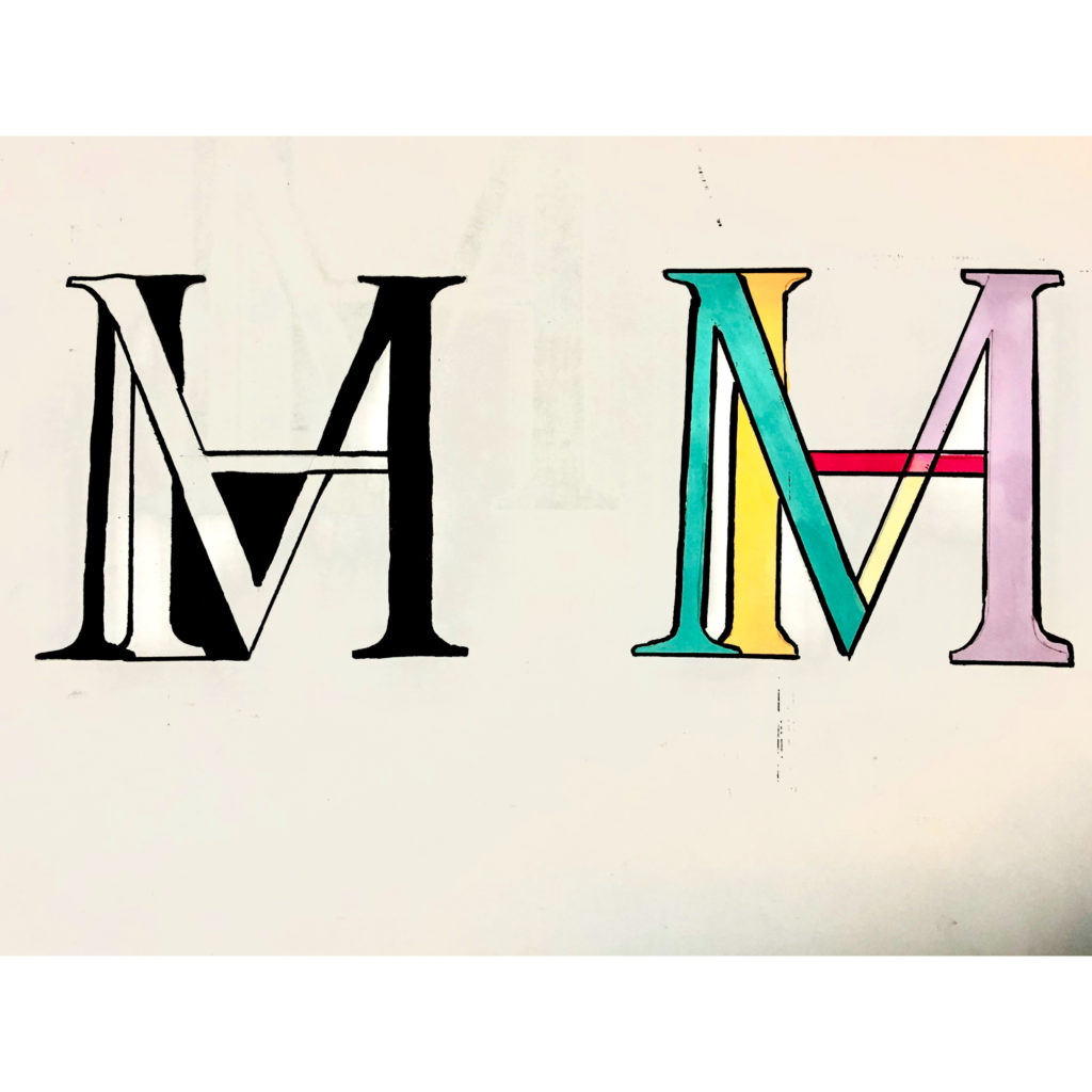
After having chosen the compositions that I liked best, I decided to develop my ideas further with use of colour. One idea I tried was inverting the white background and black letterform to create black negative space and a white monogram. I liked the finished look of this, and then proceeded to try a combination of black and white negative space, switching between the two in different sections of the letterform. I tried this with coloured pens as well, which i liked, but not as much as the black and white one. So, to finish, I drew out the black and white version in a slightly bigger size to produce a final, neat piece.
I really enjoyed this task and the way it encouraged me to think about design in simple letterforms, I effectively developed and created my own glyph based on my two initials which I thought was really fun and creative!