
Real job: A team created illustrations and branding for this local initiative to encourage creativity amongst young people.
Author: ChristiVan Heerden
Eat, Pray, Love, Repeat
In TY1INT Indesign practical session, we had to all create a copy of a classical Penguin book cover. We were then asked to experiment with that book and perhaps change the colour and title of the book.

I chose to change the cover to another classical penguin book.
We were then asked to design our own book/film cover, including an element of wittiness. We had to stick to the basic rules of our first classical penguin book cover.
I chose the book ‘Eat, Pay, Love’, because it is about a woman who had everything; a house, a successful career, and a husband. However, she loses everything, and loses sight of what is important to her in life. She sets out on a journey, stepping out of her comfort zone, and she builds her life back together again, coming back a stronger woman. To me this book conveyed such a powerful and important message.
We can all relate to Eating, Praying and Loving in a very personal and eclectic way, but there are also universal ideas and emotions about these concepts that we can sometimes joke about. In this case I am playing with sarcasm and the notion of food as a comfort, but also as a source of guilt. In a society where women are constantly beating themselves up for wanting to eat (a lot and not necessarily healthy)and always chasing the unattainable perfect body, you have to appreciate the encouragement to eat as much as you can, praying that you don’t expand beyond your most comfortable outfit. And when you ticked the first two boxes, Loving the chef is easy. I added Repeat to highlight the fact that humans are creatures of habit and we sometimes struggle to move away from our repetitive lifestyles and routines.
Safe in space
When studying my images( combination of own photographs and internet images), it made sense to divide them into four categories, Hands, Face, Space and Safe. It links with the meme ‘Wash hands, cover face, make space’ created by Boris Johnson. I felt the need to add ‘Safe’ to it to accommodate a category of pictures that I find necessary.
My categories share similarities in how they communicate, convey information, create awareness and offer warnings. All the categories share the aim of helping people with their decisions based on the information they see. They are similar in communicating information to the same audience/readers, and in how they use a range of verbal and non-verbal elements to convey a message. Similarities are also found across the four categories in how some signs are less effective than others due to overcrowding or illegibility. That reduces the impact and clarity of the message, and would surely cause difficulty with reading and comprehension, so people would move on and miss the message. There are also good signs in all four categories, which are easy to read, communicate concisely with few words and draw attention. The use of colour is also quite similar is all four categories. Colours that come up mostly are amber, blue and red. That is not a coincidence, but a result of the psychological effect that colours have on people. Amber is associated with caution, whereas red implies danger or warning. Blue stands for informing, trust and building relationships.
Differences between the categories are seen when it comes to the specific areas of focus. The Hands category emphasises the importance of washing hands and using hand sanitiser to protect ourselves from getting or spreading germs, whereas the Face category concerns itself with face coverings and protecting others. Space has the biggest variety of signs and its aim is to discourage physical contact. They vary from markings on pavements to socially distance, to road signs and various forms of signs in shops, all directed at encouraging consumers to distance from others. The category Safe is different from the rest in that it plays on the notion that people are unified through circumstances that affect everyone, and that we all play a role to keep ‘us’ safe. I also like that some of the images are more personalised and encouraging when compared to those that are purely functional and impersonal.
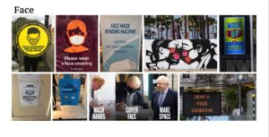
References for Face images:
Wear a face covering (electronic display)
Wash hands, cover face, make space
The five other images were taken by me on campus and in the Oracle shopping centre, Reading.
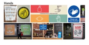
References for Hands Images:
The two other images were taken by me, also on campus and in the Oracle shopping centre, Reading.
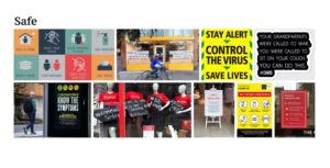
References for Safe images:
The two other images were taken by me in Reading town.
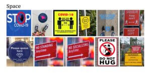
References for Space images:
No standing/socialising anytime
Two of the images were taken by me on campus and in the Oracle shopping centre, Reading.
CH monogram
In today’s class we were provided with two fonts, Garamond and Futura. Using one of these fonts, we had to use our initials to create a monogram.
I sketched out my initials, CH, and then photocopied them at different sizes, playing around with the scale. I mixed the two initials to see which shapes I could create with them. I found that I was getting lost in my own ideas, making the initials blend in such way that I could not tell they were a C & H anymore. I wanted my monogram to be a clean and clear presentation of my initials, and that is why I chose the final design that can be seen below (the last three drawings on the page).

I thought it would be fun to add some colour to my design. I chose green because it is a calm colour that is associated with nature and good-luck. It is fresh and cool, and to me it holds the idea of hope and new life.
Yellow is a happy colour. It is fun and youthful, and adds energy, just like the sun .
Britain
The word I was given to work with, was the word ‘Britain’. Immediately these images popped into my head; the Union Jack, the Pound Sterling, the Queen, Scones and tea, red telephone boxes, black cabs, the Big Ben, and Buckingham Palace.
However, I wanted to stick to simplicity. I wanted people to immediately recognise the word ‘Britain’ in my work, and to me that meant using the map of Great Britain, and the Union Jack, which symbolises the union between the four nations. I did not want to overcrowd my image and make it confusing. I wanted my work to be simple, yet effective.
The stitching within my first image symbolises that the four nations were sown together in the past to form Great Britain, but in recent years and since Brexit negotiations started, there has been tension, and so the stitches have come undone in places (seen in image two with the scissors).
I placed the scissors at the left top corner between Northern Ireland and Scotland, because that is where the most tension lies within the union of Britain due to Brexit negotiations. It also visually balances the weight of the strong Union Jack on the bottom right corner. The scissors depict the looming threat that Britain as we know it, might look different in future if some of the nations cut themselves loose to be independent.
I created my first image on tracing paper with paint, which did not work very well because it made the tracing fold, so I created the second image on normal paper. The paint also didn’t stick to the tracing paper very well and therefore the second image appears darker.