Thursday 9 May marked the opening of the exhibition designed by Aaron James and Olivia Moors for the Global Goals campaign. Displayed in the University library were posters promoting the 17 Sustainable Development Goals, designed by Part 2 students in the Department of Typography & Graphic Communication. The project originated form a professional relationship between sessional lecturer Greg Bunbury and Project Everyone, a charity led by Richard Curtis.
The exhibition allowed students from across the University, not only our own department, to see the hard work the Part 2s had put in to bringing these goals to life. It was extremely rewarding to be able to see our own work on display for everyone to see. The opening event also allowed us to get a feel for how our posters could connect to the viewer, seeing how well the message came across, watching faces react, and hoping the work inspired change in people’s thinking or actions.
At the opening, there were short talks from James Lloyd, Eric Kindel, Greg Bunbury, and Hannah Cameron from Project Everyone. Everyone was sure to congratulate the students on their work, especially Aaron and Olivia for their contribution to the exhibition itself. But what stood out to me were Greg Bunbury’s words. He talked about creating work that means something. Creating work with a message. He mentioned that you should always create work that you care about, and that you believe in. I feel that this was the most important part of the project for the designers involved. We had the chance to create some meaningful work possibly for the first time, with the intention of getting a real message across. And through this exhibition, we were able to see the impact those messages can have.
Students and visitors exploring the impactful work
This Real Job comes in the form of a contest, something fairly unusual for these briefs. Following a recent social trip to Carter’s Steam fair, a traditional English travelling funfair, members of the department began talking with attraction owner, event organiser and sign-painter Joby Carter. After learning more about his incredible talent and passion for hand painting stunning fairground signs, this competition was developed, giving students an opportunity to experiment with this highly niche style. To me, this seemed like an amazing way of trying a new typographic style, experimenting, and playing with this fun concept.
An image of Joby Carter hand-painting lettering for a sign. Found on https://www.jobycarter.com/
Brief
The brief of this work was very straightforward – to pick a brand and recreate its logo in the fairground style. While specifications of the deliverables were given, being digital or physical and being a 2000px square, the choice was left to us. Joby stated in the brief that he personally enjoys poking fun of serious topics and making the most of the jovial, light-hearted nature of fairground lettering.
Concept
Immediately having read the brief, I began thinking about the most serious business that I could put a spin on with this decorative, over-the-top lettering style. My mind raced to topics like finance, law and banking which quickly led to Legal & General, a financial services provider that’s been in operation since 1836. The history of this company was really engaging, reminding me of old legal documents, such as those seen below. The typeface used are highly decorative and ornamental, being somewhat like the fairground typefaces linked to the fair, allowing this to marry well, being a suitable and engaging brand to remake in this unique style.
Example of legal documents use of decorative lettering, on a stock certificate from the 1980s. Found at glabarre.com/item/Dunleith_and_Dubuque_Bridge_Co_Stock_Certificate/18001
Initial Ideation
Beginning this work, I started sketching different letterforms and concepts for a Legal & General logo, having looked through Joby’s work online for inspiration. I was immediately faced with a challenge – my lack of artistic ability. I typically refrain from sketching and drawing, knowing I am stronger creating things digitally. While eager to move onto Photoshop and Illustrator, I knew the importance of these fast-paced, initial sketches. While many pagers were created, below shows the strongest concepts.
Key pages from my initial sketches
Digitising
Before meeting with Joby, I wanted to refine the better concepts digitally, giving myself a clearer direction going into the imminent feedback session. With my sketches being very rough, this would give a much more blatant presentation of my idea and how it may be executed. I quickly generated these designs, using the umbrella element which I thought was the strongest from this ideation. While the lettering itself was just a standard font, this would be changed later following the feedback.
Some of the digitised experiments based on these first sketches
This is the first ‘final’ design, featuring the umbrella corner ornamentation and a typeface, only the ampersand being created by hand
Meeting Joby Carter
We then had the opportunity to meet Joby Carter, visiting his expansive workshop in Maidenhead. Hearing Joby talk about his work, his process and even watching him hand-paint some lettering was hugely informative for this project and style. The difference between typography and lettering was a really interesting idea mentioned by Joby, with his discussing how different they are treated and how lettering is a largely different skill. While getting masses of inspiration from Joby’s work and enthusiasm, it was clear this was not a skill that could be mastered quickly. I came to the conclusion that, while the hand-made, slightly imperfect appearance is key to the authenticity of this style, I would need to utilise some digital effects and techniques to get close to replicating the skill of professional lettering painters.
Images of Joby’s hand-painted signs from his workshop
Following this event and the following feedback session, I decided to largely restart the concept. Knowing much more about lettering and sign-painting after meeting Joby, I decided to return to ideating, wanting a new concept that was more in line with how hand-painted lettering is constructed and designed.
Secondary Ideation
Going back to square one, I went back to sketching, now having more focus on this style of lettering. These sketches were much closer to what I’d learned about sign writing, providing much more engaging ideas focussed on the letterforms themselves, knowing the rest could come after. Placing the focus on constructing the letters allowed the outcomes of these sketches to being much better foundations for the final outcomes.
Secondary sketches more in-line with the style of lettering in Joby’s work
Secondary Digitising
For this process, there was much more switching between hand-drawing and digitally creating. Knowing that the imperfect style could only be achieved effectively by hand, I persevered with sketches alongside designing digitally. This allowed me to bring across the more rustic, authentic style of lettering without oversimplifying the designs digitally, using Adobe Illustrator to make things mathematically perfect. This also let me test designs digitally, deciding if the sketches adapt well into a digital space or not. While more time consuming, this meant that the idea I concluded was the best would undoubtably work. After some back and forth, I selected a sketch that was suitable, drawing out the key letters for the brands logo before digitising them. By creating the letterforms by hand, I knew that the end result would have the rich authenticity of hand formed text, but would likely be more challenging and time consuming to create.
The refined sketches of the lettering style, featuring all the relevant letters to construct the full brand name
The digitised version of these sketches, with the other letters being roughly drawn to fit the style
I was already much happier with this concept than the previous design – this put much more focus on the lettering, adhering to both the brief and what I learned from Joby, with the careful crafting of the basic letterforms being the key to an effective, successful outcome.
Over this time, there was extensive tweaking and refinement to the characters, with countless iterations being used to mark milestones and save a history of the process to compare changes. The image below illustrates part of this.
Here is part of the letterings evolution process. While professional painters would achieve this balance of perfect imperfection, it took me a much longer time to tweak and alter this typography to get somewhere close to this, relying heavily on the softwares tool to help
Feedback from Baseline Shift
Baseline Shift provided another outlet for feedback on this design. The weekly session happened to be centred around getting advice and tips from various designers in and out of the department, allowing us to get helpful guidance from people new to the project. Wanting to take any opportunity for advice, I presented my current digitised lettering.
The main feedback I got from this was that it wasn’t fun enough. While this was partly down to the colouring, which hadn’t been considered yet, the overall composition was very linear and straight. The various typographers and calligraphers present all agreed that a more dynamic, free flowing structure would benefit this style much more, giving a more organic and fun sense to the letterforms and the overall branding.
I was also advised to use less strict lettering, ensuring duplicates of the same letter aren’t identical. This would allow the type to work better as a full flowing text, the letters adapting to work alongside those before and after. It also provides a much stronger sense of authenticity and a hand-crafted appearance, with each character seeming visually distinctive and individual.
This is the updated lettering shown during the Baseline Shift meeting, an unfinished example of the lettering without considering colour.
Making Changes and Feedback
Wanting to inject some ‘fun’ into this lettering, I experimented with different layouts, using Joby’s work and other sign-painters works as examples for structuring text. After some quick trials, moving the two lines of text around, I settled on offsetting this and using exaggerated, large first letters. This more stylised appearance is more in-keeping with conventional letter painting conventions, immediately making it more fun and visually inviting. Adding vibrant colours and an offset drop shadow, common features of this genre, also helps quickly make this design feel more in line with the brief’s requirements.
Despite being a quick derivative of the previous design, adapting the text to be more visually exciting, this version is much more successful
Below are some variations of this concept, simply experimenting with colour combinations and for the main text, drop shadow and background. While still trying alternate background colours, Joby’s use of slightly off-white tiles for his lettering along with its function as a logo encourages me to use a plain white background. From here onwards, I would stick to a solid white background, feeling this had a stronger connection to Joby’s painted lettering.
Here is some of the various colour combinations tried at this stage, looking for something in keeping with the genre of sign painting, using Joby’s work and choices as inspiration for my own
At the feedback session, where I showed both my original and updated concepts, there was a resounding lean towards the newer concept. The more dynamic, varying design was much more visually interested and had the sign painting-esque appearance. I was given incredibly useful advice on the typographic balancing, and different parts of the letterforms to tweak to give more visual balance. However, I was told again to make the design more fun and inviting, potentially using perspective, distortion or warping to add further excitement.
While the added ampersand completed the logo, finishing the brands name with the simple & symbol, it was suggested that this could match the ornamentation below, adding more consistency to the overall design and making it feel more harmonious and unifying. With this knowledge, I will start making these changes, wanting to try adding a wave or warp stylisation to give the text even more dynamism.
One key takeaway from this stage was the colours – this designs dark green and murky pink complimented each other and the golden yellow ornaments well. I quickly concluded that this colour combination could be the basis for my final outcome, being highly suitable and similar to the wacky but visually pleasing choices of Joby Carter.
While this design needs more work, this is definitely close to the final design. The warp effect needs to be smoothed out and improved, but the colours are something I definitely intend to keep
Refining the Letterforms and Warping
With this feedback in mind, I began to move forwards with the design. Despite my eagerness to play with the waving and distortion of this lettering, I knew I would have to correct the letterforms themselves before taking it further.
These corrections to the letterforms were very time consuming to alter – having created these letters by hand, these imbalances were much more prominent than having used an existing typeface by a more experienced typographer. But, as emphasised by Joby, a typographer and letter painter are very different professions, and building this type from hand ensures some imperfections and authenticity remains in the final outcome. The quantity of these changes is illustrated in the below images, where the key iterations are shown.
More of the development, trialling the distortion tools in Illustrator and tweaking the character balance further.
For example, the two ‘A’s are of particular interest. I altered the way the crossbar works on each one, the first having the curved stroke going inside the letter and the second going out. This tweak to the second instance allows much better balance, filling in the negative space and creating more visual engagement between the letters.
This illustrates how the lettering has been adapted for the context of it’s use, with the second A fitting the letters before and after much better, balancing the design
After a brief trial of warping the text in Illustrator, I concluded it would be simpler in Photoshop, applying a single wave effect to the whole design before reading the ampersand and ornamentation. Having quickly completing this, I created the drop shadow and a white stroke to separate the main text from this shadow. While beginning by offsetting a pink version of the letterforms beneath the main design, I then connected the two with hand, adding the outline in after. This subtly change made the design feel less artificial and impersonal, with the minor inconsistencies in perspective making the result seem much more personal and in-keeping with this disciple.
While a minor difference, connecting the drop shadow to the text in front gives a much better sense of place and dimensionally to the effect
While not mentioned much, the ornamentation was something that subtly evolved throughout the design process. From its initial creation, this has been altered and tweaked, both in shape and style. I was advised to make this element have varying widths, looking less uniform and have a more hand-created style similar to the letters themselves.
While this began as a symmetrical component with the ‘EST. 1836’ text in the centre, I began experimenting with an asymmetric structure, creating more visual engagement and helping to account for the lettering’s visual balance. This structural change causes the umbrella to be removed from this element, but I knew it was a feature I wanted to include in the final design. Trialling different strokes and decorative flares (shown below), I found a solution which worked effectively, feeling balanced below the focal lettering.
The most recent adaptation of the ornament element and some key changes in its development
Final Amendments
During the final feedback session, there were much less tweaks to change (a reassuring sign). The main thing to note was the balance of the hanging ornament. It was said that fitting this ornament into the negative space below the wavey text, the whole concept would feel much more balanced and the two would marry together better. A straight bottom was also advised, helping to ground the flowing text to a horizontal line. This worked well, achieving both and giving a nice sense of visual balance.
This shows the change to the ornamentation, now fitting into the gap between the big ‘G’ and wavey remainder of the word, making this element fit better alongside the lettering
I re-added the umbrella element, adjusting its stroke width to better fit the other similarly styled elements. Placing this below the enlarged ‘L’ and alongside the large ‘G’ helped to further balance this concept. It’s place here allowed it to be a relevant visual for the brand without over-complicating or crowding the design. The use of colour also helps keep the lettering distinguished from the ornamentation.
Adding the umbrella element in this section links this branding much more towards the original organisation, making this more of a stylised adaption of the original. Placing it here allows for a much better balanced overall design, having 3 elements in this style and keeping it visually pleasing and engaging
To add a final bit of depth and hand-made authenticity, I added a subtly gradient to the offset drop shadow by hand, allowing for some subtle imperfections. With this desire for a slight rustic feel being key to my design process and choices, I felt it important to continue it in every element.
Final Outcome and Self-Reflection
The final design outcome, achieving the brief and rebranding Legal & General in a fairground lettering style
Looking back at the final deliverable and my process, this has been undoubtably challenging but very rewarding to participate in. This style of design, particularly the hand-made nature, is out of my comfort zone as both a designer and typographer. Particularly when developing initial ideas, I found this Real Job tough. Meeting with Joby Carter was the first step in the right direction, with his knowledge on the subject really helping in each aspect of the following design phases. The continual feedback throughout this work also helped immensely, allowing me to show different ideas and get alternative opinions on work.
While I by no means compare my work to that of talented, trained professionals like Joby, I am happy with my outcome. I believe it achieves the brief well, fitting the style of fairground lettering and appearing hand-made and authentic despite being a digital asset. While this is not what I expected to be doing on a Graphic Communication course, this project has given me an immense appreciation for this disciple and the incredible talent and craftsmanship that goes into making such effortlessly stunning hand-painted lettering.
Amrita Shrilal has been involved in an exciting new collaboration with Bottomline Technologies this past year. Amrita is one of our MA Communication Design Graphic Design Pathway students graduating this week. She’s also a BA Graphic Communication (Hons) alumnus.
Bottomline focuses on transforming complex business payments and processes into simple, smart, and secure systems. They work with financial companies and institutions globally, and are widely recognised as a payment and collections enterprise. They have banking relations with global banks, UK banks and, building societies, growth banks and payment service providers.
Amrita Shrilal (MACD class of 2021)
Amrita has a particular passion for user interface design. To develop experience in user interface design for the financial sector, she undertook a design brief for Bottomline’s Head of UX Design (EMEA), Kellie White and, Senior UX Designer and Reading alum, Matthew Standage for her MA professional practice assignment. Dr Jeanne-Louise Moys, MACD Graphic Design and Information Design Pathway lead, supervised her project.
The brief gave Amrita the opportunity to explore approaches to designing a system that allows customers of different-sized businesses to customise the interface design, of a particular product, to match their brand needs. The challenging aspect of the brief was creating a seamless and easy process of designing elements of pages for customers with different levels of expertise on brand and webpage design. It required her to consider ways of presenting complex information and processes in a more straightforward method for end-users. Her design decisions were supported by her research into UX design, market competitors and the development of personas which helped her understand the user and business needs.
Amrita said: “I enjoyed this project as it was different from all the other UX projects I had done in the bachelor programme. It focused on Business-to-Business (B2B) rather than Business-to-Customers (B2C) which is more complex as you need to consider not just the user’s goals but different types of business capabilities and interests. I had to think about how a particular organisation could utilise or benefit from the features of the system to make their process of designing the web interface a seamless experience.”
The outcome of this project was a prototype of an interface system that allows businesses to brand themselves within Bottomline’s products. It considers different user design needs and attempts to make the process of designing interfaces straightforward to those who are not familiar with design conventions or terminology. Some of the features within the system included editing the colour scheme, text styles and button styles.
Process of uploading the brand logo and ability to view the placement of these elements in different pages.
Reflecting on the project, Amrita said: “the project was a stimulating experience as I had to think about different user perceptions of design elements. I had to constantly ask myself whether it would be easily understood by someone without any design experience. Despite that, I enjoyed the opportunity to collaborate with Bottomline on an ongoing project and it helped develop my understanding of UX/UI design”.
Kellie White said: “Amrita did a fantastic job of taking a complex problem and making it simple, a difficult task to accomplish. She worked well to align to good UX process throughout, from research through to ideation and user testing. I was thrilled with the outcome, she achieved a well thought out design solution and growth in her UX skillset through the experience. Well done Amrita! We look forward to future collaboration with the Department.”
Matthew Standage added: “It was a pleasure to collaborate with Amrita and the Department on a professional practice brief. We were not only impressed with the overall quality of the outcome, but also the thorough research and design thinking that went into the process. One of the common challenges in B2B user-experience is striking the balance between complexity and flexibility. The work Amrita produced solves this problem well, using both visual and interaction design techniques to progressively disclose more advanced options to the user and provide guidance when necessary. We look forward to seeing how we can integrate her work and thinking into future product releases.”
This project is the first collaboration between Bottomline and the Department of Typography & Communication. We look forward to exploring new briefs with them for our postgraduate students to work on in the future.
We also look forward to welcoming Matthew back in January for the two-day “Branding and user experience” workshop that he leads for our MA Graphic Design and Information Design pathway students in the spring term.
Lena Gomez, of our current MA Communication Design Information Design Pathway cohort, has been involved in an exciting collaboration with Lantana Publishing this year. Lantana is an award-winning children’s book publisher that focuses on diversity, social equality and environmental sustainability.
Alice Curry, Lantana’s founder and CEO had been talking to Pathway Lead Jeanne-Louise Moys about a potential collaboration in 2019. Lantana was looking for a holistic communications strategy that would reflect how their vision and ethos are evolving and work effectively for their different audiences and stakeholders. When Lena joined our MA cohort in autumn 2019, her strengths and interests mapped well to Lantana’s communication needs so Alice presented us with a brief that Lena undertook for her professional practice assignment.
Lena Gomez, MA Communication Design
Lena said: “Diversity in children’s literature was a large aspect of my undergraduate thesis research, so working with Lantana was the perfect fit for me. I was excited to take on the challenge of creating a communications strategy for a client that is in the middle of implementing exciting new changes”.
At the outset of the project, Lena visited Lantana and worked with them to understand their needs and priorities. She then conducted research to align her project with a broader understanding of current marketing and communication trends in the publishing industry and consider the specific customers, stakeholders and potential partners encompassed in the audience. Looking at user analytics on their existing website and social media and developing clear user personas to work with was an important part of her user-centred research. Lena also had to bear in mind how her design solutions needed to be easy and efficient to implement for an independent publisher and work with their existing systems.
Lena has also redesigned compliment slips for Lantana using her new logo design
Lena developed a range of initial approaches for Lantana. These included both visual design proposals and strategies for their implementation. Once a direction was agreed, Lena developed her ideas further producing a comprehensive strategy supported by a new logo design and style guide for the redesigned brand, compliment slips and corporate stationery, a series of infographics and proposals for the redesign of the website.
Reflecting on the project, Lena said: “Working with the team at Lantana has been a rewarding experience. Through collaboration and exploration, I feel that we came up with feasible solutions that aligned well with the goals and values of the company. I’m also happy with the range of designs that I had the opportunity to work on, from logo design to infographic design and more.”
Following submission of her project for University assessment, Lantana has contracted her to continue the redesign of the website. Alice said: “I feel the project has been beneficial for both of us, the relationship has been easy and professional, and I’ve really enjoyed working with her these past few weeks. Lena has brought some fresh, new ideas and insights to the project, giving our branding a fun, child-friendly yet professional new look, and we’re delighted. ”
This project is the first collaboration between Lantana and the Department of Typography & Communication. Jeanne-Louise said: “Working on live briefs is always incredibly valuable for our students. Lantana’s brief is particularly good as Lena needed to consider the needs of the publisher and their systems alongside the needs of their multifaceted audience. We look forward to future collaborations.”
Alongside our degree show opening last week, we also launched a new exhibition celebrating our ‘Real Jobs’ scheme.
Real Jobs has been our flagship professional experience programme for as long as Typography has existed as a department. It allows our students their first taste of working alongside clients to co-create, and deliver on, a design brief. Our graduates regularly tell us that their experiences on these projects exposed them to unique and powerful moments that helped them secure their first paid positions, and continue to inform their professional practice today.
The exhibition runs until 28 June. If you’ve ever been a client of Real Jobs, or if you’d like to know more about how the scheme could help your project or organisation, please do stop by to enjoy this celebration of five decades of students’ first steps into the world of professional graphic design.
To see our archive of recent Real Jobs, click here. If you think you have a project that would benefit from student design support you can also book in your own project here.
“I believe this is a great scheme, both supporting students with real life projects and work experience and also providing great value to small companies in need of professional design support” – Sirin Myles, International Education Consultant
“The Real Jobs scheme is an excellent way for students to get experience working towards a brief and is a great way to help everyone involved gain experience that will be useful when transitioning into a working environment. I will be recommending the scheme to my employer as I believe it provides unique opportunities for all involved.” – Isabel Cash, Holland House Books
A selection of projects led by current students, including: animations, branding for charities and voluntary organisations, art catalogues and hockey stick graphics.
Production processes ranges from letter press posters to the latest digital printing techniques.
The exhibition includes (almost) every Typography degree show invitation ever produced, shown together in chronological order.
The Department recently collaborated with Oxford University Press on an exciting digital publishing project. OUP’s brief gave final year students an opportunity to explore the challenges and possibilities of user-centred design for evolving digital platforms.
Our collaboration with DHBW Ravensburg saw 40 German students join us for a day of presentations centred on the D&AD New Blood awards. The exchange also saw five Part 3 students, along with Erasmus-supported Teaching Fellow Sara Chapman, make the trip in the other direction.
Milly Longbottom and Will Trickey, alumni of our department who now work at IBM, came to talk to Part 1 students about UX design process and internship opportunities at Big Blue's cutting edge London office.
Part 2 students who opted to design book covers for Oxford University Press in their design practice module were lucky enough to be given the opportunity to visit OUP headquarters in Jericho, Oxford.
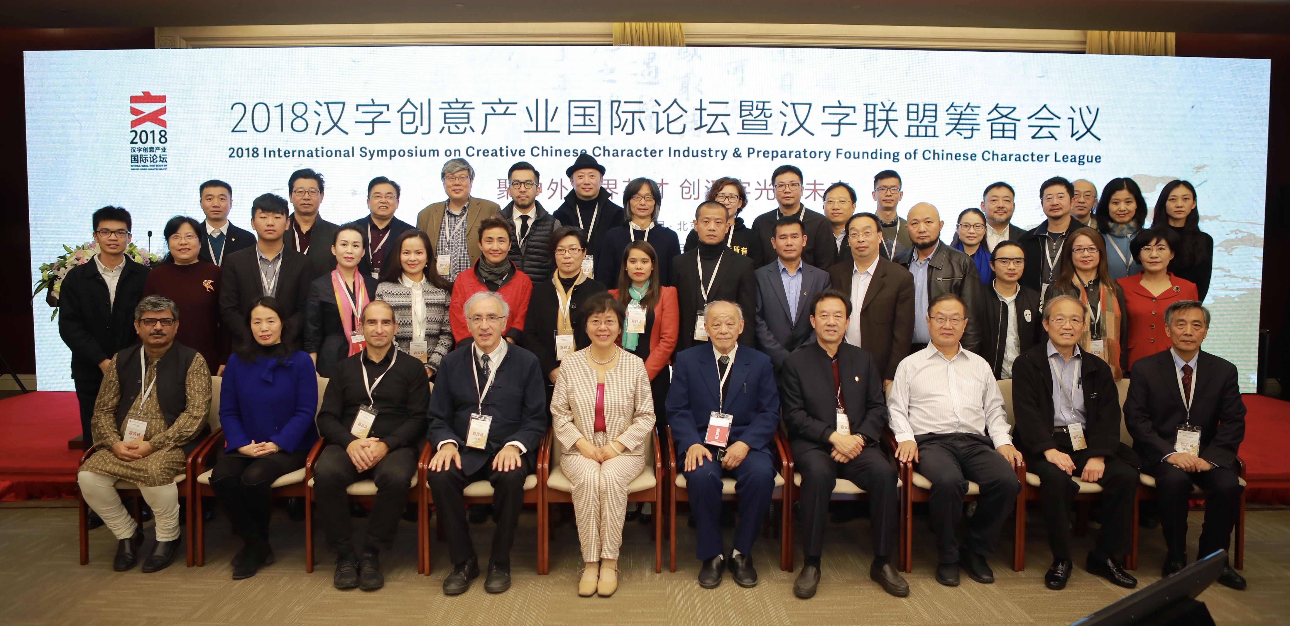
Group photo of the speakers and organisers of the Creative Chinese Character Industry Symposium
The inaugural symposium of the Creative Chinese Character Industry took place at the Beijing Convention Center on 3 and 4 November. The symposium brought together speakers from different areas of research and professional practice relating to the Chinese script: linguistics, Sinology, typeface design, publishing, and calligraphy. The symposium concluded with the preparatory work for the founding of the Chinese Character League, an interdisciplinary body bringing together organisations and agencies, including the Chinese Character Museum in Anyang.
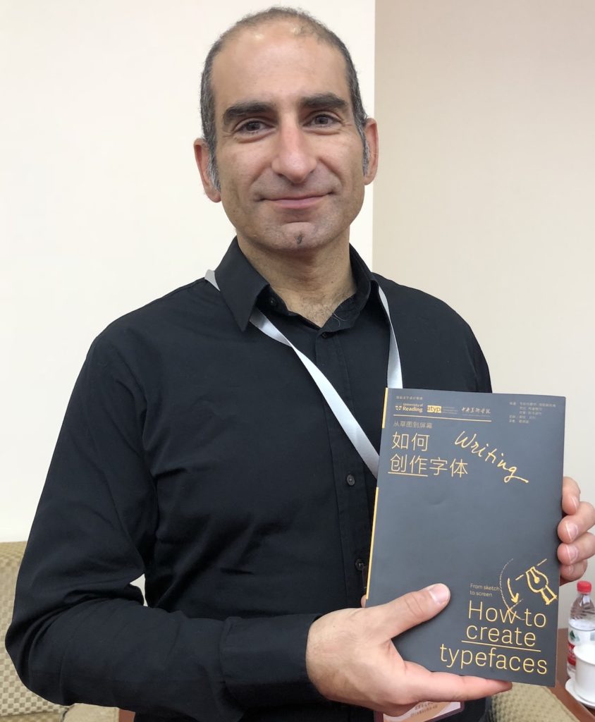
In addition to speaking at the Symposium and being invited to act as guide for the CCL, Gerry Leonidas had the opportunity to update plans for a project, supported by the University of Reading and ATypI, of publishing key typography texts in Chinese. The first title in the series, Jan Middendorp’s Shaping Text, is nearly out of print already; below, Gerry holds the proof edition of the second title, How to create typefaces by Cristobal Henestrosa, Laura Meseguer, and José Scaglione. The series extends to twelve titles, with a schedule of publishing two titles per year.
Gerry Leonidas holds the proof copy of How to create typefaces