On Tuesday 26 November, Craig and Tomoko of TDL Creative ran a workshop to kickstart Part 1 students’ visual exploration for the module Information Design 1. In this module, students address graphic design and user-centred design through the development of pictorial user instructions. In addition to exploring a range of graphic styles, students reflect on what users of instructions need to know, when, and how to explain things in way that supports understanding and action, through combined pictures and text.
Craig and Tomoko are both alumni of the Department of Typography & Graphic Communication and have both won international awards. As part of TDL Creative, they have contributed to expanding the studio’s offering, always with a strong focus on clear communication and human-centric design.
Craig and Tomoko shared their experience using diagrams and icons to build clear communications and simplify complex technical documents across a range of markets and subject areas. Their real-world experience electrified the classroom, and their fun games worked wonders in letting loose and drawing some icons!
‘Craig and Tomoko’s presentation has, no doubt, helped connect the dots up for our Pt1’s for their Information Design module. More importantly, it gives them a ‘real world’ perspective at the start of their journey here – a sense of where the course can take them!’
Fred’s remarkable journey as a global wayfinding designer began with his impressive work experiences at major events like the Commonwealth Games and the World Cup in Qatar.
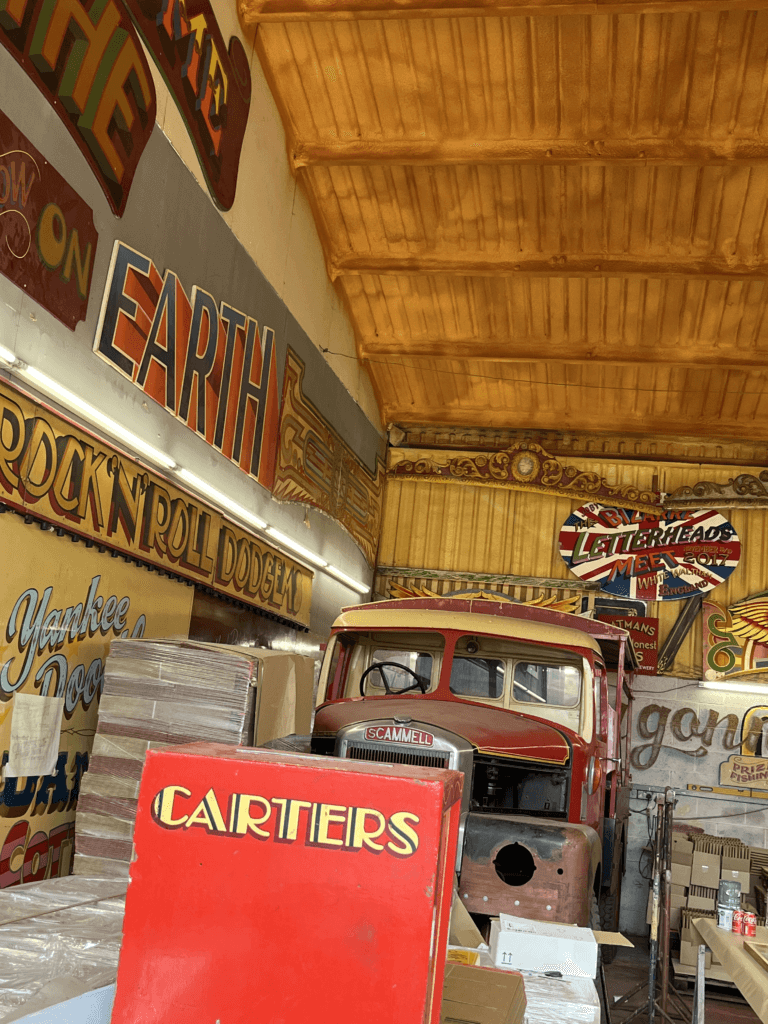
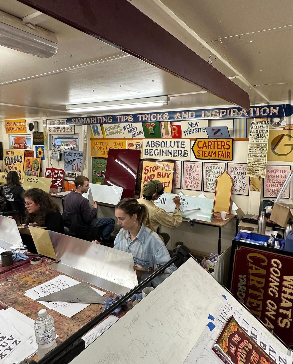
Joby is a signwriter and fairground artist who owns the famous ‘Carter’s Steam Fair’ fairground, which is the largest vintage travelling funfair in the world. Years of experience has led to Joby being one of the world’s leading experts on signwriting, fancy lettering and fairground art. I met Joby during a trip to his workshop for a project and was fascinated by his work, having never been exposed to the world of signwriting before. The precision and artistic skills that Joby possessed to have the ability to create such intricate lettering was amazing to me.
The course
I was lucky enough to receive the opportunity to take part in Joby’s 5 day intensive signwriting course this autumn. This was as a result of coming second place in his contest last year with my fairground-inspired logo redesign for Odeon. The Department offered me a place on his course as a prize using the Typography Student Fund. The course ran from 9am–5pm on Monday through to Friday, giving me 40 hours of teaching and learning with Joby.
Day 1
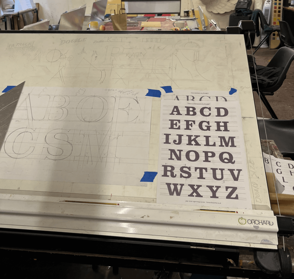
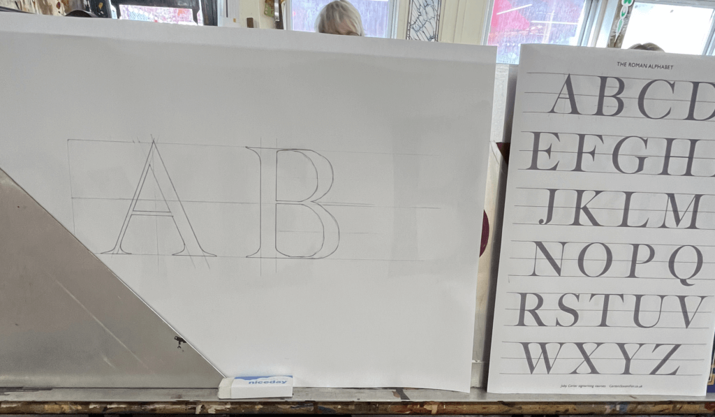
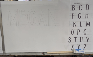
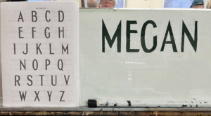
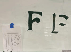
On the first day, we were introduced to the anatomy of roman lettering and the reasoning behind the thin and thick strokes, which mimic the way the brush strokes when painting the letters. We practised precisely drawing letters, copying them from Joby’s examples but accurately measuring each length and angle and scaling them to a bigger size that would be easier to draw at. Having had lots of previous experience in typography from the Department at University, I enjoyed how well I understood the different structures of the letters. We looked at some different typefaces that signwriters commonly use, and again practised drawing these accurately. There was no painting involved on this day as it was all about nailing the shapes of the letters.
Day 2
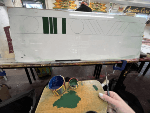
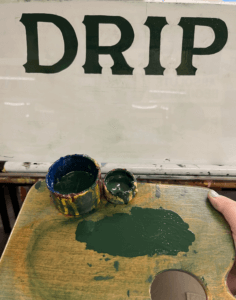
On day 2 we got the paint brushes out. Joby showed us how to prep the brushes and the paint, and the proper way to look after your brushes. We each received a brush, a palette, some dipping pots and a mahl stick. We were shown the specific way to hold the palette in your left hand in addition to the mahl stick, which is used to stabilise your right hand while holding the paint brush. This ensures smooth, straight brush strokes and acts against shaky hands. To begin with, we practised painting rectangles in order to learn to control the brush. Once gaining some confidence, we tried rectangles at a 45 degree angle, and then moved on to circles. Joby showed us the technique of twisting the brush at the start and end of the stroke to get a sharp edge, which seemed difficult at first, but practicing over and over again helped to improve technique. Methods like these are included in Joby’s book ‘Signwriting tips, tricks and inspiration’ which I found really useful to follow. Joby got us to use white spirit to wipe the paint off after each try so that we could reuse the boards over and over again. I then practised drawing out some different fonts, and wrote my name in the Switchback style, which I then transferred onto my board by rubbing charcoal on the back and then drawing over the letters again against the di-bond in order to create a trace of my sketch with the charcoal. I used the same green paint we had been practising with to paint within the lines of the letters as we were asked to use this paint up until the final day when we started our own signs due to the fact that it had a long drying time so that it could be more easily wiped off the practice boards.
Day 3
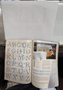
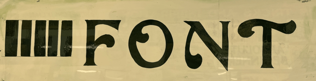
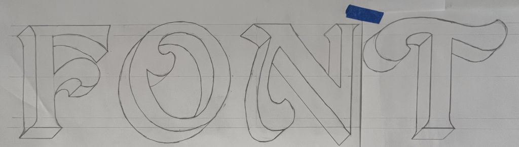
The third day was similar to day 2, and started out consisting of a combination of painting shapes again and sketching out letters. Joby really wanted us to nail letter structure and brush stroke technique before we got stuck into painting letters. One particular style of lettering caught my eye from a sign of Joby’s in the room we were working – it had beautiful curved letters and flourishes. I asked Joby where I could find this font and he revealed that it was a new one he had designed in his new book ‘All the fonts of the fair‘ called Curveside Nouveau. I borrowed a copy of his book so that I was able to analyse and copy the lettering, scaling it up to a bigger size. I once again transferred my drawings on to the di-bond and carefully painted letters to make the word ‘Font’. This combination of letters allowed me to practise drawing different angled letters with variations of flourishes on each one. I painted some other fonts from Joby’s book and found it interesting how many factors influence the appearance of a font and create a different route for your paint brush.
Day 4
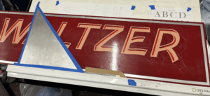
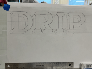
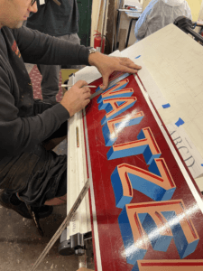
Today, Joby taught us how to create a block to make a letter appear three-dimensional. This technique is often used by traditional signwriters to emphasise letters. Joby’s method allowed us to get the block drawn on accurately without fail. All that was needed was a piece of cardboard cut into the desired width of the block shape, and then with a 45 degree angle cut from corner to corner on one end to the other. This angle is then used to draw a straight line from each point of the face of the letter to create the effect that it has been extended outwards. The block is usually set to the left of the letter as this is often easier than having to block the curves that are often on the right side of the letter, but it comes down to a matter of preference. Joby demonstrated this to us by adding a block on the right hand side to his Waltzer sign. The E and the R are more complicated to do this way, rather than simply having to block their straight edges if it were to the left. This was a compositional choice that Joby decided on, due to the word Waltzer having more empty space on the right edge of the board.
I practised this method by adding blocks to all my previous letter sketches, it was interesting to see how the style of letter affected the shape of the block and influenced the overall appearance of the word.
I then practised painting the blocks after sketching them. Joby also showed us the effect of a stepped away block, which I did on the left T. This creates an extra outline around the letter face, which is easy to do, but creates the illusion of an extra effect.
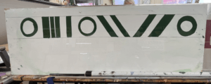
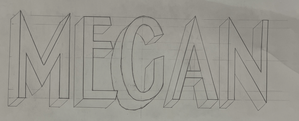
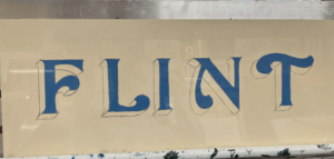
In the afternoon, I began to plan the final design for my sign. I had fallen in love with Joby’s Curveside Nouveau due to the beautiful brush strokes and shapes it created when painted. I found it to be a very fun yet elegant typeface, and I enjoyed painting the subtle curves more than painting rigid letterforms. I originally wanted to paint the name of my village, which is a nine letter word. But for the size of di-bond we were given at 62x25cm, this would be too challenging to fit in. I attempted to condense the font, but due to the thickness of the strokes it was still impossible to be able to paint it at a big enough size. I decided instead to paint my house name, as it was only 5 letters and I would be able to spend more time perfecting and adding blocks and shading. To save time, I used some of the letters that I had already sketched out, drew the additional ones I needed and then cut and taped them together, adjusting the negative space between each letter to create a balanced layout. Here is where a lot of what I learnt about typography at University helped me with my layout choices. Having an L and an I next to one another means that there is a lot of negative space between the letters, so moving these closer together creates the overall illusion that the letters are evenly spaced.
Day 5
On Friday morning, Joby showed us how to add a shadow to a letter. This helps to bring a letter to life and make it stand out from the background. This was more complicated than adding a block and took time to understand Joby’s demonstration. But I had a go at adding a shadow to some of my previous sketches.
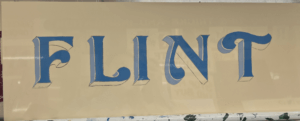
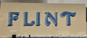
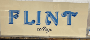
I then started to paint my sign, picking out some shades of blue, that wouldn’t take too long to dry so that I could add layers of block and shading. I started with the face of the letter, then added a stepped back block in a lighter shade of blue for the vertical sections of the block. Once this was dry I used a darker French blue for the horizontal blocks which would be more in shadow. I also added some shading using this blue, to fade some lighter sections into darker parts. Finally, I added some decorative curls within the flourishes of each letter. I then decided to add in the word ‘Cottage’ in a small script copied from Joby’s book, underneath the main word. I painted this in the darkest blue which I used for the flourish curls, to tie everything in together. The script font was difficult to paint as the strokes were so thin, I used a smaller brush to help achieve more accuracy.
If I had had more time, I would have liked to try adding a shadow. However, Joby told me that it was more difficult for signwriters to add a shadow in addition to a block that is stepped back, so this would have been challenging for me. In future I would like to experiment with more bold colour combinations, although I liked the elegance of my blue sign.
Reflection
I thoroughly enjoyed Joby’s course from start to finish and feel as though I learnt a great deal about the world of signwriting and the extensive process involved. Having background knowledge on typography from studying Graphic Communication was a huge help in my understanding of letter anatomy and dealing with spacing. But the process of hand drawing and painting letters has taken my typographic understanding to a whole new level. The act of using a brush to create the curves and the thin and thick strokes of a letter reveals why letters are shaped the way they are, and how they have evolved from the Roman alphabet.
I wish to continue practicing signwriting and the potentially utilise it in a future career. It has become a dying craft since the emergence of graphic design but is a highly skilled and fascinating trade that should be continued and passed down to future generations in order for it to be kept alive. I am so grateful to have been taught by Joby Carter, a highly respected and experienced signwriter who’s passion for the art of hand-painting letters is clear to see. I also want to thank the University and the Typography Student Fund for allowing me to have had this wonderful opportunity that I will forever cherish.
The highly esteemed Japanese design magazine IDEA dedicated an issue to the career of Toshi Omagari with the theme “Typeface design for the voice of the world: The Works of Toshi Omagari”. Toshi graduated with Distinction from the MA Typeface Design in 2010–11, and went on to work for several years for Monotype. More recently he set up his own foundry, and is now also a visiting teacher in the Department.
Toshi’s work spans both original work and revivals, and extends to numerous scripts: he is particularly notable for his work in Asian scripts for which there has not been extensive coverage in digital typefaces. He is also the author of Arcade Game Typography, the definitive book on arcade game pixel fonts, as well as numerous plugins to support font development. His teaching in our Masters spans workflows, design feedback, and approaches to global script design.
Interested in the MA Communication Design? Join us at our Open Morning and discover our 4 pathways. Visit the Department of Typography & Graphic Communication, chat with lecturers and current students, and get advice about how to apply.
Date: Tuesday 25 April 2023, 11am to 1:30pm (BST)
Where: Department of Typography & Graphic Communication, Whiteknights Campus, University of Reading
After a welcome from Dr Ruth Blacksell, Department Director of Postgraduate Taught Programmes, a presentation about the MA Communication Design will focus on our 4 pathway routes: Book Design, Information Design, Graphic Design, Typeface Design. This will be followed by a walk around the Department and a look into the studios. In a Show and Tell session, you will get a glimpse of our special collections. We will close the morning with a tour around our current Department exhibition.
Amrita Shrilal has been involved in an exciting new collaboration with Bottomline Technologies this past year. Amrita is one of our MA Communication Design Graphic Design Pathway students graduating this week. She’s also a BA Graphic Communication (Hons) alumnus.
Bottomline focuses on transforming complex business payments and processes into simple, smart, and secure systems. They work with financial companies and institutions globally, and are widely recognised as a payment and collections enterprise. They have banking relations with global banks, UK banks and, building societies, growth banks and payment service providers.
Amrita Shrilal (MACD class of 2021)
Amrita has a particular passion for user interface design. To develop experience in user interface design for the financial sector, she undertook a design brief for Bottomline’s Head of UX Design (EMEA), Kellie White and, Senior UX Designer and Reading alum, Matthew Standage for her MA professional practice assignment. Dr Jeanne-Louise Moys, MACD Graphic Design and Information Design Pathway lead, supervised her project.
The brief gave Amrita the opportunity to explore approaches to designing a system that allows customers of different-sized businesses to customise the interface design, of a particular product, to match their brand needs. The challenging aspect of the brief was creating a seamless and easy process of designing elements of pages for customers with different levels of expertise on brand and webpage design. It required her to consider ways of presenting complex information and processes in a more straightforward method for end-users. Her design decisions were supported by her research into UX design, market competitors and the development of personas which helped her understand the user and business needs.
Amrita said: “I enjoyed this project as it was different from all the other UX projects I had done in the bachelor programme. It focused on Business-to-Business (B2B) rather than Business-to-Customers (B2C) which is more complex as you need to consider not just the user’s goals but different types of business capabilities and interests. I had to think about how a particular organisation could utilise or benefit from the features of the system to make their process of designing the web interface a seamless experience.”
The outcome of this project was a prototype of an interface system that allows businesses to brand themselves within Bottomline’s products. It considers different user design needs and attempts to make the process of designing interfaces straightforward to those who are not familiar with design conventions or terminology. Some of the features within the system included editing the colour scheme, text styles and button styles.
Process of uploading the brand logo and ability to view the placement of these elements in different pages.
Reflecting on the project, Amrita said: “the project was a stimulating experience as I had to think about different user perceptions of design elements. I had to constantly ask myself whether it would be easily understood by someone without any design experience. Despite that, I enjoyed the opportunity to collaborate with Bottomline on an ongoing project and it helped develop my understanding of UX/UI design”.
Kellie White said: “Amrita did a fantastic job of taking a complex problem and making it simple, a difficult task to accomplish. She worked well to align to good UX process throughout, from research through to ideation and user testing. I was thrilled with the outcome, she achieved a well thought out design solution and growth in her UX skillset through the experience. Well done Amrita! We look forward to future collaboration with the Department.”
Matthew Standage added: “It was a pleasure to collaborate with Amrita and the Department on a professional practice brief. We were not only impressed with the overall quality of the outcome, but also the thorough research and design thinking that went into the process. One of the common challenges in B2B user-experience is striking the balance between complexity and flexibility. The work Amrita produced solves this problem well, using both visual and interaction design techniques to progressively disclose more advanced options to the user and provide guidance when necessary. We look forward to seeing how we can integrate her work and thinking into future product releases.”
This project is the first collaboration between Bottomline and the Department of Typography & Communication. We look forward to exploring new briefs with them for our postgraduate students to work on in the future.
We also look forward to welcoming Matthew back in January for the two-day “Branding and user experience” workshop that he leads for our MA Graphic Design and Information Design pathway students in the spring term.
In week 10 Baseline Shift welcomed back some graduates from the department who talked to us about their journey after graduation and current positions. Lined up we had book designer and art director Nikki Ellis, award-winning designer Anne Brady and 3D and 2D motion designer – Ed Hendry.
Nikki Ellis
‘It was fascinating and challenging, the books I worked on were varied.’ – Nikki Ellis
Nikki Ellis graduated in 2007 from a four year undergraduate master MDes course which was then offered by the department. When she graduated Nikki also managed to get a job as a result of the degree show at the end of her fourth year. ! The company was called Quadrille and it was a small publishing company which worked on books on food and drinks. She worked in Quadrille as a senior designer for 13 years. Nikki started as a design assistant, learning the ropes of book design in style sheets and layout. She designed cookbooks which she says were remarkably ‘challenging’ but interesting in their specific typography and text hierarchy. Nikki shared with us a few fantastic examples.
Chinese cooking book menu by Jeremy Pan, designed by Nikki.
This is a Chinese cooking book menu by Jeremy Pank; he wanted to make Chinese cooking accessible for everybody. There were lots of bullet points used in this book and icons, as the example above shows.
Another example of Nikki’s design of a cook book that included little art designs.
Another example was a book called ‘Porridge’, which allowed Nikki to experience being part of the photo shoot and also help out with it, which in her words was ‘amazing!’ Annie, the author of the book, wanted to have her book include her ‘art’, in the form of the porridge bowls she created like the one shown in the example above.
Niki’s experience in designing cookbooks made her better at typography, layout and page formatting, and the examples she brought in show her ambition in these aspects of design.
Nikki encourages designers not to force themselves to work within a set of rules and constraints but to have their creativity and ambitions go beyond limits and discover what their work without regulations and restrictions could be. An example of a principle Nikki uses within her work in designing books is making use of the colour black for fonts. Nikki also discussed another example: the line length in the text, which she tries to limit to no more than 13 words across, to suit comfortable reading. Some other things she looks out for are running feet, folios, subheadings, etc.
A Cook Book designed by Nikki.
However, Nikki has to comply with some rules, as the cookbooks are almost always distributed internationally, so there is a need to design in a way that is suitable for translation, and thus for different text extents.
Nikki’s main challenge when designing cookbooks is how to arrange content (images, recipe, commentary, notes) to create balance on the page to make it a user friendly reading experience.
One of Nikki’s examples of tight text, due to the big amount of bullet points or ingredients in text.
Space can be used to both separate and connect elements in a design, Nikki explained. Wider spaces separate elements from each other and narrower spaces connect elements to reveal relationships between them. The meaning of space is more critical than some consistent lining up for the sake of rigidity. Nikki has a stage for starting points, as in headings and subtitles but does not like to have a sense of constraint in her work. Therefore this is why she makes her own set of rules when designing a master page layout.
Cover of a cookbook (debossed title) – designed by Nikki.
‘Textured materiality.’ – Nikki Eliss
Cover design is also part of Nikki’s work. The example below shows a textured book cover with a background of a debossed grey rusty grain that Nikki designed, creating a debossed finish in the title.
These are some of the examples she showed in the session …
Anne Brady
‘I took a slightly different approach from Nikki.’ – Anne Brady
Anne graduated from the department in 1994, describing her experience at Reading as invaluable. Throughout her career, there have been a lot of changes in the design world and she says she has been trying to blend and merge her work into the digital world and has become much more interested in the dynamics of what digital delivery allows. Still, she says it was a great privilege to come from the printing background of the letterpress studios in Reading and understanding how typography (and technology) have developed over the last thousand years gave her a great headstart in her career.
Hired at the degree show by a studio called Jeffrey Design which only employed graduates of Typography and Graphic Communication, she considered herself ‘very lucky’ . She also said she learned and experienced the outside world of graphics through the Real Jobs she completed while at the department. Therefore, Anne suggested it is essential for us all to put ourselves into opportunities and collaborate in real work experiences while overcoming the challenges that will stop us achieving.
Through the studio she worked on a job at Cambridge University, with her boss back then – Sally. They designed the press sheet for ‘Cyclopedia Cambridge’. ‘It’s hard to imagine’, as Anne explained, ‘it was a 4000-page book which was separated into a series of editions.’ ‘It was an excellent piece of typographic design.’
After working with Sally for a few years, Anne was moved on to a job at the Museum of London, designing all of the marketing material including all of their publications and sometimes even organizing exhibitions. Her main task was to create exhibition designs and promote them. Anne enjoyed this experience and learnt a lot from the challenges.
‘As designers, we all have different skills.’ – Anne Brady
Anne returned to Dublin around 1998 and began working in a very corporate company – a design agency which worked on short films and TV shows. Anne was happy working there for about a year managing a team of 12 people. After that she decided to go solo and created her own design studio, called Vermillion, which is her focus to this day. It was hard at first when starting out but through the years she and her team started finding more and more clients and gaining their trust. Twenty-two years later, Anne’s team is still going strong, currently working on a chair exhibition for the National Museum of Ireland, working with the Department of foreign affairs and trade–designing lots of materials in 17 languages for 80 embassies around the world, which is fascinating. They are now also working on a book for the National Gallery of Ireland, which showcases all the paintings and artworks acquired by the Gallery over the last 15 years.
Photo of Anne’s team.
Anne shared this image (shown above) with us and with great pleasure and respect explained each person’s role in the team. Anne and her colleagues have worked as a team for ten years, creating a good collaboration, which is a very important aspect in the field of graphic communication. They are all different in terms of skills and abilities but working together makes a great team.
Anne’s ability was to always bring typography within a project but she also has some essential skills working with multimedia.
The National Library was one of their more significant clients as they have an incredible collection (National Library of Wales) Anne described the museum as one of the world’s leading museums of Islamic, Western and Eastern manuscripts.
Anne also talked about her experience in exhibition design. She shared with us that it is quite difficult to work with a living artist and design a cover for their exhibition. She and her team had an interesting experience when they put type on one of the artworks to create a poster for the exhibition and they had to design around 80 different variants of the poster before they got approved and published because a lot of Anne’s team’s designs were intruding too heavily with the artwork. As we all know, prototyping is always the key to success before launching. The National Gallery of Ireland was essential and one of the main clients they operated with, which made them have a good relationship with the studio.
The exhibition of the museum.
Anne’s team also worked on designing Dublin’s zoo map, as you can see in the image shown below. It was an exciting project the team worked on because most of the design decision were sensible, so they had to design the map and fix some of the icon errors.
These are examples of Anne’s team’s incredible work!
Dublin’s zoo map created by Anne and her team.
‘I have designed over 85 books for national and international publishing houses.’ – Anne Brady.
Ed Henry
Ed’ presentation was interesting since he has taken a very different, and more digital, career path. He now lives in Berlin and works as a senior motion designer at Delivery Hero. His work at the company mainly centres around creating motion designs and other types of promotion videos. However, what keeps Ed going is his obsession with music and 3D motion design. He has worked a lot with games and other animation projects for friends and colleagues who also work in the music industry. Ed shared his experiences and passion for his work and his motivations, which were astonishing to hear. The majority of Ed’s work in and out of his workplace is focused on 3D and motion design, including animations.
‘I found out that I could push myself to go into different directions.’ – Ed Hendry
Ed started his presentation explaining his experiences and flashbacks when he was at Reading University, which gave our students good ideas on how to use their time while studying.
Ed had the chance to go out and discover what drives his creativity and what pushes him out of his limits. One of his interests he discovered was motion design, which has a connection to 3D design. Motion design combines animation and motion typography and other types of fascinating video styles. After graduating, Ed managed to get an idea of what he likes and dislikes, which helped him get into the platform he is in.
Example of Ed’s work for a department project using 3D design.
Living in Berlin, Ed now works for an international company called Delivery Hero – one of the leading global online food delivery marketplaces. You can find more about them here: Delivery hero
Ed also had the opportunity to promote the company and design a new identity , using his skills and inspiration in 3D design and motion design.
Delivery Hero logo
‘This was a huge project that took me three months!’ Ed Hendry
As we all know, every project goes into our portfolio. This builds our recognition and progression from project to project.
However, unfortunately, it was not published by the his company due to technical problems. Still, Ed is very proud of his success in creating this type of motion design. The students learned a lot from his presentation including to even put work in their portfolios that did not get to be published. Certainly, this is for the sake of building your portfolio to show success ambition.
Ed is currently pushing his 3D work in slightly new directions, revisiting lettering, focusing on music and planning to get into VR sculpting!
These are some of Ed’s examples of 3D sculpting design.
Reflection
Nikki, Anne and Ed all inspire us to continue working and exploring what fascinates us – this will guide our way forwards! They suggested we all focus on building our social networks throughout our course, and seek internships and work experience wherever we can. We can also gain advantages by completing Real Jobs and getting a true insight into the industry of Graphic design, and especially client relationships.These things can empower us to develop a solid portfolio and be ready for full-time jobs.
Sometimes, students may not specifically know what interests them or what they want to do when they graduate, and that’s normal! If you have a dominant interest, you might aim to prototype your work project towards them during your experience on the course But it’s not expected that everyone recognises their destiny within the field. Research and explore, talk with our amazing tutors about your interests. By doing so, you will truly find your way.
Students’ Thoughts
‘Was really interesting to hear about different options for careers and the things past graduates have achieved!’ – Part 3 student
‘So many facets of design were covered, and it was so interesting to hear both the highs and lows of their projects. Just a nice reminder that even the big professionals have things go wrong sometimes!’ – Robin, Part 3 student
‘I really enjoyed learning about the guest speakers work and some of it was really inspiring.’ – Adam Powell, part 1 student
In spring term, our MA Communication Design students on the Information Design and Graphic Design pathways have the opportunity to undertake a wayfinding project, as one of their project choices. We usually collaborate with partners in the Reading community (for example, last year we collaborated with The Hexagon) and arrange visits to local sites. The pandemic provided an opportunity to develop new resources for teaching this project.
Wayfinding briefs provide great opportunities for strategic and creative user-centred design. Students have to consider how visual design supports decision-making and user experience of environments, as well as consider the needs and expectations of different users and stakeholders. They also require students to explore the interplay between functional problem-solving and cultural relevance and how branding and identity systems might need to work across a range of different materials and surfaces.
Wayfinding designer, and Reading alum, Joan Zalacain (http://www.zalacain.com/) leads this project. Joan says: “The importance of user-centred design is crucial to wayfinding but we also need systems that are appealing and sit harmoniously within their environment. We strive to convey this to our students as wayfinding is a growing area of international practice and our graduates need to be ready to deliver their best.”
This year, factoring in the impact of Covid-19 restrictions on mobility, we developed a new brief to ensure students did not need to conduct any site visits to undertake the project. Joan worked with architect Maciej Kozak to develop maps and models that students could work with. In professional wayfinding practice, buildings are often at the planning or development stage, so it’s realistic for wayfinding designers to work with these kinds of resources.
This year’s brief envisaged a new community arts centre for Reading. Students worked on either an indoor or an outdoor wayfinding proposal for the centre.
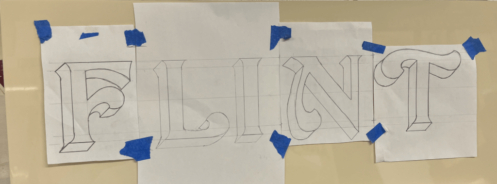
Mohammed Alhadab created this photographic mockup of his proposed design for an outdoor wayfinding system.
Information Design Pathway student, Fred Pena came to Reading because of his particular interest in wayfinding. He said: “The wayfinding project is a good opportunity to work on different aspects of design. Having to think about strategy, information architecture, user interaction, typography, and the development and application of physical objects in a three-dimensional environment really makes it a challenging endeavour. It’s about more than just making signage, but developing a whole system that has to be functional and visually engaging.”
An extract from Fred’s wayfinding project showing specification of typographic elements within his indoor sign system.
Siobhan Bailey (Graphic Design Pathway and returning alum from our BA programme) said: “I really enjoyed the wayfinding project as it was a completely new area of Graphic Communication that I was not able to study at undergraduate level. Coming from an art and psychology background before graphics, it was a perfect mix of the two and required a high level of critical thinking to meet user needs and solve problems. The skills I have learned throughout this project will be essential for me in terms of wanting to head into the exhibition design, events or wayfinding sectors, and in general for careers which require strategic thinking and initiative. Joan’s passion for wayfinding and user centred design really inspired me and he pushed me to achieve my absolute best at every step of submission.”
Siobhan’s synthesis of the wayfinding strategy and user journey to explain user interaction and touchpoints within the museum. This diagram demonstrates at what moment information is presented to the user and how this effects user experience.
The project also includes a range of inspiring contributions from professional designers and agencies who are part of the Department’s professional network. Thank you to May Chiang from Applied Wayfinding (London), Hayley Branston and Elena McLoughlin from Maynard (London), Anita Meier from Moniteurs (Berlin) who shared their professional insights and Reading PhD graduate, Dr Andrew McIlwraith who shared his expertise on mapping.
Evgenia Vrentzou (Graphic Design Pathway) said: “Through the wayfinding project I learnt to have a more inclusive thinking by considering both the needs of people and the parameters of environment, in order to make an effective, creative and functional system. All the talks during the spring term were very inspiring and we gained important knowledge on how to develop our projects. Wayfinding combines both creativity and strategic thinking and is a part of design that I would like to emphasise even more in the future.”
This diagram shows Evgenia Vrentzou’s proposed sign family.
Evgenia also chose to explore wayfinding for her professional practice assignment. In this self-directed project, she designed a new wayfinding system for the coastal city of Heraklion. Her project built on the findings from participant studies she conducted to understand people’s mental maps of the area – a great example of how we incorporate user research into practical projects at Reading.
In his professional practice assignment, Fred extended his experience of wayfinding to consider a journey-planning app that responded to new considerations arising during the pandemic. His wellbeing and urban mobility app – Let’s Walk – focused on supporting people, who might have anxiety about going out during the pandemic but also need to get regular exercise, to identify appropriate places and routes to achieve their goals.
The wayfinding project is open to students on the MA Communication Design Graphic Design and Information Design pathways and MA Creative Enterprise Communication Design pathway. We look forward to running this successful project again with our new cohort in spring 2022.
When we asked for volunteers to come and talk to our students about careers, we got quite a response. 17 generous friends and alumni stepped up to offer interviews and portfolio reviews. Robin Smith has a write-up (with a long list of credits) …