Author: Robin Smith

IAWADBD: issue 3 zine

Background

This real job was slightly different than most real jobs. Rather than getting a client brief, we make an ‘I am we are… different by design’ zine, and have done every year since 2017. This zine showcases diversity and inclusion projects from students in the School of Arts and Communication Design and from other significant people in the industry. As students, we go through the entire process of planning, interviewing, writing, and designing. This year, Liselot van Veen and Labiba Haque were team leaders, while Robin Smith and a few third year students had a more general role. Our zine secured the funding to have more copies printed and to be longer (48 pages versus 32), which meant there was more to plan and oversee.

Research

The next stage of the project was to generate some featured article ideas. Our team dedicated one or two meetings to this but, despite the lengthy discussion, it proved difficult.

This issue was longer than the previous two publications. This meant we faced generating more ideas but under the same time crunch. The difficulty also came with thinking of subjects within diversity or projects to discuss that were of enough substance. As well as this, a lot of the ideas had to come from the three of us as a number of the team faced scheduling conflicts and frequently found attending meetings difficult, so this stage took more time than usual. We also were unaware of projects being produced by Film & Theatre students and so had to undertake extra communication tasks to find out. Though ultimately, this hard work paid off as we formed an interesting gamut of topics to discuss.

To start then organising our ideas, we formed a colour-coded document:

Still image of our initial article ideas, taken from our shared Google Doc

The aim was to group articles based on their subject matters for a cohesive reading experience. This was seemingly an effective system as, once shared around the team, everyone was on the same page and knew what was to be included.

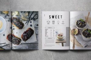
Focusing on visual research, we collated idyllic examples on a Pinterest board of other existing spread designs. When making a publication as personal as this, it proved crucial in order to see what was possible and how we can get that emotion and feeling across.

Interviewing and producing articles

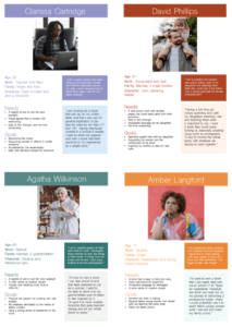
We distributed the work fairly among the team. Everyone was assigned with at least two articles to write up. Many of the pieces involved interviews and showcasing the works of others. Therefore, it was essential to follow ethics procedures before conducting interviews. The procedure involved reworking interview questions for review and approval from Jeanne-Louise. After the initial contact, all communications with participants were only to occur through our university email addresses and sent out individually for privacy and data protection. We emailed out specific documents alongside the interview questions to gain informed consent from the participants. Also emailing Victoria the appropriate forms filled out by both interviewers and interviewees as records of participation. Having collected the interview responses, we wrote the articles, sending them to Jeanne-Louise for feedback and worked on correcting them until they could be approved. 

The lengthiest part of the whole process entailed liaising between these various individuals and waiting for responses. However, this was vital in producing quality content at high standards while ensuring everything was ethically and legally secure.

Labiba wrote a think-piece in the zine about decolonising design. Initially, she planned to write about what it was and look into parallels present in Film, Theatre and Television, and Art. However, we did not sufficiently comprehend issues in those disciplines to write about them effectively. Focusing purely on design, she redrafted a more personal response as a designer on this course. As the zine’s purpose is to encourage and highlight diversity in the field, Labiba instead emphasised current issues that we have observed and suggested solutions based on the readings recommended in her article. Unlike academic pieces, writing for editorial purposes encouraged us to consider the audience more and deliver an easy read. Writing the articles enabled us to practice and improve word economy, offering more engaging, impactful and relevant pieces.

Designing

Liselot produced a template with grids to provide guidance for the team’s spread designs as we were making them separately. Though each article was individualised and had a different look and theme – as they should with subjects of this nature as to be personalised to the issue – the zine still needed to be consistent. Having the same grids across each spread meant, though different, they appeared still to belong to the same publication. The template was also useful for a member of our team, Khadjia, who joined from the Art department. She was unfamiliar with InDesign so having a template meant it was easier for her to learn, but also easier for us as typographers to make any fine adjustments later.

Paired with our previous grouping document, we produced a visual pagination to better see the balance of articles.

The pagination for issue 3 – colour-coded to show the balance of the grouping of articles under their umbrella topic

Utilising colour-coding again, we were able to see whether an appropriate amount of pages were dedicated to each group now that we knew how many spreads were required for each article. We ended up with a number of articles being of empowering marginalised groups but, given issue three was being published around the time of BLM and the horrific murder of George Floyd, this was not deemed a problem.

The process by which the spreads were designed was similar to module projects; produce a design, send for feedback, reiterate, and so on. 

The main consideration we had taken from previous years was to rename the paragraph styles to be specific to each article. When collating issues one and two, there was the time-consuming task of resolving the overriding that occurred from multiple files being joined together but InDesign confusing separate styles with the same naming conventions. Whilst significantly better this year as, with the scheduling conflicts of the same team members meaning they also were unable to find time to design their articles, we had fewer people designing and thus less room for error. There were still some difficulties as some had grouped their styles into a folder under their name which, when collated, provided the same issue of overriding. But this did not take as much time to resolve as before. So, if designing issue 4 as a physical zine again, it should be emphasised even more.

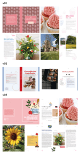
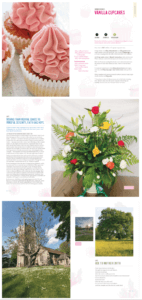
Below is an insight into the design process for the spreads we designed: how it started (left) versus how it was when it was printed (right).

‘Ok… you’re letting the grid control the size and placement of the image … think about how the image can be placed so that some of it is in the margin (rather than constrained by the column size) and this will make the layout seem less blocky.’
–Jeanne-Louise Moyes, supervisor, giving feedback on a version of the Toshi Omagari spread design


Collating and copy editing 

The three of us were left with the job of collating the entire zine during the summer after the third years had finished their final year. Luckily, Liselot had undertaken this entire job last year as well with Jeanne-Louise so she knew what we should keep standardised throughout the design process to make this part easier. With the knowledge from before, we were able to spread the workload between us while we were on a Teams call, and had a checklist to go through.

Unfortunately, there were still a few unexpected things that threw us off and made the process longer. There were a few spreads that had been made last minute and were claimed to be finished without the correct sign off. This meant that the design process fully moved into the producing stage. While we did expect this to happen in some way while we were going through the spreads to standardise them, we did not expect to design whole new spreads. This taught us that no matter how much planning, explaining, and chasing you do, the process will not always be correctly followed. We ended up trying to finish these spreads, but they still seem to be lacking something. Luckily, there are more good spreads that overshadow these less successful ones. 

After the three of us were done editing all the spreads, Liselot turned the individual InDesign files into an InDesign book since she also had experience doing this from last year. Although this would have been a great skill for others to learn, our deadline was coming up fast. After this stage, the editing continued when Rachel and Jeanne-Louise found some inconsistencies we had missed. Then the edits were to make sure the file was press-ready. While the design stage took quite some time, the editing stage was the one that was the most stressful, but the one that we learned the most from. We were able to find out what does and does not work based on the designs of other people and how they interact with each other. 

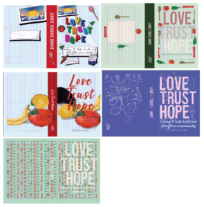
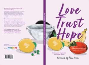
The cover was yet another thing that had to be made last minute, although it did still go through multiple developments. At first, many people in the team wanted to design the cover. However, after a team member had been allocated, seemingly nothing came of it. Realising that the deadline was coming up and there was no work, we had a meeting between us to generate some potential back-up ideas. Following this, Liselot took it upon herself to make a cover that could be used if the original stayed uncompleted. Everybody in the team seemed to like the back-up concept (basing it on protest signs as to relate back to the heavy focus on marginalised groups) which led to further development into the finished cover you can find on the zine today. This incident was a case of occasionally needing to ‘jump-in’ despite a colleague being allocated the role to make sure the final product is finalised in time, and is something the team can be proud of.

COVID-19 issues

In previous years, we booked a room in the department spanning over a few days dedicated to zine production. COVID-19 introduced a new challenge: physically preventing face-to-face meetings, thus forcing us to work remotely from our homes. Suddenly, the process became more individualised as teamworking was difficult in this environment and production ‘days’ turned into ‘weeks’. Therefore, our communication and time management suffered while everyone was adjusting to the new ‘normal’.

We lost the benefits of quick communication. The ethics approval process, and giving and receiving feedback on our spreads took much longer. Instead working in a studio environment, we were all directly emailing our pieces back-and-forth with Jeanne-Louise. All work had to be uploaded to our shared Google Drive to see others’ progress or receive any feedback from the team. We resorted to using Messenger for informal feedback, gaining faster responses from each other in order to replicate that studio environment as best as possible.

Following delivery from the press, we found the body text looked slightly large for the format. Although the size was forgivable, being unable to print and proof while designing stressed its importance. The disruptions in postal services, caused by the pandemic, further delayed the delivery of zines and gratitude notes to our participants. The result of this was email responses thanking participants for their patience with PDF versions of their spreads for the time being. In the end, all participants received their physical copies and were very positive about their experiences being interviewed by us.

‘Thank you for sending me a physical copy of the diversity zine – I thought it was exceptionally presented and a really interesting and insightful read.’ – Lizzie Moran, interviewee from MA Creative Enterprise (film pathway)


Reflection

After being part of last year’s zine, we expected the process to go more efficiently with improvements. We had noted where things went wrong and made it clear how we could improve those aspects. However, the world threw an unexpected turn, where we all had to work remotely and individually. This brought a whole new area of issues. Although stressful during the moment it is happening, this is where we learned the most. 

We produced a quality zine with engaging content and aesthetics. It is impressive that we successfully handled the challenge of managing a team and delivered a complete zine remotely. Acknowledging the current predicament, we realised transferring to an online platform would be best. Thus, plans for a monthly blog with promotional social media posts are currently underway for 2021/22.

@uortypography: the student-led Instagram account

Background

The student-led Instagram has been operational since 2018 when a group of students rightfully decided that it would be a great tool to promote the work that goes on in our department. I joined the team in the spring term of my first year with my responsibilities increasing until, this year, it was my turn to lead the team. This job involves posting on the account for the duration of the year, covering the ongoings of the department anywhere from projects to events.

In addition to the focus of promotion previously, this year it was decidedly more of a recruitment and networking strategy. We wanted to showcase more the work that prospective students could anticipate, as well as giving more of a focus on the ‘who’ and not the ‘what’ of the student work we posted.

Learning from previous years

Two years of experience gave an opportunity to look at what strategies were undertaken prior and assess their effectiveness.

As written about previously, Sophia discussed the branding of yellow featuring in posts to represent our vibrant front doors. 

Screenshots of the account featuring some yellow – but not enough that it appears as a ‘brand’ choice across the whole feed

Though a nice idea, in practice this detail was perhaps too subtle when looking at the earlier feed. It was also quite limiting in what was ‘fitting’ to post. Therefore, this year we decided to ditch this approach and aim for engagement through a vibrant, multi-coloured approach. When posts were being created by those outside of our team who would not have been briefed on the yellow branding, this was seemingly a more appropriate solution.

Summer preparation

Knowing that both I and my team had busy years ahead, I felt doing the bulk of the preparation that was able to be done in the summer would reduce time strain later.

To improve on the lack of clarity of individual responsibilities in previous years, I created a rota for each regular task outside of the ongoing role of keeping tabs on upcoming deadlines and events. This is definitely something I recommend the team take on next year as it made planning time around this job much easier, ensured all jobs were covered each month, and allowed fairness of task distribution. However, creating a rota for each term would probably be a better solution than making it in the summer as done this year. Changes of availability and circumstance meant the annual rota needed to change more frequently. In theory, a shorter time scale would allow for better accuracy and reduce need for change.

Once it was finalised which ‘types’ of posts would be a regular feature on the account, we set out to make post templates. Previously, all posts would seemingly be stand-alone if looked at from the feed and the user would be required to read the caption for context. However, we decided Baseline Shift events and announcements of open/portfolio days would benefit from being easily distinguishable – but in different ways.

Rejected regular post template layouts – most being deemed unsuccessful based on colour choices
Chosen template designs as decided amongst the team

Open and portfolio days feature large text so this can be read from the thumbnails, in the scenario that a user wants to find it quickly to see timings, for example. However, with Baseline Shift, the guest speakers’ work would be the main feature rather than our branding. Thus, using brand guidelines from the Baseline Shift team, I created this more understated ‘label’ that means it is still clear on the feed, but not overpowering due to its smaller scale. A set of instructions on how to use the templates were provided on the packaged file in case team members were unfamiliar, and to prevent any changes that risk consistency.

Posting more

One big goal we established early in team discussions was to post more frequently – namely on the main feed.  From being on the team in the previous year especially, I knew this was flagged by our client as something important to them and so made this a high priority. Looking at the balance of posts made across all three academic years of @uortypography, this is something we did achieve:

This goal ultimately improved our engagement and follower count. Starting at 1687 followers at the beginning of the 20/21 academic year and ending with 2030 followers at the time of submitting this post, I definitely think having more content and thus more with which to engage will have contributed to this uptake. Having the aforementioned rota was also very helpful in ensuring we had at least one post to send out every week rather than posting more sporadically as done prior, and thus I cannot recommend this approach enough to the 21/22 team.

That being said, something to improve upon would be the variety within the feed content:

There is a distinct lack of Part 1, Part 2 and Real Jobs engagement compared to that of Baseline Shift, Part 3 and Postgraduate work. This may be down to several factors:

  • the way in which Part 3 and Postgraduate work were posted in some cases: both saw week-long daily features of work at one point
  • we did not recruit any Part 1 team members as early in the year as had been done prior, and so were unaware of their deadlines until much later
  • being occupied with other responsibilities around the time of submission given many projects are often due within the same week, and thus Instagram posts are not seen as high of a priority

Either way, the solution to these gaps are clear for the 21/22 team – one of which being to recruit Part 1 students as informants earlier in the year. Given they will not have been briefed on Real Jobs until the end of the year, it would likely not be fruitful to try and get them fully on board with the team until later as it will seem as too much of a commitment. This thinking is why the current 20/21 team delayed recruitment in the first place, to our detriment. But by taking a more informal approach with Part 1 students acting more as informants initially and keeping the team updated on their projects, this year group can be featured on @uortypography more and earlier.

Another solution would be to post more of the same projects, as done with the Part 3 independent magazine project this year:

Screenshot of the feed during the week of posting Part 3 magazine projects after formative submission (edited for clarity)

Drawing out posts in this way means more content, more appreciation and exposure for the individual designer as was an aim of the team this year, and hopefully more engagement as a whole. There is risk involved, however, as overindulgence can be perceived as irritating rather than engaging to followers. By selecting only the most visually exciting projects to feature in this way rather than taking this view to all deadlines, it is more likely that the right balance can be struck.

Improving engagement

With higher frequency of posts and more followers naturally came a higher amount of engagement. But, the same could not be said for the regular Baseline Shift posts. These were one of the most frequent post features, but were usually the worst performing with a few exceptions. My perception is that this is due to an overabundance of posts harming variety that followers are after – seemingly an obvious conclusion. However, having enough to post around them with no upcoming deadlines during term time, and COVID severely reducing the amount of events in the department, was decidedly difficult. Based on the number of posts we made this year, we did manage to find enough content, but I think perhaps not posting about certain Baseline Shift sessions would relieve some of this strain. For example, Instagram’s insights on the ‘feedback jam’ sessions showed the worst engagement, and these are the least visually exciting posts. Muting these may leave room for our guest speakers to benefit from a better performance.

Screenshot of one of the feedback jam session posts. It only received 26 likes which is very uncharacteristic of our usual engagement numbers

With the success of Shout Out Saturday, we wanted to engage more in a similar way with the work of our staff and lecturers and promote their interests. This was a vessel to get-to-know more about those teaching us and celebrate their achievements. 

Different colour versions of the ‘staff projects’ regular post idea. Their colours and layouts were tested in the context of Instagram’s story function in order to see if they were appropriate
The decided design that was used as a proposal to send to staff, gaging interest in the idea

We ended up posting one of these as it quickly came to light that, especially during the pandemic, the format we proposed to interview for content – via email or Teams – would be too time consuming for staff. A more informal approach could be tried post-pandemic – if we hear about a staff project, we could then ask in-person for quick information so the process is less committal. However, this could unfortunately not be attempted this year as we simply did not see anyone enough gain any insights on current projects.

It is important to also objectively review our most engaging posts (calculated via numerical data) in an attempt to figure out what made them so successful, and use this information to decide what to post more frequently. Looking back at this academic year, the following was the ranking of our most favoured posts:

  1. The infamous ‘Geoff celebration’ (341 likes, 22 comments, 12 saves)
  2. ‘Welcome back to summer term’ (181 likes, 1 comment, 4 saves)
  3. Showing the diversity zine (174 likes, 5 comments, 14 saves)
First, second and third most popular posts (left to right). The actual second most-engaged-with post was the memorial tribute to one of our own, Nick Selensky – but for the obvious reason of respect for him, it is not appropriate to analyse this based on its popularity

For the crowning most popular post, the reasoning behind its influx of engagement is seemingly because… it is Geoff. But in more digestible terms, users typically respond positively to nostalgia and the personal touch that comes along with this (Bradic, 2015). This may also explain the popularity of the ‘welcome back’ post, given many generations of students have been through the iconic yellow doors of our building numerous times, and they feel it is theirs. But the community feeling of our department means students were also able to become much closer to our staff and lecturers. Thus, seeing someone or something that reminds them of their time here is a good way of driving followers to engage and retell their experiences of T&GC – something that could be taken forward more for next year.

For the diversity zine post, the popularity could be due to the overall aesthetic – the styling, vibrancy of colour and heavy contrast with the white background. It could also be the nature of the zine content itself – our followers may be overall interested in what we are doing to promote diversity in our department and the design world. Alternatively, given the vast number of people involved in the project, this may have caused a ripple effect amongst the collaborators’ followers. The creative discussed in the article shares the post to their followers, and brings their network to our account in the process. While it is difficult to say for certain, this offers a potential set of ‘rules’ for posts:

  1. Edit photos to be their most vibrant and contrasting as this is more engaging. This also means creating variety, established as important previously, within the feed as a whole: something we were not always successful at, and should make a conscious effort to do more in future. Simply: if the previous three posts use a lot of white and yellow, make sure the next post does not predominantly use these colours. This will make the experience of visiting the profile as a whole rather than on an individual post basis more enticing.
  2. Talk more about what changes are being made in the department to promote more diversity within the course – it may encourage similar changes in other departments or universities as an added bonus
  3. Promote more work that engages with creatives outside of the university to reach a wider umbrella of users. A more obvious solution would be to have a regular post highlighting ongoing or completed Real Jobs, tagging the client and designers to encourage reposting in stories.

Another change that we undertook this year was utilising hashtags much more. Focusing now on our top ten posts from this year, these were the hashtags utilised in their captions:

Word cloud showing the hashtags used across our top 10 most popular posts in an attempt to find similarities

While some of these are naturally very content-specific, a number of the frequent hashtags used were more under the umbrella topic of design. Those that are outside of that broad topic open the account up to more exposure from a wider range of followers, but appealing to those directly interested in design is also not a bad idea. Based on the word cloud, the most popular choices used across our top ten posts were ‘typography’ (8 uses), ‘design’ (3 uses) and ‘illustration’ (3 uses). Given these are, as established, more general and could apply to the vast majority of our posts, it may be worth considering including these as a baseline for all captions. While unable to distinguish which hashtags offered the best engagement specifically, having a consistent set alongside additional content-specific choices would be more likely to generate follower traffic.

That being said, based on the built in ‘insights’ feature on the app, some of the posts did not boast many additional likes via the hashtags anyway. Our main engaging demographic are those following the account already – though not true of posts such as the aforementioned ‘Geoff celebration’ which saw 984 impressions via hashtags. Therefore, the team next year may benefit from brainstorming new and additional ways in which the account could reach a non-following audience alongside these hashtags.

Reflection

As a whole, I am pleased with the progression we have been able to achieve over the last year. I think we were better organised than previous years in terms of our team dynamic, distribution of work, and the consistency of our posting schedule: seemingly having a good impact on our follower engagement. 

This role is different to most Real Jobs listed in our department, and has the slightly odd aspect of wanting to generate more of a handbook of ‘rules’ for future teams to utilise within these blog posts. Hopefully the findings over this last year will provide good guidance – but as a final word of advice, these kinds of analytics would be best curated periodically over the year now that there is this established benchmark.

Love, trust, hope: the Alana House cookbook

Background

Alana House women’s centre, a charity in Reading that provides a safe space for women to express themselves and strive towards their goals, approached the Real Jobs scheme with a recipe book project based on their community café. With contributions from the women, staff and volunteers, it would collate recipes, poems, creative writing, artwork and photography. Robin Smith and Cristèle Sarić worked with the Alana team to produce the book in its entirety. Aimed to be a symbol of a community coming together in solidarity and support of these women in need, the original deadline was to publish the book on International Women’s Day to align with this goal.

Understanding the brief

Once we had met with the clients from Alana House, our understanding of the job and its importance became clearer. We were able to pinpoint the specifics of what the clients envisioned and ensured we were on the same page. As the book was aimed at a wide audience as it would serve as a fundraiser, it was important to the clients that the book be designed with universal intentions. It should look and feel homely, but not be assuming of prior cooking experience. Because they were wanting a small book, the idea of a ‘scrapbook’ style was the main idea. It worked well with the wide array of content to be included, as well as being something that those that contributed could be proud of and feel belongs to them.

At this stage, we had to be mindful of design inspiration given the clients did not have an established budget as of yet. Given this would be a fundraiser, and the nature of the client business, we felt it would be more appropriate to keep costs as low as possible to maximise the gain to the service.

Initial research

User personas

To inform our decision making, we created user personas to help identify user needs and their goals. This was information because of the aforementioned universality, and thus we chose personas with a range of backgrounds and experience:

Our produced user personas

From then on, we were able to identify four key user needs:

  • The book would need to be be bound in such a way that it can lay flat on a countertop in order to follow recipes. This also means needing to be able to be read from a further distance
  • It needs to be enticing as a ‘coffee table book’ outside of cooking
  • Interactions should be accessible and easy for a range of age groups. This is particularly true when picking typeface, type size, space allowed to hold the book, etc.
  • Personify the community spirit of the contributors

Research into existing designs

To establish what is conventional, we looked at published books aimed at different age ranges to make a base set of ‘rules’ for us to follow. This helped us in understanding the average sizes, print specifications, layout methods, and understanding how navigation is used to aid in following instructions. This step proved to be essential as we started this project in the middle of a national lockdown, and thus we were very aware that we would not be able to test print any time soon. So, having a baseline to follow would lessen the risk of inappropriate design decisions when it came to that stage. Some of the books we looked at contained a wide range of designs within these specific rules which was helpful in generating conceptual ideas for the internal spreads and cover.

The overlap of the donut on the top example was the inspiration for the maintained continuity between the front and the back cover. The other examples aided in our final decision making in the size of the book and the layout of the internal spreads

With these in mind, we extended our research to looking at more umbrella styles. We had identified common practice already, and so wanted to develop these ideas further. So, we created multiple mood boards – each looking into different styles of eye catching book covers, user friendly inside spreads, and illustration styles that resembled the ‘scrapbook’ feel.

Examples from our mood boards. We felt these matched the more rustic feel of scrapbook design and achieved it through different methods of design
This illustration style that was chosen to create the scrapbook feel for the final product. These illustrations had a lot of layering which was something we were considering early in the project
The use of icons and a similar typeface in this example was an inspiration to our choices made for the internal spreads

We had also looked into different binding methods and compared the best options that would align with both the scrapbook style, as well as the user needs. Based on these, we looked into the pros and cons of wiro spiral binding first. This would allow for durability – responding to our the users who would need a book that could withstand splashes and general wear and tear. However, this would have split the design of the internal spreads and limit the ability to be stacked. We also offered perfect binding to cater to the tight budget, but advised that this would mean going against the user needs of it lying flat on a countertop. This was thankfully agreed as being too much of a disadvantage, and thus agreed on section sewn binding – a more expensive choice, but worth the cost to make a more pleasurable user experience.

Our design process

Equipped with our research, we then went on to designing. This part of the process spanned roughly from October until final adjustments and sending to print in March.

Designing the internal pages

Creating sample spreads and cover designs to establish the clients’ perceived preferences was the first plan of action – the insides being tackled first as this would form the bulk of the book. We created three designs each in an attempt to provide a wider gamut of styles. Compiling all six, we whittled down our options to the three most successful that we would later take forward to the clients:

Earlier samples of our inside spreads, creative writing pages and covers shown to the clients

This was a useful method of working as it meant we explored the options but would not overwhelm the clients with too many ideas. It also meant we could still operate as a partnership – though created separately, we each had input in the design decisions going in through preliminary feedback and discussion. However, some of our ideas did end up being quite similar in styling. We may have benefitted from deciding a base set of 6–8 entirely different styles beforehand, some pushing the original ‘scrapbook’ and ‘handmade’ umbrella more than others, in order to avoid this overlap.

After a few rounds of feedback from our supervisor and the Alana House team, we ended up taking forward style 1 for the rough look of the inside pages.

The base styling of the recipe pages allowed enough space for handwritten notes from users, fit within the scrapbook theme without being too gimmicky, and was the most ‘clean’ to allow the food photography to be the attraction. However, we and the clients discussed that the scrapbook theme had been taken too far in some cases – particularly on the poetry and creative writing pages. The team favoured a ‘less is more’ approach, thus citing that the tape and coffee stains were perhaps a bit on the nose. This favouring a more subtle approach was taken into account for the rest of the design process.

A notable difference from our original sample and the printed design is the lack of backing illustrations. We had originally intended to host a workshop and encourage service users to produce these illustrations based on a list of ideas curated by us, which we would later render digitally and colour-correct. This idea would mean there was an extra form of participation from the women outside of their providing of content, and meant the book could really feel like their own creation. However, the workshop was unable to go forward due to poor weather conditions rendering participants unable to come in, and the subsequent national lockdown preventing a postponement. Taking on this responsibility for ourselves under the circumstances felt like too ambitious of an undertaking given the timing – and in hindsight, probably would have been too much even in the most ideal of scenarios. It also would have removed the personal touch of being made by the women themselves, something we felt was key, and thus decided to abandon this feature. That being said, the white space allowed from the lack of illustrations better mimics the minimalist approach preferred by the clients and the later printed cover – thus ultimately a better design decision anyway.

Designing the cover

Using the same process as before, the cover samples were created after implementation of content had begun on the inside spreads. This was decided in order for the book to appear as a unified package – we had the grids, typefaces and styling of the internal design to dictate the feel of the cover.

Earlier cover samples we presented to the client. The concept (middle left) ended up being the winner as it represented most the idea of a cookbook with the use of fruit and vegetables on the cover, and the clients liked the attractive centralised typeface and layout

The clients were very keen about discussing the cover and offered a lot of feedback for the samples – indicating a real passion for being involved in the decision making for this part specifically. In order to maintain this close client relationship and focus on their creative involvement, dedicating one person to lead the production of the cover seemed to be the most effective approach. This method of working separately on the same overall product is oftentimes risky. To avoid detachment of the cover to the insides, outside of using the same grids and typefaces, we wanted to best simulate a collaborative environment within our remote work setting. We made sure at every stage to offer feedback to each other first and foremost to keep the design stage as more of a discussion. Cristèle focused also on the illustrations to be used inside as well as designing the cover to maintain consistency in the styling, but also to ensure we each had some part in both ‘pieces’ of the cookbook. While this separated methodology did have limitations and was not the approach we originally intended, this was good professional practice of upholding good communication with your team when working individually. We also had more exciting content to show in client meetings as each part was happening simultaneously, and editing the inside pages before sending to print later was much easier as we could ensure the ‘rules’ were applied consistently.

After close collaboration with the clients, and further feedback from our supervisor to achieve a print-quality finish, we decided upon the cover:

The clients wanted to enhance the branding aspect by using Alana House’s official colours instead of the red. The subheading has also changed its placement by being slightly raised and centred. The title placement needed to be positioned so as to better balance its relationship with the illustrations. We also included the full title on the spine to indicate that this was a cookbook instead of the illustration indication we tried previously

Of all of our base styles, the clients expressed again that they favoured the more ‘minimalist’ approach taken with this sample. They also appreciated that the illustration style and typeface fit within the base theme of hand-making and ‘DIY’. With the other samples, they were hesitant about the more busy layering – something we wanted to try as a direct contrast to the heavier use of white space on the inside pages. Both the clients and our supervisor were also unsure of the balance between the textual elements and the frequency of the illustrations. The overall clarity of the fridge magnet design was also questioned, debating whether this was visually indicated well enough as being what it was in reference to.

‘“Love Trust Hope”, somewhat overwhelms the covers. I think you’ll need to seek a more meaningful balance between the main title and the subtitle, since it’s the subtitle that actually says what the book is about.’ Eric Kindel, project supervisor

This choice had flexible space for trying the textual elements in different positions, and allowed for the ‘yummiest’ colour palette for the food illustrations – a key consideration for cookbooks.

For both insides and outsides, the rest of the design process until sending to press was simply inputting the recipe content as it came in, as well as keeping in touch with the clients and our supervisor for feedback, updates, and rigorous detail-checking on each part of the book.

Getting more involved

Both we and the clients were keen to get involved in the development of the actual content as well as the design, and thankfully there were opportunities to do so. The recipe curator of the client team, Deborah Puxley, noted that they were short of vegan recipes but were eager to include more. Knowing veganism is popular amongst our age group, we offered to post a plea to our personal social platforms for friends to get involved in the cause. Because we had opened ourselves up to being involved in this way, we also were able to have a say in the selection of the best recipes to include in the book. This, in hindsight, was crucial as it meant we were able to prevent over-promising the amount of recipes that could be included per spread. Especially given the tight budget and limited number of pages, this control and advising of available space definitely saved some future heartache.

We were also able to provide more of an art directing role when it came to food photography. This was an initial worry given the restrictions of lockdown meaning we had to perform this role remotely. It would have been better to be there with student photographer Tara Fergueson (University of Bath) to physically see and direct the shoot. However, to substitute this level of collaboration, we discussed in a meeting prior roughly what direction would be best, and the technical aspects such as the file formats. Robin was also on call with Tara on the day of the shoot to check in and answer ongoing questions. While this was the best solution under the circumstances, it did mean there were some unexpected surprises in the finished photos:

Examples of some of the strategic cropping. The salmon (top) ended up being one of the more unsuccessful examples, and the soup (bottom) being one of the more successful

A number of them were shot in landscape, rather than the portrait formats we showed in our sample. This is something we should have clarified earlier, but was too late to rectify – an unfortunate lesson to takeaway for future projects. To work around the issue, we operated via strategic cropping and selecting the most delicious-looking piece of the image to zoom in on and create portraits. Most were able to be finessed well enough, but some were awkward to work with as a result and would have been better if we had just been more specific in the first place.

Pre-press checks and sending to print

When it came to sending the book to press, this is the area where we sought the most guidance and learned the most technical skills. Neither of us had sent a job of this kind and scale to press before, so figuring out how to specify finishes, what information is needed to request an accurate print specification, and what makes good file practice expected of a professional editorial designer were all covered during this stage. However, our deadline for sending to press was unfortunately pushed back twice – actually being finished in mid March.

We were receiving feedback from all parties up to the wire. While this proved difficult to navigate at times, this was somewhat inevitable given the vast amount of people involved in the team needing their say. This did prove useful, though, as it meant more rounds of proofreading and thus flagging all of the minor errors that went uncaught prior. While embarrassing that the occasional double space and typo slipped under the radar, it brought the realisation of how meticulous one must be when performing pre-press checks. Thankfully, our clients were open to pushing the deadline in order to finesse the final product more, and it definitely benefited from this extra time. The original aim of printing in time for International Women’s Day was no longer a priority as the clients had a second event at which to fundraise. The release of the book could thus align with this new date instead, and brought the extra few weeks of editing with it.

Outside of these factors, the process by which the book was sent to print was thankfully straightforward and we had relatively few changes before doing so.

Pictures of the printed book. We opted for a lavender fly leaf to enhance the quality given there were no special finishes on the cover

Reflection

Overall, this was a big learning curve for both of us. While difficult and frustrating at times, having the experience of what goes into good editorial design, liaising with a large client team, and how to send work to a professional press is invaluable. We ended up producing a cookbook that not only we and the Alana House team are happy with, but something the service users themselves can be proud of. We are glad to have been involved in providing a vessel and an outlet to these hugely creative women, and hope it is something they cherish.

‘Thanks Robin and Cristèle for all your work on this!’ Eva Chapman, PACT staff

#mygreenstudy

Background

#mygreenstudy is a student-led project, run by three third-year BsC students at the University of Reading, supervised by Associate Professor of Botany, Alastair Culham

As house plants has become a trend recently, the campaign was created to encourage students to have plants in their room, and use social media to promote the cause. The aim of the job was to design a visual identity for the campaign on both printed and digital platforms for the campaign, and had to be something that represented the student and study aspect, as well as the plants.


Brief

Deliverables

  • Logo and visual identity on social media
  • Poster for plant swap event, A3/A4, PDF, and needs to be editable by the client
  • Advice on website templates
  • Template design for plant profile posts on social media


Role allocation 

Chia-Yi was in charge of the poster, Robin, the logo, and Joanne, the banner and Instagram template. We agreed to separate the roles, rather than take a more collaborative approach and all work on each deliverable, due to the quick turnaround. However, we did still keep in regular contact and had meetings with our clients every week, so had ample opportunity to advise each other.

Before deciding on this, we all drafted some initial logo designs for our first meeting, and then later decided on the delegation based on the feedback from the client.


Research and ideation

We decided to use two different personas before starting the design work – one plant ‘expert’ who wants to learn more, and one complete novice, to get the best spread of personalities to cater our ideas towards. We were in the unique position of the target audience being our age group, so this was a much easier task than usual.

The client offered this range of logos they collated for inspiration (see below), but upon viewing them, we felt they looked like council logos, and so decided to take a ‘devil’s advocate’ approach and produce other ideas. We produced a Pinterest board of ideas to base some initial drafts from: https://pin.it/he7424oztudfpa 

Logo

Initial ideas

Design development

After ‘finalising’ the original, busy version of the logo with the client, it was suggested in real jobs that we try a completely different approach, and pitch this to the client. This was suggested with two weeks until the deadline, so originally we were unsure about the idea. However, having made some new drafts and discussed options on Trello, the client ended up liking the new logo and decided to opt for the second version.

It was designed as a rolling logo as it was important to the client that a wide range of plants be used – having just one would not properly encompass the project. The geometric approach was to link to the banner design, and the plant growing from the side is to mimic natural growth and establish a relationship between the elements.

Final stages

The clients decided to use both produced versions – the first ‘logo’ was used as a design to print on merchandise. 

There was some debate as to whether to include the text on the final design, given its use on social media as a smaller icon. The client decided they wanted it and, despite the concern of legibility, is readable even at small scale.

Banner

Initial ideas 

The clients were very clear on what they wanted for their banner and wanted to use their own images as a ‘background’ with the name of their project also included.

Design development

I tried this idea with darker images, and these worked better, but the client knew that they would want to change the pictures from time to time. With the way clipping masks had been used to create the knockout text would mean making a lot of banners to hand over to them, or having to contact us in the future, which would not be viable. Illustration-based banner designs were suggested so that there would be more continuity between the logo and the poster, but the client rejected this idea. Knowing they were set on photography, a stencilled effect was suggested by the client as although they liked the knockout text that had the plant image filling it, they thought that a white box around it would help it to work on a wider range of images with varying background colours.

Final stages 

The simple design gives the banner a lot of versatility as it meant the client can create their own without our guidance. When uploading the banner to Youtube there were a few issues as the banner had to work on different screen sizes. The border of the stencil kept getting cropped out, and took a lot of troubleshooting to get it to work as it should. This meant creating a different banner size template to be used on Youtube to solve the issue.

Instagram template

Initial ideas 

The template given to the client had to be editable as the client wanted to use it as a plant fact file, and would need to be able to input the plant-specific data. This was made in Powerpoint, creating more of a challenge to design something that looked professional due to the software limitations. The client wanted the template to include a large plant image of the plant, and to use icons to show user care information.

Design development 

Developing from information fighting for space and hierarchy, we suggested that the client could make use of the carousel feature on Instagram. This would allow the image of the plant to be eye-catching and give the icons enough space to be clear and easily understood.

For watering, droplets were suggested by the client but at a distance these looked very nondescript, and so a watering can was used instead for a more direct action.

Deciding how to accurately show the temperature was a struggle – the client was very keen to have text on the template to help explain, but we advised that this was not viable given the space available on mobile, and that it means the icon wasn’t clear enough. We managed to work on the slider to show the ideal temperatures that worked well with the other icons and allowed for the client editability.

Final stages

Master slides were created to give the maximum amount of guidance to the client and prevent any long-term commitments for us. A guide was also made to help them use the template. The logo acting as a watermark was included as the client wanted their fact file to be recognisable to them, and acts as a ‘copyright’ at their request.

Poster

Initial ideas

The poster has the same editable requirements as Instagram template.

Design development 

Bringing the concept of a recycling sign with plants and hand gesture further, the clients were looking for an organic and friendly poster. Instead of having a vector illustration of all components, a hand drawn style of illustration was adapted with no colour filled. A beige background and dark brown text is used to match the organic theme. The clients liked the overall style and illustration, and was kept the same on Instagram for consistency. We provided a few versions which have different placement of text and logo styles to let the clients to choose. Our supervisor suggested to have the plants illustration filled to create a focal point for the poster. All different versions of illustration were sent to the clients to select the best option.

Final stages

Final artwork is done in Word document, with the text put in different text boxes to make it editable. There are different positioning of text on the Instagram poster and printed version – the square formatting of Instagram images meant the text needed to be more readable, whereas on A3 printed poster, information was put below the illustration that leave more negative space for the title to stand out.

Reflection

We did face a few problems during the process, some of which have been covered already.

We initially had a lack of cohesion in design caused by our method of role allocation. We got around this problem by revising the logo so that it uses the same styling as the banner – these two are going to be adjacent on all platforms, so this was essential. We also made the illustrations on the poster the same style of colouring as the logo. Despite this issue, we feel we made the right choice to delegate the work in this way.

Ultimately, seeing the finished results in use and knowing that the clients are happy with the results shows that the needs have been met. They were put to use at their first plant swap event, and it was great to see our work in situ.

If you want to see the designs in action, and learn more about the campaign, here are the handles to their social media:

@mygreenstudy (Instagram)

@mygreenstudy (Twitter)

My green study (Facebook)

Robin Smith, Joanne Tunbridge, Chia-Yi Chu