
Background
#mygreenstudy is a student-led project, run by three third-year BsC students at the University of Reading, supervised by Associate Professor of Botany, Alastair Culham.
As house plants has become a trend recently, the campaign was created to encourage students to have plants in their room, and use social media to promote the cause. The aim of the job was to design a visual identity for the campaign on both printed and digital platforms for the campaign, and had to be something that represented the student and study aspect, as well as the plants.
Brief
Deliverables
- Logo and visual identity on social media
- Poster for plant swap event, A3/A4, PDF, and needs to be editable by the client
- Advice on website templates
- Template design for plant profile posts on social media
Role allocation
Chia-Yi was in charge of the poster, Robin, the logo, and Joanne, the banner and Instagram template. We agreed to separate the roles, rather than take a more collaborative approach and all work on each deliverable, due to the quick turnaround. However, we did still keep in regular contact and had meetings with our clients every week, so had ample opportunity to advise each other.
Before deciding on this, we all drafted some initial logo designs for our first meeting, and then later decided on the delegation based on the feedback from the client.
Research and ideation
We decided to use two different personas before starting the design work – one plant ‘expert’ who wants to learn more, and one complete novice, to get the best spread of personalities to cater our ideas towards. We were in the unique position of the target audience being our age group, so this was a much easier task than usual.

The client offered this range of logos they collated for inspiration (see below), but upon viewing them, we felt they looked like council logos, and so decided to take a ‘devil’s advocate’ approach and produce other ideas. We produced a Pinterest board of ideas to base some initial drafts from: https://pin.it/he7424oztudfpa

Logo
Initial ideas

Design development
After ‘finalising’ the original, busy version of the logo with the client, it was suggested in real jobs that we try a completely different approach, and pitch this to the client. This was suggested with two weeks until the deadline, so originally we were unsure about the idea. However, having made some new drafts and discussed options on Trello, the client ended up liking the new logo and decided to opt for the second version.
It was designed as a rolling logo as it was important to the client that a wide range of plants be used – having just one would not properly encompass the project. The geometric approach was to link to the banner design, and the plant growing from the side is to mimic natural growth and establish a relationship between the elements.
Final stages
The clients decided to use both produced versions – the first ‘logo’ was used as a design to print on merchandise.
There was some debate as to whether to include the text on the final design, given its use on social media as a smaller icon. The client decided they wanted it and, despite the concern of legibility, is readable even at small scale.


Banner
Initial ideas
The clients were very clear on what they wanted for their banner and wanted to use their own images as a ‘background’ with the name of their project also included.

Design development
I tried this idea with darker images, and these worked better, but the client knew that they would want to change the pictures from time to time. With the way clipping masks had been used to create the knockout text would mean making a lot of banners to hand over to them, or having to contact us in the future, which would not be viable. Illustration-based banner designs were suggested so that there would be more continuity between the logo and the poster, but the client rejected this idea. Knowing they were set on photography, a stencilled effect was suggested by the client as although they liked the knockout text that had the plant image filling it, they thought that a white box around it would help it to work on a wider range of images with varying background colours.
Final stages
The simple design gives the banner a lot of versatility as it meant the client can create their own without our guidance. When uploading the banner to Youtube there were a few issues as the banner had to work on different screen sizes. The border of the stencil kept getting cropped out, and took a lot of troubleshooting to get it to work as it should. This meant creating a different banner size template to be used on Youtube to solve the issue.

Instagram template
Initial ideas
The template given to the client had to be editable as the client wanted to use it as a plant fact file, and would need to be able to input the plant-specific data. This was made in Powerpoint, creating more of a challenge to design something that looked professional due to the software limitations. The client wanted the template to include a large plant image of the plant, and to use icons to show user care information.
Design development
Developing from information fighting for space and hierarchy, we suggested that the client could make use of the carousel feature on Instagram. This would allow the image of the plant to be eye-catching and give the icons enough space to be clear and easily understood.
For watering, droplets were suggested by the client but at a distance these looked very nondescript, and so a watering can was used instead for a more direct action.
Deciding how to accurately show the temperature was a struggle – the client was very keen to have text on the template to help explain, but we advised that this was not viable given the space available on mobile, and that it means the icon wasn’t clear enough. We managed to work on the slider to show the ideal temperatures that worked well with the other icons and allowed for the client editability.

Final stages
Master slides were created to give the maximum amount of guidance to the client and prevent any long-term commitments for us. A guide was also made to help them use the template. The logo acting as a watermark was included as the client wanted their fact file to be recognisable to them, and acts as a ‘copyright’ at their request.

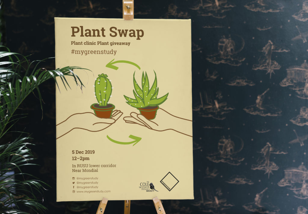
Poster
Initial ideas
The poster has the same editable requirements as Instagram template.


Design development
Bringing the concept of a recycling sign with plants and hand gesture further, the clients were looking for an organic and friendly poster. Instead of having a vector illustration of all components, a hand drawn style of illustration was adapted with no colour filled. A beige background and dark brown text is used to match the organic theme. The clients liked the overall style and illustration, and was kept the same on Instagram for consistency. We provided a few versions which have different placement of text and logo styles to let the clients to choose. Our supervisor suggested to have the plants illustration filled to create a focal point for the poster. All different versions of illustration were sent to the clients to select the best option.
Final stages
Final artwork is done in Word document, with the text put in different text boxes to make it editable. There are different positioning of text on the Instagram poster and printed version – the square formatting of Instagram images meant the text needed to be more readable, whereas on A3 printed poster, information was put below the illustration that leave more negative space for the title to stand out.


Reflection
We did face a few problems during the process, some of which have been covered already.
We initially had a lack of cohesion in design caused by our method of role allocation. We got around this problem by revising the logo so that it uses the same styling as the banner – these two are going to be adjacent on all platforms, so this was essential. We also made the illustrations on the poster the same style of colouring as the logo. Despite this issue, we feel we made the right choice to delegate the work in this way.
Ultimately, seeing the finished results in use and knowing that the clients are happy with the results shows that the needs have been met. They were put to use at their first plant swap event, and it was great to see our work in situ.


If you want to see the designs in action, and learn more about the campaign, here are the handles to their social media:
@mygreenstudy (Instagram)
@mygreenstudy (Twitter)
My green study (Facebook)