
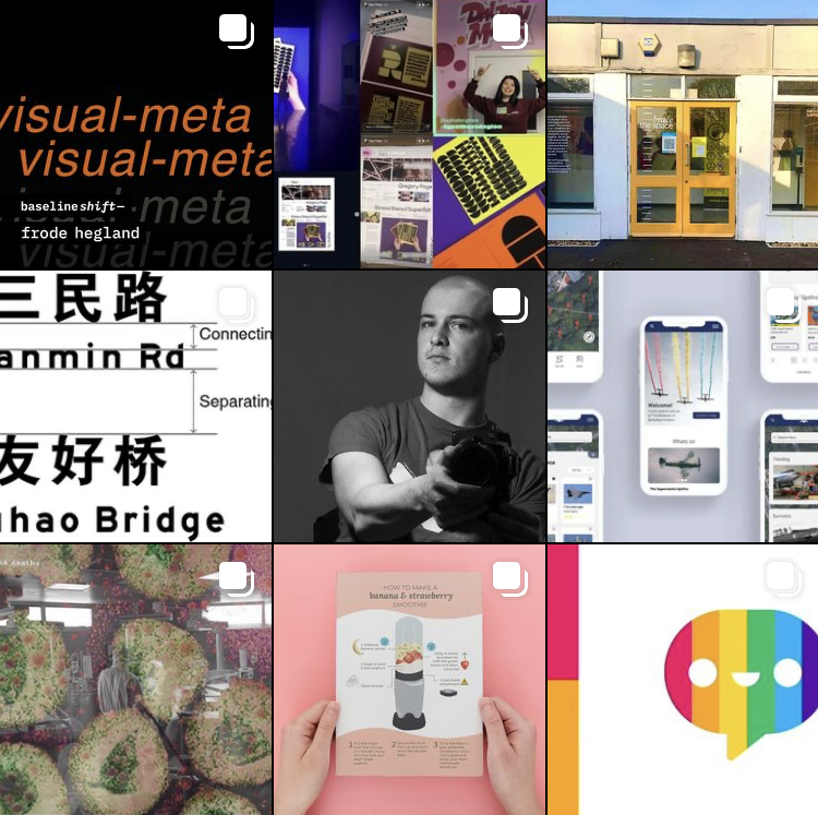
Background
The student-led Instagram has been operational since 2018 when a group of students rightfully decided that it would be a great tool to promote the work that goes on in our department. I joined the team in the spring term of my first year with my responsibilities increasing until, this year, it was my turn to lead the team. This job involves posting on the account for the duration of the year, covering the ongoings of the department anywhere from projects to events.
In addition to the focus of promotion previously, this year it was decidedly more of a recruitment and networking strategy. We wanted to showcase more the work that prospective students could anticipate, as well as giving more of a focus on the ‘who’ and not the ‘what’ of the student work we posted.
Learning from previous years
Two years of experience gave an opportunity to look at what strategies were undertaken prior and assess their effectiveness.
As written about previously, Sophia discussed the branding of yellow featuring in posts to represent our vibrant front doors.

Though a nice idea, in practice this detail was perhaps too subtle when looking at the earlier feed. It was also quite limiting in what was ‘fitting’ to post. Therefore, this year we decided to ditch this approach and aim for engagement through a vibrant, multi-coloured approach. When posts were being created by those outside of our team who would not have been briefed on the yellow branding, this was seemingly a more appropriate solution.
Summer preparation
Knowing that both I and my team had busy years ahead, I felt doing the bulk of the preparation that was able to be done in the summer would reduce time strain later.
To improve on the lack of clarity of individual responsibilities in previous years, I created a rota for each regular task outside of the ongoing role of keeping tabs on upcoming deadlines and events. This is definitely something I recommend the team take on next year as it made planning time around this job much easier, ensured all jobs were covered each month, and allowed fairness of task distribution. However, creating a rota for each term would probably be a better solution than making it in the summer as done this year. Changes of availability and circumstance meant the annual rota needed to change more frequently. In theory, a shorter time scale would allow for better accuracy and reduce need for change.
Once it was finalised which ‘types’ of posts would be a regular feature on the account, we set out to make post templates. Previously, all posts would seemingly be stand-alone if looked at from the feed and the user would be required to read the caption for context. However, we decided Baseline Shift events and announcements of open/portfolio days would benefit from being easily distinguishable – but in different ways.


Open and portfolio days feature large text so this can be read from the thumbnails, in the scenario that a user wants to find it quickly to see timings, for example. However, with Baseline Shift, the guest speakers’ work would be the main feature rather than our branding. Thus, using brand guidelines from the Baseline Shift team, I created this more understated ‘label’ that means it is still clear on the feed, but not overpowering due to its smaller scale. A set of instructions on how to use the templates were provided on the packaged file in case team members were unfamiliar, and to prevent any changes that risk consistency.
Posting more
One big goal we established early in team discussions was to post more frequently – namely on the main feed. From being on the team in the previous year especially, I knew this was flagged by our client as something important to them and so made this a high priority. Looking at the balance of posts made across all three academic years of @uortypography, this is something we did achieve:

This goal ultimately improved our engagement and follower count. Starting at 1687 followers at the beginning of the 20/21 academic year and ending with 2030 followers at the time of submitting this post, I definitely think having more content and thus more with which to engage will have contributed to this uptake. Having the aforementioned rota was also very helpful in ensuring we had at least one post to send out every week rather than posting more sporadically as done prior, and thus I cannot recommend this approach enough to the 21/22 team.
That being said, something to improve upon would be the variety within the feed content:

There is a distinct lack of Part 1, Part 2 and Real Jobs engagement compared to that of Baseline Shift, Part 3 and Postgraduate work. This may be down to several factors:
- the way in which Part 3 and Postgraduate work were posted in some cases: both saw week-long daily features of work at one point
- we did not recruit any Part 1 team members as early in the year as had been done prior, and so were unaware of their deadlines until much later
- being occupied with other responsibilities around the time of submission given many projects are often due within the same week, and thus Instagram posts are not seen as high of a priority
Either way, the solution to these gaps are clear for the 21/22 team – one of which being to recruit Part 1 students as informants earlier in the year. Given they will not have been briefed on Real Jobs until the end of the year, it would likely not be fruitful to try and get them fully on board with the team until later as it will seem as too much of a commitment. This thinking is why the current 20/21 team delayed recruitment in the first place, to our detriment. But by taking a more informal approach with Part 1 students acting more as informants initially and keeping the team updated on their projects, this year group can be featured on @uortypography more and earlier.
Another solution would be to post more of the same projects, as done with the Part 3 independent magazine project this year:

Drawing out posts in this way means more content, more appreciation and exposure for the individual designer as was an aim of the team this year, and hopefully more engagement as a whole. There is risk involved, however, as overindulgence can be perceived as irritating rather than engaging to followers. By selecting only the most visually exciting projects to feature in this way rather than taking this view to all deadlines, it is more likely that the right balance can be struck.
Improving engagement
With higher frequency of posts and more followers naturally came a higher amount of engagement. But, the same could not be said for the regular Baseline Shift posts. These were one of the most frequent post features, but were usually the worst performing with a few exceptions. My perception is that this is due to an overabundance of posts harming variety that followers are after – seemingly an obvious conclusion. However, having enough to post around them with no upcoming deadlines during term time, and COVID severely reducing the amount of events in the department, was decidedly difficult. Based on the number of posts we made this year, we did manage to find enough content, but I think perhaps not posting about certain Baseline Shift sessions would relieve some of this strain. For example, Instagram’s insights on the ‘feedback jam’ sessions showed the worst engagement, and these are the least visually exciting posts. Muting these may leave room for our guest speakers to benefit from a better performance.

With the success of Shout Out Saturday, we wanted to engage more in a similar way with the work of our staff and lecturers and promote their interests. This was a vessel to get-to-know more about those teaching us and celebrate their achievements.


We ended up posting one of these as it quickly came to light that, especially during the pandemic, the format we proposed to interview for content – via email or Teams – would be too time consuming for staff. A more informal approach could be tried post-pandemic – if we hear about a staff project, we could then ask in-person for quick information so the process is less committal. However, this could unfortunately not be attempted this year as we simply did not see anyone enough gain any insights on current projects.
It is important to also objectively review our most engaging posts (calculated via numerical data) in an attempt to figure out what made them so successful, and use this information to decide what to post more frequently. Looking back at this academic year, the following was the ranking of our most favoured posts:
- The infamous ‘Geoff celebration’ (341 likes, 22 comments, 12 saves)
- ‘Welcome back to summer term’ (181 likes, 1 comment, 4 saves)
- Showing the diversity zine (174 likes, 5 comments, 14 saves)

For the crowning most popular post, the reasoning behind its influx of engagement is seemingly because… it is Geoff. But in more digestible terms, users typically respond positively to nostalgia and the personal touch that comes along with this (Bradic, 2015). This may also explain the popularity of the ‘welcome back’ post, given many generations of students have been through the iconic yellow doors of our building numerous times, and they feel it is theirs. But the community feeling of our department means students were also able to become much closer to our staff and lecturers. Thus, seeing someone or something that reminds them of their time here is a good way of driving followers to engage and retell their experiences of T&GC – something that could be taken forward more for next year.
For the diversity zine post, the popularity could be due to the overall aesthetic – the styling, vibrancy of colour and heavy contrast with the white background. It could also be the nature of the zine content itself – our followers may be overall interested in what we are doing to promote diversity in our department and the design world. Alternatively, given the vast number of people involved in the project, this may have caused a ripple effect amongst the collaborators’ followers. The creative discussed in the article shares the post to their followers, and brings their network to our account in the process. While it is difficult to say for certain, this offers a potential set of ‘rules’ for posts:
- Edit photos to be their most vibrant and contrasting as this is more engaging. This also means creating variety, established as important previously, within the feed as a whole: something we were not always successful at, and should make a conscious effort to do more in future. Simply: if the previous three posts use a lot of white and yellow, make sure the next post does not predominantly use these colours. This will make the experience of visiting the profile as a whole rather than on an individual post basis more enticing.
- Talk more about what changes are being made in the department to promote more diversity within the course – it may encourage similar changes in other departments or universities as an added bonus
- Promote more work that engages with creatives outside of the university to reach a wider umbrella of users. A more obvious solution would be to have a regular post highlighting ongoing or completed Real Jobs, tagging the client and designers to encourage reposting in stories.
Another change that we undertook this year was utilising hashtags much more. Focusing now on our top ten posts from this year, these were the hashtags utilised in their captions:

While some of these are naturally very content-specific, a number of the frequent hashtags used were more under the umbrella topic of design. Those that are outside of that broad topic open the account up to more exposure from a wider range of followers, but appealing to those directly interested in design is also not a bad idea. Based on the word cloud, the most popular choices used across our top ten posts were ‘typography’ (8 uses), ‘design’ (3 uses) and ‘illustration’ (3 uses). Given these are, as established, more general and could apply to the vast majority of our posts, it may be worth considering including these as a baseline for all captions. While unable to distinguish which hashtags offered the best engagement specifically, having a consistent set alongside additional content-specific choices would be more likely to generate follower traffic.
That being said, based on the built in ‘insights’ feature on the app, some of the posts did not boast many additional likes via the hashtags anyway. Our main engaging demographic are those following the account already – though not true of posts such as the aforementioned ‘Geoff celebration’ which saw 984 impressions via hashtags. Therefore, the team next year may benefit from brainstorming new and additional ways in which the account could reach a non-following audience alongside these hashtags.
Reflection
As a whole, I am pleased with the progression we have been able to achieve over the last year. I think we were better organised than previous years in terms of our team dynamic, distribution of work, and the consistency of our posting schedule: seemingly having a good impact on our follower engagement.
This role is different to most Real Jobs listed in our department, and has the slightly odd aspect of wanting to generate more of a handbook of ‘rules’ for future teams to utilise within these blog posts. Hopefully the findings over this last year will provide good guidance – but as a final word of advice, these kinds of analytics would be best curated periodically over the year now that there is this established benchmark.