
Background
Art for Research Reading is an organisation that runs yearly to raise money for Cancer Research UK Children and Young People, by running an art competition for 4 to 14 year olds. It is reasonably newly founded, with 2019/20 being the first year of the competition. There were many entries in the first year and the aim is to get more and more as the years go on, though this has been difficult to achieve this year with Covid-19. Art for Research Reading enrols students to compete in the competition through their schools, so the advertising material targets the schools as well as the students who will compete. Every child pays a small fee to enter their work and donation to pick it up again at the end of the exhibition, so it is really important to have as many children competing as possible in order to raise the most money. I joined the committee for the year to join in with monthly meetings, and fundraising events as it is a great way to stay up to date with what is happening in the project, as well as it being rewarding to help for charity.
Unfortunately for Art For Research Reading, Covid-19 has made it difficult to gather entries for the competition, which is really what makes it successful as this is how they raise money for cancer research. The committee decided to postpone the competition from March 2021 until June 2021 so there is more time to gather more entries and organise the event. The event will now be held it online where entries are submitted and displayed through Facebook.
Deliverables
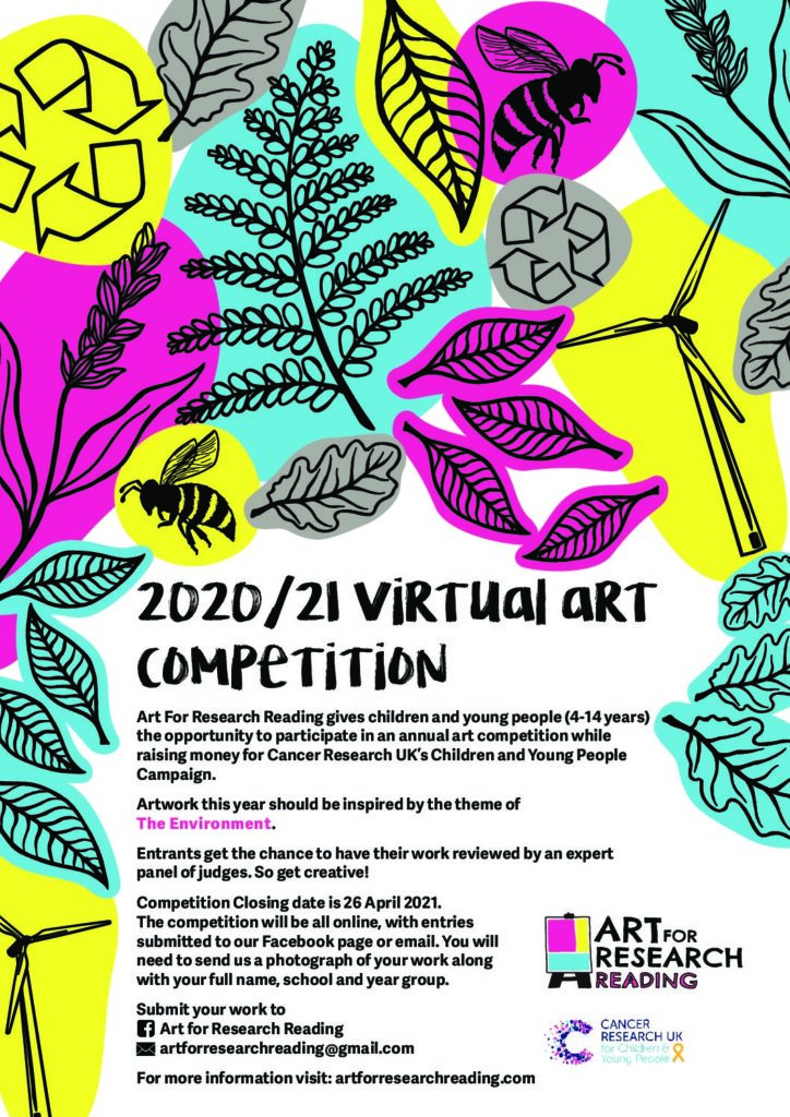
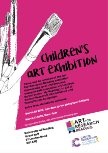
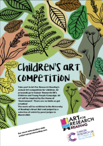
This project involved making a poster, flyer and programme to support Art for Research Reading’s 2021 children’s art competition. The poster aimed to advertise the competition and encourage children to enter work into it. This was completed in May 2020 and sent out in June, nearly a year before the closing date for entries. The flyer originally aimed to get people to come to visit the exhibition, but since the charity changed their mind to hold an online event rather than a physical one, it was more informative of how this would work. The programme contains all the information about the children’s work, judges and the charity. Despite only now having an online event, the committee still decided they wanted a programme showing information about the charity, the competition and all the entries, so that children could see their hard work and awards presented formally and it gives them the opportunity to print it out themselves. Art for Research Reading also hopes that this will encourage interest from more people in the competition for following years.
Research
Art for Research Reading already had a strong visual identity when I joined the team, which had been established by a previous University of Reading typography student. Therefore, I had a reasonably clear starting point when creating material to fit in with this.
The theme for this year’s competition was the environment, so the main focus that the client wanted was for it to fit into the theme. After researching into the branding of charity events, material aimed at children and the previous year’s identity for Art for Research Reading, the client decided they wanted a child appropriate approach with clear information and bright colours, as this was the primary target audience.
The design process and development
The client was clear in wanting the target audience for all designs to be for children, 4 to 14 year olds who might enter the competition. Despite this, all entrants are enrolled to compete through their schools so all material has to go through schools and parents to encourage them to get children to enter the competition, before it even reaches the children. Therefore, the target audience is not only children but their schools and parents, with home learning being done as a result of the Covid-19 pandemic. The client was reasonably open to approaches in the design style as long as it fitted with the theme of the environment, was child friendly, and had a consistent design that could work across multiple formats to represent this years competition.
My original design clearly mimicked the previous year’s poster but including a strong environmental theme. The client fed back that they liked the illustrative style but wanted more environmental imagery to get contestants thinking about sustainability and recycling as well as nature.
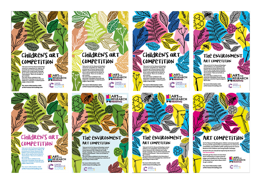
To follow on from this I created multiple variations with a new design in which the client could choose from. They decided they liked the brighter designs and wanted me to experiment using the colours from cancer research, pink, yellow, blue and grey. I also looked into using different features with the overlapping illustrations such as overlaying the colours and having different textures instead of block colours.
Overall the client decided that this design would be the most appropriate as the illustrative style and bright colours help appeal to a child audience, and the individual illustrative blocks can easily be conveyed to other material. This makes the design easily pliable in different contexts enforcing consistency between all the material for the 2020/21 competition, making it easily recognisable.
Communications with the client
The client was very open minded in allowing me to experiment with what would work best as an approach. Though they had clear constraints and ideas in which were to be included in the material, they were open to all my ideas. The committee have been very supportive in giving me clear feedback and were very active in the design process, allowing us to work together to figure out the approach they wanted. They have also had very clear deadlines in which everything must be done by, helping me to manage my time appropriately.
When I first began this real job, I was given the opportunity to join the Art for Research Reading committee, which I accepted. This ended up being one of the most beneficial parts of this project as not only was I able to connect with the client on a personal level but also stay up to date and contribute my ideas about fundraising and the exhibition. This has allowed me to get a full understanding of the client’s needs and the users I am working for. I also helped share my knowledge of social media and ideas to get the most contestants contributing, which was crucial for the client this year due to the exhibition being held online. Due to having a friendly and trusting relationship with the client it has meant that I have had speedy responses and excellent constructive feedback. As this is a charity everybody is there because they want to be, and the committee are always happy to help out. This has made the real job very positive and fun to be a part of.
Covid-19 restrictions
Due to Covid-19, the client made the decision to postpone the exhibition and hold it online where entries are submitted and displayed through Facebook. Despite this, they still decided they wanted a programme showing information about the charity, the competition and the entries, so that children could see their hard work and awards presented formally and it gives them the opportunity to print it out themselves. They also hope that this will encourage more people to be interested in the competition for following years. The committee decided to postpone the competition from March until June so there is more time to gather more entries and organise the event online. Because this is past the real job deadline, I have created a programme template using the text and information from last year’s competition and will continue to work with them after the real job deadline to create a programme with the up to date information on time for the online exhibition in June.
Conclusion
Overall, I have found this project to be very rewarding. The support from the client has meant it has been really enjoyable and I have gained valuable skills in sticking to very short deadlines, where the client needs something to be completed within a few days, as well as very long ones, where I have six months or so before something needs to be completed. There have been moments in this project where no design work needs to be done but in this time I have continued to attend committee meetings to support with the development of the competition.