Background
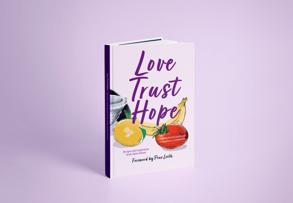
Alana House women’s centre, a charity in Reading that provides a safe space for women to express themselves and strive towards their goals, approached the Real Jobs scheme with a recipe book project based on their community café. With contributions from the women, staff and volunteers, it would collate recipes, poems, creative writing, artwork and photography. Robin Smith and Cristèle Sarić worked with the Alana team to produce the book in its entirety. Aimed to be a symbol of a community coming together in solidarity and support of these women in need, the original deadline was to publish the book on International Women’s Day to align with this goal.
Understanding the brief
Once we had met with the clients from Alana House, our understanding of the job and its importance became clearer. We were able to pinpoint the specifics of what the clients envisioned and ensured we were on the same page. As the book was aimed at a wide audience as it would serve as a fundraiser, it was important to the clients that the book be designed with universal intentions. It should look and feel homely, but not be assuming of prior cooking experience. Because they were wanting a small book, the idea of a ‘scrapbook’ style was the main idea. It worked well with the wide array of content to be included, as well as being something that those that contributed could be proud of and feel belongs to them.
At this stage, we had to be mindful of design inspiration given the clients did not have an established budget as of yet. Given this would be a fundraiser, and the nature of the client business, we felt it would be more appropriate to keep costs as low as possible to maximise the gain to the service.
Initial research
User personas
To inform our decision making, we created user personas to help identify user needs and their goals. This was information because of the aforementioned universality, and thus we chose personas with a range of backgrounds and experience:
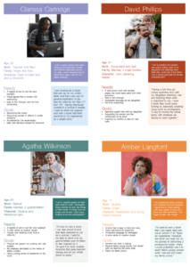
From then on, we were able to identify four key user needs:
- The book would need to be be bound in such a way that it can lay flat on a countertop in order to follow recipes. This also means needing to be able to be read from a further distance
- It needs to be enticing as a ‘coffee table book’ outside of cooking
- Interactions should be accessible and easy for a range of age groups. This is particularly true when picking typeface, type size, space allowed to hold the book, etc.
- Personify the community spirit of the contributors
Research into existing designs
To establish what is conventional, we looked at published books aimed at different age ranges to make a base set of ‘rules’ for us to follow. This helped us in understanding the average sizes, print specifications, layout methods, and understanding how navigation is used to aid in following instructions. This step proved to be essential as we started this project in the middle of a national lockdown, and thus we were very aware that we would not be able to test print any time soon. So, having a baseline to follow would lessen the risk of inappropriate design decisions when it came to that stage. Some of the books we looked at contained a wide range of designs within these specific rules which was helpful in generating conceptual ideas for the internal spreads and cover.
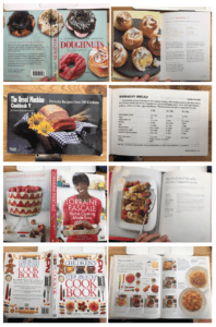
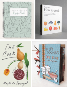
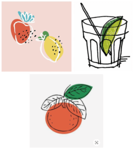
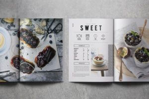
With these in mind, we extended our research to looking at more umbrella styles. We had identified common practice already, and so wanted to develop these ideas further. So, we created multiple mood boards – each looking into different styles of eye catching book covers, user friendly inside spreads, and illustration styles that resembled the ‘scrapbook’ feel.
We had also looked into different binding methods and compared the best options that would align with both the scrapbook style, as well as the user needs. Based on these, we looked into the pros and cons of wiro spiral binding first. This would allow for durability – responding to our the users who would need a book that could withstand splashes and general wear and tear. However, this would have split the design of the internal spreads and limit the ability to be stacked. We also offered perfect binding to cater to the tight budget, but advised that this would mean going against the user needs of it lying flat on a countertop. This was thankfully agreed as being too much of a disadvantage, and thus agreed on section sewn binding – a more expensive choice, but worth the cost to make a more pleasurable user experience.
Our design process
Equipped with our research, we then went on to designing. This part of the process spanned roughly from October until final adjustments and sending to print in March.
Designing the internal pages
Creating sample spreads and cover designs to establish the clients’ perceived preferences was the first plan of action – the insides being tackled first as this would form the bulk of the book. We created three designs each in an attempt to provide a wider gamut of styles. Compiling all six, we whittled down our options to the three most successful that we would later take forward to the clients:
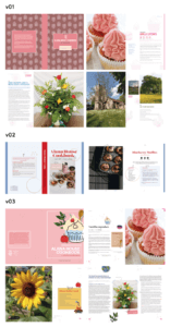
This was a useful method of working as it meant we explored the options but would not overwhelm the clients with too many ideas. It also meant we could still operate as a partnership – though created separately, we each had input in the design decisions going in through preliminary feedback and discussion. However, some of our ideas did end up being quite similar in styling. We may have benefitted from deciding a base set of 6–8 entirely different styles beforehand, some pushing the original ‘scrapbook’ and ‘handmade’ umbrella more than others, in order to avoid this overlap.
After a few rounds of feedback from our supervisor and the Alana House team, we ended up taking forward style 1 for the rough look of the inside pages.
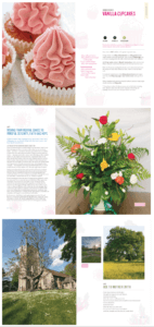
The base styling of the recipe pages allowed enough space for handwritten notes from users, fit within the scrapbook theme without being too gimmicky, and was the most ‘clean’ to allow the food photography to be the attraction. However, we and the clients discussed that the scrapbook theme had been taken too far in some cases – particularly on the poetry and creative writing pages. The team favoured a ‘less is more’ approach, thus citing that the tape and coffee stains were perhaps a bit on the nose. This favouring a more subtle approach was taken into account for the rest of the design process.
A notable difference from our original sample and the printed design is the lack of backing illustrations. We had originally intended to host a workshop and encourage service users to produce these illustrations based on a list of ideas curated by us, which we would later render digitally and colour-correct. This idea would mean there was an extra form of participation from the women outside of their providing of content, and meant the book could really feel like their own creation. However, the workshop was unable to go forward due to poor weather conditions rendering participants unable to come in, and the subsequent national lockdown preventing a postponement. Taking on this responsibility for ourselves under the circumstances felt like too ambitious of an undertaking given the timing – and in hindsight, probably would have been too much even in the most ideal of scenarios. It also would have removed the personal touch of being made by the women themselves, something we felt was key, and thus decided to abandon this feature. That being said, the white space allowed from the lack of illustrations better mimics the minimalist approach preferred by the clients and the later printed cover – thus ultimately a better design decision anyway.
Designing the cover
Using the same process as before, the cover samples were created after implementation of content had begun on the inside spreads. This was decided in order for the book to appear as a unified package – we had the grids, typefaces and styling of the internal design to dictate the feel of the cover.
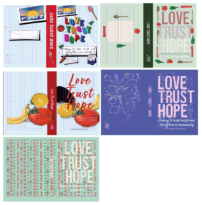
The clients were very keen about discussing the cover and offered a lot of feedback for the samples – indicating a real passion for being involved in the decision making for this part specifically. In order to maintain this close client relationship and focus on their creative involvement, dedicating one person to lead the production of the cover seemed to be the most effective approach. This method of working separately on the same overall product is oftentimes risky. To avoid detachment of the cover to the insides, outside of using the same grids and typefaces, we wanted to best simulate a collaborative environment within our remote work setting. We made sure at every stage to offer feedback to each other first and foremost to keep the design stage as more of a discussion. Cristèle focused also on the illustrations to be used inside as well as designing the cover to maintain consistency in the styling, but also to ensure we each had some part in both ‘pieces’ of the cookbook. While this separated methodology did have limitations and was not the approach we originally intended, this was good professional practice of upholding good communication with your team when working individually. We also had more exciting content to show in client meetings as each part was happening simultaneously, and editing the inside pages before sending to print later was much easier as we could ensure the ‘rules’ were applied consistently.
After close collaboration with the clients, and further feedback from our supervisor to achieve a print-quality finish, we decided upon the cover:
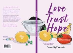
Of all of our base styles, the clients expressed again that they favoured the more ‘minimalist’ approach taken with this sample. They also appreciated that the illustration style and typeface fit within the base theme of hand-making and ‘DIY’. With the other samples, they were hesitant about the more busy layering – something we wanted to try as a direct contrast to the heavier use of white space on the inside pages. Both the clients and our supervisor were also unsure of the balance between the textual elements and the frequency of the illustrations. The overall clarity of the fridge magnet design was also questioned, debating whether this was visually indicated well enough as being what it was in reference to.
‘“Love Trust Hope”, somewhat overwhelms the covers. I think you’ll need to seek a more meaningful balance between the main title and the subtitle, since it’s the subtitle that actually says what the book is about.’ Eric Kindel, project supervisor
This choice had flexible space for trying the textual elements in different positions, and allowed for the ‘yummiest’ colour palette for the food illustrations – a key consideration for cookbooks.
For both insides and outsides, the rest of the design process until sending to press was simply inputting the recipe content as it came in, as well as keeping in touch with the clients and our supervisor for feedback, updates, and rigorous detail-checking on each part of the book.
Getting more involved
Both we and the clients were keen to get involved in the development of the actual content as well as the design, and thankfully there were opportunities to do so. The recipe curator of the client team, Deborah Puxley, noted that they were short of vegan recipes but were eager to include more. Knowing veganism is popular amongst our age group, we offered to post a plea to our personal social platforms for friends to get involved in the cause. Because we had opened ourselves up to being involved in this way, we also were able to have a say in the selection of the best recipes to include in the book. This, in hindsight, was crucial as it meant we were able to prevent over-promising the amount of recipes that could be included per spread. Especially given the tight budget and limited number of pages, this control and advising of available space definitely saved some future heartache.
We were also able to provide more of an art directing role when it came to food photography. This was an initial worry given the restrictions of lockdown meaning we had to perform this role remotely. It would have been better to be there with student photographer Tara Fergueson (University of Bath) to physically see and direct the shoot. However, to substitute this level of collaboration, we discussed in a meeting prior roughly what direction would be best, and the technical aspects such as the file formats. Robin was also on call with Tara on the day of the shoot to check in and answer ongoing questions. While this was the best solution under the circumstances, it did mean there were some unexpected surprises in the finished photos:
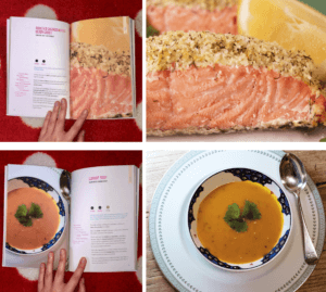
A number of them were shot in landscape, rather than the portrait formats we showed in our sample. This is something we should have clarified earlier, but was too late to rectify – an unfortunate lesson to takeaway for future projects. To work around the issue, we operated via strategic cropping and selecting the most delicious-looking piece of the image to zoom in on and create portraits. Most were able to be finessed well enough, but some were awkward to work with as a result and would have been better if we had just been more specific in the first place.
Pre-press checks and sending to print
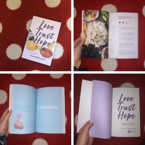
When it came to sending the book to press, this is the area where we sought the most guidance and learned the most technical skills. Neither of us had sent a job of this kind and scale to press before, so figuring out how to specify finishes, what information is needed to request an accurate print specification, and what makes good file practice expected of a professional editorial designer were all covered during this stage. However, our deadline for sending to press was unfortunately pushed back twice – actually being finished in mid March.
We were receiving feedback from all parties up to the wire. While this proved difficult to navigate at times, this was somewhat inevitable given the vast amount of people involved in the team needing their say. This did prove useful, though, as it meant more rounds of proofreading and thus flagging all of the minor errors that went uncaught prior. While embarrassing that the occasional double space and typo slipped under the radar, it brought the realisation of how meticulous one must be when performing pre-press checks. Thankfully, our clients were open to pushing the deadline in order to finesse the final product more, and it definitely benefited from this extra time. The original aim of printing in time for International Women’s Day was no longer a priority as the clients had a second event at which to fundraise. The release of the book could thus align with this new date instead, and brought the extra few weeks of editing with it.
Outside of these factors, the process by which the book was sent to print was thankfully straightforward and we had relatively few changes before doing so.
Reflection
Overall, this was a big learning curve for both of us. While difficult and frustrating at times, having the experience of what goes into good editorial design, liaising with a large client team, and how to send work to a professional press is invaluable. We ended up producing a cookbook that not only we and the Alana House team are happy with, but something the service users themselves can be proud of. We are glad to have been involved in providing a vessel and an outlet to these hugely creative women, and hope it is something they cherish.

