

Design ideas and design process.
Design idea 1

This design takes inspiration from luxury brand monograms. I chose a serifed font, and through disconnected strokes, combined my initials ‘TM’. The simplicity and clarity makes this design very effective as a sophisticated logo.
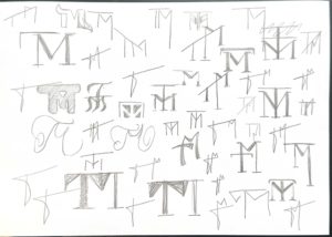
I began by sketching several variations of ‘TM’ monograms on paper, I find that using pencil and paper for this initial idea generation process allows for numerous quick generated designs that do not worry about being neat or technically perfect and instead focus on depicting the way in which the letters interact with one another or the feeling that they convey.
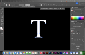
Taking it into Illustrator, I started by typing a capital ‘T’ with the text tool in Illustrator. I used ‘create outlines’ to convert this type into an editable vector image.
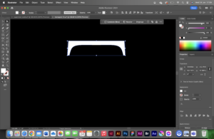
I edited the-now-vector letter by deleting anchor points with the direct selection tool.
I then shifted into wireframe mode and created guides to stick to, which is frequently used in logo design to create a uniform, clean, alignment.
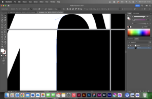
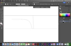
Finally, I looked at the finer details; to reflect the curve of the terminal on the ‘T’, I edited the control handles for the anchor points on the top of the ‘M’.
Design idea 2
This design idea takes a much more playful approach than the first. It pushes the boundaries of the concept of a monogram logo with its inflated 3D form, however, it still combines the letters ‘T’ and ‘M’. This type of design would be great for social media posts, possibly incorporating a short animation of the logo itself inflating.
Design idea 3

This design took a more corporate, industrial approach, and captures a completely different feeling to the previous two. It relies on heavy geometric shapes, slightly softened by an applied transparency gradient .
Software tutorials
Throughout this project, I watched several video tutorials to assist in my illustrator learning.
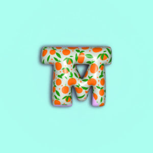
I used this youtube video on the latest generative fill tips and tricks for illustrator, to help me gain a greater general understanding of current illustrator tools. This is where I thought of using generative fill to generate a pattern to apply over the monogram: Generative fill
Another tutorial that I relied on when creating the inflated monogram, was a tutorial on how to inflate shapes and objects in Illustrator, as I was keen to experiment with some sort of 3D elements within the module this term: 3D inflate tool
One of the software tutorials linked at the bottom of the brief that I used when creating my Monograms in Illustrator is how to outline fonts. This is a key step in editing type as a vector and this tutorial reminded me on how to use the shortcut “cmd+shift+o”: Outline type
Design resources and articles.
I suffer from relatively strong colour blindness, and therefore often rely on taking existing colour palettes from existing designs, or those that can be found in the real world. A resource that assists me in choosing colour combinations, is ‘Adobe Color’, which allows you to copy colours by their hex codes: Adobe Color
To inspire me with my design ideation process, I created a moodboard of existing monograms on Pinterest as advised in previous feedback from TY1SK1: Pinterest board
Learning throughout the module.
This module taught me many valuable software skills through the numerous tutorials that I read/watched and through pushing me out of my comfort zone and encouraging me to explore previously unused tools within the software. My biggest learning moment of the module was getting to grips with After Effects. I used in-depth design tutorials sourced from the website Skillshare which gave me a great understanding for the basics of the software. As Illustrator is the Adobe software that I feel most comfortable with, learning After Effects complimented this perfectly, as it builds on the vector images created in Illustrator.