
Hierarchy: The classification or assortment of subjects regarding their importance.
Hierarchy in typography is arguably the most important consideration when creating layout. It writes subliminal messages within the page that tell the reader what’s important, what should they look at, what should they read first. This is why it is so important you don’t mess it up.
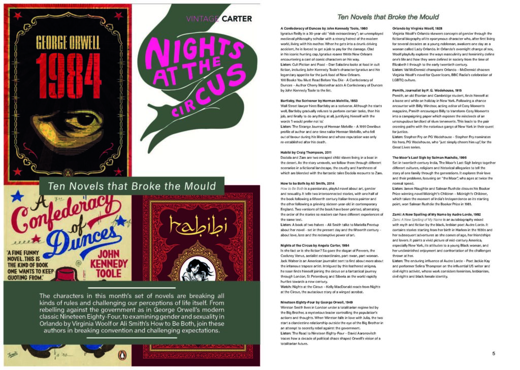
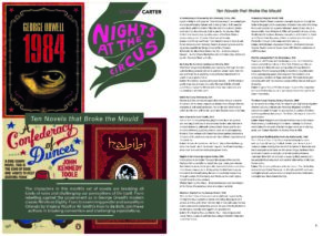
The task at hand was to format an effective layout for a double page spread. The content would be an article on novel characters which break character norms. The text would be supplied, but it was up to layout the content, edit the hierarchy and format an effective DPS.
Software Tutorials
Prior to the spring term my knowledge in Adobe software such as Photoshop and InDesign was already quite extensive and I have had much experience in these applications. However, I found that it is useful to have a refresher in some of the more niche or hidden features of these. To do so I have searched for a few tutorials, most notably in InDesign, to boost my knowledge in these fields and solidify my skills as a designer, and bring them to fruition.
I also came to use less familiar software, such as Illustrator, which posed as new and interesting challenges to overcome. While challenging at first, after a few tutorials I found myself quickly becoming more confident.
One of the more useful tutorials I used was a creative cloud download which ran down on the importance of tracking and leading in text and how this can be used in InDesign.
Change letter and line spacing in text (adobe.com)
Design Ideas and Design Process
I began by creating the InDesign file I’d be working in. This consisted of a double page A4 spread with facing pages. The margins were set at 16mm as this would create plenty of space in the center of the page for the body text, while keeping a healthy distance from the edge. It was after this I implemented the baseline grid, which would help me to layout my text later.
This feature in InDesign is vital to formatting a good layout as it allows you to evenly space the lines of text on your page. This is becomes especially prominent in the body copy where it can assist in organizing masses of text with just a few mouse clicks.
With this done, my next step was inserting the main body of text. This is where the Importance of layout and hierarchy became too apparent.
I found that there was too much going on, the text was in big chunks that was harder to digest. Some lines didn’t have enough space between them do divide the different subjects, and some had too much space, making something of minor importance seem more so. I believe this made the reading experience awkward and unrewarding.
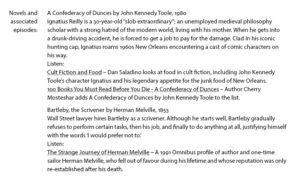
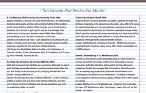
I amended this by firstly splitting the text into columns which split the text into more digestible parts that wouldn’t fatigue the reader. I also spaced the paragraphs apart by an entire line to show that they are not connected, and bundled the “reading:” and the reading list onto the same line to establish their connection as before it appeared as though they were unrelated.
I then began establishing the typographical hierarchy, using different type styles and sizes to differentiate the relevance of the text. For example, the headings of the sections would use a semi-bold variant of Acumin Variable Concept, where as the body would remain in regular form. I saved these as paragraph styles, which would later help me to format the text far more efficiently and in uniform.
Following this, I created the left page, which consisted of images of some of the books mentioned in the article. It is important to involve graphics in double page spreads as it helps to create visual relation to the article content and also balances out the text, reducing the likeliness of a reader being discouraged by the masses of reading.
My final change was adding the title and introduction paragraph. I wanted to integrate these into the image page so separate them from the body text, but also didn’t want them to get dwarfed by the imagery. The solution to this problem was containing the text in a dark band, and using white text to create contrast to set out from the background. I also used italic type for the title, and increased the tracking, to set this text apart from the rest.
Design Resources and Articles
Before making too much progress on the layout design I found myself experimenting with some features to explore my options, as well as watching some tutorials on some of the features I was less familiar with to prepare me for the task ahead. For example, I needed to recap on how to more efficiently format text using paragraph styles using the tutorial below.
I also revised how to set up a baseline grid as this was a feature I had only recently practiced and was not entirely confident in using, nor did I fully understand it’s utility. I feel however that this task has helped me to appreciate it’s uses.
For the image page, I used high quality jpeg covers of the books relevant to the article.
Learning Throughout the Module
Throughout this module I have picked up many new skills, as well as reinforced ones I knew already. One of which is understanding the importance of using a baseline grid in typography. The vitality of this feature has become obvious to me during this task and I have increased my understanding of how to set one up.
I also think my ability to create a pleasing and useful layout has been improved through not only looking at other material for reference, but through trial and error, and experimenting with the layout rather than keeping a tunnel vision on one idea.
However, next time I would try to be more ambitious with my layout. I think I could have created something much more interesting by having images placed on the same page as the body text. This would have posed some new challenges for me to overcome and offer more experience in how to establish the layout and hierarchy of a page.