
Design ideas and design process
I have always found illustrator to be one of the areas of design that is most difficult. This is not only because I find the tools quite complicated to use sometimes, but also because I am not very confident in my drawing skills. This is why I want to focus more on my illustrator task and talk about how I have been able to improve my skills over this task.
Design 1
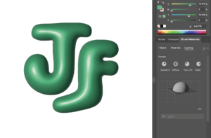
When beginning this task, my original approach was to use the inflate tool to create a metallic balloon like logo (figure 1). Which I ultimately ended up scrapping because I could not figure out how to not have the effect be pixelated. This was a positive though as I then took a step back and made the design less complicated, I took a more vintage style approach to the design through the extreme curves and the smooth style of the typeface.
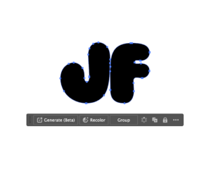
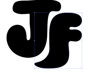
First of all, I found an appropriate balloon-like font on adobe fonts, which was Ziclets, and selected the type tool to place my initials onto the page. I then used this tutorial to outline the letters to make them editable (figure 2), this brings up anchor points which we will use to extent the letters. Afterwards this tutorial helped me figure out how to use the pencil tool to alter my type. This was done through selecting the pencil tool, clicking on the anchor point where I wanted to start the extension and then dragging it to the anchor point to where it should end (figure 3). I lowered the F down slightly so there was space on the right side of the J at the top and at the bottom of the F. Consequently, I used the pencil tool again to extend the ends of each letter so they are slightly wrapped around each other, and to make it more aesthetically pleasing I changed the colour to green, duplicated the layer and changed the colour to a lighter green on top to make a shadow effect (figure 4).
Design 2
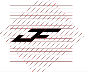
For the second design, I followed this tutorial on making an initial logo using a grid and the pathfinder tool. I first drew a vertical line on the page, used the option key (⌥) and dragged to the right, then I pressed command ⌘ and D to duplicate the line across the page. I highlighted the lines used the option key (⌥) and dragged again, rotating until it made a diamond pattern, making sure that it is not rotated too far that the logo will appear too slanted in the end. Afterwards, I selected the pathfinder tool, and dragged across the boxes I wanted to use to make my letters (figure 5), adjusting the letterform and extending the grid wherever I need to (figure 6). Finally, I selected the extra lines outside of the filled boxes and deleted them leaving the logo, and to separate the letters, I found the line dividing the letters and changes the fill colour on each side to different colours.
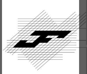
The software tutorials were the most important part here because I would not have known that using the pathfinder tool on a grid was a technique that I could use. The inspiration behind this design was sports logos, specifically adidas and the way that the logo is slanted towards one side which can be seen here, which is what I wanted to imitate in my design. I am not sure why I assumed that logos like this were done without a grid, but it makes much more sense after watching the tutorial. The final design is shown above (figure 7).
Design 3
For my final design, which is the one I feel is most effective, I went for a traditional calligraphic style logo where the serifs were altered and connected. Firstly I looked at my original sketches and found the one that I thought would be interesting to execute on illustrator.
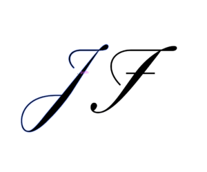
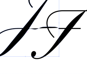
We start off with the letters being placed on the page, and here I used the typeface Rizado Script. Next, the text needed to be outlined which was done the same way it was in the first design, this is by selecting the text and right-clicking to bring up the menu, then selecting create outlines to make the text editable (figure 8). I then connected lines using the pen tool (figure 9), and used other letters from the typeface, applying the rubber tool to create the parts which I would employ to help connect the lines and the serifs together to make a fluid logo. I had not thought to use other aspects of other letters to enhance my logo if it were not for this tutorial which explains how you can use that technique as a feature of the design. As a result of this, I inserted the letter O into the file and used the curves from half of an O to falsify having looped serifs (figure 10 & 11).
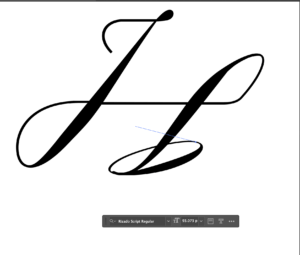
The linked tutorial above really helped me for this logo, it also covers parts of illustrator which was provided through multiple links on the brief just in one video. Going into this task I thought that I would be using the pen tool for everything because that is what I have always done. I surprised myself though, specifically in this final design as pretty much only used tools which I did not know existed before I started this task. The final design is shown below (figure 12).
Software tutorials
Most of the tutorials I used were ones that I found on my own through YouTube, I did review the tutorials that were recommended on the brief, but I found that lots of the YouTube tutorials covered lots of the same things. I was able to find out about approaches that I had not considered before through video tutorials, such as using a grid and connecting the sections together to fill them.
Although some of the software tutorials such as the bubble text tutorial were just consolidating skills I already had, the ones that had completely new tools I feel have increased my confidence in Illustrator by a considerable amount. The tutorials I used for my task are linked in the walkthrough for each design.
I definitely still feel like there are more skills that I need to learn and develop on this software, like most people would as software is constantly changing and developing. Something specific which I would like to learn further is using the pen tool, as although I used it extensively in this task, it took me quite a lot of time to get used to it and make my work smooth and even. There are still gaps in my knowledge which I can improve by finding more tutorials.
Design resources and articles
The first thing I did after reading he brief was create a Pinterest board and started adding logos which I found to be effective and aesthetically pleasing (figure 16). I personally like Pinterest as it shows me what is trending in my own age range.
I also did what most people probably did for this task, which was just search up ‘initial logos’ to see what comes up. Through this I managed to find some images which were useful displaying different letterforms and styles, like (figure 17). Additionally, I browsed this website which includes different logos for a range of companies, which was one of the things that I think most people would think of when they hear the word logo. I liked these ones specifically because it just shows a list of a wide range of logos from clean sharp lines to elaborate, intense designs.
Learning throughout the module
Despite my scepticism in this module being self-directed, it has allowed me to work at my own pace and solidify my knowledge in software that I (naively) thought I knew well.
I began with previous knowledge of a few pieces of software, that being Photoshop and Illustrator, but through this module I have been able to learn about InDesign and After Effects which I did not know existed! Finding out about, and learning how to use these new software’s has been what I believe to be the most important part of my year. I now know the purpose for each of these individual software’s and what part of design they are mainly used in. Such as Illustrator being for logo design and InDesign for setting out any text.
Skills that I have improved while doing this module include cutting out hair in photoshop, especially curly hair which I found to be very challenging, but most importantly I have been able to improve my time management skills. Although last term my time management skills were not too bad, I definitely improved this skill during this half of the module. I was completing each task on a set day every week which has been a highlight for me because it has relieved some stress.