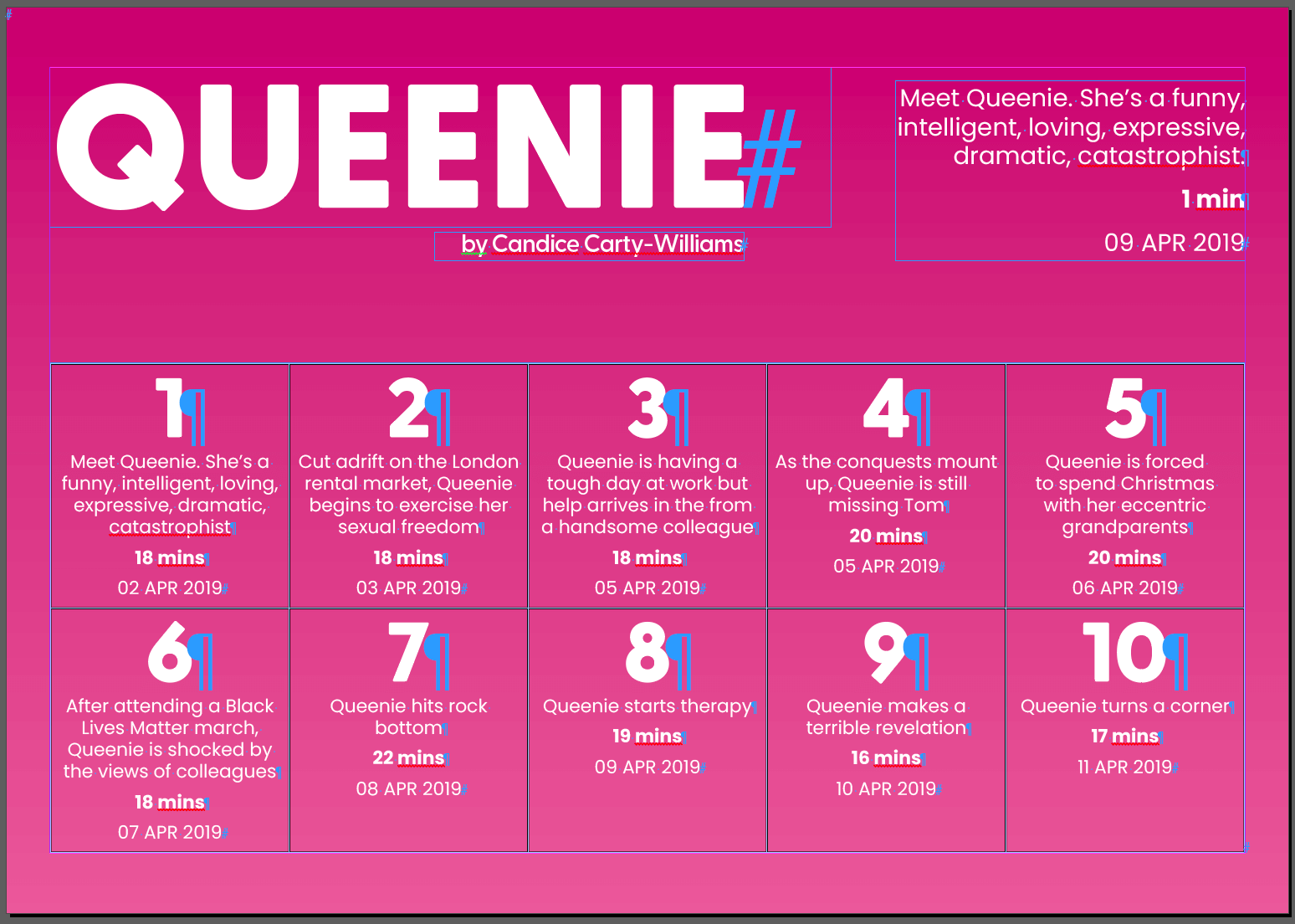
Tables in InDesign can be very useful when organising content, making it quicker and easier to understand. Most people will have explored making tables in Word or Excel, but designing them in InDesign allows for more creativity and control.
I was tasked to design and format content into a table. Before this I had never made tables in InDesign before, however I now feel confident in using and explaining the basic features.
Software Tutorials
Since it was all new to me, I started off by reading through the materials given to me on the brief. I found that the information from the Adobe Website was a great way to learn the basics of creating tables. Another tutorial which I felt explained the basics but also went a bit further in giving more detail on styling tables was by Yes I’m a Designer on YouTube.
Design Ideas and Design Process
Initial Idea
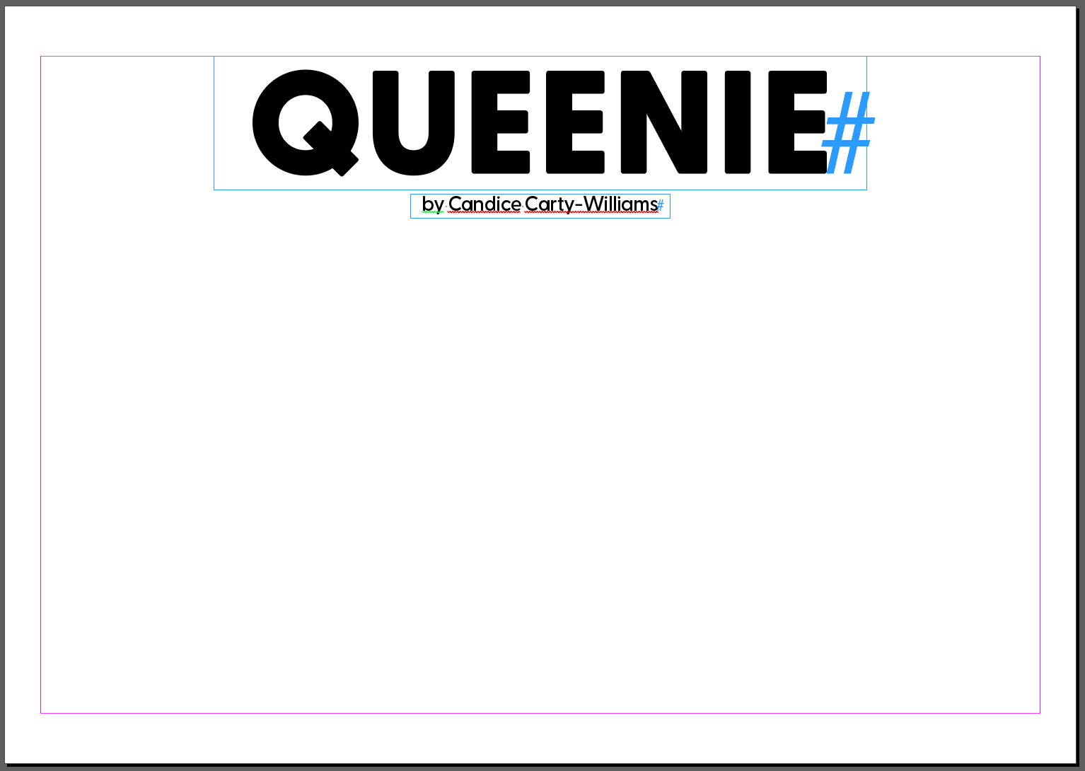
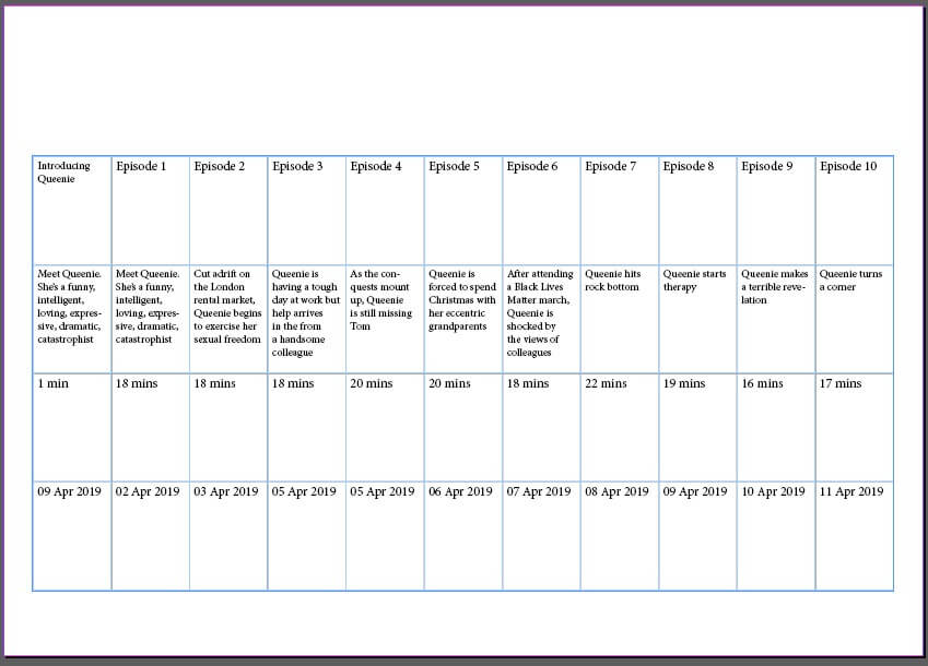
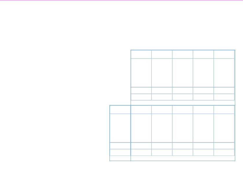
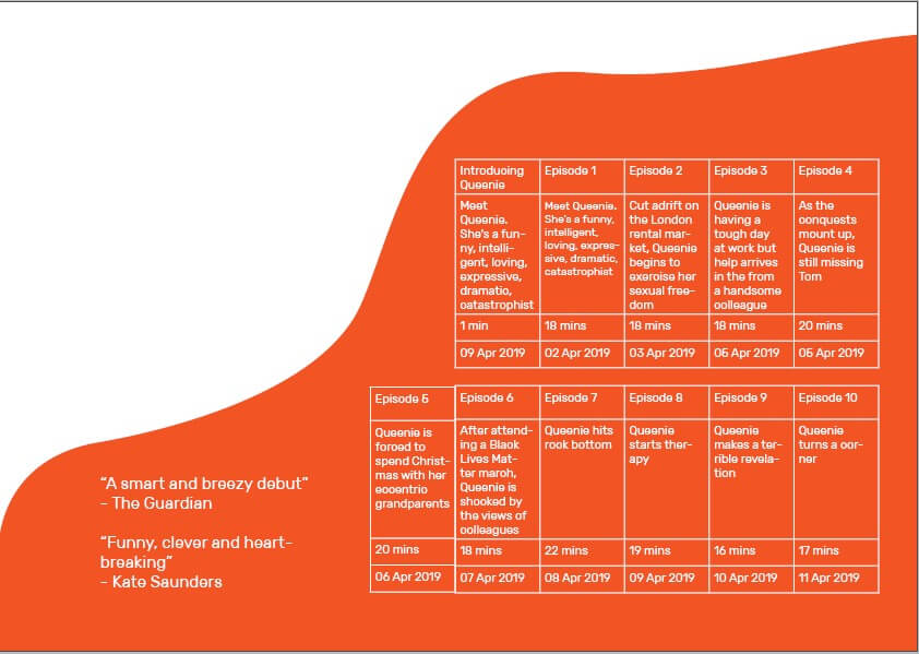
Figure 1 – initial idea
My initial approach to the task was for the whole design and timetable to be portrait. The table size used in this design was 5 rows by 2 columns. I felt that the size of the table in this design was too squashed and so it made the information difficult to read as it was quite small. This lead me to think of having a landscape design as this would fit the content better and allow for the type size to be larger, improving legibility!
Final Design
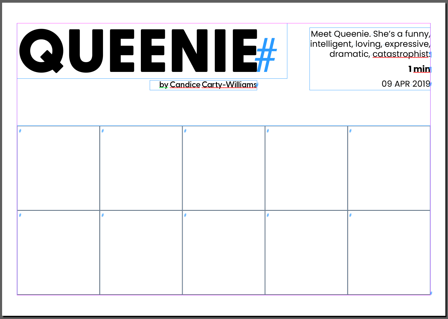
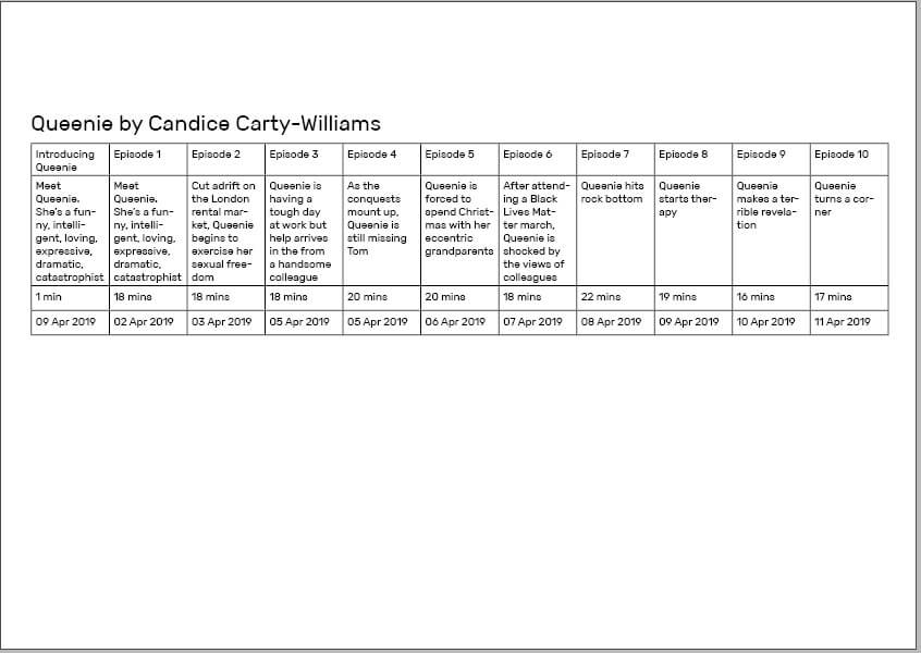
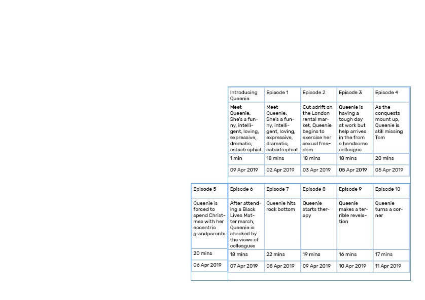
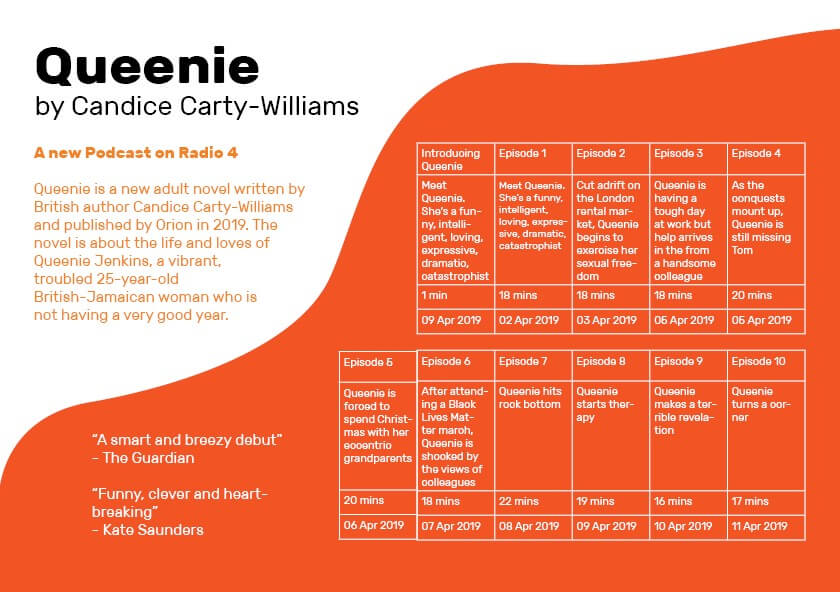
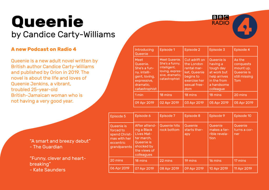
Figure 2 – adding type
I started off by setting up my document with top & bottom margins of 14mm, and left & right margins of 10mm. I then began adding in the information that would not be kept inside a table: the title of the podcast and its description. The typeface for the title is Greycliff CF, and for the body text is Poppins.
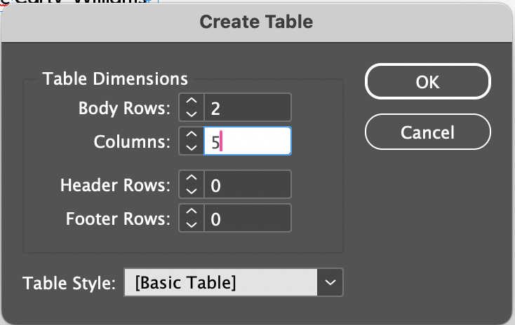
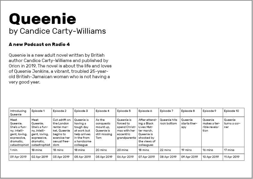
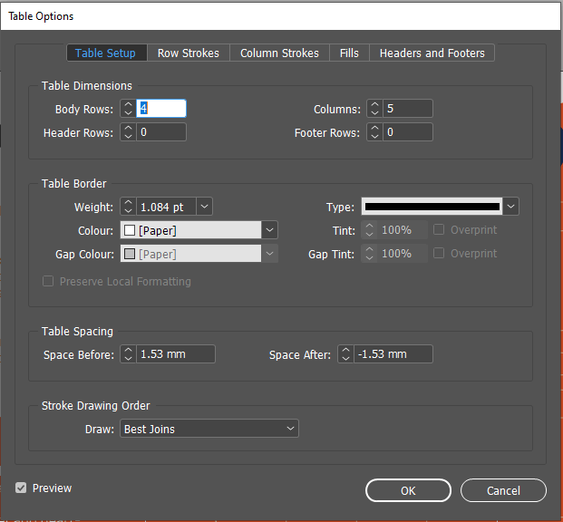
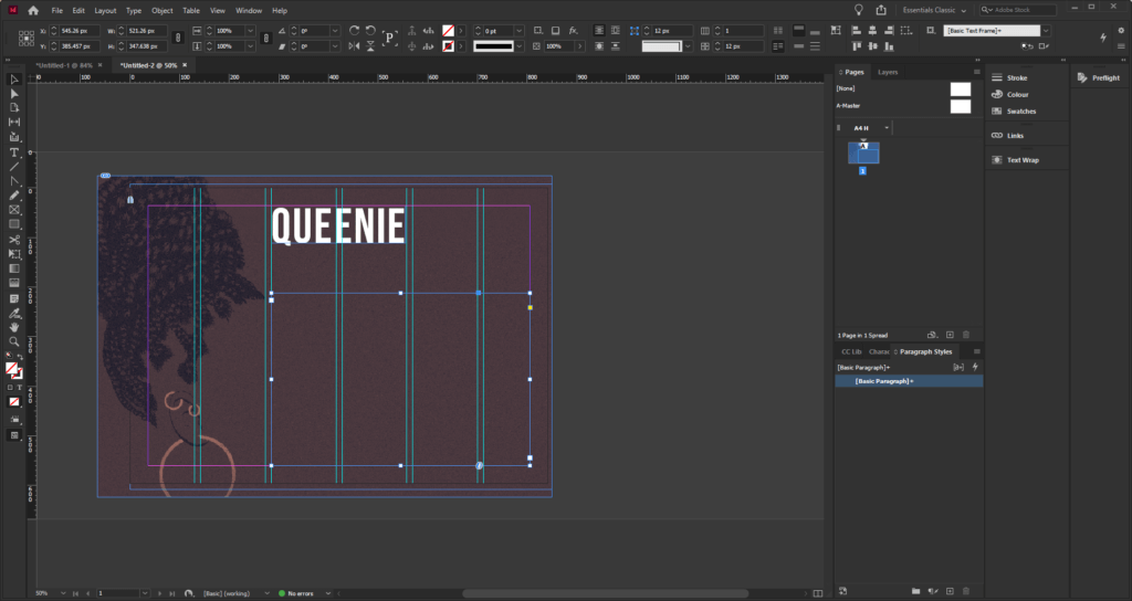
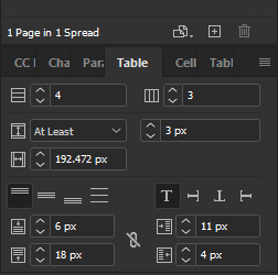
Figure 3 – table dimensions
To create the table, I used the following dimensions: 2 Body Rows, 5 Columns; and for now I kept the default table style that InDesign sets.
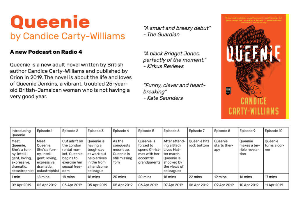
Figure 4 – table addedFigure 5 – adding table data
I then added in each set of information to the corresponding cells, and used Paragraph Styles to style the text.
Figure 6 – removing table lines
Using the Table Styles panel, I chose to remove the lines surrounding each cell of the table as I felt they were unnecessary for my particular design since the content was already well divided enough.
Design Resources and Articles
Uxcel has some useful information to consider when designing tables. It discusses how to best design tables in terms of scannability, legibility, alignment, and styling.
Learning Throughout the Module
At the beginning of this module I had only just started to become familiar with using InDesign due to a book design project in another module; and before that I had only ever used InDesign once or twice during A levels. I feel that this project has taught me about many different design tools and skills, but has also helped me to become more comfortable when using Adobe software and its variety of features. This task in particular was helpful in discovering how to create & style tables, as well as getting me to make use of paragraph styles.
I think it’s important to start off by saying I had no idea how to make tables and grids in InDesign. Other than my limited use in the book design project and making work files, I haven’t used the software before. I was well aware that I’d have to start with the basics, but I’m glad this module gave me a chance to do this.
Software Tutorials
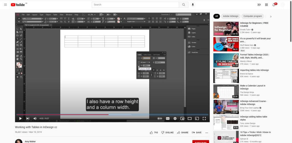
I, therefore, had to begin with the software tutorials, needing this information to progress with this challenge. I began with a YouTube tutorial by Amy Maher, which allowed me to grasp the basic technical aspects involved in grids and tables. This focussed on the foundational skills, a complete beginner’s guide to this tool which was perfect as I currently didn’t know anything about this.
Using my newly-gained knowledge, I opened InDesign to begin this project. I decided quickly that my first design would be an incredibly basic but functional table, making sure that I could adapt this to suit my needs, before moving on to a better designed and more visually appealing design.
Amy Maher’s video ‘Working with Tables in InDesign cc’, showed me the basics of tables in InDesign and how to amend sizes simply.
Design Ideas and Process 1
The process of creating a table and adjusting its characteristics to suit my informationMy initial table with consistently sized cells – obviously not appropriate and taking up unnecessary space.
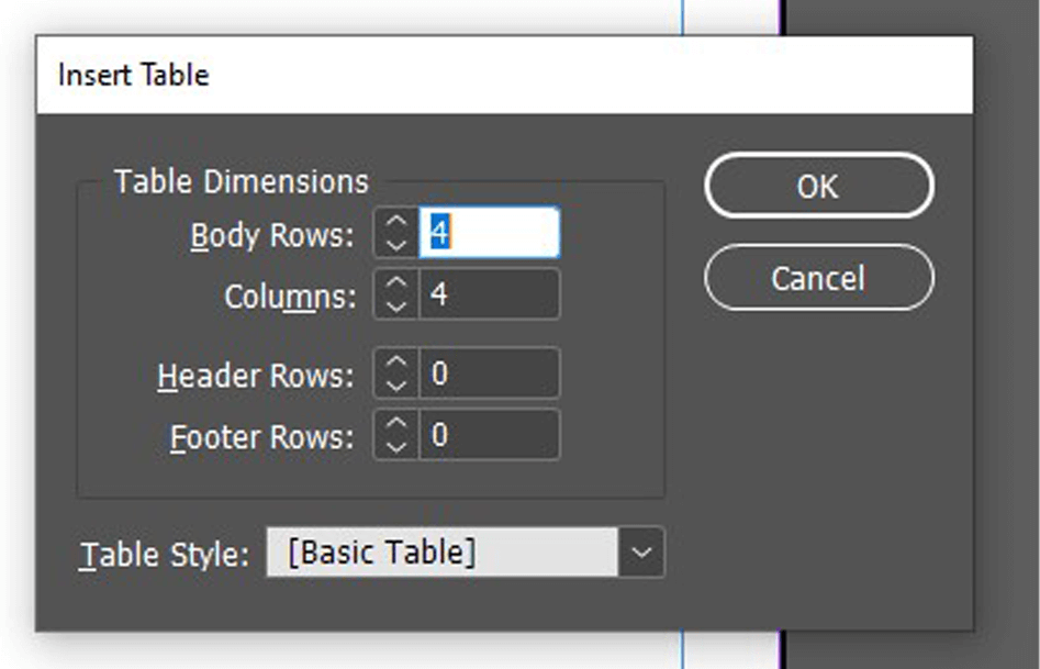
I started by closely following the tutorial – I used the ‘Create Table’ tool to add a table to my page I was then able to specify the specifics, altering the rows and columns to my requirements. I did a simple, linear format for these, not wanting to overcomplicate the design. This tool worked well (other than me needing to add an extra row to the top for the titles), allowing me to input the data into each cell.
As the tutorial said, I was then able to adjust the size of my cells, selecting a row or column to adjust a group at the same time, a quicker and more consistent method. Having done this, my simple table was complete and I was able to move on to the design aspect.
Having adjusted the cell sizes, I then added a title and began to style the page.I then began adding other elements, creating visual hierarchy but attempting to keep the table as the focus.
I placed this table along the bottom of the page, adding text initially to create a clear hierarchy. I used knowledge from the previous terms InDesign class to allocate clear paragraph and character styles, while also knowing more about the alignment and structuring that would benefit my final design.
Finally, I added an image of the book and quotations along the right-hand side, allowing a more balanced design to be achieved and having typography and layout separating the different layers of information.
I am happy with this design, clearly a simple beginning, but allowing me to test this tool for the first time and gain more experience in InDesign, both technically with the software and enhancing my skills as a designer through more practice.
My first table design – a relatively simple but conveys the necessary information in a well-structured, visually appealing manner.
Software Tutorial/Article
Coming off the back of that example, I wanted to explore the styling aspect of the table more, breaking the conventional, linear structure. I began looking at articles and resources, finding a post by ScienceEditor about the best practices for table design. This added to the foundational knowledge, informing me of conventions of table design – these included the increased ease of comparing numbers when in columns rather than rows and the benefits of breaking up a long, linear table.
I also had to consult an article when hitting a problem – when having trouble adding a row into the table, I used a blog by Adobe to fix this minor issue.
Design Ideas and Process 2
The basic grid structure that my table will follow.The same structure, now with the relevant data filled in.
I began by creating a more visually interesting layout for the table, stacking the two parts on top of one another and right aligning it. I then filled in the same data, ensuring that each entry has a consistent size to the next.
I was much happier with this structure for the information; although not linear, the information is still clear and creates much more interest through this less conventional shaping.
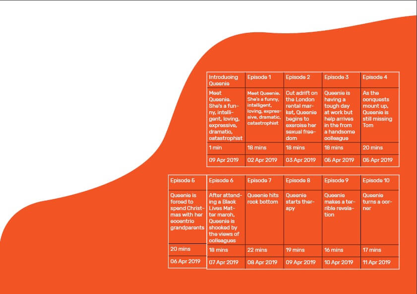
The ‘Table Options’ menu, allows me to adjust the colour and weight of the tableThe result of my styling experiments – a much more engaging appearance with some clear areas to be altered, such as the black lines between the cells.
I added this coloured shape as a background element using the pen tool, looking to make something fluid-like but not overpowering. I used the colour picker to select an orange from the book cover. Looking at this with a black table, I knew I had to invert this to white, the contrast making the table and its data more readable.
However, this was not as easy as I thought – I had to use the ‘Table Options’ menu to adjust the colouring, also allowing me to alter the line weight. The results of this were much more successful, with a clearer contrast helping the table stand out from the background.
The addition of these reputable quotes helps balance the positive and negative space.The use of colour and font weight helps to create a clear reading structure and a better visual appearance.
Now being happy with the layout and colouring of the table, I moved on to the rest of the design. I began by adding two quotes into the remaining orange space, testing all three and deeming this too much.
I then went on to add the text (sources from the book’s summary) and the title to the top, again using size, font-weight, and spacing to create a structure and deliberate relationship between the levels of information.
Design Resources
Finally, I added the BBC Radio 4 logo (an online resource) to the design, feeling this provided some visual balance to the design and helped to complete the layout. However, the rest of this design was simple typographic work and shapes created by me, not wanting to overcomplicate the design with external images and resources.
My final design, adding the BBC Radio 4 Logo into the top right, helped to balance the design and make it a more realistic piece of promotional material.
This second design is a better design – visually, the page is much more striking and provides much more interest to a viewer and potential listener. The table itself is much more fun and unconventional layout that helps to draw the eye to this vital information without it dominating the page in size.
Learning Across the Module
I began this project with no knowledge of using grids and tables in InDesign. Although my first attempt was relatively basic (and not without issues), my second design is a visually engaging and effective table, working as an element within a successful and balanced full page. While I am sure there are more nuances to this process, I feel comfortable in creating a table, a skill that will certainly be necessary for later work. I have built up from nothing and am now able to use a brand new tool in InDesign, an integral piece of software I will likely use for the rest of my career.
Tables come in many shapes and formats. Although there are many programs in which you can create tables, InDesign allows the designer to be in control of all the elements in a table. For this task, I was challenged to create an effective layout that utilised a table. Since I’ve never worked with tables before, this task was quite tricky at first. After countless trial and error attempts, I feel like I got the gist of the essential features.
Design ideas and design process
Figure 01
To start this task, I first imported images I wanted to use in my design. I decided to use the existing book covers and adapted them by changing the colours and removing the text to leave a clean image. I then pasted the photos into the file and arranged them on the page. I locked the image in-place to ensure that it does not get in the way while I work on the table.
Figure 02
To set up my table, I first created a simple ‘grid’ to help me position the title and the rest of the text (Figure 01). I placed a text box inside the grid I created and used the table tool to create a 12 cell table (Figure 02). Using what I learnt through my research, I started customising the table. This process was mainly based on trial and error since I did not know what to do. Having said this, however, I eventually managed to achieve the look I wanted to.
Figure 03
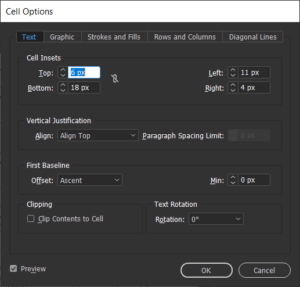
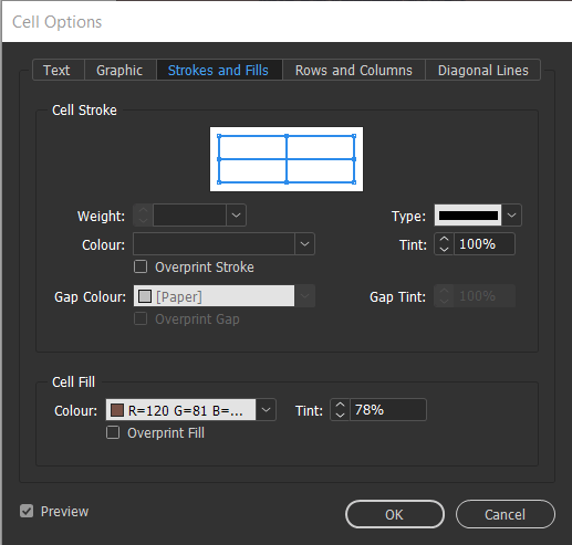
For the cell style options, I changed the cell inset sizes to make sure that the table does not appear crowded, and the information is easy to read (Figures 03). The use of space in this example is vital as I have not intended to use any rules between the columns and the rows. I created this effect by adjusting the ‘stroke and fills’ settings found in the cell options (Figure 04). To remove all lines I selected both vertical and horizontal strokes and set their colour to ‘none’. Figuring out how to use this feature was quite tricky, but as I worked my way seeing what works and what doesn’t, I eventually got the gist of it.
Figure 04
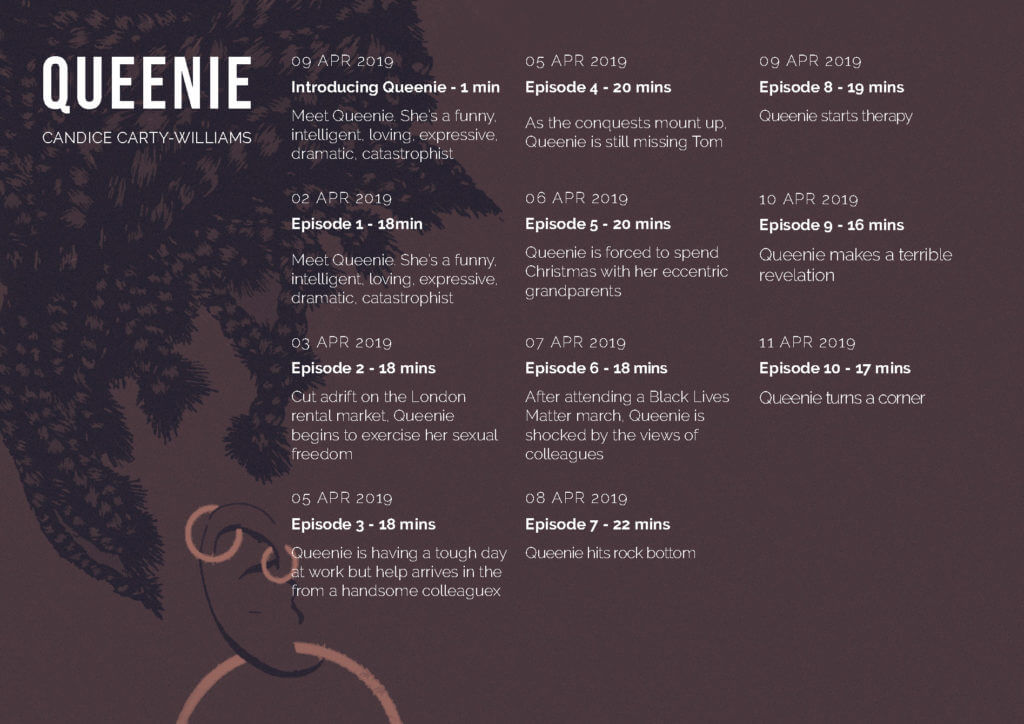
After I was happy with the table I created for this design, I started to format the text. I decided to put the dates at the top as this seems like one of the most crucial information to the intended user. For the dates, I chose to use the all-caps type because I wanted the information to be easier to find and comprehend. Furthermore, I simplified the dates so that they are easy to understand within seconds but also to save space. For the descriptions, I used the regular font since this information is the least important.
Idea 1Figure 05
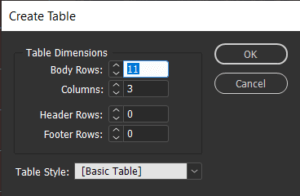
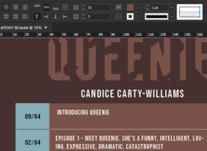
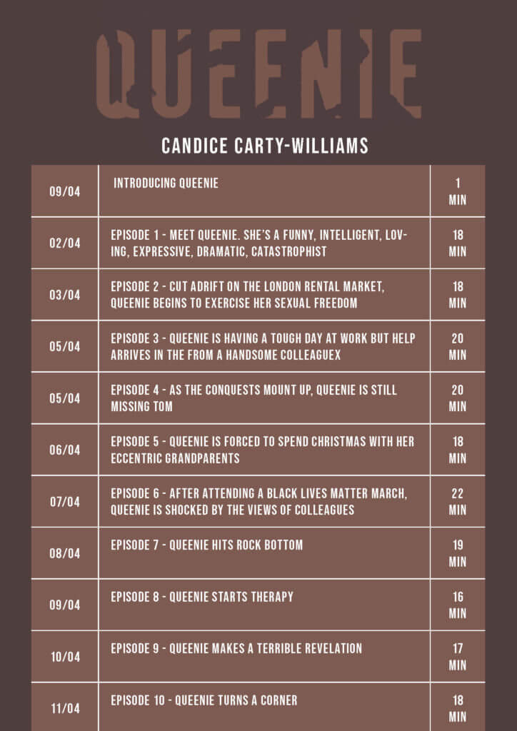
For my second design idea, I wanted to experiment with the table in a different format – portrait. While working on this idea I tried to focus more on arranging information, rather than focusing on the visual aspect of the design. I first made a text box and followed the same steps as my previous design. By choosing a portrait format, I realised that I could utilise more space and make the information more readable. Unlike in my previous design idea, I did not have to worry about maths and try to work out how many columns and rows I need. Instead, I created eleven rows an three columns: first for the date, second for the general information and third for the duration of the podcast (Figure 05).
Since the cells in this design were much narrower than in my previous design idea, I decided to add strokes to make sure that the information is not mixed up. After experimenting with the table and cell styles, I learnt how to use cell styles to recreate this effect. Using a feature found in the top bar menu, I could select the individual column and row strokes and change their weight as well as style (Figure 06).
Figure 06
To use this feature, I picked the columns I wanted to format. In this example, I highlighted the first column and highlighted the strokes I’d like to format. Once I chose all the elements to edit, I changed the colour/weight and saved the formatting in a new cell style. I repeated this step for the rest of the rows until I was happy with the result.
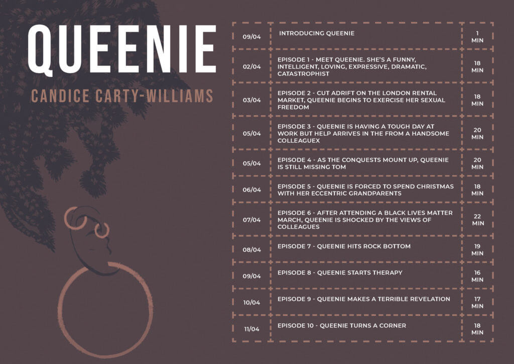
Idea 2
In my final design idea, I decided to combine the two styles into one. Both designs were equally good; however, I noticed that each had flaws In them. By picking out the favourite elements from each design, I managed to create a table that is legible but also visually appealing. Since this is a form of advertisement, It was important to me that the designs I created were eye-catching; this was not the case with my second design idea with lacked ‘decoration’.
Final Design Idea
Software tutorials
The tutorials I found on the brief were pretty useful since I lacked even the most basic knowledge of tables. The tutorials, however, were a bit too basic and I wanted to challenge myself during this task. Over some time I allowed myself for this task I watched several videos on Linkedin learning. These were very useful as they not only explained the basics of using tables but also had an in-depth demonstration of the other tools. Since I am only used to working with text; therefore, the character and paragraph styles, I was surprised that tables have styles as well. I was quite happy to realise that they work in a very similar way. What I learnt through Linkedin Learning was very useful, as it allowed me to style every single element of my table. This is unusual to me because I am used to creating tables on PowerPoint or Excell, where the styling of the tables is limited.
On the other hand, a lot of the tutorials I watched were quite outdated. For example, one of the videos dated back to 2015. Adobe updates its programs on regular basis, meaning some of the features in the version of the program I’m using, were not discussed in the tutorials. Because of this, I’d like to further explore new features related to making, styling and formatting tables. Often, the features introduced by Adobe have a goal of speeding up the designing process. Working under pressure is something that I struggle with; therefore, it would be useful to know some tool that could speed up my design process.
Resources for research and inspiration
Because many of the videos watched as part of my research were fairly old, I found them quite uninspiring in terms of what I can achieve using InDesign. Having said this, I looked at examples of modern tables and noted some key features that are not seen in older table designs. One notable key feature is the use (or lack of it) of horizontal and vertical strokes. It was quite common for me to come across works, in which the stroke seems to be the major contributor to the overall design of the table. Another notable feature was the use of colour in these tables. The main purpose of the stroke is to identify between the different columns and rows in a table. Although they are functional, often they are styled in a specific way: e.g. light, dark, dashed or dotted. In my last design idea, I experimented with the different stroke types. After trialling the different styles, I concluded that I liked the look of the dashed line. At first, I struggled to recreate this idea, because of my basic knowledge of this feature. Eventually, I became much more confident and my experimentation leads me to create this effect.
I also researched the book itself. Although this was unnecessary I didn’t know anything about the book; therefore, I felt quite uninspired. The only images I could find are that of the book cover. By analysing the branding features on the book cover, I figured out what style I’d like to use for this design. Learning what the book is about has also influenced my design decisions – at first, I found it difficult to think of any ideas; however, after reading reviews of the book it was easier for me to decide what I’d like the design to look like.
