
For Gerry’s project, we looked at different typefaces and were given two tasks, which was using clues from the visible parts of letters and try to imagine how the rest of the letters may look like.
Task 1
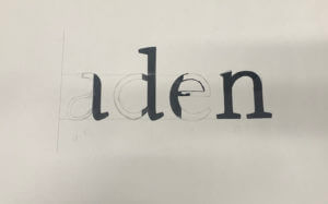
In the first task, we were given a sheet where half of the letters were printed and we were to draw the rest of the letters. The sheet I had chosen was the font ‘Rosetta Type Skolar’ and the word that spelt out after we were done was ‘aden’. I focused on the terminals of the letters and kind of replicated them when drawing the other halves of the letters, as I believe it was one of the main elements of the font. I had also drawn the x-height and the baseline of the letters in pencils (not very visible on camera), to help me with drawing the letters in the same height. Unfortunately, I was unable to finish filling in the letters with the black markers but Gerry had gone over the different fonts and explained to us the differences, the spacing and the context of the typefaces. This was very interesting to know as it would help us to choose what typefaces to use when we need them for future projects and we were also informed of where to get fonts from.
Task 2
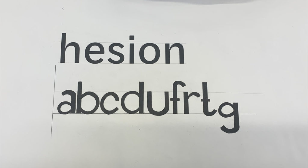
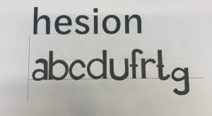
For the second task, we were given the word ‘hesion’ in a specific font and using that as a clue, we were to draw the letters ‘abcdufrtg’, figuring out how the letters look based on that font. In my sheet, I had the word in the font ‘Darden Studio Halyard’. I started off by drawing the x-height and the baseline on the paper. Then I measured the height of the letter ‘h’ to see how tall the stems of the letters should be. I had also measured the width of the stem of the letter, so as to draw the letters as accurately as possible. After all of this, I proceeded to draw the letters, using those measurements and also focusing on the shoulders and the variation of thicknesses of the letters.
Thoughts on this project
Overall, this project helped me in understanding typefaces even better and the amount of time and thinking that goes behind creating new fonts, whether its a variation of one or a completely new one from scratch. I was also revealed to the reality of the fact that it is indeed not easy to draw letters in a certain typefaces quickly and it takes years of practice to master this skill.