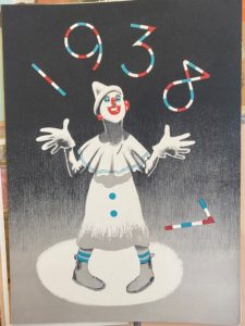
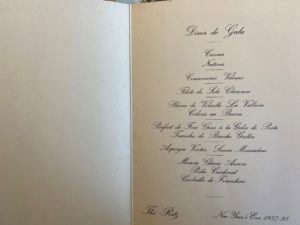
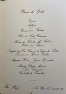
The Menus shown above were made in 1938 for The Ritz Hotel. I was initially drawn to the choice of design on the cover as it doesn’t reflect the brand identity of the upper- classed hotel, but the choice of a clown suggests the entertainment and classical element if the Ritz. The typography presented inside the menu demonstrates the traditional and glamorised element of the hotel, as they’ve used rather flamboyant serif fonts that almost like its been hand written. The layout for the menu is unusual for the time as it focuses on appearance rather presenting the information clear for customers.
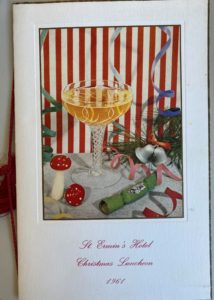
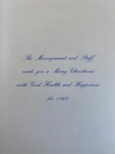
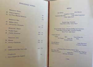
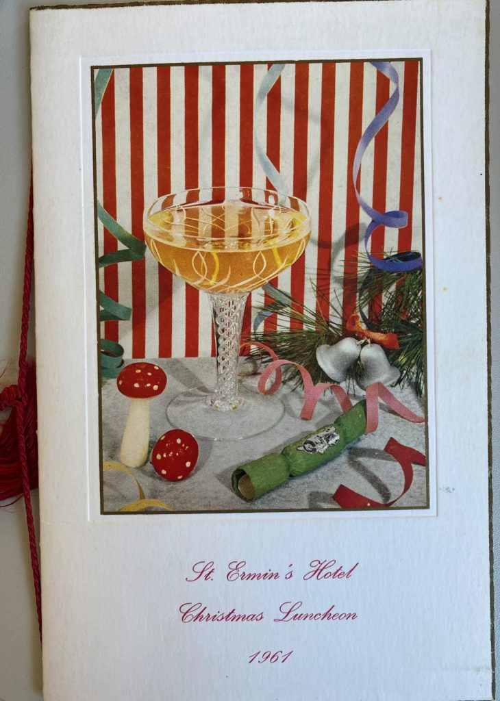
The menu above was created in 1967 for a slightly lower classed hotel. Again the menu uses a painting as their feature cover image as well as a decorative piece of string. But the main difference between the two menus is the layout of the menu and the use of a more simpler serif font. The menu has a more clearer list for customers and include the price of the food whereas the Ritz menu doesn’t. The ST. Ermin’s Hotel also includes the use of coloured ink reflecting the the evolvement of type design.

