
We were given a project to create a flyer for the Reading Film Theatre Autumn 2017 listings. We had to create two different designs based on the information given and our own research.
In the brief, we were asked to keep in mind the targeted audience when making the flyers and consider the layout and typography used and they were:
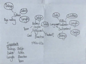
- A father with two children under 10
- A visiting professor working in Reading, but originally from Switzerland
- A retired doctor and her husband, both of whom have a passion for old Hollywood
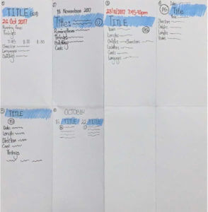
Firstly, I brainstormed the important details essential for each target audience and circled out the ones that was important amongst all of them. Then, I sketched out some potential layouts for the movie listings.
After having some ideas of how I wanted my layout to be, I searched up the RFT logo and based on that, I chose the colour palette for my flyers. The main colours were red and grey. Then, I proceeded to edit the text information about the movies and its details and I noticed, obviously, that a lot of vital information, such as running times, country of origin, etc were missing.
![]()
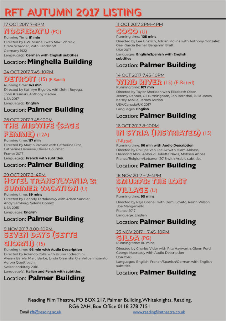
Keeping the target audience in mind, therefore, for my first design, I went with a grey background with black and red text over it. I had used red for the movie titles, so that they stood out easily and I focused on making the movie running time, location of the theatre and languages available more visible, so as to make it easier for the target audiences to find these details easily, as I believe these are what the targeted audiences would look up for when searching up information of the movies. I kept my overall design simple and straightforward so that everything is accessible without much trouble.
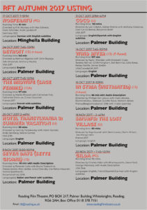
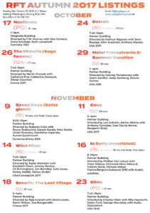
For my second design, I decided to categorise the movies in terms of the months they were being aired in the theatre. I used a gradient of red, grey and orange for the heading, sub headings and movie titles, to reflect the colours of the RFT logo. I did the layout of the dates of the movies from left to right and I grouped the age ratings and running times together as I believe they were the most important in terms of the hierarchy of information. For the rest of the information, I had laid out the times and the location first and then the other bits. I had also kept this whole design simple to make it quick and easy to find the information needed.
Overall, I really enjoyed this project as I got to learn more in depth about InDesign and about layouts and hierarchies and I believe all the skills I have learned from this project will help me in my ‘Design for Reading’ book design project as well.
The PDF version of my flyer designs: