Category: Student work

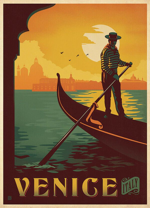
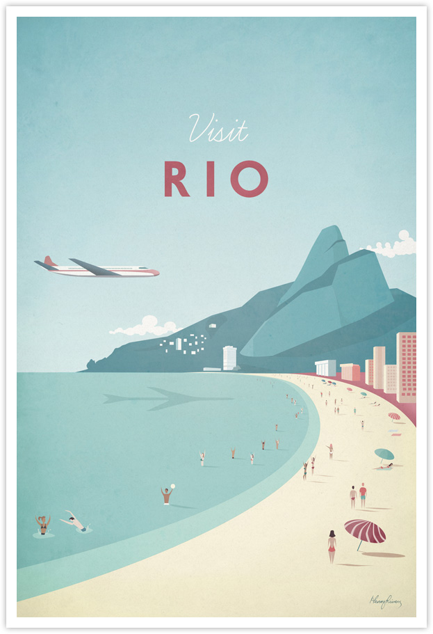
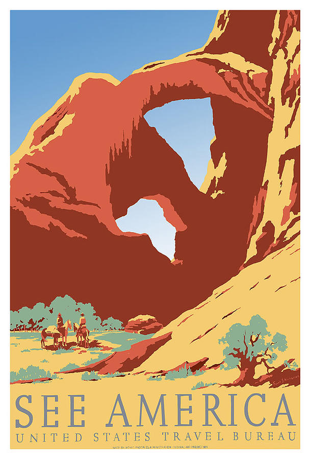
Retro logo

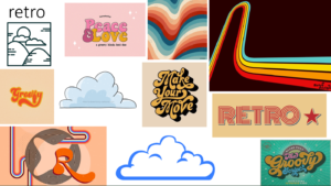
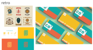
I had a lot of fun with this project.  you can see from my mood board my inspiration, but my focus was a retro theme. by looking at many retro designs I saw a great emphasis on line work, bubble, and pop fonts, and either pastel or primary colors. these are the things I chose to incorporate into my design. this project was very fun and I learnt a lot on illustrator.

New York Hotels

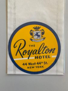
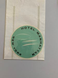
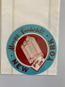
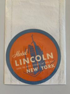
When looking at the collections highlighted along by Emma was clear to see that there were some interesting and intriguing items, the ones standing out to me being the New York Hotel logos. Vast arrays of colour, combined with their simplistic image is a common part of all of their designs which builds a logo that is crisp, clear and interesting whilst being simple and informative, a balance within these designs that I found particularly intriguing.

Whilst all the designs shown convey the standard circular shape, an image and the name, they are still all unique in their own ways when looking at the typography, layout and colours.

The Royalton Hotel uses a san serif font for all its typography other than the name of the hotel itself, emphasising the hotels importance of highlighting the hotels name and making it stand out so customers or passers by become familiar with the name. Hotel Manhattan on the other hand is much more simplistic, a stylish ‘M’ as the image along with a san serif font on a coloured background, the anomaly in the 4 examples as there is no inner circle, no secondary colour and no secondary typography.

The other two designs are a little more adventurous with two colours working harmoniously together, a building silhouette as the image and the combination of a san serif font and a secondary more brush script like font. These designs are all successful in their own right but when looking at a hotel sign the second example despite being quite minimal is not necessarily my preferred design but I find the others too crowded with information, the second design has the image in the centre surrounded by text which is much easier to read compared with the other examples.

Typeface drawing

Following the Thursday interactive session from Gerry Leonidas, I have come to recognise and acknowledge the details in typography as well as overall design.

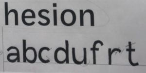
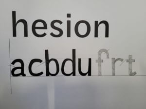
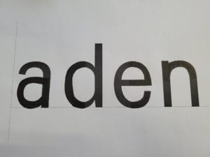
The session had us draw letters of a particular typeface that was only in small parts that were pre-drawn; and from that reference we had to draw the rest of what remained of the text. I believed this exercise was to test our knowledge of not just typefaces, but to see if we could guess the following style through little information.

The picture on the right of the page illustrates an example of my drawn work that shows how I continued with the pre-drawn typeface. Compared to the original, it was fairly accurate, however the “a” and “e” required more curvature, after being given 4 words, the task moved onto doing more without a starting reference on what we had to draw. Very similar to the first example I had drawn, they were mostly accurate other than the curvature of the lines on certain letters. In future projects, I will need to improve my skills of refining and recognising fine details, especially when it is related to text or fonts. These drawing skills will help reintroduce me into sketching for future assignments as well as improving my confidence in refinement.

To conclude, the session helped me understand the foundations of what future analysis of designs/typefaces will require. Additionally, as I have not drawn for a while, it was always helpful to regain my confidence into drawing more again.

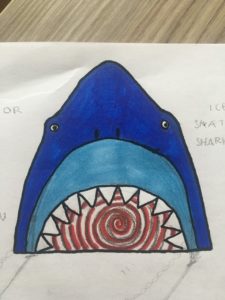
Shark Outfit Generator

I was partnered with Daisy and the 3 things she said about herself were;

  • She likes sharks
  • She likes shopping
  • She likes chocolate

My initial ideas were having a robotic shark for a personal shopper, chocolate on tap in all shops and edible clothing made from chocolate. But for my final idea I created a ‘Shark Outfit Generator’. The idea is the shark eats you, acting as a walk in wardrobe filled with every clothing item and style available, helping to dress and style Daisy.

Labyrinth book narrative

For this brief I chose the word Labyrinth.

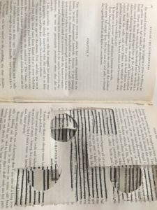
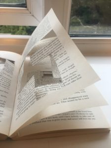
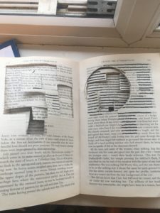
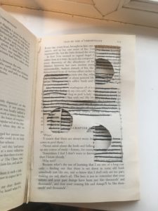
I cut out different shapes and sections on the pages, each page representing a different chunk from a labyrinth maze. As the chapters went along, I cut out more and more sections, making it harder to the reader to turn the page, trying to correlate the number of chapter to the number of maze pieces.

Each page had it own individual shape, which made the pages more fragile and easily tearable causing the reader to be more cautious as they turn the page, much like in a labyrinth. I started to block out some of the text but realised this made it easier to see where the next maze sections were. Therefore, I stopped making it more complex too read as the the text lines up with the sentences behind.

Working with technology

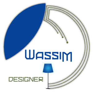
At first, I chose my theme modern furniture. Then, I started searching on how  I can present my theme and develop it into a mood board. I thought about what feel I want to present to the reader and what typeface I wanna choose. For me, circle presents the most modern shape and therefore the best way to show my theme. I presented technology on the shape on the right as I wanted to show the connection between every smart object. I connected the lines to a lamp that shows modern furniture and tried to play with the colors In order to show the 3D effect. Then, I used the shape on the left to show the floating feel. Finally, I used a modern typography that represents technology and played with the characters size in order to balance my logo.

Damien’s Ideal Gift – Tiger Trophy with other statues

Set of statues and trophies for different aspects and interests of Damien.

I wanted the main gift to be a trophy to celebrate his 5 years of playing ice hockey. The jersey has his team number (13), and one of his favourite animals is a tiger, hence the combination. The sketching began with a simple silhouette of a tiger standing up and then was decorated to fit the colours of Damien’s team.

The other animals are decorations for Damien’s room, as he could use some more. He told me he likes reptiles and small animals, and so I drew a chameleon and a chinchilla. My random words to incorporate were umbrella and magazine, so I gave the chameleon a little umbrella, and the chinchilla is holding Damien’s magazine called Tag, that he worked on a couple of years ago.

Set of statues and trophies for different aspects and interests of Damien.


Circus Poster

My chosen piece from the collections today was this circus poster. I was drawn to this poster because its helpful…but also not. It only gives generic information such as what they have to offer at the circus, but not specifics such as times and location. Therefore, making the poster unhelpful for public planning to attend. However, in the image below it shows a blank space below the title. I think this is where the timings and dates would have been placed but due to a circus constantly being on the move, it’s cheaper and easier to leave the space blank until needed. Another noticeable point in this poster is the size and shape of it. The image above shows the poster is a vertical rectangle. This type of shape would have been used firstly to reduce cost, but also for space on walls or lamppost to advertise. As the bigger the poster, the more likely it was to be cover by something else, therefore creating a poster this size helps to reduce those chances.

Further on to the poster being cheaply made, a lot of the print hasn’t managed to transfer properly. The image below shows an  inconsistency in the blank print around the red letters. For example, on the letter T in tiger, there is a consistent black boarder around the letter. However, with the rest of the word there is a lack of black outline around the letter, compared to the word above, ‘Norna’. I think much of this is due to the poster being cheaply and quickly made. Hundreds of these would have been printed and they were only needed for a short amount of advertising time, so a small inconsistency in the print wouldn’t have meant much.

Due to the poster having no date or location, it makes it difficult to date the poster black to a specific time. The colours used are red and black, which were the favoured colours used in typography during the modernism movement, which helps to date it back to 1930s. Further to this, the image below shows that the circus was mainly made up of animal acts, which are now banned in the UK due to animal welfare. These types of acts were more popular and allowed around the 1930s, helping to date the poster back to the early to mid 20th century.