When looking at the collections highlighted along by Emma was clear to see that there were some interesting and intriguing items, the ones standing out to me being the New York Hotel logos. Vast arrays of colour, combined with their simplistic image is a common part of all of their designs which builds a logo that is crisp, clear and interesting whilst being simple and informative, a balance within these designs that I found particularly intriguing.
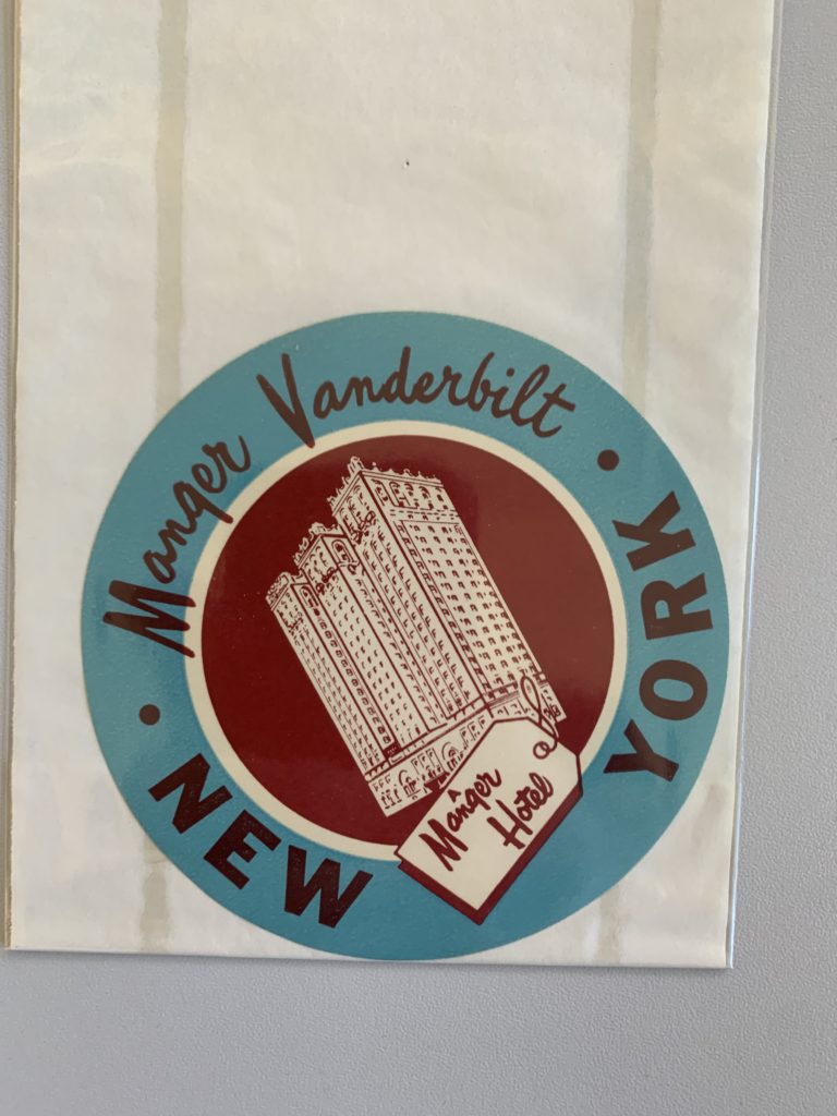
Whilst all the designs shown convey the standard circular shape, an image and the name, they are still all unique in their own ways when looking at the typography, layout and colours.
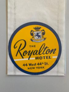
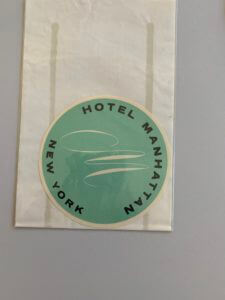
The Royalton Hotel uses a san serif font for all its typography other than the name of the hotel itself, emphasising the hotels importance of highlighting the hotels name and making it stand out so customers or passers by become familiar with the name. Hotel Manhattan on the other hand is much more simplistic, a stylish ‘M’ as the image along with a san serif font on a coloured background, the anomaly in the 4 examples as there is no inner circle, no secondary colour and no secondary typography.
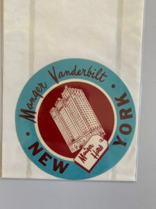
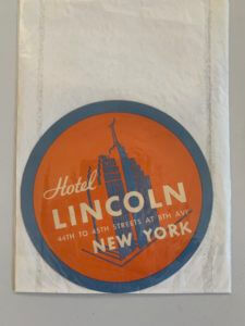
The other two designs are a little more adventurous with two colours working harmoniously together, a building silhouette as the image and the combination of a san serif font and a secondary more brush script like font. These designs are all successful in their own right but when looking at a hotel sign the second example despite being quite minimal is not necessarily my preferred design but I find the others too crowded with information, the second design has the image in the centre surrounded by text which is much easier to read compared with the other examples.