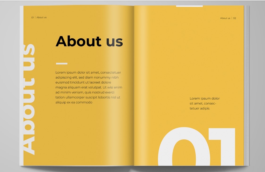
Interested in the MA Communication Design? Join us at our Open Morning and discover our 4 pathways. Visit the Department of Typography & Graphic Communication, chat with lecturers and current students, and get advice about how to apply.
Date: Tuesday 25 April 2023, 11am to 1:30pm (BST)
Where: Department of Typography & Graphic Communication, Whiteknights Campus, University of Reading
After a welcome from Dr Ruth Blacksell, Department Director of Postgraduate Taught Programmes, a presentation about the MA Communication Design will focus on our 4 pathway routes: Book Design, Information Design, Graphic Design, Typeface Design. This will be followed by a walk around the Department and a look into the studios. In a Show and Tell session, you will get a glimpse of our special collections. We will close the morning with a tour around our current Department exhibition.
This Real Job comes in the form of a contest, something fairly unusual for these briefs. Following a recent social trip to Carter’s Steam fair, a traditional English travelling funfair, members of the department began talking with attraction owner, event organiser and sign-painter Joby Carter. After learning more about his incredible talent and passion for hand painting stunning fairground signs, this competition was developed, giving students an opportunity to experiment with this highly niche style. To me, this seemed like an amazing way of trying a new typographic style, experimenting, and playing with this fun concept.
An image of Joby Carter hand-painting lettering for a sign. Found on https://www.jobycarter.com/
Brief
The brief of this work was very straightforward – to pick a brand and recreate its logo in the fairground style. While specifications of the deliverables were given, being digital or physical and being a 2000px square, the choice was left to us. Joby stated in the brief that he personally enjoys poking fun of serious topics and making the most of the jovial, light-hearted nature of fairground lettering.
Concept
Immediately having read the brief, I began thinking about the most serious business that I could put a spin on with this decorative, over-the-top lettering style. My mind raced to topics like finance, law and banking which quickly led to Legal & General, a financial services provider that’s been in operation since 1836. The history of this company was really engaging, reminding me of old legal documents, such as those seen below. The typeface used are highly decorative and ornamental, being somewhat like the fairground typefaces linked to the fair, allowing this to marry well, being a suitable and engaging brand to remake in this unique style.
Example of legal documents use of decorative lettering, on a stock certificate from the 1980s. Found at glabarre.com/item/Dunleith_and_Dubuque_Bridge_Co_Stock_Certificate/18001
Initial Ideation
Beginning this work, I started sketching different letterforms and concepts for a Legal & General logo, having looked through Joby’s work online for inspiration. I was immediately faced with a challenge – my lack of artistic ability. I typically refrain from sketching and drawing, knowing I am stronger creating things digitally. While eager to move onto Photoshop and Illustrator, I knew the importance of these fast-paced, initial sketches. While many pagers were created, below shows the strongest concepts.
Key pages from my initial sketches
Digitising
Before meeting with Joby, I wanted to refine the better concepts digitally, giving myself a clearer direction going into the imminent feedback session. With my sketches being very rough, this would give a much more blatant presentation of my idea and how it may be executed. I quickly generated these designs, using the umbrella element which I thought was the strongest from this ideation. While the lettering itself was just a standard font, this would be changed later following the feedback.
Some of the digitised experiments based on these first sketches
This is the first ‘final’ design, featuring the umbrella corner ornamentation and a typeface, only the ampersand being created by hand
Meeting Joby Carter
We then had the opportunity to meet Joby Carter, visiting his expansive workshop in Maidenhead. Hearing Joby talk about his work, his process and even watching him hand-paint some lettering was hugely informative for this project and style. The difference between typography and lettering was a really interesting idea mentioned by Joby, with his discussing how different they are treated and how lettering is a largely different skill. While getting masses of inspiration from Joby’s work and enthusiasm, it was clear this was not a skill that could be mastered quickly. I came to the conclusion that, while the hand-made, slightly imperfect appearance is key to the authenticity of this style, I would need to utilise some digital effects and techniques to get close to replicating the skill of professional lettering painters.
Images of Joby’s hand-painted signs from his workshop
Following this event and the following feedback session, I decided to largely restart the concept. Knowing much more about lettering and sign-painting after meeting Joby, I decided to return to ideating, wanting a new concept that was more in line with how hand-painted lettering is constructed and designed.
Secondary Ideation
Going back to square one, I went back to sketching, now having more focus on this style of lettering. These sketches were much closer to what I’d learned about sign writing, providing much more engaging ideas focussed on the letterforms themselves, knowing the rest could come after. Placing the focus on constructing the letters allowed the outcomes of these sketches to being much better foundations for the final outcomes.
Secondary sketches more in-line with the style of lettering in Joby’s work
Secondary Digitising
For this process, there was much more switching between hand-drawing and digitally creating. Knowing that the imperfect style could only be achieved effectively by hand, I persevered with sketches alongside designing digitally. This allowed me to bring across the more rustic, authentic style of lettering without oversimplifying the designs digitally, using Adobe Illustrator to make things mathematically perfect. This also let me test designs digitally, deciding if the sketches adapt well into a digital space or not. While more time consuming, this meant that the idea I concluded was the best would undoubtably work. After some back and forth, I selected a sketch that was suitable, drawing out the key letters for the brands logo before digitising them. By creating the letterforms by hand, I knew that the end result would have the rich authenticity of hand formed text, but would likely be more challenging and time consuming to create.
The refined sketches of the lettering style, featuring all the relevant letters to construct the full brand name
The digitised version of these sketches, with the other letters being roughly drawn to fit the style
I was already much happier with this concept than the previous design – this put much more focus on the lettering, adhering to both the brief and what I learned from Joby, with the careful crafting of the basic letterforms being the key to an effective, successful outcome.
Over this time, there was extensive tweaking and refinement to the characters, with countless iterations being used to mark milestones and save a history of the process to compare changes. The image below illustrates part of this.
Here is part of the letterings evolution process. While professional painters would achieve this balance of perfect imperfection, it took me a much longer time to tweak and alter this typography to get somewhere close to this, relying heavily on the softwares tool to help
Feedback from Baseline Shift
Baseline Shift provided another outlet for feedback on this design. The weekly session happened to be centred around getting advice and tips from various designers in and out of the department, allowing us to get helpful guidance from people new to the project. Wanting to take any opportunity for advice, I presented my current digitised lettering.
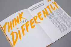
The main feedback I got from this was that it wasn’t fun enough. While this was partly down to the colouring, which hadn’t been considered yet, the overall composition was very linear and straight. The various typographers and calligraphers present all agreed that a more dynamic, free flowing structure would benefit this style much more, giving a more organic and fun sense to the letterforms and the overall branding.
I was also advised to use less strict lettering, ensuring duplicates of the same letter aren’t identical. This would allow the type to work better as a full flowing text, the letters adapting to work alongside those before and after. It also provides a much stronger sense of authenticity and a hand-crafted appearance, with each character seeming visually distinctive and individual.
This is the updated lettering shown during the Baseline Shift meeting, an unfinished example of the lettering without considering colour.
Making Changes and Feedback
Wanting to inject some ‘fun’ into this lettering, I experimented with different layouts, using Joby’s work and other sign-painters works as examples for structuring text. After some quick trials, moving the two lines of text around, I settled on offsetting this and using exaggerated, large first letters. This more stylised appearance is more in-keeping with conventional letter painting conventions, immediately making it more fun and visually inviting. Adding vibrant colours and an offset drop shadow, common features of this genre, also helps quickly make this design feel more in line with the brief’s requirements.
Despite being a quick derivative of the previous design, adapting the text to be more visually exciting, this version is much more successful
Below are some variations of this concept, simply experimenting with colour combinations and for the main text, drop shadow and background. While still trying alternate background colours, Joby’s use of slightly off-white tiles for his lettering along with its function as a logo encourages me to use a plain white background. From here onwards, I would stick to a solid white background, feeling this had a stronger connection to Joby’s painted lettering.
Here is some of the various colour combinations tried at this stage, looking for something in keeping with the genre of sign painting, using Joby’s work and choices as inspiration for my own
At the feedback session, where I showed both my original and updated concepts, there was a resounding lean towards the newer concept. The more dynamic, varying design was much more visually interested and had the sign painting-esque appearance. I was given incredibly useful advice on the typographic balancing, and different parts of the letterforms to tweak to give more visual balance. However, I was told again to make the design more fun and inviting, potentially using perspective, distortion or warping to add further excitement.
While the added ampersand completed the logo, finishing the brands name with the simple & symbol, it was suggested that this could match the ornamentation below, adding more consistency to the overall design and making it feel more harmonious and unifying. With this knowledge, I will start making these changes, wanting to try adding a wave or warp stylisation to give the text even more dynamism.
One key takeaway from this stage was the colours – this designs dark green and murky pink complimented each other and the golden yellow ornaments well. I quickly concluded that this colour combination could be the basis for my final outcome, being highly suitable and similar to the wacky but visually pleasing choices of Joby Carter.
While this design needs more work, this is definitely close to the final design. The warp effect needs to be smoothed out and improved, but the colours are something I definitely intend to keep
Refining the Letterforms and Warping
With this feedback in mind, I began to move forwards with the design. Despite my eagerness to play with the waving and distortion of this lettering, I knew I would have to correct the letterforms themselves before taking it further.
These corrections to the letterforms were very time consuming to alter – having created these letters by hand, these imbalances were much more prominent than having used an existing typeface by a more experienced typographer. But, as emphasised by Joby, a typographer and letter painter are very different professions, and building this type from hand ensures some imperfections and authenticity remains in the final outcome. The quantity of these changes is illustrated in the below images, where the key iterations are shown.
More of the development, trialling the distortion tools in Illustrator and tweaking the character balance further.
For example, the two ‘A’s are of particular interest. I altered the way the crossbar works on each one, the first having the curved stroke going inside the letter and the second going out. This tweak to the second instance allows much better balance, filling in the negative space and creating more visual engagement between the letters.
This illustrates how the lettering has been adapted for the context of it’s use, with the second A fitting the letters before and after much better, balancing the design
After a brief trial of warping the text in Illustrator, I concluded it would be simpler in Photoshop, applying a single wave effect to the whole design before reading the ampersand and ornamentation. Having quickly completing this, I created the drop shadow and a white stroke to separate the main text from this shadow. While beginning by offsetting a pink version of the letterforms beneath the main design, I then connected the two with hand, adding the outline in after. This subtly change made the design feel less artificial and impersonal, with the minor inconsistencies in perspective making the result seem much more personal and in-keeping with this disciple.
While a minor difference, connecting the drop shadow to the text in front gives a much better sense of place and dimensionally to the effect
While not mentioned much, the ornamentation was something that subtly evolved throughout the design process. From its initial creation, this has been altered and tweaked, both in shape and style. I was advised to make this element have varying widths, looking less uniform and have a more hand-created style similar to the letters themselves.
While this began as a symmetrical component with the ‘EST. 1836’ text in the centre, I began experimenting with an asymmetric structure, creating more visual engagement and helping to account for the lettering’s visual balance. This structural change causes the umbrella to be removed from this element, but I knew it was a feature I wanted to include in the final design. Trialling different strokes and decorative flares (shown below), I found a solution which worked effectively, feeling balanced below the focal lettering.
The most recent adaptation of the ornament element and some key changes in its development
Final Amendments
During the final feedback session, there were much less tweaks to change (a reassuring sign). The main thing to note was the balance of the hanging ornament. It was said that fitting this ornament into the negative space below the wavey text, the whole concept would feel much more balanced and the two would marry together better. A straight bottom was also advised, helping to ground the flowing text to a horizontal line. This worked well, achieving both and giving a nice sense of visual balance.
This shows the change to the ornamentation, now fitting into the gap between the big ‘G’ and wavey remainder of the word, making this element fit better alongside the lettering
I re-added the umbrella element, adjusting its stroke width to better fit the other similarly styled elements. Placing this below the enlarged ‘L’ and alongside the large ‘G’ helped to further balance this concept. It’s place here allowed it to be a relevant visual for the brand without over-complicating or crowding the design. The use of colour also helps keep the lettering distinguished from the ornamentation.
Adding the umbrella element in this section links this branding much more towards the original organisation, making this more of a stylised adaption of the original. Placing it here allows for a much better balanced overall design, having 3 elements in this style and keeping it visually pleasing and engaging
To add a final bit of depth and hand-made authenticity, I added a subtly gradient to the offset drop shadow by hand, allowing for some subtle imperfections. With this desire for a slight rustic feel being key to my design process and choices, I felt it important to continue it in every element.
Final Outcome and Self-Reflection
The final design outcome, achieving the brief and rebranding Legal & General in a fairground lettering style
Looking back at the final deliverable and my process, this has been undoubtably challenging but very rewarding to participate in. This style of design, particularly the hand-made nature, is out of my comfort zone as both a designer and typographer. Particularly when developing initial ideas, I found this Real Job tough. Meeting with Joby Carter was the first step in the right direction, with his knowledge on the subject really helping in each aspect of the following design phases. The continual feedback throughout this work also helped immensely, allowing me to show different ideas and get alternative opinions on work.
While I by no means compare my work to that of talented, trained professionals like Joby, I am happy with my outcome. I believe it achieves the brief well, fitting the style of fairground lettering and appearing hand-made and authentic despite being a digital asset. While this is not what I expected to be doing on a Graphic Communication course, this project has given me an immense appreciation for this disciple and the incredible talent and craftsmanship that goes into making such effortlessly stunning hand-painted lettering.
After joining the instagram team in our first year of University, we (Emily and Rio) began to co-lead the Instagram at the beginning of 2022. Our experience of being on the team previously gave us a good prior understanding and ideas of what to post and we already had a structure. Once the Instagram was officially handed over to us, we began to make our own decisions about how to lead the team, what content to post and set ourselves goals to improve our online presence.
Our Goal As soon as we were handed full control of the instrgram, we felt we should focus all our efforts to making the account feel more like a welcoming community for current students, gradates, lecturers and friends of the department. We also felt it was crucial that we captured the department in a way that was appealing for prospective students, showcasing the vast range of projects, techniques and classes available on our course. To do this, we wanted to share a larger variety of posts, creating a more engaging feed. We also wanted to aim to post much more frequently than the previous years team, and engage more with other accounts.
Updating the Account
We immediately noticed that the account had a very unprofessional bio. It did not accurately portray our department as it had a chaotic and haphazard appearance. The first noticeable change to the account was updating this bio, making it feel much more considered and designed. Emily had the idea of adding a link tree to our bio, adding level of functionality as it would provide viewers easy access to the department website, UoR website, open day bookings, baseline shift talks and much more.
Planning and posting In order to achieve our goal of posting more frequently, we implemented a new strategy for planning posts. We used an excel spreadsheet to plan our each month of posts, and allocated each post to a member of the team. The idea behind this was to get more organsied and allow each member to have a clearer idea of what to post, and when to post it.
Unfortunately, in practise this did not work as well as we had initially intended. Often, team members would forget to post on their allocated day, or other content would come up that wouldnt follow the structure and disturbed the plan. In practice, this strategy was too rigid and. Once we realised this wasn’t successful, we met with the team to discuss their thoughts on how well this was working. We all agreed that a more forgiving and less strict structure would work better for the nature of the content that we post. We also discussed with the team that frequent reminders on our group chat would be helpful to remind team members to post content.
New Content
Typography Posts
Emily had the idea of using our account to better celebrate the typographic side to our departments course. To do this, we contacted Gerry, and requested links to typefaces designed by past MA Typeface Design Programme students. From here, Emily designed a carousel post template and began showcasing these typefaces regularly on the account. We felt having these posts helped us achieve a more considered and balanced feed, providing us with an element of consistency within our posts.
These posts did well in terms of engagement, and we were pleased to see type foundaries sharing us on their stories!
Inside the Department As we have previously mentioned, we wanted to create a more welcoming and community feel to the account. One of the main ways we strived to achieve this, was by sharing both feed posts and reels, capturing the department itself, as well as classes such as feedback sessions.
We found these posts did really well, not only with the current students, but also past graduates, providing them with a sense of nostalgia! This was especially the case with the video content and the photography of the outside of the building.
Tips and Advice
Over the summer holidays, Rio thought that it would be a nice idea to welcome the new Part One’s with an advice post to help motivate them and inspire them at the start of this new term. IIn order to achieve this, we implemented carousel posts that shared wisdom from graduates of the department as well as current students. We found this post was welcomed warmly by our followers and would love this concept to be adopted by the new team and continue to share tips and advice!
Introduction of Guides
Guides are a feature on Instagram that allow you to collate posts into one space within your account. We felt this would be the perfect opportunity for us to help current students find the work of previous year groups, to take inspiration from examples of work and to get a better understanding of what will be expected from projects. With this being said, we made a guide for each ‘part’ as well as a guide of Real Job projects, MATD typeface posts, posts within the department, and baseline shift content.
Having implemented this into the departments account, we spoke to a few students who all agree that it was a ‘useful’ addition allowing easy access to content, especially when you are looking for a particular type of post.
Creating these guides have also been useful to help us grasp a better understanding of what we need to post more or less on the Instagram. For example, at one particular point in the year, Emily and I found ourselves posting a lot of Part 2 content, as it was the most accessible to us at the time. Therefore, we decided to recruit new students in the year below to hellpus out with posting, and got in touch with students in the year above to ask permission to post their work.
Engagement & Following
One of the main goals of posting on social media is to promote our department to new students, as well as create an online community of students, staff and alumni. Therefore, engagement and following is important to consider when posting. We have realised that certain posts ie: pictures of the department, or posts that follow trends increase engagement, and often, we have aimed to focus our content based on which
Looking at out insights on our professional dashboard, we can see that in the past 90 days of running the instagram account, we have reached 61% more accounts compared to 1 Jun–29 Aug, engagement has increased by 29% and our follower count has increased by 3.4%.
Looking back on our posts since we have lead the team, there are certain posts that have stood out to us as being more successful than others, and these are backed up by interactions and reach. To measure the success of a post, we take into account the number of interactions with the post such as likes, comments and shares, as well as how many accounts the post has reached. Using our professional dashboard insights, we can see what our following found the most engaging, as well as features of posts which drew in non-followers.
Little miss post
With 203 interactions with this post, the little miss post that we illustrated and designed ourselves was our most successful post. This post was designed in response to a popular trend on social media based on the well-known Mr Men book series.
Joby Caters Workshop With 199 interactions, our post about our recent visit to Joby Carters sign writing workshop has been another hit amongst our followers. Photos of lettering and typography are something that would be enjoyed by the majority of our following, so it is no wonder that this post did well. Posts such as these are important to keep other members of the department up to date on what everyone gets up to.
Photographs and reels of the department Our posts showing photographs of the outside and inside of the department, frequently received comments such as ‘love that place!’, ‘missing the yellow doors’ and ‘brings back memories’. We found that sharing these photos have been particularly successful amongst alumni, bringing back memories for former staff and students reminiscing their time at the department. These kind of posts are also useful or prospective students to grasp a vision of what life in our department looks like.
Preparing the New Team
During the autumn term, we decided to speak to the years below us, and gather new members to join our team. Having run the instagram as just a pair for several months, we felt it was key that we grew our team both for our benefit, to take the pressure as we were now part three students, but to also set up the new team to take over from us. We planned to take a step back from running the instagram towards the end of the autumn term, and did our best to guide our new team members towards new leadership and help make them comfortable posting and sharing content. We held several meetings throughout the term to share the idea we had for new content, as well as encouraging the new members to share any thoughts they had. We hoped to ease the new team into taking over the account rather than what we experienced, and leaving them to fend for themselves without prior warning!
We are delighted to say that we were able to recruit four new members to our team and we hope we have provided all the support and encouragement they need to allow the instagram to continue to grow not only as a social media account, but also as a community for students, staff and friends of the department.
Our Thoughts
As soon as we were handed the account at the start of 2022, we came up with a huge range of ideas. Unfortunately we were unable to design all these posts and implement them into our feed, however we definitely feel we have made a hugely positive impact on the Instagram, improving the content, engagement levels and community feel to the account.
We believe we have successfully maintained a consistent posting schedule, posting throughout the week. Previously, when we were under the leadership of the year above, we found that we lacked content especially at the start of each term, with the majority of posts being shared after from end of term submissions. We also found the content was mainly final mockups of work. We feel we have used our prior experience regarding this, and made a series of changes to improve not only the feed’s variety, but also the engagement with our content.
It was an absolute pleasure running the Instagram and we both feel we have gained valuable experience throughout the process. We feel our success lies with our ability to work collaboratively to run the account, gaining key skills in team leadership and time management. On top of this, we were able to harness our creativity to bring new and engaging content to the account in a variety of ways.
On top of this, we hope we have successfully prepared the next team, helping ready them for the creation of new content as well as maintaining new ideas that we have implemented ourselves.
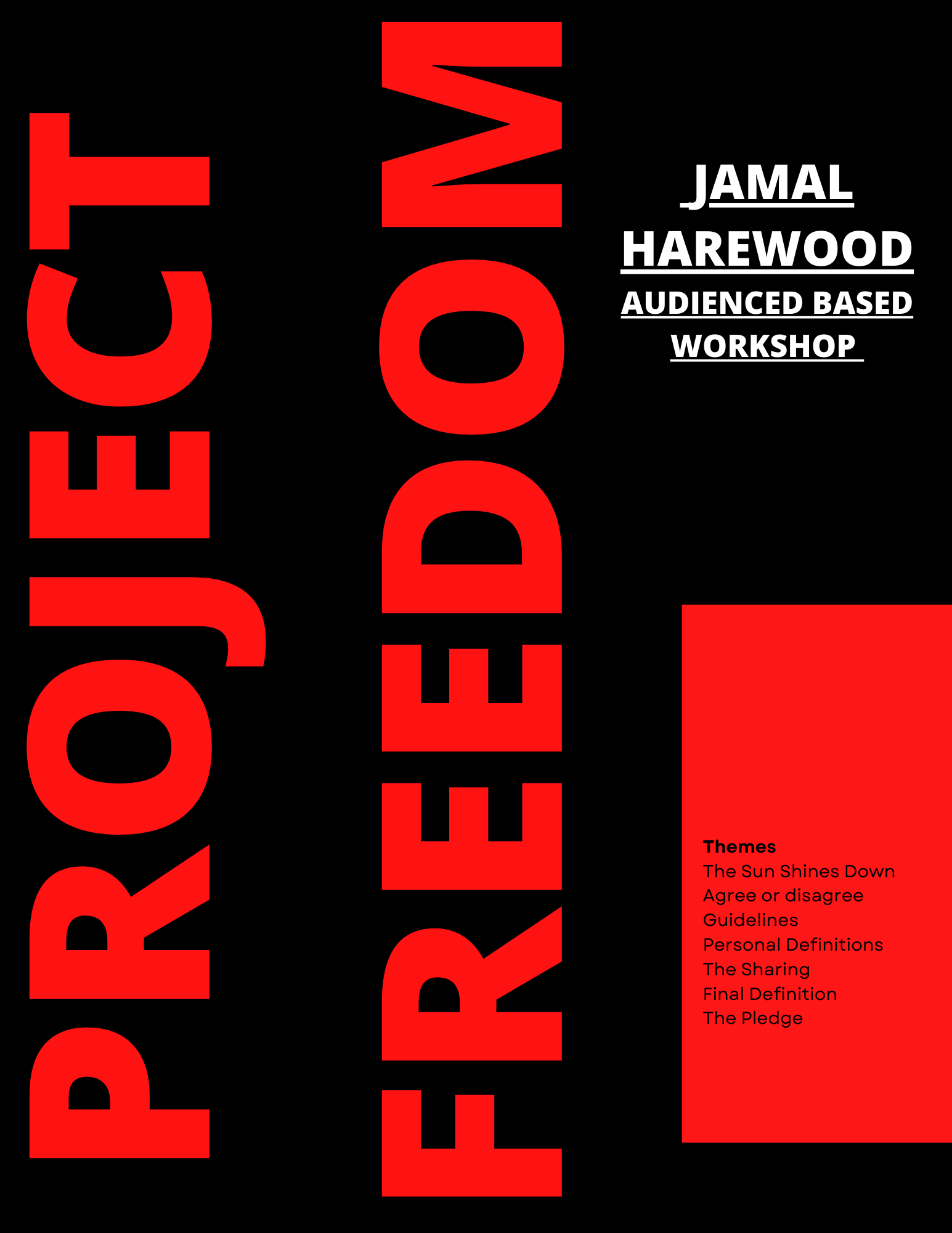
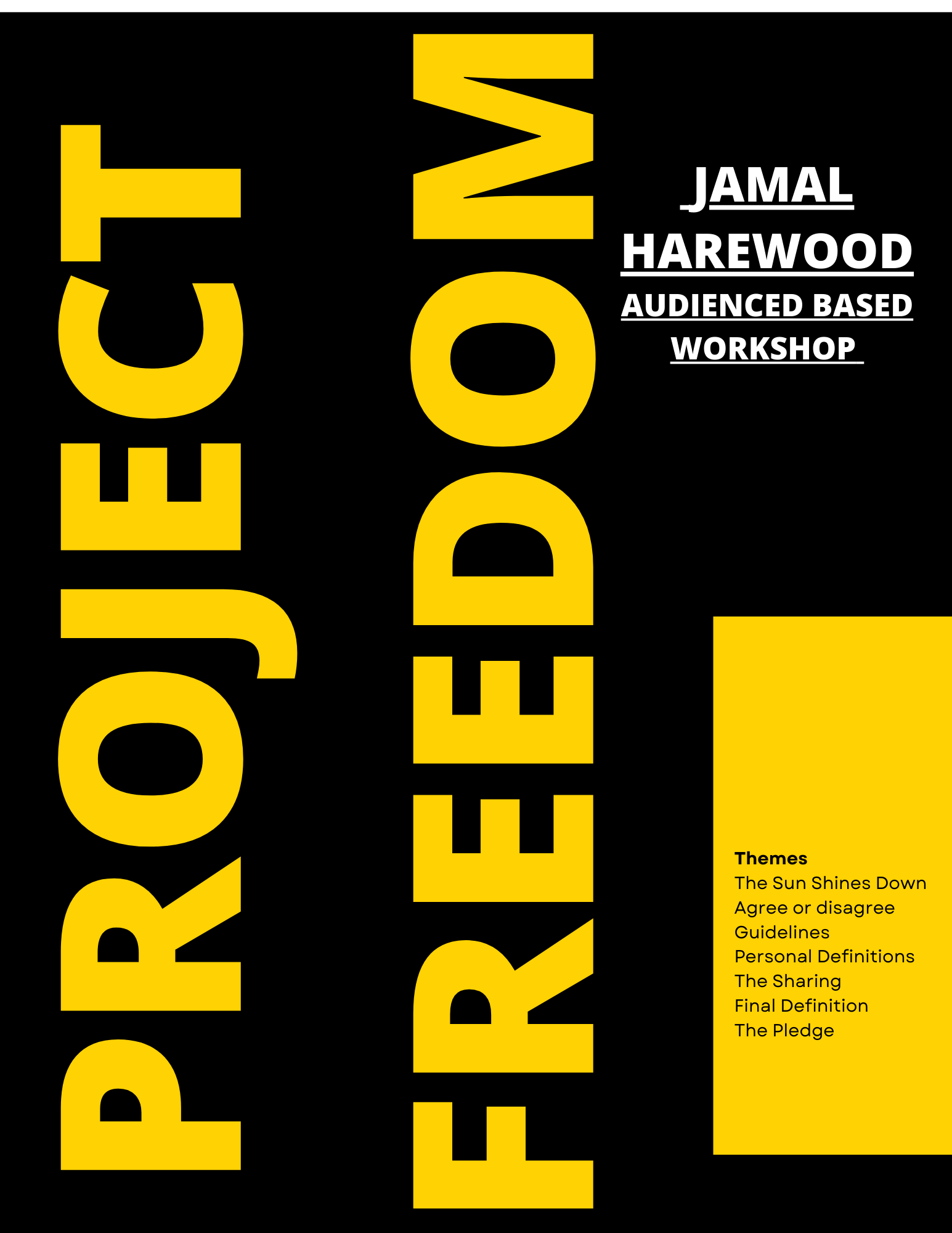
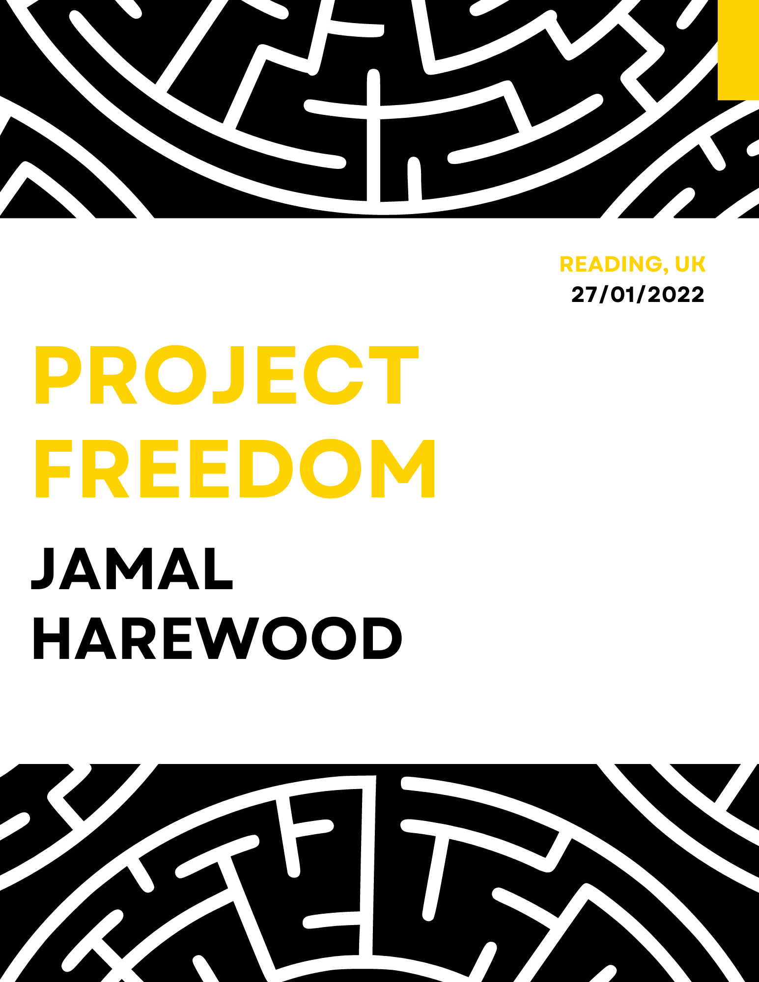
RJ00455: Student-lead Department Instagram 2022
Emily Collard & Rio Ware
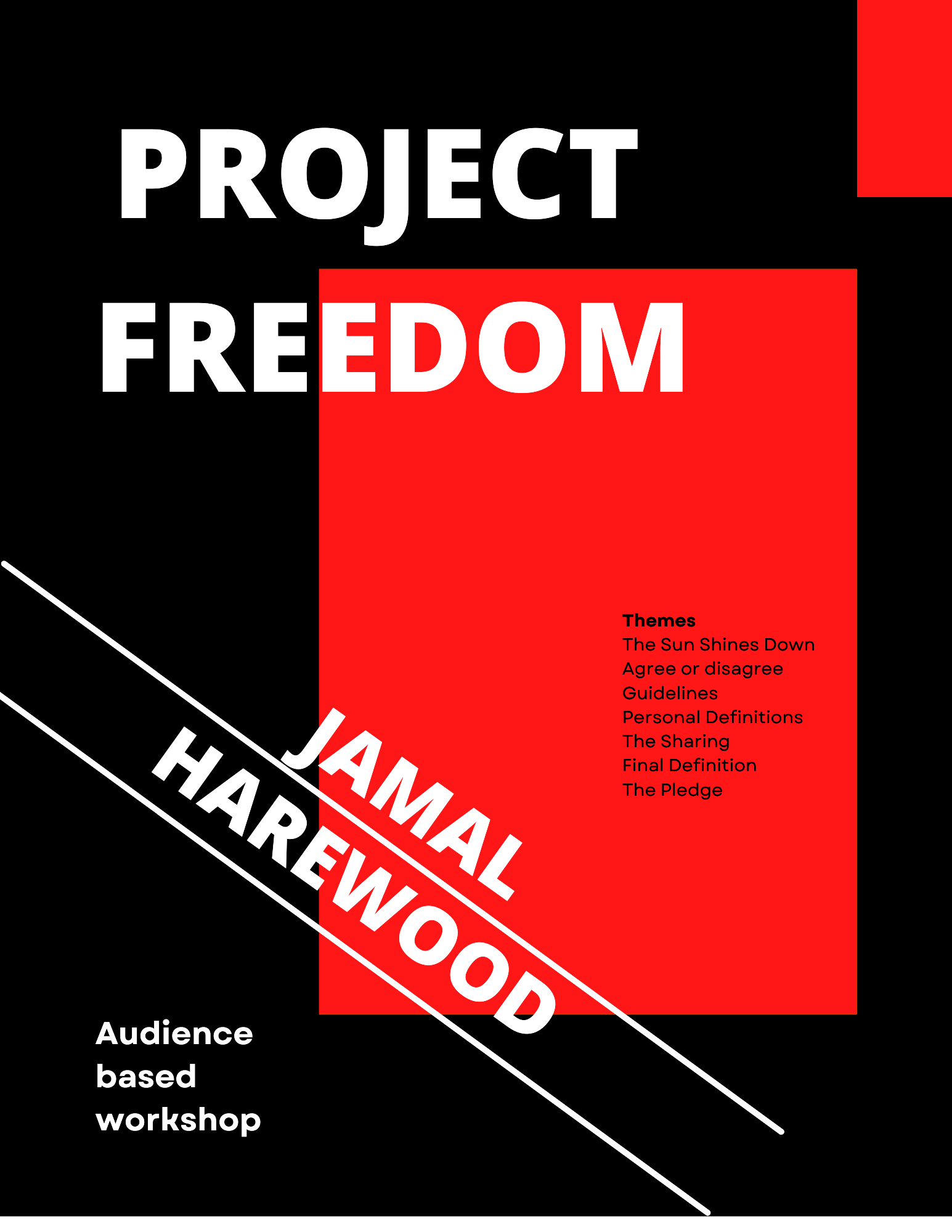
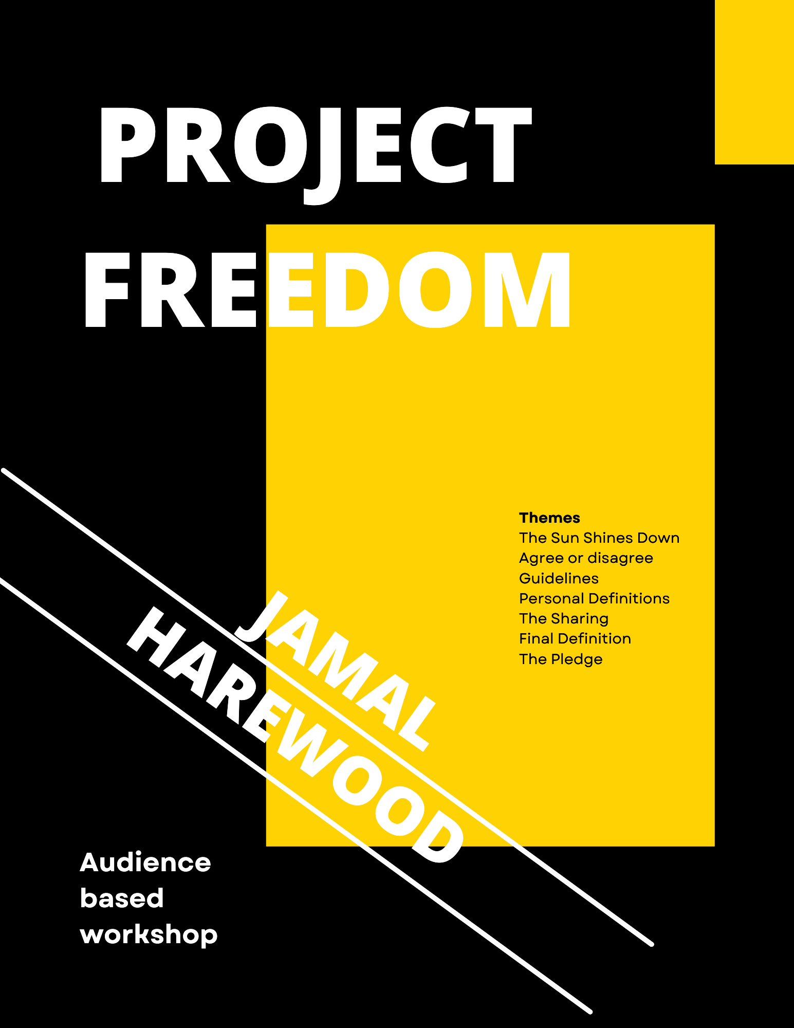
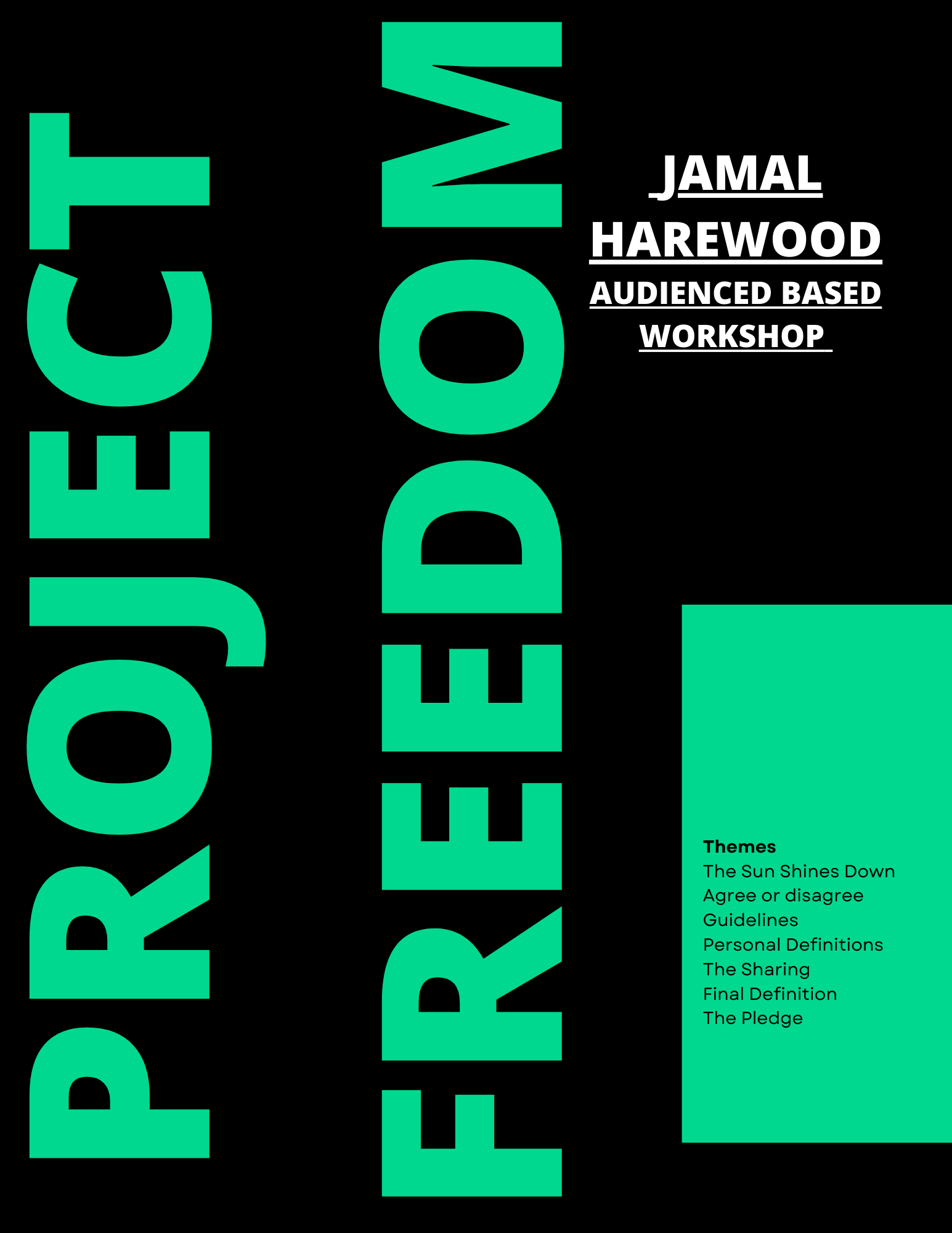
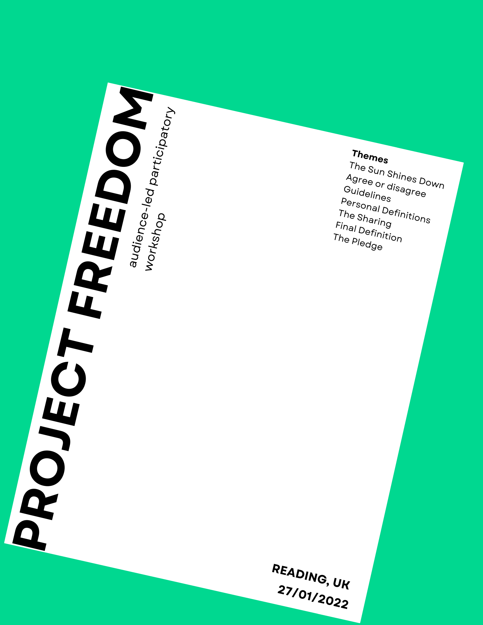
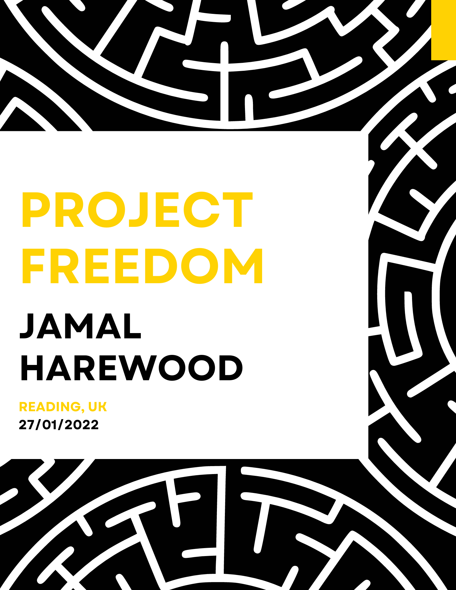
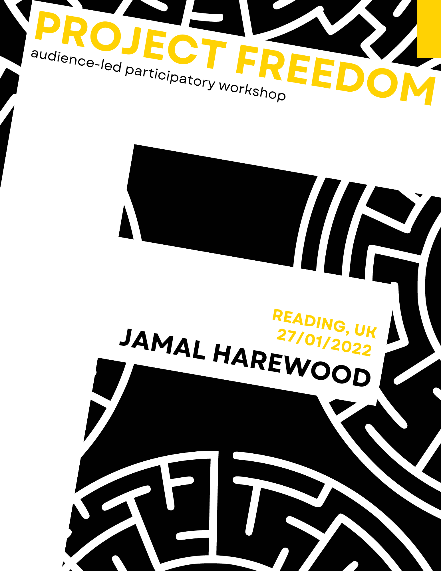
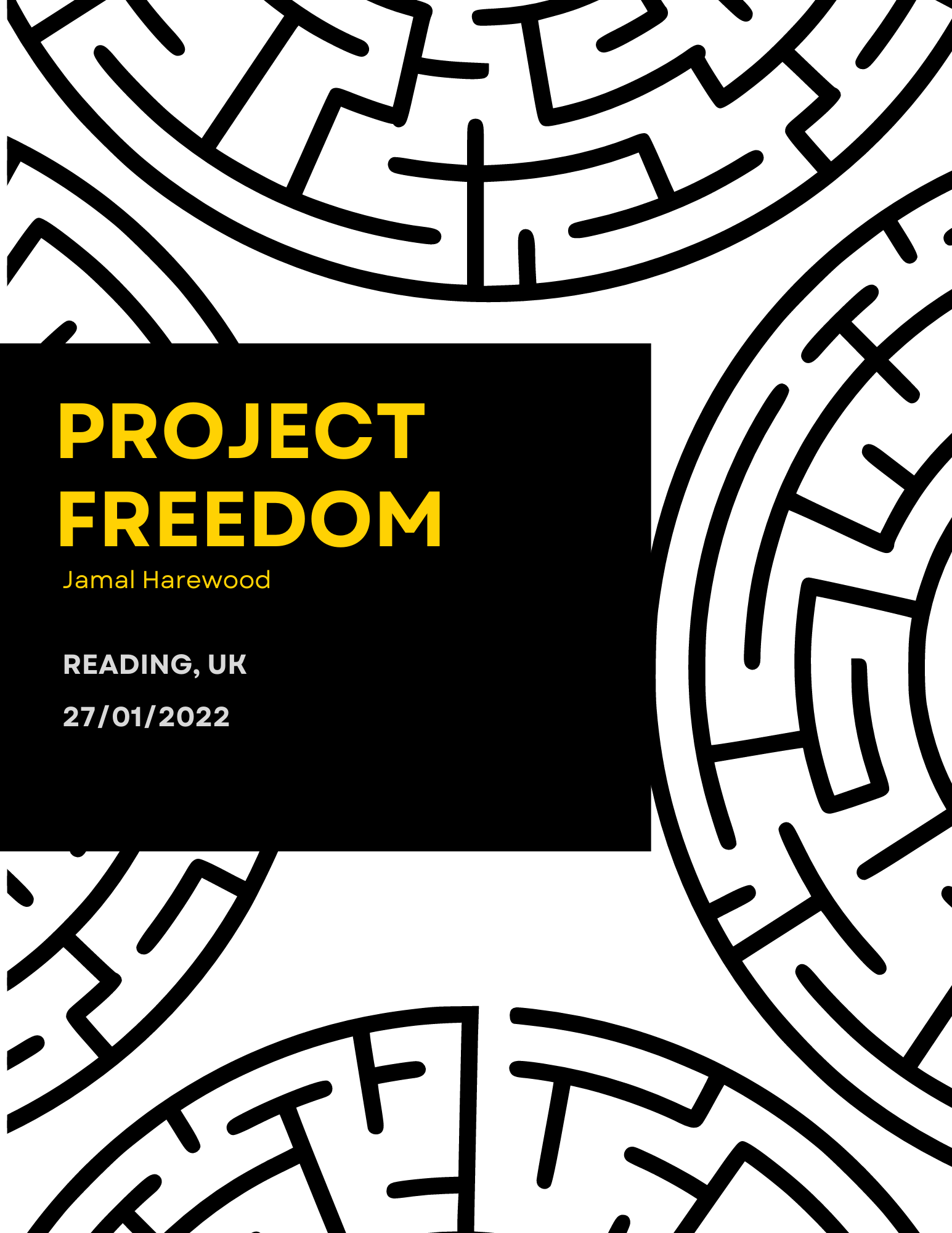
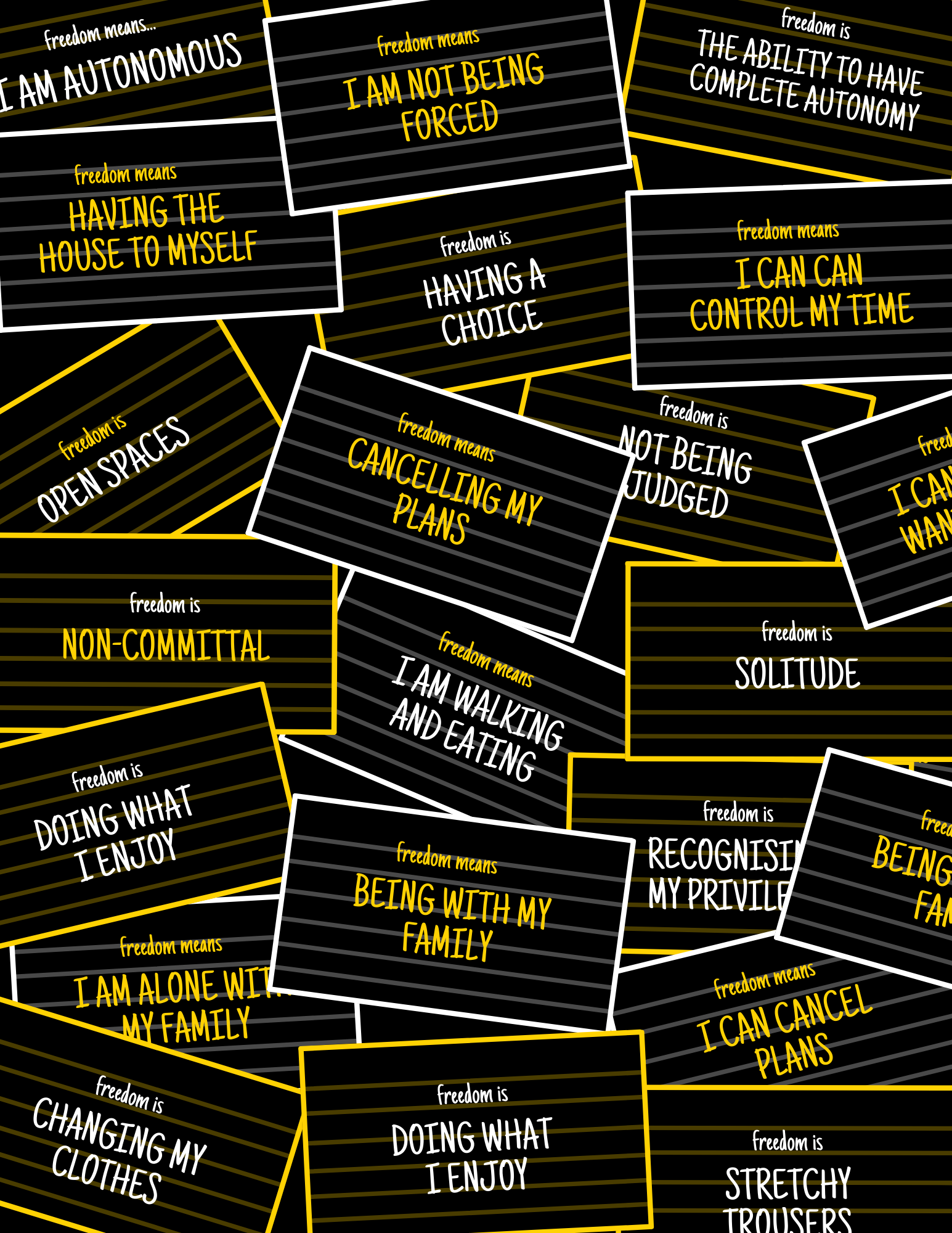
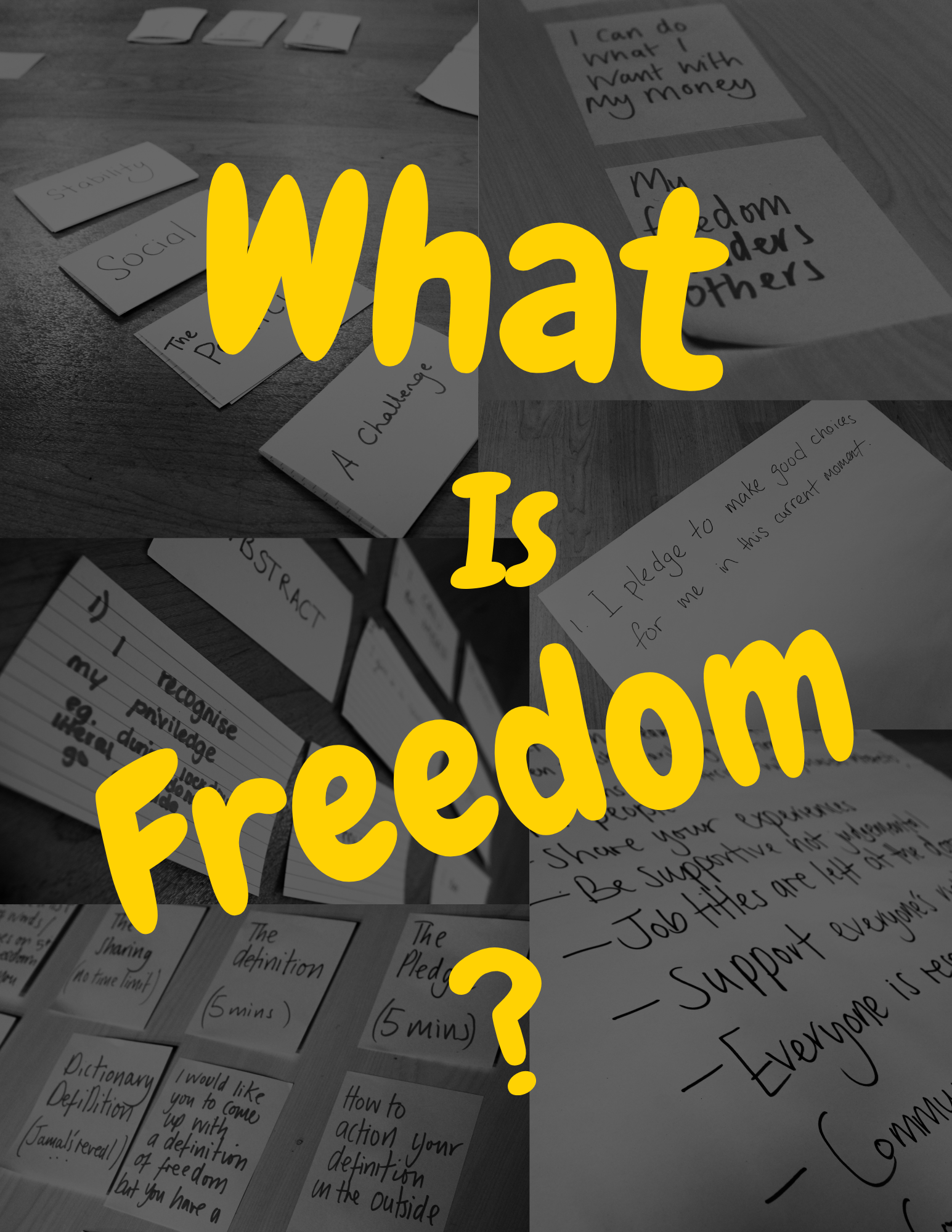
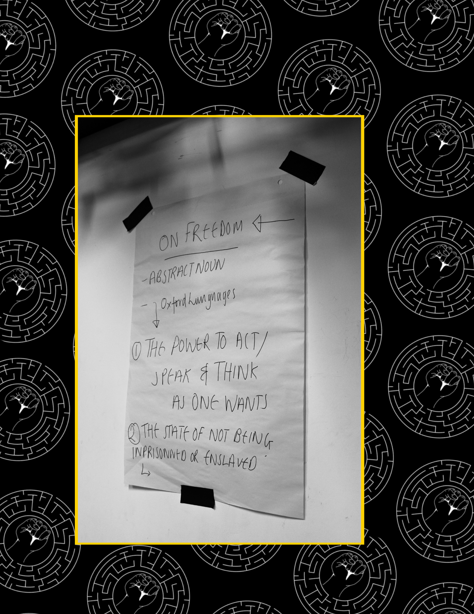
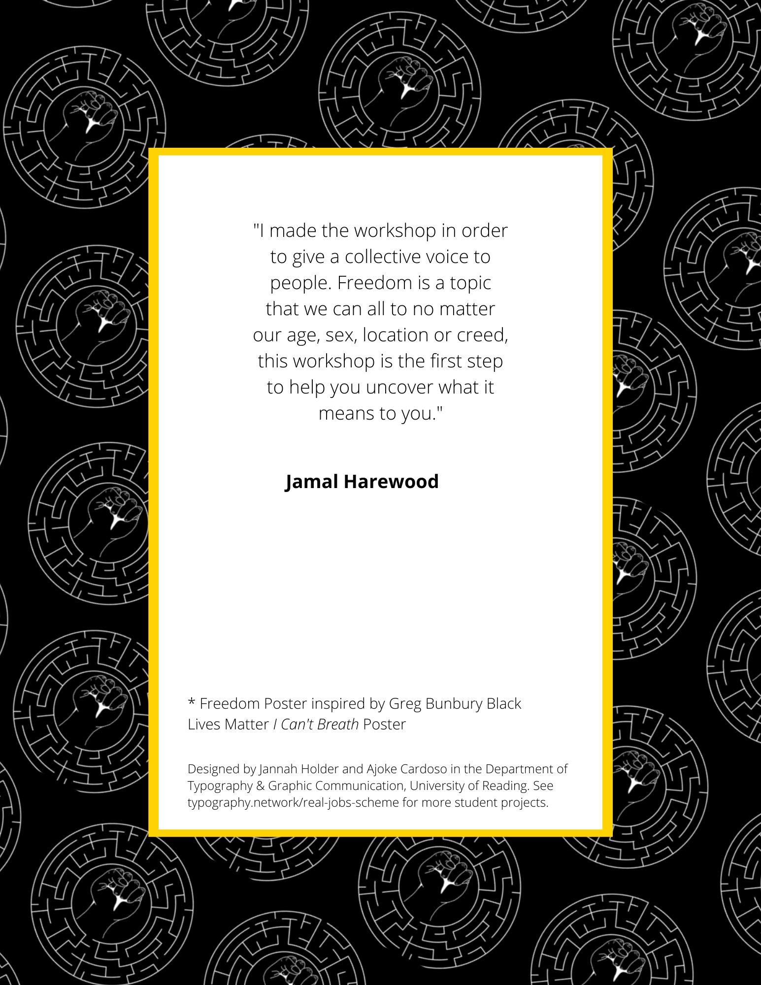
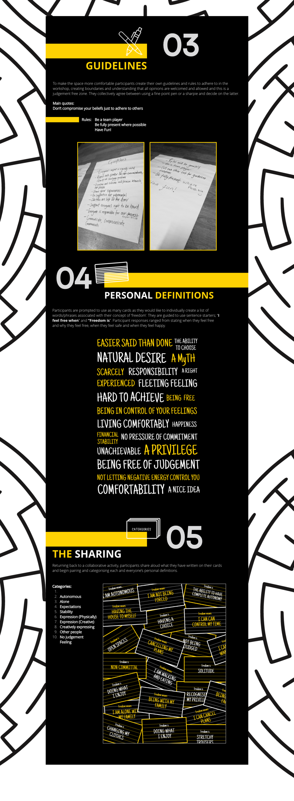
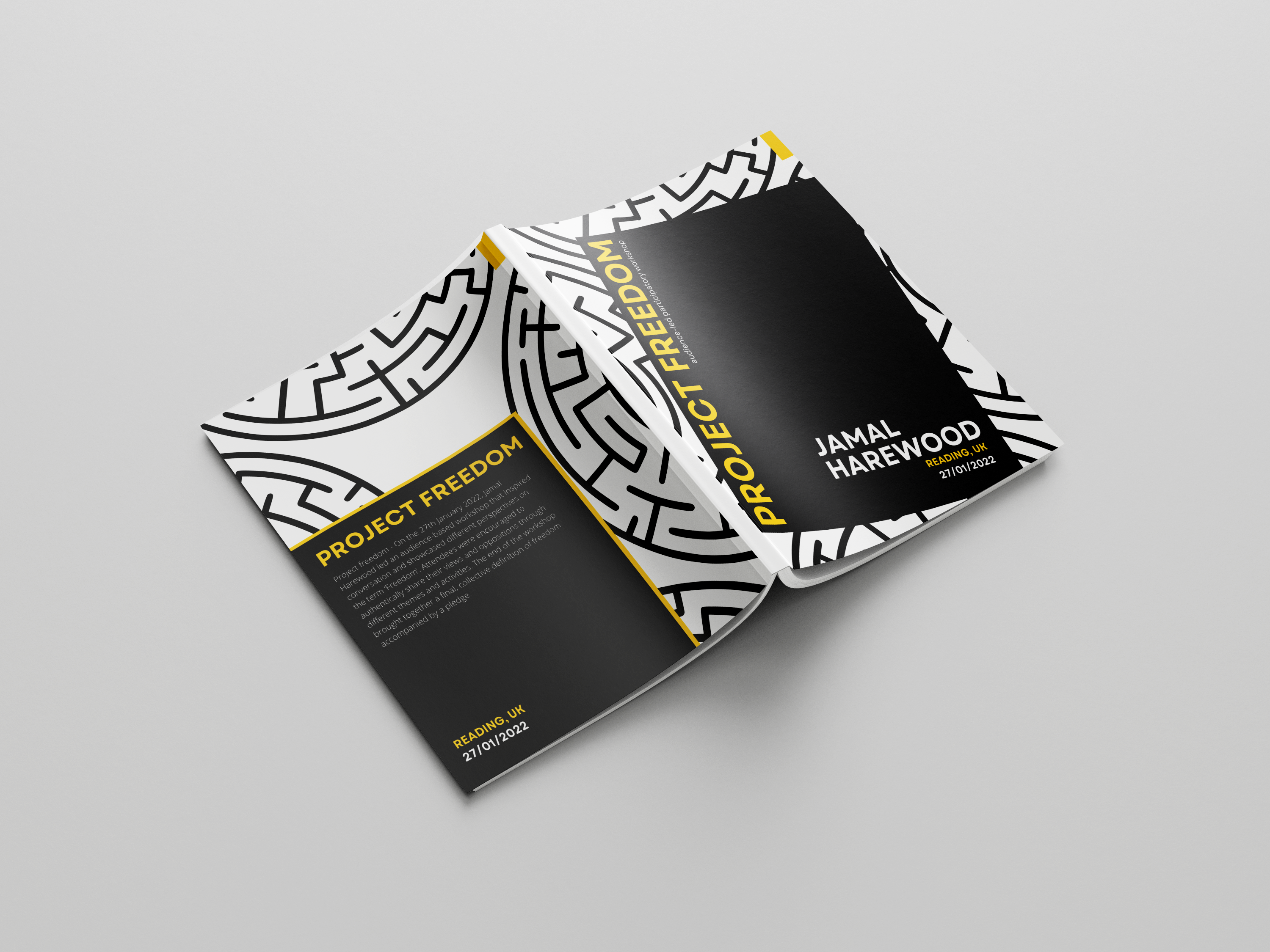
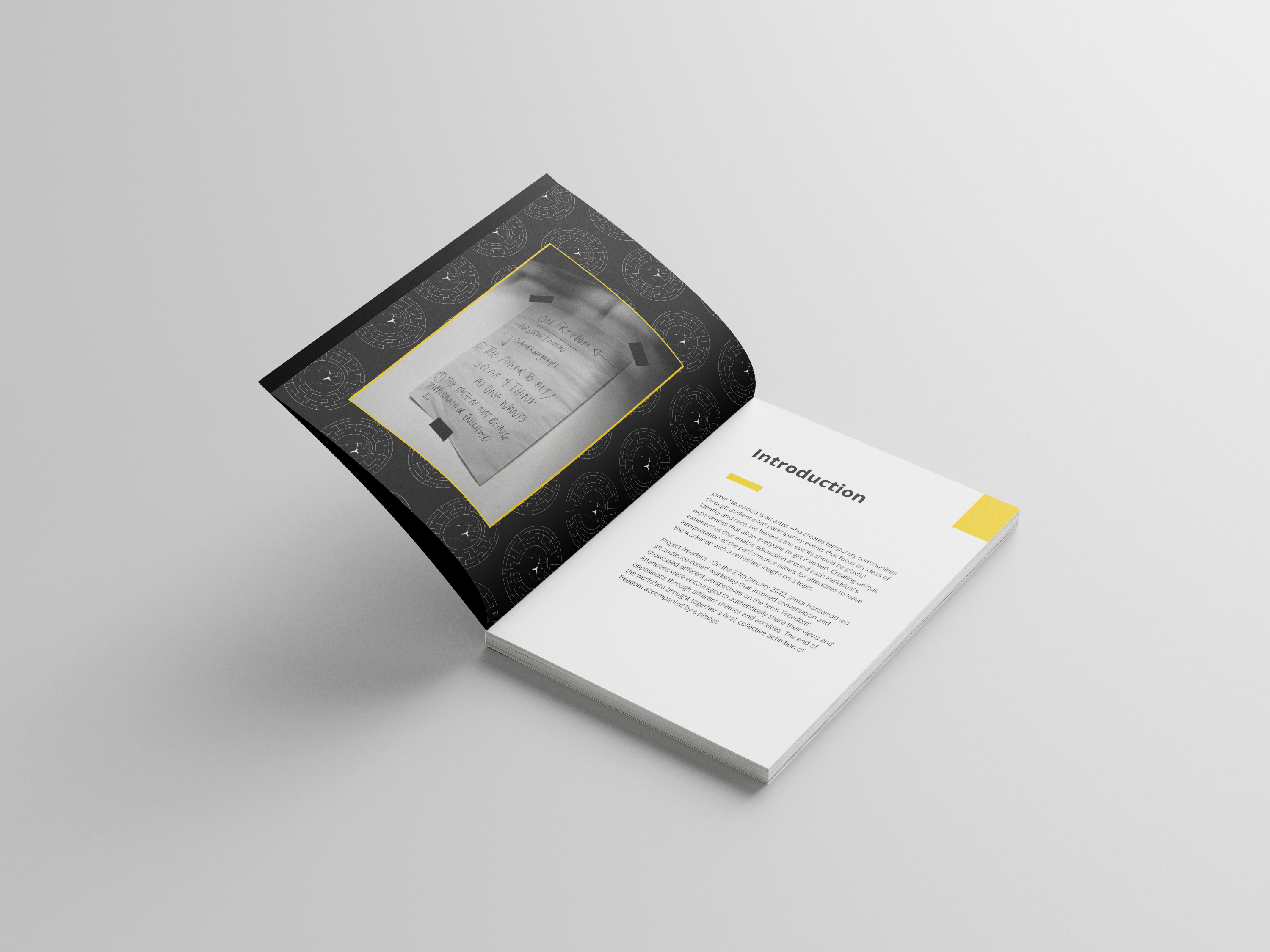
Jamal Harewood is an activist who sets out to share his vision of race and identity through workshops around England. He is currently undergoing a freedom workshop that seeks to redefine the term ‘freedom’ by discussing each individual in the workshop—participants brought in different perspectives and Fresh insight onto specific topics free from any judgement and authenticity.
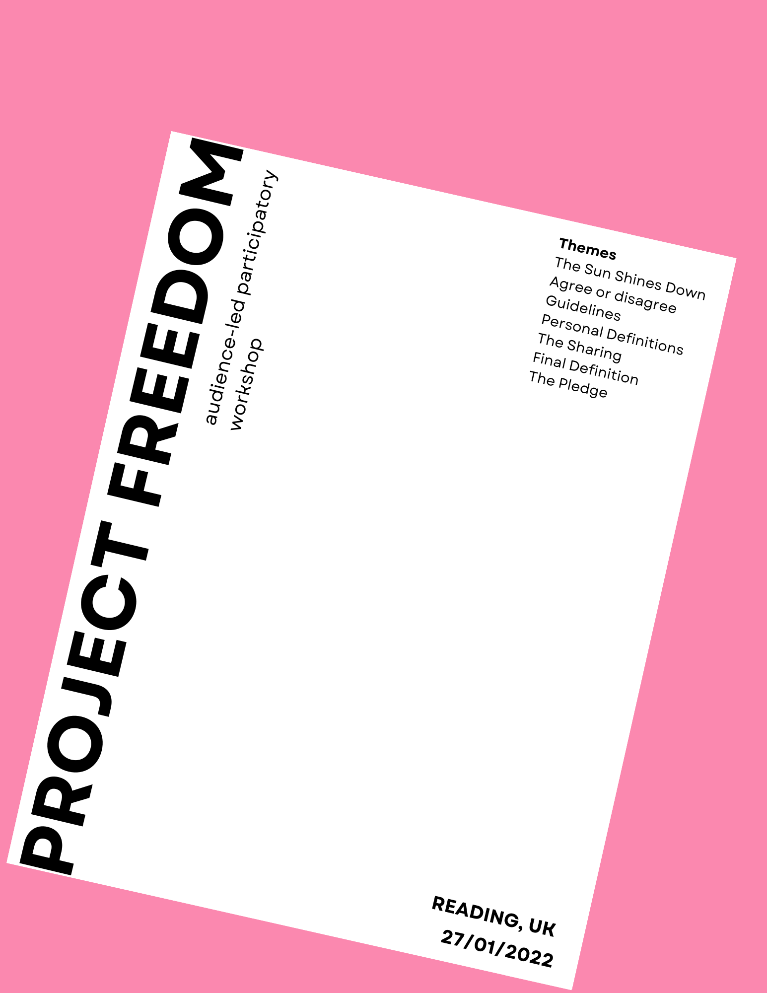
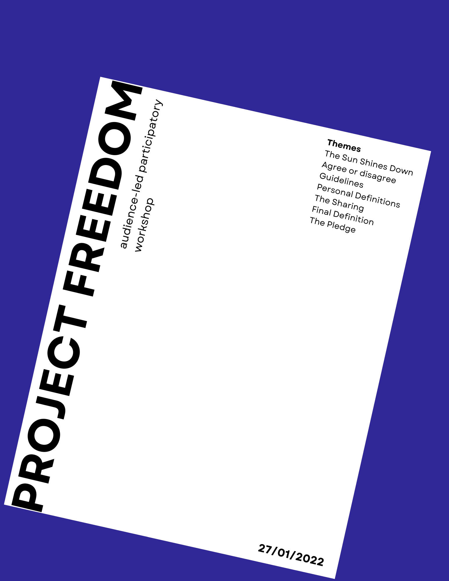
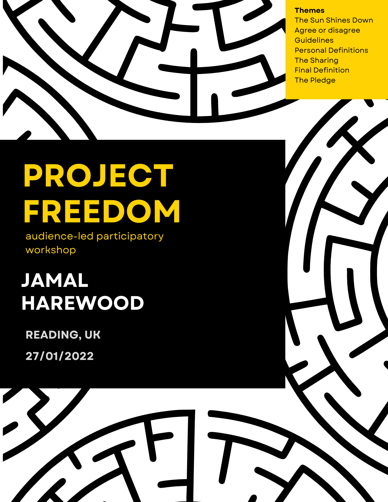
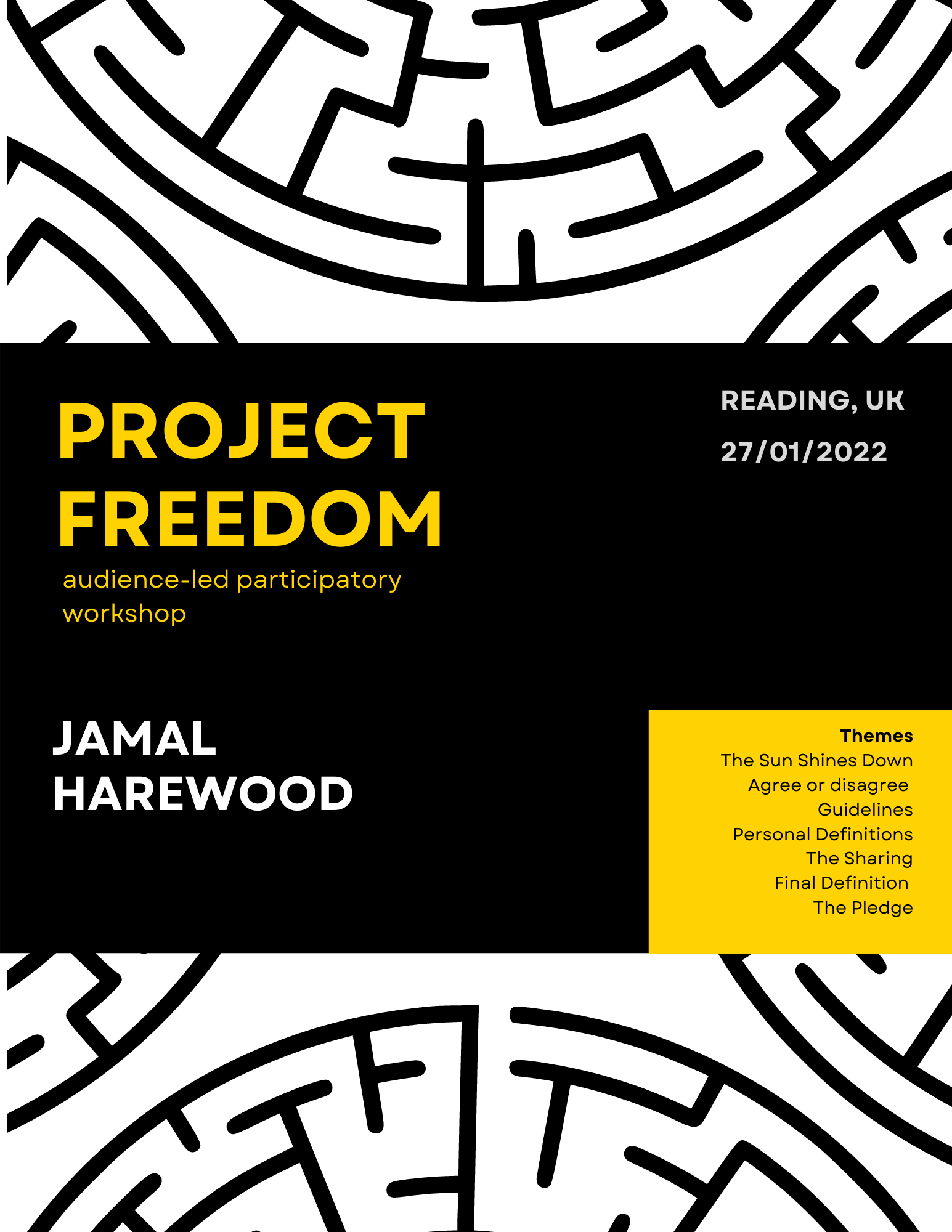
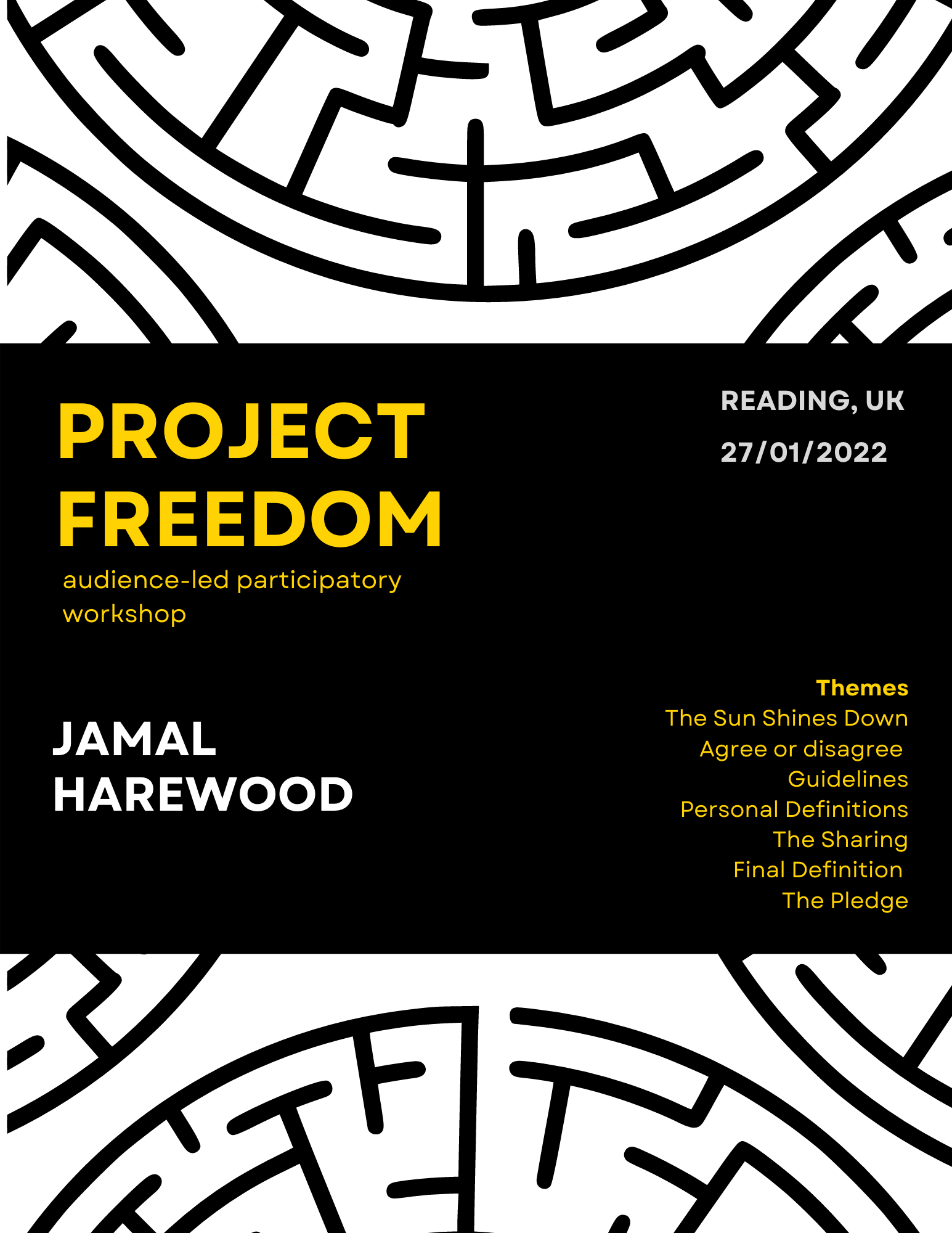
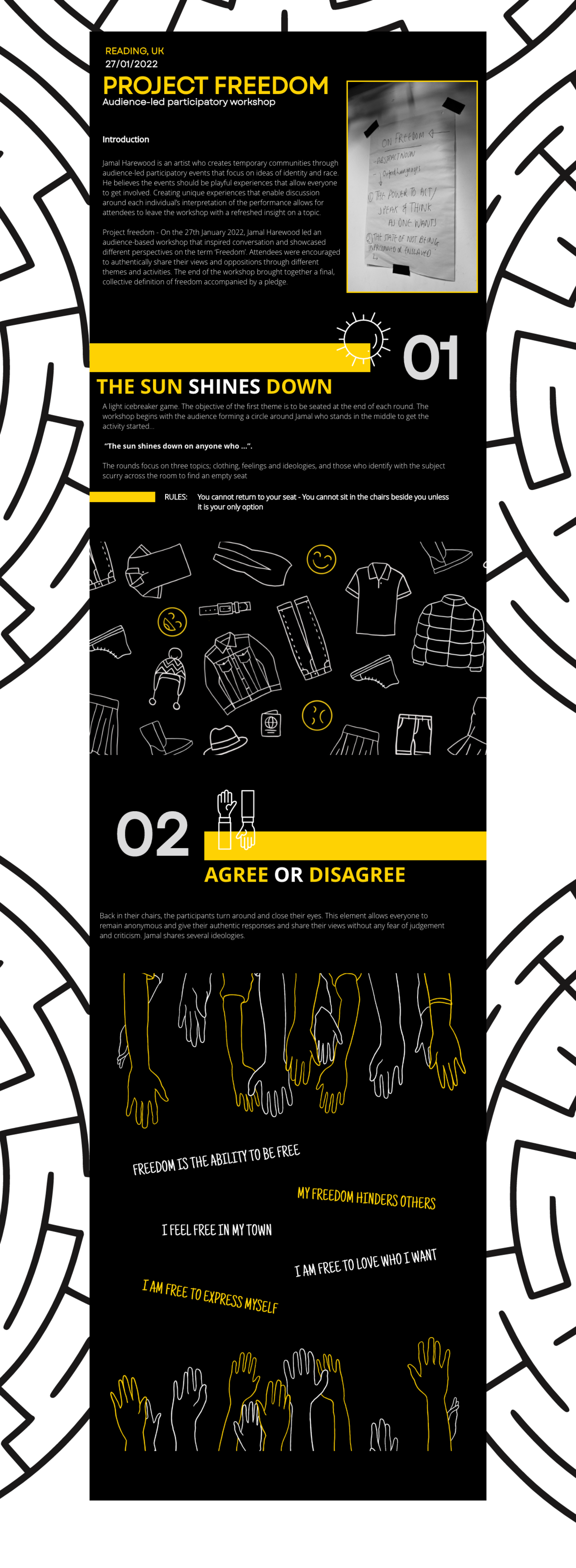
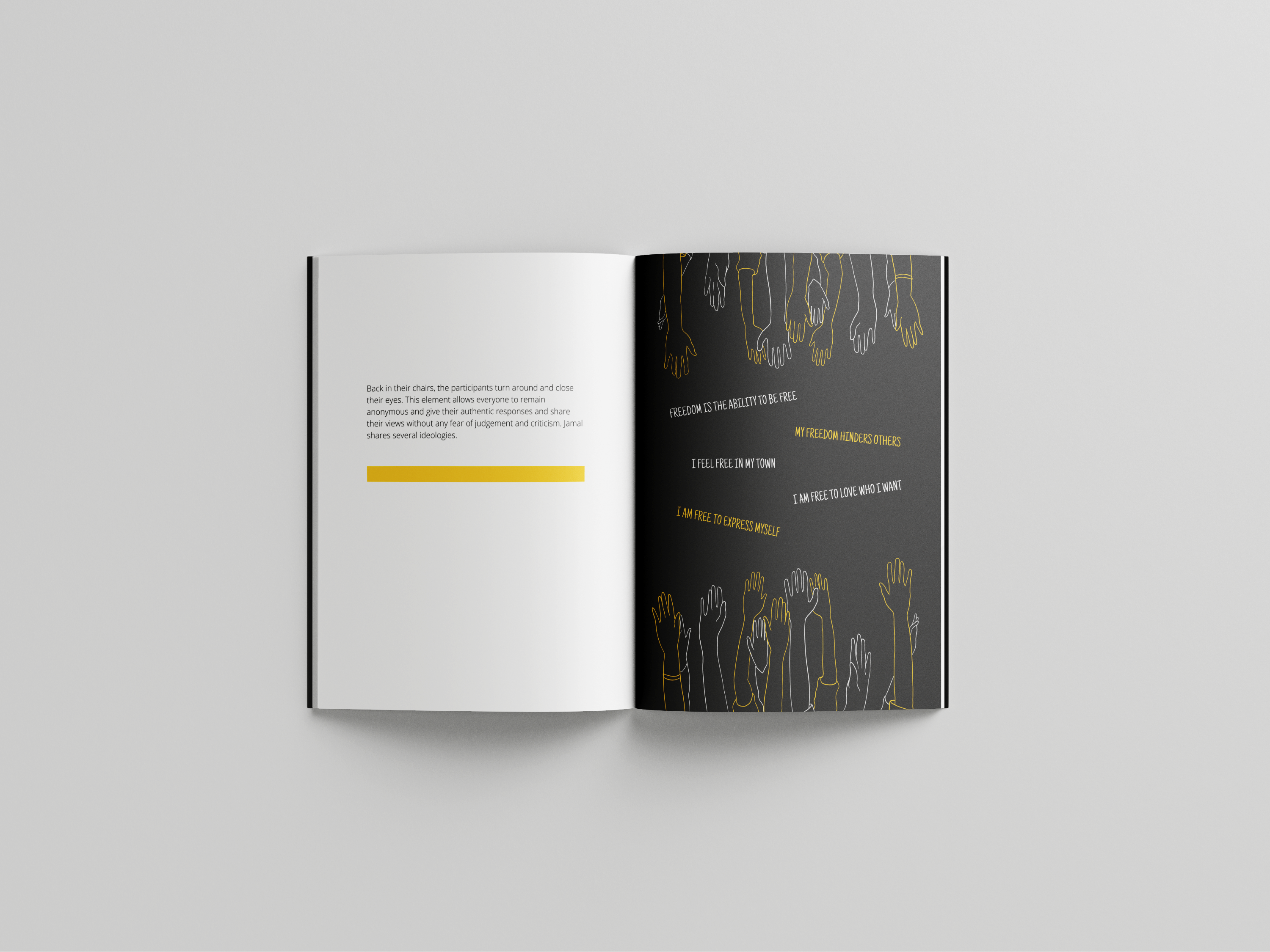
On the 27th of January, Jamal Harewood led an audience-based workshop, ‘Project Freedom’, in Minghella Studios theatre Reading university. It comprises a diverse number of students that seek to redefine freedom on their terms. The workshop was a playful experience where participants were encouraged to discuss and share their views and opposition to different themes and activities. Each individual created a new definition of freedom and a pledge to follow through. Overall, the workshop brought a collective of ideas together.
The premise of this real job is to document the workshop and create deliverables that would suit Jamal’s brand and idea. He wanted to write about the unique experience of this temporary community and show the discussions and interpretations of each individual.
Restated brief
GOALS
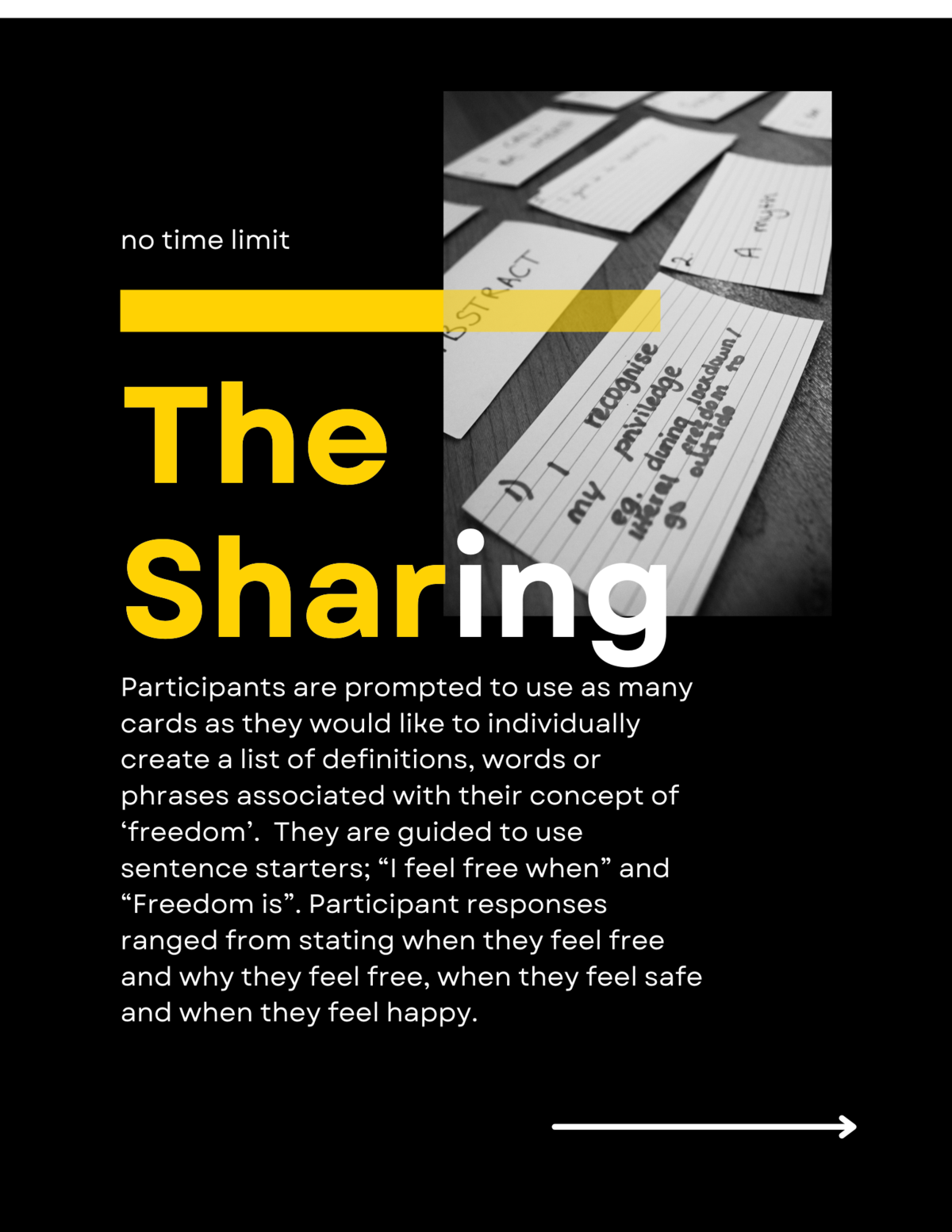
After we document our client’s workshop ‘Project freedom’ and his interactions with the audience, we are tasked to create a booklet and UX blog post that include the wide range of diverse experiences and definitions of freedom from the participants. The audience is the focal point of the workshop, so it is important to make the deliverables as personal as possible, not only showing their ideas but their performances and behaviour.
Our Brief main goal is to offer attendees an opportunity to revisit their experiences in Jamal’s workshop. They would be able to look through the deliverables and find quotes and thought that they said at the workshop. Although we would only be able to document one workshop, Jamal would like to carry out this project in other workshops, thereby using this deliverable as a template for future workshops and making a profit from the booklet independently.
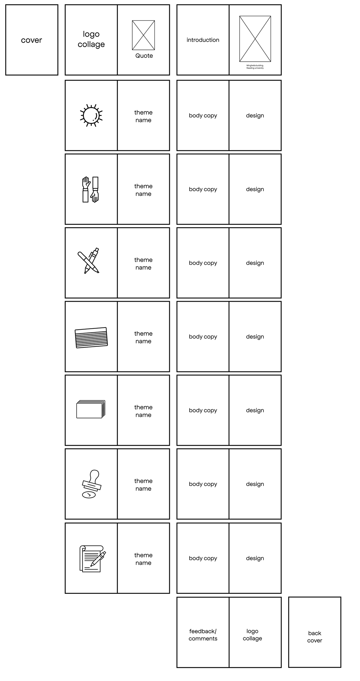
DELIVERABLES
Booklet.
Booklet template. Amendable Canva template for client’s upcoming workshops
Blog post prototype.
Research and ideation
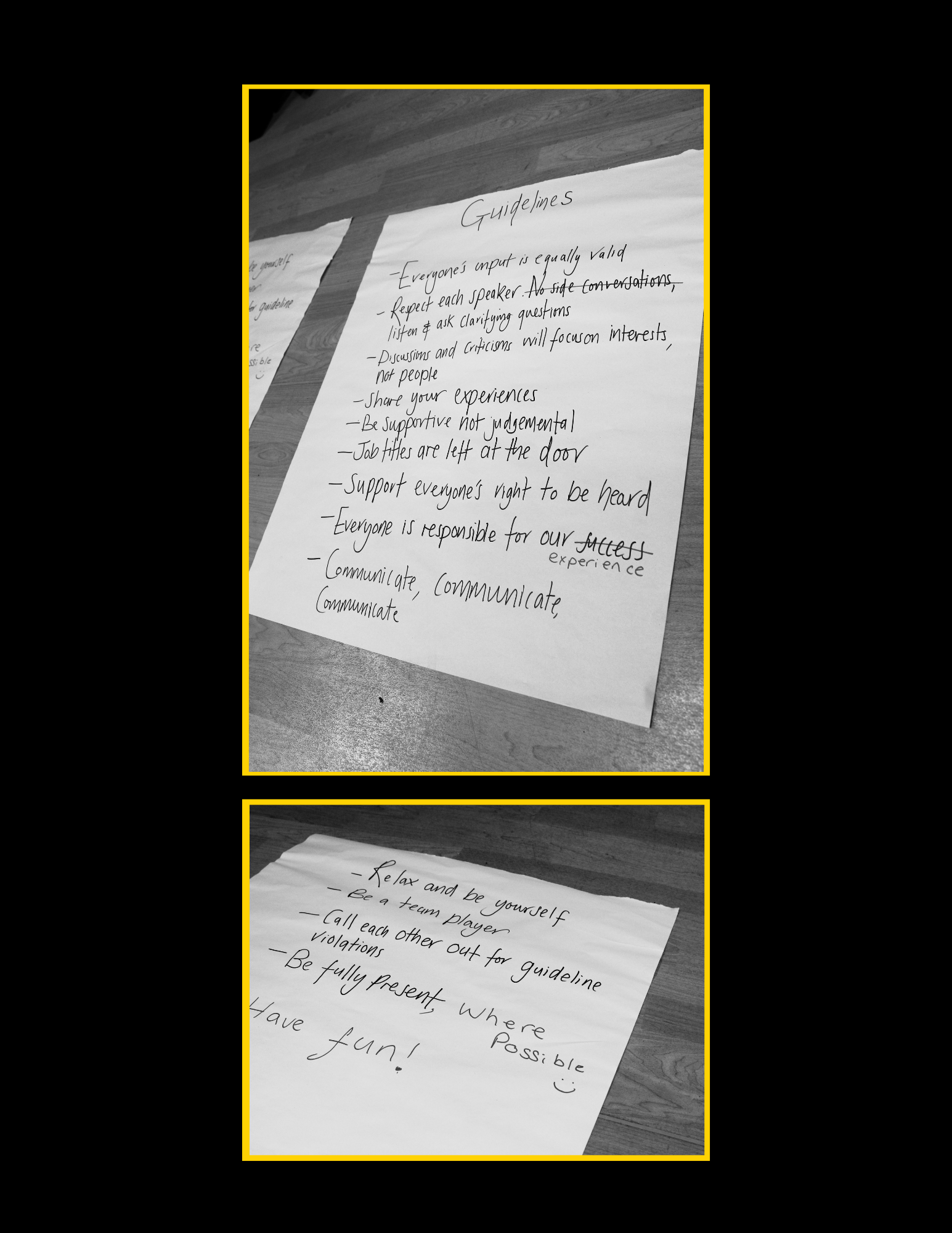
One of the primary branding guidelines Jamal gave us was to involve the colour black. Initially, he wanted the book page to be black but having an all-black book would not be legible with some research and inspiration, we were able to find what works for Jamals.
For inspiration, Jannah and I started looking at different design idea platforms such as Pinterest and Behance. We looked at different layouts and formats of presenting texts and theme pages. We found some booklets that integrated box shapes into the body text while acting as a filler; This helped because the body text of the booklet isn’t heavy, so it was important to find a way to show the text without the book looking empty.
Inspirations for Project Freedom
We understood that for this deliverable to be genuinely successful, we needed to have colours that would resonate with Jamal and his brand. When researching, the colour yellow with black caught our eyes the most. The cheerful and eye-catching hues of yellows are balanced by the more sober and sophisticated shades of black. Black and yellow branding worked well as these two colours were balanced and contrasted.
We set out to not only look for design inspirations but a colour scheme for Jamal to use across the different workshops. The colours you use in your branding and design are more than just a matter of aesthetics. Is your brand exclusive, accessible, friendly, cheerful, or mysterious? Your choice of colours reflects what your brand stands for and what customers associate with it. Understanding Jamal and the type of brand he wants to represent was one of the primary key points noted when choosing inspirations online.
Due to the nature of this project, we had to find a way for Jamal to distinguish his booklets across different workshops. We thought of the idea of using colours to differentiate but keeping the layout and the design of the booklet the same would be helpful for Jamal to design his booklet without the need for designers. So when users see the different branding colours, they would be able to associate the colour with the various workshops.
Design Development
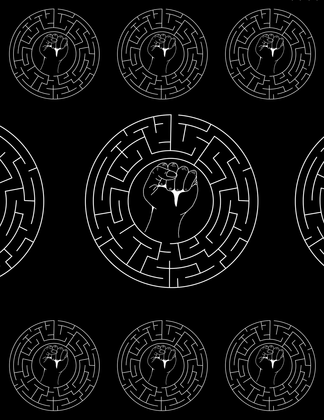
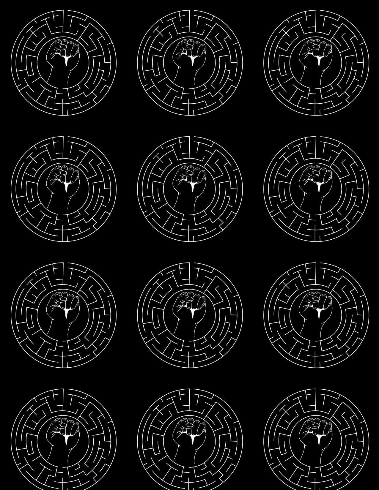
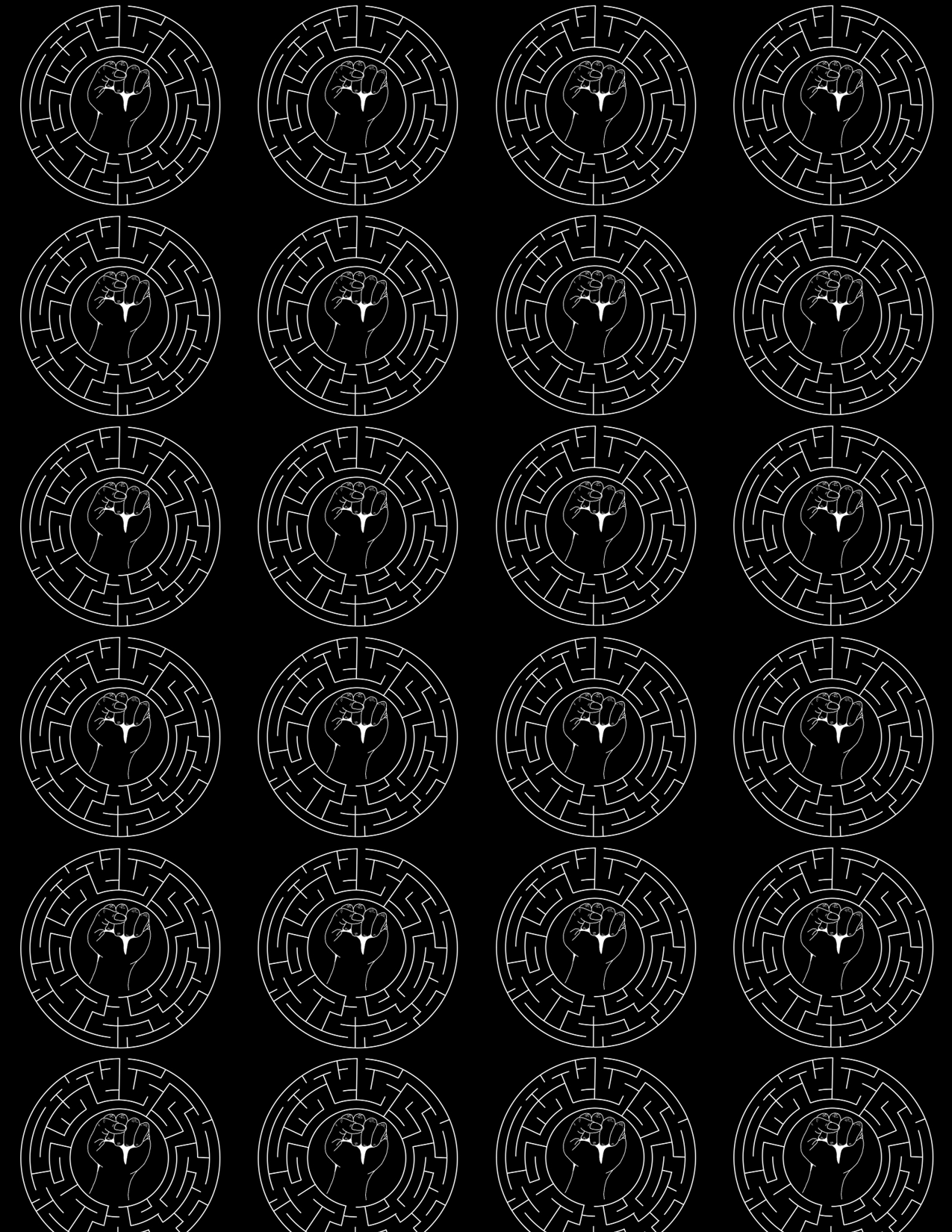
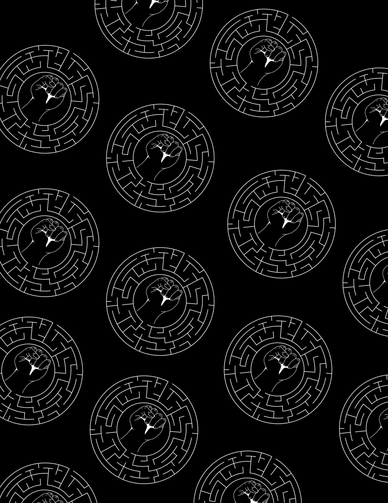
Jamal Harewood gave us complete creative control however, he wanted the primary colour for his deliverables to be black. This was because his brand identity is black with a maze and fist logo showing his connection to the BLM movement. He wanted his brand identity to be applied to his printed booklet and blog post for a consistent brand identity. We explored different colour palettes that will complement the key colours (black and white) the client has requested to be used throughout each deliverable.
Front cover
This was my first draft for the book cover. The layout was nice and exciting, but it had a stern look and did not fit Jamal’s brand. However, the design had a sophisticated look similar to a journal, which contrasted Jamal’sbrand for the booklet is meant to be playful and inviting. The structures are shown in different colours to give Jamal an idea of how we would represent his various workshops. The coloured box represents a door revealing the theme; it helps viewers know what to expect when coming to the workshop.
For the second book cover design, I played around with making the cover as friendly and as inviting as possible. However, it was typographically right. The title of the book, being vertical, was not legible, and there were too many different text formats that did not complement each other. This resulted in a lack of proper hierarchy in the text and could confuse users.
Jannah Design Draft
Jannah’sdesigns were interesting as they also played around with the vertical and diagonal layout for the text, but the background felt like something was missing. Jannah’ssecond draft also had the issue of being sophisticated and not fitting Jamal’spersonality or the playfulness of the workshop.
To move further, we decided to combine the best elements of our designs into one to create Jamal’s book cover. However, nothing on the book cover represented Jamal or his brand apart from his name. I suggested using the maze design and adding it to the book cover’s background, which worked well to show Jamal’s brand. I explored different layouts and formats for the maze design.
As we move further into the book cover development, Jamal told us he preferred the white background with the black maze line. we agreed with him because it was neater and more visually appealing when combined with the other book cover element
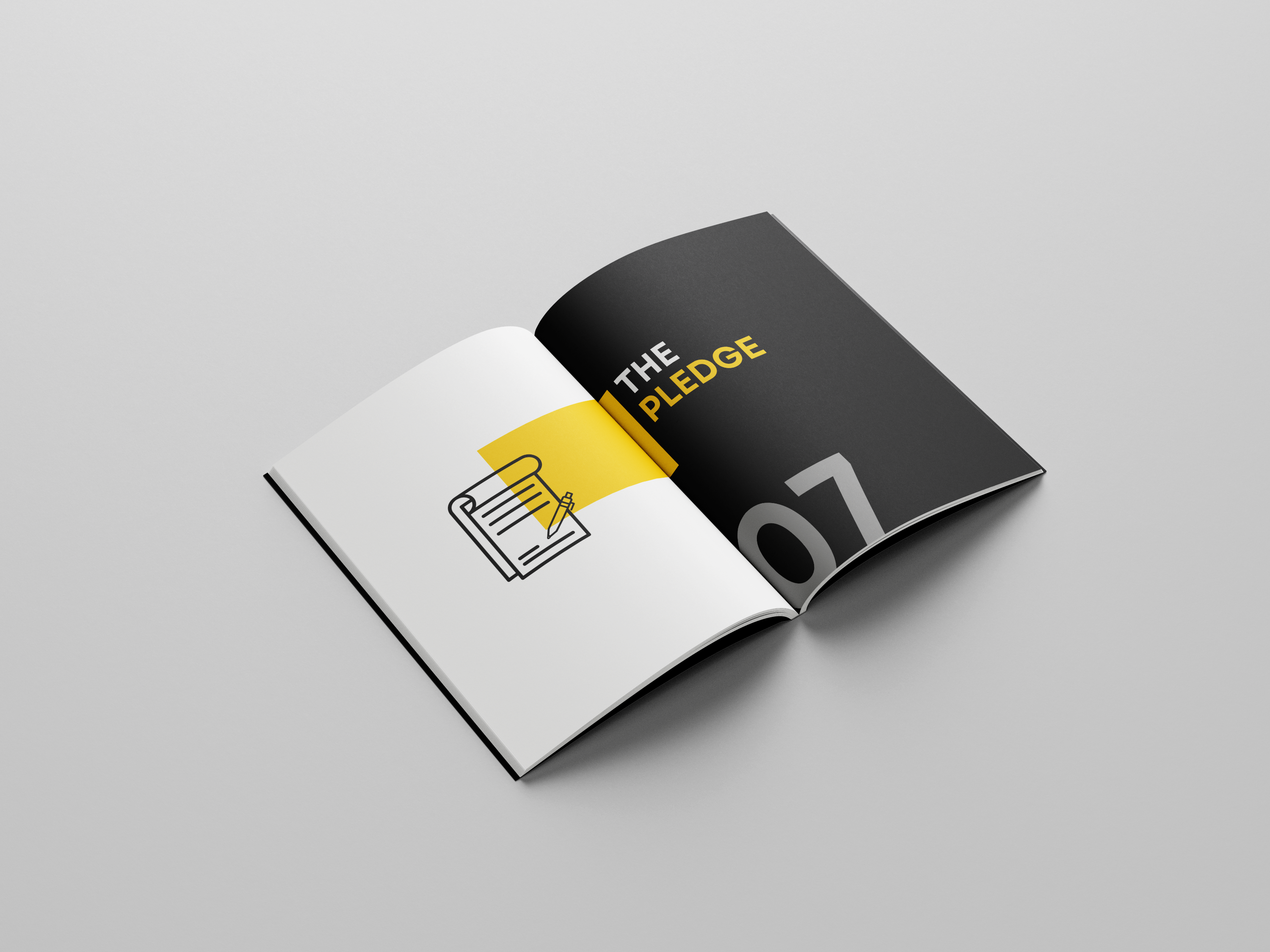
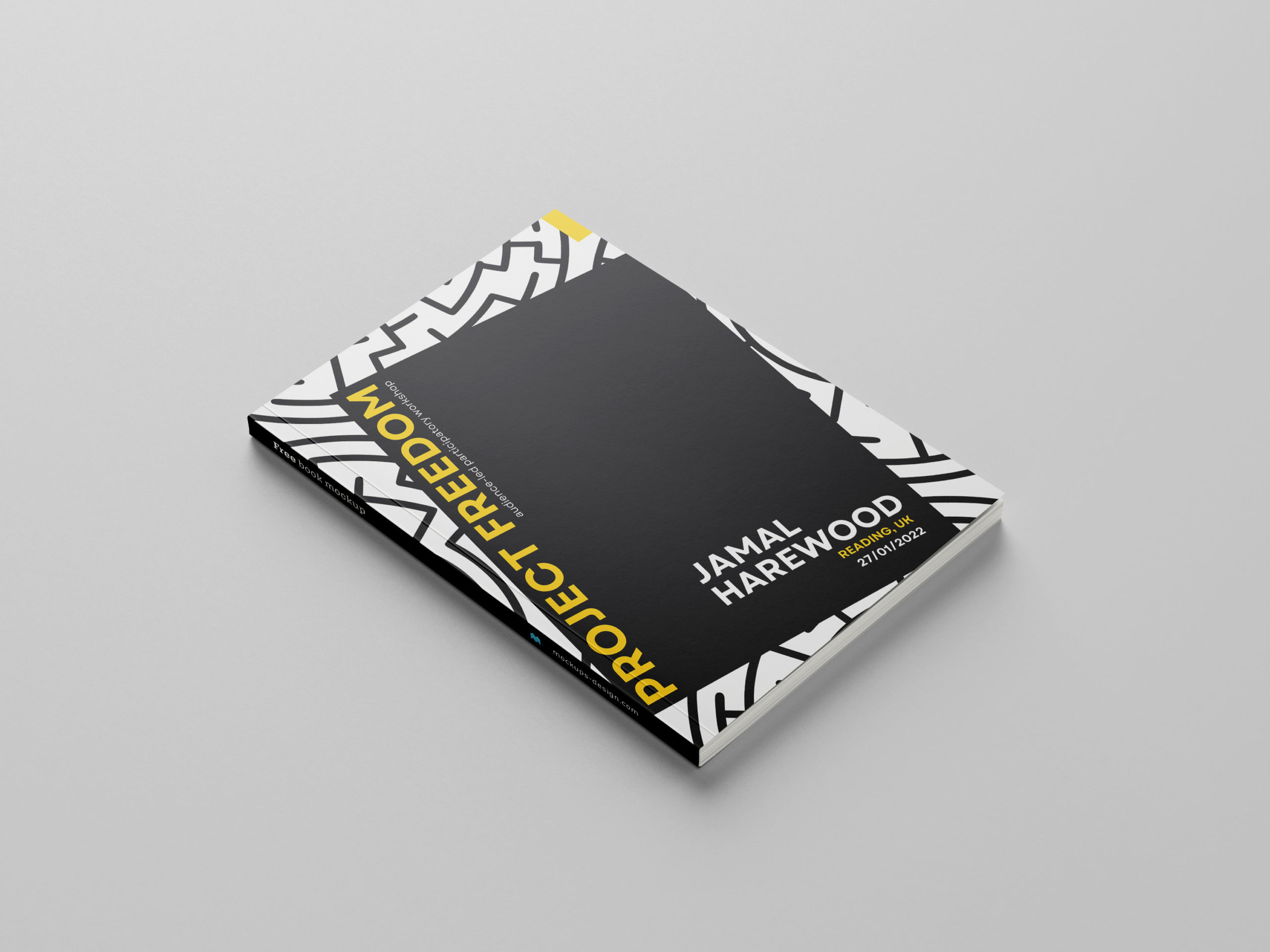
Final Book Cover Design
Back Book Cover
We took out the theme title from the front page because we did not want to give much away to viewers when looking at the cover. The final book page works because there is a clear visual hierarchy. Jamal likes the book cover format because it is clear and playful while complementing his brand.
Inside Pages
layout design
Jamal did not want to include photos of the participants, so we had to find a way to represent the theme or show the activities in the workshop. This part of the project was split into two, with Jannah designing the booklet’s illustrations and Theme page and I handling the Book text layout and photomontage. This idea was because we wanted each design element to have a consistent design style.
Book Illustration
Book Illustration
The illustrations represent the themes; they have a youthful look as the target audience is young adults. They have the same line length as the maze design because we wanted to follow through with consistency. Adding this illustration gives the book more volume and makes the book pages more attractive. The illustration has a symbolic meaning as it represents the different activities in the workshop.
Theme Page
Theme Draft
When designing the theme page, we added time and text however, this element did not work because it made the theme page complicated and was not necessary. Separating each piece on the theme page made the book bulky and showed each element on its own.
Theme Page
We used the image above as the final design because of the apparent visual hierarchy. The use of yellow and white shows visual hierarchy and highlights the critical word in the text. The illustration represents the theme and is connected to the next page with a yellow box. We found the connecting shape helpful in linking the two pages together.
Photo Gallery
Photo gallery
The photo montage gave the book a personal touch and helped viewers understand what happened in the workshop. Participants can see their writing and help push further the idea that this workshop was audience led.
Body Text
Body Text
The body text wasn’t heavy, so it was essential not to make each body text page look empty or isolated. With this idea, each booklet element is highlighted, and the text stands out on its own, with the text box adding vibrance and giving the book format a consistent look to the theme and number page.
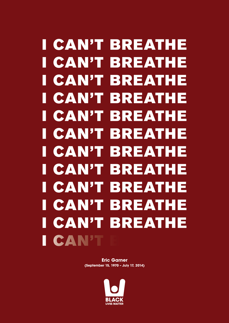
What is Freedom?
I cant Breath Poster by Eric Garner
Jamal Harewood is an activist and supports the BLM. This idealogy was implemented in the Freedom posters designed on the last page of the booklet. The freedom poster is designed similarly to the BLM ‘I can’t breathe’ poster by Eric Garner. This would help viewers identify Jamal’s support and appreciation for design in BLM.
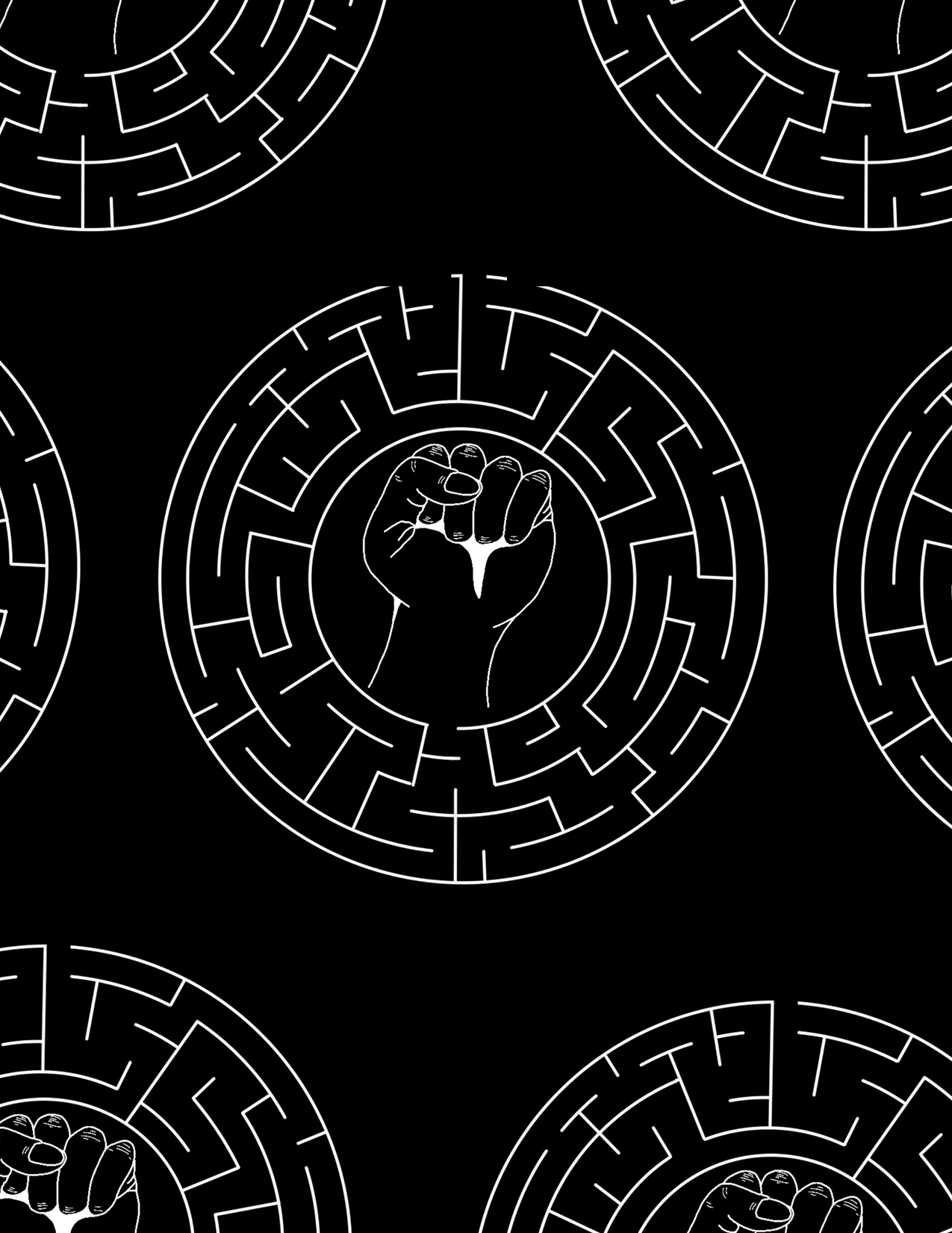
Maze Collage
maze draft
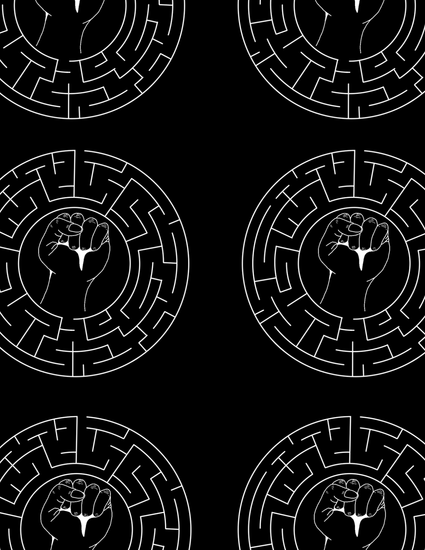
During our first meeting with Jamal, he stated he wanted to develop a brand mark from the client’s logo and translate this onto the opening and closing pages of the booklet. The maze design is a collage of Jamal logo design; there are two different maze designs, one that is used on the front cover and the other that is used on the inside pages. The front cover maze design lets the viewer know that this booklet is under Jamal’s brand.
The maze collage acts as a filler, for the booklet introduction and ending. it also helps us go further in the branding technique than just the front book cover. it is presented diagonally with five logo designs in a row. Jamal liked this layout because the logo design was not big and the layout was much more dynamic compared to the other maze designs.
Website
Participants who are not able to visit the workshop would be able to look at the blog post. The blog post is designed in cohesion with a booklet layout for clients to implement onto their website. It was designed on Adobe XD with Jannah overseeing the design. The blog post design has the same design elements as the booklet, so few developments or changes were made. We did look at the consistency of spacing and how viewers would navigate through the blog post.
One of my favourite design elements on the blog is the maze background with the black box. it follows the format and layout of the front cover, which is helpful in consistent branding.
Final stages
The main goal of this project was for Jamal to be able to print and redesign this booklet on his own. We informed him about printing in the department and the process of printing at home. Informing him of the cons and Pros, Jamal decided to print at home after much analysis as it is more cost-effective and personal.
Since we were designing on canvas, we learned how to create and show bleed and crop marks on the canvas. Though it was slightly more straightforward, it was not as customizable as doing it on InDesign.
The printing aspect of this project allowed us to look at flaws that we overlooked while designing on canvas, such as alignment issues, spacing issues, etc. however, such cases were few. The printing of the project was successful because the booklet looked relatively similar on the screen to the print, with the colours complementing each other, the font size being readable, and the illustrations looking presentable.
Reflection
As this project progressed, I understood how vital group work is when both partners play through their strengths. As time went on, it became clear to me that working with a partner who has a different design style yet similar mindset as you is helpful. We explored different styles and illustrations while barely having conflicts because we communicated effectively and ensured that everyone’s opinions were valid as we went through the project.
Overall, the design process of this booklet was enjoyable as we made sure to include Jamal at every step after our supervisor had approved it. Each design element was explained to Jamal and why such detail works with his booklet, and if he wanted any changes, it was noted and implemented immediately. However, such changes were few because he trusted our designs and believed we understood him as a person and knew what kind of designs he wanted.
During the Autumn term, the Department organised and paid for a trip for the Part 3s to go to London and visit the MagCulture. Not only were we immersed in inspiration for our own magazine designs and concepts, but we also enjoyed a talk from Jeremy Leslie about the current state of the independent magazine scene. After the talk and trip were done, the year went out together as a Department social in London. With train tickets provided by the department through the Typography Student Fund we were able to get out of the building and experience magazine world in its fullest form.
During Jeremy’s talk, he showed us a range of current trends and creative ideas… to to the extremes of a single plank of wood being sold as a magazine! He opened up his shop to us, which covered every genre in the magazine world, where we were allowed to browse, take pictures and experience the materiality of these objects firsthand. Take a look at their instagram for inspiration: https://www.instagram.com/magculture/
From all of us in Part 3, I would like to thank Sara and Rob for organising this trip. We’d also like to thank all the clients from Real Jobs who have donated to the Typography Student Fund, making an educational event fun.
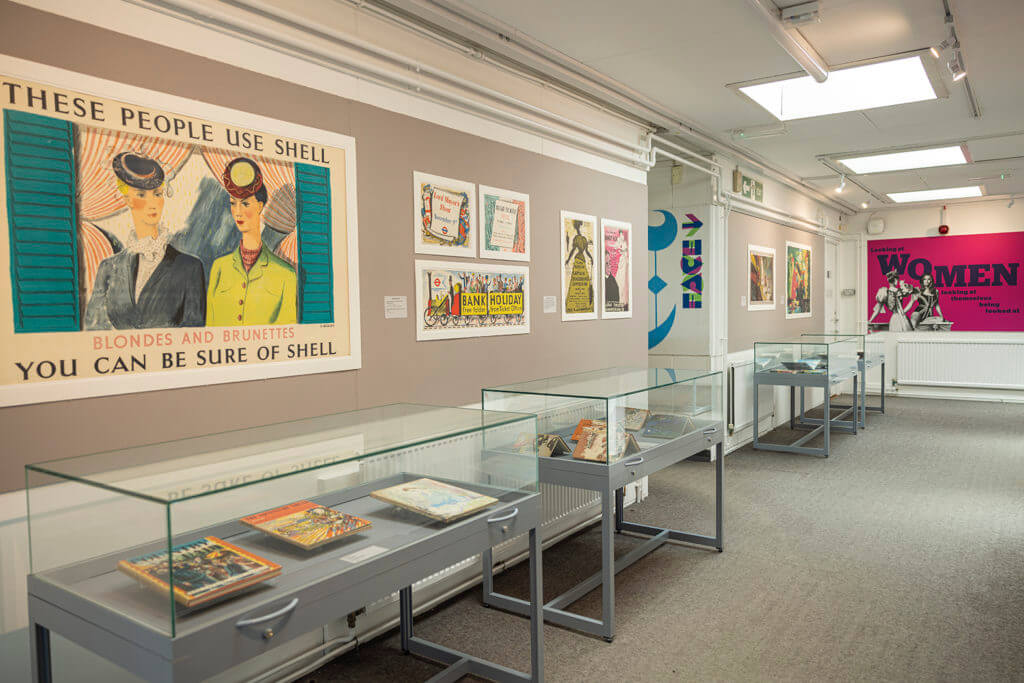
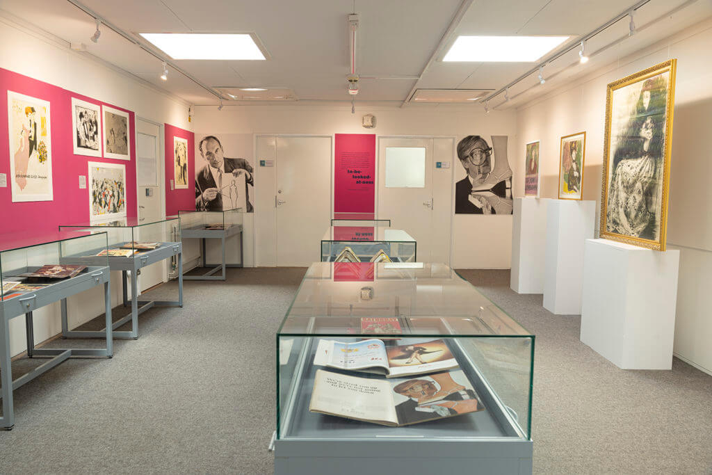
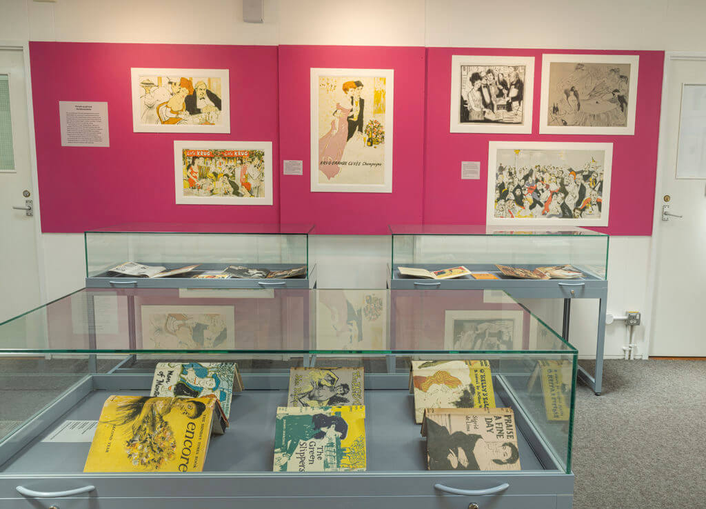
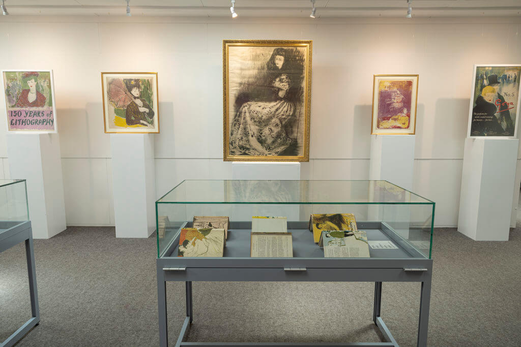
This exhibition, now open in the Department of Typography & Graphic Communication, explores the concept of the male gaze in twentieth-century British illustration, and is curated by Cătălina Zlotea.
The exhibition analyses the work of the British illustrator, Charles Mozley (1914–1991), through a contemporary lens. It does so by foregrounding two female stereotypes depicted in advertisements, ephemera, and fine art lithographs made by Mozley between the late 1940s and the early 1980s. The exhibition arrangement creates contrast and conflict between the image of the middle-class “virtuous” woman – a virgin goddess placed on a pedestal – and the “loose” woman – an anonymous sex object signalled through hair colour and scanty clothing. This female presence, recurrent in Mozley’s work, demonstrates the quality of the artist’s draughtsmanship while connoting middle-class masculine virtues, follies, and sexual desires.
The exhibition is open weekdays, 10 am to 5 pm. Closed bank holidays.
About Charles Mozley
Charles Mozley was born in Sheffield where he studied painting and drawing at the Sheffield College of Arts and Crafts. In 1933 he won a scholarship from the Royal College of Art and moved to London to study painting. After graduating, he taught life drawing, anatomy, and lithography at Camberwell School of Arts and Crafts. Following the Second World War and for the rest of his career, he worked as a freelance artist.
Prolific and versatile, Mozley was among the artists commissioned by Frank Pick and Jack Beddington for prestigious London Transport and Shell-Mex advertising campaigns. He also created designs for the advertising agency Colman, Prentis & Varley, for theatre and film production companies, and for many British publishers. He painted a mural for the Festival of Britain, contributed to the popular “School Prints” and “Lyons Lithographs” series, and produced ephemera for restaurants and the wine trade. Alongside commercial work, Mozley continuously painted, made prints, and exhibited in solo and group shows.
The long list of commissions, as well as the works held by the Charles Mozley Trust, provide evidence that Mozley’s pictures were widely seen in Britain in the second half of the twentieth century. As Nicolas Barker has remarked, Mozley’s work is “a graphic-mirror of the post-war era”, making it a valuable resource for the study of visual culture.
Credits
Curator: Cătălina Zlotea
Exhibition design: Cătălina Zlotea, Hannah Smith
Exhibition consultant: Eric Kindel
Archive consultant: Sallie Morris Production: Geoff Wyeth
Thanks to the Charles Mozley Trust, which has supported this exhibition and the doctoral research by Cătălina Zlotea that informs it.
Installation
Selected works by Charles Mozley highlighting key projects.Overview of the exhibition space contrasting the “loose” woman and the “virtuous” woman, as subjected to the male gaze.Illustrations by Mozley depicting the “loose” woman.Illustrations by Mozley depicting the “virtuous” woman.
Ed Fella: Exit Level Design, 1985–2012, an exhibition in the Department of Typography & Graphic Communication surveying the experimental graphic practice of the American designer, Ed Fella.