
Announcing the 2024 intensive summer course in typeface design: one week of a multiscript masterclass, and one week of a research-focused working seminar. Read more…
Category: homepage
Promoting the Sustainable Development Goals
Spring Term 2024
An exhibition by second-year students in the Department of Typography & Graphic Communication
The work featured in this exhibition are posters designed in response to a brief inspired by Project Everyone, a United Nations Global Partner dedicated to promoting the Sustainable Development Goals (also known as the Global Goals). The work aims to inform, engage, and inspire individuals, organisations, and institutions to take meaningful action towards achieving the goals by 2030.
The task
The project to promote the Global Goals was devised and led by tutor Greg Bunbury. Each student was given the task of creating a compelling poster and supporting materials to promote one of the seventeen goals. Their work needed to incorporate graphic, typographic, or illustrative elements, and feature the ‘Halftime’ campaign hashtag #ImagineWinning, as well as project branding and a call-to-action.
The exhibition
The display of twenty-nine posters has been installed in the Department’s exhibition space, grouped under four headings: economy, equality, environment, and well-being. The exhibition was designed by second-year students, Aaron James and Olivia Moors, as part of the Department’s Real Jobs scheme. The exhibition project was supervised by tutors Sara Chapman and Geoff Wyeth with support from Department colleagues. The posters and other exhibition graphics were printed by the University’s Creative and Print Services.
The exhibition has been made possible by a generous award of funding from the University of Reading’s Arts Committee. Following its display in Typography & Graphic Communication, the exhibition will travel to the University’s library foyer where it will be installed for an additional run.
![]()
Installation


Federico Pena: MA Information Design alumni
Fred’s remarkable journey as a global wayfinding designer began with his impressive work experiences at major events like the Commonwealth Games and the World Cup in Qatar.
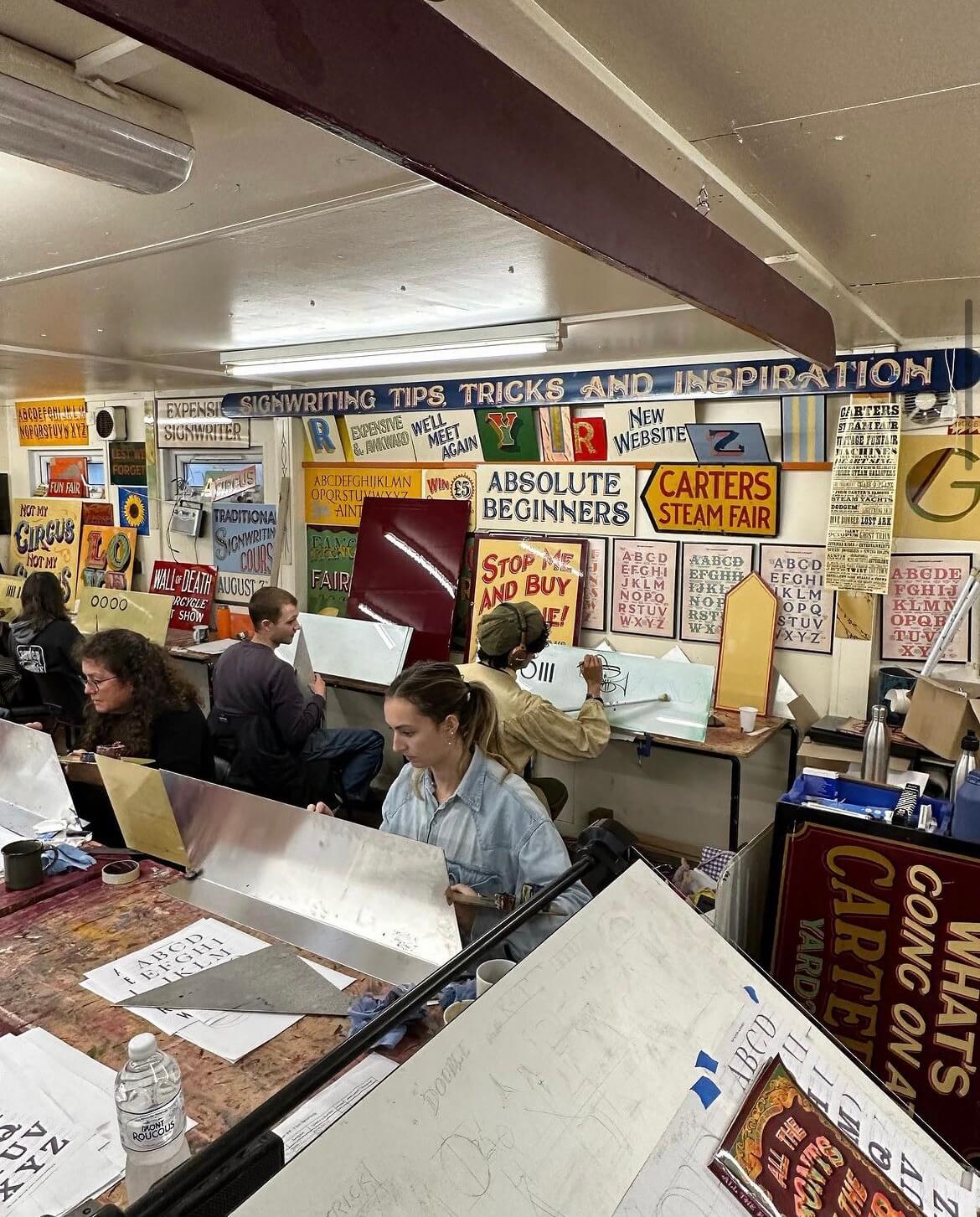
Signwriting: A 5 day intensive course with Joby Carter
5 Days of signwriting
Joby Carter
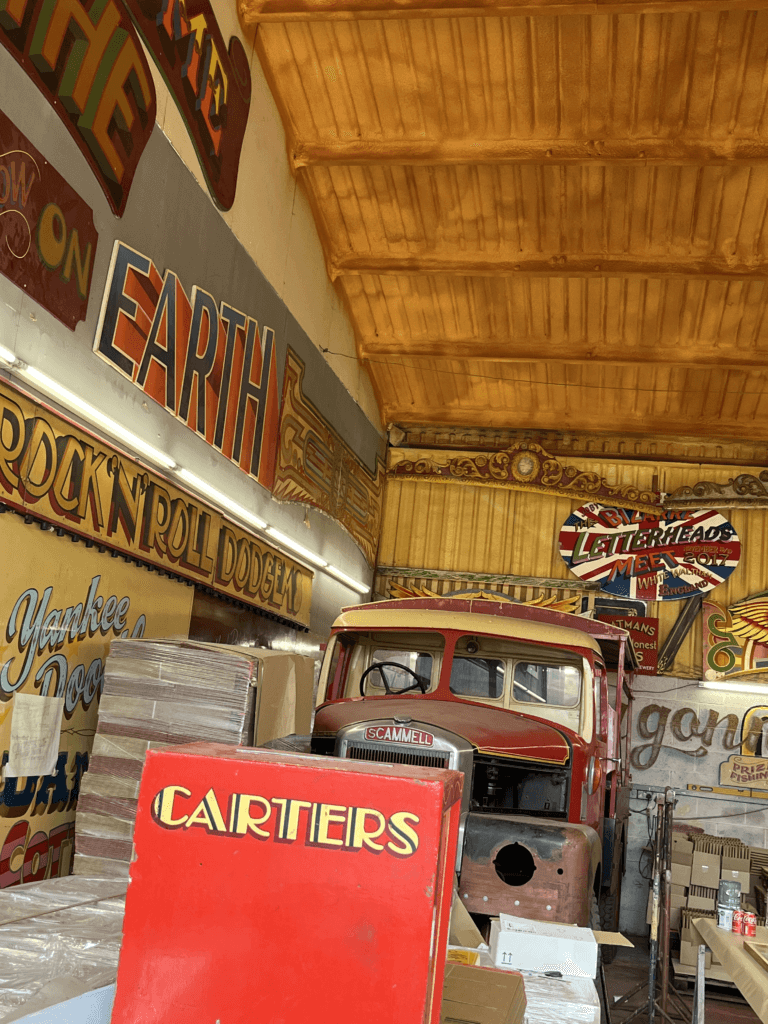
Joby is a signwriter and fairground artist who owns the famous ‘Carter’s Steam Fair’ fairground, which is the largest vintage travelling funfair in the world. Years of experience has led to Joby being one of the world’s leading experts on signwriting, fancy lettering and fairground art. I met Joby during a trip to his workshop for a project and was fascinated by his work, having never been exposed to the world of signwriting before. The precision and artistic skills that Joby possessed to have the ability to create such intricate lettering was amazing to me.
The course
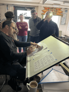
I was lucky enough to receive the opportunity to take part in Joby’s 5 day intensive signwriting course this autumn. This was as a result of coming second place in his contest last year with my fairground-inspired logo redesign for Odeon. The Department offered me a place on his course as a prize using the Typography Student Fund. The course ran from 9am–5pm on Monday through to Friday, giving me 40 hours of teaching and learning with Joby.
Day 1
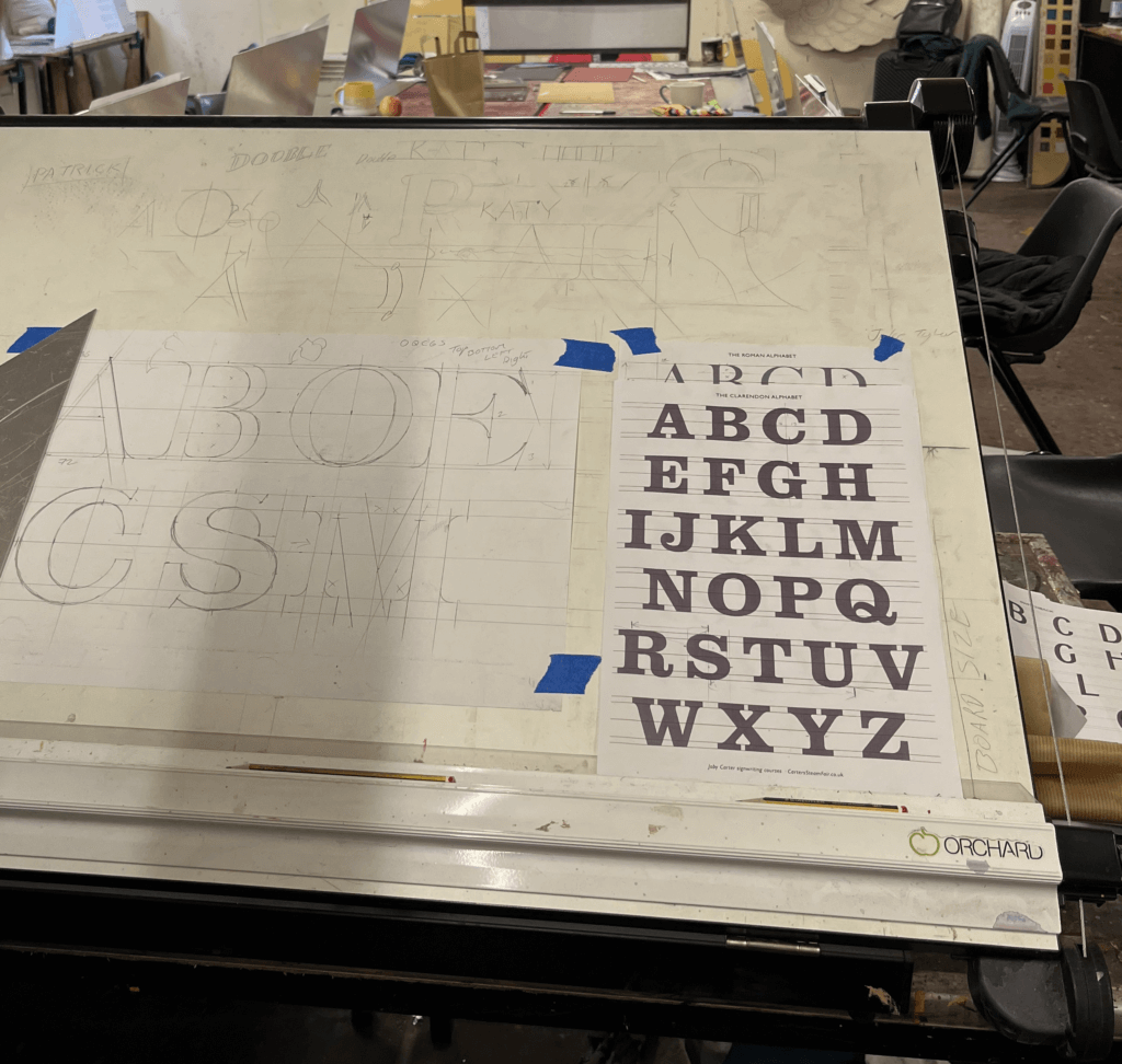
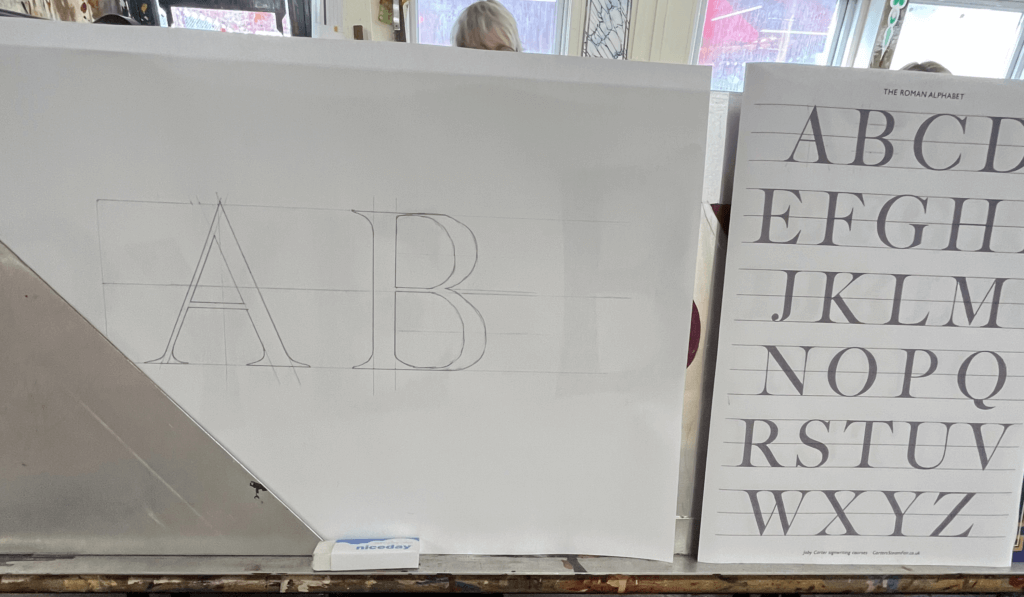
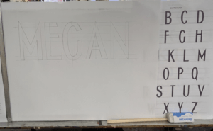
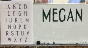
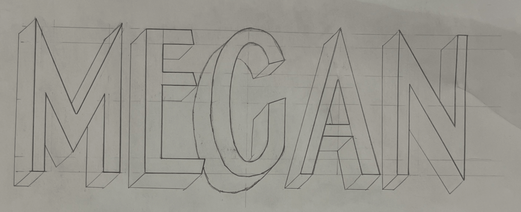
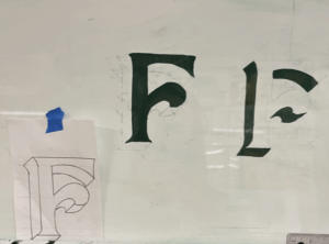
On the first day, we were introduced to the anatomy of roman lettering and the reasoning behind the thin and thick strokes, which mimic the way the brush strokes when painting the letters. We practised precisely drawing letters, copying them from Joby’s examples but accurately measuring each length and angle and scaling them to a bigger size that would be easier to draw at. Having had lots of previous experience in typography from the Department at University, I enjoyed how well I understood the different structures of the letters. We looked at some different typefaces that signwriters commonly use, and again practised drawing these accurately. There was no painting involved on this day as it was all about nailing the shapes of the letters.

Day 2
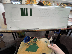
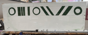
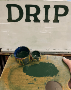
On day 2 we got the paint brushes out. Joby showed us how to prep the brushes and the paint, and the proper way to look after your brushes. We each received a brush, a palette, some dipping pots and a mahl stick. We were shown the specific way to hold the palette in your left hand in addition to the mahl stick, which is used to stabilise your right hand while holding the paint brush. This ensures smooth, straight brush strokes and acts against shaky hands. To begin with, we practised painting rectangles in order to learn to control the brush. Once gaining some confidence, we tried rectangles at a 45 degree angle, and then moved on to circles. Joby showed us the technique of twisting the brush at the start and end of the stroke to get a sharp edge, which seemed difficult at first, but practicing over and over again helped to improve technique. Methods like these are included in Joby’s book ‘Signwriting tips, tricks and inspiration’ which I found really useful to follow. Joby got us to use white spirit to wipe the paint off after each try so that we could reuse the boards over and over again. I then practised drawing out some different fonts, and wrote my name in the Switchback style, which I then transferred onto my board by rubbing charcoal on the back and then drawing over the letters again against the di-bond in order to create a trace of my sketch with the charcoal. I used the same green paint we had been practising with to paint within the lines of the letters as we were asked to use this paint up until the final day when we started our own signs due to the fact that it had a long drying time so that it could be more easily wiped off the practice boards.
Day 3
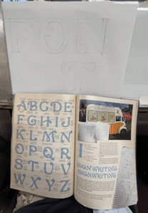
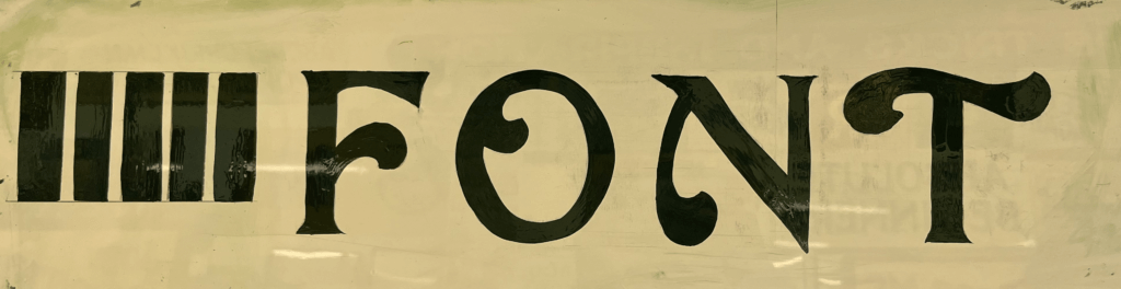
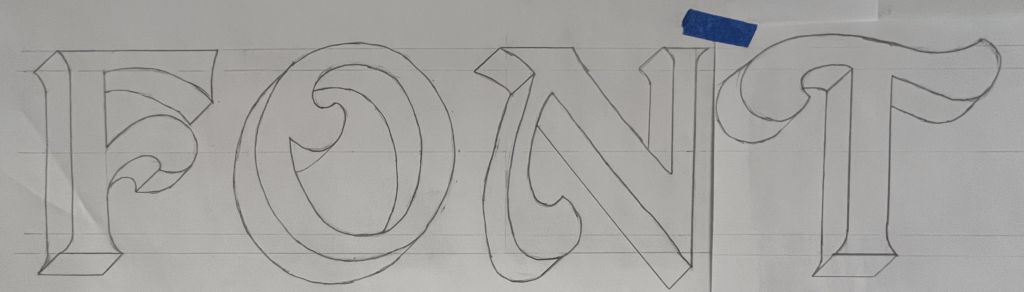
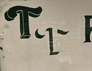
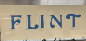
The third day was similar to day 2, and started out consisting of a combination of painting shapes again and sketching out letters. Joby really wanted us to nail letter structure and brush stroke technique before we got stuck into painting letters. One particular style of lettering caught my eye from a sign of Joby’s in the room we were working – it had beautiful curved letters and flourishes. I asked Joby where I could find this font and he revealed that it was a new one he had designed in his new book ‘All the fonts of the fair‘ called Curveside Nouveau. I borrowed a copy of his book so that I was able to analyse and copy the lettering, scaling it up to a bigger size. I once again transferred my drawings on to the di-bond and carefully painted letters to make the word ‘Font’. This combination of letters allowed me to practise drawing different angled letters with variations of flourishes on each one. I painted some other fonts from Joby’s book and found it interesting how many factors influence the appearance of a font and create a different route for your paint brush.
Day 4
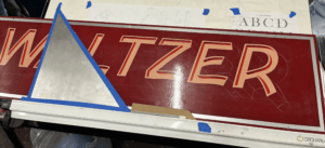
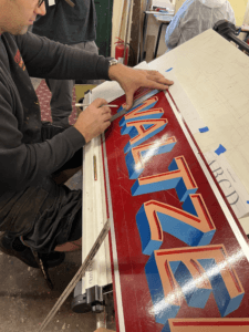
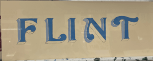
Today, Joby taught us how to create a block to make a letter appear three-dimensional. This technique is often used by traditional signwriters to emphasise letters. Joby’s method allowed us to get the block drawn on accurately without fail. All that was needed was a piece of cardboard cut into the desired width of the block shape, and then with a 45 degree angle cut from corner to corner on one end to the other. This angle is then used to draw a straight line from each point of the face of the letter to create the effect that it has been extended outwards. The block is usually set to the left of the letter as this is often easier than having to block the curves that are often on the right side of the letter, but it comes down to a matter of preference. Joby demonstrated this to us by adding a block on the right hand side to his Waltzer sign. The E and the R are more complicated to do this way, rather than simply having to block their straight edges if it were to the left. This was a compositional choice that Joby decided on, due to the word Waltzer having more empty space on the right edge of the board.
I practised this method by adding blocks to all my previous letter sketches, it was interesting to see how the style of letter affected the shape of the block and influenced the overall appearance of the word.
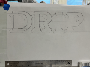

I then practised painting the blocks after sketching them. Joby also showed us the effect of a stepped away block, which I did on the left T. This creates an extra outline around the letter face, which is easy to do, but creates the illusion of an extra effect.
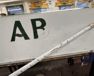
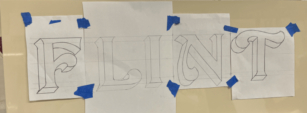
In the afternoon, I began to plan the final design for my sign. I had fallen in love with Joby’s Curveside Nouveau due to the beautiful brush strokes and shapes it created when painted. I found it to be a very fun yet elegant typeface, and I enjoyed painting the subtle curves more than painting rigid letterforms. I originally wanted to paint the name of my village, which is a nine letter word. But for the size of di-bond we were given at 62x25cm, this would be too challenging to fit in. I attempted to condense the font, but due to the thickness of the strokes it was still impossible to be able to paint it at a big enough size. I decided instead to paint my house name, as it was only 5 letters and I would be able to spend more time perfecting and adding blocks and shading. To save time, I used some of the letters that I had already sketched out, drew the additional ones I needed and then cut and taped them together, adjusting the negative space between each letter to create a balanced layout. Here is where a lot of what I learnt about typography at University helped me with my layout choices. Having an L and an I next to one another means that there is a lot of negative space between the letters, so moving these closer together creates the overall illusion that the letters are evenly spaced.
Day 5
On Friday morning, Joby showed us how to add a shadow to a letter. This helps to bring a letter to life and make it stand out from the background. This was more complicated than adding a block and took time to understand Joby’s demonstration. But I had a go at adding a shadow to some of my previous sketches.
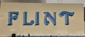
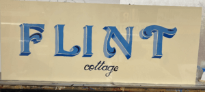
I then started to paint my sign, picking out some shades of blue, that wouldn’t take too long to dry so that I could add layers of block and shading. I started with the face of the letter, then added a stepped back block in a lighter shade of blue for the vertical sections of the block. Once this was dry I used a darker French blue for the horizontal blocks which would be more in shadow. I also added some shading using this blue, to fade some lighter sections into darker parts. Finally, I added some decorative curls within the flourishes of each letter. I then decided to add in the word ‘Cottage’ in a small script copied from Joby’s book, underneath the main word. I painted this in the darkest blue which I used for the flourish curls, to tie everything in together. The script font was difficult to paint as the strokes were so thin, I used a smaller brush to help achieve more accuracy.
If I had had more time, I would have liked to try adding a shadow. However, Joby told me that it was more difficult for signwriters to add a shadow in addition to a block that is stepped back, so this would have been challenging for me. In future I would like to experiment with more bold colour combinations, although I liked the elegance of my blue sign.
Reflection
I thoroughly enjoyed Joby’s course from start to finish and feel as though I learnt a great deal about the world of signwriting and the extensive process involved. Having background knowledge on typography from studying Graphic Communication was a huge help in my understanding of letter anatomy and dealing with spacing. But the process of hand drawing and painting letters has taken my typographic understanding to a whole new level. The act of using a brush to create the curves and the thin and thick strokes of a letter reveals why letters are shaped the way they are, and how they have evolved from the Roman alphabet.
I wish to continue practicing signwriting and the potentially utilise it in a future career. It has become a dying craft since the emergence of graphic design but is a highly skilled and fascinating trade that should be continued and passed down to future generations in order for it to be kept alive. I am so grateful to have been taught by Joby Carter, a highly respected and experienced signwriter who’s passion for the art of hand-painting letters is clear to see. I also want to thank the University and the Typography Student Fund for allowing me to have had this wonderful opportunity that I will forever cherish.
MA Communication Design Open Morning: Thursday 25 January 2024
Interested in MA Communication Design? Join us at our Open Mornings and discover our 4 study pathways. Visit the Department of Typography & Graphic Communication, chat with lecturers and current students, and get advice about how to apply.
Dates: Thursday 25 January 2024
Time: 11:00 am to 1:30 pm (UK time)
Where: Department of Typography & Graphic Communication, Whiteknights Campus, University of Reading
THIS IS AN IN-PERSON EVENT
After a welcome from Dr Ruth Blacksell, Department Director of Postgraduate Taught Studies, a presentation about MA Communication Design will focus on our 4 study pathways: Book Design, Information Design, Graphic Design, and Typeface Design. This will be followed by a walk around the Department and a look at our studios, special collections, and printing workshop, ending with a tour of the current Department exhibition.
Contact email: typography@reading.ac.uk
Before that, discover more about our Master’s programmes and see our students’ work
Toshi Omagari featured in special issue of IDEA magazine
The highly esteemed Japanese design magazine IDEA dedicated an issue to the career of Toshi Omagari with the theme “Typeface design for the voice of the world: The Works of Toshi Omagari”. Toshi graduated with Distinction from the MA Typeface Design in 2010–11, and went on to work for several years for Monotype. More recently he set up his own foundry, and is now also a visiting teacher in the Department.
Toshi’s work spans both original work and revivals, and extends to numerous scripts: he is particularly notable for his work in Asian scripts for which there has not been extensive coverage in digital typefaces. He is also the author of Arcade Game Typography, the definitive book on arcade game pixel fonts, as well as numerous plugins to support font development. His teaching in our Masters spans workflows, design feedback, and approaches to global script design.


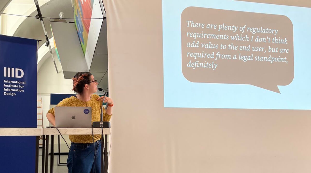
Testing beyond Covid: Our point of use instructions at IIID Vision Plus 2023
At the 2023 IIID Vision Plus conference, Josefina gave a presentation about her, Sue Walker, and Al Edwards’s work on the project ‘Information Design for Diagnostics: Ensuring Confidence and Accuracy for Home Sampling and Home Testing’, which looked at the design and usability of instructions for point of use Covid-19 lateral flow rapid tests.
The talk focused on Josefina and Sue’s experience of applying the research findings and the design approach to a set of documents explaining how to use a test for viral flu. The team developed a toolkit to support the creation of point-of-use instructions, taking account of views from diagnostic industry members to inform an understanding of how instructions are produced currently and what guidance might be helpful.
Plus, the IIID award ceremony closed the conference, and Josefina won an award in the Healthcare category for her work with CwPAMS on their Antimicrobial Stewardship Toolkit. Congratulations to Josefina!
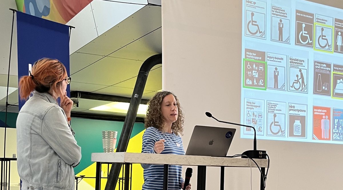
Design that cares? – IIID Vision Plus Conference 2023
Healthcare was the theme for the 2023 IIID Vision Plus Conference, held in the Design Forum in Vienna. Rachel and Josefina gave a joint talk about their ongoing work looking at documents from the Forms Information Centre Collection held at the Department of Typography & Graphic Communication. The documents were produced by the British government in the 1970s–80s to guide citizens in navigating public services. These services included claiming benefits, accessing healthcare, supporting disabilities, and help for those with caring responsibilities.
Presenting at the conference was a good opportunity to share examples of healthcare-related documents that are held in this unique collection. They shared a brief timeline of what was happening during the time that these documents were being produced. They then shared examples of document design that were of particular interest during their initial work. These include how symbols, pictograms, and illustrations were used to communicate healthcare topics, and how colour and layout helped people understand their options and take steps to access public services.
Flux 2023 Degree Show
A team of third-year students took on the branding and promotion for this year's degree show.
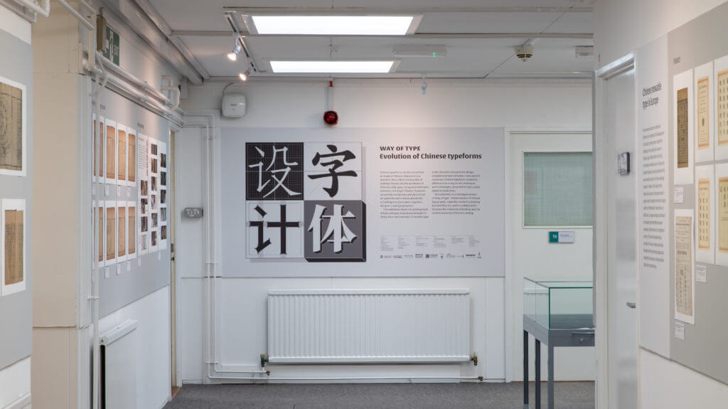
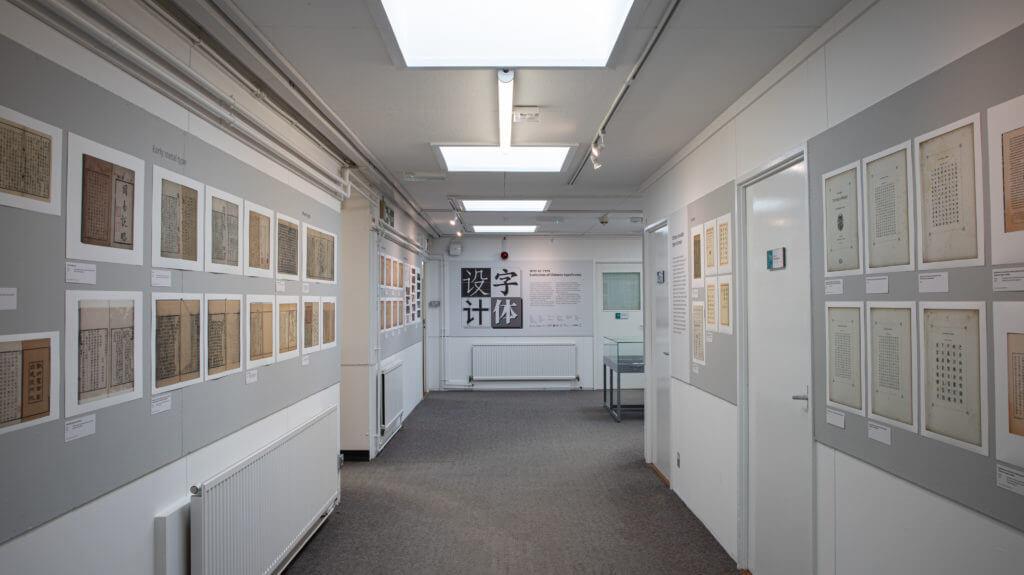
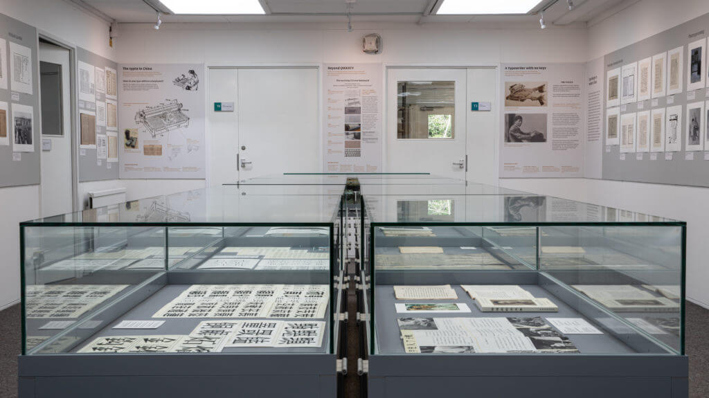
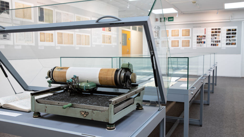
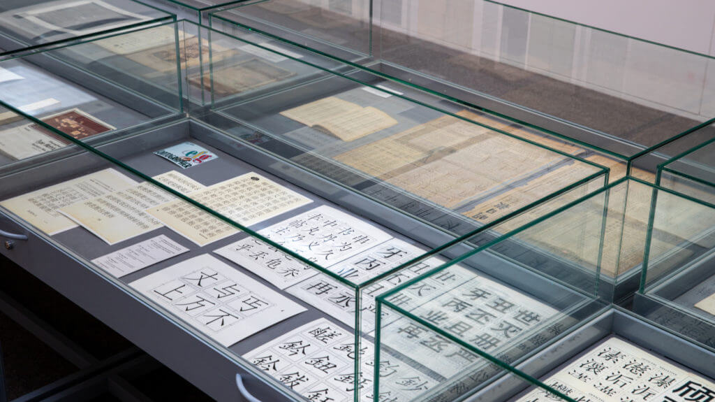
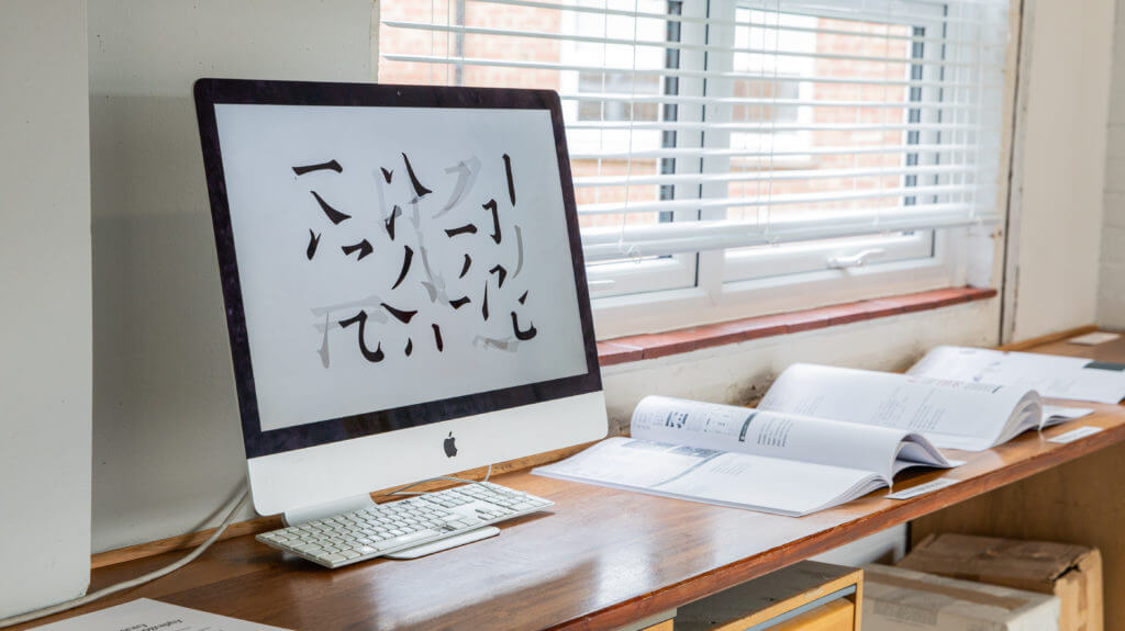
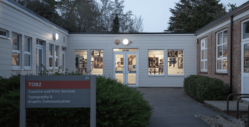
Way of type – Evolution of Chinese typeforms
17 April – 21 July 2023
An exhibition in the Department charting the development of Chinese type and type-making technologies.
Chinese typeforms are the visual form or shape of Chinese characters in a typeface. They reflect the function of reading Chinese and the aesthetics of Chinese calligraphy. Compared with Latin typefaces, the larger Chinese character set and the complexity and diversity of its typeforms have always presented a challenge to type makers, typeface designers, and typographers.
This exhibition charts the development of type and type-making technologies in China, from the invention of movable type in the eleventh century to the design of digital typefaces of today. It documents the rich variety of Chinese typefaces created in different eras using varied techniques and technologies, presented in high quality digital reproductions.
The exhibition is an abridged version of ‘Way of Type – Modernisation of Chinese typography’, originally curated by Jieqiong Yue and Zhao Liu, and is a collaboration between the University of Reading and the Central Academy of Fine Arts, Beijing. It represents the first exhibition in the UK featuring Chinese typeforms and type design.
Open weekdays, 10 am to 5 pm. Closed bank holidays.
Installation photos
Credits
China team
Academic chair: Di’an Fan
Curators: Jieqiong Yue, Zhao Liu
Coordinators:
Xi Yang, Ping Ju,
Liping Du, Yanan Zhang
Assistant designers:
Kui Zhu, Yue Chen, Peilin Song, Congyu Zhang, Kushim Jiang, Yangzhi Duan, Tengqi Zhaoxu
UK team
Academic chair: Eric Kindel
Curator: Xunchang Cheng
Visual designers:
Xicheng Yang, Huati Wulan, Ahmet Berke Demir
Production: Geoff Wyeth
Special thanks
Thomas Mullaney, Yiyuan Ma, Li Xing
Texts by
Min Wang, Mingyuan Sun, Zhongxiao Cong,
Xunchang Cheng, Guoyan Ji
Guided by
China Foreign Languages Publishing Administration
Organisers
University of Reading,
Central Academy of Fine Arts,
China Center for International Communication Development
Co-organisers
Department of Typography & Graphic Communication
Co-Innovation Center for Art Creation and Research on Silk Road of CAFA
Special thanks
Hanyi Fonts,
Arts Committee (University of Reading),
Shenzhen Graphic Design Association,
TypeTogether, LiuZhao Studio