Background
This Real Job required us to design a publication for the PLACEing objects exhibition that ran in March 2020. The exhibition was part of Julie Brixey-Williams PhD requirements and showcased a selection of multidisciplinary artists. The client wanted a publication to showcase the both the work displayed at the exhibition and the workshops that occurred on the “Day of Dialogue”.
The brief
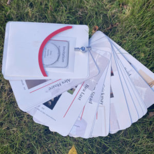
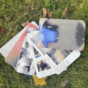
There was a selection of deliverables for this Real Job that adjusted slightly throughout the timeline. The main deliverable was a 48 page printed publication. The key unique aspect the client was interested in was that all pages in the publication must have equal importance. This meant we had to come up with a way to ensure the binding didn’t force a linear format, and that the users could rearrange each page.
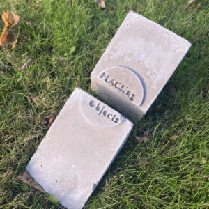
The secondary deliverable was a logo that client would send off to be cast into a concrete block. The block was a structural part of the publication, giving the printed publication a stand.
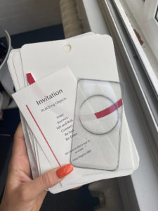
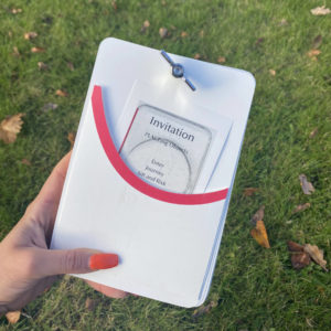
Alongside these primary deliverables, we also designed an invitation, an acetate ingot – replicating the glass one used in the exhibition – and a pocket page to hold both of these.
Research
User personas and interviews
The initial stage of research was looking through the early content and images of the exhibition shown to us by Julie. We wanted to get a thorough understanding of what the meaning of the exhibition was and what it was showcasing before starting any design work.
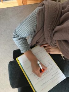
The next stage was considering the types of users within the audience that would be consuming the publication. We created a set of interview questions to get an insight into what potential audiences may expect to see in an exhibition publication. We set up 3 key user personas and conducted interviews on real life people that fit those categories.
Mood boards
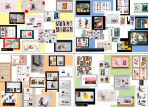
Initial research required both me and Amina going away and looking at examples of existing publications. We made 4 mood boards,. We then explore different approaches to this, including an abstract approach to the publication design, a clean cut approach and an approach where text or images commonly overlapped. Finally, we looked into existing editorial design for artists and exhibitions, examples of publications that could be considered a direct competitor. We sent these mood boards to the client to get an overview of the style she liked and allow us to begin some sketching.
Design
Deciding on formats
The client had used an iPad mini as part of the exhibition and wanted the publication designed with these dimensions, even down to the rounded edges.
The client also wanted a way to hold the publication together without it being physically bound. While this was initially intended on being a belly band we eventually designed for a screw to be drilled into the top. A screw was used in the exhibition and the client felt this was another way to integrate the physicality of the exhibition into the publication.
Testing layouts
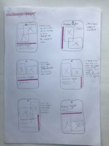
Designing the pages for the publication was the main part of this project. We trialed different layouts and sent them to the client so she had options to choose from and discuss what she liked and what she felt didn’t work. Once we knew what the client wanted we created a grid and paragraph styles that all pages would utilise. This required a lot of testing as the content for each page was vastly different, yet it was important to keep a clear consistency throughout.
Concrete block and integrating a logo
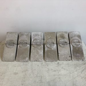
The client came up with the concept of a sculptural way to hold the publication rather than a band to hold it together. Julie wanted to have the publication sit in between 2 concrete blocks working as bookends that she would get cast by a professional at a later date. We were tasked with the responsibility of finding a way to anchor the title and branding within the design of said concrete block.
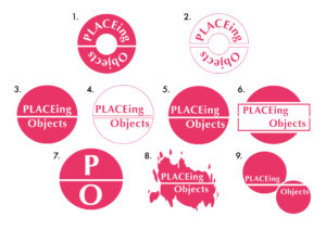
At this stage of the project a logo was one of the deliverables. The client did not have a specific use for the logo at this time and therefore we discussed using this on the concrete block make the entire project more cohesive. The logo used on the block would showcase the name of the exhibition while also adding an element of design to the block. We tested various versions to see how different layouts could work but eventually settled on a logo where the title would be split in 2, ensuring the audience would know the block was one of two.
While we initially considered applying a vinyl sticker with the logo design on it to the concrete block, we eventually decided that getting the actual logo cast into the block would be a more subtle way to showcase the logo and create the sense of it being ingrained within the whole publication concept.
This was a unique request and required some specific conditions such the files would have to be sent in. However, after close conversations with Jon, the caster, we were able to get the logo cast into the block exactly how the client wished.
Finalising
Iterations
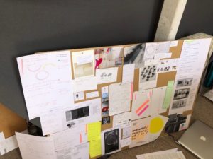
Meeting regularly with the client was key to the success of this publication. We would ensure that we were sending updated iterations of the project and having meetings in order to confer and review decisions about each page. We made a lot of alternations but this lead to a strong design that conveyed each artist honourably, in the way the client wanted.
Paper decisions
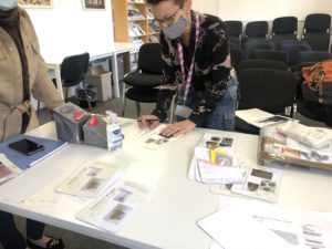
A large part of this project was the physical feel of the publication. We had a lot of conversations with the client about the shade and thickness of the paper. We printed out pages on a variety of different paper stocks to allow her to choose the one she felt represented her exhibition best. This was especially important as the main publication was printed on different stock to the invitation and the ingot. It was key to get the stock right so that they all worked together.
Production
The publication was a short run, but due to the variety of complex printing elements such as the acetate insert and pocket page we decided the Design Print Studio in the department was the most appropriate printer. It made the communication regarding all printing easier as we could talk directly to DPS and had Geoff to advise about complex parts of the publication.
Reflection
This Real Job was the first one I picked up. This meant it was a lot of new experiences for me, from working with my first client to sending my first job to print.
This project was incredibly large and intensive with lots of contributors. It took a lot longer than initially intended as we had to wait for different pieces of content alongside working to create a highly physical piece of work over multiple lockdowns. Additionally, much of the content can in different formats so it took a lot of time to work to standardise all copy and images.
Working in a group also had a lot of added complications. We couldn’t meet in person so everything had to be done over zoom which occasionally meant their was communication issues. Additionally, we could not work on a file at the same time and would have to ensure the latest file was uploaded to OneDrive at all times. Reflecting on this project, I think there could have been more appropriate ways to divide up workload to be more efficient, however this experience has helped guide future Real Jobs and other group projects.
Overall this has been an incredibly educational experience, providing me with invaluable opportunities and a printed publication that I am very proud to have collaborated on.
 .
. 