Category: TY1DP1

Work by Part 1 students as part of their ‘Design Practice’ module.

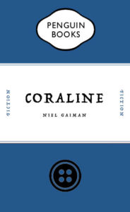
Coraline Penguin cover transformation


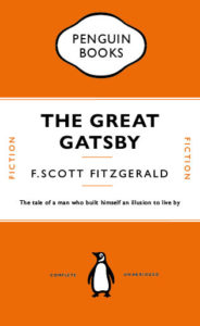
In Fridays integrated design technical session, we focused on the Adobe software ‘InDesign’ and practised recreating a conventional penguin book cover. We looked at the The Great Gatsby by F.Scott Fitzgerald. I learnt some very important skills which I hadn’t discovered before, for example using only one text box and creating complex shapes with tools I didn’t realise were available in InDesign. For the follow up task of creating a distorted cover with an ironic twist to it, I decided to base mine on the novel Coraline by Neil Gaiman. The novel follows the narrative of a young girl who finds a portal to a world similar to that of our own but the people in the other dimension have button eyes. The buttons are a heavy theme throughout the book as well as in the movie. So I decided to swap the penguin for the button. I decided to set the main colour as blue to represent the main characters hair colour and general aura of the novel.
 

Approaches

Covid-Signs designed by University of Reading.

Remarkable is that you can find a generic use of colours and shapes, which create a kind of branding.

You find these signs all over the campus, in every building, cafe or hall.

The strong yellow stands in contrast to the black.

By using these two colours together a message of warning and look of toxicity is conveyed to the adressee.


Shades of blue expressing cleanness, calmness and clarity

In these graphic instruction sheeds, the designer used clear and simple graphics, complemented by two to three words. Also he only works with three basic colours.

Thereby the instructions are easily to understand, they appear calm and create an educational message.


How is Coronavirus represented in the internet?

Creating an alarm signal by a small yellow box popping up on top of the screen.

The message to the receiver is warning and demands a reaction.

The real looking virus makes a dangerous and serious impression.


Fresh blue is catching attention

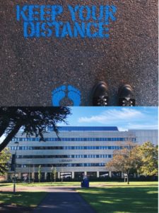
The fresh blue is used to bring the advise to keep distance out of the ground and to get the attention of people waiting there.

By implementing some more colours in the illustrations on the left the advices appear more friendly to the recipient.

Impressive how different colours can be used to create different types of messages for the adresse!


Minding the Gap Can Get Tricky

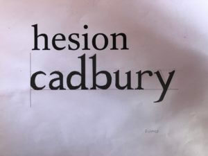
This task was quite straightforward as all the brief was, was to write the word ‘Cadbury’ in the typeface provided. This proved more tricky than I’d anticipated as I chose a serif font, so the structure of the lines was a lot more organic when compared to a sans serif font. This meant that getting the proportions right for every stroke involved was quite hard.

I thought I’d done a good job, but as Gerry pointed out, my serifs were way too pointy and my stroke width was very inconsistent.

For the second part of the task, we had to fill in the remaining parts of the letter from what we were given on the sheet. My serifs definitely improved this time but again, maintaining consistent stroke widths was hard.

Varying amounts of formality in Covid communications

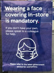
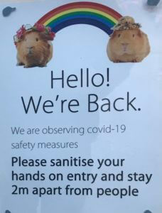
One of the interesting things about the pandemic is the wide range of graphic responses to it. Prom the government, to companies, to families in their homes, there is a massive variety of notices which have been put up, both formal and informal. Companies such as Tesco and Next will probably have their own in-house graphic designers while smaller businesses and families won’t. This means that some notices look very professional and on-brand, whereas others will appear more handmade and thrown together. Two noteworthy examples I found where those of Tesco and one at a shop in the oracle.


Tesco’s poster keeps the Tesco typeface and colour scheme as well as a fitting illustration. As a sidenote, I think it’s also quite interesting how a face mask has become so widely used and recognised. It’s as if simplistic representations of face masks have entered our vernacular. While the poster clearly mimics the Tesco styling, which the designer evidently intended, I would argue that this makes it too easy to ignore. In a Tesco store, there may be many similar posters with this styling, which means this porter may blend in to the point were it’s not actually paid attention to. This makes the design unsuccessful. I think mimicking the official Tesco aesthetic too much runs the risk of appearing too cold and official. I don’t think this design really speaks to the customer in the exact same way as intended as it’s styled almost more of an advertisement.

The other shop (which I unfortunately can’t remember the name of)  on the other hand, has appeared to have taken a rather different approach. They have included two guinea pigs with a rainbow between them. This is quite bizarre, but I think it actually does a lot to maybe make the company’s communication more informal and friendly. The rainbow has come to symbolise the NHS recently, and the guinea pigs may just be being used as symbols for a softer approach. I’m not sure if this is intended, but the rainbow between them makes it appear as if they were socially distant. It’s not exactly professional, but I think this actually communicates to the customer better by doing a lot to humanise the business and its effort for the pandemic. The guinea pigs almost give the business a vulnerable quality.

To conclude, I think the more personal, if less professional communication involving the guinea pigs is actually better, because it humanises the company and is less likely to be ignored.

Temple disc and Smart ring

My partners 3 facts were:

  • Enjoys listening to music, favourite artists are Krept & Konan, Headie one, AJ Tracey…
  • Likes to watch TV and films a lot. some examples are Brooklyn 99, Power, Fast and Furious…
  • Likes technology, using it, watching videos about it…

Below were my initial brain storm of ideas from his facts:

My three random words were:

  • Software
  • Game
  • Bomb

Below, are my concepts shown through the matrix grid. I came up with all these using one of the elements above, and sometimes mixing them.

From there I re-drew my two final ideas for the gift. These were: 1 pair of temple discs and a Smart ring. Can be seen below.

The concept behind the Temple Discs are that when you put them on, they link to your brain. They take you into a different reality, where you can live as a character in you favourite tv show/film. I thought this was a good idea and it is a new experience as instead of just watching you are living it too. I came up with this concept from his love of watching tv and films. But also from the two random words of game and software.

My second final idea is called Smart Ring. It links to your brain again, however this time you control it all. You can speak to it to find out information, can control music, read out a text for you, send texts and make calls for you. Lastly works as a camera by capturing what you see from your own eyes. I got to this idea from the random word of software and my partners love for music and technology.

Font Finding


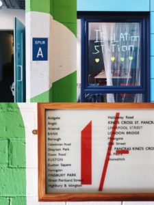
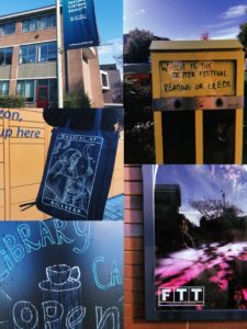
For Eric’s lesson on Monday we had to find lettering in our environment, eg around campus.

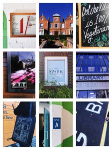
We got lucky with the weather being very sunny, and clear blue skies, as this meant a lot of light in our photographs, and a bright sky that on occasion helped add to the photo. I found signs, graffiti and stickers posted about campus. I also took a couple photos of the lettering in the typography department, however kept my focus to signs outside.

When it came to grouping our photos together and finding a common theme in them, my photos in honesty didn’t have much in common, when it came to font, topic, wording, or even colours. So I did create a collage of some of my favourites, editing them to have a common ground with yellow, blues and greens. And one similarity I did find between a couple photos was framing, where the type had been framed by a certain material, to be the centre of focus, such as, a window, wooden frame, or created on board and centred on a thin wall, giving it a frame.

After this project I will make an effort to look for more lettering in the environment, why it is used, and how communication varies from a sign being instruction (stop, slow down, caution. In bold capitals with bright warning colours). To creative welcoming advertising, for cafes or restaurants that use blues, or black and white for a professional sleek look.


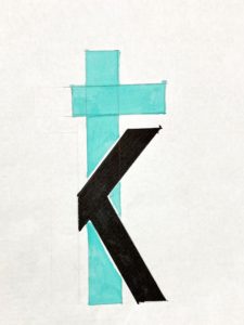
TK

TK


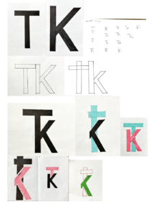
To transfer our iniatals into a monogram logo I have used Futura font. I had to draw my letters separately and then I have ligature the letters to make a logo. I have  made some potential designs which I could use. Then I have chosen the designs which I wanted to explore further. After my final design I wanted to colour it in two different colours.

Social Media

The noun I was given was social media. I had a few ideas for this word which can be seen below in my brain storm.

I started my taking photos so I would be using primary photos instead of secondary . I then opened my photos in photoshop and developed them within the software. Resulting in these two images.

I went for this concert people as the image is more than less the same with change one element; the control. I found that my other ideas changed more than one element, therefore may not of been best suited for this brief.

I went for the concept of representing social media through someone liking posts on there. (to make it more clear by adding in the logos in the background). To another view that social media is toxic and controlling us. As the hand stretches to like the photo, whilst being with strained by the charging cable connected to the phone.

Fragile Happiness

For Sara’s project, I was given the word “happiness”. The first thing that popped into my head was the classic smiley emoticon. After trying to explore other ideas I chose to go with the emoticon as emoticons nowadays are like a universal language, it’s almost guaranteed that my theme would be understood.

For my altered version of my original image, I chose to have cracks and pieces broken away from the smiley face revealing small hints of a sad, monochrome face. The cracks and fragments missing from the face were to show how fragile happiness can be and that sometimes even someone who looks like they couldn’t get any happier, are still pretending to smile. I chose to strip away the colour from the face behind the smiling mask as happiness is often associated with bright colours, particularly yellow. I felt that taking away that bright colour helped to increase the contrast between the two faces, therefore making it easier to differentiate between the two.

If I were to do this again I would have liked to use adobe software to use the original emoticon and then edit it digitally.

London – Olympic Underground

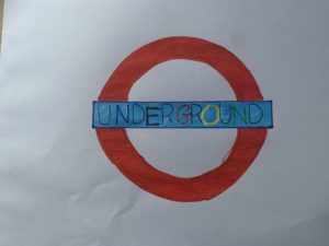
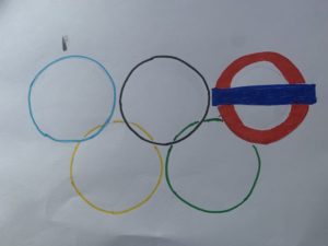
The task that I was set was ‘ London’, I actually decided to show this word and this location by showing the simplistic universal logo of the Olympics along with the culmination of the underground logo. Within the first few images or designs that I made were inspired and created with the logo of the Underground with the colours of the Olympic rings implemented into the lettering with this. The final image that I made was a mixture of the Olympic rings and the underground lines coming out of the rings themselves. I feel as these two images and logos are very recognisable, and quite relatable to London as the city of London hosted the Olympics in 2012. Previously the city hosted the games in 1908, 1948, and now 8years ago 2012.