
This task was quite straightforward as all the brief was, was to write the word ‘Cadbury’ in the typeface provided. This proved more tricky than I’d anticipated as I chose a serif font, so the structure of the lines was a lot more organic when compared to a sans serif font. This meant that getting the proportions right for every stroke involved was quite hard. 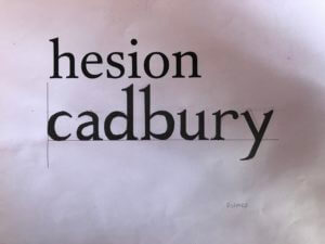
I thought I’d done a good job, but as Gerry pointed out, my serifs were way too pointy and my stroke width was very inconsistent.
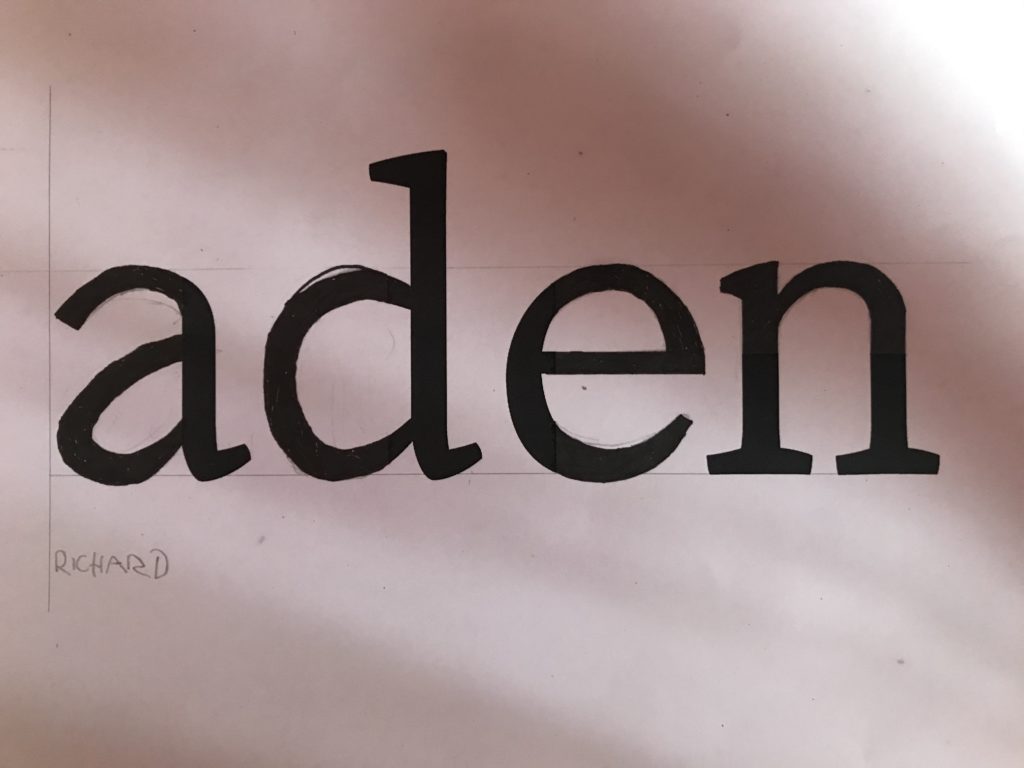
For the second part of the task, we had to fill in the remaining parts of the letter from what we were given on the sheet. My serifs definitely improved this time but again, maintaining consistent stroke widths was hard.