

Covid-Signs designed by University of Reading.
Remarkable is that you can find a generic use of colours and shapes, which create a kind of branding.
You find these signs all over the campus, in every building, cafe or hall.
The strong yellow stands in contrast to the black.
By using these two colours together a message of warning and look of toxicity is conveyed to the adressee.

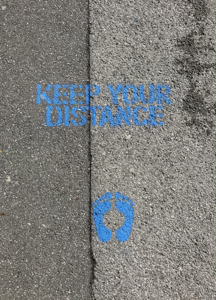
Shades of blue expressing cleanness, calmness and clarity
In these graphic instruction sheeds, the designer used clear and simple graphics, complemented by two to three words. Also he only works with three basic colours.
Thereby the instructions are easily to understand, they appear calm and create an educational message.

How is Coronavirus represented in the internet?
Creating an alarm signal by a small yellow box popping up on top of the screen.
The message to the receiver is warning and demands a reaction.
The real looking virus makes a dangerous and serious impression.

Fresh blue is catching attention
The fresh blue is used to bring the advise to keep distance out of the ground and to get the attention of people waiting there.
By implementing some more colours in the illustrations on the left the advices appear more friendly to the recipient.
Impressive how different colours can be used to create different types of messages for the adresse!