What are the Connectedness reports?
A set of three reports summarising past conferences taking place at Manchester University that will be given out at the June 2023 conference, Connectivity and Inclusivity in HEIs – A solution-based approach. The first report focuses on creativity and inclusivity in higher education and women in environmental science, followed by a smaller booklet that summarises key outcomes from the Women in Science report.
The Creativity and Inclusivity in Higher Education report showcases engaging and accessible resources which convey the methods, processes, and outcomes to key audiences and stakeholders. While also addressing the need for equality, diversity, inclusion, and accessibility (EDIA) initiatives to recognise lived experiences as essential to knowledge sharing and to directly inform practice.
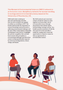
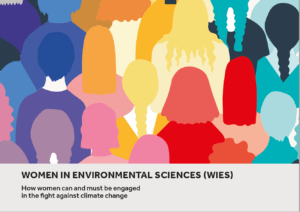
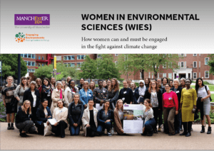
The Women in Environmental Science report focuses on the way that the climate crisis will impact women, how we can bring women together with diverse backgrounds, lived experiences, ethnicities, and disciplines, to promote inclusiveness, widen participation and foster discussion, help to inspire women to engage with their environment and environmental sciences. Focusing on the key themes of Women’s rights and issues that comes with this, climate change, sustainability, leadership, community, relationships, and communication.
Brief
The brief was to create three reports that would be printed and handed out at the next conference, we also had to create interactive PDFs for each report that would be showcased on the website. While also combining elements from the different stakeholders, Manchester University, and the co-brand Engaging Environments.
Our goal was to create an interactive and engaging set of reports containing a strong super-graphic and illustrations throughout to capture the reader’s attention as the content was very text-heavy. The super-graphic we created needed to represent ‘connectedness’ as it was used throughout the documents, tying them together visually.
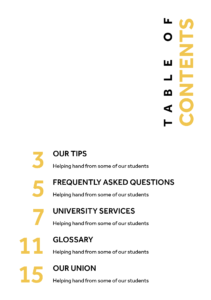
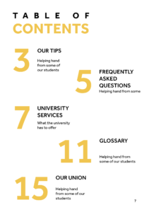
Deliverables:
Design x3 documents that will be hosted as PDFs with a limited print run.
Deliverables:
PDFs and limited print runs of:
• Women in Environmental Science report (A4)
• Women in Environmental Science Toolkit (A5 Booklet)
• Creativity and Inclusive in Higher Education report (A4)
• Super-graphic
Branding
For the branding of the reports, we needed to use both Manchester University and Engaging Sciences branding. We were given guidelines from both brands which showed us the appropriate usage of logos and typography.
Audience
Looking into the audience and stakeholders was an important part of the process of coming up with a visual identity. Looking at past events from Manchester University which was provided by a video from our client allowed us to create a list of potential users for each report:
Women in Environmental Science
- Women working in or with an interest in environmental sciences.
- Equality, Diversity, Inclusivity & Accessibility (EDIA) practitioners
- Higher education professionals
- Policymakers in environmental science
- Students
- Early career researchers
Creativity and Inclusivity in Higher Education
- EDIA practitioners
- Academics staff
- Students
- Researchers from the UoM comprising diverse ages, ethnicities, and career stages.
- Friends and community partners of UoM
- Communities and participants from all parts of the UK
After researching and speaking with our client we came up with a list to cater our work to the specific audience. The client was very open with what he wanted the design to be but put emphasis on using bright colours whilst avoiding gender stereotypes. The client also wanted bold and assertive graphics throughout as opposed to illustrations that could be seen as passive. Our main goal was to create a design is visually appealing, assessable, clear headings, navigation and easily understood data.
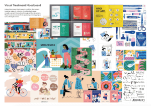
Finding a creative direction
After understanding the content of the reports and the target audience we began creating some mood boards and investigated some existing reports. Showing our client our mood boards allowed us to make sure we were heading in the right direction while also being able to ensure the client was on board with our aesthetic approach before designing.
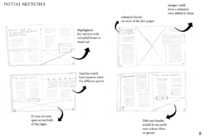
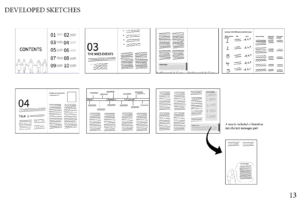
Design development
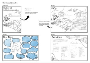
As we had a lot of creative control over this project, we began with some initial sketches based on the mood boards. Overall, the client was excited about these initial ideas but commented how they wanted the front covers to focus less on science and more on hearing different people’s voices while showcasing diversity.
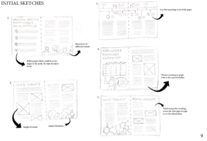
We then went on to develop some front cover sketches based on the client’s feedback by incorporating different women and avoiding science or gender stereotypes.
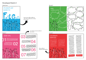
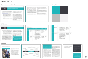
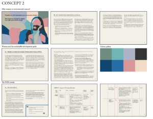
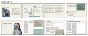
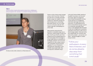
Feedback from our supervisor, we decided it would be better for the pages to be landscape as the content was text-heavy and contained multiple graphs and tables. After further feedback, our client liked concept three as it included a vibrant colour palette and the text in four columns made it legible.
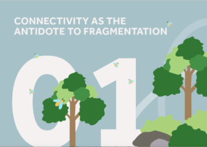
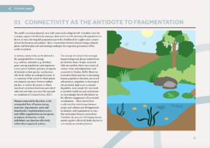
Super-graphic
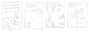
Our client wanted a logo/super-graphic that would be used to tie all three reports together. The three examples shown were given to us for inspiration, and we then began to create some sketches focusing on “connectiveness and community linking to the natural world element. Nature and ecology”. After speaking to both our client and supervisor, we decided to take a different approach and create something a bit simpler that could be spread across each of the pages as well as shown on the front covers.
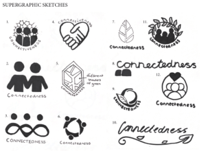
The final super-graphic shows connectedness through two circles overlapping each other, this also helps add visual interest and break up the text-heavy pages.

Women in Environmental Science Report (WIES)
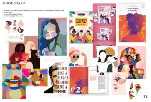
For the WiES report, we wanted to use bright colours and powerful illustrations that would be relevant and helpful alongside the text. Finding an illustration style was something we found quite difficult at first due to the content being very text-heavy there would therefore be lots of illustrations throughout. To help with this we came up with another mood board to help with some visual directions.
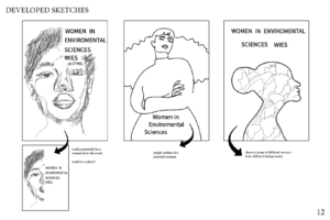
These two images show two different illustration styles that we experimented with showing the use of block colours and female empowerment.
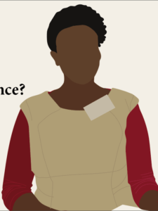
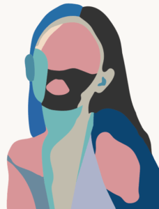
Here are the illustration styles that we implemented throughout the reports. Showcasing women in different relevant elements of the report. We decided on this style as it is simplistic and easy to replicate in many forms while still being visually interesting.


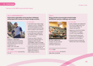
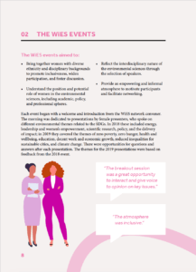
The inside pages consisted of us using different colours for each of the different sections. This worked well in separating each section and carries through in the titles and super-graphics of each page. Through making this report we worked hard in creating visual interest in each page through different illustrations and images. We aimed to keep the pages different and not too text-heavy as this would bore the reader. This visual interest was upheld using speech bubbles are boxes to emphasise the standout information in the report.
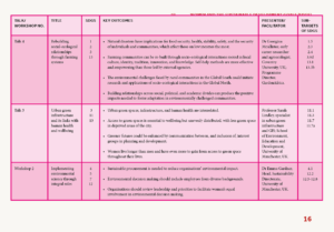
A challenge that we faced was coming up with a way to show clear information in a table. Below shows an initial table where we used different shades and lines to separate the information. However, this wasn’t a viable option as it is difficult to read with the line width being too small and not engaging for the reader. In the end, we had to think of a new way to display this information and decided to scrap the table idea and take the information out into its own sections. As you can see this way of displaying information works a lot better as the reader can take a glance and understand the text through the strong visual hierarchy that has been used.
Creativity and Inclusivity in Higher Education Report (C&I)
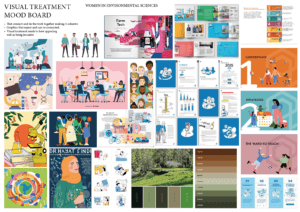
The client wanted us to focus this report more on nature and humans connecting with the environment. To do so we used blue, green and earth tones for the different sections as well as incorporating illustrations of trees, water, and rivers throughout. Although the two reports have different themes and content, we kept the same structure and illustration style as the WIES report.
Lessons from Women in Environmental Science (The WiES toolkit)
This report is a summary of the main WiES report but follows a different structure of an A5 landscape booklet. As this report is a summary it has a lot less text but still contains elements of visual interest with a clear structure.
Front covers
For the front covers we wanted them to reflect the content inside while also appealing to the reader. We began experimenting with different front covers the first being using an image that spread across the whole page and the other being more of an illustrative approach.
However, we decided that both of these didn’t fit and also didn’t give the reader an insight into what the report was about. The final cover designs that we came up with use typography and illustrations in a fun and engaging way that makes it clear what each report is about and follows the design inside.


Reflection
Feedback from are client was very positive. “Both of you worked extremely well on the Real Jobs project for Engaging Environments and our partner University of Manchester earlier in 2023. You absorbed a lot of complex information contained within the reports and on our calls regarding the project to produce designed outputs that were of a really high standard and reflected the themes of the work. Our partner was extremely happy with the reports, to the extent that they would like to produce a final report on Pt 3 of the C&I workshop in the same style, and the materials were also very well-received by the intended audiences at the event where these were shared.
You also worked to very tight deadlines, which was impressive given the size and scale of the reports that needed to be produced, and the commitment you showed to the projects throughout was very much appreciated.
I wouldn’t have any negative comments, I thought you both did a great job.”
Overall, this project has taught us many things with the main thing being time management and prioritisation. As it was such a big project with just over two months to complete three printed reports and three interactive PDF’s we needed to be realistic with what we could achieve in this time frame and didn’t have months of planning and sketching time like other projects would traditionally have. We were able to split the project up well to showcase both of our strengths while also allowing us to stay efficient in work production.
After this project we can both say that we have gained a lot more experience in editorial design as well as interacting with a client. We worked on our project management skills making sure the reports were ready for the event. We learnt to take on board feedback from both our clients and supervisors and create different revisions based on our feedback. Worked with branding guidelines, making sure that all the logos were placed correctly and maintained brand consistency. We learnt to address design challenges creatively and find solutions that met our client’s objectives.
Where to find the reports
All three reports can be found on Manchester University’s website under the WiES sections.
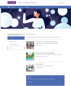
https://www.meri.manchester.ac.uk/wies/research/resources/