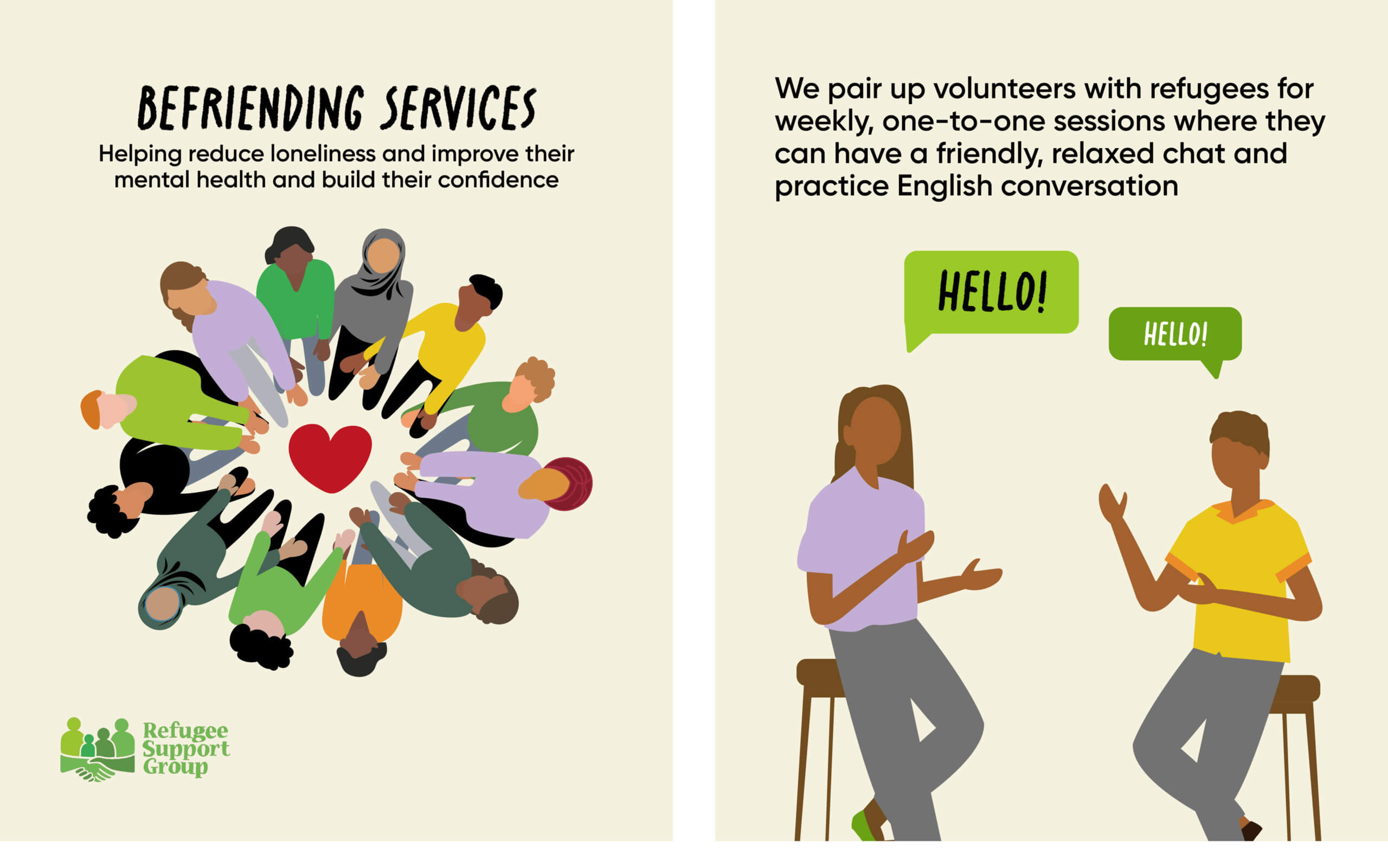
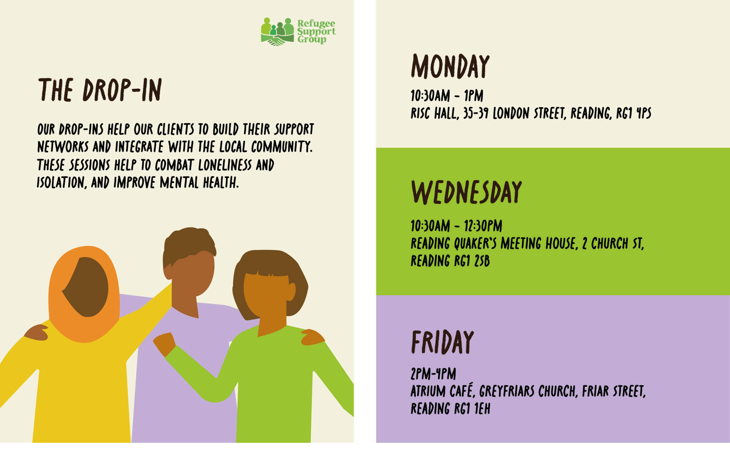
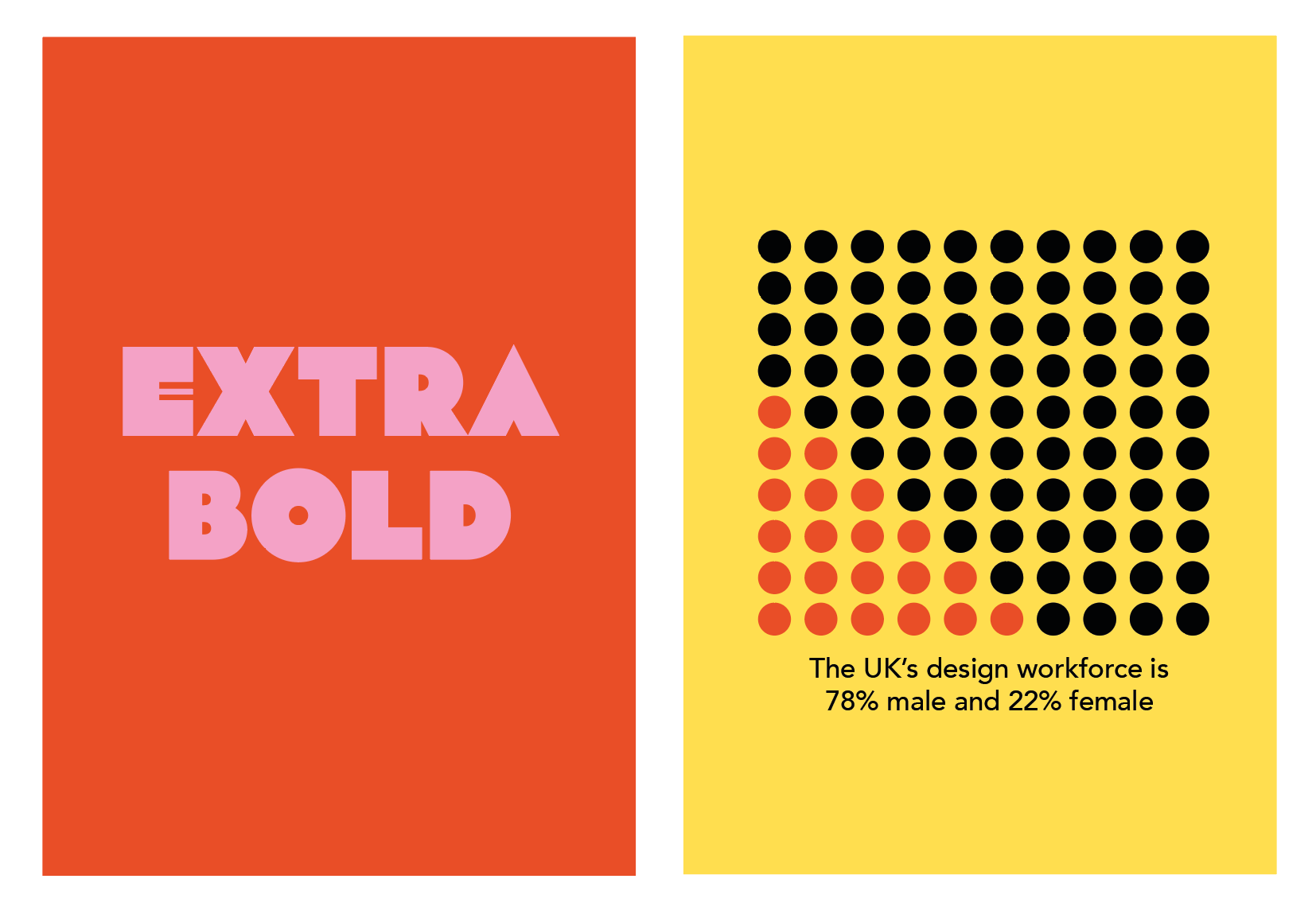
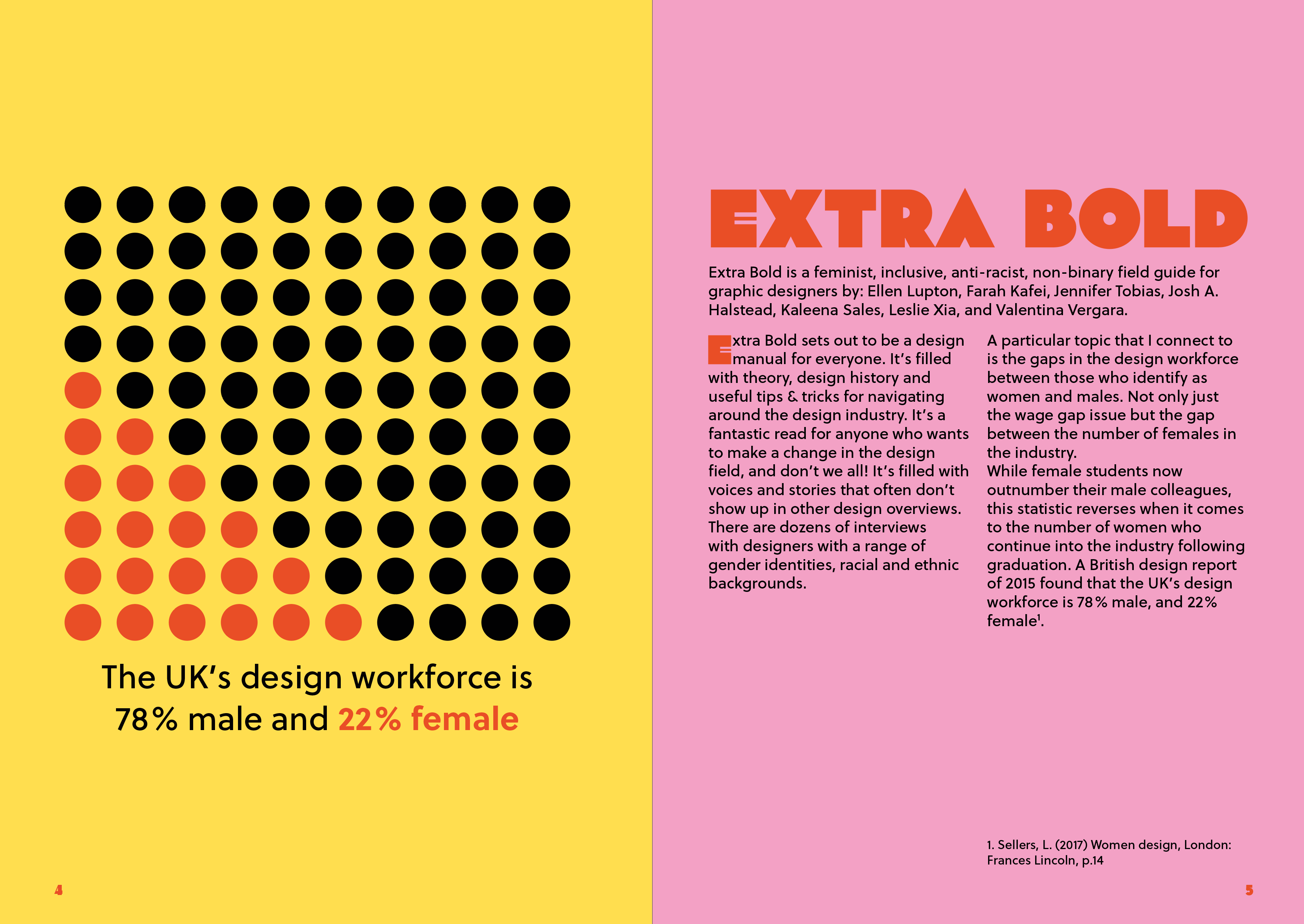
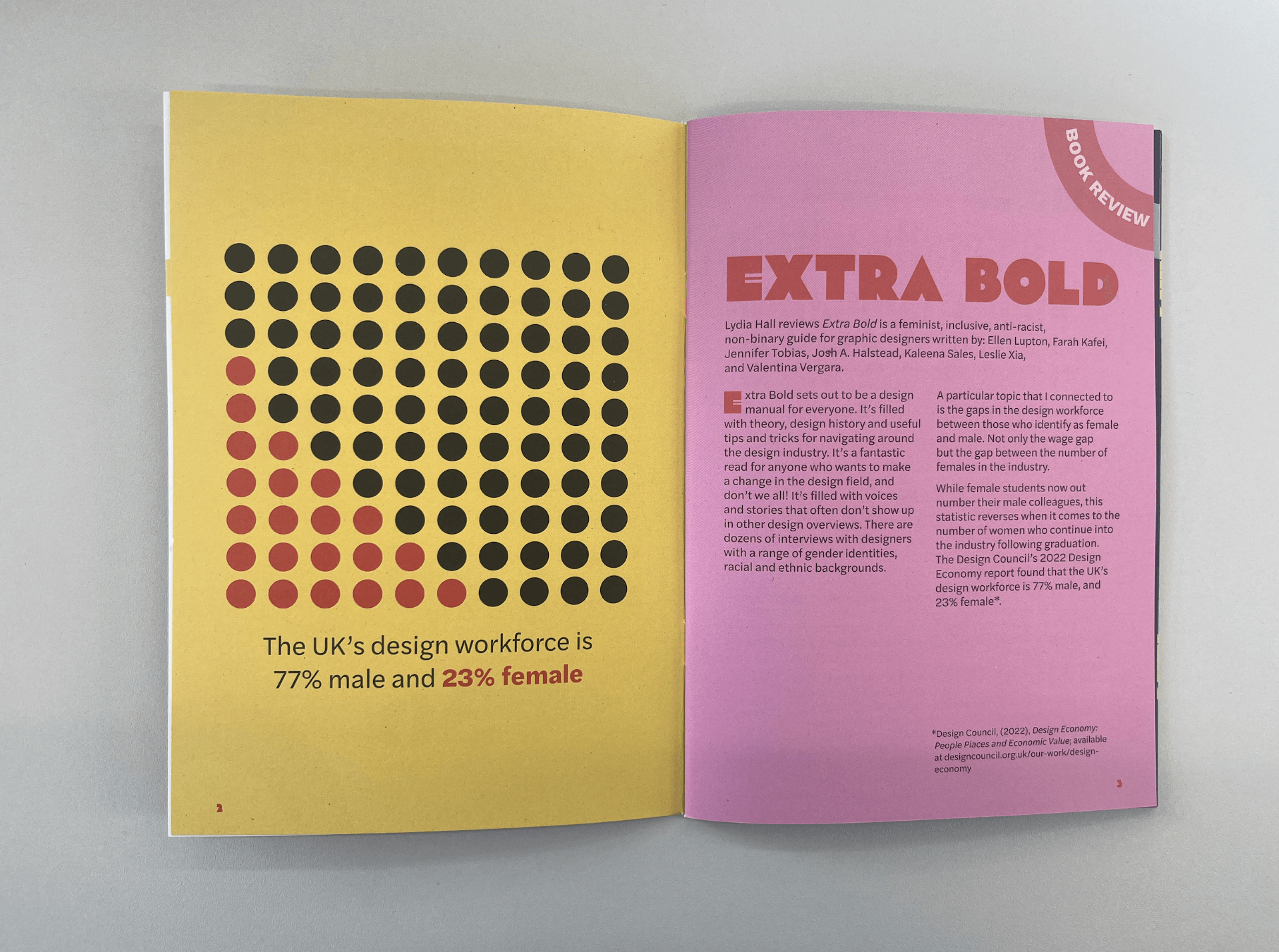
Background/overview
Inspired Earth Design is a landscape and garden design company that orchestrates and produces beautifully constructed garden layouts. They carefully curate landscape designs to match their customers’ exact needs and find a comfortable balance between beauty and sustainability. The clients, Emily and Jude, work closely with their customers to create a garden design that matches their overall style and aesthetic. The Inspired Earth Design team won gold at the RHS Hampton Court Garden Festival, where they competed in designing the perfect garden that reflected ‘Americas Wild’. This real job aimed to create an instantly recognisable logo highlighting the company’s expertise in garden design in a modern yet feminine style.
Restated Brief
The main deliverables for this project were a primary logo and a logo mark, which will accompany their new website launch. Upon meeting with the clients, we discussed their brand, target audience, previous logo, and aspirations for this project. This meeting allowed me to gain an understanding of who the clients were, what they wanted, and how I could achieve this for them.
Target Audience
- Women who have a disposable income, and an interest in sustainability.
- Customers who have a love for nature and preserving the environment.
- eco-conscious and environmentally friendly people may want to create a garden that maximises their space to plant and grow fruit and vegetables. As well as gardens that support biodiversity, rainwater harvesting, and looking after insects.
- Clients who take pride in their gardens and wish to turn their house into a home.
Research
Before completing the design process, the main starting point for this project was to conduct a thorough analysis of Inspired Earths Design company. For example, what their primary goals are within the logo, who their competitors are, and the foundation of other logos within the gardening sector.
Competitors
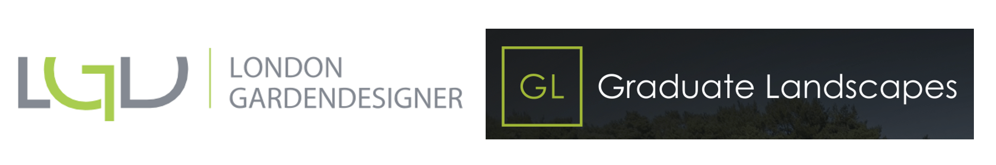
Initially, looking at their competitors’ logos, the designs roughly followed the same format. The logos are pointy, mainly typographical, and use a vivid lime green. These brand identities are bold, modern, and somewhat masculine. The client’s general idea is to create a brand that visually stands out compared to these and emphasises their feminine, gentle, and hands-on qualities.
Other Gardening Logos
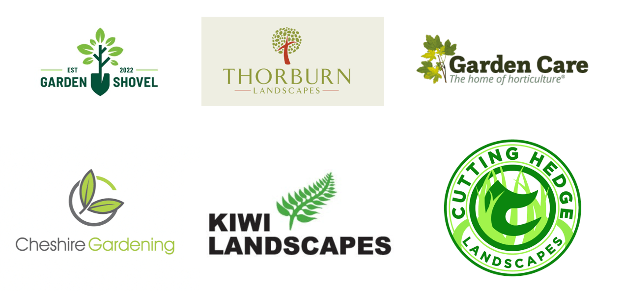
Upon researching other logos within the garden design and landscape community, there are several common themes that each logo possesses.
- Garden design logos usually use a vivid shade of light lime green and feature elements from nature, such as plants, leaves, trees, and flowers.
- A common recurring word/ theme is garden, landscape and green.
- There are not many typographic logos only using the company name or the initials of the company in the logo.
- Serif logos make the company appear older and slightly out of date, they are not modern, new, or fresh.
- Circular logos are very popular in gardening as they help enhance organic shapes.
Initial Design Ideas
- A modern timeless logo that can be used for an extended time.
- Emphasise the feminine touch within the logo that represents the client’s attributes and qualities that help them stand out compared to their competitors.
- A use of gentle and elegant typography that is clean and bold but doesn’t take away from the logo mark.
- An elegant and subtle colour scheme that reflects the personality of Inspired Earth Design and works cohesively with their website.
- The logo mark should consist of the brand’s initials, ‘IED’.
- Explore the use of natural scenery, such as leaves, plants, flowers, trees, and more.
Design Stage
Upon completing the general research and meeting with the clients, it was now clear what type of logo the clients wanted. This research acted as a solid foundation for the rest of the project. The goal now was to create a feminine logo that included the company’s initials with a naturalistic aspect and organic shapes and designs.
Logo Design
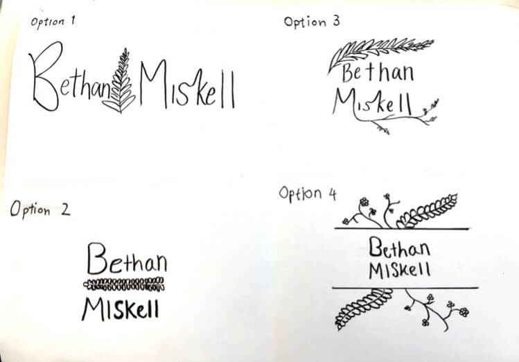
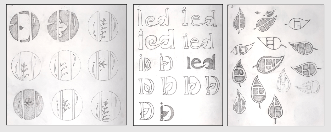
The initial logo sketches all considered incorporating Inspired Earth Designs initials with leaves, trees, and plants in an organic and feminine style. These logo ideas were explored using the company’s initials in a range of different ways to get an idea of which direction the clients wanted to take. Upon showing the sketches to my clients, we decided on three main logos to develop further and test how they would work digitally.

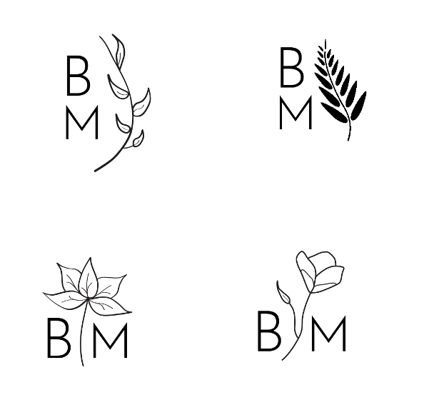
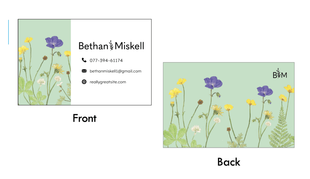
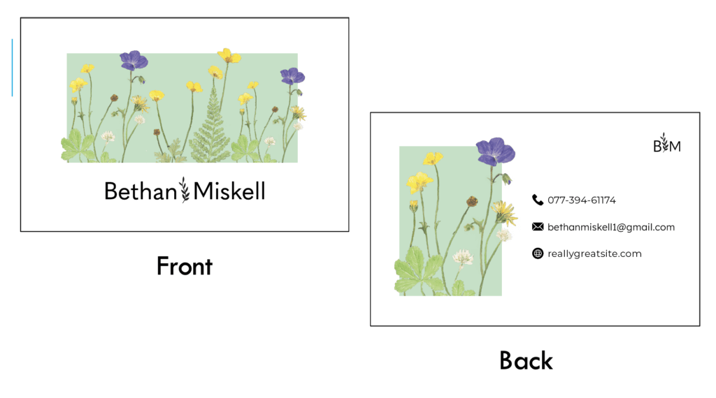
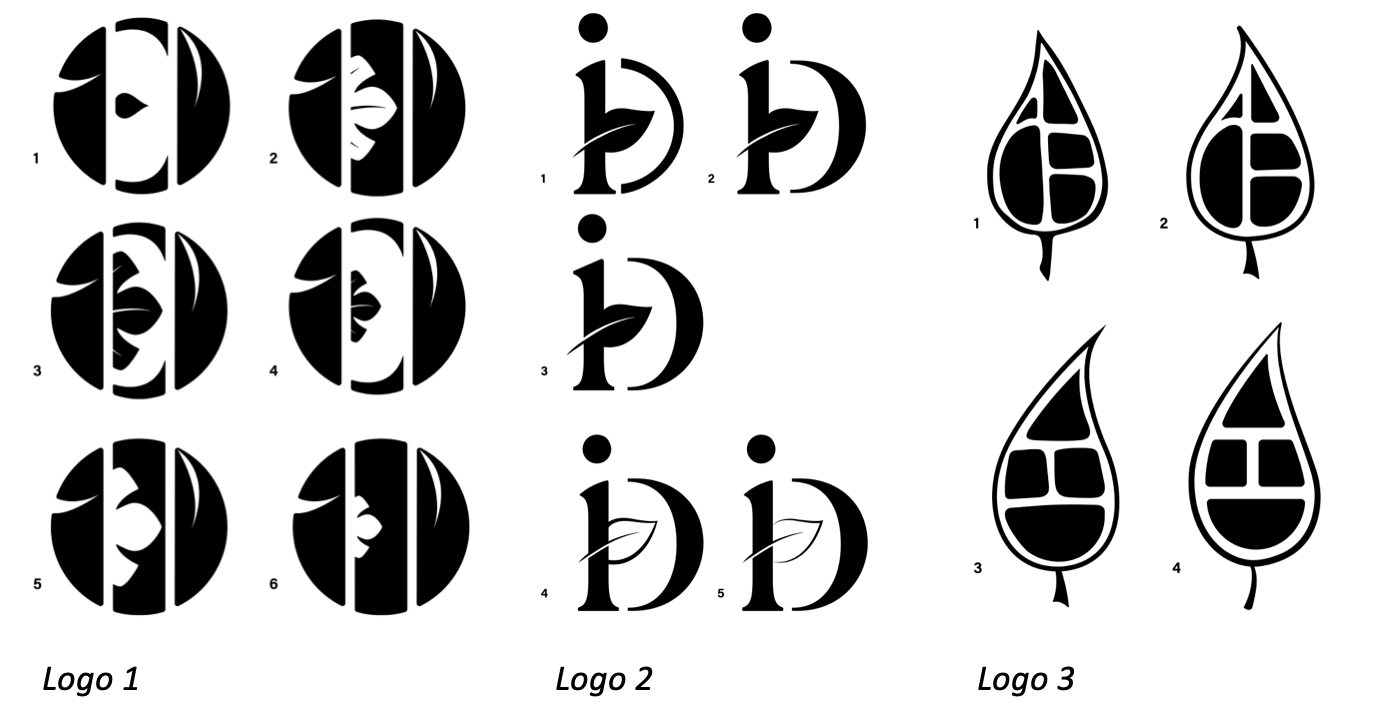
Three Chosen Logos
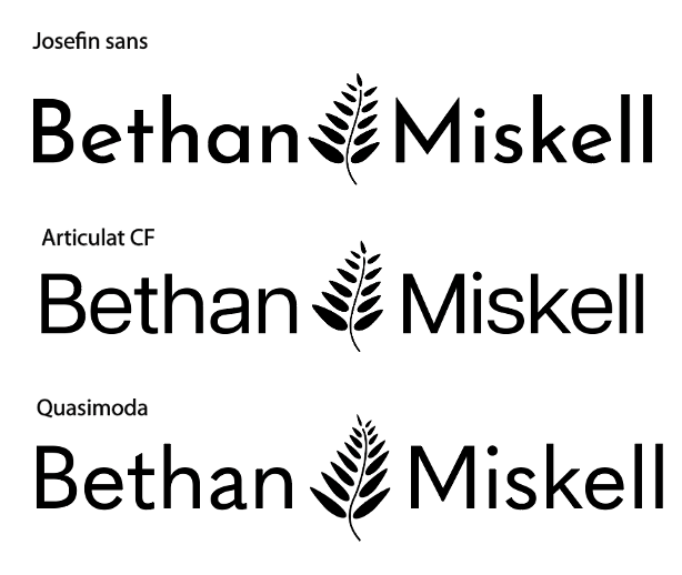
Upon creating the logos and reviewing them digitally, my supervisor and I decided the third logo did not translate well onto the screen. While the sketches for this idea were among the strongest, we found that after creating the logo digitally, it became one of the weakest. After receiving feedback from the clients, we decided logo 1 was the strongest and had the most potential for their company. They found that this logo design effectively communicated their brand identity and highlighted their feminine qualities and modern style.
Further Development
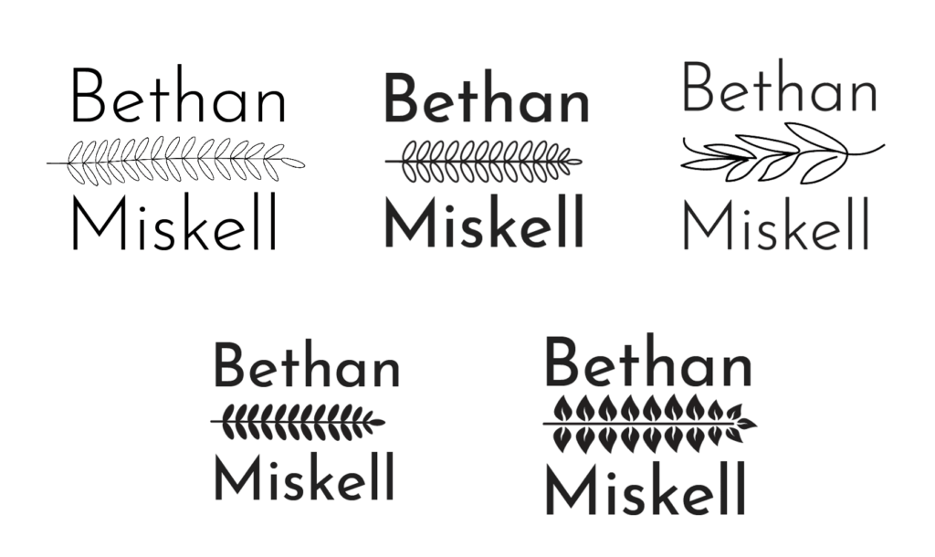
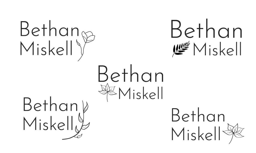
My supervisor then suggested looking at other leaves or plants for the centre of the ‘E’ as this is the main focal point within the logo and should be more visually interesting. Upon researching several other plants and leaves that resembled the letter E, such as ferns, mistletoe, monstera leaves, philodendrons and more. I sketched out the new ideas and then chose the strongest ones to gauge how they worked digitally.
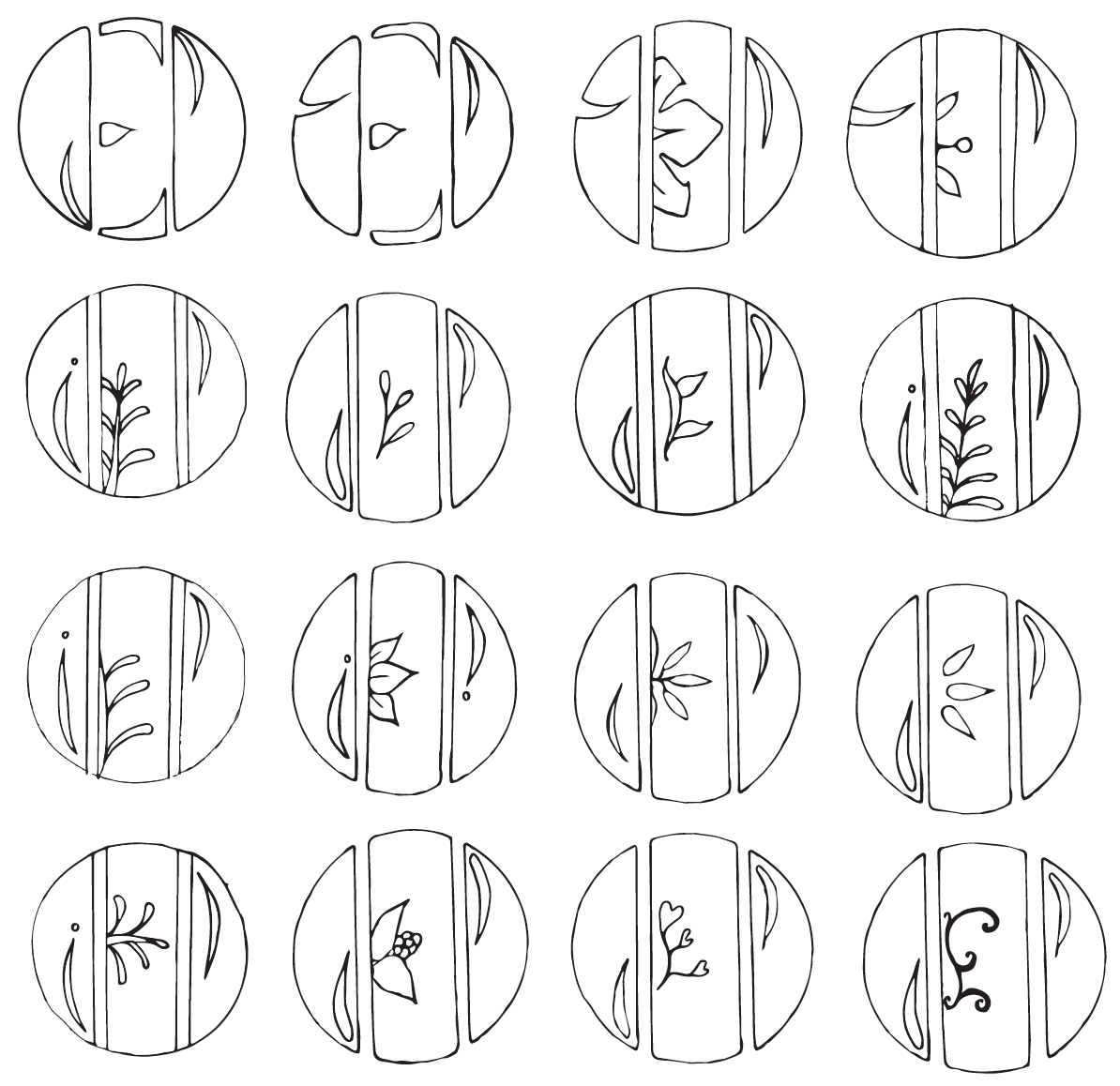
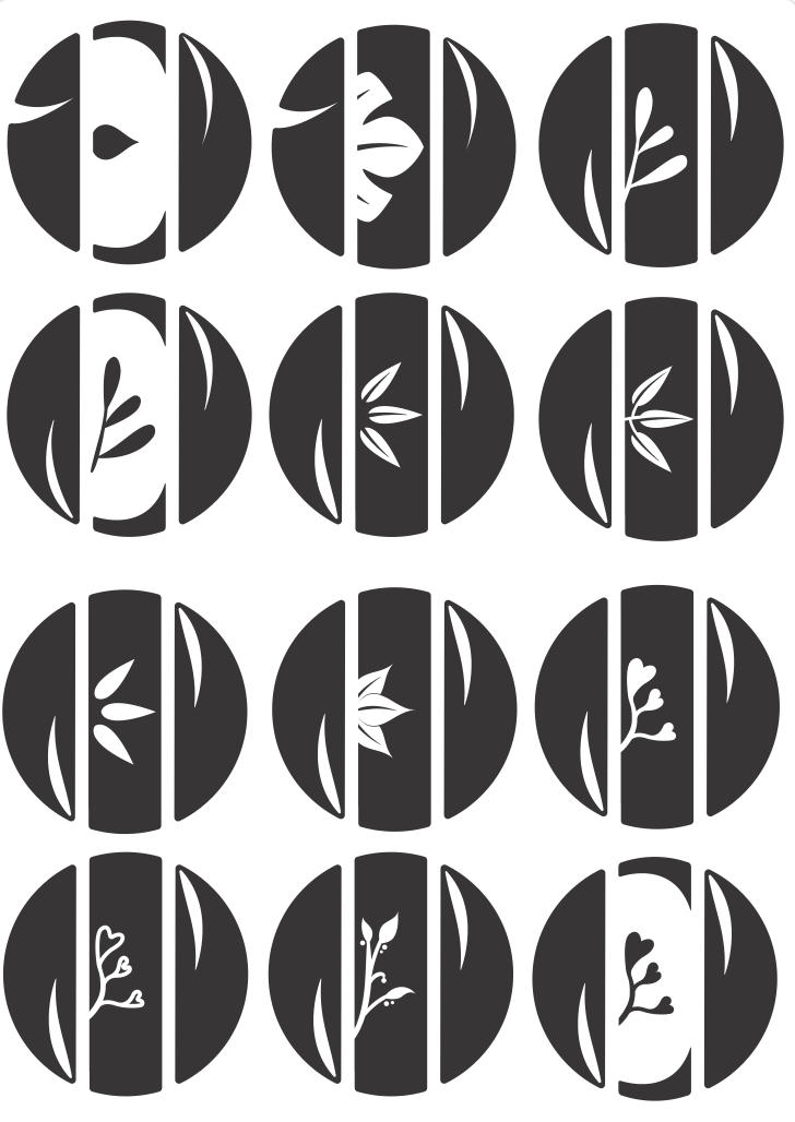
Upon showing these digital logos to the clients for review, the clients had three top choices that interested them the most. The clients felt the clean and modernness of Logo 3 had a strong and impactful message displaying their brand. However, they thought that Logos 1 and 2 held more personality and were visually interesting. At this stage, we were torn between which of these three variations captured Inspired Earth Design fully and in a feminine and organic way. While my supervisor and I felt Logo 3 was the strongest, the clients ultimately chose Logo 2 as the final version. This second logo is more playful than the others, yet the thick and thin strokes with the gentle berries add a more natural, handmade style that perfectly reflects the client’s hands-on company.

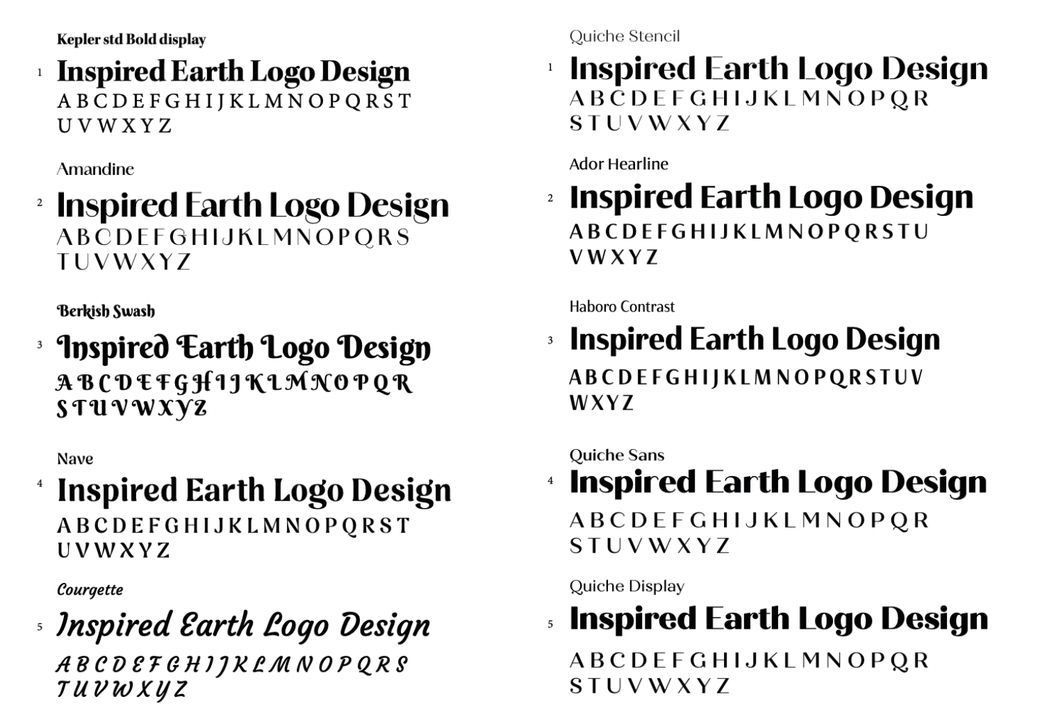
Experimenting with Typefaces
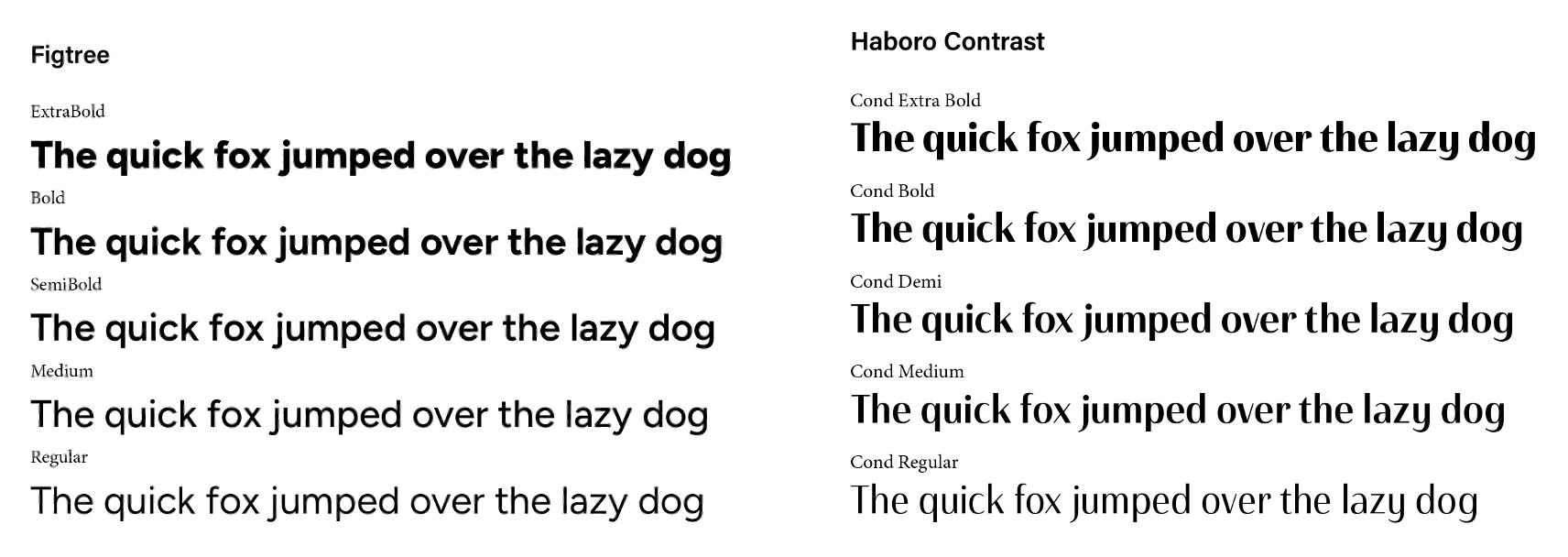
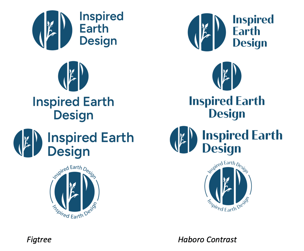
Initially researching typefaces, I decided to look at clean fonts with a strong thick and thin contrast, as this style displays an elegant, more natural style which the clients want to achieve. Upon receiving feedback from my supervisor, we found the sans-serif fonts held the most potential with the logo design. Additionally, we concluded that the typefaces would work best in bold as the logo mark is quite strong, and a delicate light typeface would create an off-balance visual. When reviewing the typeface options with the clients, we chose two primary fonts: Haboro Contrast, and Figtree. We initially chose Haboro contrast as the final font, however, after more consideration, the clients chose to use Figtree as this is also the font being used within their new website.
Format and Layout
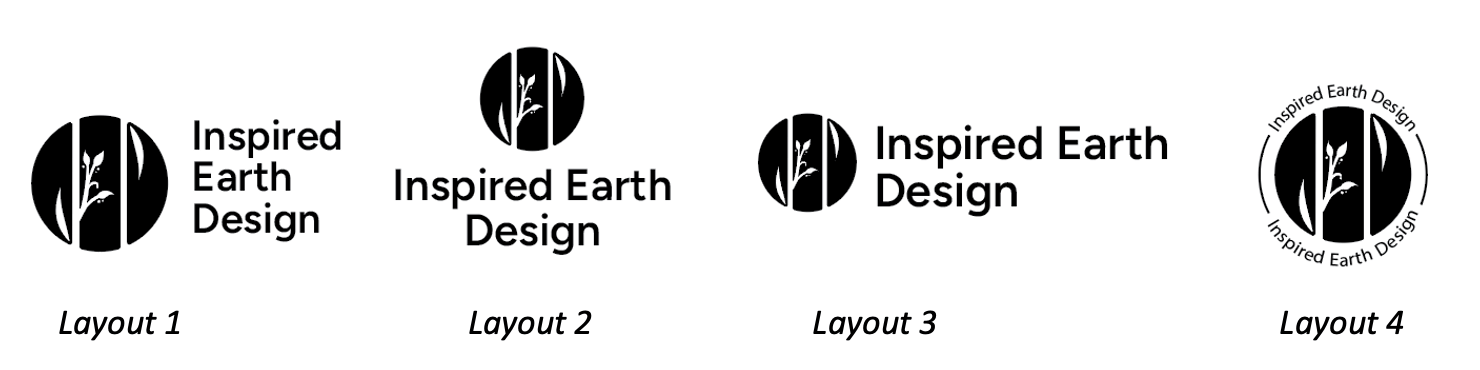
Upon selecting two main typeface options, these were then used and organised against the logo to experiment with the format and layout options. This layout experimentation also worked as a way to distinguish which font should be the primary typeface within the logo design. In this experiment, we struggled when selecting the primary font, while my supervisor and I found Haboro Contrast to be the strongest typeface with the most potential, the clients ultimately preferred Figtree. As a result, we initially chose Haboro contrast as the final font, however, after more consideration, the clients chose to use Figtree as this is also the font being used within their new website. The clients and my supervisor both thought Layout 1 worked best alongside the logo, as the other layouts were not as strong and made the logo look off-balanced.
Colour Scheme
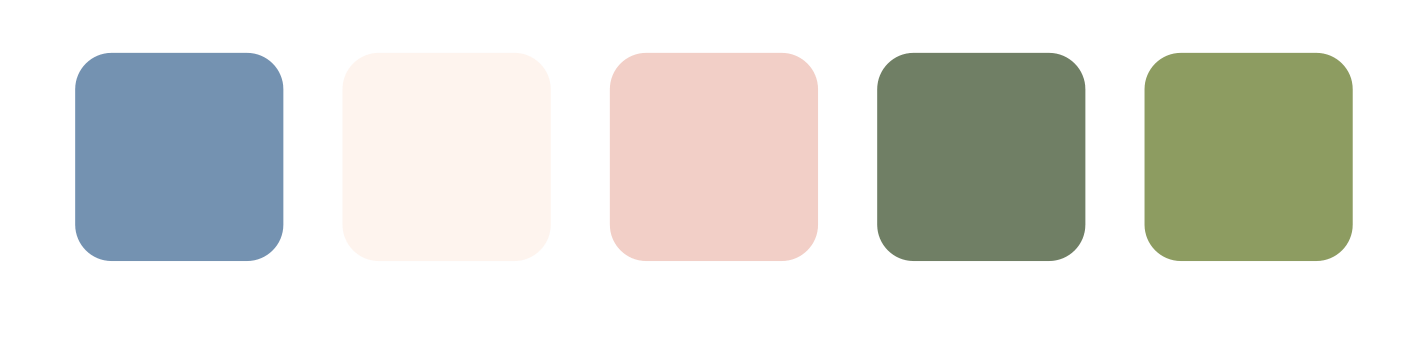
Starting this project, the clients informed me they already had a few options for the colour scheme; they carefully curated a colour palette that matched their new website design, which consisted of navy blues, light pinks and little to no greens. The clients mentioned they wished to avoid green and earthy tones as a way to stand out from their competitors. However, as greens are associated with gardening and nature, it seemed appropriate to suggest a few shades that could match their original colour scheme.
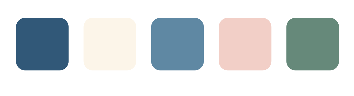
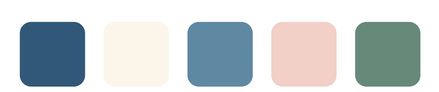
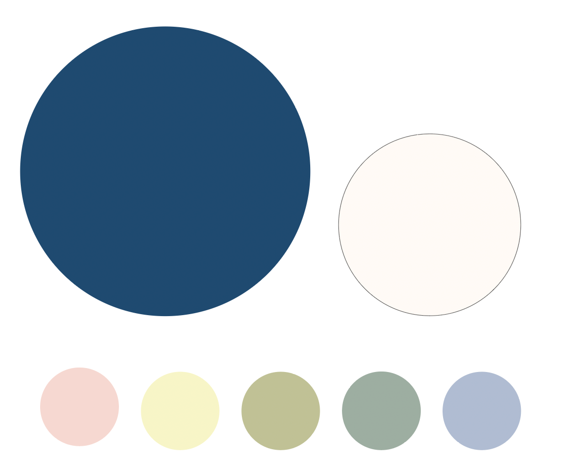
Upon designing an updated colour palette that works with the client’s primary blue and pastel pink, it became clear that these tones could not be used as a primary colour for the logo. The tones are too light and delicate to have a strong enough contrast for high legibility. However, as the clients love these accent colours, so we decided that these tones should only be used behind the primary dark blue within the logo. This ensures a high enough contrast and, therefore, strong legibility while also displaying the light and gentle attributes of Inspired Earth Design.
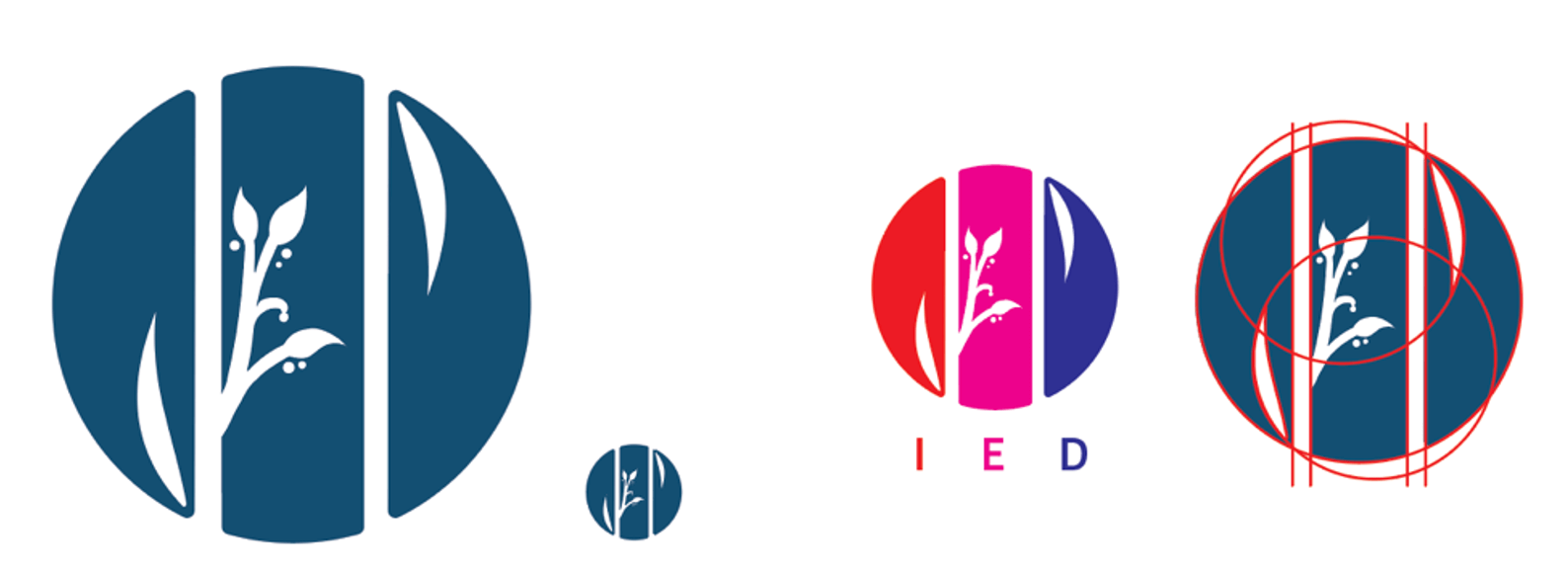
Final Logo
Brand Guidelines
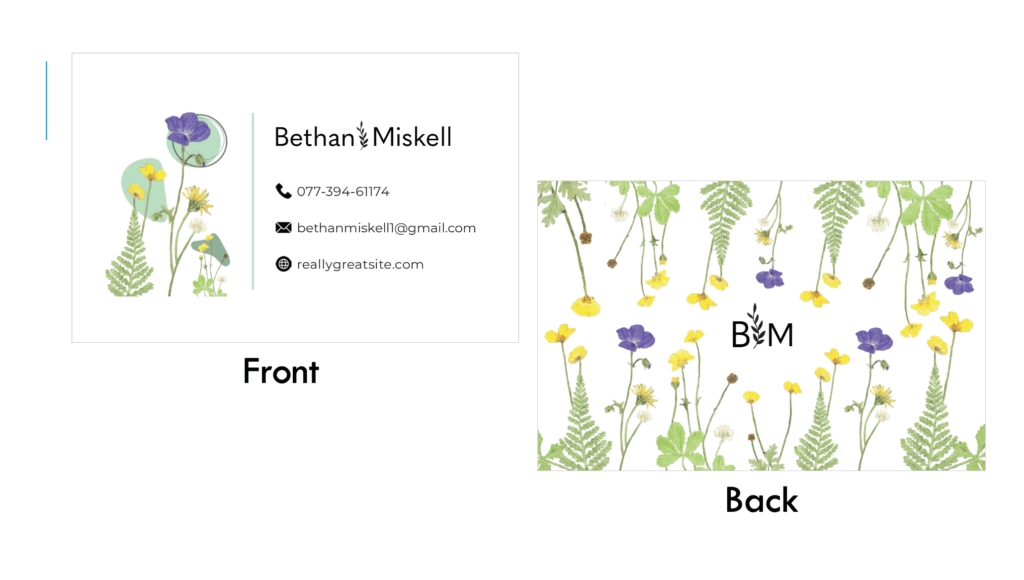
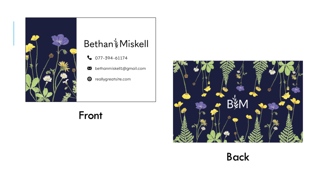
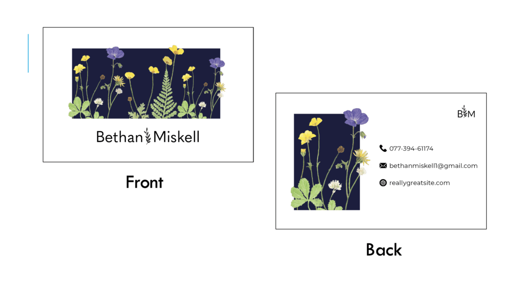
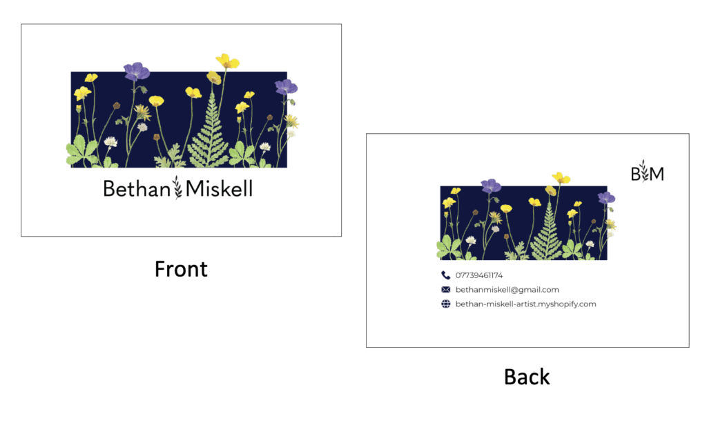
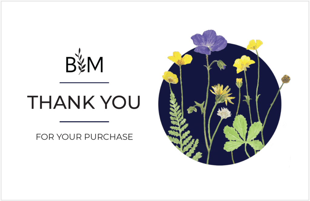
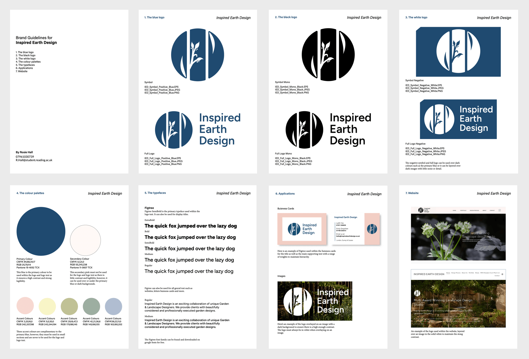
The Inspired Earth Design brand guidelines help inform the clients on how and where to use the logos. They inform the clients of the chosen typefaces, colours and colour codes, logo formats, and inspiration. This helps to ensure the brand is presented correctly and consistently across social media and other mediums. Displaying a range of applications and mock-ups of potential business cards and website designs further helped the clients feel confident about the final logo design. Brand Guidlines IED RJ00675
Conclusion
Finally, looking over the project, it is incredibly successful; the clients are delighted with the result and have already started using the logo within various mediums. The logo perfectly reflects the brand and has exceeded the client’s expectations. While the clients had initially intended to work alongside me in designing the logo using their ideas, Emily and Jude were impressed by my work and initiative to let me take full control of the design process.
While the workload was initially challenging and stressful to handle by myself, creating a structured timeline and plan within the restated brief helped guide me and meet deadlines on time to ensure I met the end target date. As a result, this taught me how to manage my work and time efficiently, and will be a valuable skill that can be used in my future projects. Another essential skill required for this project is effective and consistent communication. Upon meeting with my supervisor countless times, learning to handle constructive criticism was an essential asset to achieving the ideal logo for the clients. Additionally, going back and analysing the small details within the logo helped the symbol work as a whole by testing the grids, proportions and legibility at different sizes, this has helped me improve as a logo designer.
Future Improvements
To improve future projects, creating a solid foundation would help the progress of the design flow smoothly. During the initial sketches of the project, they were somewhat unorganised and unstructured. This required me to go back and redraw the sketches properly to convey the design effectively and see the full potential. This small step wasted some of the time that could have been spent developing the logos further. This meant some tasks were more rushed to catch up and stay on top of the weekly deadlines. As a result, creating a structured timeline and weekly deadlines to complete tasks efficiently would have kept me on track throughout the project. Finally, this challenge is something I will consider and work on going into future projects.
Overall, this project has taught me a lot of valuable skills and lessons that can be applied to my next projects. Furthermore, logo design is an area I feel particularly confident in and would love to do again in the future. As a result, the clients wish to work together again in the future for further developments across other mediums such as business cards, letterheads and more.