Background
This brief for this job was to create posters for a series of short films created by Film, Theatre and Television students of the University .
The short film ‘Pieces’ focusses on a young woman, Carmen, who moves away from her family and old life to pursue artistic endeavours. Her friend, later revealed to be a figment of imagination, coaches her to achieving her dreams and letting go of her past. Cinematic influences of the writer included Thelma and Louise and The Virgin Suicides.
Logline: ‘Carmen leaves her small-town life behind for the vast city to find a sense of identity. In doing this, she tackles the good, bad, and ugly areas of womanhood, femininity, and family expectations.’
The student crew team highlighted the importance of femininity and isolation within the film, as well as transition into adulthood from a troubled youth. In our first meeting, the team had a pitch-pack prepared, with colour stories and multiple mood boards showing ideas for characters and sets. Their primary film aesthetic inspirations were the 1990s and 2000s, with a focus on clutter and muted colours.
Restated brief
This? brief was to design the promotional poster for the short film Pieces. The brief we received from the FTT member of staff also included animated title sequences for the students, however upon meeting with the student group this was not necessary, and they decided against this. The final deadlines also differed: one in the final week of the Spring Term and one in the first week of summer time.
Research and ideation
High-budget films
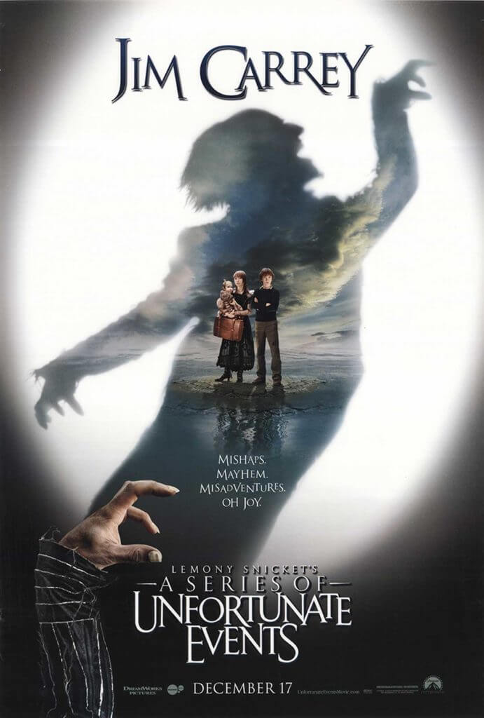
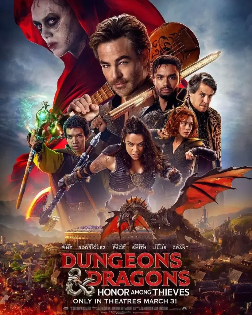
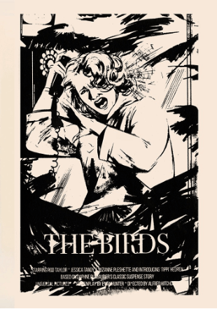
High budget films and franchises frequently use photography to display the characters, who are often recognisable actors and actresses. This is a sensible decision when the success and box office sales can be driven by familiar faces, however in the context of independent student films this is not necessary. Hierarchy in typography similarly reflects the drive to sell tickets in recognition of directors, production companies and stars. The freedom from these factors allows for a different approach to typography because of the difference in motives; the goal for this poster is to capture and communicate the essence and themes of the film, rather than names of personnel. Illustration is less commonly used across this genre in comparison with other styles of film.
Short films
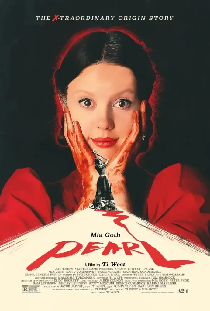
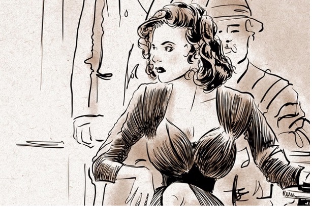
Short film posters rely less on the notoriety of the people involved but take a similar approach to typographic styles. Images tend to appear more intimate than those of high-budget films: closer cropping on faces and focus on a single person are the key takings when looking at a large number of posters. The imagery must work harder to attract viewers than high-budget/feature-length films with their large promotional campaigns. In turn, image is typically the focal point of short films.

What is different here from high budget/ famous posters is the hierarchy and primary focus on elements. The posters for FTT do not require promotion based on meeting box office targets or encouraging awards. Instead, the focus here is far more intimate and looks at representing the work of the students as best as possible.
Conceptual sketches
Discussions with the clients of their wishes and ideas led to initial sketches representing the chaotic nature of the protagonist. The clients wanted a style which reflected the artistic themes. This considered, we agreed that illustration rather than photographic / typographic approaches would be most appropriate. These following illustrations represent initial conceptual ideas.
The provided pitch pack referenced ‘outdated’ media and cultural references (Furbies, CDs and LPs…), captured in the sketch of the table. Using reference location shoot images, the student group enjoyed the chaotic line textures and representation of clutter in the protagonist’s life.

This sketch aimed to emulate the artistic nature of the main character, as though it be a page taken out of her sketch book. The student group liked the idea of a busy photo collage, however ultimately, they did not have enough visual material to create this. The group also noted this as a concept to move forward with, introducing colour and more detail.

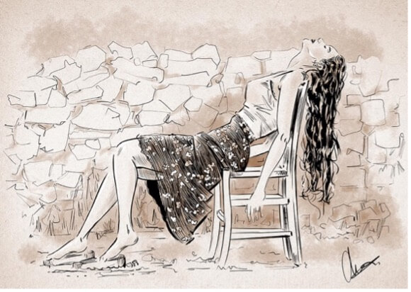
The idea of this sketch was to display a comfortable, but lonely corner of living space as featured in the film. The students were interested in this idea and asked for the introduction of the protagonist and motifs to be included. Another aspect some of the group liked was the ‘sketchy’ nature of the lines, however this divided opinions.

Design development.
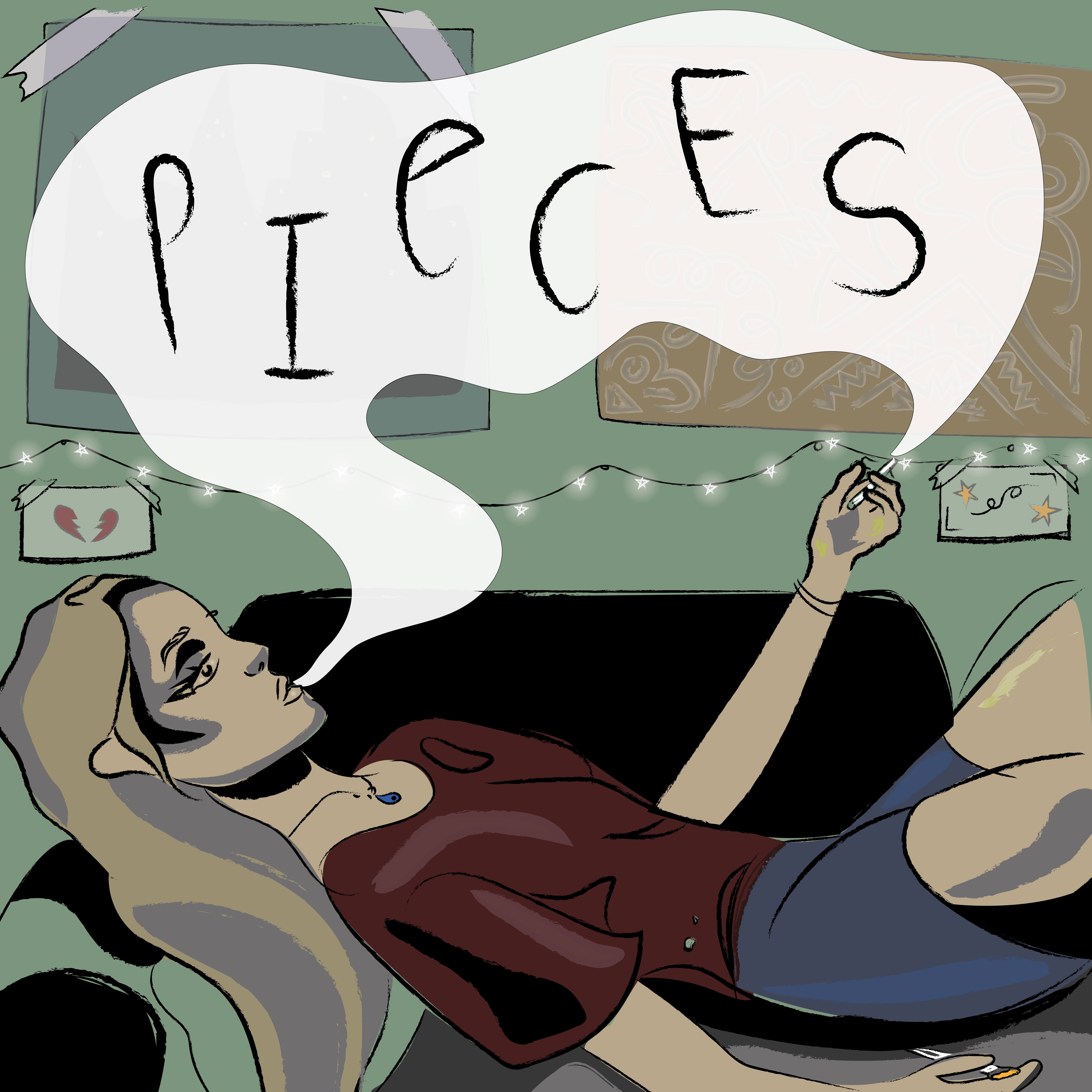
The first developed sketch from the initial sketches (and the agreed route by students) focussed on representing the protagonist in a lonely, solemn manner and adding surrounding detail as a nod to the ‘chaos’ the students wanted to portray.

Supervisor feedback
- Illustrations have to work harder.
- Continue developing the illustrations, so they have much more weight, depth and contrast.
- Bring drama in with a tighter crop or through the environment.
My supervisor provided some stylistic guidance and suggestions to help create drama and depth to the illustration. The use of black and textured materials create a depth, and facial features are far more exaggerated.

Supervisor feedback
- consistent line-weight
- frame the whole image and set the billing text outside of this
- The amount of detail in the image is great
Client feedback
- More colour
Changes were made to reflect the received feedback from Real Jobs meetings, client, and supervisor feedback. Adding back in small details of paint on the character’s thighs and ying-yang necklaces brought life back into the illustration. The colours were selected with consideration to the client pitch-pack, and palettes within the film. The students asked for all the crew to be names on the poster, which pushed the poster in a more text-heavy way than I had originally planned for within the illustration. The suggestions to frame the illustration later helped to resolve this issue.

Final stages
The supervisor suggestion was that framing the illustration would ‘give the overall poster a premium feel to it – like something in a gallery – and help everything feel more intentional’. The crew and actors were differentiated through the use of caps as well as their relationship to the illustration. The client also asked for a warmer skin tone to be used.

Reflection
This has been my first experience working on a highly personal project. The clients were deeply involved with their project, and their involved relationship with the film posed a challenging dynamic. Working with pre-conceived notions and ideas could be difficult – translating some client hopes and ideas into a reality would not always provide them with the best output from the project. Not only was it a challenge to be working with such an involved and equally creatively inspired group, but it was also their first time working with a graphic designer. This required some steering and assistance into approaching briefs, feedback and understanding the film industry from a different perspective. Respectively, the clients aided the process with their insights into film making, their underlying knowledge and understanding of subtleties was useful for pulling out motifs and appropriate styles.
This project has allowed me to improve my abilities in Illustrator, and understand how illustrative style is important to use properly. I found details in this process especially challenging as well as working with multiple conflicting opinions amongst the client group.

