Background
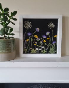
The client Bethan Miskell does press flower artwork and wants to sell her artwork online. Bethan had not started the business and she wanted to set up a brand to promote her artwork and her message. As her business was in the beginning stage, she did not have ideas for a particular style yet, but she mentioned some preferences she would like us to follow on the design in our first meeting.
Restated brief
Bethan wanted to use her artwork to emphasise and celebrate the importance of plants or weeds that may be overlooked or not seen as typically ‘pretty’ but were increasingly considered to be ‘hero’ plants and essential for biodiversity. We needed to create a unique brand to convey Bethan’s intended message.
The three deliverables are a logo, a business card, and a ‘thank you for your purchasing’ card. The brand logo will be used across all platforms like Bethan’s website and social media. Also, it will be applied to the cards. Our client also mentioned she did not need a physical mock-up of the cards, so we only need to create them digitally.
The target audience for Bethan’s business is people who are interested in floral decoration and the preservation of nature. These people tend to be women around the age of 50 and above. The effectiveness of the deliverables was measured by receiving customer feedback from a set of questions, and by frequently reviewing the brief to ensure the items meet the client’s requirements.
Research and ideation
First, we explored different kinds of logo designs like monograms, wordmarks, symbols and lettermarks and explained to Bethan about their characteristics. Bethan did not like the lettermark. We thought wordmark could work best for introducing Bethan’s business as she wants to use her full name as the brand name. It is simple and recognisable to combine words with images.
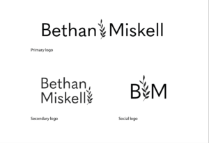
We found that businesses usually have some logo variations so that they can fit on different platforms more flexibly. For example, logos with a longer width can be used on website banners. However, it is not suitable for an Instagram circle icon, so they need a more abstract one. We therefore decided to create a primary logo, a secondary logo, and one for social media.
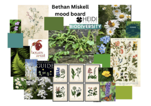
We also did research based on the keywords that Bethan used to describe her business which were ‘biodiversity’, ‘botanical’, ‘organic’, and ‘wildlife’. She created a moodboard with mainly plants and a layout of logos she liked and wanted us to get inspiration from. Besides her moodboard, we studied other competitor websites and their social media which are related to botanic for inspiration like Jam Jar Edits, Pressed Floral, and Refined Studio.

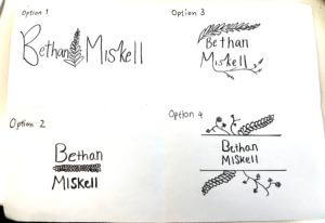
Bethan especially mentioned that she liked the style of Heidi Clover’s logo, so we knew that she wanted simpler illustrations and typefaces. It helped us to develop some suitable initial sketches for her.
Design development
Logos
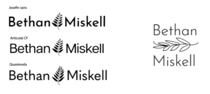
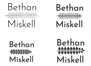
Bethan did not like the handwriting style or rounded and curvy fonts, but she wanted bolder spaced-out typography. Based on her requirements, we found a range of simple and neat san serifs for her to choose from for example, Josefin sans, Articulat CF, Serenity, and Quasimoda. We also experimented with different weights of the same fonts, but we could not make a decision before combining them with the illustration to see how they balance. I personally did not like Josefin with the sharp ascenders as it did not look friendly and Serenity because the bold soft strokes looked weird on Bethan’s business. We suggested she choose Quasimoda which looked fresh with a thinner width and a normal x-height.
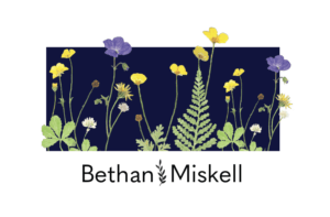
For the illustration, at the beginning, we tried to combine illustrations of plants into Bethan’s name and showed them to her. Bethan liked fern more because she thought fern could represent the ‘hero’ plant. Therefore, we carried on designing different styles of ferns for the symbol. For example, the line illustration, without or with strokes and details, and the shape of leaves. Bethan and my team chose the thinner fern between her name for the primary logo because the other looked more decorative and heavier.


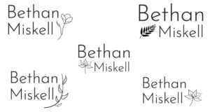
The secondary logo is based on the primary logo but just changed the layout to make it narrower and could be used on other suitable platforms. Our supervisor suggested we show three options to Bethan for both with and without filling. They were with or without dots surrounding the fern, the horizontal ferns between Bethan’s name, and the vertical fern next to her name. We all liked the filled option and the vertical fern placed next to Bethan’s name. It incorporates the primary logo better as both of the ferns are vertical. The fern with dots option was not suitable because it was too complex for Bethan’s style.
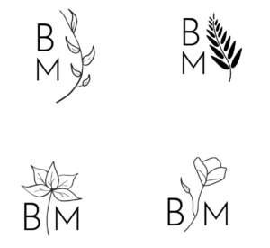
For the social one, we provided four plant options and two different layouts for Bethan to choose from. Because she chose the primary logo with the fern, we suggested using the same plant across all the logos to make them consistent and the brand identity could stand out more. She liked the idea of placing the plant in between the two letters to make the logo look balanced. In the end, we created the logo sets in both white and black so Bethan could use them according to her needs more easily.
Business card
The business card is 85mm in width and 55mm in height. For the front, we considered two concepts mainly. One was used illustration that was connected to the logo. Another one was to use Bethan’s artwork. We asked Bethan if we could borrow one of her artworks and scan it for the press flower elements. She liked the idea of including her artwork’s elements on the card as a mini version of her artwork. It can promote her business more effectively because people can immediately understand her style instead of spending more time to search her artwork.
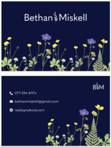
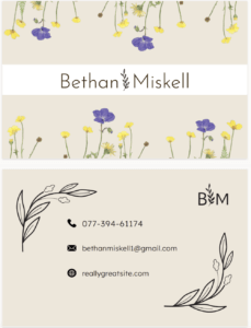
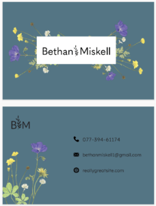
We explored different layouts with the press flower elements placed partly on the bottom, in the centre or close to the edges. At the same time, we changed the black background that Bethan usually uses to some natural colours based on the keywords Bethan mentioned like, beige, brown, mint, teal, and dark blue. We found that dark blue worked the best because it balanced the style of Bethan’s original artwork with a formal business card style.
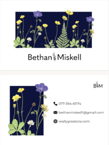
Our supervisor thought the idea which had a dark blue block in the middle with a press flower could be further developed. Rather than the one with flowers surrounding the block, she commented that keeping the format from Bethan’s artwork would be better. To make it look more interesting and livelier, our supervisor also suggested we extend the flower outside of the block.
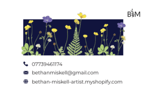
We tried to use illustrations to decorate the card at the back, but we were given feedback from our supervisor that it was not consistent with the front design. So, we continued the press flower block. The icons that represent different contact methods look minimal, so it does not make Bethan’s artwork ‘overshadowed’. We used the ‘Lexend deca’ light typeface which is balanced with the icon’s weights and Bethan’s requirements on typefaces.
‘Thank you for your purchasing’ card
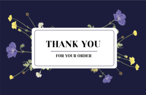
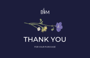
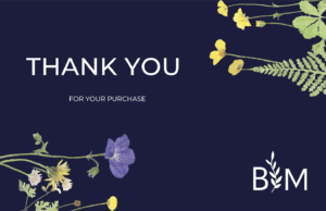
For the ‘Thank you for your purchasing card, we decided to continue a similar style and layout with the business card. It was the same size as Bethan’s business card. We kept the continuity by using the press flower from Bethan’s artwork instead of creating a new illustration. We showed a range of options to our supervisor for feedback.
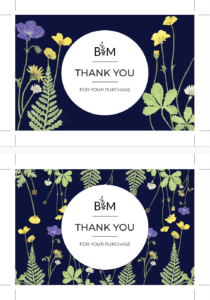
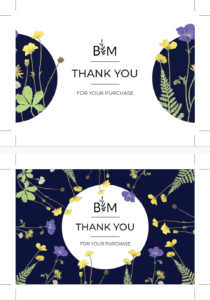
In the beginning, we experimented with a block in the centre surrounded with flowers, it just looked like the business card with another format. Therefore, we did not keep the idea. To show the consistency of the two cards while making them distinguishable, we chose another geometric shape, a circle. We placed a similar group of press flowers from the business card into the circle, so they looked similar in style. We chose the typeface ‘Montserrat’ for the text from a range of San serifs because we liked the clean and elegant strokes. The size contrast of ‘Thank you’ with ‘for your purchase’ emphasised the sincerity.
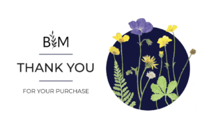
For the final version, we wanted to show the consistency of the two cards while making them distinguishable with different geometric shapes. We placed a similar group of press flowers from the business card into the circle. We used the social logo for Bethan’s brand instead of the other two because the card is sent with the customer-purchased items. The customers must already know about Bethan’s brand so this logo is used like a sign so we did not want it to look too extra.
Reflection
We expected that the project would be completed in December, but our deadline was extended until January. Even though it was agreed by the client, I think we could manage the time better. We spent too much time exploring the logo design at the beginning which made us not have enough time for the cards by the end of the expected deadline. We can show more variations to the client at the same time so she can pick one that she liked earlier.
The thing I learnt from this project was to always ask for more details to ensure what you are making is what the client likes. The client may not have an idea of how they want the design to be presented sometimes because they are not professional designers, but they have their preferences and thoughts. We should not be afraid to contact the clients often to check if they have any updates or further requirements during the design process.
Also, this project improved my confidence in communication. I feared expressing my concepts and showing opposite thoughts to others, but I feel comfortable communicating with my teammate as we respect each other’s ideas, and the client is supportive of our work.
