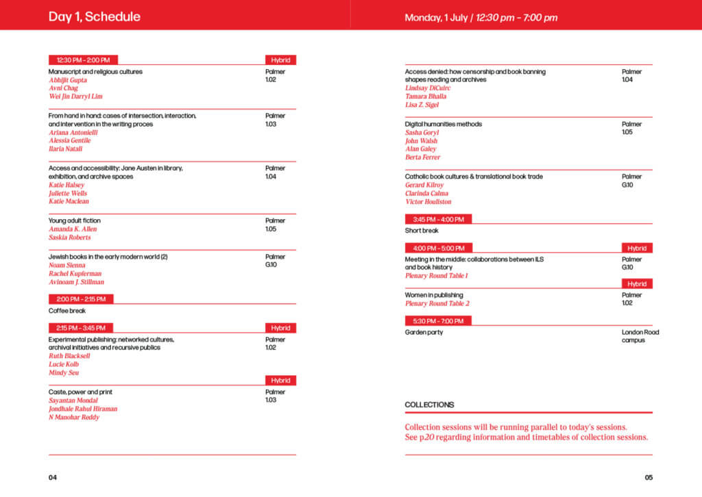
Context
The client is a non-profit company whose mission is to “unite education and business to inspire and equip our future workforce for tomorrow’s workplace.” EBP are re-branding to modernise their current identity with the aim to appeal to both corporate and young people alike. The client aims to relaunch with their new branding for the upcoming academic year starting September 2025.
Restated brief
Aim of the project
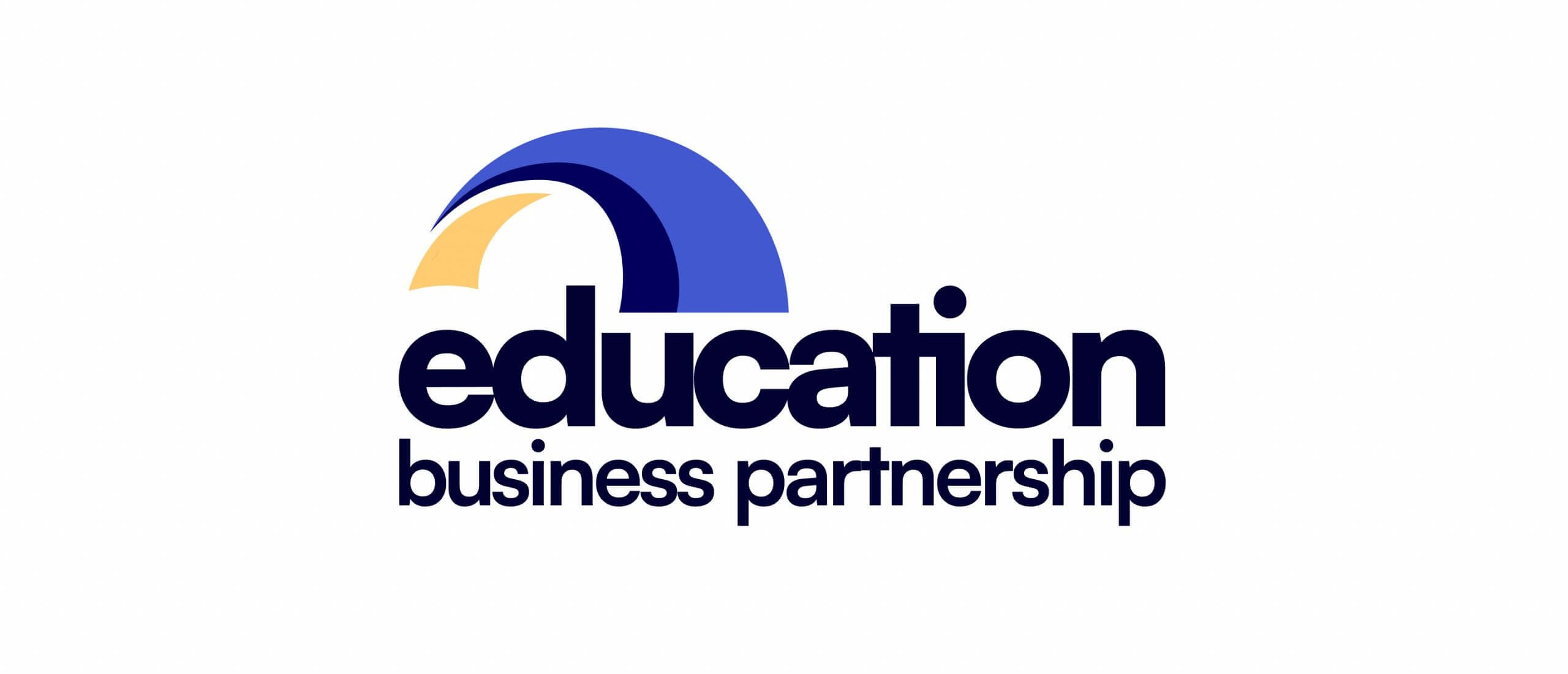
The client aims to move away from the current, ‘dated’ logo and create a modern, professional, and trustworthy feeling through updated branding.
Objectives
Through a detailed analysis of both the client’s current branding and that of their competitors/comparators, new branding will be developed with the aim to create a more positive impact for the different stakeholders.
Deliverables
- A logo
- A set of clear and easy to use brand guidelines
- Five editable Canva templates for social media
- Linkedin Banner
- Facebook Banner
How the deliverables will be measured:
Client feedback will determine the reception from internal and external stakeholders both throughout the design process and when the new branding and logo launch.
User needs:
The new logo and branding should aid in the business appearing modern, trustworthy and professional to the user. The client has two very different stakeholder groups, one being corporate professionals and the other being young people who may benefit from the charity. Both of these user groups’ individual needs must be considered and met within the re-brand. Some key needs are to be approachable, friendly, and empowering, while also being professional, reliable and sleek.
Notes from initial client meeting:
- The client has explicitly stated that there are a few things to avoid while re-branding. These include: Primary colours and clip-art-style imagery.
- The client has already brainstormed some elements that the new logo could take inspiration from, such as bridges (bridging business and education), business, and people.
- EBP’s brand values as stated by the client are to be reliable, trustworthy, professional, and to have a positive impact to both businesses and education.
- The client mentioned that while EBP is a charity, they are also providing a service for businesses (e.g. by helping them to meet their corporate social responsibilities).
- The client was open to investigating the current strap-line and potentially suggesting alternatives.
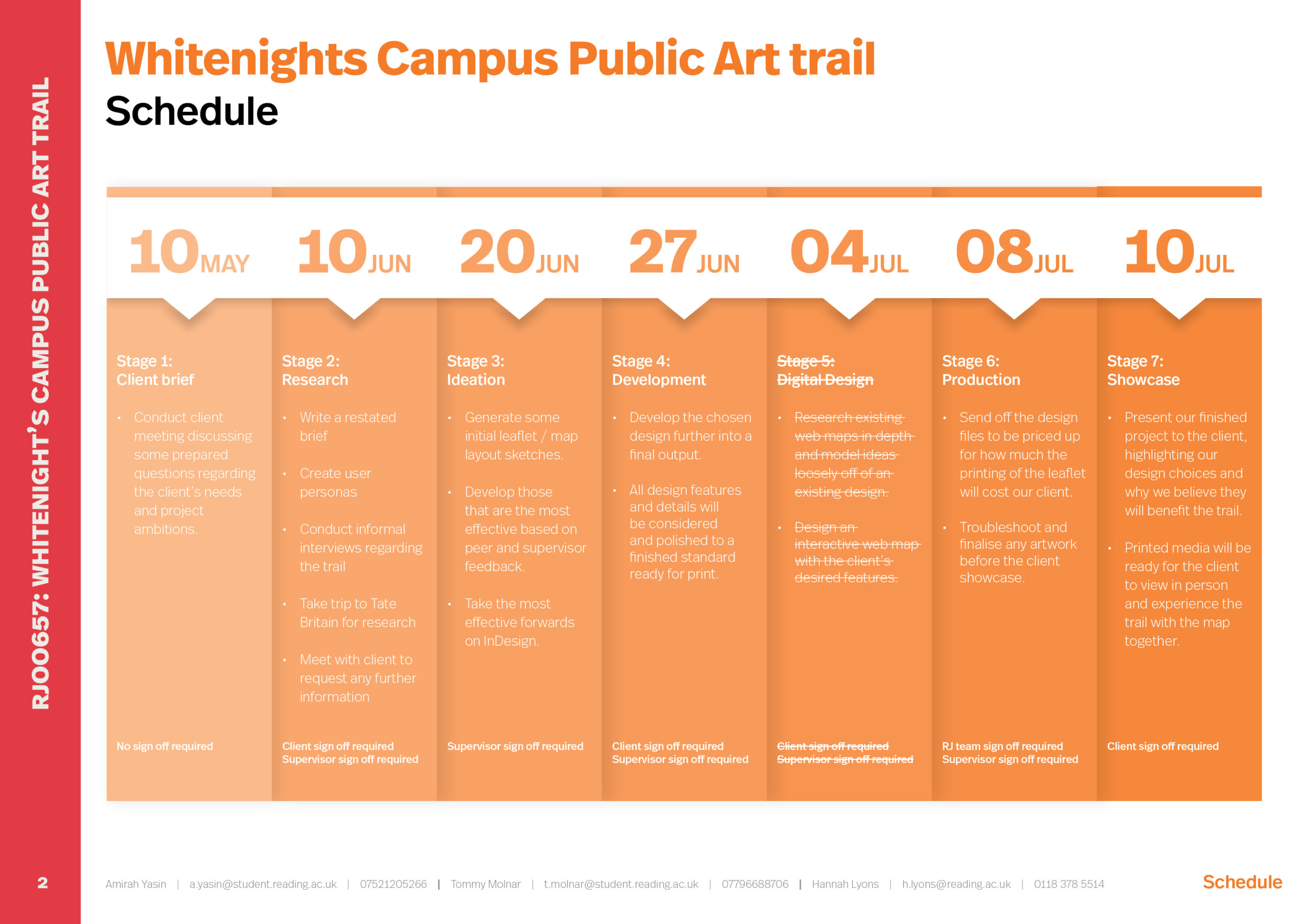
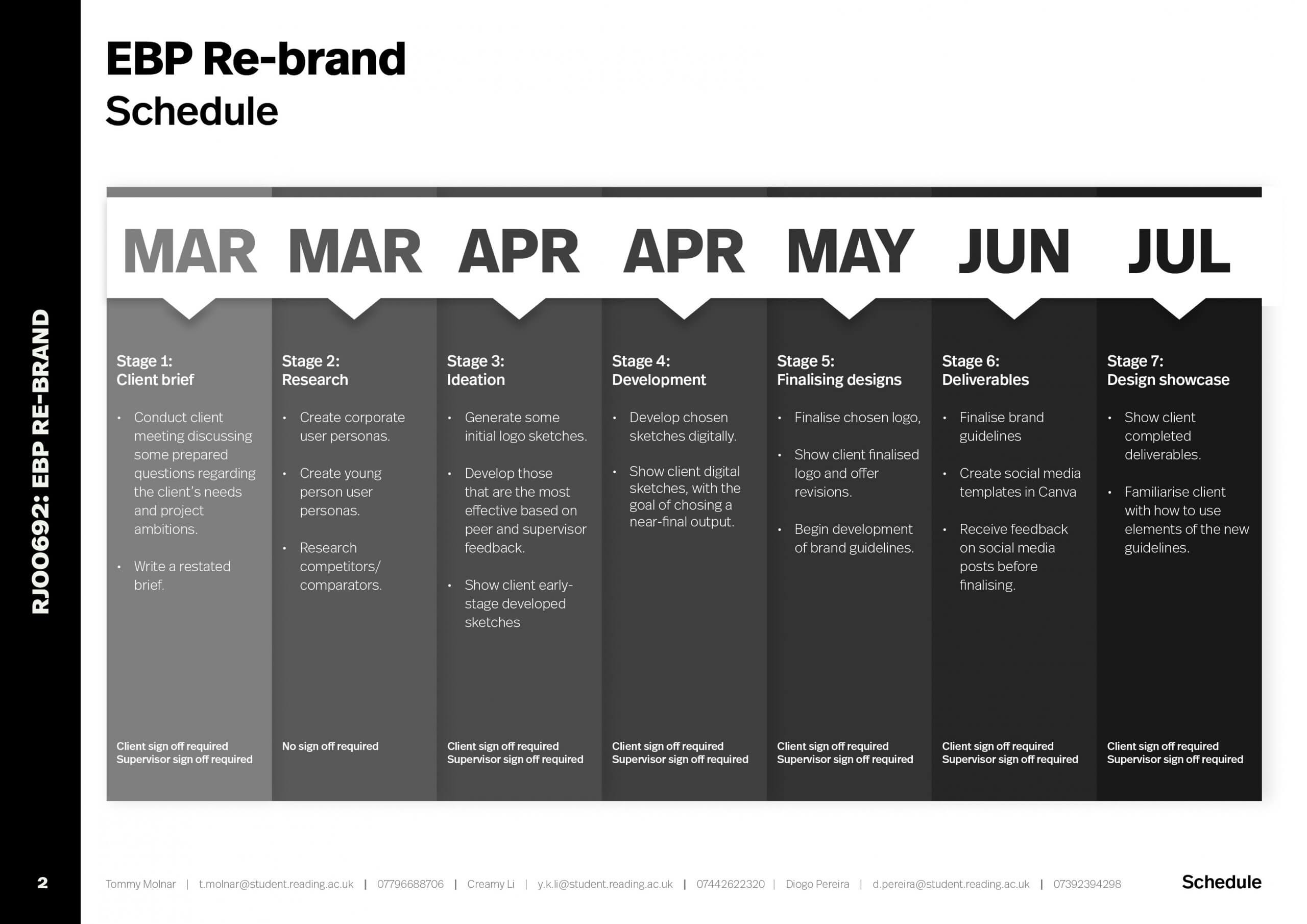
Schedule
Research
Branding workshop
After receiving the brief for this job, our team were fortunate enough to be invited along to a workshop run by Chris Washington-Sare, specifically on re-branding charities and non-profit organisations. This is where we were introduced to brand archetypes, symbolic colour interpretations, and some ‘deceptively simple brand questions’ that can be used to dive into the meat of what the brand really stands for, who they are, and who their target demographic is.
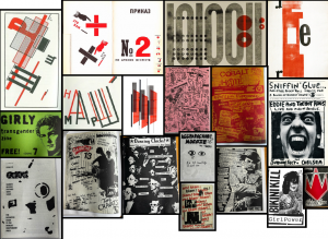
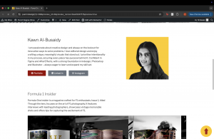
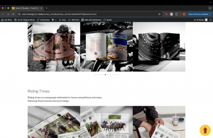
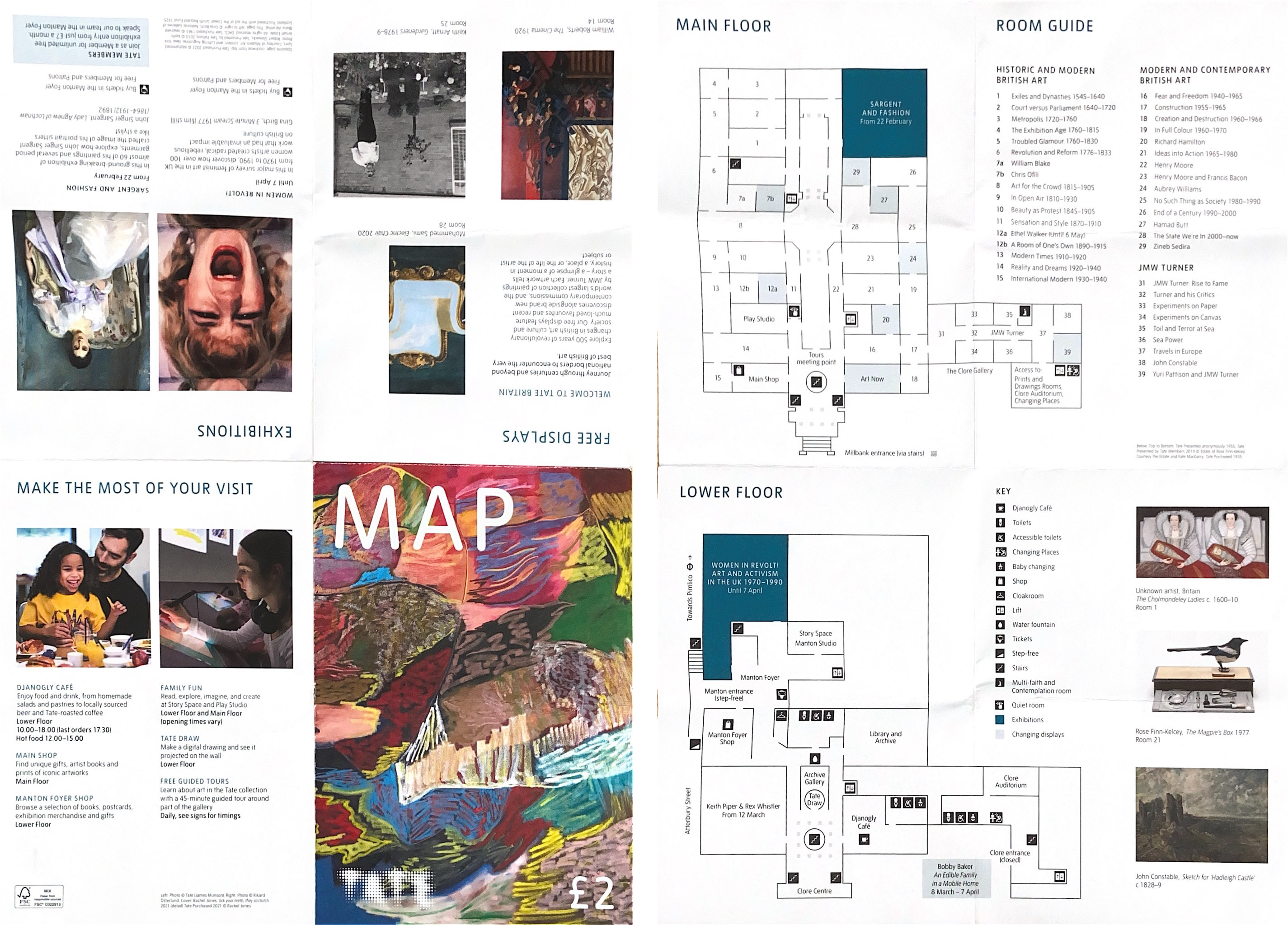
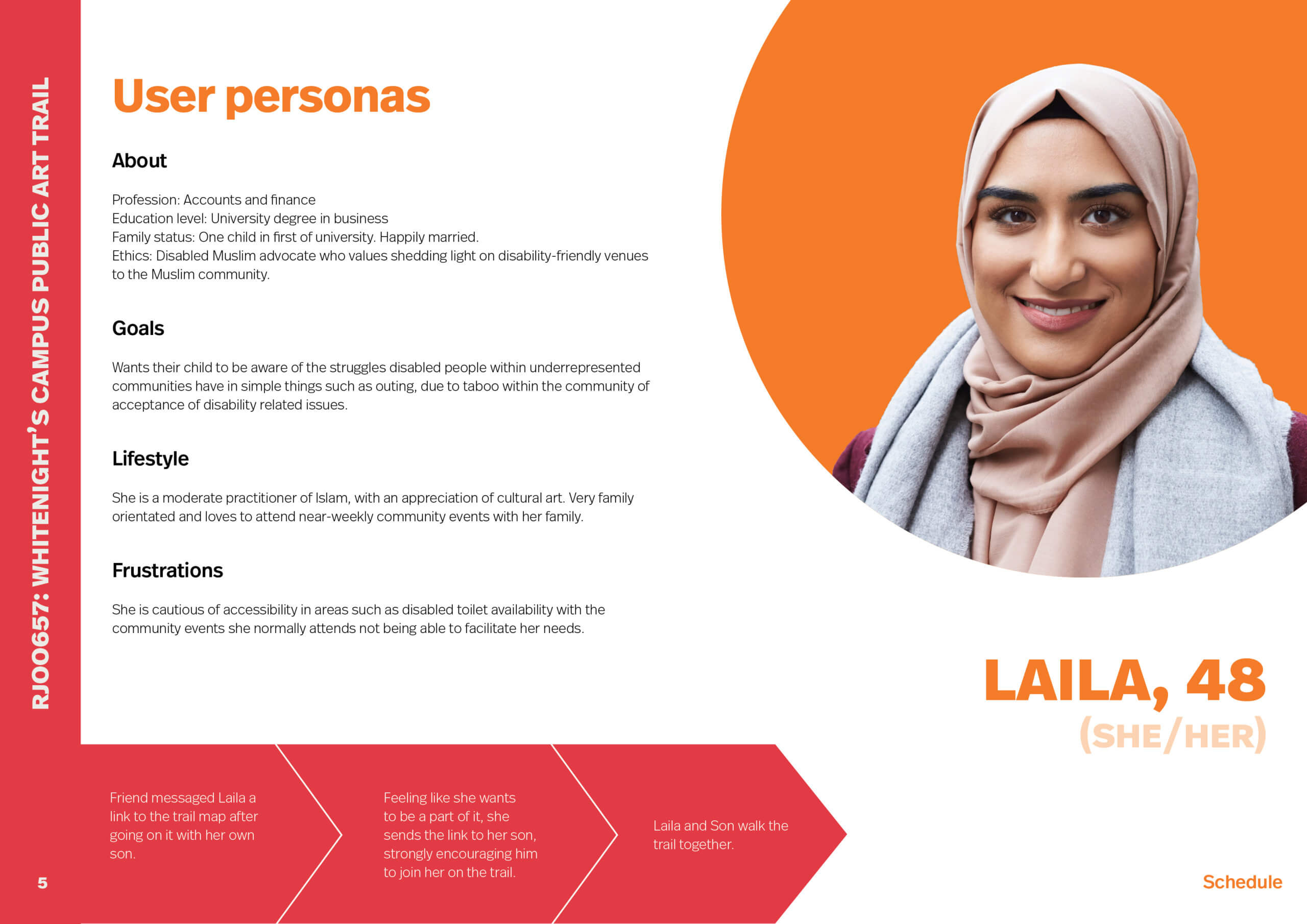
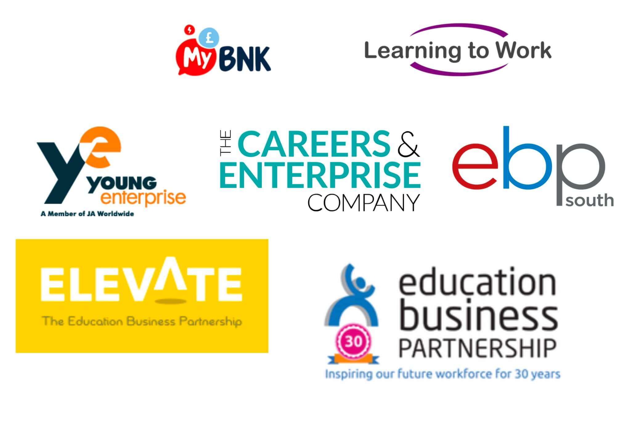
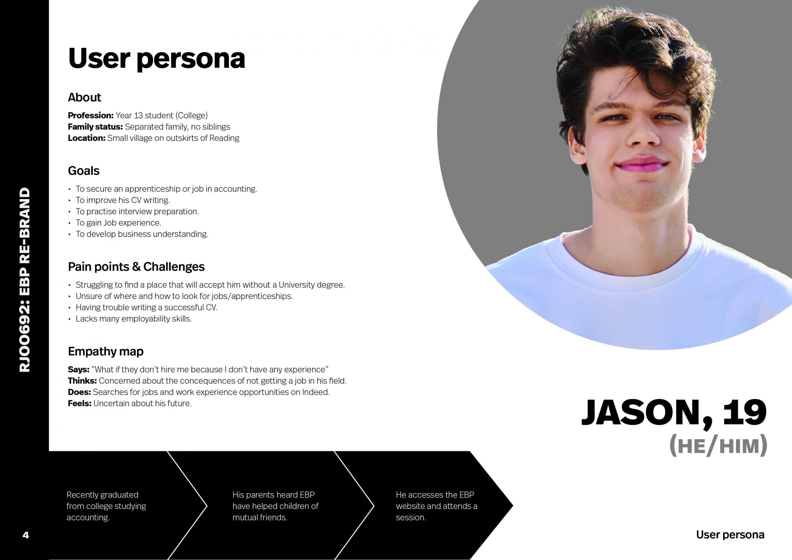
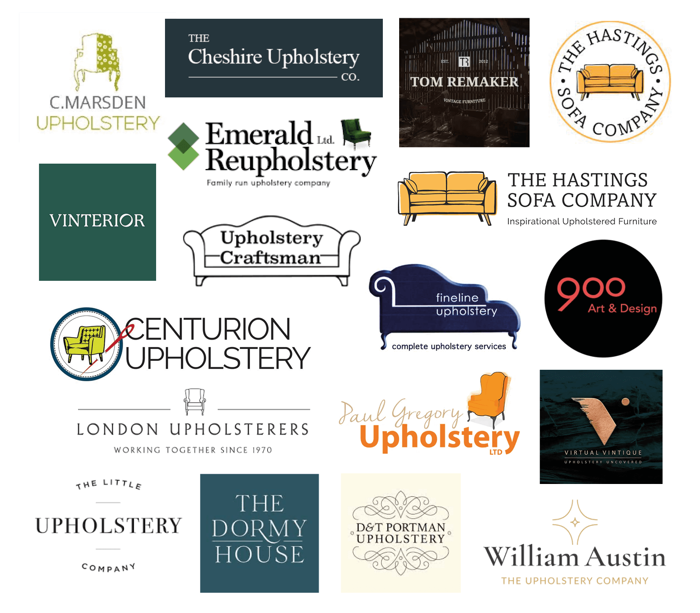
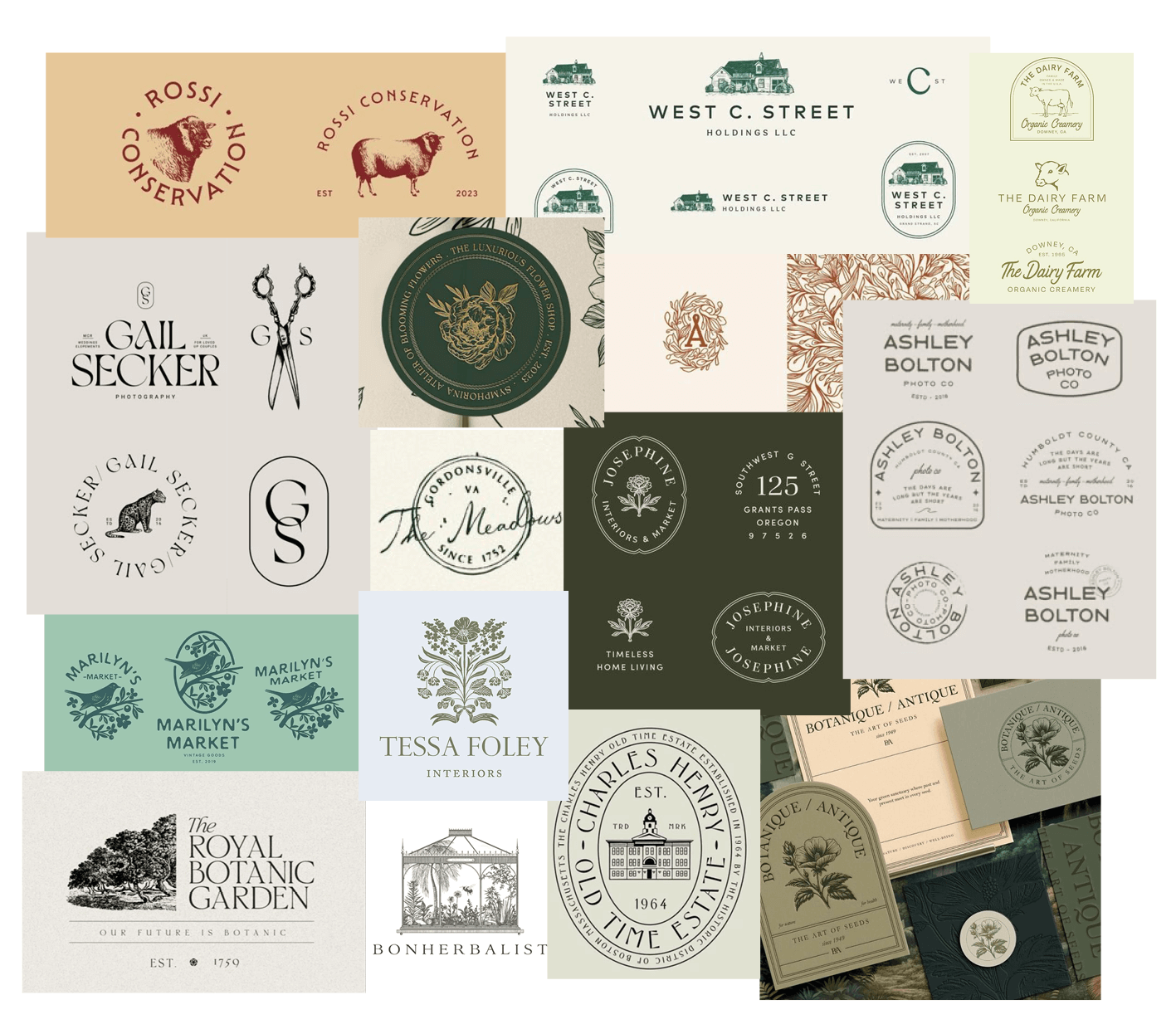
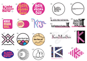
Comparator and user research
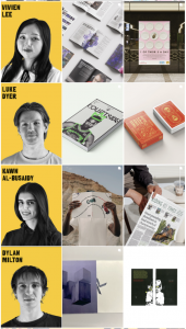
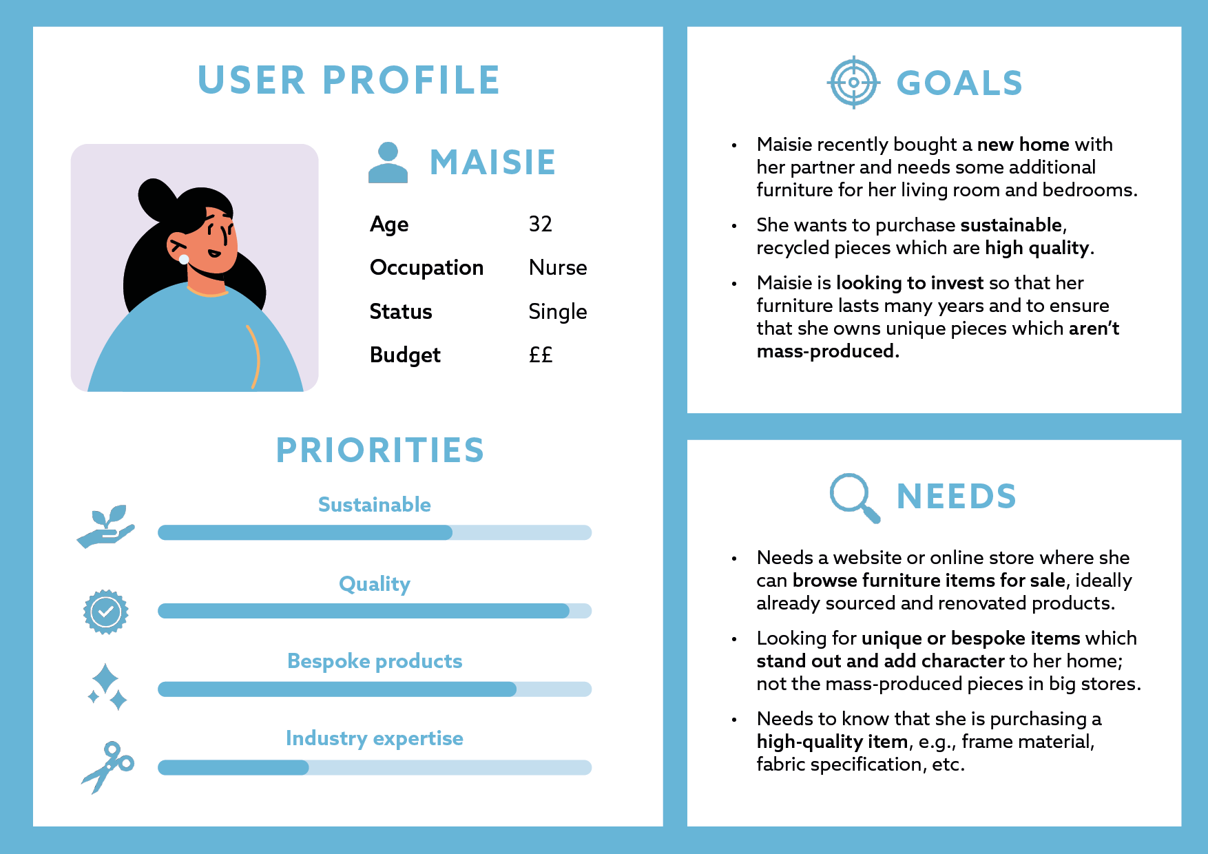
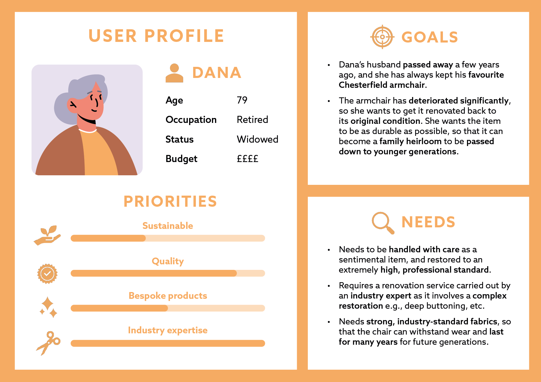
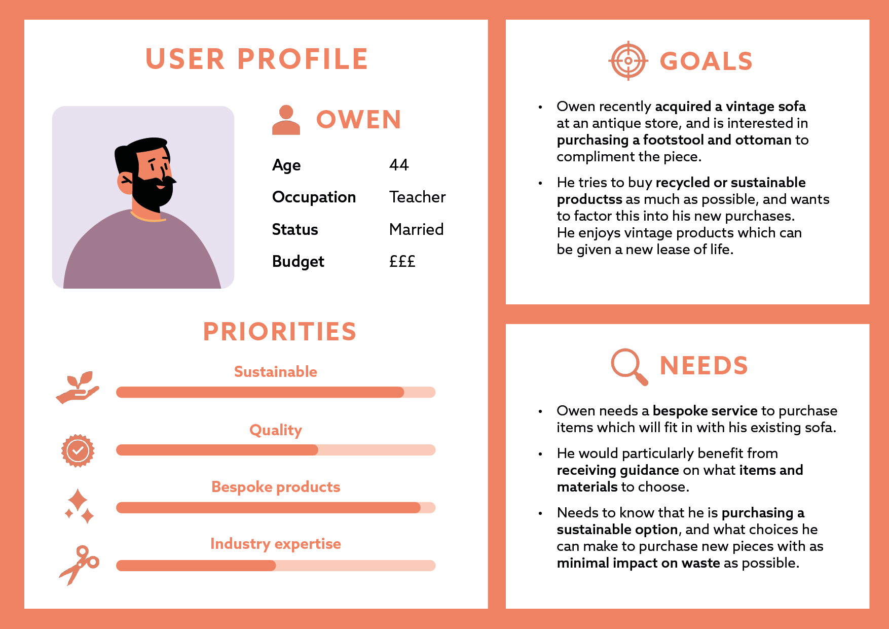
After using some of these questions and techniques in our initial client meeting, we began to research brand comparators (fig 2), and develop user personas for the different types of stakeholders involved (figs 3–4). This brief had the challenge of targeting both corporate and young people alike, so developing these different personas was key to understanding the requirements of both.

Logo sketches
Initial sketches
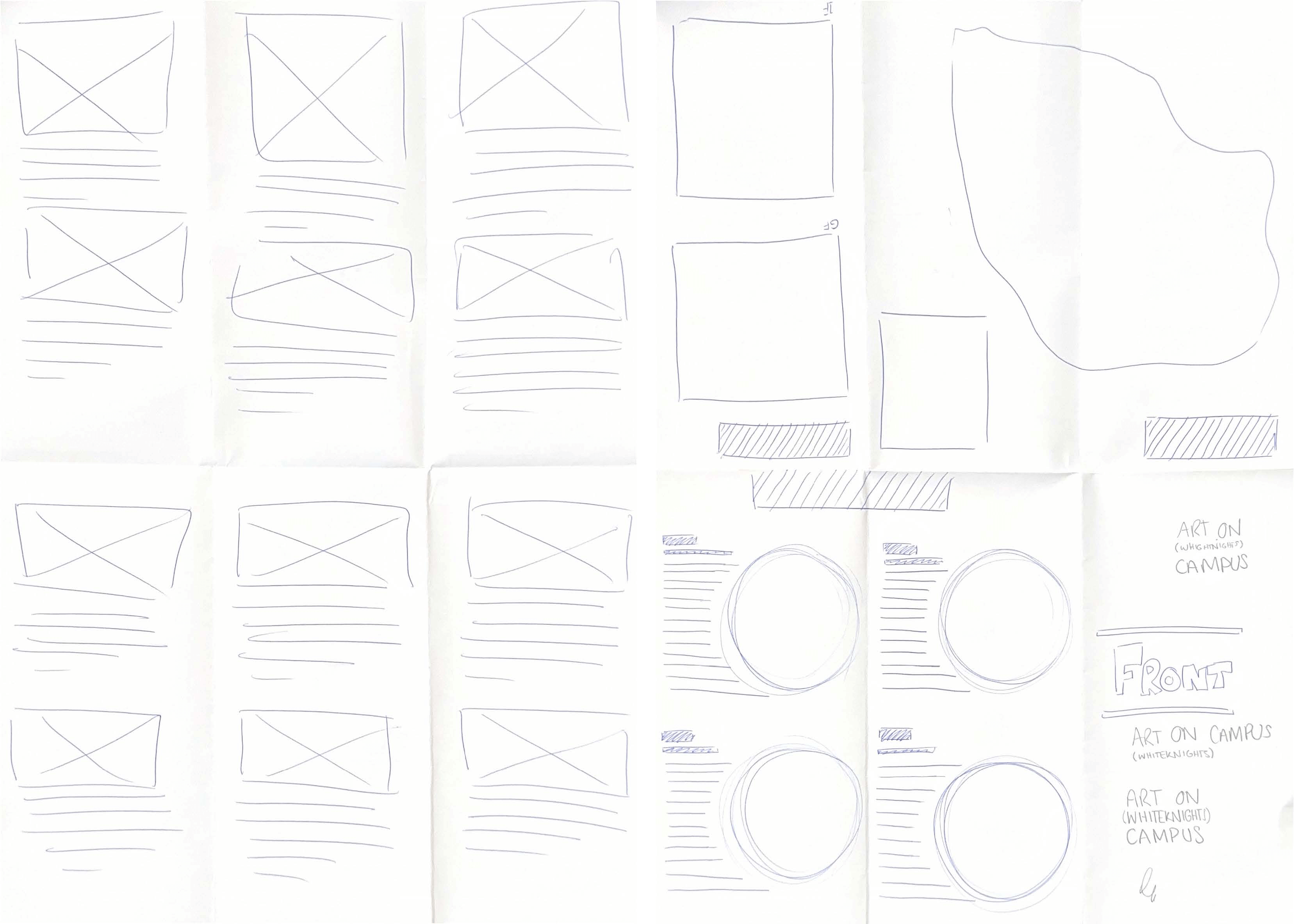
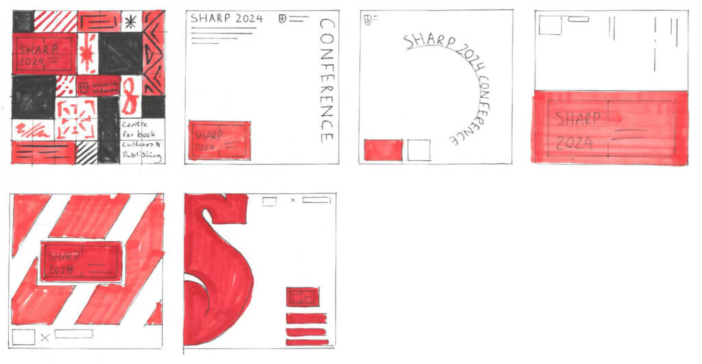
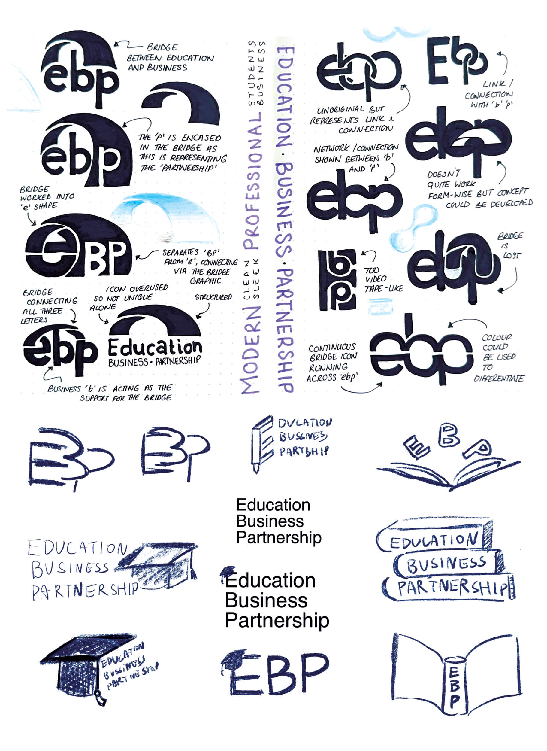
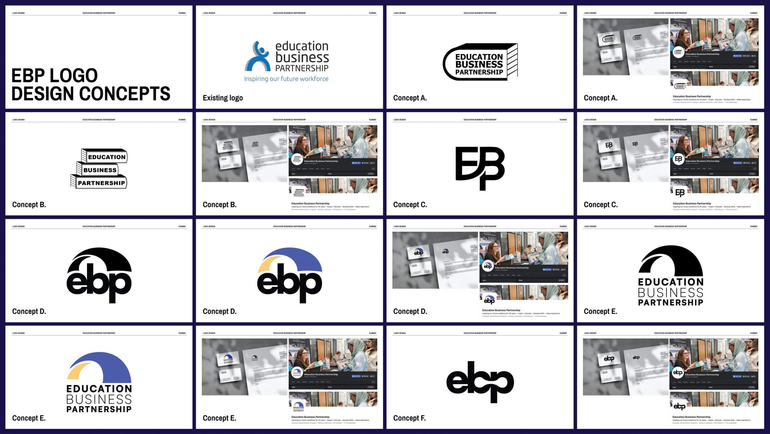
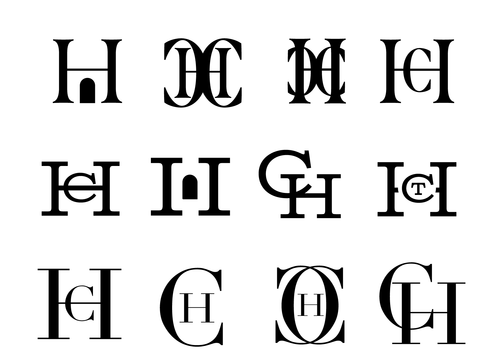
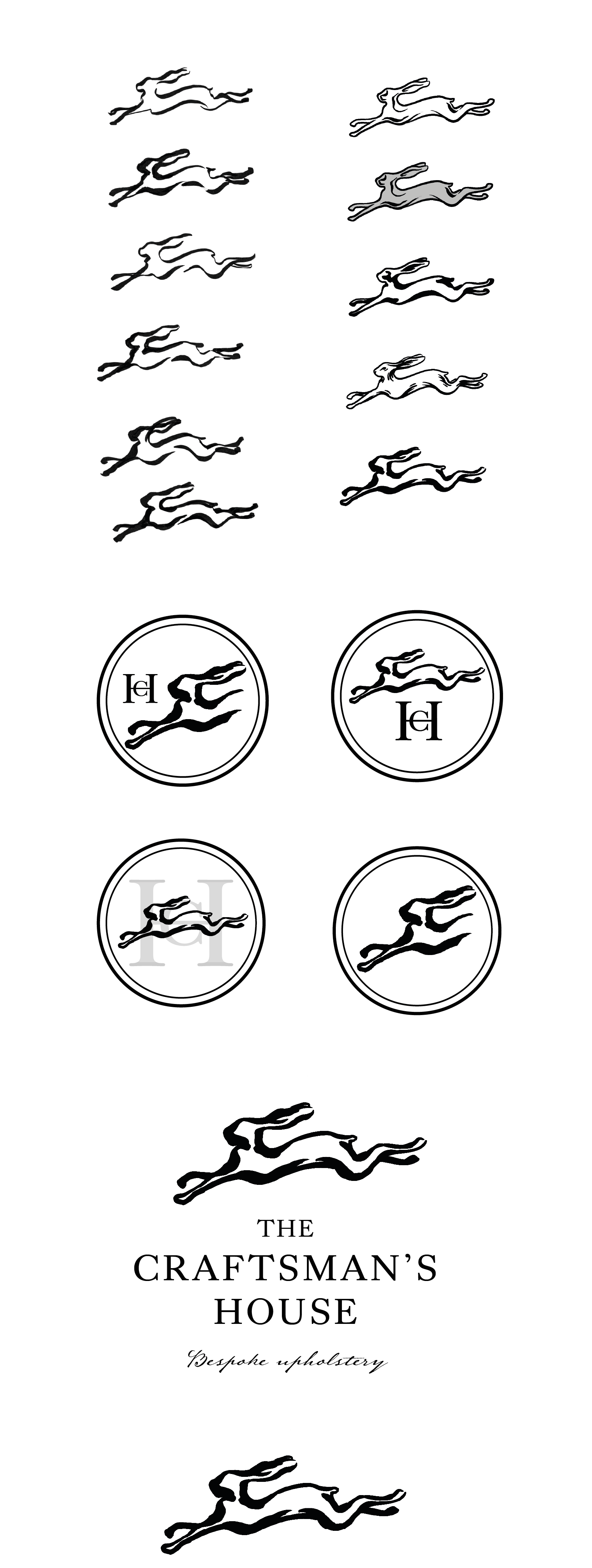
After reviewing the meeting notes, we began sketching some initial logo concepts, keeping the clients’ words in mind (fig 5). There was a recurring theme of ‘bridging’ education and business that came up throughout our initial client meeting, which was something that we incorporated in a few of the sketched concepts. When presenting these sketches, instead of showing them in their natural state (pen & paper), we took them into illustrator, as advised by our supervisor. Taking the concepts digital and placing them in contextual mockups at this stage helped us to refine some of the ideas and make the message clearer for the client to understand (fig 6).
Developed sketches
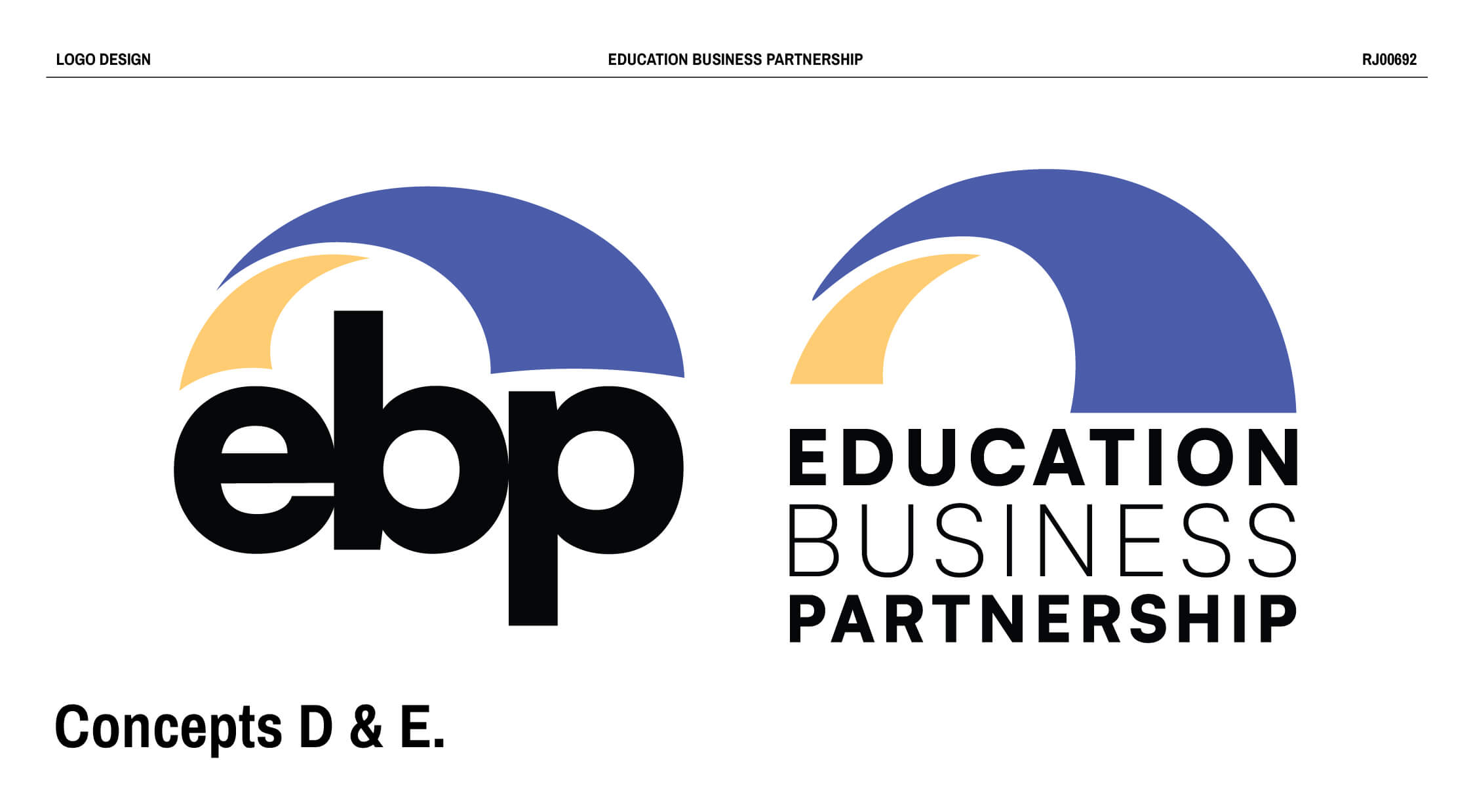
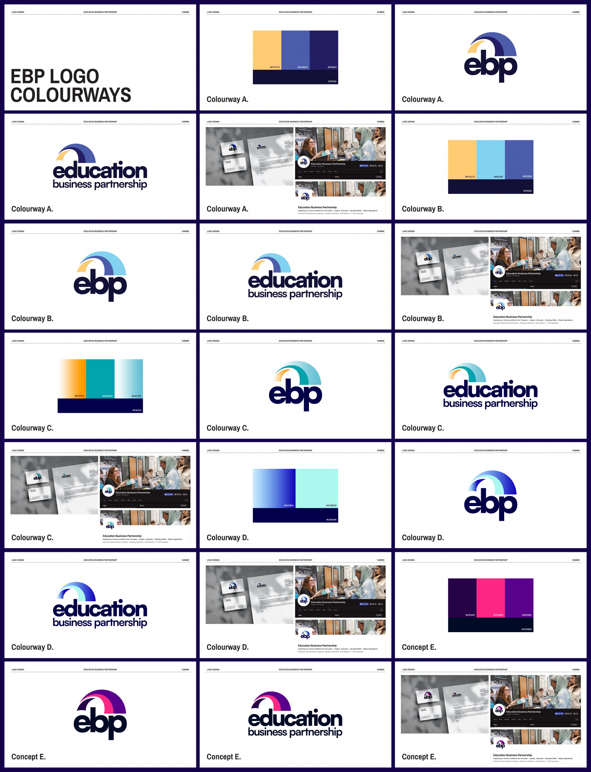
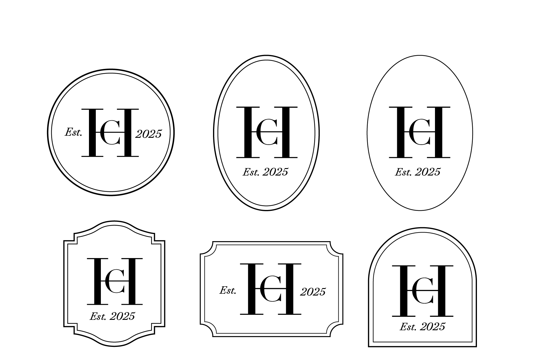
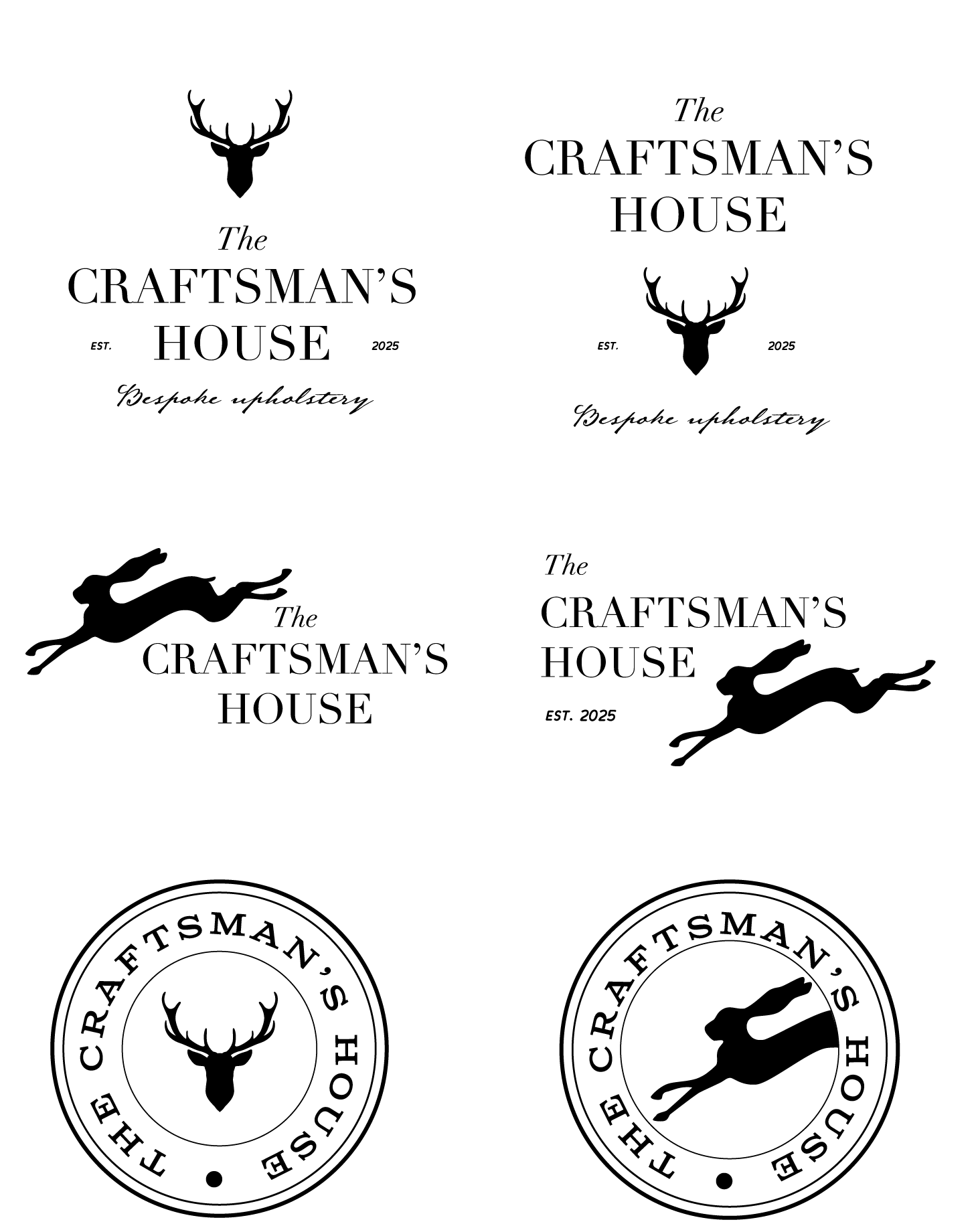
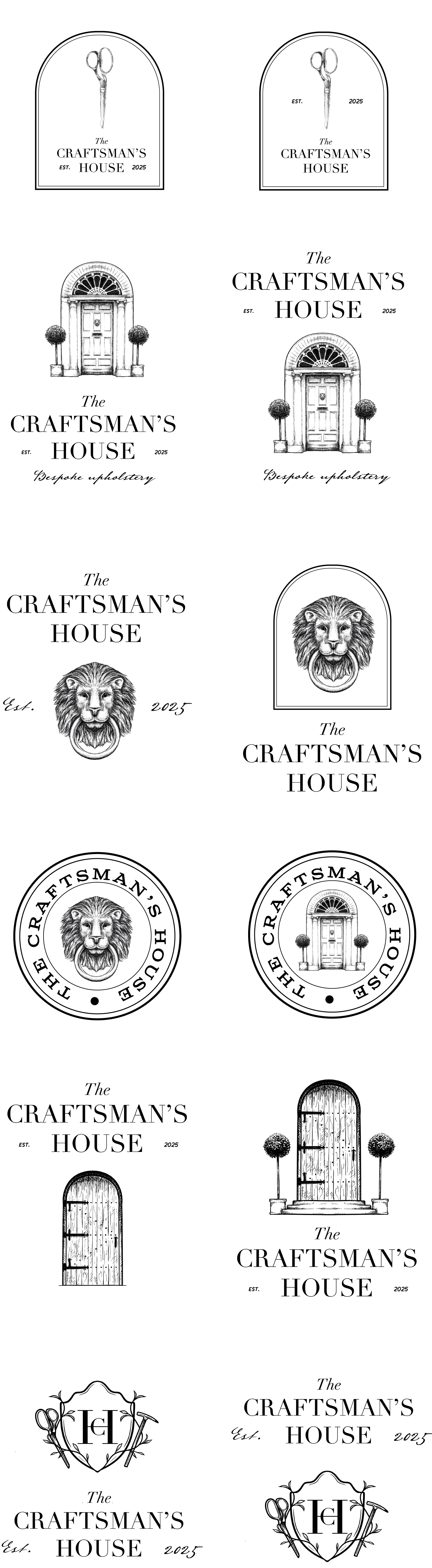
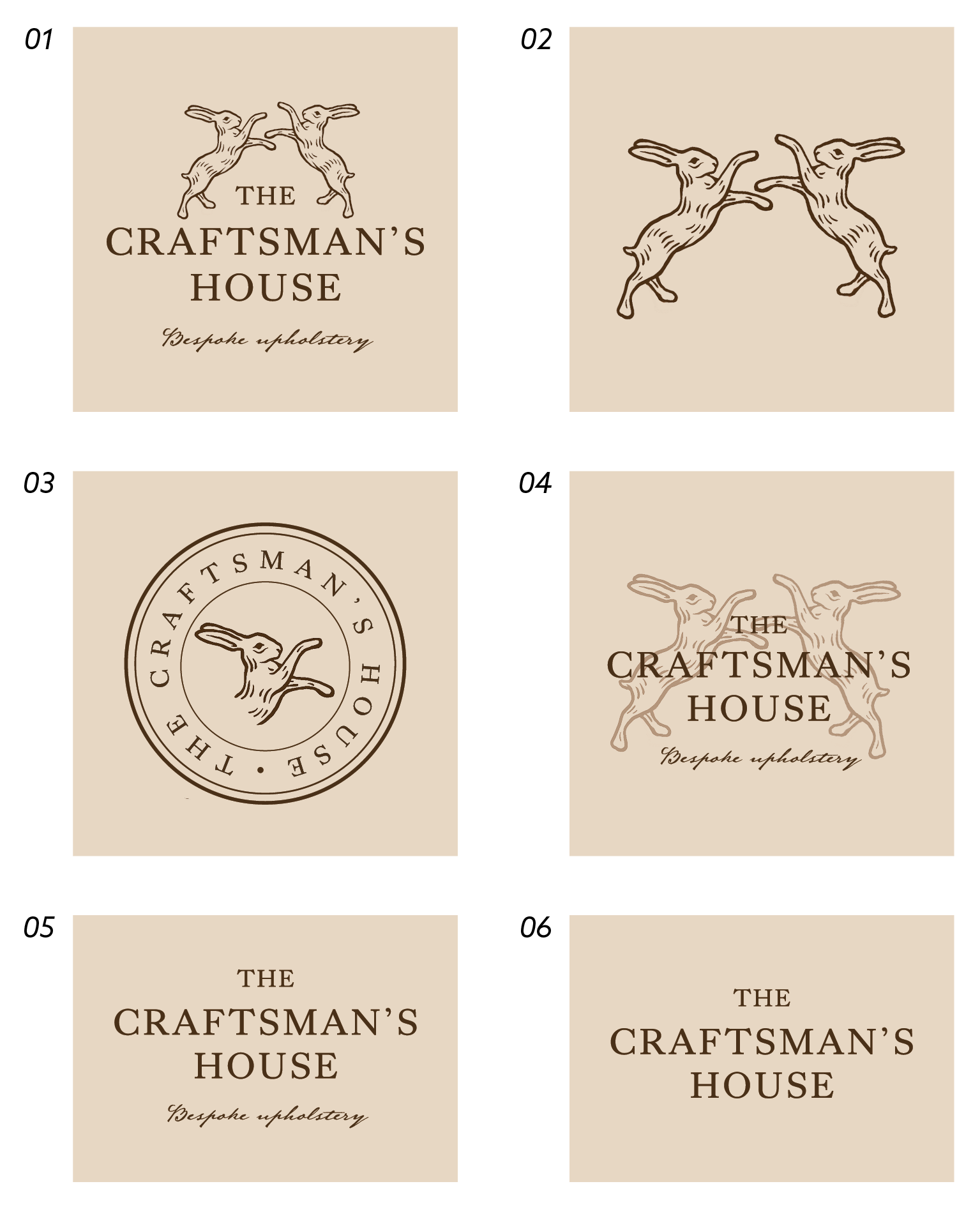
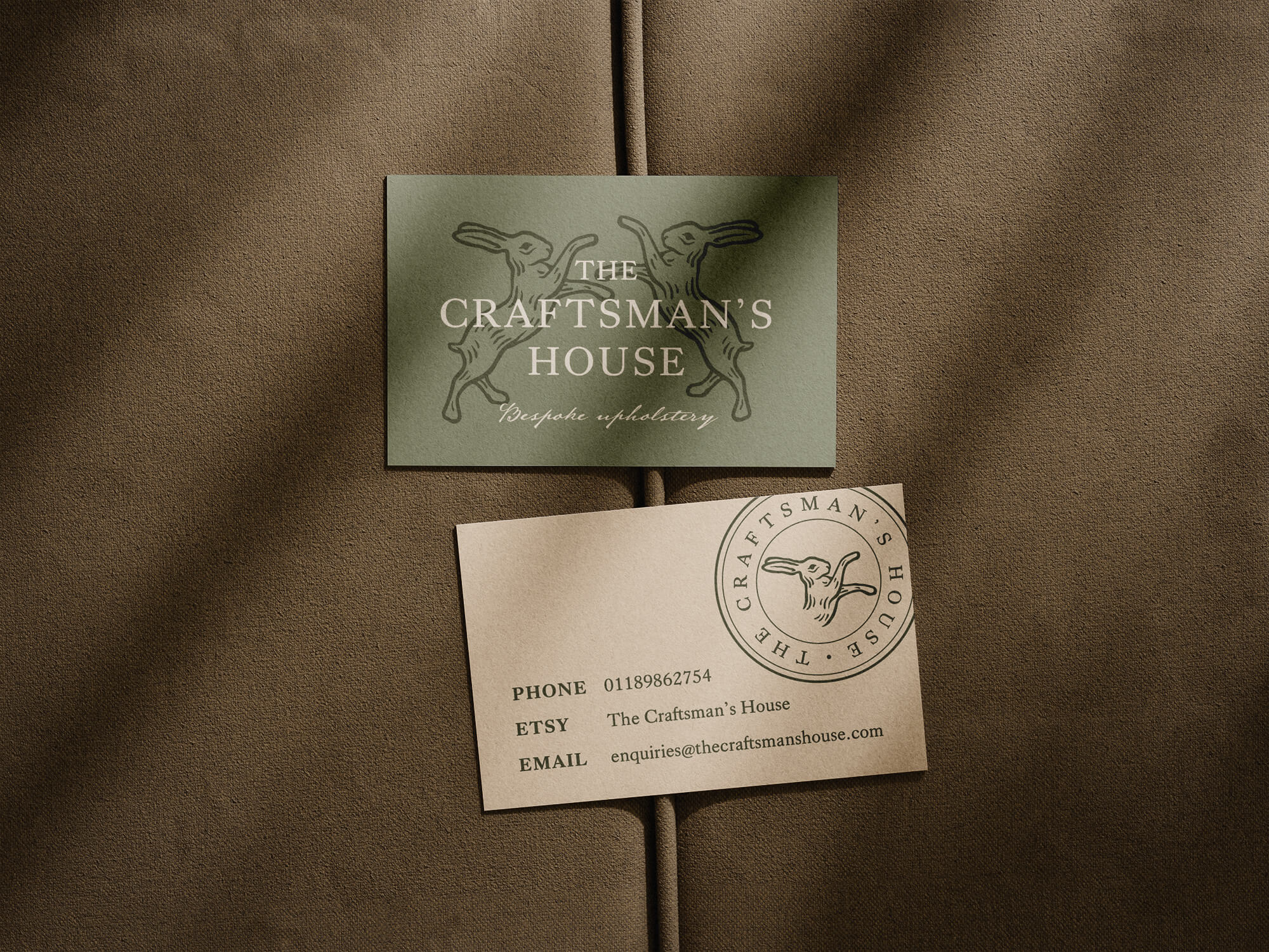
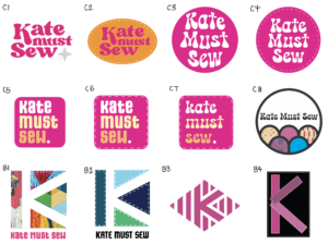
After presenting the client with the six refined concepts, the clients decided to move forward with Concepts D, and E, (fig 7) combining the two, with the clients requesting one logo using the full organisation’s title ‘Education Business Partnership’, and one using its shortened acronym ‘EBP’. It was at this stage that the client mentioned that different sectors of the organisation are currently separated and categorised by four assigned colours. As redesigning the organisation’s website was out of the scope of this project, the client asked if we could incorporate four different colours in the developed concept. This prompted the idea to add a third element to the bridge icon (fig 8), meaning that, including the colour of the type, a total of four colours would be incorporated in the new logo concept.
Logo refinement
Refining logo structure
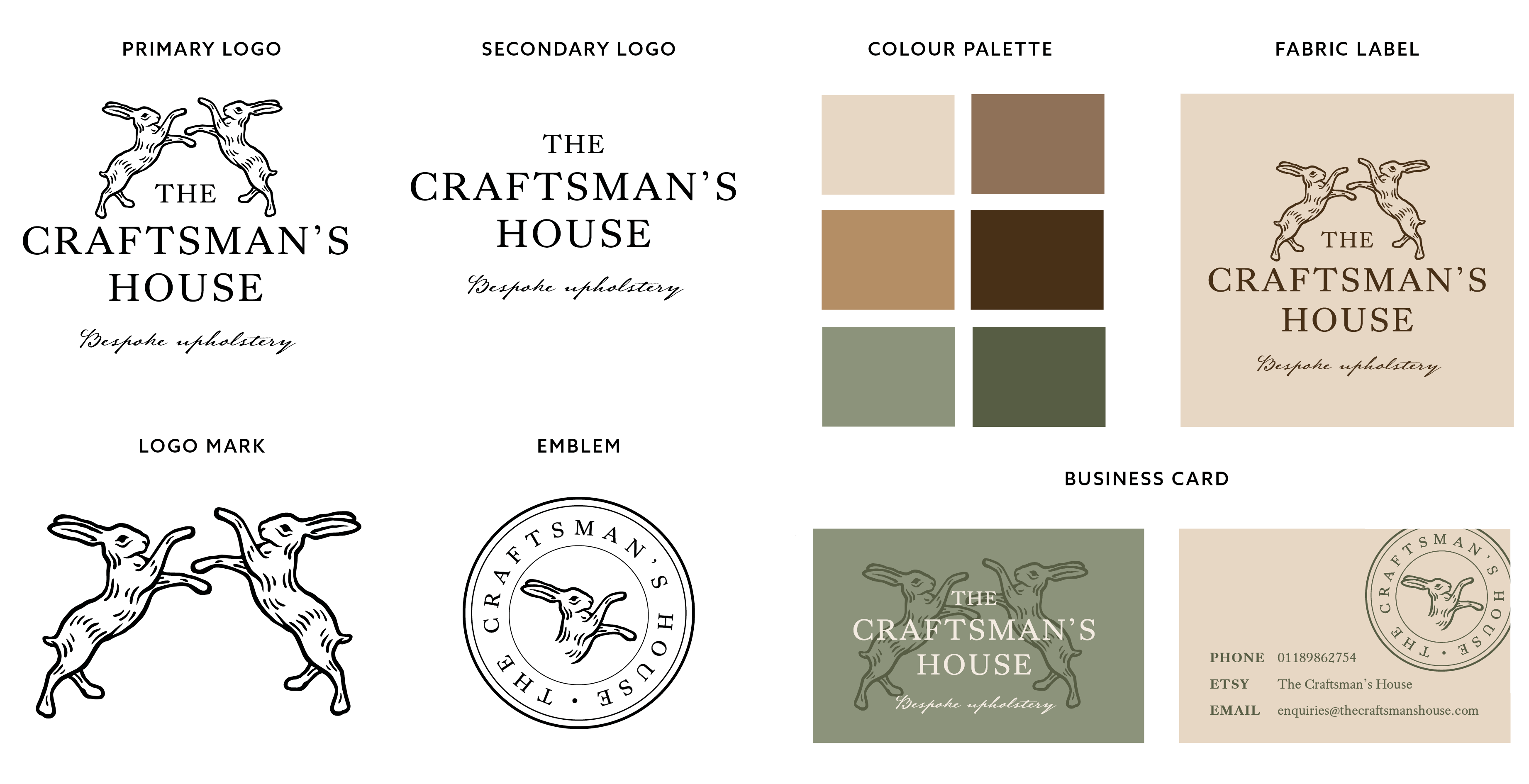
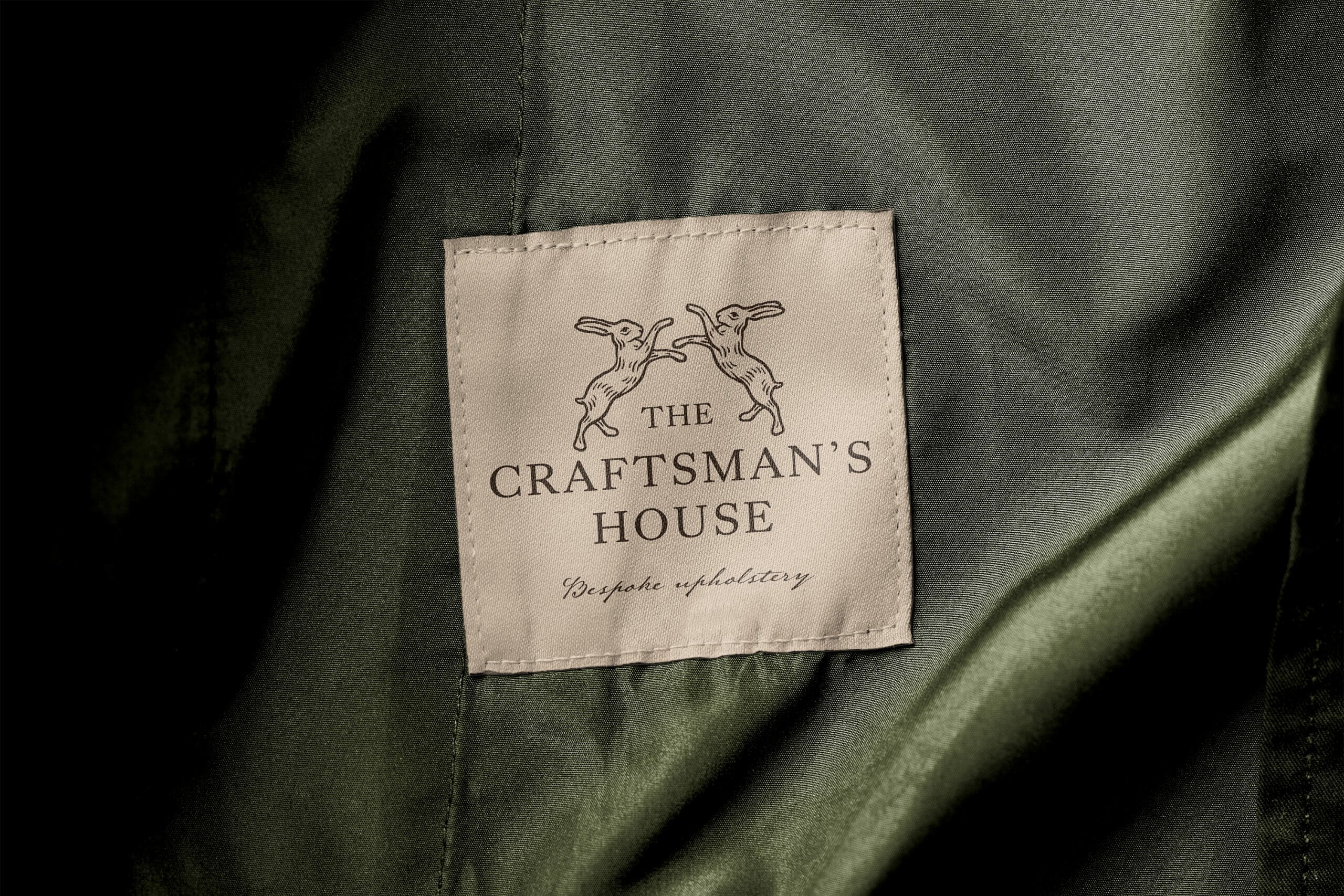
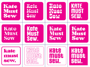
After deciding to add the third element into the icon in the form of a shadow along the bridge, we moved to looking at the overall silhouette of the logo, in both its short and long format. After feeling like the long-format logo was a little heavy/busy with the icon running along the entire length of the type, our supervisor, Greg Bunbury helped us come to the ideal solution of shrinking the icon, so that it still hugs the letterforms and allows the type to stand on its own (fig 9).
Colour variations
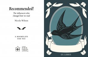
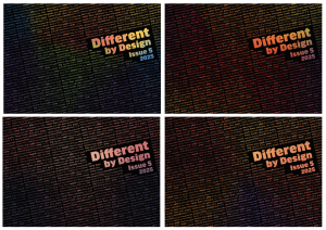
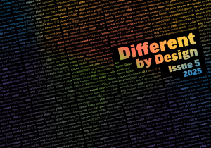
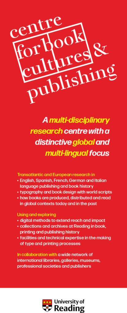
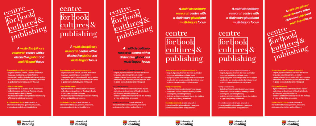
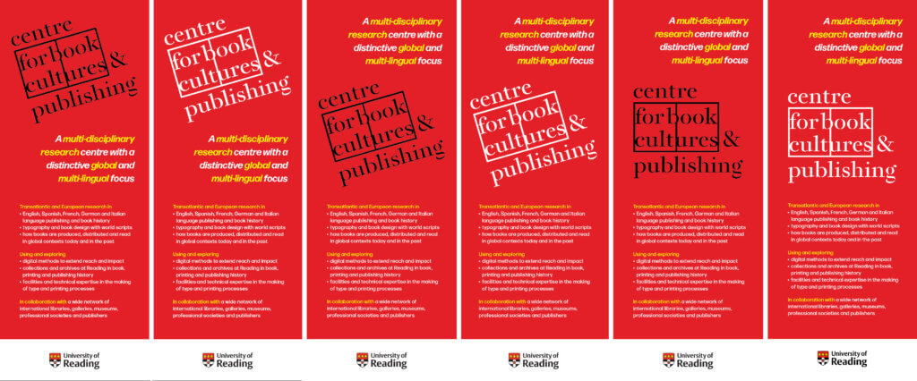
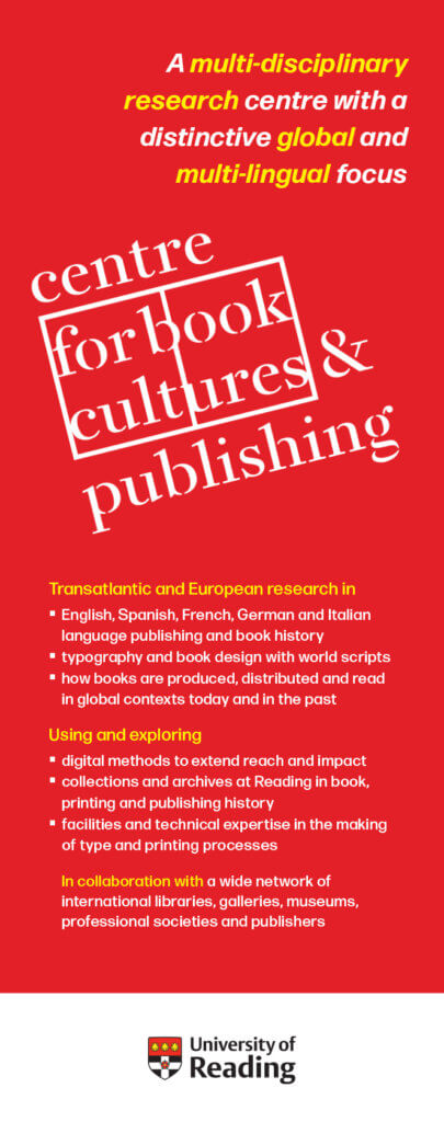
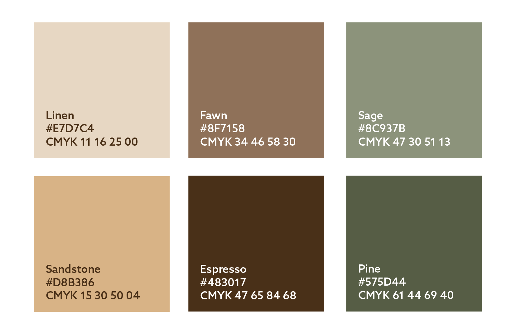
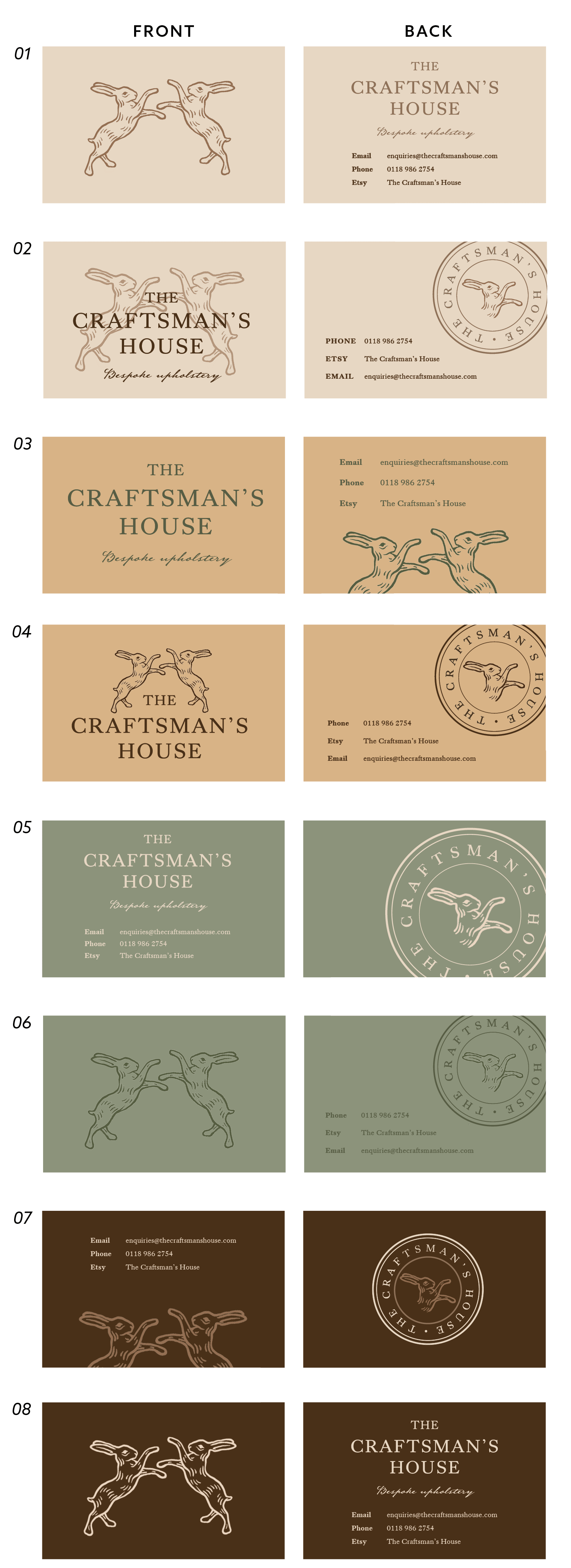
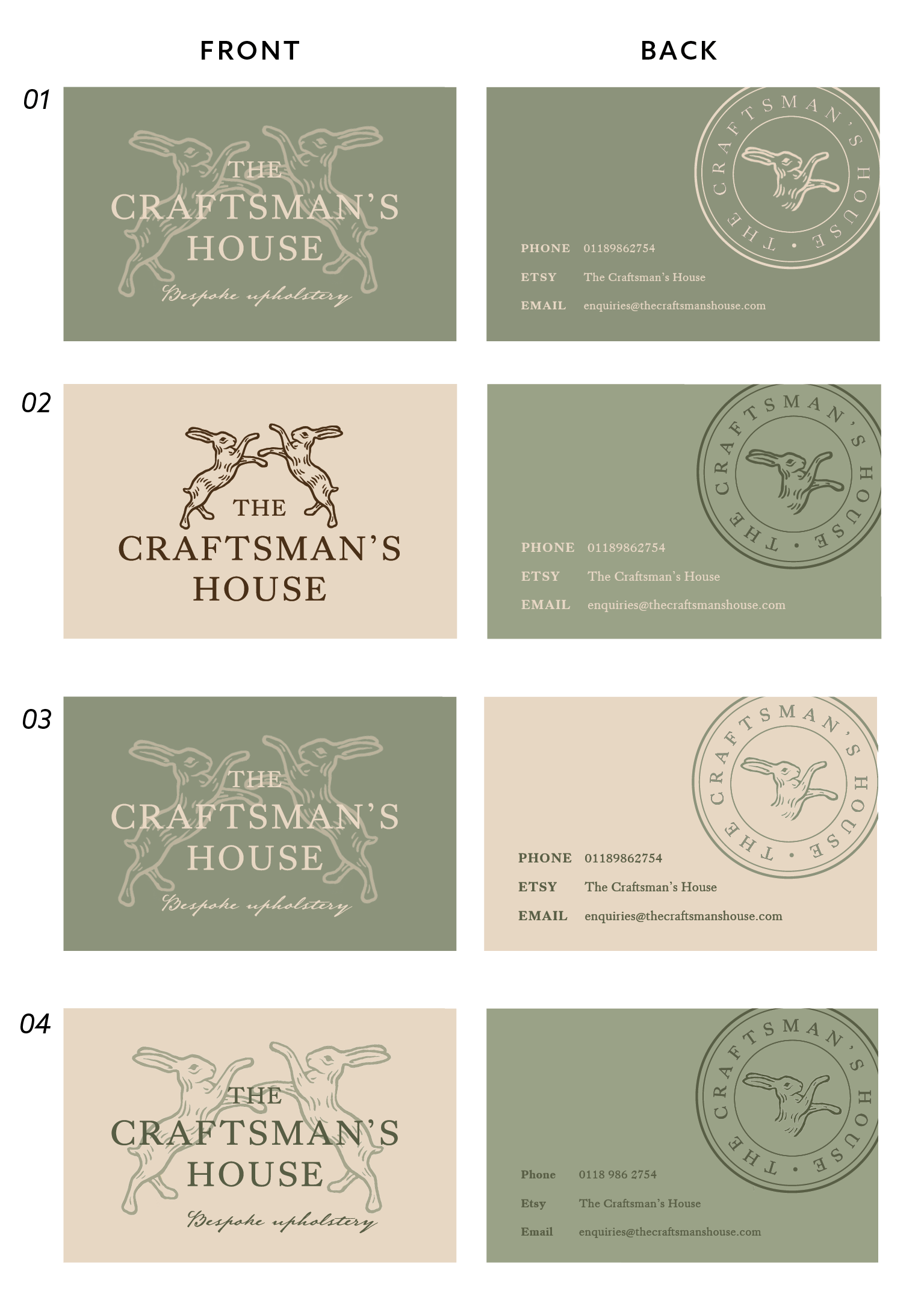
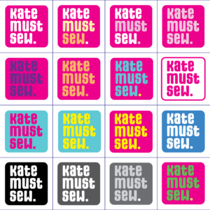
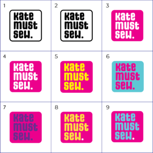
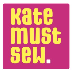
After finalising the format and structure of the logo variations, it was time to experiment with colour palettes. We then presented the client with five options (fig 10), and Concept B (fig 11) was chosen as the colourway for the final branding.
Social media
Editable Canva templates
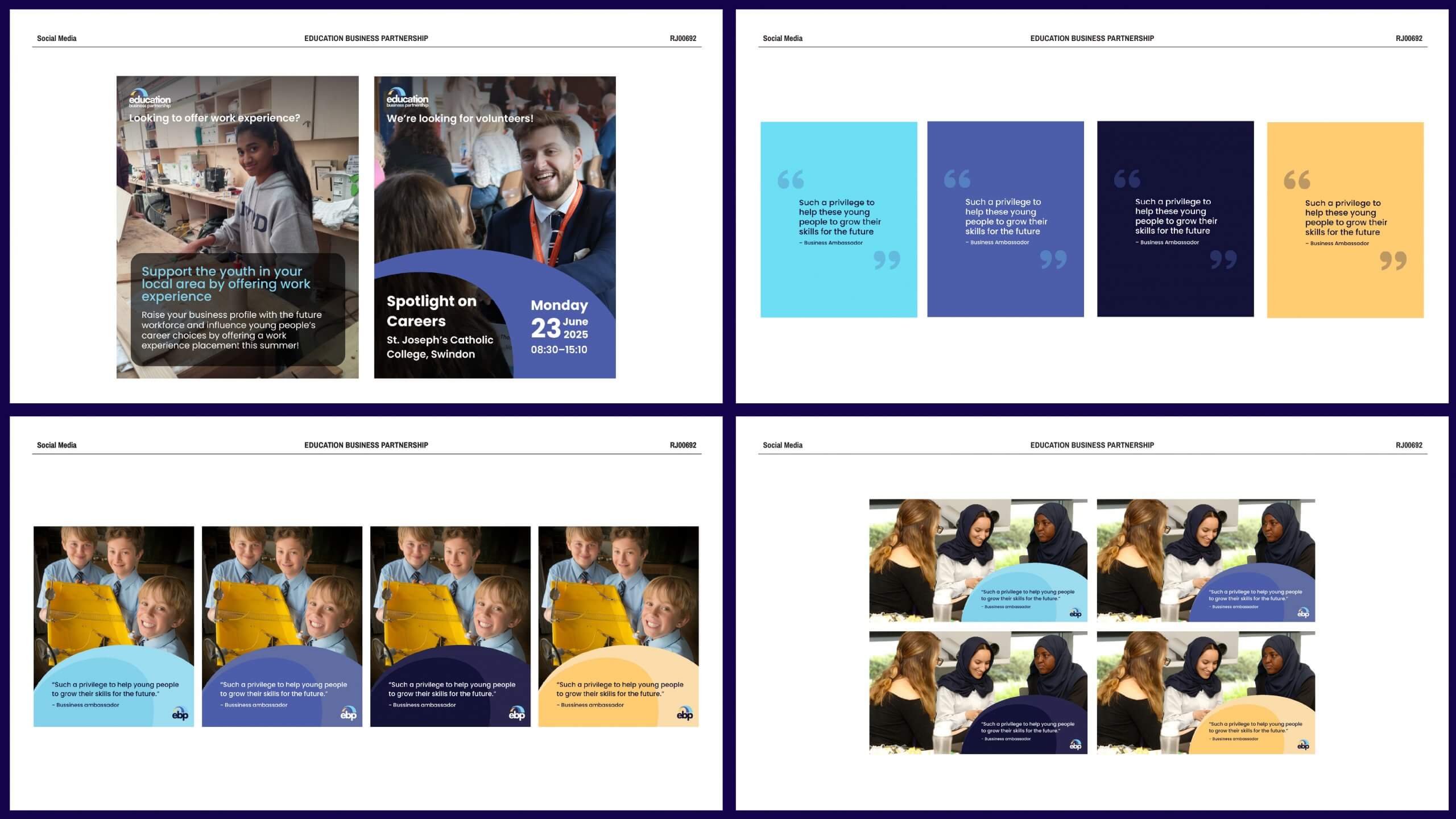
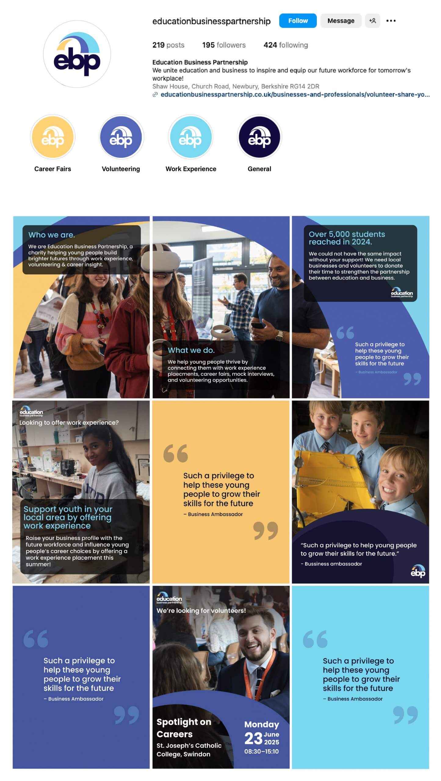
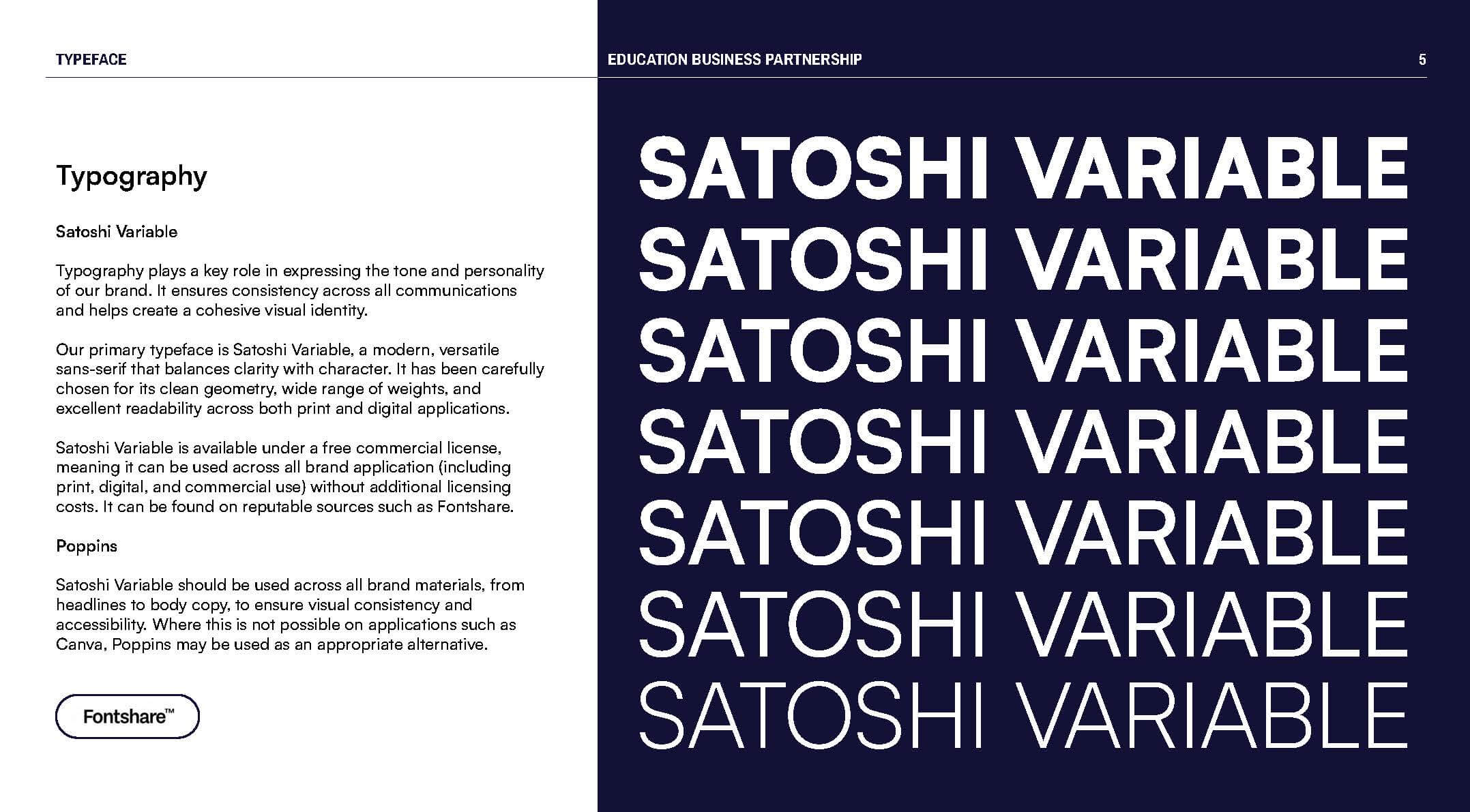
With the logos finalised, it was time to begin considering EBP’s social media and working on some templates that the clients can use moving forward. After investigating the organisation’s existing social media, it became clear that they would need posts to, advertise their volunteering events, showcase work experience opportunities, post quotes from stakeholders, and display general photographs taken from various events. Templates were created for each of these on Canva (fig 12), which brought with it the challenge of not being able to use our chosen typeface, Satoshi. We considered creating the templates in Figma, and providing instructions for the client, however, after a discussion with the Real Jobs team, it became clear that choosing a suitable alternate typeface on Canva was the most logical solution to allow for ease of use for the client.
Introductory assets
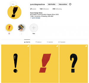
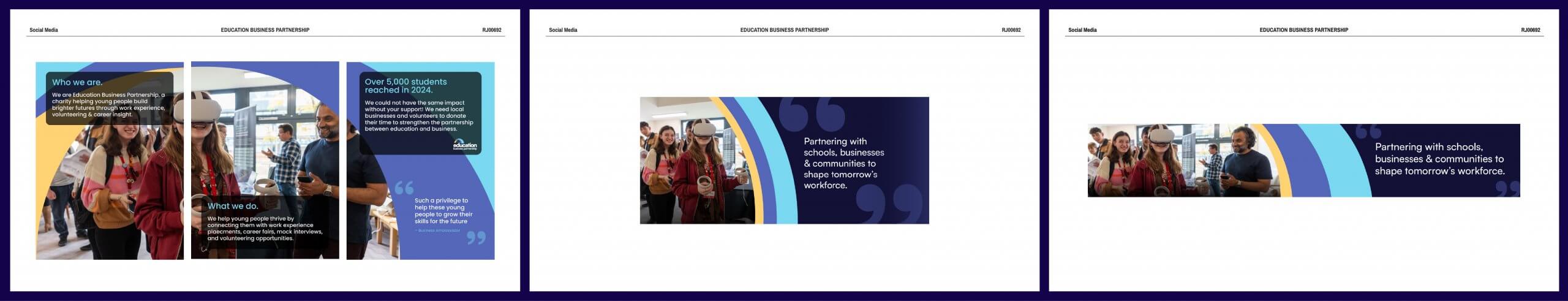
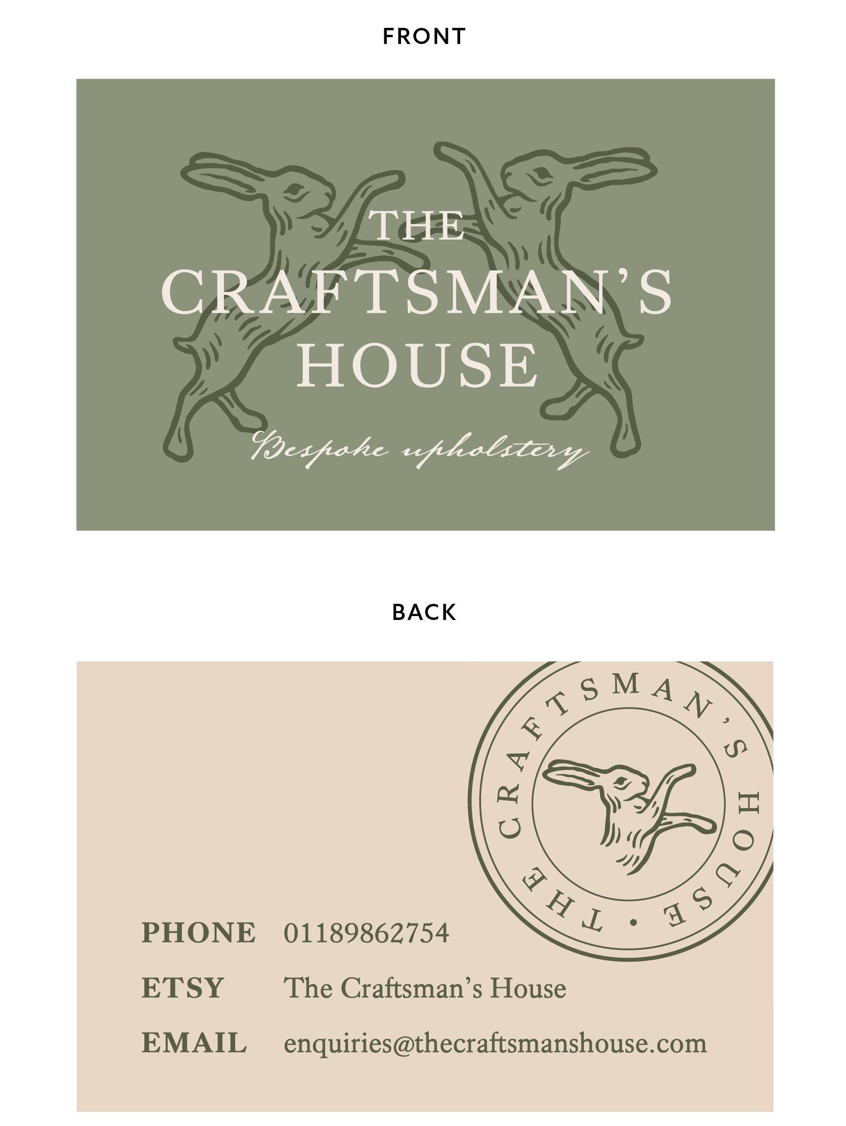
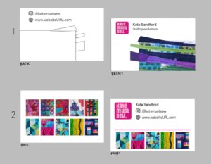
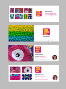
While editable post templates were important to provide the client with, we also pitched three pinned posts for the organisation’s Instagram page, as well as LinkedIn and Facebook banners, to act as introductory assets when users land on their socials (fig 13). As the rebrand is due to be launched after the time that this blog post was written, we have included a mockup of what the organisation’s instagram would look like with the templated social media posts (fig 14).
Brand Guidelines
File sizes
With all of the individual deliverables designed and finalised, we put together a brand guidelines document for the client to refer to and potentially provide to other designers in the future if they decide to rework their site with their new brand identity. Throughout the project, due to large file sizes, we were using WeTransfer to send over deliverables and documents. James Lloyd offered the insight that while this was okay for transferring folders and deliverables, the brand guidelines document being such a large file would make it very difficult for the client to send around internally. After this feedback, we compressed the document into a small enough file to comfortably send via email. This was a good lesson – that when designing, it is just as important to consider the client’s user experience in handling the internal documents, as it is to consider the end-user and stakeholders’ experiences.
Extra Instructional doc.
WordPress instructions
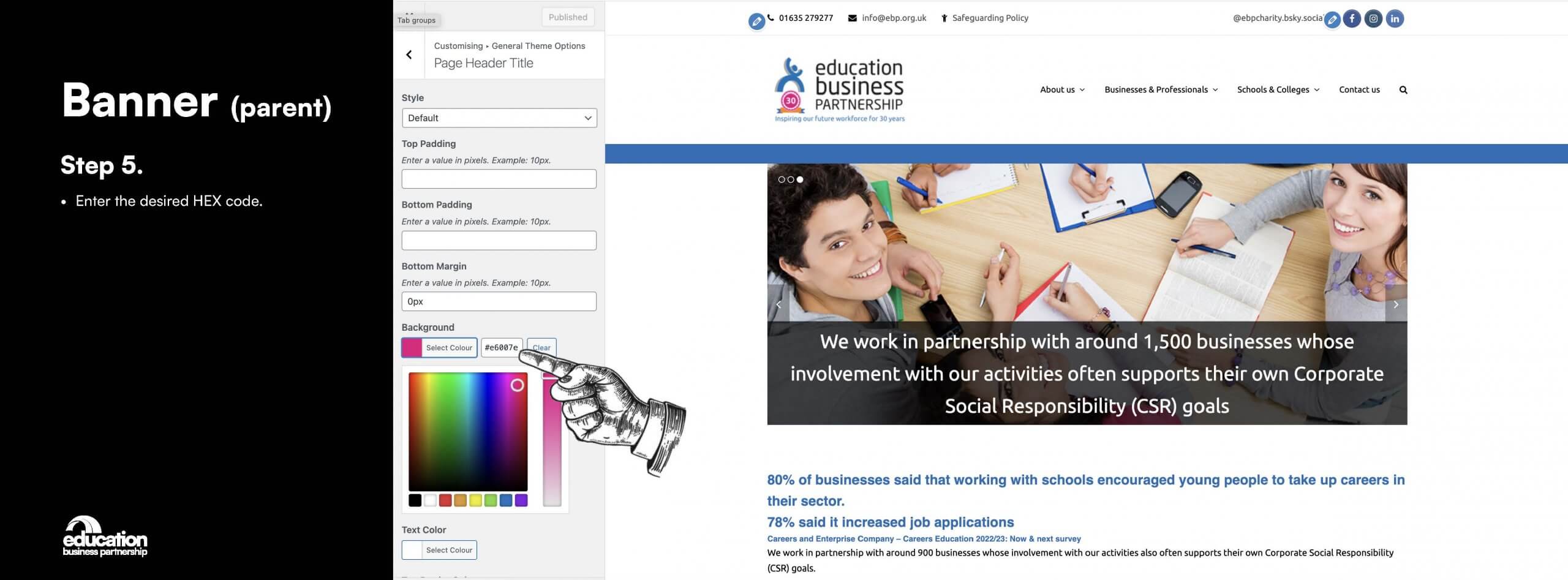
While a full redesign of the organisation’s website was out of the scope of this Real Job, the client still wanted to implement their new colour palette and logos into their existing website. The WordPress website was previously designed by an external designer, so the client did not know how to go about changing the colours of certain areas of the site. This was an exciting challenge for us to investigate, and once we had come to the conclusion that the coloured headers and footers were controlled through WordPress themes along with some custom CSS, we created a simple set of instructions (fig 17) for the client to follow to go about making these changes without impacting the rest of the site.
Feedback
Client feedback
“Tommy, Creamy and Diogo worked with us to come up with a re-brand for our charity. From the initial meeting, the team were excellent, professional and demonstrated a good understanding of our requirements. The work produced was of a high standard, they listened and acted on feedback and maintained good communication throughout the process. They demonstrated a high level of professionalism at all times and we were absolutely delighted with the final designs selected. We would not hesitate to recommend them for any future work and wish them all the best in the future.”
– Kate Barrow (CEO of Education Business Partnership)
Reflection
Our experience
Working on this project has been incredibly rewarding, and we are extremely grateful to have had such communicative, active clients who are deeply passionate about their organisation and the rebrand. While we believe that our scheduling and organisational skills were very strong, if we were to redo this project, we would book in specific dates and meetings ahead of time with both the clients and supervisor, to give fixed communication points. It is very easy when working alongside other responsibilities to leave enough time for one another to review the designs before they reach the client, but it is also vitally important to ensure that there is time for the supervisor to review the design work, and this is where we could have improved.
By Tommy Molnar, Creamy Li, and Diogo Pereira


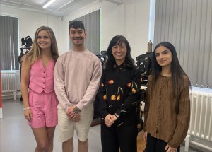
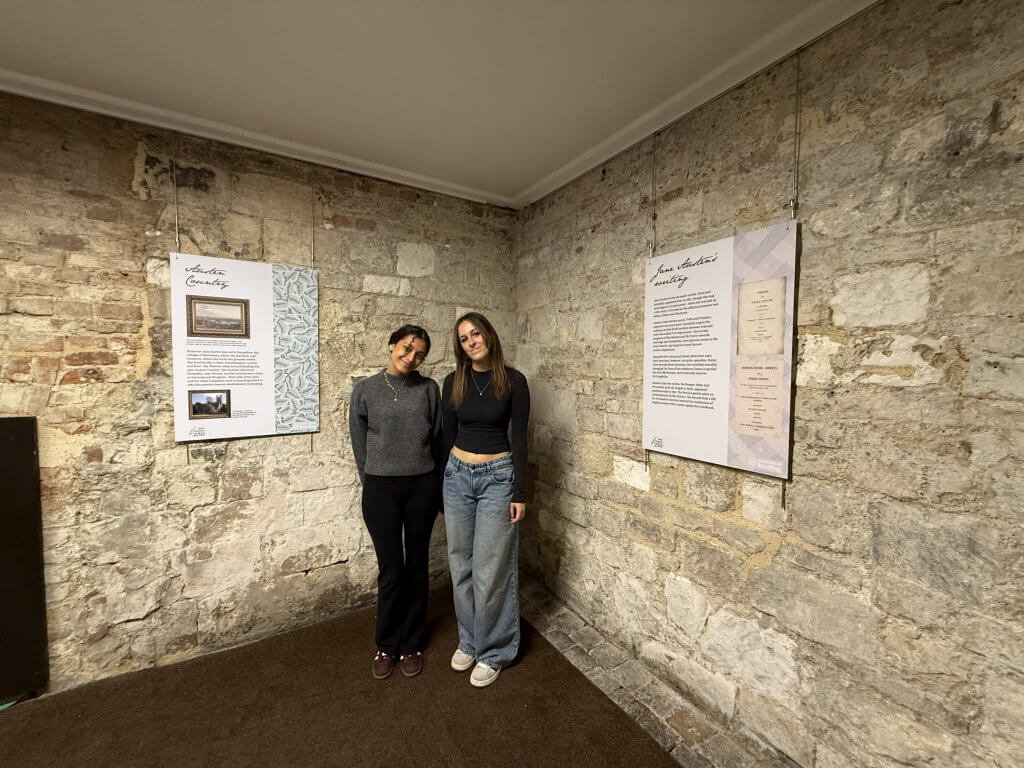 Picture of us reviewing our work at the Abbey Quarter