
Real Job by Ameera Khan
AK Design Studio
Brief
This project with Sophia White from the Brand Design Agency will help you look at design trends and understand how a mood board can be used to help you develop and design with this in mind. You will develop ideas for Logotype Trends for 2022-23 working with a specific theme in mind. This project will help you to look at trends and design logotypes for a specific theme. Using the selected theme, create a logo for yourself as a designer that you may use to promote your work/own design studio.
Process
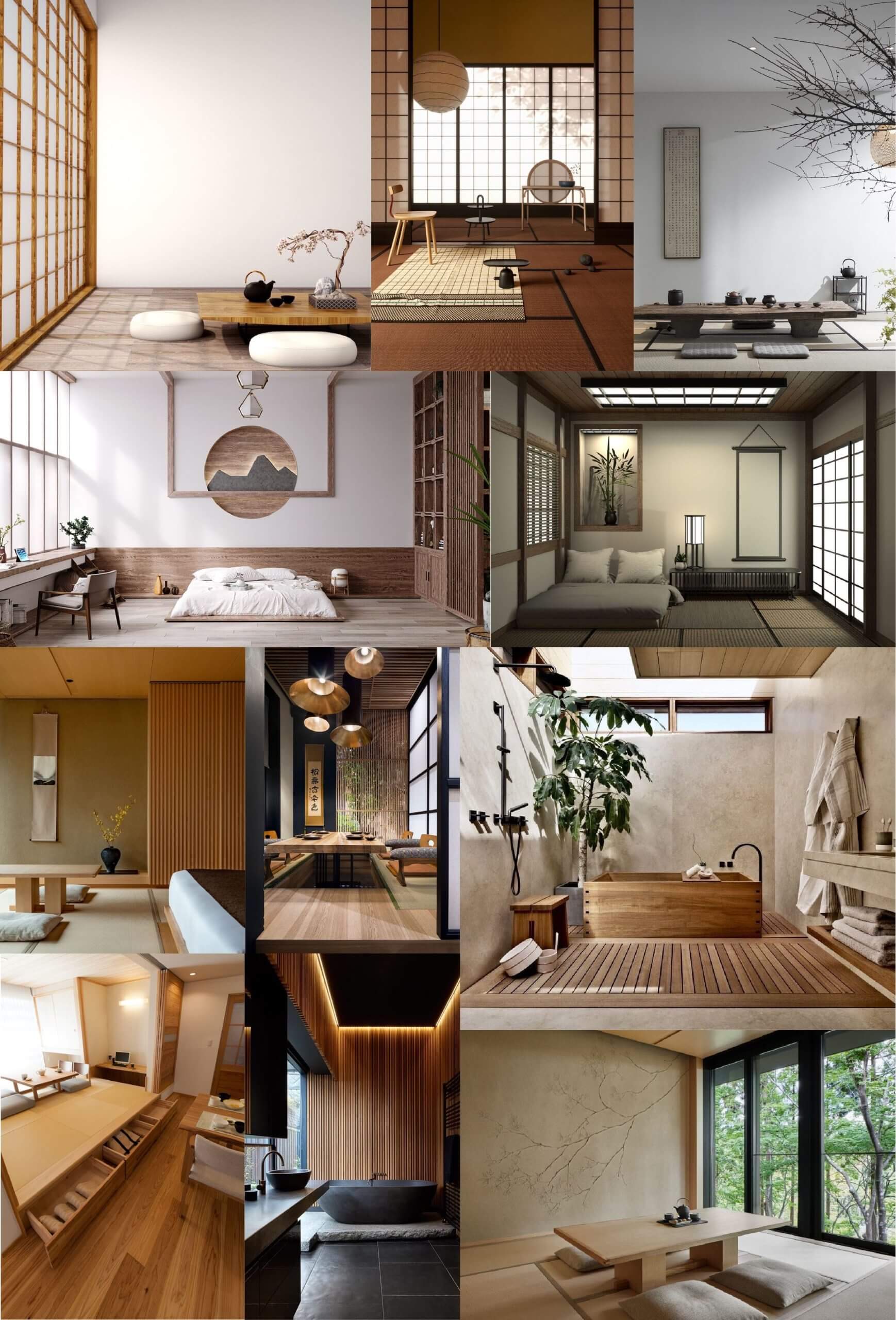
The first step I took to approaching this project was selecting a theme from this article that Sophia sent us in advance that lists 10 upcoming interior design trends for 2022. After looking through the different trends, I found that I was most drawn to the ‘Organic Materials’ theme. This is because I liked how it was very simple yet combining different elements still creates a clear contrast. Whilst looking at pictures associated with my chosen aesthetic, it reminded me of Japanese minimalist interior design so I decided to base my logo ideas around the elements of it. To get a better idea of the elements I wanted to use, I made a mood board of pictures so that I could start creating some sketches of possible logo ideas.
I isolated some prominent features of Japanese minimalist interior design and found the following:
- Organic shapes contrasting with geometric
- Block colours
- Simple lines
- Nature
- Clean cut aesthetic
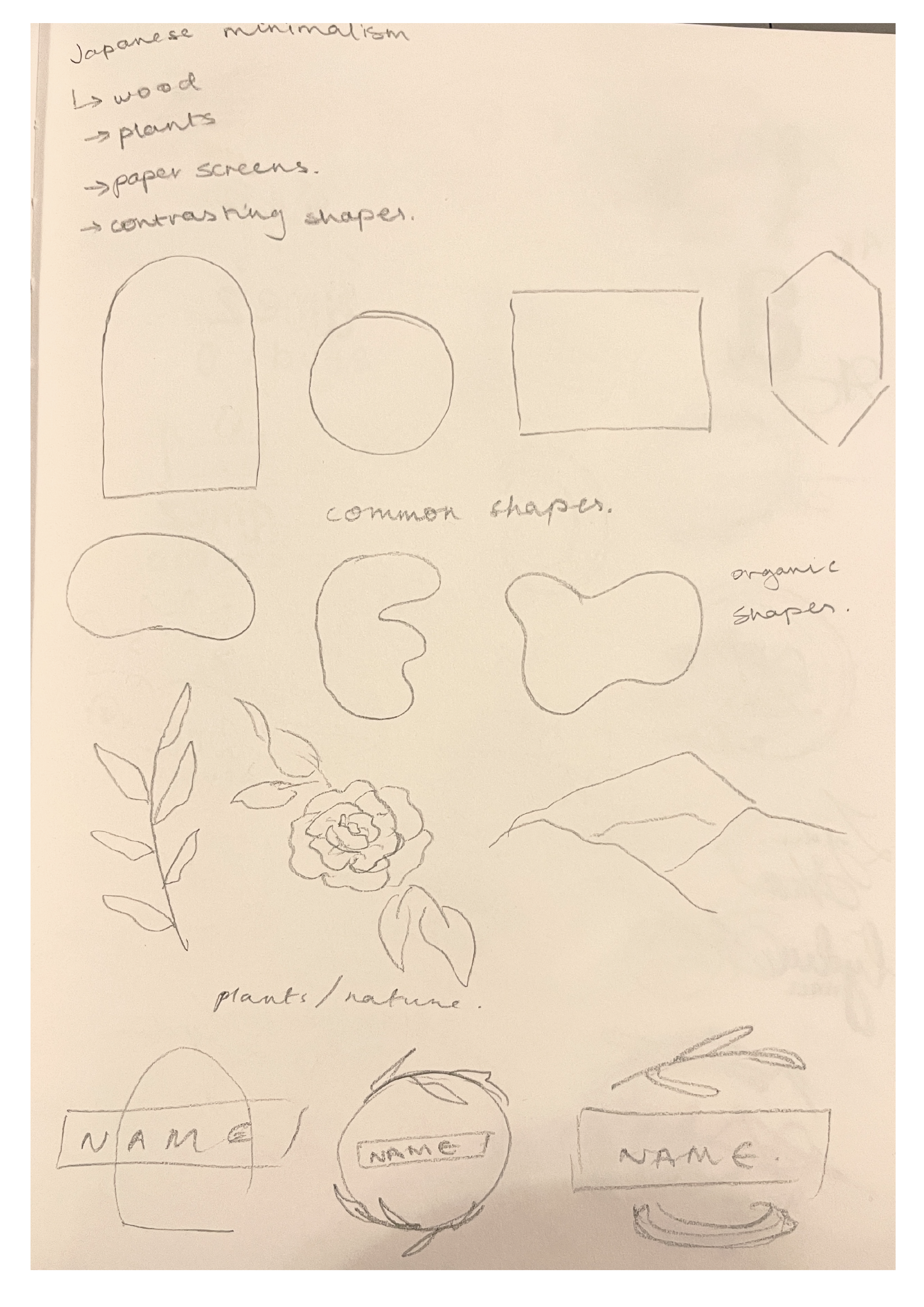
I began by sketching the different elements I found so that I could see them all in front of me and start thinking about how I could combine them into a logo that represents me while adhering to the theme. While considering the theme of the logo, I also had to decided how I would represent myself – either with my own name or a different one. In the end I decided to just use my own name – more specifically my initials ‘AK’ – as it is much more direct and clear; to showcase that the logo is for our own design company, I chose the name ‘AK Design Studio’, with my initials being the main focus. Because I decided to use my initials, I thought to use my signature, which makes the logo much more personal, as well as making it look more refined and clean. As for the inclusion of the theme, I quite liked my initial element sketches around the subheading ‘nature’, so my logo was steered in that direction.
Now that the main base of my logo was decided, I had to begin to try and incorporate the elements of the theme into it. To start this process, I sketched out my initials and drew circles and ovals around it. This is because my signature can create either a general square or rectangle shape, so by drawing a circle/oval around it creates the contrast similar to what I identified in my primary research. In order to add ‘nature’ into the logo, I replaced different sections of the ellipses with a branch of leaves, making them look like wreaths.
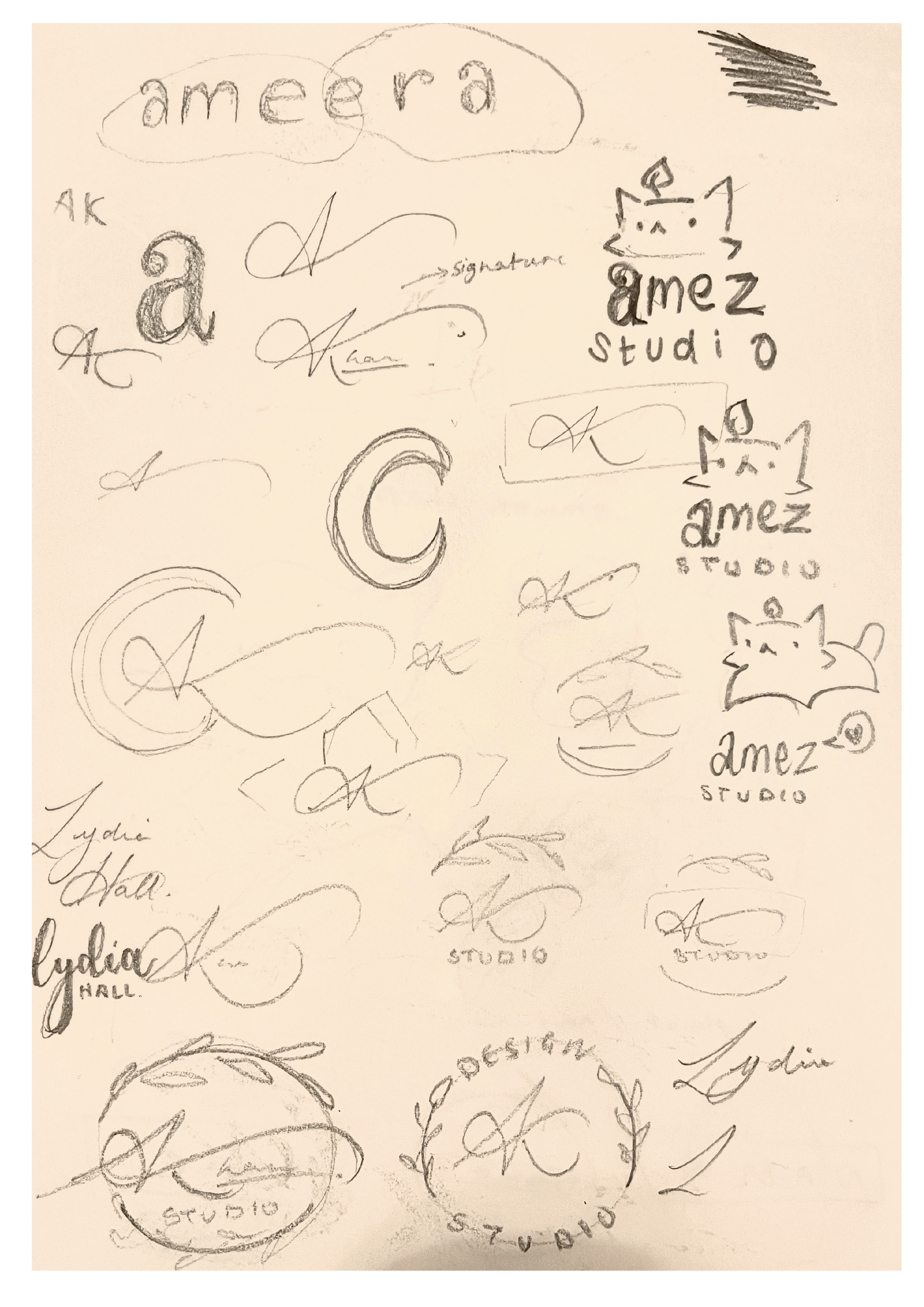
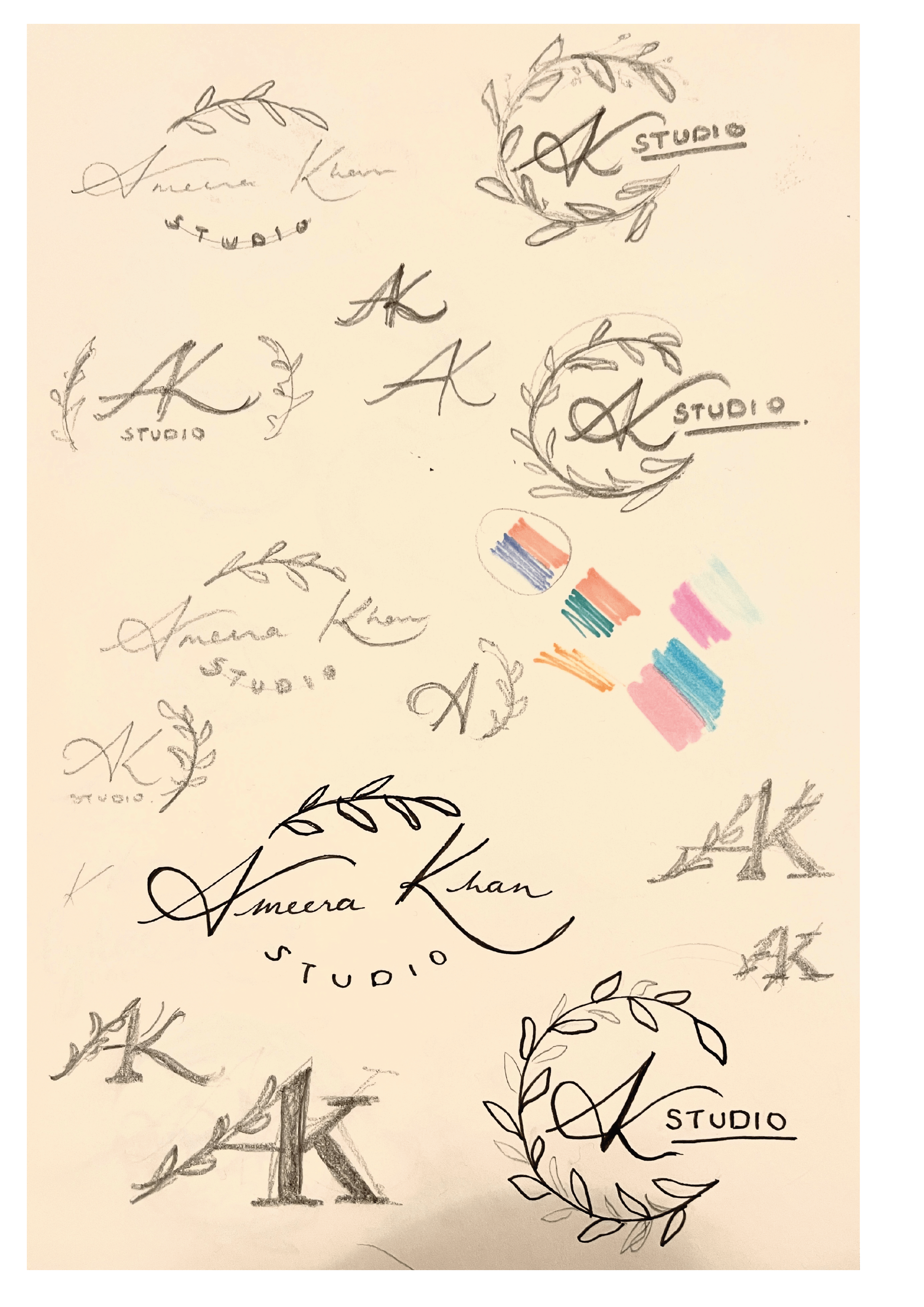
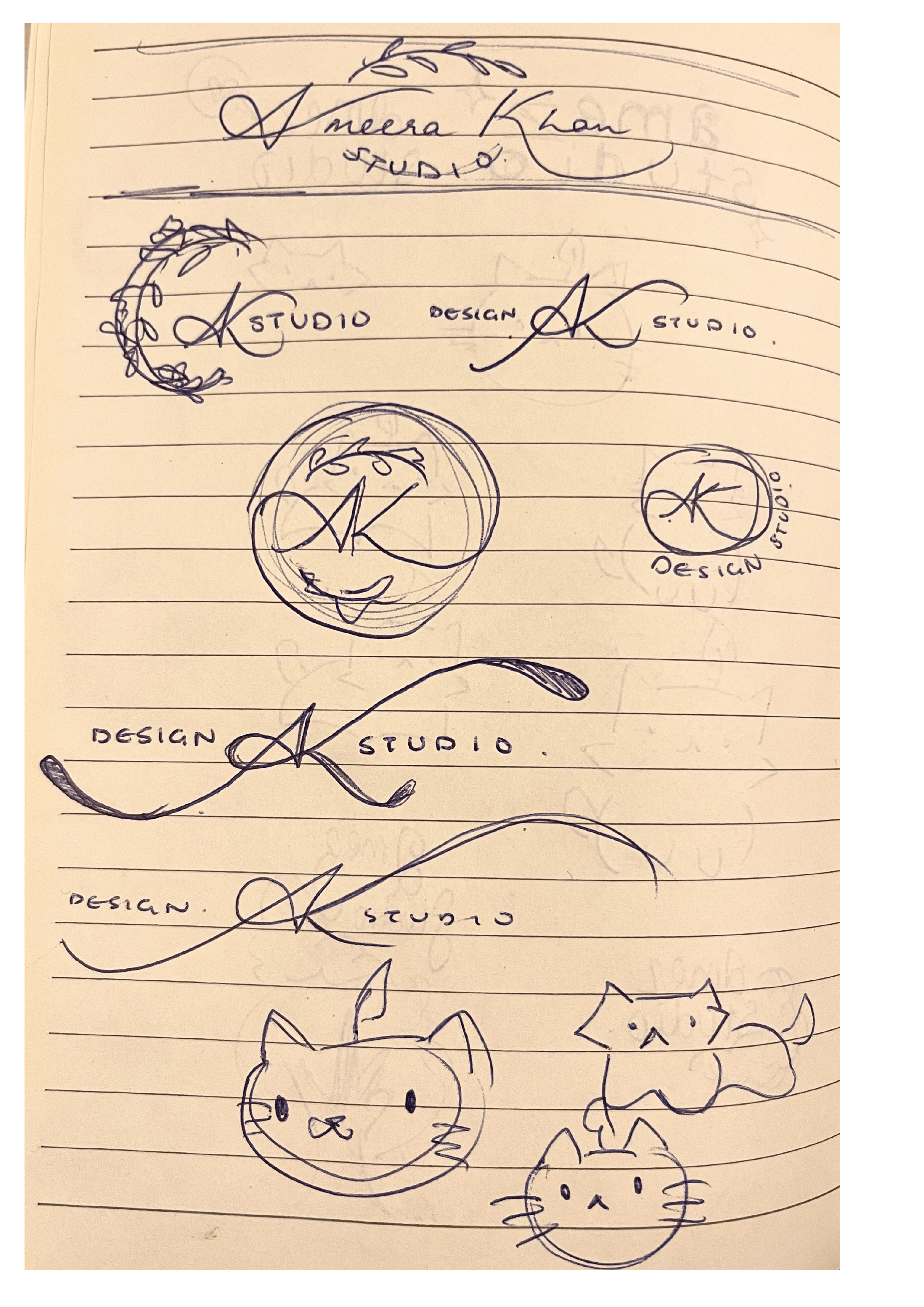
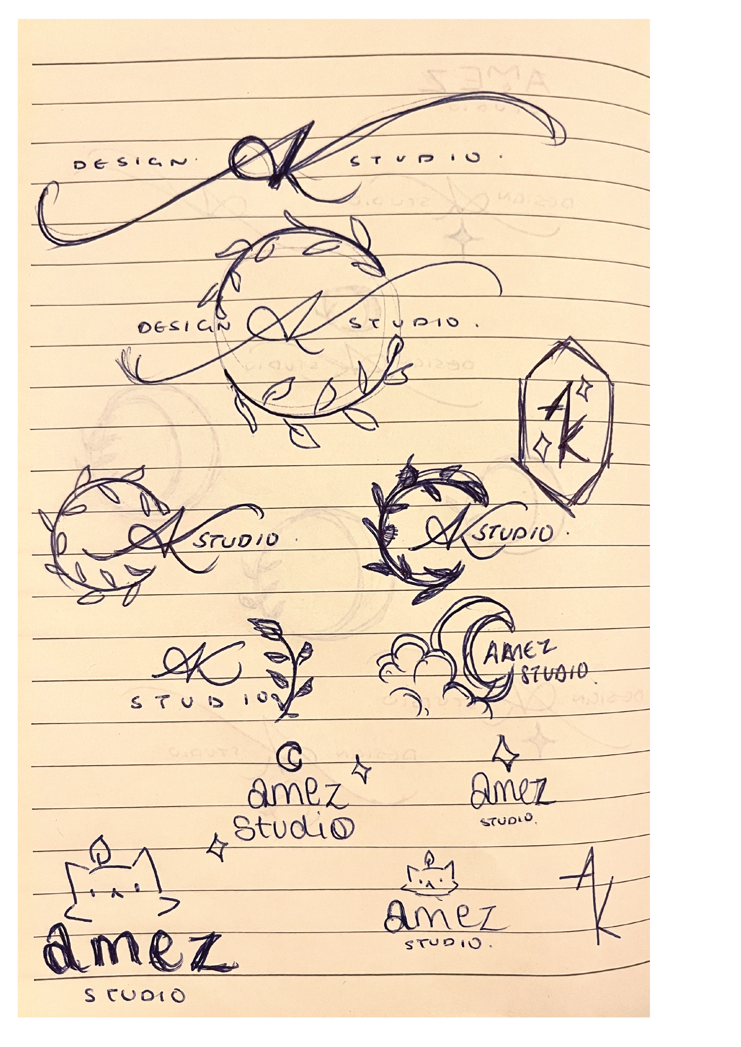
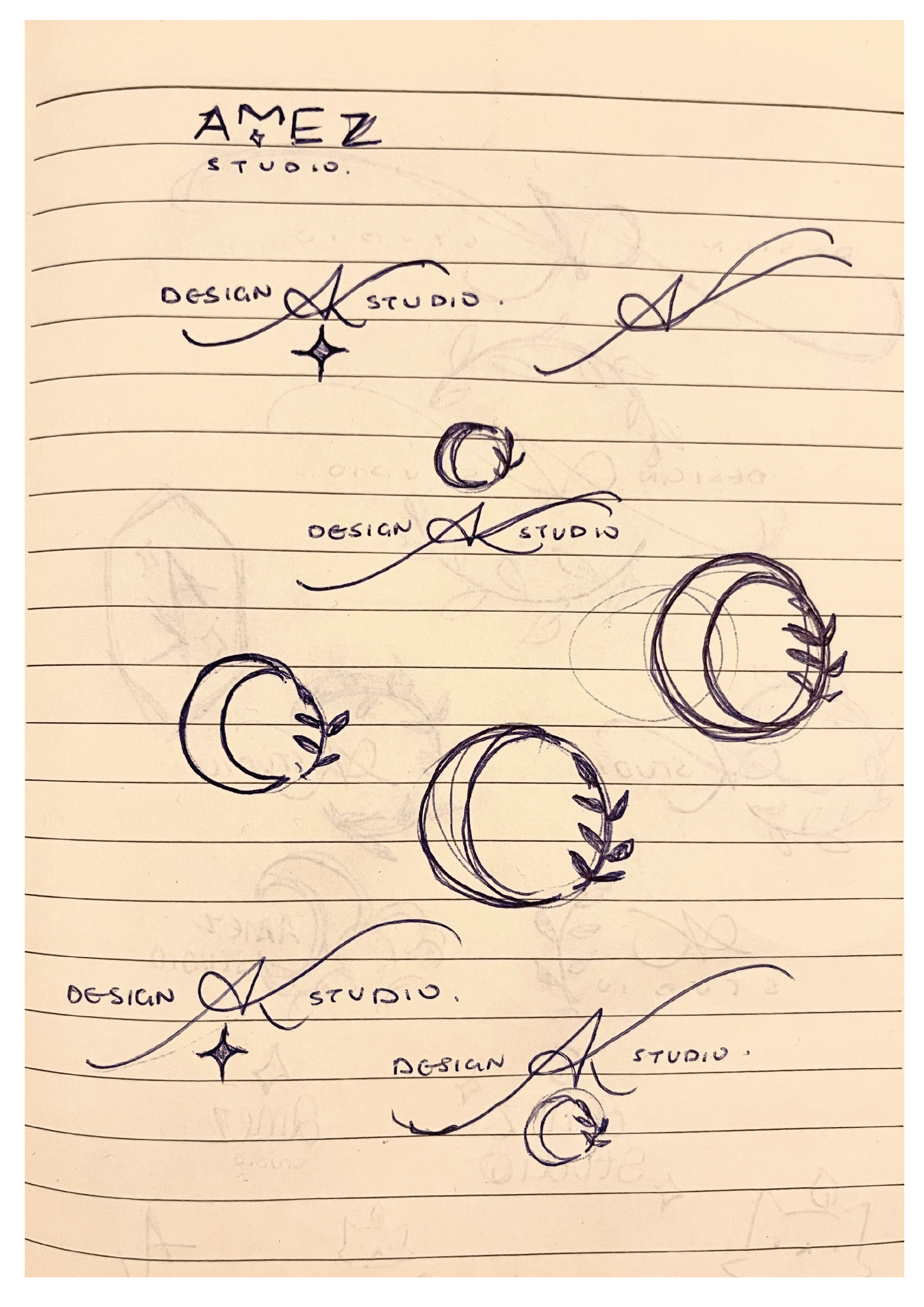
 After doing some more sketches experimenting with different placements, I saw that none of the ones I produced seemed to fit the result I was looking for. I then realised that I could venture into the concept of ‘nature’ a bit further, and use imagery such as moons and stars instead, as it still fit in with my original objective. Like before, I started sketching new ideas with these new images. Rather than trying to make the additional illustrative elements a main part of the logo, I decided to accentuate the initials by making the entrance and exit (which serves as the diagonal of the K) strokes longer; by elongating these strokes, it created a gap which I was able to fit the words ‘design studio’ into, hence making the title portion of the logo complete. Concerning the illustrative elements, I noticed the space underneath the ‘AK’ looked quite open, whereas the top half already had the point of the ‘A’ which was balanced out by the valleys either side of it. Because this open space made the logo look unbalanced, I decided to add a four-pointed star underneath. I made this decision as the other images I tried to add into that space didn’t work for the balance overall.
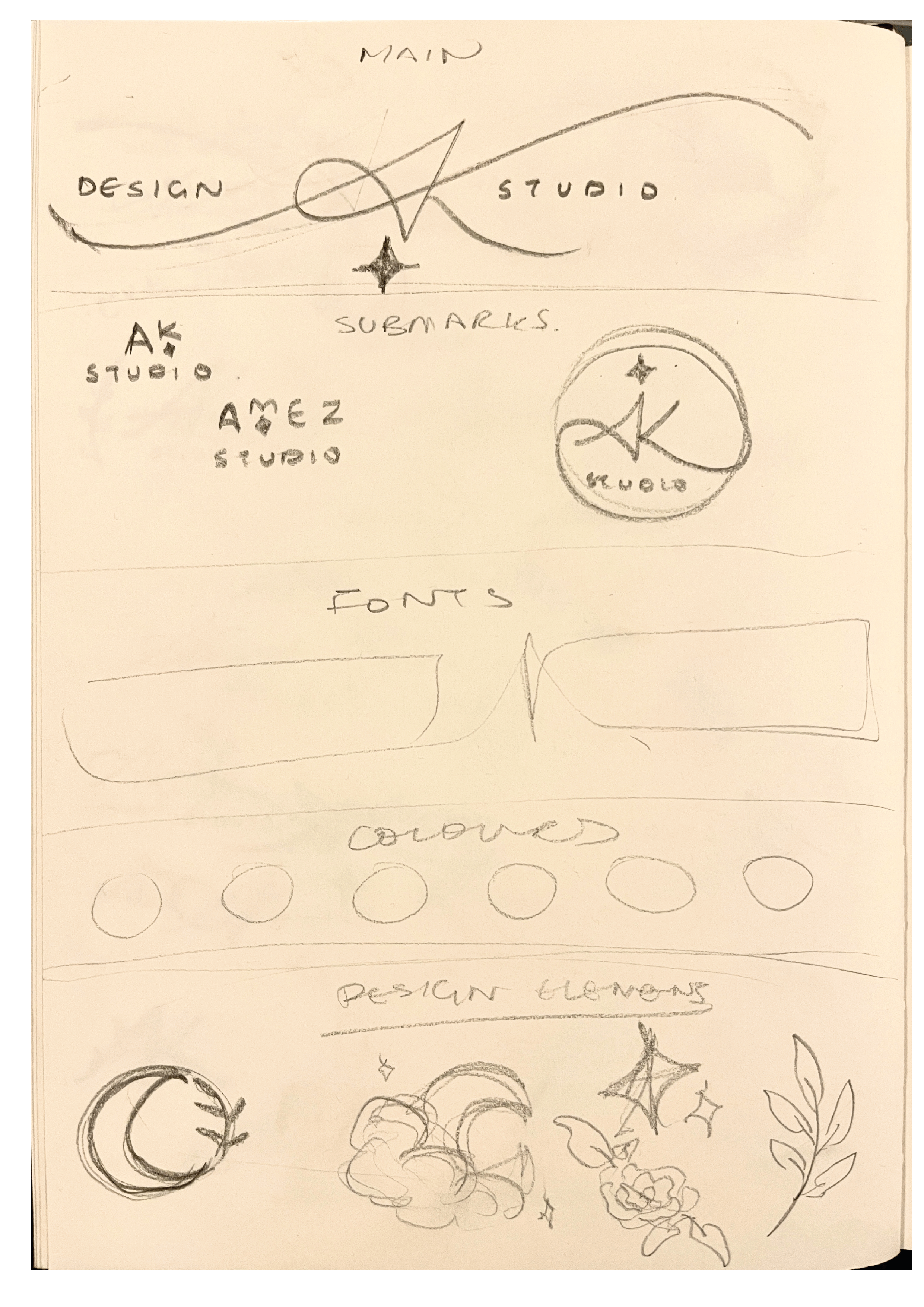
To make the final refined logo, I took a picture of the sketch and imported it into Procreate; this is because the way the letters are written is quite unique, and I couldn’t find a fold that was similar enough to manipulate to recreate them. I used a thin technical brush to trace the ‘AK’ so that I could get a tapered effect that calligraphic typefaces don’t have. After doing this, I took the finished trace into Illustrator and did Object > Image trace > Make & Expand, which recreated my drawing as a vector that I could then manipulate. I then added in the words ‘Design Studio’ using Baskerville, I chose this font as a serif font looks much more cohesive with script/calligraphic lettering. Once this was complete, I created the star by making an oval, the going to Effect > Distort & Transform > Pucker & Bloat, then puckered the oval to bring in the sides apart from the vertical and horizontal points, thus creating a four-pointed star. After this, I positioned all of the elements of my logo together and readjusted them accordingly, to ensure that the balance was correct.
As this was a logo project, I thought that the most appropriate way to present it would be a brand board. In order to complete it, I made two simple submarks that still incorporated my initials and decorative elements. I also showed the fonts I would use in my brand, and displayed a simple colour palette.
Reflection
![]()
Overall, I really liked this project, as it allowed us to get an insight from a designer in the industry and showed us part of a professional’s process, which I thought was really interesting. Furthermore, I liked how much freedom the brief gave us, and there weren’t a long list of rules that we had to follow; the only ‘restriction’ being our chosen theme, which we still had freedom to pick. This project let us be creative in a way that was fun but also very useful to show us a real world application of our work, and how a typical project in the industry might proceed. As well as this, because we were able to create branding for ourselves, a lot of us may use these as either a starting point or how they are to develop an identity as a freelancer if we so wish.
Good Omens
Brief
Complete the Great Gatsby cover we began in class, ensuring that, as much as possible, every detail is a match for the photograph we are copying. There is no need to ‘distress’ the paper. If you like, have a go at changing the colour of the book (perhaps use another well known Penguin colour) and change the book title and author to something else, to prove that your file is robust.
Once you have completed part 1, select another book and author – ideally something you have enjoyed or which means something to you. Something you know well. Inspired by the David Pearson’s Penguin cover for 1984, or both other artists or designers whose work you enjoy, create a new cover for your chosen book that:
-
- Sticks to the basic rules of your first classic Penguin
- Introduces new elements, or alters existing elements to create something funny / witty / insightful / relevant to the content or nature of your chosen book.
Process
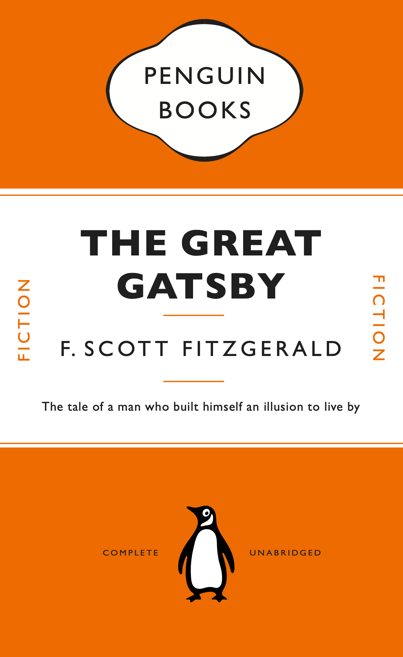
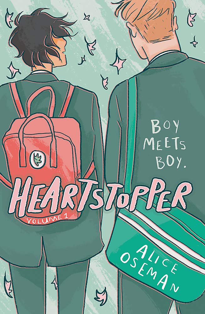
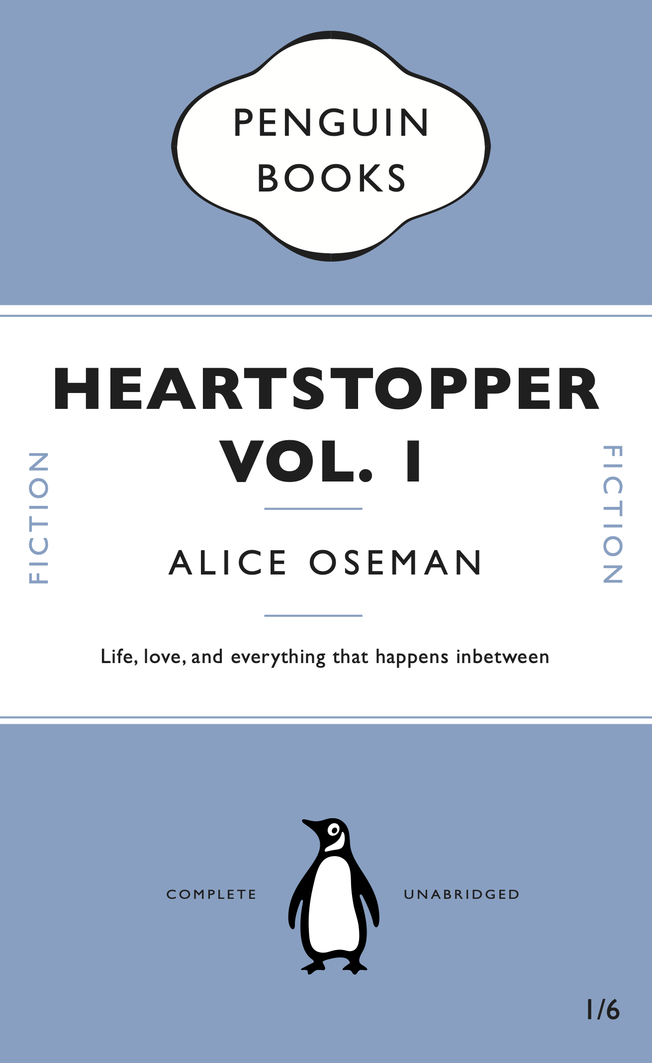
After finishing the initial penguin book cover tutorial, I decided to have a go at changing some different elements of the book to see if I properly understood how the mechanisms in Indesign we learned worked and how to use them. For example making my own style sheets and making the cartouche again were especially good ways to see if i remembered how to make and use them, instead of just copying the tutorial. For the alternate version, I decided to make the cover for ‘Heartstopper Vol. 1’ by Alice Oseman. As the original is illustrated, I wondered how it would look as a penguin cover which is much simpler.
PDF’s for the two covers:
The Great Gatsby 01 Heartstopper 02
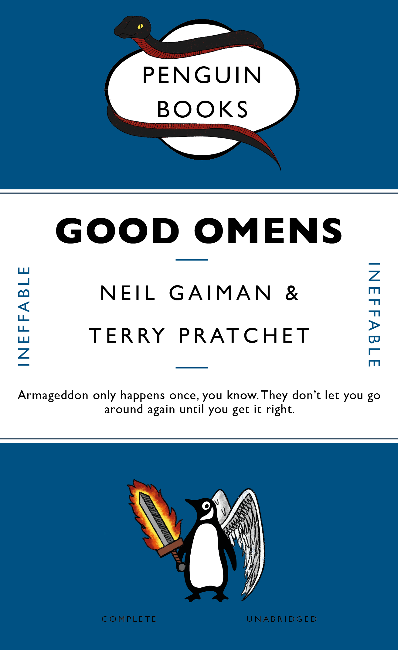
For the second part of the brief, I decided to use the book Good Omens by Neil Gaiman:
“[A] somewhat fussy angel and a fast-living demon — each of whom has lived among Earth’s mortals for many millennia and has grown rather fond of the lifestyle — are not particularly looking forward to the coming Rapture. If Crowley and Aziraphale are going to stop it from happening, they’ve got to find and kill the Antichrist (which is a shame, as he’s a really nice kid). There’s just one glitch: someone seems to have misplaced him. . . .”¹
In the book, the demon Crowley is often portrayed by a black and red snake, while the angel Aziraphale is usually only shown with wings to identify his true identity; another common motif for Aziraphale is his flaming sword. As these are the most commonly known portrayals of the two characters, I thought that including these would be the best way to make the cover more interesting while tying in the theme of the book.
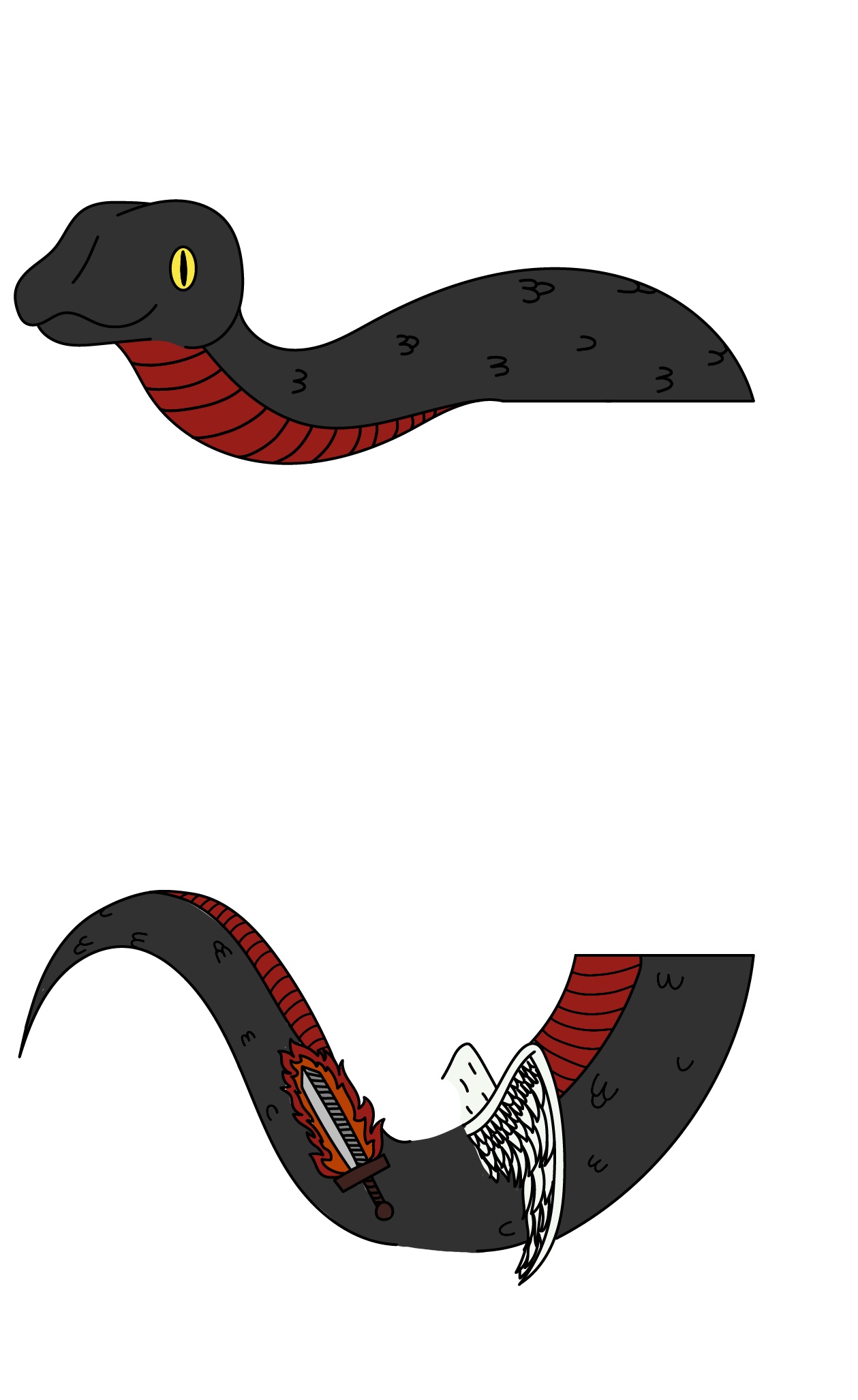
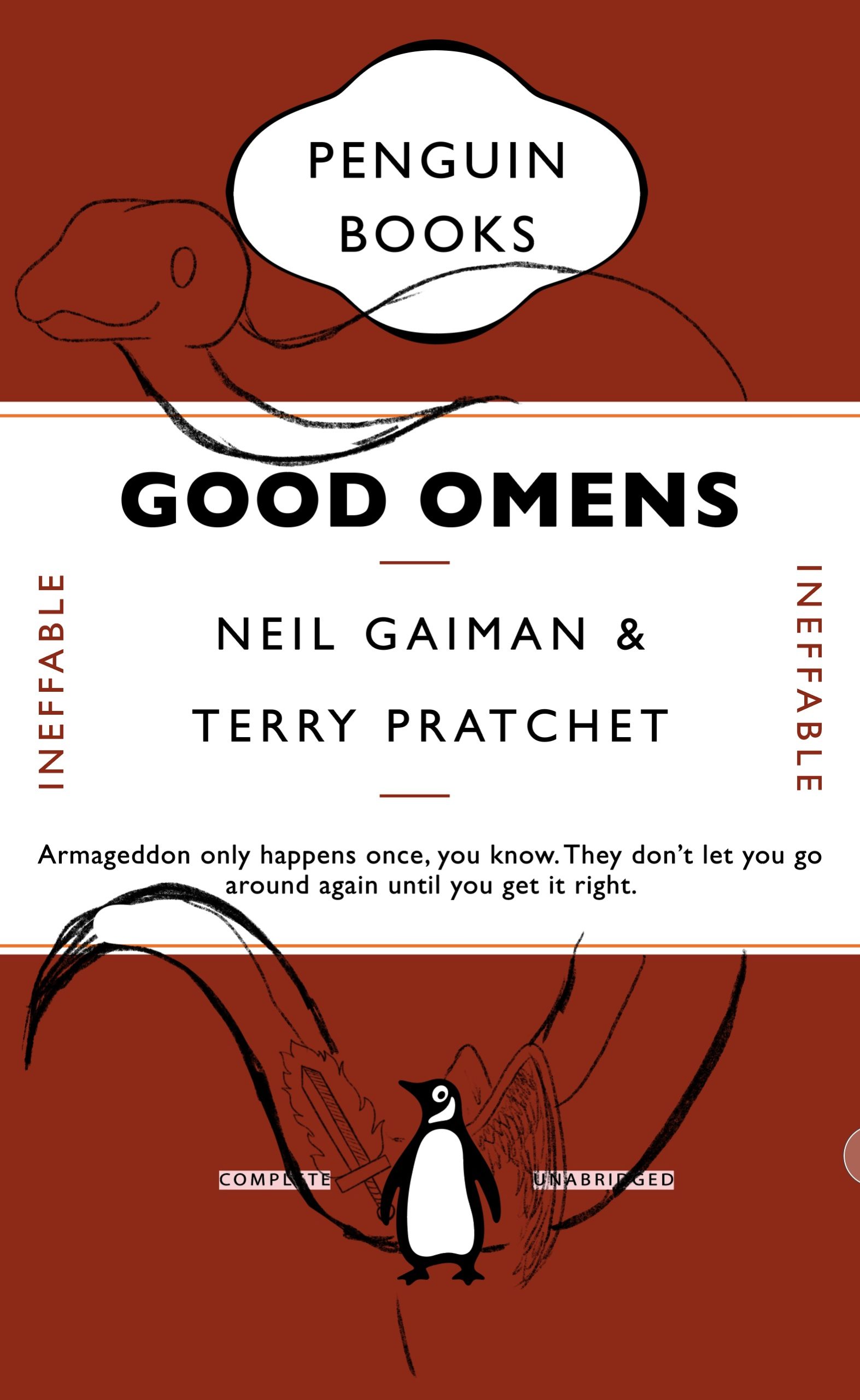 I started by altering the details of the cover such as the title and author, as well as the small words on either side of the cover. After changing these main elements I took a picture of the altered cover and began to sketch the snake, angel wings and flaming sword over it. I decided to put the snake around the middle banner of the cover, as though it was coiling/hanging over it, and used the wings and sword to decorate the penguin. After sketching it out in Procreate, I transferred it to Illustrator and traced a clean, smooth outline using the pen tool. To make the colouring process easier, I took it back to Procreate and coloured it using a monoline brush to create flat colours. I saved the finished illustration as a PNG to make it transparent and placed it in InDesign.
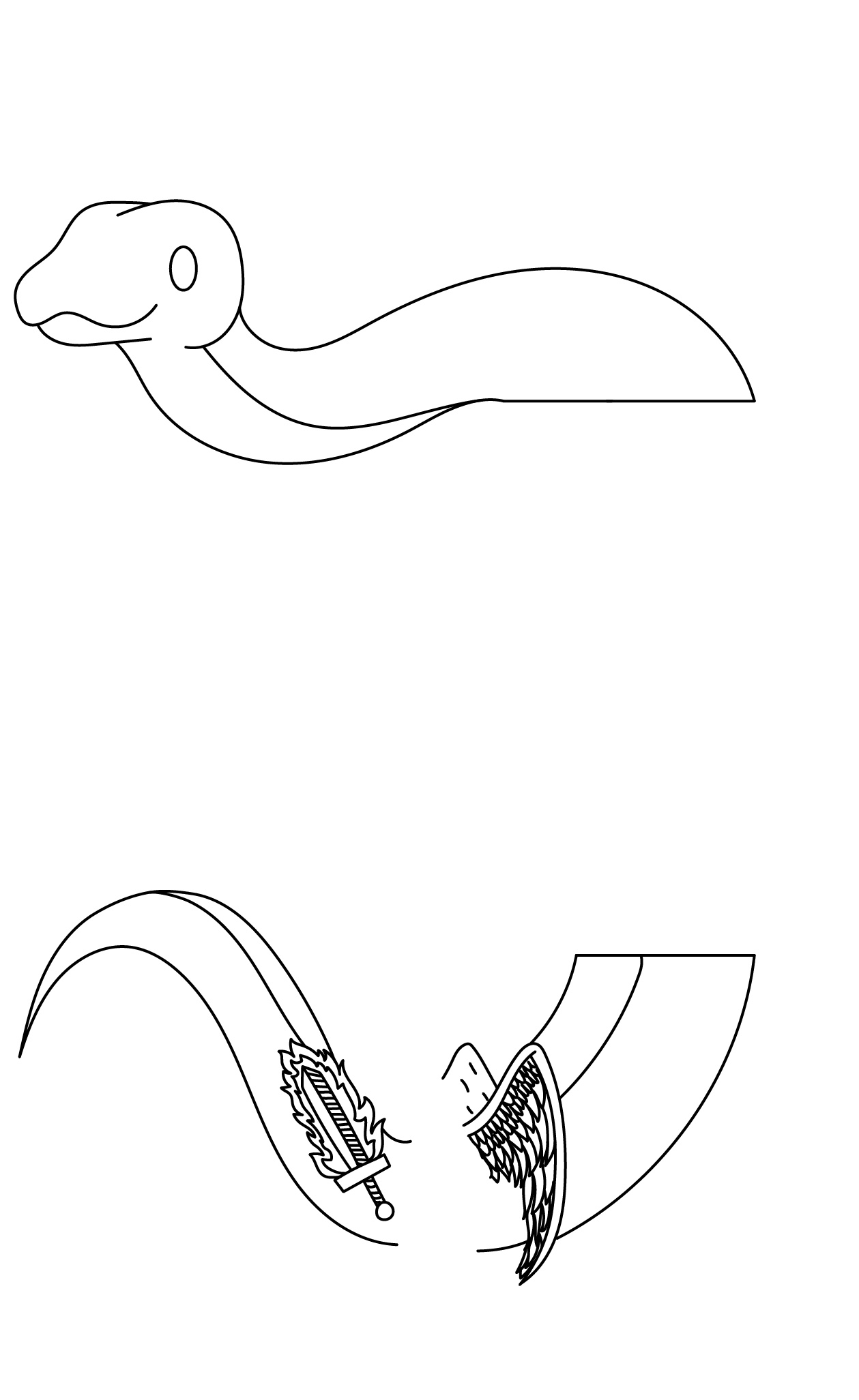
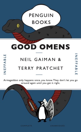
 However drawing the snake hanging over the banner looked too imposing and didn’t mould well with the rest of the cover’s components, whereas because the wings and sword were smaller to be added to the penguin, they fit in. For this reason, I thought about making the snake smaller so it blended in well – the only problem being its placement. Going back to my initial idea, I thought about having the snake wrap around something, but wasn’t sure about where to put it. After confiding with some peers, I decided to make it go around the cartouche. I thought this was rather ironic, having the representation for the demon at the top, and the angel at the bottom.
Again I sketched it in Procreate, but I decided not to trace it in Illustrator; after the first attempt of the cover, the smooth lines and flat colour looked somewhat out of place and too modern for a classic cover. So I made the decision to use a textured brush from Procreate and drew an outline that looked more like a pencil drawing or rustic print. I was much happier with how this looked, to took it forward and began to colour it; similarly to the outline, the flat colour didn’t merge well with the aesthetic of the cover, so I coloured it with a charcoal textured brush, making the colour slightly speckled and not entirely even. I was much happier with this result as it looked more fitting for a classic cover, and the added illustrations were balanced in their placement. For the main colour of the book, I settled for a deep blue that still allowed you to see the outlines of the illustrations and created a good contrast with the warmer colours used.
 Reflection
Overall I really enjoyed this project as an introduction to using Indesign and it covered a lot of the main features that we will use in future tasks, while still allowing us to have some creative freedom and explore with it. Doing this project also made me understand why working with peers is very important – if I hadn’t confided with the people around me, I wouldn’t have been able to complete this project to a higher standard. Furthermore creating this cover made me think about how to develop something that already looks ‘finished’ even further and how to introduce a new theme, in this case the book’s premise, into something that already exists, and how to tie the two together. I think this project helped me make a confident start with using the InDEsign software, and developed my critical thinking skills.
Final cover PDF: Good Omens 03
¹taken from https://www.neilgaiman.com/works/Books/Good+Omens/
Different Every Time
Brief
A client has written a novel and asks you to work on the design of the book. He wants you to develop a concept that enhances and brings forward the visual dimension of the story. He does not request a traditional design, but a book that helps to develop the narrative through its form and materiality.
Out of the given story options, I chose Labyrinth, which goes as follows:
“A family moves into a house with unexpected spatial characteristics. The rooms keep shifting position every time a door is opened. The family members are trapped inside the house and start a journey to find the front door. While they keep moving from one room to the next, they discover that they are not the only ones lost in the impossibly infinite labyrinth of the house.”
Process
 Rather than trying to think too carefully about how to display the concept of ‘Labyrinth’, I thought that just starting to work with the book after a couple of rough sketches would be a better approach given the amount of time we had to complete the project.
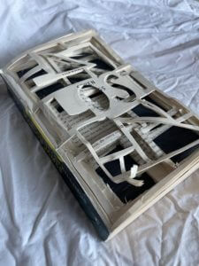
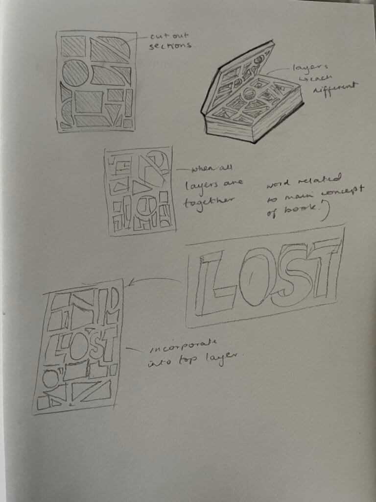
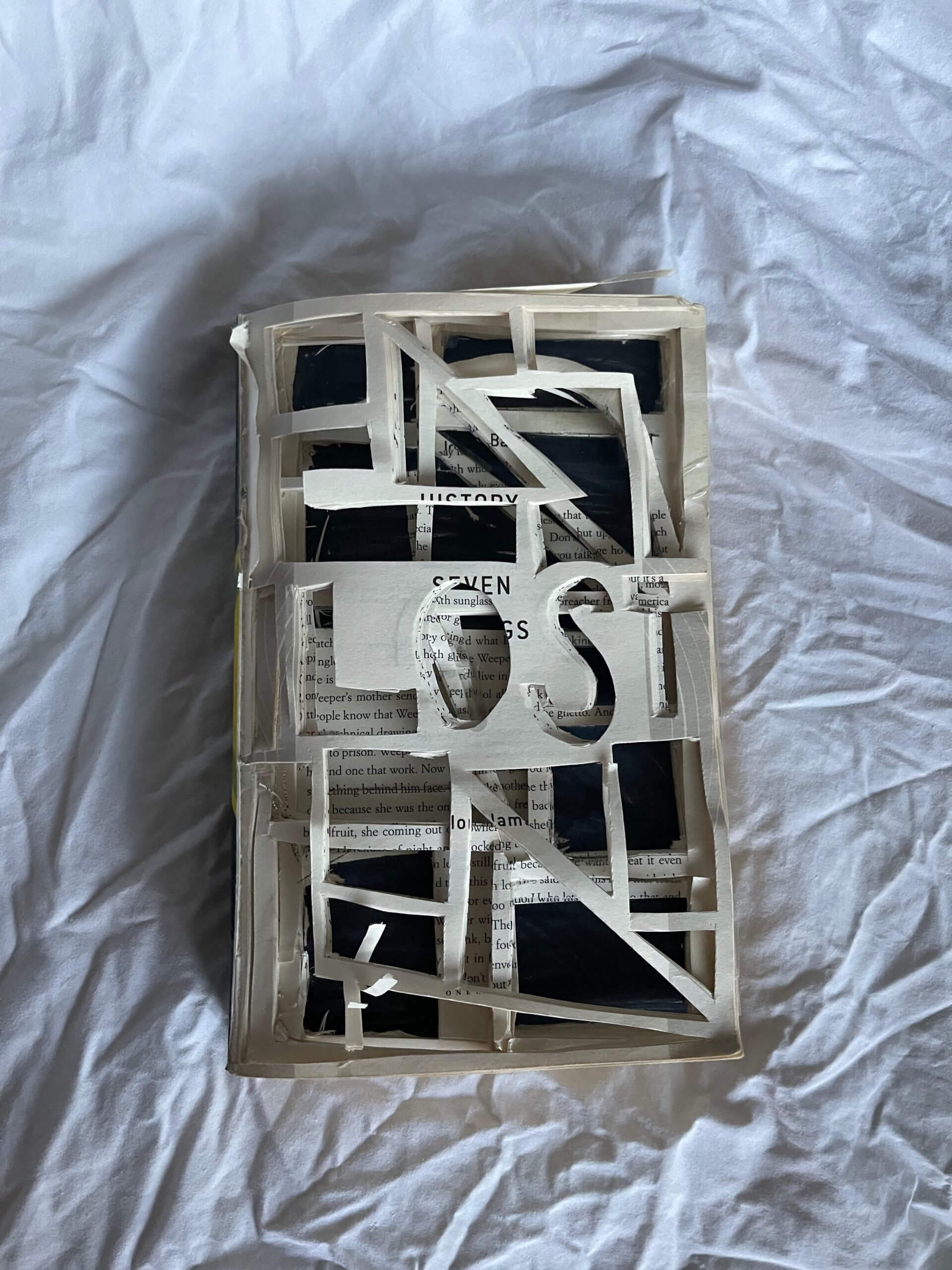
To get a clearer picture of what I wanted to create, I did some research on sculptural books and decided to base my design on the work of Brian Dettmer. From the summary of the story Labyrinth, I decided to focus on the fact the every time a door is opened, the rooms keep shifting position. To express this idea in a physical form I had the idea to separate the books pages into equal sized sections and cut out different shapes in each section to represent the rooms shifting, so that when the layers are laid on top of each other, the book itself looks like a labyrinth.
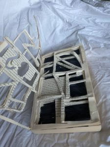
I started cutting out shapes from sections of the book, however due to the thickness of the book, the sections were relatively big so cutting was a difficult task. Because of this, some of the smaller corners and thin strips of paper tore, so I reinforced these with tape, which also made the structure of each section stronger and thus made them clearer. However I decided not to tape up the top section so that it would look more haphazard and confusing, relaying how the family would be feeling at the start of the story.
Reflection
This project really made me think about how to incorporate a concept or idea into an object that already exists, rather than making something from scratch. I enjoyed this project as it was very hands on from the start and had a lot of freedom concerning how we wanted to manipulate the books.
The Little Things
Brief
For this project, search for lettering around the campus based on a theme of your choosing and take photos of it. The theme can be whatever you like – or find, such as style, function, material, colour, texture, technique, and so on. Look everywhere – up, down, straight ahead; on buildings, objects (including cars), and bits of infrastructure (like lamp posts or utility covers). When you’re photographing, get up-close as well as shoot from distance.
Process
After the introduction to the project from Eric, we were left to take photographs for the remaining hour. As I wandered around the department to look for anything that stuck out to use as a theme, I stopped and thought to myself- ‘what if i did the exact opposite?’. So I decided to look for things that didn’t stick out, small examples of lettering that were passed by on a daily basis without anyone looking at them. I found engravings in the handrails outside of the department, university logos printed on the smallest of stickers and even a logo etched into the head of a nail.
Refinement
I decided to sort my photos into three sections: engraved, printed and raised.
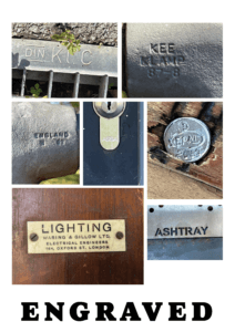
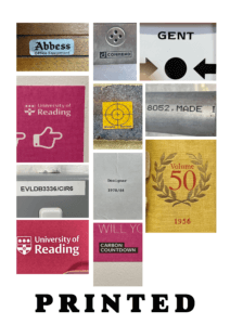
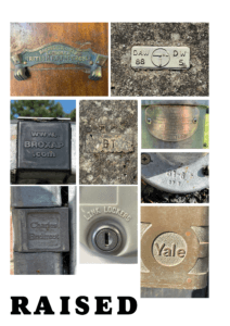
I decided to do this to highlight the differences in materials, textures and creation methods behind each of my photos. For example, a majority of the raised and engraved letters are made from stone or metal, whereas the printed ones were on paper, plastic and canvas type materials. Making these connections made me think more deeply about the manufacturing process of these letters, and the different methods used, for example, after watching lectures from our Printing & Printmaking module, I considered whether metal casting similar to the process of making sorts was used for any of the small metal objects, such as the nail head.

It also made me realise, that while these small letters may not have any kind of significance to a majority of people, they still have uses to others. For example this small website at the very top of a bike rack- no one would ever bother to stop and read it, but if it were to break, the person repairing it would need that website to figure out who made it, and how to fix it.
Reflection
I really enjoyed doing this project as it was much more active and let us think for ourselves about a theme that we could apply to what we were looking for, essentially letting us each create our own unique brief as a development of the original. Doing this project also let me learn how lettering interacts with the environment, and that sometimes type is needed in even the smallest of things, as it can still communicate and has a purpose- not one noticed by many, but essential to some.
Scribble-as-you-go Backpack
Brief
After discussing three unusual/interesting facts with your partner, use these to design an ‘ideal gift’ for them using the ‘Double Diamond’ design process (Discover, Define, Develop, Deliver) by the Design Council .
Initial Ideas
The three facts I was given about my partner were:
- She likes things to be organised, yet she herself just uses scraps of paper to make notes
- She enjoys nature, the colours of it as well as its forms- and especially taking photos of it
- Her favourite colour is blue
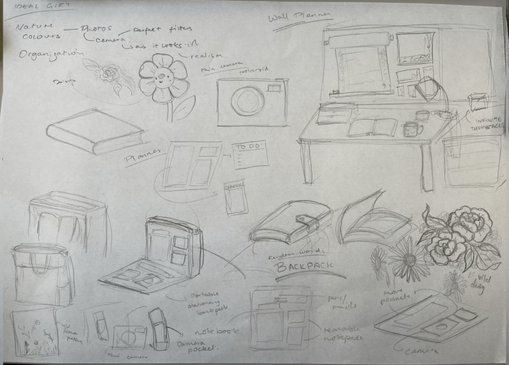
At first I considered going down a photography focused route by designing a camera that would take pictures exactly as she wanted. However it was difficult to incorporate the rest of her given facts into this. For this reason I decided to explore the fact that she likes things to be organised. I started this by thinking about the detail that she uses scraps of paper rather than a full notebook. This made me think of a wall planner to go above her desk with rolls of paper and small paper pads of varying sizes that she could tear off and use. To incorporate her love of nature, I added a wildflower design to the notepads to make the gift more visually appealing, and to create an overall theme for it.
 Development
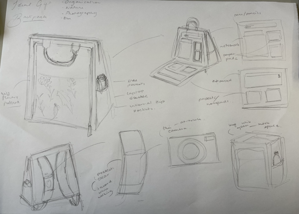
After finishing this design idea, I used the Random Word Technique so that I could develop this idea even further in more creative ways. The word I ended up with was BACKPACK. To incorporate this into my original idea, I took inspiration from a recently popular tote bag from IKEA which has gained a lot of attention for being versatile and practical. Using this bag as a starting point, I thought of ways to include a planner and camera into design. Rather than taking up the space inside of the bag for these, I thought of adding an extra pocket on the outside of the bad purely to hold small pads of paper, a notebook, pens, and pockets for anything extra. To include the photography aspect, I decided to add a small sleeve on the strap of the bag that could hold a slim camera, for example a Paper Shoot camera. Finally, to address her final fact- her favourite colour being blue, as well as her love of nature, I decided to make the bag blue, and add an embroidered wildflower pattern to it to add visual interest and adhere to her preferences.
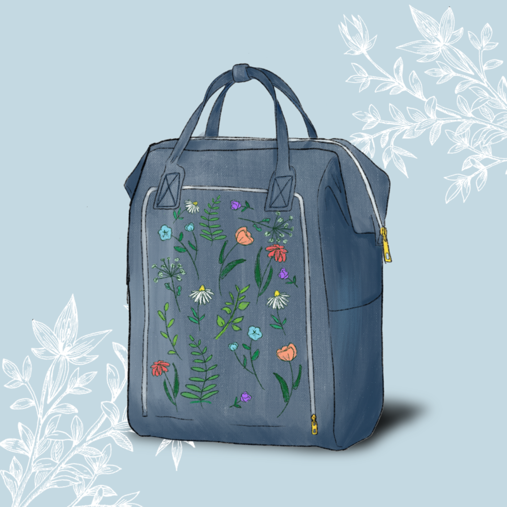
Final Render
 Initially I found it difficult to try and think of one object that could tie together three completely different facts, however I soon discovered that this was the goal of the project: to think outside of the box and generate creative solutions rather than trying to find something that already existed. For example. using the Random Word Technique was new and unfamiliar to me, but I it challenged me to explore different ideas and ways of experimenting during my design process.