Andrew Mangham and Emma Aston from the Classics department at the University of Reading anranged for an exhibition presented in the Madjeski Gallery at the Reading Museum, showcasing works of painter Paul Reid and sculptor Eleanor Crook. This exhibition looks at the ‘the biological and artistic meaning of diversity and difference, and the vital role that history plays in our understandings of the dynamic working of natural history’.
Restated brief
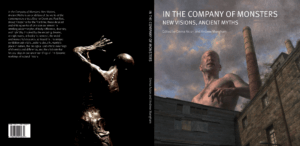
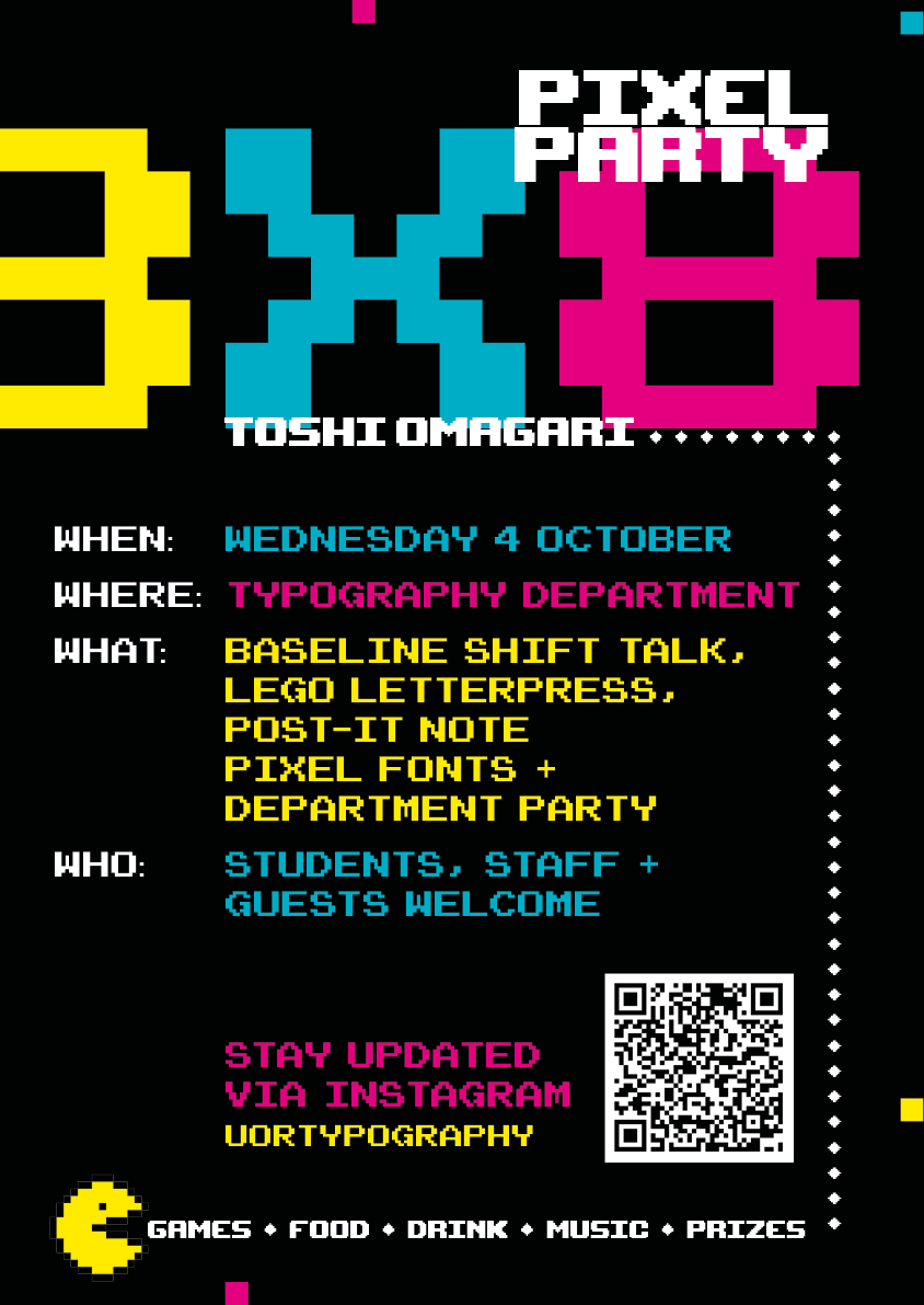
The brief was to design a catalogue entitled In the Company of Monsters: New Visions, Ancient Myths for the exhibition presented in the Madjeski Gallery at the Reading Museum and to design and send this to print in time for their exhibition by the 25th August 2023 (dated decided on towards the end of the project). The catalogue will showcase feature short essays from experts in ancient history, literature, fine art, and gaming as well as images of paintings and sculptures by artists, Paul Reid and Eleanor Crook.
deliverables
Design of front/spine/back cover
Identify images by Paul Reid to create a front cover with presence.
Design of front matter including:
Title page
Table of contents
Acknowledgements
Foreword
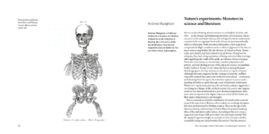
Layout of 6 x 1000 word essays including provided illustrations
Illustrations for decoration and for essays as requested/suggested by client
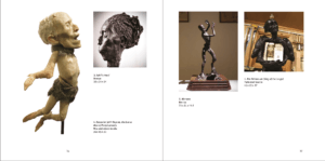
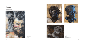
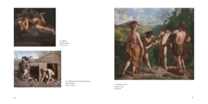
Layout of catalogue of artworks on display, exact number of artworks and images thereof to be provided. Details are: title/date/medium
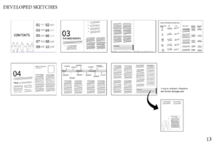
Design process
Research
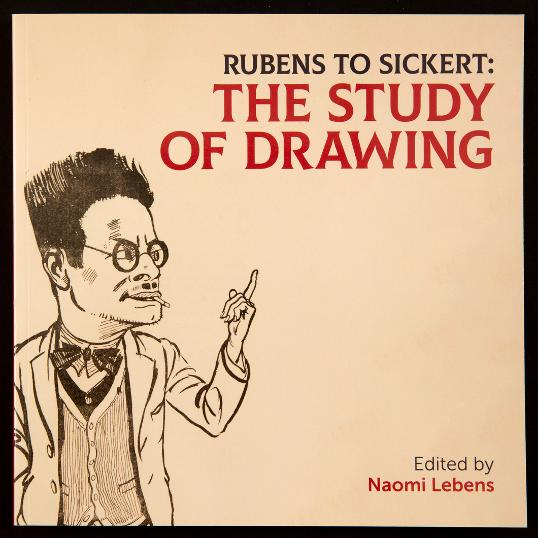
In our initial meeting with the client we found that the aim of the catalogue was to create a catalogue that will effectively showcase the the paintings and short essays. The layout should assist the reader in way-finding in the exhibition.We began by looking at Rubens to Sickert: The Study of Drawing, a previous exhibition book as our client said they would like the catalogue to have a similar design and format.
Rubens to Sickert: The Study of Drawing Cover artRubens to Sickert: The Study of Drawing Inside pageRubens to Sickert: The Study of Drawing Catalogue pages
Ideation
inside pages
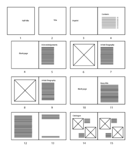
We began by researching what similar catalogue books had done for their page composition. After looking at ‘Rubens to Sickert: The Study of Drawing’ we kept our book in a square format as well and kept some of the same composition like keeping all text on the left with a wide margin for references.
Basic catalogue layout
Cover
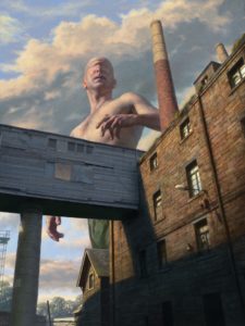
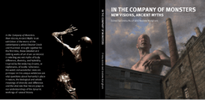
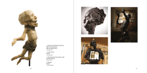
After meeting with our client we learnt that would like to have the painintg ‘The Cyclops’ by artist Paul Reid who is an artist featured in the catalogue and the exhibition.
The Cyclops, 2021 Digital Painting
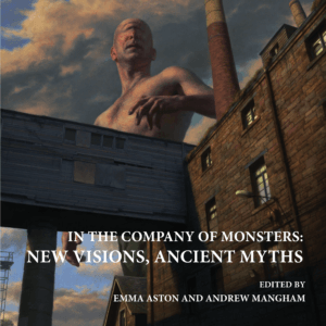
We designed two possible cover ideas, proposal 1 following the themes of the inside pages where it used the same typefaces and alignment and proposal two was a little more experimental using a a more gothic typeface to link more with the topic of the catalogue. After the meeting the feedback was:
Proposal 1:
Likes the serif typeface as it gives a professional quality to catalogue
Proposal 1
Proposal 2:
Likes that the original image wasn’t edited and kept to the correct brightness
Proposal 2
Overall:
Wants the cover to match the seriousness of the pages inside the catalogue.
We decided to continue with proposal one as it was the most liked by the client as it still kept elements from the inside of the book and seemed like it was all part of the same catalogue.
Design development
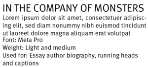
Typography
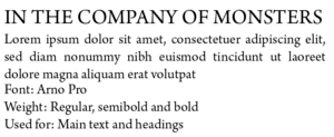
Meta ProArno Pro
Cover
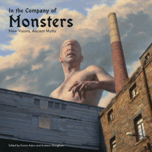
At this stage, Richard had graduated and left and I worked on continuing with this project. I had continued with proposal one but following feedback, the typography and alignment of the inside pages had changed and so I changed the text on the cover to match the inside pages.
Developed cover
Inside pages – Essay
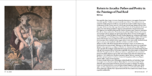
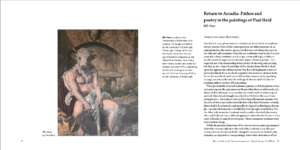
Following feedback, I worked on two different page compositions for the essay portion of the catalogue. Layout one still continued with the long text block on the right side of the page with a wide margin and with the facing page image left aligned. This layout had a lot of white space and made the pages look asymmetrical and a little empty. Layout two used the margin space for the essay author’s biography which helped to fill the space and had a reduced line length for the body copy. The facing page image was now smaller and aligned with the author name on the following page. This layout had better flow and so I chose to continue working on this design.
Layout oneLayout two
Inside pages – Catalogue images
I received the images towards the end of the project but as I had a basic page layout plan, I placed the imaged according to it. I quickly realised my planned layout wouldn’t work as my layout had squared images. I changed my layout so that bigger images would have their own page and grouped smaller images where I could so that the images weren’t too spread out. I felt that layout two had better flow to the pages and continued with designing this version.
Layout oneLayout two
Final stages
I received an unexpected and sudden deadline of a week left to complete the catalogue. During this week, I had to work on completing the catalogue images section. This was a little difficult as I didn’t have all the images till halfway through the week but once receiving them I was able to place them into my planned layout. Through this week I also worked on finalised the cover of the catalogue and carried the decisions I made on the cover through to the title page.
Final cover
Final essay pages
Final catalogue pages
Reflection
We regularly communicated with a clients through teams calls once every fortnight and received relatively quick responses which was helpful during the designing stage as we weren’t waiting on the clients response. However, we had been brought into the project long before we were needed as when we had joined in March, the client didn’t have finalised copy until September and the images for the catalogue images till towards the end of the project. We received a lot of positive feedback after the catalogue was printed and it was well received.
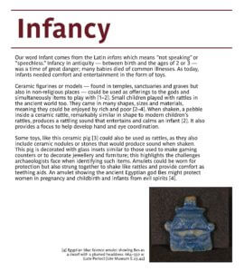
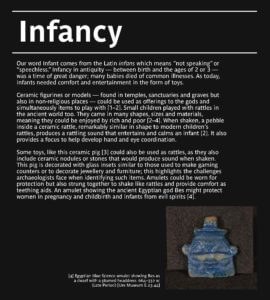
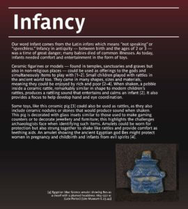
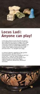
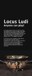
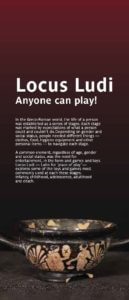
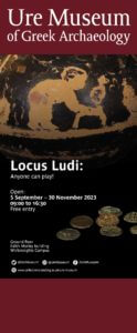
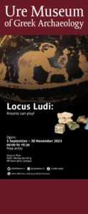
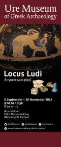
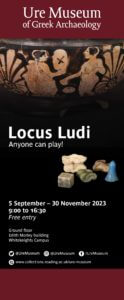
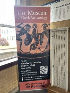
The Ure Museum of Greek Archaeology in the University of Reading had held the exhibition Locus Ludi: Anyone can play! from 5th September – 30th November, showcasing the games played in the ancient world and understanding the educational, societal, and integrative role of play in the past, which is important to understand the present and widen the debate on high tech toys and new forms of sociability. The exhibition’s aim was to show everyone that people of all demographics can engage in playing games and this will be showcased through the exhibition of objects related to various games, ranging from childhood to adulthood. The exhibition aimed to teach the audience about the different games played during the Ludic culture and engage in the interactive activities included in the exhibition and send out the message that everyone enjoys engaging in various games, no matter what age. The exhibition was targeted towards everyone of all demographics as the objects on display range from childbirth to adulthood, as well as including objects related to after death.
Restated Brief
The brief was to design the physical materials for the Locus Ludi: Anyone can play! Exhibition. This included display panels, promotional banner, an online exhibition booklet and educational outreach materials, all of which would be displayed during the exhibition, with the booklet being available online. Most of the details of the deliverables were undecided at this point of the brief and was subject to change during the process of this project, however, having visited the exhibition space in person, it was ready to go forward with drafting ideas.
Deliverables
After discussion with the client on what would work best for each of the deliverables, this is what was decided on:
Display panels:
To be placed in each display space to inform audience of the collections, an overall summary of the exhibition space.
2 promotional banners promoting the exhibition:
First one would be a roll up banner, which would be placed in the corridor of the building for promotion.
The second one would be at the front entrance of the exhibition room.
Information booklet:
An interactive PDF file in A4 format.
Educational outreach materials:
Including information about the games on display
All of the deliverables mentioned above would be submitted to the client in PDF format but was subject to change if needed.
Research
As there was a lack of resources provided during the research stages, there was little research conducted. However, the client had kindly provided us with their house style in terms of typefaces and brand colour, which helped with developing initial ideas for the deliverables. Furthermore, having also paid a visit to the exhibition space to find out the measurements for the display cases, helped with designing the display panels, which would work as supporting materials for the exhibition display items. Research was also limited due to not gaining enough information from the client and poor communication from both sides, leading to months of no work being done from both ends.
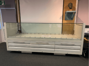
display case for where the museum items were to be displayeddisplay case for where the second half of museum items were to be displayed
Colour palette
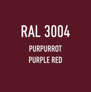
Brand colour chosen for the exhibition
To match the museum’s branding, the client had decided on the colour Purpurrot as the brand colour of the exhibition, as it complimented well with the museum’s branding. Both the HEX code (#691B23) and Pantone code (491 C) was provided, which then helped with developing the deliverables and implementing the branding onto them.
Typefaces
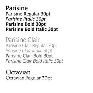
Typefaces used for body text, headings and logo
According to the Museum’s house style, Parisine was chosen as the typeface for body text within the family, the regular, italic, bold and bold italic weights were to be used for body and label texts. The bold weight was also to be used for titles and subtitles.
For listings and item numbers on labels, the client had requested that Parisine Clair was to be used and had also provided an example how all of the styles combined would look like when used in designing the panels and banners.
Example of the house style for text copyThe Ure Museum of Greek Archaeology logo
The museum logo was already provided; therefore, it wasn’t needed to create anything new for that, but nonetheless, the client had provided us with the typeface name used in their logo, in case it was needed.
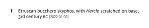
Other important things to consider was that the terms BC and AD when mentioning years were to be used in small caps and that hanging numbers were to be used in body text but lining numbers to be used in object numbers and case numbers. Their house style also indicated that they preferred Italics over quotes for use-mention distinction and use open punctuation for label text.
Design process
Starting off with designing the display panels first, there was three concepts in total. For the first concept, to keep it simple, the brand colour was used for the headings of each section with lines both on top and bottom of the heading. For the text, the house style’s typeface Parisine was applied. Furthermore, images were added on the display panels to support the body copy within them, with added captions to assist readers in understanding the references used throughout, as well as when they walk around in the exhibition space.
For the second concept, the same layout was kept, except for changing the background to black to try and make the display panels fit into the aesthetics of the display items. The third concept reflected more of the brand colour of the museum with a gradient background of dark red fading into black. All three of these concepts were also applied onto the introductory panels that were to be used in the exhibition space.
The design for the banner was kept similar to the banner that was on display during the duration of the existing exhibition and therefore the same layout was used. Modifications for the banner were made based on feedback from my supervisor, including a layout idea suggested by my supervisor himself. The main focus of the banner was information about the exhibition itself, so I tried to emphasise that by using different typesizes and weights to create hierarchy between the sets of information on the banner and balance it out with images related to the exhibition.
Version 1Version 2Version 3Version 4Layout suggestion by supervisorBanner of the exhibition that was open during the process of this Real Job
The design suggested by my supervisor focused on using one image to bring impact to the banner. He suggested making the Ure Museum of Greek Archaelogy logo smaller to avoid attention to it. The aim of this layout was to make the title more. As mentioned in one of his feedbacks: “In general the design lacks impact. Partly because nothing is really big, and partly because there isn’t a lot of space. You can achieve this by making more of the good image and dropping the other one. If not and it has to be small, you could try making Locus Ludi bigger – it could be across two lines in caps.”
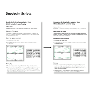
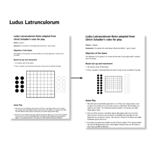
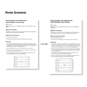
For the educational outreach materials, nothing much was done for it as the client had requested it to be a typical A4 sheet of paper of game rules and instructions and therefore, I only designed A4 sheets containing the game rules and added illustrations, which were provided and then refined by me, onto the document, using different typesizes, weights and spacing to make it presentable
Duodecim Scripta game rules sheetLudus Latrunculorum game rules sheetPente Grammai game rules sheet
.
Final product
During the final stage, due to poor communication, most of the deliverables were not delivered to the clients on time and as a result, the design ideas for each deliverable did not progress further. However, the client was still willing for me to work on the educational outreach materials and therefore over the next week, progress was made on the materials.
In the mid process of refining the materials, the client had requested to submit the educational outreach materials as it was and after making quick adjustments to the files, thet were all submitted to the client.
As this was my first real job, it was a challenge to tackle, with communication being one of the biggest challenges during the whole process. However, the support from the Real Jobs tutors and my supervisor helped me with progressing further with this, despite the final results not being what was expected or desired. Having started off this Real Job as a two person job meant that the responsibilities would have essentially been divided between me and my partner, however, by the end of this Real Job, things had changed and it became a one person job, however, I took this as an opportunity to challenge myself and get as much done as possible. Overall, this was an interesting project to work on as it allowed me to look at the behind the scenes of setting up an exhibition and the thoughts and efforts that go into the whole process. All the skills I had developed and learnt during this project are valuable and I hope to implement them in my future works as well.
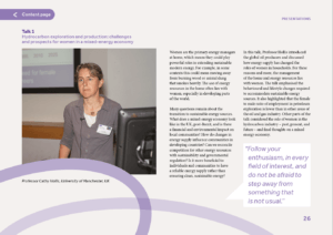
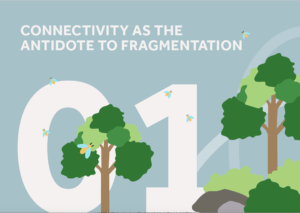
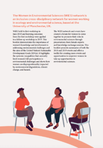
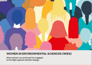
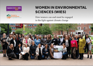
A set of three reports summarising past conferences taking place at Manchester University that will be given out at the June 2023 conference, Connectivity and Inclusivity in HEIs – A solution-based approach. The first report focuses on creativity and inclusivity in higher education and women in environmental science, followed by a smaller booklet that summarises key outcomes from the Women in Science report.
The Creativity and Inclusivity in Higher Education report showcases engaging and accessible resources which convey the methods, processes, and outcomes to key audiences and stakeholders. While also addressing the need for equality, diversity, inclusion, and accessibility (EDIA) initiatives to recognise lived experiences as essential to knowledge sharing and to directly inform practice.
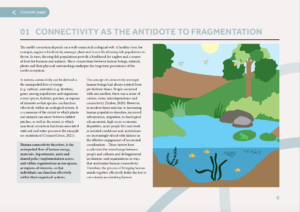
The Women in Environmental Science report focuses on the way that the climate crisis will impact women, how we can bring women together with diverse backgrounds, lived experiences, ethnicities, and disciplines, to promote inclusiveness, widen participation and foster discussion, help to inspire women to engage with their environment and environmental sciences. Focusing on the key themes of Women’s rights and issues that comes with this, climate change, sustainability, leadership, community, relationships, and communication.
Brief
The brief was to create three reports that would be printed and handed out at the next conference, we also had to create interactive PDFs for each report that would be showcased on the website. While also combining elements from the different stakeholders, Manchester University, and the co-brand Engaging Environments.
Our goal was to create an interactive and engaging set of reports containing a strong super-graphic and illustrations throughout to capture the reader’s attention as the content was very text-heavy. The super-graphic we created needed to represent ‘connectedness’ as it was used throughout the documents, tying them together visually.
Deliverables:
Design x3 documents that will be hosted as PDFs with a limited print run.
Deliverables:
PDFs and limited print runs of:
• Women in Environmental Science report (A4)
• Women in Environmental Science Toolkit (A5 Booklet)
• Creativity and Inclusive in Higher Education report (A4)
• Super-graphic
Branding
For the branding of the reports, we needed to use both Manchester University and Engaging Sciences branding. We were given guidelines from both brands which showed us the appropriate usage of logos and typography.
Audience
Looking into the audience and stakeholders was an important part of the process of coming up with a visual identity. Looking at past events from Manchester University which was provided by a video from our client allowed us to create a list of potential users for each report:
Women in Environmental Science
Women working in or with an interest in environmental sciences.
Researchers from the UoM comprising diverse ages, ethnicities, and career stages.
Friends and community partners of UoM
Communities and participants from all parts of the UK
After researching and speaking with our client we came up with a list to cater our work to the specific audience. The client was very open with what he wanted the design to be but put emphasis on using bright colours whilst avoiding gender stereotypes. The client also wanted bold and assertive graphics throughout as opposed to illustrations that could be seen as passive. Our main goal was to create a design is visually appealing, assessable, clear headings, navigation and easily understood data.
Finding a creative direction
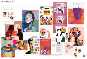
After understanding the content of the reports and the target audience we began creating some mood boards and investigated some existing reports. Showing our client our mood boards allowed us to make sure we were heading in the right direction while also being able to ensure the client was on board with our aesthetic approach before designing.
Mood boardMood board
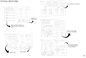
Design development
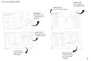
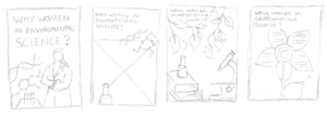
As we had a lot of creative control over this project, we began with some initial sketches based on the mood boards. Overall, the client was excited about these initial ideas but commented how they wanted the front covers to focus less on science and more on hearing different people’s voices while showcasing diversity.
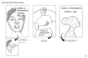
We then went on to develop some front cover sketches based on the client’s feedback by incorporating different women and avoiding science or gender stereotypes.
Developed sketchesDeveloped sketches
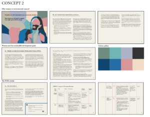
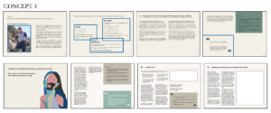
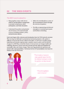
Feedback from our supervisor, we decided it would be better for the pages to be landscape as the content was text-heavy and contained multiple graphs and tables. After further feedback, our client liked concept three as it included a vibrant colour palette and the text in four columns made it legible.
Concept 1Concept 2Concept 3
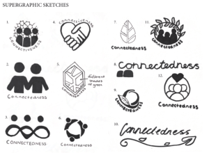
Super-graphic
Our client wanted a logo/super-graphic that would be used to tie all three reports together. The three examples shown were given to us for inspiration, and we then began to create some sketches focusing on “connectiveness and community linking to the natural world element. Nature and ecology”. After speaking to both our client and supervisor, we decided to take a different approach and create something a bit simpler that could be spread across each of the pages as well as shown on the front covers.
Super-graphic sketches
The final super-graphic shows connectedness through two circles overlapping each other, this also helps add visual interest and break up the text-heavy pages.
Final supergraphicSupergraphic in use
Women in Environmental Science Report (WIES)
For the WiES report, we wanted to use bright colours and powerful illustrations that would be relevant and helpful alongside the text. Finding an illustration style was something we found quite difficult at first due to the content being very text-heavy there would therefore be lots of illustrations throughout. To help with this we came up with another mood board to help with some visual directions.
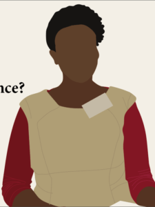
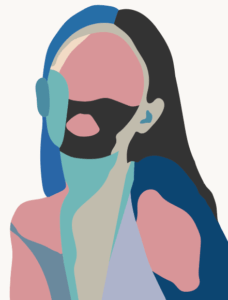
These two images show two different illustration styles that we experimented with showing the use of block colours and female empowerment.
Illustration style 1Illustration style 2
Here are the illustration styles that we implemented throughout the reports. Showcasing women in different relevant elements of the report. We decided on this style as it is simplistic and easy to replicate in many forms while still being visually interesting.
The inside pages consisted of us using different colours for each of the different sections. This worked well in separating each section and carries through in the titles and super-graphics of each page. Through making this report we worked hard in creating visual interest in each page through different illustrations and images. We aimed to keep the pages different and not too text-heavy as this would bore the reader. This visual interest was upheld using speech bubbles are boxes to emphasise the standout information in the report.
A challenge that we faced was coming up with a way to show clear information in a table. Below shows an initial table where we used different shades and lines to separate the information. However, this wasn’t a viable option as it is difficult to read with the line width being too small and not engaging for the reader. In the end, we had to think of a new way to display this information and decided to scrap the table idea and take the information out into its own sections. As you can see this way of displaying information works a lot better as the reader can take a glance and understand the text through the strong visual hierarchy that has been used.
Table developmentFinal table layout
Creativity and Inclusivity in Higher Education Report (C&I)
The client wanted us to focus this report more on nature and humans connecting with the environment. To do so we used blue, green and earth tones for the different sections as well as incorporating illustrations of trees, water, and rivers throughout. Although the two reports have different themes and content, we kept the same structure and illustration style as the WIES report.
C&I page examples
Lessons from Women in Environmental Science (The WiES toolkit)
This report is a summary of the main WiES report but follows a different structure of an A5 landscape booklet. As this report is a summary it has a lot less text but still contains elements of visual interest with a clear structure.
WiES toolkit page examples
Front covers
For the front covers we wanted them to reflect the content inside while also appealing to the reader. We began experimenting with different front covers the first being using an image that spread across the whole page and the other being more of an illustrative approach.
Front cover experimentsFront cover experiments
However, we decided that both of these didn’t fit and also didn’t give the reader an insight into what the report was about. The final cover designs that we came up with use typography and illustrations in a fun and engaging way that makes it clear what each report is about and follows the design inside.
Reflection
Feedback from are client was very positive. “Both of you worked extremely well on the Real Jobs project for Engaging Environments and our partner University of Manchester earlier in 2023. You absorbed a lot of complex information contained within the reports and on our calls regarding the project to produce designed outputs that were of a really high standard and reflected the themes of the work. Our partner was extremely happy with the reports, to the extent that they would like to produce a final report on Pt 3 of the C&I workshop in the same style, and the materials were also very well-received by the intended audiences at the event where these were shared.
You also worked to very tight deadlines, which was impressive given the size and scale of the reports that needed to be produced, and the commitment you showed to the projects throughout was very much appreciated.
I wouldn’t have any negative comments, I thought you both did a great job.”
Overall, this project has taught us many things with the main thing being time management and prioritisation. As it was such a big project with just over two months to complete three printed reports and three interactive PDF’s we needed to be realistic with what we could achieve in this time frame and didn’t have months of planning and sketching time like other projects would traditionally have. We were able to split the project up well to showcase both of our strengths while also allowing us to stay efficient in work production.
After this project we can both say that we have gained a lot more experience in editorial design as well as interacting with a client. We worked on our project management skills making sure the reports were ready for the event. We learnt to take on board feedback from both our clients and supervisors and create different revisions based on our feedback. Worked with branding guidelines, making sure that all the logos were placed correctly and maintained brand consistency. We learnt to address design challenges creatively and find solutions that met our client’s objectives.
Where to find the reports
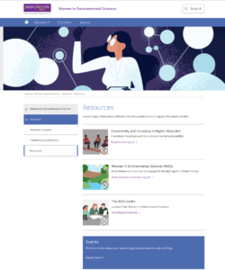
All three reports can be found on Manchester University’s website under the WiES sections.
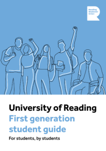
Student-led guides to university is a collaboration of guides with Reading Student Union (RSU) containing personalised advice and guidance to underrepresented and marginalised new students. This is so all students regardless of background or circumstance can feel supported, represented, and empowered during welcome week. Each guide is written by students and designed by students. This ensures the provided insights, diverse viewpoints, and understanding of campus life is more accessible to new students as they feel like they have been understood, creating a sense of community and connection.
Brief
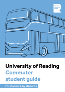
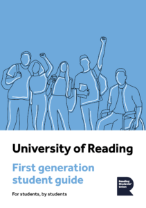
We were tasked with creating two guides: Commuter Students’ Guide to University and First-Generation Guide to University. The goal was to create a coherent visual design across the two deliverables that also had the ability to expand for future editions. The guides need to provide an engaging way to relay key tips and contact information to students. We were provided with the copy, images, QR code and RSU branding but our clients gave us to have lots of freedom with the design of the booklets.
Deliverables
2 print-ready, a5 multi-page guides for commuter and first-generation students
2 interactive PDF, a5 multi-page guides for commuter and first-generation students
Branding
In terms of aligning our design with current branding, we had a relative amount of freedom as the clients wanted to push the idea that the guide was made by students, and therefore steering the design away from the University’s branding helped us achieve this. We were directed away from using the University branding, colours, and recognisable climate stripes. However, we did have to include the Reading Student Union logo.
Audience
We identified our target audience to be new undergraduate and postgraduate students. This meant we had an advantage when designing as we were once the intended audience. We kept in mind that these guides were specifically aimed towards commuting and first-generation students, however we decided that it would be appropriate to design for all types of students so everyone could consume it easily. Understanding our audience was important in portraying an appropriate visual route so we carried out a range of document research aimed at students.
Research and ideation
When approaching this project, we decided it would be beneficial to research existing university guides. Although there were no existing ones that explicitly pushed the idea of being created by students, this process was still useful to recognise the norms of student guides, as well as highlighting areas of improvement so we could compete in the current market successfully. The main things we found out that we wanted to take forward were that coloured backgrounds are a useful tool in visually dividing sections, images can help to make the guide engaging, and icons are helpful in giving a quick overview of what is to come. We also researched varying forms of editorial design so we could understand how different layouts work for portraying different types of content.
University guides examplesUniversity guides examplesEditorial layout mood board
Creative direction
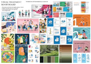
After understanding the content of the guides, the target audience and investigating some existing guides, we began creating mood boards. We discussed ideas and showed the mood boards to our clients to make sure we were heading in the right direction whilst also ensuring the clients were on board with our visual approach. From this, we learnt they were not keen on the corporate style and wanted a more fun and approachable feel with lots of bright colours. The images we were provided with by the clients gave a corporate feel which we needed to steer away from. Therefore, we decided upon an illustration route to ensure our guide would stand out and was known that it was made by students, demonstrated in the fun illustration style.
Visual treatment mood board
Design development
After understanding the visual route, we needed to take, we created some initial sketches for the inside pages and front covers. Our clients gave us the feedback that they wanted a more fun and approachable design.
Initial sketches
We then moved on to develop more sketches which took a more fun and colourful approach. The ideas that were liked the most by our clients and supervisor were concept two but with the line drawing style of concept one. These designs showcase university in a fun and inviting light making new students feel welcomed and accepted by the different communities.
Developed sketchesDeveloped sketches
These are the further developed sketches for both the commuter and first-generation guides. We developed them further by looking into different illustration styles and deciding which ones worked best for these guides. One comment from our clients was that the green could span across the whole page so that the speech bubbles weren’t cut in half. This meant we changed our half colour approach throughout. An element that we struggled with was coming up with a way to make the university services page more exciting and less text heavy. A solution to this was to include icons as well as relevant illustrations to the different points talked about.
Developed sketches for first generation guideDeveloped sketches for first commuter guide
Colour and typography
We experimented with typography looking at clear typefaces that would work well with the style of guides. We decided on using the typeface that the university use, Effra. This typeface works as it is very legible, versatile, and most importantly is accessible with clear letterforms and balanced spacing, making it easy for all students to read.
Colour and typeface exploration
Picking the colour pallet was difficult as we wanted to have a different colour for each of the sections. We decided that a bright colour pallet worked best and found 6 colours that both contrasted and complimented each other.
Final colour pallet
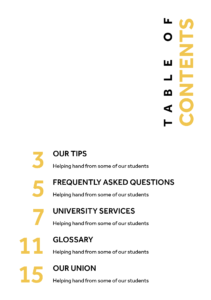
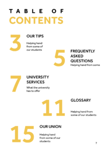
Content page
We did lots of experiments in order to come up with an interesting and easy way to use the contents page. We ended up using the colours from each of the sections to make navigating the document easier. This content page works well as it gives the reader an insight of what is to come whilst sticking to the theme of our guides.
This section’s main goal was to clearly differentiate the five tips. Using big numbers and highlighting the topics of each tip was a successful way in doing this. Changing the colour of the text halfway through proved to be distracting and broke up the flow of reading so we removed the colour from behind the writing. We decided the short introduction provided by the clients would work better as an additional tip so we changed this, which once again enhanced the reading experience as it gave the spread a better flow. A general change we applied to the whole guide was making the section titles sentence case so they were less harsh. Another change that was made throughout was the illustration style. This developed into a more interesting style that had varying line weights and the highlights were less prominent.
Our tips developmentFinal out tips layout
Frequently asked questions
For this section we wanted to separate each question with speech bubbles. We at first kept it simple by having the question and answer inside the speech bubble. Then we were asked to include some images that related to each question. However, after showing this to our client and supervisor we decided that pictures were not appropriate in this guide as we were limited to the student union’s image bank which weren’t relevant to these guides and looked too much like stock images. To ensure we had some visual interest for each question, we continued down the illustration route, creating a relevant illustration for each question. This broke the section up nicely, gives context to each question and tied in with the theme of illustrations throughout the rest of the guide.
FAQ developmentFAQ developmentFinal FAQ layout
University services
This section brought some challenges as it included a lot of important copy which did not allow for experimental design as it needed to be quickly and easily understood by the reader. Some tools we used as a way of bringing visual interest to the pages were colour, illustrations, icons and typographic hierarchy. We created icons to represent “website”, “email” and “phone” as this emphasises the information rather than the descriptive words. Once we moved away from the half colour spreads, we drew this landscape illustration to break up the text so it did not look so heavy. We knew this orientation of illustration would work because the guides were being bound by staples so it could open out flat.
University services developmentFinal university services layout
Glossary
Once again, this section is very text heavy so we had to ensure we created a design that would make it easy to read and highlight that there is loads of help available, avoiding creating an overwhelming scenario for the new students. We started off by using a rule to divide each definition, but this was deemed as too harsh. We then adapted our design to reflect a dictionary which was effective as it helped with navigation of the section, but it created too much white space and made the glossary too long. To develop it further, we stripped it back to just typography but used space and typographic differentiation to create an interesting but accessible design.
The union page was a page that was introduced later in the project. We created and illustration of a band playing at the student union as well as the outside of the union building. As each guide had different amounts of copy for this section, we adjusted to this by moving the band illustration down to allow for some more room.
Final union layoutFinal union layout
Cover
Our approach to the covers was to reflect what could be seen on the inside, illustrations and coloured pages. We went through many iterations in order to find a suitable combination of elements that sat nicely together on the page, as well as act as a tool in attracting people to pick up and read the guide. We introduced this blue colour as it is bright, fresh and positive which is a nice message to put across to new students. The illustrations had to represent the overall theme of each guide, first-generation students being relatively difficult to sum up but we decided that an image of students together and supporting each other was the appropriate message to put across.
We experimented with the placement of the blue block with the illustration on top and were advised to ensure there was a white section on the cover where the text could sit as we have kept typography on white backgrounds as a general rule. There was a stage in the process of designing the covers where we proposed the tagline of ‘for students, by students’. We thought this would be a useful way of emphasising the fact that these new students will be getting first-hand advice from current students. Our clients and supervisor were very fond of this tagline and we were suggested to create a sticker motif. However, after experimentation this did not work with our design as apart from the illustrations, we do not have any rounded graphic elements within the guides. The last major change we made was changing the text from all caps to sentence case. This made a huge difference in how approachable the guide felt as before it could have been portrayed as harsh, especially as the title was seen in a heavy weight of the typeface.
The RSU was requested to be added to the covers much later on in the project. This further solidified our choice of where to have the blue section as generally, logos are found in the top right corner of documents.
As for the back covers, we chose to reflect the design from the front cover, just with illustrations that appeared as those you were looking at the ones used on the front covers from the back.
As part of our brief, we needed to make interactive pdfs for each guide that will be hosted on the university website. To adapt our design to this function, we made buttons for the top right corners taking you back to the content, enhancing navigation throughout the document. We also made sure that all the links were clickable making it easier for our users to get the help they need.
Final Interactive pdf layout
Our own reflection
Overall, this project has taught me many things, number one being how to interact and communicate with our clients on a weekly basis. We learnt to address design challenges creatively and find solutions that met our client’s objectives. To meet our deadlines, we needed to have good time management skills sticking to our schedules. After completing this project, I feel more confident working on real briefs and look forward to working on more. – Daisy
I have learnt and improved on lots of skills throughout this project which I will be able to take forward and build on in future projects. We learnt to collaborate effectively by identifying each other’s strengths ad using them to our advantage to efficiently create these guides. This job brought about my first experience dealing with clients, but it was a very positive one as we worked well with them due to frequent contact and honesty from both clients and designers. Another skill I have had the opportunity to improve is file management and how to present work in a professional manner to the clients. We did this by creating annotated documents of our work so when we couldn’t show them a printed prototype of the guides and verbally go through the reasonings behind design decisions, the clients could understand the justification and edits we made in order to give us relevant feedback. Additionally, regarding file management, we had a shared folder that contained everything we created and needed for the project which ensured for a coherent experience when designing collaboratively. It helped that us as designers were often communicating with one another as well. One thing we could have improved on was proofreading the copy. Although we were assured that this had been done, we ultimately should have read through it thoroughly ourselves to ensure no mistakes were made. – Jasmine
The feedback we received was positive from both our clients. “We quickly built a friendly working relationship with you that enabled us all to synergise well as a team. I was very satisfied with the level of communication and the quality of the product. You were always both highly professional. Jasmine, you impressed us with your client management skills and struck a diplomatic balance between incorporating our suggestions and pushing back on them where necessary – I appreciated that. Daisy, you impressed us with your illustration and design talent, lending a unique hand-drawn style that enhanced the aesthetic and appeal of the design.”- Matt
Universal Voices is a free community choir for children aged 7-12 at the Institute of Education (IoE), run by Dr Rebecca Berkley and a volunteer student team. Singing Communities is a project funded by the UoR Communities fund. It is an inter-generational song sharing project, where the children in Universal Voices ask an elder member of their family (grandma, granddad, aunt, uncle, friend) to teach them a chant, singing game or song that they knew when they were children. Through this community, Rebecca aims to highlight the different cultural backgrounds of the students. Through the eBook, she aims to also disseminate it to the local primary schools, to allow them to teach their students and also spread multicultural values to the students. Therefore, our aim as desginers, were to create an eBook that would allow users to both learn and engage in various cultures through the joy of music.
Restated Brief
As mentioned previously, based on the client’s goals, our brief was to create an eBook that celebrated the different cultures through songs collected by the children through their family members, with both front and back covers. This meant creating an identity that was playful and innocent, to reflect the contribution of the children, but at the same time informational, to reflect the educational value of the songs. All three of these elements needed to be balanced as Rebecca had mentioned that she aimed to distribute and use the eBook as an educational material for teachers to use, therefore, we had to make sure that it would be accessible and easy to navigate and understand.
The client had also requested us to design the eBook on Canva, with them also kindly providing us with the Pro version of this website to use during the designing of the eBook. This was so that it would allow them to make changes or add more songs in the eBook in the future. This was a new challenge for both me and my partner, Zainab, as we have never used this app before for editorial design, but nonetheless, was excited to start on this, as this meant that it will allow us with new skills and experience.
Furthermore, after further discussion, we had also agreed to refine their existing logo to allow them to have better formats of the logo for their future use as well as improve the clarity and quality of the logo.
Deliverables
After the initial meeting with Rebecca, and going over multiple options, we opted for an eBook that would be interactive, where each song will contain:
Supporting music score
Embedded video and audio links
Lyrics, along with phonetic pronunciation and translation (if applicable)
Description about the origin of the song.
For the book covers, the client’s vision was to make an inclusive and interesting cover but was open to discussion with us and therefore we were given the creative freedom to work on this.
For the logos, we agreed that we will provide the client with two sets of files, containing the appropriate file format, depending on whether it would be used in printing or on screens. The formats decided were:
EPS, PDF, and TIFF files for print use
SVG, PNG, and JPEG files for screen use
Research
When discussing the work with the client, she had mentioned that she was inspired by Nordic Sounds, an online e-book containing ‘pedagogical collection of traditional music, dance, songs, games, rhymes and lullabies from the Nordic countries: Denmark, Faroe Islands, Finland, Greenland, Iceland, Norway and Sweden’ (taken from the description used in the website) and although the website uses illustrations to support the songs, for this project, the client had decided not to include any illustrations as all the songs are from different cultures and would have no correlation between each other.
Moodboard
To help with developing our ideas and visualising the theme we aimed to design, we also collated a series of moodboard to help with this. Each moodboard contained ideas and pictures of a singular theme and using each of them helped us during the design process.
Moodbooard to visual the general ‘feeling’ of the eBookMoodboard for typefaces, colour and shapesMoodboard for cover design
Colour palette
The client requested that we somehow incorporate the colour palette used by the Nordic Sounds website onto the eBook and therefore we tried doing that through taking the colours from their wordmark logo in the home page. However, she wanted them in pastel tones as they believed that the colours used in the Nordic Sounds website are quite bright. The choir consisted of children who are really young so therefore she wanted pastel colours to be used to make it soft and easy to read, instead of it being distracting with the bright, bold colours. They had also asked us to use a light beige colour for the background as this was what they use for their backgrounds in presentations.
Colour palette derived from the Nordic Sounds wordmark logo
Typefaces
For typefaces, we mainly went for the theme of childness and innocence, and therefore, focused on typefaces that resembled children’s writing or overall appeared handwritten. At the same time, we tried choosing typefaces that were legible and had a range of different weights for flexibility, however this was limited, as we had to choose from the list of typefaces available at Canva only and most typefaces had limited weights or had none at all.
List of typefaces explored
After going through a range of typefaces and showing it both our supervisor and our client, we decided on Children One for the headings, and Childos Arabic for the body text. The different weights within Childos Arabic allowed us to create hierarchy within the body copy and also separate the song lyrics from the translation and phonetics. As some of the songs had lyrics in its native language, we had to find typefaces similar to Childos Arabic to accommodate. The combination of Children One and Childos Arabic worked well, as Children One highlighted the childlike appearance of the book and also reflected the contents of the book with its uneven letters, and it was well balanced by Childos Arabic, a Sans Serif, with its roundedness and flaired descenders.
Chosen typefaces
Kids’ drawings
Since the children of Universal Voices were involved in the collecting and recording of the songs, we also wanted to reflect that on the eBook visually, and therefore we decided to do this on the front and back covers of the eBook. In order to do this, we paid a visit to the children during one of their rehearsals, where we got to talk to them about what they love and think about Universal Voices.
First time visiting Universal VoicesExample of one of the slides presented during the visit to the Universal Voices rehearsal
After gaining some insight from the children themselves, we had also prepared an activity for them which involved them drawing out what they had told us regarding Universal Voices. This proved to be very productive, both for us and the kids, as this kept them engaged and also allowed us to have a good collection of drawings to select from when making the covers.
Example 1 of some of the children’s drawingExample 2 of some of the children’s drawing
Design process
Sketches
To start off, with the advice of our supervisor, we sketched out layout ideas, focusing on clear and concise layout, as the goal was to make the pages be as much easy to navigate as possible and some of the layouts, we considered were having text on one side with all the images based elements to be the other side and vice versa. We also sketched out layouts where we made use of separating the content into top and bottom halves.
In our initial layouts, we wireframed some quick layouts to show to our supervisor and after getting feedback on how to create better layouts, as we had initially lacked the creativity in our design ideas, we went back on track and started using colour and different combinations of typefaces to create layouts, allowing us to better understand what worked well.
Some of the layout ideas we tried out involved colour coding each section of the spread, or by blocking each section in colours, as well as having a coloured background and playing around with placements of the score sheets and the video and audio links.
Layout idea 1Layout idea 2Layout idea 3Layout idea 4Layout idea 5
Reflecting the song’s origins
To make the eBook more educational and make it engaging for the readers, we brought up to implement another way kids can learn more about the origin of the song with a more visual approach, instead of only having a written section at the bottom of each page. Therefore, we suggested to add the flag of the country that the specific song originated for. In one of our suggested layout designs, the client had really loved the idea of the pages having a coloured border, which reflected the colours of the representative flag and therefore, to keep them consistent, we added those borders onto the prelim pages of the eBook as well, but instead used a combination of two colours from the main colour palette.
Example 1Example 2Example 3
Refining logo
Since the logo only required refinement, the only thing done was redrawing the main element of the logo and vectorise it in illustrator. The original logo was used as a reference to redraw and for the typeface used on the logo, Futura was used as it resembled the closed to the original. The logo was drawn in three different colours: black, white, and red, with red being the brand colour, as the children in Universal voices wear a red t-shirt while performing in events and we wanted to reflect that on their logo as well.
Original logoRefined logo (in black)Refined logo (in white with red background)Refined logo (in red)
Covers
As previously mentioned, we wanted to reflect the kid’s contribution to the making of the eBook and decided to do so through the covers. Having collected their drawings during the visit to one of their rehearsals, all of them were scanned and using both Canva and photoshop, the covers were made. Using Canva, I added in the selected drawings and created a collage. I specifically chose drawings that reflected very clearly what Universal Voices meant to the kids, as well as using hand drawn lettering done by one of the children as the title of the eBook, to highlight the innocence and enjoyment of the children and also reflect what the eBook was about. A crumpled paper texture effect was added onto the background of the covers to once again, reflect the childish nature of the eBook.
Front coverBack cover
Final product
Combining different elements from each layout idea, we made our final design where each section was colour coded, and it was specifically emphasised for the video and audio links where the colour coding stayed consistent throughout the pages and this was useful as it allowed users to know which link referred to the audio or video as some songs only contained either one of them.
It was a great success, as we managed to deliver the eBook to the client on time. we also had the opportunity to present our work on the launch day of the eBook in front of all the kids and their families.
“At the launch of the e-book in November 2023, Jaf and Zainab came and presented to the audience explaining the work that they had done. Their presentation was clear and interesting, and they both spoke very well.”
– Rebecca Berkley, Artistic Director of Universal Voices
Attending the launch event of the Universal Voices eBook
Furthermore, the client was very impressed with our work and loved the use of borders in the book and keeping a clear layout as mentioned below:
“They communicated regularly with me presenting draught ideas for the layouts for each page and the overall design of the book. They were very good at taking my ideas and turning them into reality. I was particularly impressed at how careful they were to make sure that their rendering of my ideas matched my vision. They were always cheerful, helpful, accurate and delivered on time. They made several suggestions about the layout which also improved the content of the book. Their communications were always professional and they delivered the product to the agreed timeframes. When we had to make an adaptation to the deadlines or the content, they were always very helpful in accommodating that. The overall design of the book was delightful. They created a visual style for the book which had a primary school feel to it, using bright colours and a clear layout. They matched the borders of each page to the colours of the national flag of the language of each song, which was a lovely detail in the design.”
– Rebecca Berkley, Artistic Director of Universal Voices
Self-reflection
Having the children involved within the designing of the book was a very lovely experience, as I got to see their creativity and apply that onto my own as well, and seeing their lovely work really inspired me to work on this eBook more efficiently. Knowing that the children liked the cover of the eBook was very heart-warming to me and made my experience working on this eBook very valuable.
“Jaflenur and Zainab came and worked with the children in Universal Voices to create artwork for the front and back covers of the book. They asked the children to draw pictures and write sentences about what the choir meant to them, and then copied the children’s art work and made a collage for the front and back covers. The children really loved seeing their art work in the e-Book. It was particularly popular with the children, because every child could see their artwork in the book and it made the book very special to the children. I have found working with both of them fantastic. Their credit to their department, and a really good example of what a great programme Real Jobs is.”
– Rebecca Berkley, Artistic Director of Universal Voices
The client Bethan Miskell does press flower artwork and wants to sell her artwork online. Bethan had not started the business and she wanted to set up a brand to promote her artwork and her message. As her business was in the beginning stage, she did not have ideas for a particular style yet, but she mentioned some preferences she would like us to follow on the design in our first meeting.
The client’s press flower artwork
Restated brief
Bethan wanted to use her artwork to emphasise and celebrate the importance of plants or weeds that may be overlooked or not seen as typically ‘pretty’ but were increasingly considered to be ‘hero’ plants and essential for biodiversity. We needed to create a unique brand to convey Bethan’s intended message.
The three deliverables are a logo, a business card, and a ‘thank you for your purchasing’ card. The brand logo will be used across all platforms like Bethan’s website and social media. Also, it will be applied to the cards. Our client also mentioned she did not need a physical mock-up of the cards, so we only need to create them digitally.
The target audience for Bethan’s business is people who are interested in floral decoration and the preservation of nature. These people tend to be women around the age of 50 and above. The effectiveness of the deliverables was measured by receiving customer feedback from a set of questions, and by frequently reviewing the brief to ensure the items meet the client’s requirements.
Research and ideation
Example of wordmarksExample of logo sets
First, we explored different kinds of logo designs like monograms, wordmarks, symbols and lettermarks and explained to Bethan about their characteristics. Bethan did not like the lettermark. We thought wordmark could work best for introducing Bethan’s business as she wants to use her full name as the brand name. It is simple and recognisable to combine words with images.
We found that businesses usually have some logo variations so that they can fit on different platforms more flexibly. For example, logos with a longer width can be used on website banners. However, it is not suitable for an Instagram circle icon, so they need a more abstract one. We therefore decided to create a primary logo, a secondary logo, and one for social media.
The client’s moodboard
Competitor Jam Jar Edit’s logo for websiteCompetitor Press Floral’s logo for website
We also did research based on the keywords that Bethan used to describe her business which were ‘biodiversity’, ‘botanical’, ‘organic’, and ‘wildlife’. She created a moodboard with mainly plants and a layout of logos she liked and wanted us to get inspiration from. Besides her moodboard, we studied other competitor websites and their social media which are related to botanic for inspiration like Jam Jar Edits, Pressed Floral, and Refined Studio.
Heidi Clover’s logoInitial sketches
Bethan especially mentioned that she liked the style of Heidi Clover’s logo, so we knew that she wanted simpler illustrations and typefaces. It helped us to develop some suitable initial sketches for her.
Design development
Logos
Typeface options
Fern illustration ideas
Bethan did not like the handwriting style or rounded and curvy fonts, but she wanted bolder spaced-out typography. Based on her requirements, we found a range of simple and neat san serifs for her to choose from for example, Josefin sans, Articulat CF, Serenity, and Quasimoda. We also experimented with different weights of the same fonts, but we could not make a decision before combining them with the illustration to see how they balance. I personally did not like Josefin with the sharp ascenders as it did not look friendly and Serenity because the bold soft strokes looked weird on Bethan’s business. We suggested she choose Quasimoda which looked fresh with a thinner width and a normal x-height.
For the illustration, at the beginning, we tried to combine illustrations of plants into Bethan’s name and showed them to her. Bethan liked fern more because she thought fern could represent the ‘hero’ plant. Therefore, we carried on designing different styles of ferns for the symbol. For example, the line illustration, without or with strokes and details, and the shape of leaves. Bethan and my team chose the thinner fern between her name for the primary logo because the other looked more decorative and heavier.
Secondary logo options with filled symbolsSecondary logo options with not filled symbols
Other secondary logo illustration options
The secondary logo is based on the primary logo but just changed the layout to make it narrower and could be used on other suitable platforms. Our supervisor suggested we show three options to Bethan for both with and without filling. They were with or without dots surrounding the fern, the horizontal ferns between Bethan’s name, and the vertical fern next to her name. We all liked the filled option and the vertical fern placed next to Bethan’s name. It incorporates the primary logo better as both of the ferns are vertical. The fern with dots option was not suitable because it was too complex for Bethan’s style.
Social logo options
For the social one, we provided four plant options and two different layouts for Bethan to choose from. Because she chose the primary logo with the fern, we suggested using the same plant across all the logos to make them consistent and the brand identity could stand out more. She liked the idea of placing the plant in between the two letters to make the logo look balanced. In the end, we created the logo sets in both white and black so Bethan could use them according to her needs more easily.
Final version of the logo set
Business card
The business card is 85mm in width and 55mm in height. For the front, we considered two concepts mainly. One was used illustration that was connected to the logo. Another one was to use Bethan’s artwork. We asked Bethan if we could borrow one of her artworks and scan it for the press flower elements. She liked the idea of including her artwork’s elements on the card as a mini version of her artwork. It can promote her business more effectively because people can immediately understand her style instead of spending more time to search her artwork.
Experiments on colours and layouts of the business card
We explored different layouts with the press flower elements placed partly on the bottom, in the centre or close to the edges. At the same time, we changed the black background that Bethan usually uses to some natural colours based on the keywords Bethan mentioned like, beige, brown, mint, teal, and dark blue. We found that dark blue worked the best because it balanced the style of Bethan’s original artwork with a formal business card style.
Further developed business card idea
Our supervisor thought the idea which had a dark blue block in the middle with a press flower could be further developed. Rather than the one with flowers surrounding the block, she commented that keeping the format from Bethan’s artwork would be better. To make it look more interesting and livelier, our supervisor also suggested we extend the flower outside of the block.
Final version of the business card (front)
Final version of the business card (back)
We tried to use illustrations to decorate the card at the back, but we were given feedback from our supervisor that it was not consistent with the front design. So, we continued the press flower block. The icons that represent different contact methods look minimal, so it does not make Bethan’s artwork ‘overshadowed’. We used the ‘Lexend deca’ light typeface which is balanced with the icon’s weights and Bethan’s requirements on typefaces.
‘Thank you for your purchasing’ card
Example of ‘Thank you for your purchase’ card ideas
For the ‘Thank you for your purchasing card, we decided to continue a similar style and layout with the business card. It was the same size as Bethan’s business card. We kept the continuity by using the press flower from Bethan’s artwork instead of creating a new illustration. We showed a range of options to our supervisor for feedback.
Further developed ‘Thank you for your purchase’ card ideas
In the beginning, we experimented with a block in the centre surrounded with flowers, it just looked like the business card with another format. Therefore, we did not keep the idea. To show the consistency of the two cards while making them distinguishable, we chose another geometric shape, a circle. We placed a similar group of press flowers from the business card into the circle, so they looked similar in style. We chose the typeface ‘Montserrat’ for the text from a range of San serifs because we liked the clean and elegant strokes. The size contrast of ‘Thank you’ with ‘for your purchase’ emphasised the sincerity.
Final version of the ‘Thank you for your purchase’ card
For the final version, we wanted to show the consistency of the two cards while making them distinguishable with different geometric shapes. We placed a similar group of press flowers from the business card into the circle. We used the social logo for Bethan’s brand instead of the other two because the card is sent with the customer-purchased items. The customers must already know about Bethan’s brand so this logo is used like a sign so we did not want it to look too extra.
Reflection
We expected that the project would be completed in December, but our deadline was extended until January. Even though it was agreed by the client, I think we could manage the time better. We spent too much time exploring the logo design at the beginning which made us not have enough time for the cards by the end of the expected deadline. We can show more variations to the client at the same time so she can pick one that she liked earlier.
The thing I learnt from this project was to always ask for more details to ensure what you are making is what the client likes. The client may not have an idea of how they want the design to be presented sometimes because they are not professional designers, but they have their preferences and thoughts. We should not be afraid to contact the clients often to check if they have any updates or further requirements during the design process.
Also, this project improved my confidence in communication. I feared expressing my concepts and showing opposite thoughts to others, but I feel comfortable communicating with my teammate as we respect each other’s ideas, and the client is supportive of our work.
The client for this project was the Manuel Bravo Project, a free legal representation for asylum seekers and refugees based in Leeds. The organisation recently had a rebrand of their logos and letterheads, causing them to look for new physical outputs to help enhance the new branding. There are two different branches of the Manuel Bravo Project – In-house and Outreach. They are aiming to look for ways to appeal directly to these different target audiences.
Restated brief The client originally requested two leaflets to appeal to their separate target audience; In-house and Outreach. However, we suggested to help raise further brand awareness, therefore by having a physical banner, it would be a useful output for the organisation can use at charity events to help draw in new support and clients.
Due to the organisation’s two branches, our client wanted us to incorporate the different brand colours within the leaflets, to ensure the correct information is being received. With their green colour symbolising the Outreach audience, and red for the In-house casework audience. Our client has distinct target audiences – clients who are often new to the country with limited English, corporate/funder audiences who need to know a bit more about our background, and volunteers/partners who we recruit to help them with their work.
Final deliverables:
2 A5 2pp leaflets
2m portrait banner for physical use
Research
The first stage of the project began with research to understand the Manuel Bravo Project. We used information provided by the client as well as their website to gain a thorough understanding of the charity’s background and its mission, vision and core values. We identified that our main target audience was those who spoke minimal English and therefore knew our designs needed to cater to this. However, we also recognised a secondary audience such as volunteers and donators, so we wanted to make sure our design resonated with both demographics.
During the research process, we analysed various charity leaflets for inspiration. We noted that many of them tended to be overcrowded with information, potentially overwhelming for the readers. This was something we needed to avoid especially with our primary target audience. We aimed to structure the leaflets in a way that prioritised clarity and ease of understanding, by focusing on hierarchy and simple messaging.
Designing We commenced the design process by experimenting with various leaflet styles through sketches, considering different layouts. After visualising each exploration, we opted for a simple double-sided A5 leaflet design. We felt this choice was best suited for its intended target audience, as there was no complexity of what pages of the leaflet were to be read first. Our client agreed with this decision and during a feedback meeting with him, we further discussed his favoured options for text and image placement.
On the front of both leaflets, we highlighted the charity’s mission, vision, and approach as well as a concise overview description. For the back of the leaflets, we tailored the content more specifically to each branch of the organisation – In-house representation and Outreach services.
Furthermore, to address the main target audience, we thought it would be useful to enhance the accessibility of the leaflets for those whose first language isn’t English. We proposed the idea of a scannable QR code translator on both leaflets for users to access relevant information and resources in their chosen language.
Figure 1: Leaflet sketch 1
Figure 2: Leaflet sketch 2
Figure 3: Banner sketch 1 & 2
The banner was designed after the leaflets were finalised. Initially, we struggled with how to represent Manuel Bravo in a banner format. The real jobs meeting was extra helpful during this stage of the design process as tutors and peers helped us refine our banner design. We focused on maintaining consistency with the leaflet designs by carrying over key design elements such as typography and illustration style. One of our illustrations was adjusted to sit perfectly on the banner and it was able to fill in white space that we initially struggled with.
Meetings with the client and the real jobs team helped us guide our design decisions to create the most effective designs. The client was helpful in providing minor tweaks for us to change throughout the project.
Imagery We created engaging and unique illustrations to present on the front and back of the leaflets. The illustrations allowed us to depict diverse characters. The characters on each leaflet wear the corresponding colour attire to reinforce the differentiation between the different branches of the organisation and to maintain brand consistency.
We opted for illustrations over photography, as the organisation wanted to move away from the photography direction. Having previously used images of Manuel Bravo himself in promotional materials, it felt inappropriate to them to plaster his image all over their outputs and social media. Our illustrations provided a more respectful alternative and maintained privacy and sensitivity.
Figure 4: Initial line drawing illustration
Figure 5: In-house front page illustration
Figure 6: Back illustration for both leaflets in the In-house colour palette
Figure 7: Outreach front page illustration
Copy While specific body copy was not provided to us by the client, we took the initiative to select words that we felt best represented the Manuel Bravo Project’s ethos. Drawing from our research and understanding of the organisation, we chose messaging that we felt was most important to display and we are confident that our banner design will help Manuel Bravo Project raise awareness and gain additional support.
Figure 8: Leaflet version 1
Figure 9: Leaflet version 2
Figure 10: Leaflet version 3
Final outputs
Due to the client being based in Leeds, we weren’t able to see the deliverables go to print. To reduce printing costs we, sent our client print-ready PDFs of each of our deliverables. To help the client we also provided them with rough estimates of the print production costs from CPS. To help the client visualise our leaflets and banner designs, we provided him with mock-ups to showcase the final deliverables in their potential environment.
Figure 11: Mock up of finalised leaflets (front)
Figure 12: Mock up of finalised Outreach leaflet
Figure 13: Mock up of finalised leaflets (back)
Figure 14: Mock up of final banner
Reflection
Although the designs of this real job are simple, we wanted to ensure each of the deliverables were easily accessible and understandable for the client’s target audience. Therefore, by providing the client with the option of having a QR translation code, it gave the client’s target audience a quick and efficient understanding of what their organisation does.
The job did come with its challenges, with the client’s recent rebrand, and no printed documents prior to our deliverables, the client had only been provided with RGB-coloured logos. This meant that when the documents were to be printed the colours would come out slightly different. To prevent this, we decided to create a CMYK colour conversion for the client to use in future output designs to ensure all future printed materials match our deliverables. This will ensure their branding remains consistent.
Additionally, due to the client’s excitement about their rebranding and utilising their new logos, it caused a delay when providing us with other materials that we needed such as the body copy. They initially weren’t sure on the copy for these deliverables, which created some delays as we struggled to format the leaflets with the missing text.
Another problem faced was incorporating their new logos. The client sent us versions of the logo that weren’t useable in our outputs as they hadn’t been sent in a high enough quality. Eventually, the main In-house logo was sent to us in a high-quality format, but the client couldn’t seem to provide the same with for the Outreach logo. This meant we had to use the In-house logo he sent to recreate the Outreach logo. At the end of the project, we sent this new logo for them to use in all future designs.
Figure 15: Initial Outreach logo provided by client
Figure 16: Final Outreach logo created by us
Creating leaflets and banners was a new experience for both of us. This real job was invaluable and helped us develop new skills that we can take forward in similar future projects. We also got to experience real challenges that we may face in the industry.
This real job involved creating weekly posts of the departments events and students’ projects throughout the year. This year we wanted to change the perception and aim of the Instagram, by broadening the design content for prospective, current and alumni students. Previously, the account has focused on events and design-based posts, however this year we wanted to boost engagement through trending posts, such as; Spotify and Barbie, as well as informative posts, such as; tutorial reels and Adobe shortcuts.
Our goals The main goal we wanted to achieve when taking over the department’s Instagram was to create a broader design community. We felt it was important to broaden our online community, as it would help boost our engagement and further the creativity of account. Additionally, we also wanted to showcase the department to prospective students by creating a more engaging feed. To do this, we created a wider variety of content ranging from informative posts and current Instagram trends.
Updating the account
Rebrand We decided that the Instagram would benefit from a small rebrand. This is because we felt this would help the feed look more consistent and part of one identity, as we had a varied number of design posts. We also changed the profile picture to the TGC logo, adapting it to each season or holiday e.g. Christmas, Halloween, Easter theme. This is because we felt this better represented the department than the previous profile picture of the yellow doors that no longer exist, and would be potentially confusing to prospective students.
Profile picture Within this rebrand we were able to improve our feed layout, as our feed looked very one dimensional due to only showed design-based posts and the occasional photos of the department. As a team, we wanted a more varied and personal feed and to achieve this, we began to post more ‘in class’ posts of student’s progress work and final deliverables, to help the account feel more connected to the people in the department. We also introduced posts that gave tips such as the Adobe shortcuts series as we wanted to create the sense of community, as well as posting digital mockups of final work. The improvement of these posts has helped increased our engagement.
Figure 1: Seasonal profile pictures
Posting schedule One of our goals was to continue posting consistently and to post more varied content. To do this, we created a schedule each month on an excel spreadsheet which allocated a post to each team member. We found this strategy was successful as it helped us be organized and make sure that we weren’t posting similar types of content. One problem we faced with this strategy was that sometimes team members would forget to post their allocated content. A solution we found to this, was to schedule the posts earlier on Instagram so that the post would still go up in time.
New content
To increase our post insights and better our follower engagement, we researched into current Instagram trends and related them to typography and graphic design. Examples of this include; creating a yearly ‘Spotify Wrapped post’, a ‘Barbie post’ and conducting interviews with our lecturers to find out ‘designers icks’. Out of these three posts, the post that was the most successful was Spotify Wrapped which earned over 130 likes, reached 1,351 accounts, 188 non-follower accounts and 3 comments.
We also introduced more informational posts to our feed. This is because in our research we found that informational posts help followers feel like they are part of a community. We felt that these posts would be helpful for current students, designers and people who are interested in graphic design and typography.
The informational posts we introduced are:
Tutorial reels Tutorial reels were one of our posts with the highest level of engagement, as it reached over 1000 non-followers, with a total watch time of 5 hours and 18 minutes. These posts consisted of quick design demonstrations on different Adobe software’s that can benefit our followers’ future projects. The tutorials were aimed at current student followers, and aspiring designers.
Adobe shortcuts This is a post that showcased some basic shortcuts for Adobe software’s. This post had a high level of engagement as it reached 89% of non-followers to our account and had many impressions, meaning it was accessed through home, profile and hashtags 2086 times. The reach is the number of accounts that have seen the post. These posts were aimed at current students as well as designers within the industry.
Figure 2: Adobe shortcut posts
Reading list The idea behind this post was to share what we felt were important design books that all designers should have a look at. This post also had a high level of engagement, with 198 account interactions through likes, saves and shares.
Figure 3, 4, 5: Examples of reading list post
Q&A stories These posts on our story brought a sense of community as it allowed us to talk to people. Although these posts did not have the highest level of engagement, it was still rewarding to be able to talk to people and answer their questions about design, the department and our course.
Figure 6 & 7: Example of Q&A stories
Engagement and following
The most successful posts have been the reels we introduced, providing the audience with short, informative illustrator tutorials, with the ‘how to merge type and shapes in illustrator’ reaching nearly 2,000 accounts. This shows that reels were incredibly successful in boosting the Instagram accounts engagement, due to the wider accessibility Instagram gives to reels throughout the platform. This accessibility has enabled the Instagram account to reach 69% of non-followers, helping to boost the accounts audience reach. Further to this, since December 2023, the reels have boosted the interactions by 320%. Further to this, the following has grown by 70% over the last 3 months.
Figure 8 & 9: Accounts engagement between December 2023 – March 2024
Our thoughts
Being part of the department’s Instagram team has enabled us to get experience with understanding what makes a post engaging. We learnt that reels were the most engaging type of posts for non-followers due to Instagrams pre-existing algorithm. Whereas, the most engaging post for the current followers were the regular posts. By creating a consistent balance between the two types of posts, we were able to boost the accounts interactions and engagement levels.
As well as this, we consistently posted and maintained a monthly posting schedule which allowed us to introduce new types of posts. We felt this was important as before we took over, the posts were mostly submission/process posts and we felt it was important to offer informational posts that would help designers and students. Including informational posts has helped create a more varied feed and increased engagement with our followers.
What we learnt This experience of running the department’s Instagram account has taught us how to effectively work together to run a design team, the importance of group collaborations on new design ideas and problem solving, and lastly it improved our time management skills as we created a posting schedule for when the account would gain the most follower interaction.
Students enjoying the game, in preparation for the event on the 4 October 2023
Working as part of the Baseline Shift team prior to this job, we knew we wanted to connect more with the guests we have and understand more about their career and experiences to allow ourselves the best insight into future design paths. We knew we wanted to take on board the Pixel Party job as not only did it link to Baseline Shift and build on the communication element but would also allow us to experiment with the deliverables that would help build our portfolios, for example Mia working on motion graphics and Habibah on branding. The freedom of this job would enable us both to incorporate our current strengths within design as well as build on those we are interested in.
Toshi Omagari giving his talk for students and staff
About
Week 2 of the Autumn Term kicked off with a whole day with Toshi Omagari returning to the department! The day consisted of an afternoon and evening full of typography fun starting with a Baseline Shift Talk also hosted and organised by ourselves followed by a Post-it note and Lego letterpress workshop, ending the day with a department party including food, drink, music and most importantly games.
Toshi Omagari is a typeface designer specialising in arcade game typography and alumni of the MA Typeface Design course at the University of Reading. His book, ‘Arcade Typography, focusses on pixel-fonts used in arcade games between the 70s and 90s and is available in the department. His passion for games is truly inspiring and the work he does within this field is profound.
Due to unforeseen circumstances, the original set date for the event was rescheduled from February to October. This gave us more time to work on furthering our deliverables and added a Post-it note storage system to our outputs.
Toshi’s talk
We started the day with Toshi’s Baseline Shift session, exploring his career in type design to both undergraduates, postgraduates as well as staff here in the department. He presented his in-depth research on arcade game typography and how they have developed over the years, specifically focussing on the characteristics of glyphs. It was very interesting to see the evolution of arcade typography from black and white to colour to the introduction of elements such as drop shadows and gradients. He also spoke about life after Reading and different fields in which he explored initially before finding his current passion. The very inspirational talk left many students feeling motivated with Part 1 student Ethan saying:
“It was an enthralling talk that really showed the lineage of digital fonts throughout video games – One of the best talks!”
Students and staff engaging in the Q&A session of the Baseline Shift talk
Workshops
Following the talk, Toshi hosted a Master’s session on type design, and then assisted us in hosting a Pixel Post-It note and Lego Letterpress workshop for the students. This session consisted of creating glyphs using both Post-Its and Lego using colours to create depth and shadows, much like arcade typography.
Toshi during his master’s session.
The Post-it note workshop decided to work as a group to create an entire alphabet of pixel font letters. The posters used an 8×8 grid to format the letters, which students created based on fonts in the Arcade Typography book, however one student: Emma from Part 1 was recognised and awarded with a prize for the best designed letter!
Students in action for the Post-it note workshop.
The Lego letterpress workshop invited students to design 8×8 Lego plates to print their letters. As the only colours available were green, blue, purple and pink, some students chose to layer the available four inks to create a dynamic printed letter.
Lego letterpress productions.
These letters were then handed over to Toshi during the evening to announce a winner, Lydia from Part 3 taking the trophy home and saying:
“I thoroughly enjoyed the pixel font workshop, not only was it an interesting challenge, it was a perfect excuse to use the letterpress equipment! A massive thank you to those who organised it!”
Arcade evening
To round out the day, we hosted an arcade themed department social attended by students of the BA, MA and PHD design courses, as well as staff and friends. The attendees enjoyed the carefully curated arcade theme playlist, as well as the games, food, and drinks.
The event was a great opportunity to bring the department together and welcome the new Part 1 students of the BA course. We’d like to thank Toshi and everyone who attended for the awesome turnout!
Toshi enjoying the dance mat
Post-it notes storage unit
With the additional deliverable added as the deadline extended, we created prototypes to accommodate the hundreds of Post-it’s the departments holds. This began by measuring and counting stock and finding a way that we could display this in an aesthetic way.
Cardboard prototype
We chose to create a box, with 8×8 slots joining to create boxes for individual colours and found this worked well, so proceeded with materials involving acrylic and designing this complimenting existing branding. Experimenting with placement, we decided that organising the colours by hue and shade would be the best option for easy recognition and access of different variations.
Prototyped storage unit, created using the laser printer
Considering feedback and testing, we opted to order external acrylic boxes to house our grid in. Doing so allowed for a more stable unit, which is entirely square and the edges are flush. One issue we had building this using the laser printer was having to use multiple sheets of acrylic to build the base, which felt unstable. The glue used to attach elements also broke away after use, which showed we needed a stronger frame to hold the Post-it notes.
We chose to use a black acrylic for the external elements as it contrasted the colours of the paper and fit the branding of the event. This created a sleek appearance, which we decided did not need additional branding or decoration.
We made an additional unit for department displays and activities, recycling materials where possible from the prototypes. These units are stronger, and have handles to hold the weight more comfortably and manoeuvre more easily.
The completed Post-it note storage units
Posters
We designed the posters using relevant typography and decided on a black background with the colours of yellow, cyan, and pink. We based the design off of classic arcade games, and used Pac Man to attract students who were not overly familiar with arcade gaming. The box Pac Man follows groups the core information, with the main event title and decorative pixels aiming to show movement on the ‘screen’.
Poster design, printed and displayed around the department.
Animation
The animation featured on the department Instagram and Facebook. Social Media posts which are motion tend to increase engagement, which we wanted to take advantage of in promoting the event. The glitch and bounce mimic the movement of arcade games and served as a punchy teaser to build anticipation before the event.
The main screen at the department featured the 8X8 logo, to remind students and staff of the upcoming event.
Department static screen
Social posts
Social media was the primary method of marketing, as the department Instagram is the most frequented point of contact for the BA students. These were shared on Instagram and our Facebook groups, as well as a daily countdown on the stories to further build anticipation and act as a reminder. Social media and email marketed the sign-up form for the workshops, which were fully booked for the day of the event. You can see the day unfold on our department Instagram story, where we documented the events @uortypography where the highlights are still available.
Example story countdown post
Playlist
Researching into arcade inspired music and games using ‘chip-tunes’, we carefully curated a playlist representative of this to be played throughout the night during the department social. As well as this, we additionally added some songs popular in the noughties party scene to cater for our young audience and create a livelier atmosphere.
We concluded that the food served throughout the party should reflect the theme so bought things served as shapes such as circles or squares and involving colour. Our shopping list involved pizza, marshmallows, and brightly coloured drinks, both alcoholic and non-alcoholic as well as many more.
Food and drinks being enjoyed by the attendees
Games Organisation
The games were a popular feature, with dance mats and arcade video games within two of the largest rooms in the department. To frame the iMac screens, we designed a foam board consisting of instructions on how to operate the controller and promote the branding for the vent further.
MA student enjoying the game, with the frame surround
Games room ready for the start of the event
Decoration
Finally, the last part of planning was organising decoration to revamp our standard department to something special for the night. We did this with paper chains and balloons representative of our colour scheme as well as lanterns, LED and fairy lights to create a arcade vibe.
The decoration for the rooms.
Conclusion
We both had a lot of fun planning this and seeing our ideas come to life with an amazing turnout. After overcoming organisational obstacles, it was all worthwhile and we thoroughly enjoyed connecting with everyone in the department more. As team leaders for Baseline Shift, it was valuable to take on another role more closely linked with the people we host, to build connections, network and prepare us for the future. It not only taught us event and time management, but how to collaborate with different people as well as develop our design skills along the way. We each were able to apply our existing knowledge in areas we were confident in (Habibah, branding and Mia motion graphics) and were open to learning new things, making the whole process a lot smoother.
For events like this in the future, we would find a longer run-up to the event useful. Unfortunately with only 2 weeks to promote, we felt numbers could have been higher but overall the turnout was good considering this. We would have also liked to encourage attendance across the year groups face-to-face or using printed material ourselves . Our supervisor helped us get the attention of the whole course through emails and verbal promotion, which we believe encouraged Part 1s to be particularly involved and present.
We struggled with time dedication and motivation to produce our storage deliverable. Without experience in product design, the novelty of this process was often challenging and tedious. Despite this, we did eventually find it rewarding to have a physical item alongside the iMac frames to show our hard work.
Thank you for everyone who attended, and we hope you have been inspired by the events of the day. Another massive thank you to Toshi, for doing this. It wouldn’t have been possible without you!
– Habibah Begum and Mia Bryan, 2024
*There is no Trello Board for this Real Job as advised by our supervisor*