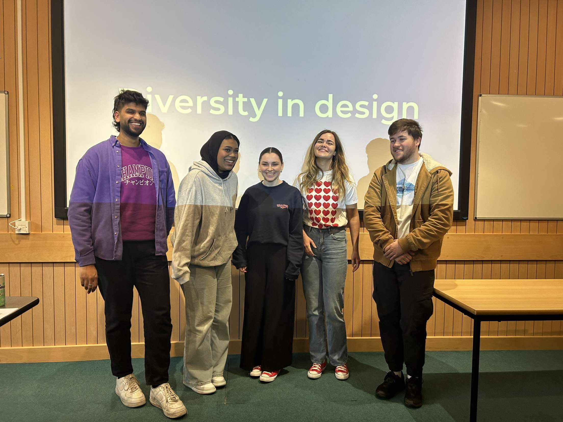
Background
Taking over Baseline Shift for the 23/24 calendar, myself, Habibah, and Ben had new ideas from our experience on the previous year. As with the previous year, we wanted to provide a more diverse range of speakers – whether this be in the sense of design sector, backgrounds, race, gender etc… We also knew we wanted to make Baseline Shift feel more approachable and interactive for students: we noticed the way our own year group felt about Baseline Shift was not aligned with our goals: some students attended, but most did not interact with the sessions or speakers, which is what we felt the sessions are all about.
This year, our goals were to bring the students into an environment which was more laid back and encourage them to get involved. This meant:
- Making ourselves known as members of the team
- Interacting with students and talking about the weekly speakers
- Starting relaxed conversations with speakers
- Encouraging in-person sessions over online sessions
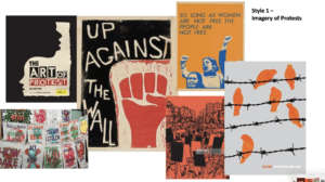
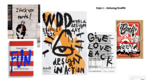
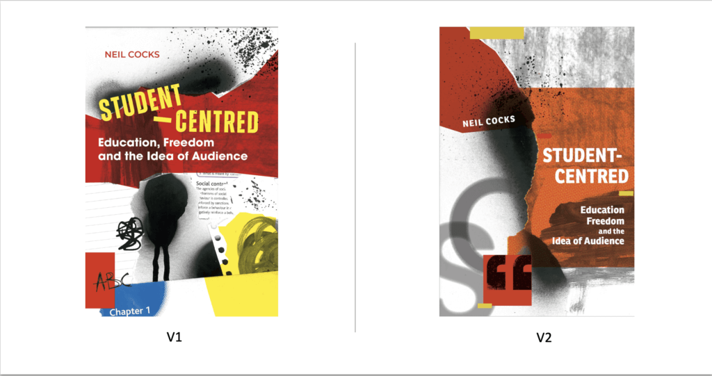
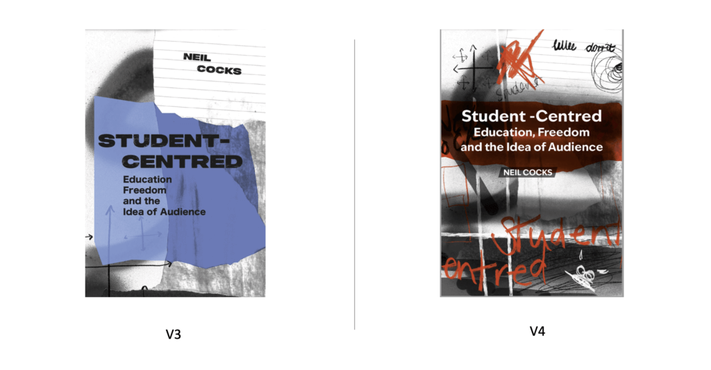
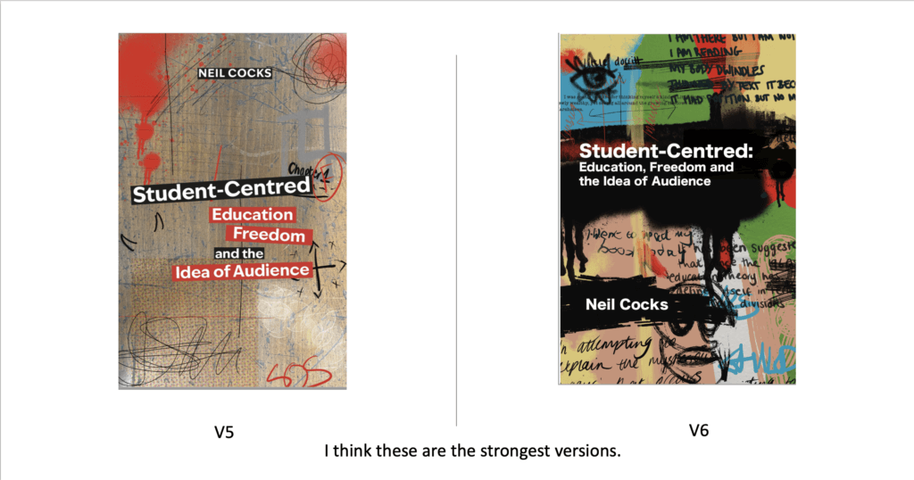
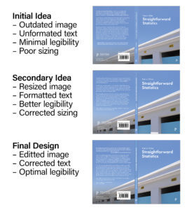
Having been on the team for a year, we were aware of distaste towards the branding for the project and is something we also wished to consider. Unfortunately, due to the team’s availability over the summer, this took a backseat and we were restricted with our time to completely rebrand. Instead, we adapted the previous branding to feel more simple. We wanted to involve the new team members in this process and took on creative director roles, assisting the new team in creating the branding.
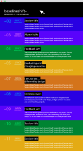
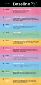
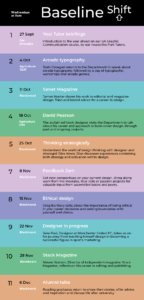
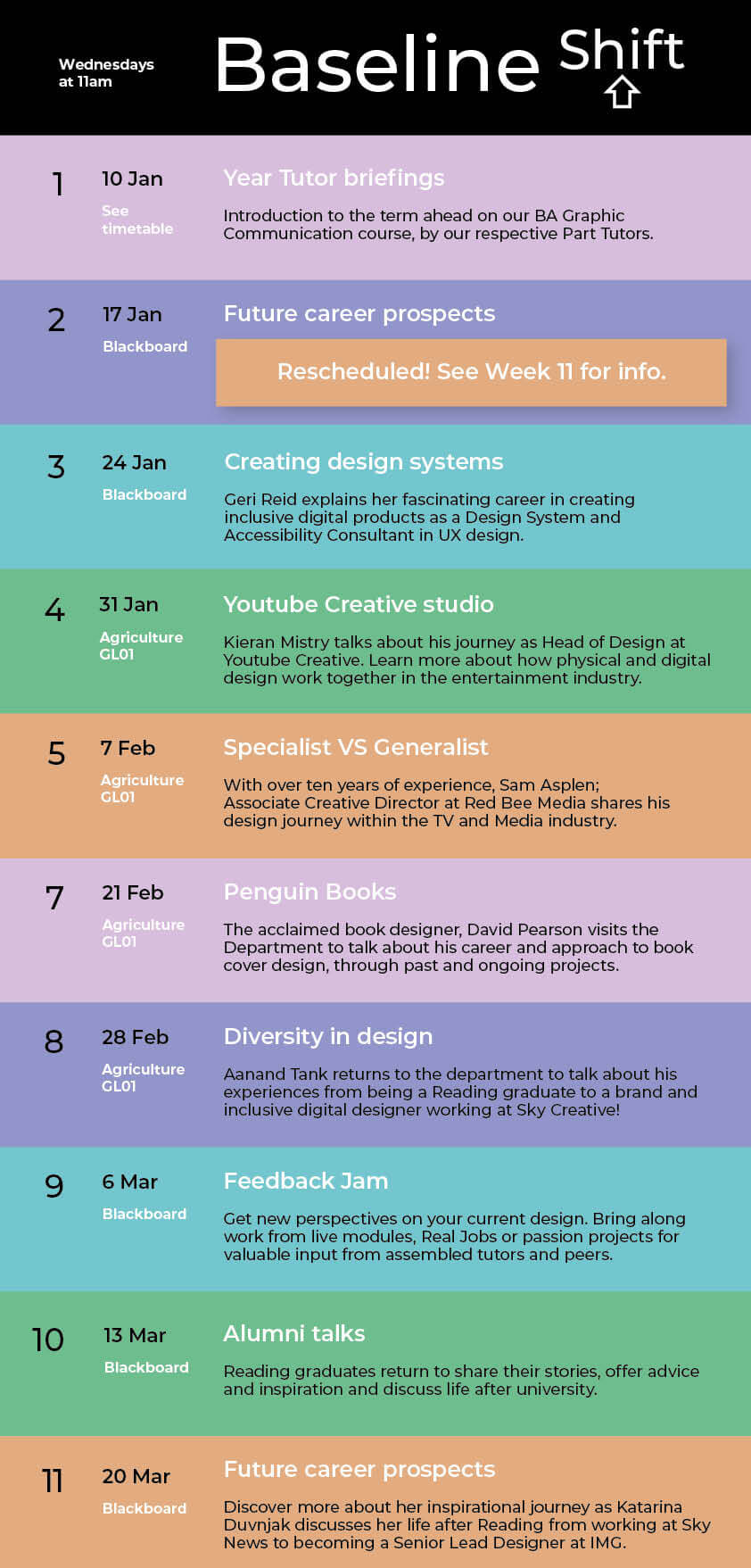
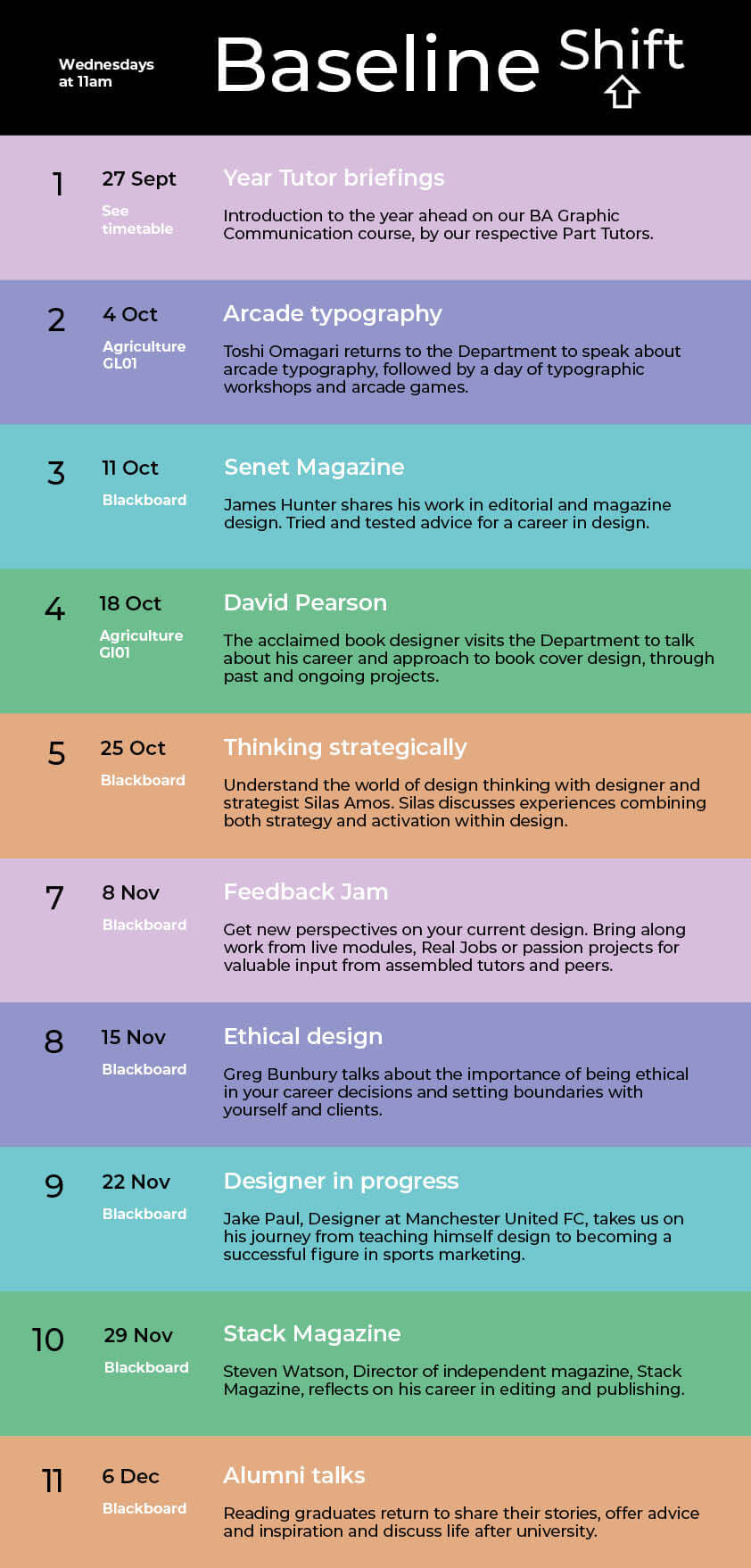
We wanted the team to feel excited about our calendar in hopes to pass this enthusiasm onto the students. We invited speakers whose work we found inspiring ourselves (such as Jake Paul, Kieran Mistry, Katarina Duvnjak) as well as designers and professionals who we felt offered important messages. We wanted to do our best to create a calendar which aligned with the projects running. As a result, the Autumn term was heavily print related to align with the Part 3 magazine project, while Spring Term had a digital focus to work alongside various UX, UI and motion graphics projects. From our end of year feedback, students left the following comments about the selection of speakers and design sectors covered.
‘Hearing from less traditional speakers (motion graphics etc) was really useful as it’s something we don’t get much experience of in the course.’ – Part 3
‘Good variation, but would have been nice to have had more people from a print background’ – Part 1
‘There was an excellent range of speakers from several disciplines/career paths.’ – Part 1
Overall, it appears that students still enjoy hearing about print work. Despite our Autumn term calendar being nearly exclusively print speakers, it could have been beneficial to hear from a wider range within this sector – our calendar focussed largely on magazine work to support Part 3, but we could have incorporated poster design, exhibition design etc to have a more varied schedule. It does seem however, the introduction of other specialities was appreciated and raised new areas of interest for many.
We also noticed a vocal preference for in person sessions, which we did our best to encourage with our speakers. This naturally is not possible for everyone, and due to the rising costs of public transport it is very understandable for speakers to present online. Technical issues occurred in video presentations, which was not optimum, however for the most part speakers were able to present their sessions smoothly. Interactions between student and speaker were lower in these online sessions, which was a challenge to change. People were far more inclined to network with guests when face to face or in private. Despite the challenges of online sessions the team has been pleased to hear of students contacting speakers after sessions. For these reasons, the online sessions have still been of great value in assisting networking within the Department even if we do not see this first hand.
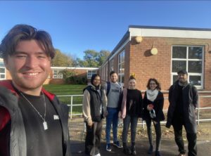
Team roles
To run the calendar smoothly we maintained weekly blogs, promotional posts, and emails. To manage this, we divided the roles with myself as team and promotional leader, Ben leading blog posts and Habibah leading the hosting. Considering their specific areas of interest and preferences, we agreed with Tilly to assistant host sessions and Amber to assist promotion. We also ensured to rotate the roles across all team members. This way, the new team members could learn how they would run the roles themselves in the future and avoid boredom among the team.
As team organiser, I have been responsible for ensuring the team was comfortable, happy, and meeting their weekly responsibilities. In attempt to automate some of this, we created a schedule sheet denoting the team weekly roles and the expected criteria/deadlines. Despite this, we struggled with members of the team not engaging with their roles and responsibilities. This affected the team and meant others were carrying more of the weight than others, but also meant that the distant team members would not benefit from the connections the rest of us were making.
I approached this sensitively through politely reminding and correcting as needed. As time progressed, deadlines were consistently not met on time or to a suitable standard. To maintain a positive relationship across the group, I ended up correcting or taking on extra roles to keep the schedule running properly. In hindsight, the co-leaders of Baseline Shift and I could have been more assertive to the situation. We tried handing more autonomy of the roles over to the new members of the team, but this still resulted in last minute cancellations, late, and poorly executed deliverables.
Working with this team member and managing the issues which came as a result was difficult: being sensitive to all members of the team and distributing roles equally resulted in hurried outputs, which was noticed by students. A Part 1 student said, ‘There was slight issue some weeks with a lack of clarification if the session was in person or on Blackboard.’, which came as a result of last-minute information because of these inconsistencies. We noticed lower attendance in weeks where this was an issue, and it highlighted the importance of consistent and reliable information.
Weekly feedback and highlights
Through contacting speakers and attending the sessions, I feel connected with individuals and design companies as well as being more prepared for the realities with the industry. Many speakers this year highlighted the importance of ai, which we had not heard much about before. The industry insight on ai from speakers including Aanand Tank and Sam Asplen was refreshingly positive – these two speakers both explained that ai is a tool and not a threat so long as we learn to adapt and develop parallel to it.
Greg Bunbury and Geri Reid provided great sessions about design approaches and professional relationships. The focus on approach instead of content was beneficial across all interests and raised important questions about professional practice especially coming from people working in the field currently and adapting to changes.
Reflections
This role has given me confidence in networking first and foremost, while also showing me how to manage a team under time restrictions. Working with the team as a whole has been a positive experience, especially since this is the largest and most active team project I have been a part of. Reflecting on the two years, I have found that I often extend beyond my assigned responsibilities to ensure the job is completed in a timely and good standard. Although this made the sessions run smoothly from the outside perspective, it meant that a lot of the weight landed on me when other members did not follow through on their roles. Learning to allow other people to make mistakes has been a tricky adjustment, but has allowed others to see the weight of their responsibility and consequences of their actions. We could see the attendance to sessions was lower when promotional roles were late or incomplete, and students were far more encouraged to interact with speakers when the hosting was confident and enthusiastic.
My main takings from the time on the team has been the power of networking and communicating with other designers. Particularly, our approach this year has encouraged relationships between different years more so than in past years. Our roles on the team have made us known to students and professionals, which we are hopeful will benefit us in our careers and professional relationships to come.