
BACKGROUND
For this project, the Real Jobs team were approached by Brian O’Callaghan, an MA Photography student at Falmouth University, and former lecturer and staff tutor within the History of Art & Architecture department at the University of Reading. The focus of this project was to create a photo book and corresponding digital files that supported Brian’s Final Major Project for his MA Photography course.
Based on a series of maps released by the East Suffolk council in their 2007 strategic flood risk assessment (SFRA), Brian wanted to highlight the costal erosion and inevitable risk of flooding to the Southwold area due to climate change. The maps modelled various scenarios, including the area of Southwold that would be flooded with continued climate change and a one-in-200-year flooding event. Brian’s project, ‘Life on the line: exploring edgelands in a shifting landscape,’ uses photography to capture life along the edge of the projected flood area. The photo book would contain a selection of these photographs, and support a corresponding exhibition.
RESTATED BRIEF
Initially, the brief was fairly vague due to there being flexibility on the format of the photo book (e.g., a newspaper, zine, traditional book, etc were all possible if appropriate). As the project developed, details such as the exact format were finalised through the ideation and development stages. However, other preferences for the photo book’s content and production were specified in the restated brief, including for the product to incorporate:
CONTENT
- References to the flooded area shown in the East Suffolk council maps
- An emphasis on the duality of Southwold, as both an area of picturesque tourist areas, and a more ordinary, familiar place to locals, e.g., residential housing, farmland, junk yards, etc.
- An explanatory Artist’s Statement at the end of the photobook
PRODUCTION
- An element of sustainability, due to the subject matter of climate change, e.g., using recycled stock
- A physical or tactile element, such as die-cuts, foldouts, or different paper stocks for relevant sections
- A physical print at the end of the photo book
IDEATION
To explore existing approaches to photo book designs, constructions, and formats, I referred to a range of sources. This included reading Martin Parr & Gerry Badger’s The Photobook: A History, volumes i–iii, reviewing finalists of the Paris Photo Aperture Book Awards, and visiting the Books on Photography (BOP23) photo book festival with the client.
 Photograph from BOP23, held by the Martin Parr Foundation & The Royal Photographic Society in Paintworks, Bristol
These materials covered a diverse range of topics, yet it was noticeable how few books used exclusively square photographs. As all of the images within this project were taken on square film, this was a key component of the design. Hence, other works such as Illuminance and Utatane by Rinko Kawauchi and The Shipping Forecast by David Chandler & Mark Power were also consulted for their use of square images.
For explorations into photo books with contrasting stocks and map elements, the works of Awoiska van der Molen (The Living Mountain) and Matt Writtle (The River Meadow at the Pile of Stones) were particularly insightful. Their combinations of image and typography added complexity to each narrative, whilst the use of map elements provided context to the subject matter.
This research collectively guided my initial experiments with formats, and provided inspiration for the development of the design.
 Examples of works researched, including (from left) ‘Illuminance’ by Rinko Kawauchi, and ‘The Shipping Forecast’ by David Chandler & Matt Power
DEVELOPMENT
In the development and refinement of the photo book, the following design decisions were made:
PAGE FORMAT
Every photograph within this project was taken by a Hasselblad 501c film camera, on 60 by 60mm black and white film. Due to the unconventional nature of using exclusively square photographs, I found that through testing different formats and page sizes, a square page of 210 by 210mm would be most suitable. This allowed for pages of full-bleed photographs without any negative space, and spreads containing maps and larger images.
PHOTOGRAPHS
All photographs were converted to a grayscale colour profile to avoid colour tints when printed, and at a minimum resolution of 300DPI. The sequencing of the photographs initially remained unchanged, and the sizes were consistent in the first drafts. However, these were updated following feedback from my supervisor, who suggested creating hierarchy to shape the narrative. Adapting the sequence allowed for grouping of relevant sections, and highlighted key images in full-bleed pages and spreads. This rhythm also emphasised the contrast between the tourist and local areas of Southwold.
 Sample spread showing full-bleed and standard image sizes
 Sample spread showing groupings of images
MAP
Recreating the map of Southwold was a key component of the photo book, to avoid the low resolution in the existing version, and any potential copyright issues. The original map equally felt very disjointed from the photographs, so the final shape of the flood zone was redrawn in Illustrator.
Although the map originally depicted flood depth, the majority of the area was equal in depth and thus appeared as a solid shape. By tracing this shape and creating a clearer boundary around the area of flooding, it reinforced the titular concept of ‘life along the line.’ In addition, the map was substituted for an OS map of Suffolk from 1956, which complemented the photographs more organically in colour and style. Furthermore, this connected the past, present, and future of Southwold through the vintage map, present photographs, and future flood zone.
The photographs are contained between two of the OS maps, (the latter of which incorporates the area of flooding). This guides the viewer through the narrative of images before reaching the explanatory Artist’s Statement.
I wanted to create further connections between the maps and images, so incorporated transparent Xerox sheets with close-ups of the flood area.
These layered with the text and images underneath, hinting at the final map and emphasising the future destruction of the floods.
 Sample spread of the combined OS map and flood area
 Sample spread with Xerox sheet containing of a close-up of the flood area and OS map
TYPOGRAPHY
Through experimenting with type specimens, Miller Text was selected as the typeface for this project. It matched the OS map typography and organic nature of the photographs well, in addition to offering a range of small capitals and non-ranging numerals for typographic differentiation.
During various iterations, the text pages evolved from single- to double-columns to improve line lengths and avoid unnecessary negative space.
The width and symmetry of the columns additionally emphasised the square theme throughout.
Within Real Jobs meetings, I suggested including page furniture and text to complement the images, which my supervisor supported. Hence, the photo book evolved to experiment with page numbers and map coordinates, before settling on grid references for each photograph that correspond with the OS maps included. Manicules were incorporated too as a subtle detail for further clarity or to indicate images overleaf, and thus avoid layering text over images.
Various quotes related to edgelands and flooding in literature were added, including The Anglo-Saxon Chronicle, Timon of Athens by William Shakespeare, and Edgelands by Marion Shoard. These were adjusted to a smaller type size and charcoal shade to avoid detracting from the images. Moreover, the photo book was adapted to include a foreword from Professor Alastair Driver (Director of Rewilding Britain and former Head of Conservation for the Environment Agency).
 Sample spread with double-column text
 Sample spread with quotation
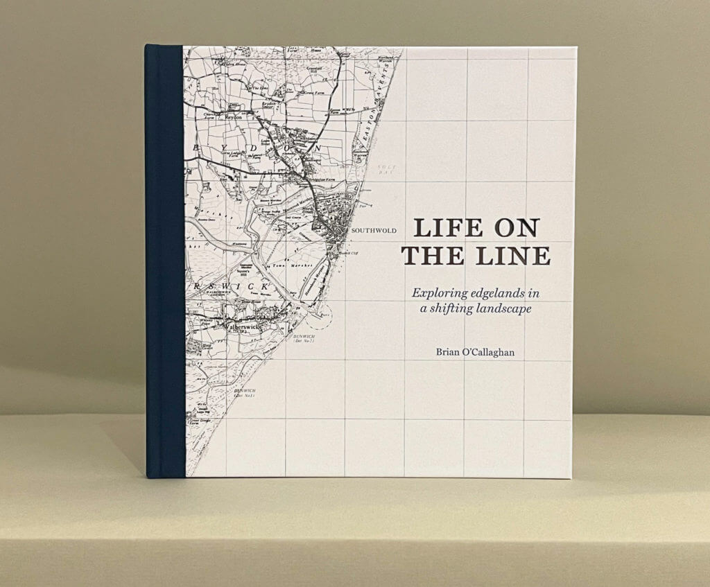
COVER
The cover for ‘life on the line’ explored many alternatives before reaching the final version. The chosen cover embraces the importance of the map, as the foundation of the project. The blue of the sea, however, has been removed to give prominence to the title and accented spinal tape. This is reiterated through the contrasting bold, smoky blue that floods the endpapers. Silver foiling was applied to the title and spinal tape to emphasise the area, and align with the monochromatic theme of the book.
 Sample cover designs
 Final cover design
BINDING
Using saddle-stitch binding was confirmed early in the project, as it allowed the book to lay flat for users to admire the content. As the photo book progressed, incorporating this binding with a hardback cover became increasingly appropriate to address the formality of the subject and showcase the quality of the photography. This was supported by feedback from Brian’s tutor, who stressed the importance of creating a powerful visual and tactile experience for the reader.
The final product was sent to a local specialist printer and binder to achieve a section-sewn, hardback finish. This included the use of spinal tape, silver foiling, and (excluding the Xerox sheets), fully recycled paper stock to minimise the environmental impact of the process.
 Close-up showing book signatures and spinal tape
 Close-up showing section-sewn binding
REFLECTION
Overall, the feedback on this project has been very positive from Brian, his tutor, and my supervisor. The design process has significantly benefited from feedback within Real Jobs meetings, from my supervisor, Brain, his tutor, portfolio reviews, and an independent publisher with 30 years of industry experience.
With further time, it may have been useful to explore a secondary sans serif typeface in the book for the grid references, as mentioned by the publisher. I believe that the current design does meet the initial restated brief, but this feedback equally offers an area for exploration in future projects.
I’m very grateful to have been fortunate enough to work on this photo book as it has been invaluable in terms of experience. Focusing on such a pressing issue has been particularly rewarding, and the importance of this project is perhaps best highlighted by gov.uk issuing of flood warnings to the Southwold area during the later stages of this project (November 2023).
Brian has been an exemplary client, and I hope that both this photo book and his future exhibition encourage further conversations about the future flooding within Southwold and the impact of climate change.
 Final photo book
 Final photo book
 Sample spread with Xerox sheet
 Sample spread with full-spread image
 Physical print included with photo book