Straightforward Statistics book cover

Background

Our client, Dr Patrick White, received a PhD in Social Sciences from Cardiff University. Since then, Patrick has written various books and journals for The Statistics Education Research Journal, started a YouTube channel, and lectured at the University of Leicester in Media Communication and Sociology.

Patrick’s previous books, 3 individually and 1 in conjunction with other academics have not had good covers in his eyes. Patrick told us in conversations that publishers usually take the cover designs out of his hands, something he feels strongly against. With the book being personal to him and his work, the cover design should embody this, bringing together the themes and ideas of the book into a single visual image.

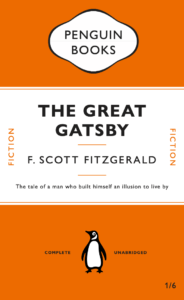
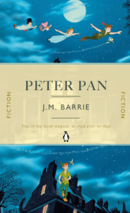
Looking at beginner’s statistics books, which is what this book intends to be, they are often minimal, featuring just colour blocks and text. They often seem very unwelcoming, clinical and academic. Patrick told us that he wants to make his book seem accessible and welcoming to beginning undergraduates, seeming less intimidating than other competitors.

Brief

The brief was to essentially create a book cover design for a new textbook called ‘Straightforward Statistics’, a stand-alone academic asset. The design should be simple and approachable, using negative space to achieve this. The design should be more abstract, less of a conventional portrayal of a subject, and more visually engaging, being sold predominantly online. It would be aimed at undergraduates and those learning about statistics for the first time. While having an interest in reading about this subject, this is more of a beginner’s guide, so it should be directed towards those who may be sceptical of the topic. This should act as a gateway into the topic, with the jacket’s design reflecting the welcoming nature.

Deliverables

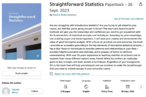
  • A single, complete cover for the academic textbook ready for use by the publishers and in-line with the publisher’s requirements. This will feature the front, spine, and back cover.
  • An ebook variation, showing just the cover with an appropriate file setup.

Research and ideation

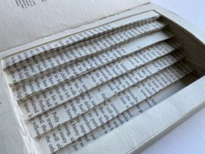
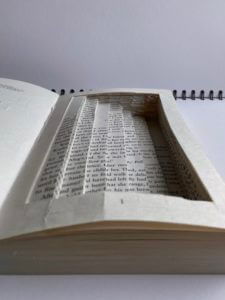
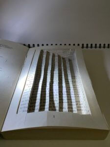
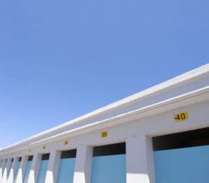
Before meeting with Patrick, our client, my partner and I did some research on our clients’ previous books and other books related to the topic to get a general idea of the structure and layout of the cover. After meeting with Patrick, he provided us with an image that we were very keen on using as the book’s cover and a quick draft he put together on Word to present his vision to us.

Photo provided by client for the cover
Client’s vision

Design development

My partner and I then created a few different designs on Indesign to bring his vision to life more meaningfully. We experimented with typography, alignment, layout, and colour.

Initial ideas

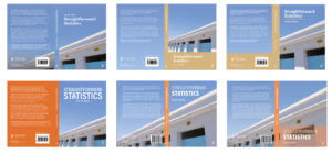
After showing these to the client, he preferred the first design because of the “blue space about the main image” and he liked “the fact that the photo continues to the back page”. He also liked the typeface of the first, fourth and fifth designs. He was less keen on the beige-coloured spines and the image being too zoomed in. Therefore, we reflected on his feedback and came up with a few more designs. He also raised some issues about image quality and whether we could redraw the image using Illustrator or using AI to enhance the quality.
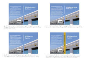
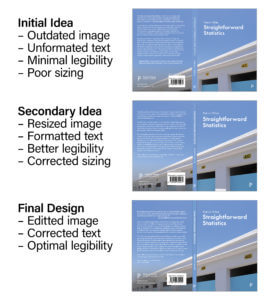
Image quality

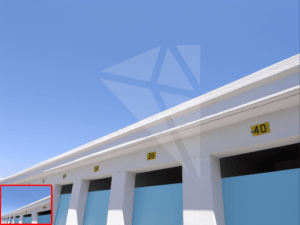
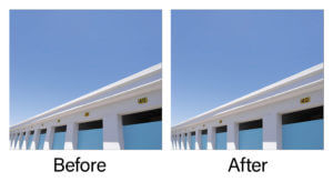
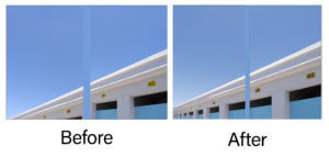
As the image was taken on a phone camera, upscaling the image became an issue. My partner and I tried tackling this issue in various ways, such as importing it into Illustrator and auto-tracing the image to transform it into a vector shape. However, this made the image grainy and unrealistic. Eventually, after exploring different software and speaking with the department’s in-house printing experts, my partner used a new software to upscale the original image to achieve 350 ppi. From our own testing, this new resolution image was the most appropriate but it was ultimately determined by the publishers and printers as there were many factors that could alter its success. This worked effectively and the client was very happy with these results.

Upscaling image using AI preview

Final stages

After receiving feedback from our supervisor, we decided to tackle the legibility of the back cover elements (‘Book subject area’, and the Policy Press logo) by adding a darker gradient and slightly moving the text to ensure it does not sit across both a light and dark part of the image.  It was recommended to remove the ‘Book subject area’ as this element was a point of difference across the two formatting examples sent by the publishers, but the most recently sent one did not use this so we removed it entirely. We then created more box space around the sides of the barcode to appear less tight. Additionally, although the front and back cover would not be viewed together, it was still important to align the doors on both sides in order to create a neat line. Our supervisor reminded us to include hinges to help the printers line elements up without it looking “broken”; however, from research, we found that our client’s previous books had no hinge, assuming the printers are reasonably accurate. Therefore, we decided to not include a hinge. Last of all, we changed the spine to have capital letters to follow the conventions of a typical book spine.

After these further adjustments, we sent the final version to our client which received praise from him.

“I’m pleased to tell you that the publishers have agreed to use your cover! I’m very pleased about this and will send you both a copy of the book when it’s published (which should be about September). Thank you so much for all your hard work on this project. I’m delighted with the final design and can’t wait to hold a copy in my hands.”

–Patrick White

Final design

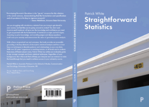
Straightforward Statistics Book Jacket


Final product on Amazon

Reflection

Overall, this project was a fun and practical experience that was completed within a short period. The image already being decided as the cover photo enabled me to explore various typographic and layout options in depth.  This, however, limited the options of my partner’s and my own interpretation of the cover, which could have had a greater impact on the audience. Despite this, our client was very eager to use this photo as he had personal connections to it, which we respected. By using this low-resolution photo, we had a chance to explore different software and talk to experts about solutions to increasing this which we eventually did successfully. We regularly sent over ideas to our client and he was mostly quick to respond to our emails. However, receiving information from an external printing and publishing company was a little slow and the unexpected problems faced due to tackling the image quality resulted in a few weeks delay of sending the final design to the client.

We received lots of positive feedback from our client and useful guidance from our supervisor and Real Job meetings. This range of feedback ensured we covered every detail on the cover, which led to a successful design, which the client was very pleased about.

Reading Film Theatre Cinema Listing

For my cinema listing design, I decided to aim my first one for ‘A retired doctor and her husband, both of who have a passion for old Hollywood’. When researching, I looked at old, vintage Hollywood cinema listings, movie posters and screen prints in order to help me with the colour scheme, layout and font. I first chose quite a bold font for the title, however, I did not really like it when I wrote the rest of the information out as it did not have the old style Hollywood theatre feel that I wanted. So I searched for more fonts and found a very eye-catching, retro style one which felt very suitable for the theme.

I then looked at colours and thought that red and black had a very distinct look, which is quite conventional when looking back to older cinema listings. When focussing on the text of information, I decided to order the films in terms of age rating; the films more appropriate for older couples would be first, then the more family friendly ones would be at the bottom. However, after the feedback session on Friday, I realised that this order could be slightly misleading as all the dates are jumbled up and in most cases, people would not read this listing in order from top to bottom, but instead, scan through and see the films that look most interesting for them. Therefore, I decided to group them into adult and family films, then order them by date.

For my second cinema listing sheet, I wanted it to target ‘A father with two children under 10’. I copied the same layout from my first one over and changed the font to make it more exciting and fun. Then I also changed the colour from red to yellow, again to make it seem brighter, happier and more inviting to a younger audience.

And similar to my other one, I decided to group them again by age and date by boxing up the family friendly ones and putting them at the top, and then leaving the other non kid friendly ones for adults to browse around in their own time.

Peter Pan

As I have never worked with Indesign, I thought James’ tutorial was very useful in knowing the basic techniques within this software. I found the paragraph style very useful and the different layers you could add and lock so that it is easier to adjust specific images/text at a time.

For my second book cover design, I did Peter Pan and got inspiration from the illustrations from the book and also the 2003 movie. For the background, I used a one of the scenes from the Peter Pan movie, where they are flying to Neverland and I really like how movement can be captured at the top, which will draw the reader into the book and make them question where they are going. For the bottom image, I used the same scene and just split the image in half so that the cover flows from top to bottom. For the middle section, I overlaid a yellow background on top of the scene where Wendy looks out of her window, with a big bright moon in the centre, adjusting the transparency levels to a 50% and 80%. I really like this result as again, this gives the reader a preview of the storyline, but also makes the book come to life in a way compared to if it was just a solid yellow background.

Overall, I am very happy with this design as the story of Peter Pan is meant to be described as magical and thrilling, and I think I have managed to achieve these two things with the vibrant colours, use of space, font and images.

If I were to improve part of it, I would maybe change the colour of the font where it says ‘One of the most magical stories ever written’, making it bolder or even brighter. I could have used the effects tool to add some glimmer/shine around it to enhance the ‘magical’ bit of the review.

70s Retro Themed Logo Design

For my logo trends design, I picked the theme of 70s retro style. I first created a mood board of the 70s retro styled interior design which featured lots of interesting patterns such as floral, geometric, seamless swirls, psychedelic patterns etc… I really liked how colourful and bold everything was, but still had an elegant feel to it. I then looked at fonts, logos and brands in this era which matched very well to this retro theme. I again really liked how the text is really vivd and eye-catching, with lots of colours, making me feel rather happy and excited.

And so with this research, I wanted to mirror this kind of excitement I felt when looking at this style and put it into my logo. I started off with the font and colours. I was inspired by the Bee Gees ‘Staying Alive’ title in my second mood board and decided to use these shades of pink and a similar font. 

I then created a ring of circles with pastel colours of the rainbow, imitating a vinyl to possibly have a music theme, linked with the Bee Gees and the retro themed music at the time. I got inspiration from my second mood board again where it looks like there are an array of records lined up beside each other. I thought this would be a good way to encapsulate my name (my brand) within the circle to give it a clear central focus. When putting my name in the middle, I thought it looked quite bland so looking back at my mood board, I saw a splatter-like shape and thought it would be nice to add behind my name to look like it was popping out, giving it more texture and depth. I originally drew a black splatter with a turquoise outline, however, it was slightly too harsh to the eye, so after some debate around colour, I changed it to white with a pastel purple outline, making it easier to read the logo.

Overall, I am generally happy with my design as I think it fits very well with the theme of 70s retro style. I also like how colourful it is which will capture the attention of viewers. If i had more time, I would probably reconfigure the splatter behind and continue to experiment with colours as I still think the white is too bland. Maybe I could have incorporated another retro themed pattern within it.

Lettering in the Environment

As I was taking pictures of different letter forms, I focused on texture, lighting and shadow. I like how each of the letters shown in the collage above either have a rough/smooth texture in the background or in the actual text. I found it really interesting how the blue ‘E’, painted on a white, textured brick wall, could still convey straight lines even though it was painted on an uneven wall. This is when I looked closer and noticed that the paint had been applied in a jagged format so when looking from a further distance, it almost created an illusion that the lines were straight, when in fact, they were actually uneven. Another form I liked was the ‘ROYAL’ one at the top right as the smooth texture that created reflections in the light and gold colour really brought out the ‘royalty’ of the text, making it really fit in with its purpose.

Staircase

For my book design, I chose the theme ‘Staircase’ and started off with the front cover. The cover already had an image of a girl who looked quite scared with a building which looked like a Sanatorium behind her. Therefore, I instantly used the building and cut out its windows so viewers can have a mini preview into the building before properly entering/opening the book. I put a mask over the girl’s face to represent those with an unknown illness who are about to enter the Sanatorium. I covered the title using masking tape and wrote tally’s of 7 to represent the seven lives each of the patients have before death.

When designing the inside of the book, I created a staircase with seven steps, representing the seven floors in the Sanatorium. I created a border around it so the reader can still see the page numbers, but also so that when you close the book, it looks like a normal book, but in actual fact, the reader gets deceived when opening it, just like the man who was deceived when he was constantly moved down a floor until death.


I played around with light and shadow to create a more ominous atmosphere which I think was successful as you can really see the depth of each stair and how deep it really goes.

Medicine Conveyor Vending Machine

For my ideal gift project, my partner gave three interesting facts about herself:

  1. She eats a lot of medicine
  2. She likes listening to music
  3. She likes writing in Chinese

Unfortunately, I could not include the third point, however,  I have used the first two facts to create a vending machine where you select a pill you want to take, then use the handle to turn the conveyor belt inside to the right pill. Whilst you are turning the handle, her favourite song will be playing through the speaker at the top. The pattern and colours of the machine have been inspired by the album cover of her favourite song, ‘Cherry Bomb’ by NCT 127.