

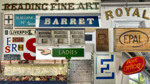
As I was taking pictures of different letter forms, I focused on texture, lighting and shadow. I like how each of the letters shown in the collage above either have a rough/smooth texture in the background or in the actual text. I found it really interesting how the blue ‘E’, painted on a white, textured brick wall, could still convey straight lines even though it was painted on an uneven wall. This is when I looked closer and noticed that the paint had been applied in a jagged format so when looking from a further distance, it almost created an illusion that the lines were straight, when in fact, they were actually uneven. Another form I liked was the ‘ROYAL’ one at the top right as the smooth texture that created reflections in the light and gold colour really brought out the ‘royalty’ of the text, making it really fit in with its purpose.